
D3.js is a JavaScript library for manipulating documents based on data. D3 stands for data-driven documents and this library provides powerful visualization components and a data-driven approach to DOM manipulation.
To use D3 in our JavaScript application, we can download the library from the D# website found at http://d3js.org/.
Or we can use the CDN in our script tag:
<script src="//d3js.org/d3.v3.min.js" charset="utf-8"></script>
A more dojo-centric approach would be to add this as a package in the dojoconfig and use it as a module in the define function.
Here is a snippet to add D3 as a package to the dojoConfig:
var dojoConfig = {
  packages:
  [
    {
      name: "d3",
      location: "http://cdnjs.cloudflare.com/ajax/libs/d3/3.5.5",
      main: "d3.min"
    }
  ]
};
Using d3 library as in the define function:
define([
  "dojo/_base/declare",
  "d3",
  "dojo/domReady!"
  ],
function
(
  declare,
  d3
)
{
  //Keep Calm and use D3 with dojo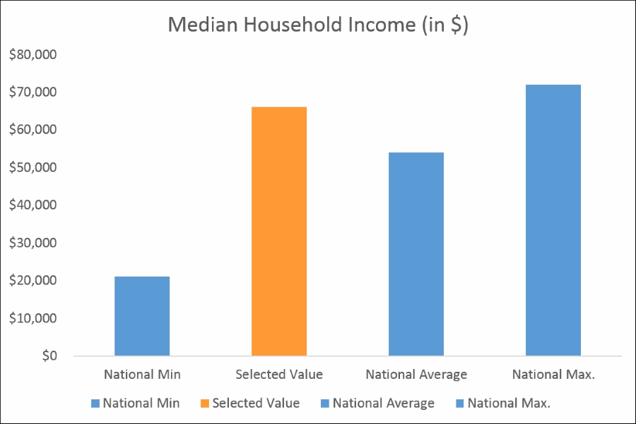
});Let's create a column chart with D3 using the county-level demographics data. Our objective is to use the column chart to display four measures of Median Household Income centered upon the Median Household Income of the county of interest. The four measures are:
- The National Minimum or value at 5th percentile (Average—three Standard Deviation)
- The Median Household Income of the county being clicked
- The National Average value for Median Household Income
- The National Maximum or value at the 95th percentile
The following image is a mock-up of how we intend to build our chart:
There are several reasons why we have chosen to demonstrate constructing this chart using D3. D3 is entirely data driven, and hence flexible, especially for data visualization. Many visualization libraries are built on top of D3 and a knowledge of D3 will even help us build intuitive charts and data visualizations.
D3 works on selections. The selections in D3 are very similar to jQuery selections. To select the body tag, all you have to do is declare:
d3.select("body")To select all div tags with a particular style class named chart, use the following snippet:
d3.select(".chart").selectAll("div")To append an svg (scalable vector graphic) tag or any other HTML tag to a div or the body tag, use the append method. The SVG element is used to render most graphic elements:
d3.select("body").append("svg")Use it along with an enter() method to indicate that the element accepts the input:
d3.select("body").enter().append("svg")D3 is driven by data as its name suggests. All we need to render a simple chart is to feed data to the D3 selection. Data can be as simple as an array:
var data = [45, 87, 15, 16, 23, 11];

  var d3Selection = d3.select(".chart").selectAll("div").data(data).enter().append("div");

  d3Selection.style("width", function (d) {
    return d * 3 + "px";
  }).text(function (d) {
    return d;
  });
All we are doing in the previous snippet is we are setting the width property for the style object of the D3 selection. And we get this:
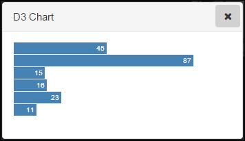
The width value of each div in pixels is taken from the value of each element in the data array multiplied by 20, and the text value within the bar is again taken from the value of the individual data. There's something that needs to be done before, to get this beautiful chart—we need to set the CSS styling for the div. Here's a simple CSS snippet we used:
.chart div {
    font: 10px sans-serif;
    background-color: steelblue;
    text-align: right;
    padding: 3px;
    margin: 1px;
    color: white;
}In the previous snippet to show a simple D3 chart, we used a multiplicand value of 20 with each value of the data to get the pixel value for the div width. Since our container div was around 400 pixels wide, this multiplicand value was fine. But what multiplicand value should we use for a dynamic data? The rule of thumb is that we should use some kind of scaling mechanism to scale the pixel values so that our maximum-most data value fits inside the chart container div comfortably. D3 provides a mechanism to scale our data and calculate the scaling factor, which we use to conveniently scale our data.
D3 provides a scale.linear() method to calculate the scaling factor. Additionally, we need to use two more methods, namely domain() and range(), to actually calculate the scaling factor. The domain() method accepts an array with two elements. The first element should mention the minimum-most data value or 0 (whichever is appropriate) and the second element should mention the maximum-most value of the data. We can use the D3 function d3.max to find the maximum value of the data:
d3.max(data)
The range function also accepts an array with two elements, which should list the pixel range of the container div element:
var x = d3.scale.linear()
    .domain([0, d3.max(data)])
    .range([0, 750]);
Once we find the scaling factor x, we can use this as the multiplicand for the data item value to derive the pixel value:
d3.select(".chart").selectAll("div").data(data)
  .enter().append("div").style("width", function (d) {
    return x(d) + "px";
  }).text(function (d) {
    return d;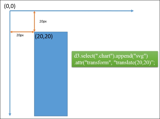
});SVG, though intimidating in its entirety, offers several advantages while working with data visualizations, and supports a lot of primitive shapes to be rendered in HTML. One key thing to be noted is that the SVG coordinate system starts from the top-left corner and we need to bear this is mind while calculating the desired positions of our elements.
Appending an SVG element is similar to appending a div to our chart class:
var svg = d3.select(".chart").append("svg")
    .attr("width", 500)
    .attr("height", 500)
    .append("g")
    .attr("transform", "translate(20,20)";
In the previous snippet, we can actually set the styling and other attributes such as width and height. transform is an important property by which we can move the position of the svg element (remember the SVG coordinate system origin is in the top-left corner).
Since we will be constructing a column chart, the first element in the array accepted by the range() method while calculating D3 linear scaling should not be the minimum-most value, but rather the maximum height value in pixels. The second element in the array is the minimum pixel value:
  var y = d3.scale.linear()
    .range([700, 0]);
Conversely, the x scaling factor should be based on an ordinal scale (meaning, we don't use numbers to calculate the width and spacing of the bars):
var x = d3.scale.ordinal()
    .rangeRoundBands([0, width], .1);
From the feature statistics module we have discussed earlier, we should be able to get the mean and standard deviation of a particular field in the feature layer.
From the previous two pieces of information, we know how to calculate the 2.5th percentile (bottom 2.5% income) and 97.5th percentile (top 2.5% income level). We intend to compare the Median Household Income of the selected feature along with these values. The formula to calculate the 2.5th and 97.5th percentile is shown as follows:
|
1st percentile = mean - 2,33 * SD |
99th percentile = mean + 2,33 * SD |
|
2.5th percentile = mean - 1.96 * SD |
97.5th percentile = mean + 1.96 * SD |
|
5th percentile = mean - 1.65 * SD |
95th percentile = mean + 1.65 * SD |
From previous statistic computations, we know the following data:
mean = $46193
SD = $12564
We need the 2.5th and 97.5th percentile which can be calculated as follows:
2.5th percentile value = mean – 1.96 * SD
                       =   46193 – 1.96*(12564)
                       =             21567.56
And for the 97.5th:
97.5th percentile = mean + 1.96 * SD
= 46193 + 1.96*(12564)
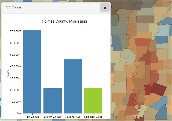
= 70818.44So, this is going to be the data for our chart:
var data = [
  {
    "label": "Top 2.5%ile",
    "Income": 70818
  },
  {
    "label": "Bottom 2.5%ile",
    "Income": 21568
  },
  {
    "label": "National Avg",
    "Income": 46193
  },
  {
    "label": "Selected Value",
    "Income": 0
  }
];
The Income value for the Selected Value label is set to 0. This value will be updated as we click a feature in the feature class. We will also define a margin object as well as width and height variables for use in our chart. The margin object we defined looked like this:
 var margin = {
      top: 20,
      right: 20,
      bottom: 30,
      left: 60
    },
    width = 400 - margin.left - margin.right,
    height = 400 - margin.top - margin.bottom;
While constructing the chart, we will be considering the following steps:
- Determine the x scaling factor and y scaling factor.
- Define the x and y axes.
- Clear all the existing contents of the
divwith achartclass. - Define the x and y domain values based in the
marginobject, as well aswidthandheightvalues. - Define the SVG element that would hold our chart.
- Add the axes as well as the chart data as rectangle graphic elements in the SVG.
We will write the functionality in a function, and call the function as needed:
function drawChart() {

// Find X and Y scaling factor

  var x = d3.scale.ordinal()
    .rangeRoundBands([0, width], .1);

  var y = d3.scale.linear()
    .range([height, 0]);

  // Define the X & y axes

  var xAxis = d3.svg.axis()
    .scale(x)
    .orient("bottom");

  var yAxis = d3.svg.axis()
    .scale(y)
    .orient("left")
    .ticks(10);

  //clear existing
  d3.select(".chart").selectAll("*").remove();
  var svg = d3.select(".chart").append("svg")
    .attr("width", width + margin.left + margin.right)
    .attr("height", height + margin.top + margin.bottom)
    .append("g")
    .attr("transform", "translate(" + margin.left + "," + margin.top + ")");

  // Define the X & y domains
  x.domain(data. map(function (d) {
    return d.label;
  }));
  y.domain([0, d3.max(data, function (d) {
    return d.population;
  })]);

  svg.append("g")
    .attr("class", "x axis")
    .attr("transform", "translate(0," + height + ")")
    .call(xAxis);

  svg.append("g")
    .attr("class", "y axis")
    .call(yAxis)
    .append("text")
    .attr("transform", "translate(-60, 150) rotate(-90)")
    .attr("y", 6)
    .attr("dy", ".71em")
    .style("text-anchor", "end")
    .text("Population");

  svg.selectAll(".bar")
    .data(data)
    .enter().append("rect")
    .attr("class", "bar")
    .style("fill", function (d) {
      if (d.label == "Selected Value")
        return "yellowgreen";
    })
    .attr("x", function (d) {
      return x(d.label);
    })
    .attr("width", x.rangeBand())
    .attr("y", function (d) {
      return y(d.population);
    })
    .attr("height", function (d) {
      return height - y(d.population);
    });
}
We can call the previous function on the feature layer click event. In our project, the feature click event is defined in a separate file, and the D3 chart code is in a separate file. So, we can send the click results through the dojo topic:
//map.js file

define("dojo/topic",..){
on(CountyDemogrpahicsLayer, "click", function(evt){
            topic.publish("app/feature/selected", evt.graphic);
        });
}
The result can be accessed in any other file by using the subscribe() method under the topic module. In the previous snippet, the result can be accessed by referring to the name called app/feature/selected:
//chart_d3.js file
topic.subscribe("app/feature/selected", function () {
var val = arguments[0].attributes.MEDHINC_CY;
var title = arguments[0].attributes.NAME + ', ' + arguments[0].attributes.STATE_NAME;;
array.forEach(data, function (item) {
if (item.label === "Selected Value") {
item.Income = val;
}
});
drawChart(title);
console.log(JSON.stringify(data));
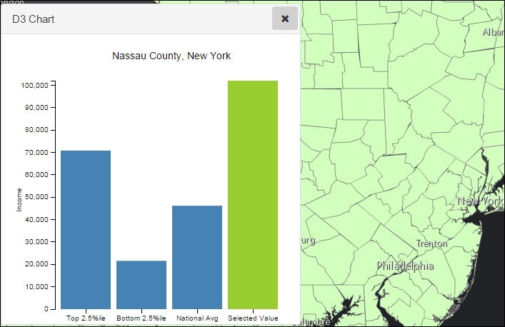
});The following screenshot is a representation of the output of our code. The D3 chart represents a typical column chart with four columns. The first three data values are static as per our code, because we can compute the top and bottom 2.5th percentile as well as the national average from the feature layer data. The last column is the actual value of the selected feature in the feature layer. In the following snapshot we have clicked in Nassau county in New York state and the data value is a bit above $100,000, which is well above the top 2.5th percentile mark:
In the following screenshot, we have selected one of the counties with the least Median Household Income. Notice how the Y axis re-calibrates itself based on the maximum value of the data.
Charting with D3 using SVG components can be cumbersome, but a basic knowledge of these will go a long way when we need to do high-level customizations.