
Our button as it stands is working perfectly, but doesn't exactly cry out to be tapped. The button's default (clear) background color and default button font may identify to an experienced user that it is indeed a button, but let's add a little sparkle to what is still a very monochromatic interface so that everyone new to the Watch - and we can, at the moment, be sure that a large proportion of our users will be just that - will both immediately recognize the button for what it is and be motivated to explore it.
This is a good opportunity to spend a little time looking at one aspect of watchOS development that is very different to its iOS counterpart—UI layout design.
It is not possible with WatchKit to programmatically create an interface or indeed make many fine adjustments to the layout once it has loaded. All this needs to be done before building the app, using the graphical user interface we have been using up until now to add a button to a blank template.
Most of the work in laying out the interface is actually done for you by WatchKit, and all you need to do is set a relatively small number of properties on each element that you add. We have already set the button to be horizontally and vertically centered in its containing view, which may be familiar to you from using UIKit's Autolayout for iOS. The use of this kind of layout is very much simpler to use with WatchKit. We will dive into more detail on this subject later in the book, but we will use this feature now, in a restrained manner, to overcome the limitations of the button view.
Just as you have less control over the layout of the screen of the Watch than you do with iOS devices, so you also do not have as much control over the appearance of the UI elements provided by WatchKit. The button you have added is an instance of WKInterfaceButton object, not UIButton object, with which you may be used to working. While it makes your life as a developer significantly simpler, WatchKit may not offer you some features that you would prefer to have available, and you will need to think about whether to change your requirements—and given the habits that you will have developed on much larger screens, it seems likely that you will be doing this pretty frequently - or whether the tools at your disposal offer you a less direct route to achieving the desired result.
We will address such a case here. We have decided our button could look a little more button-like. We have two possibilities that are provided directly by the button—we could change the background color to something a little less similar to the interface background, or we could add an image to the button. But both of those feel somewhat overbearing for a single button on an otherwise empty screen - we are looking for something more subtle. A discrete border would do the job, but WKInterfaceButton object offers no such property, so do we need to find something else?
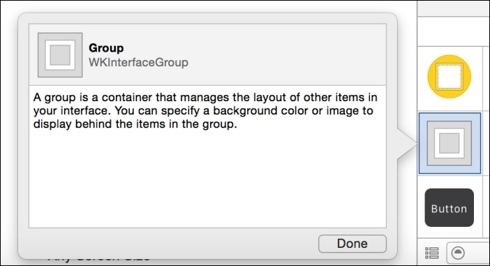
Well it turns out that one of WatchKit's most modest and unexciting looking elements, WKInterfaceGroup object, can be used to great effect, once mixed with a little imagination.
To produce our border around the button, we will simply create a containing group, an instance of WKInterfaceGroup, an object that will contain the button, but be large enough that a small margin is visible around it. And we won't write a single line of code to do it, it's all done in Interface Builder.
Follow these steps to create a group object:
- Drag a group from the Objects menu onto the interface (it doesn't matter where you drop it) and name it
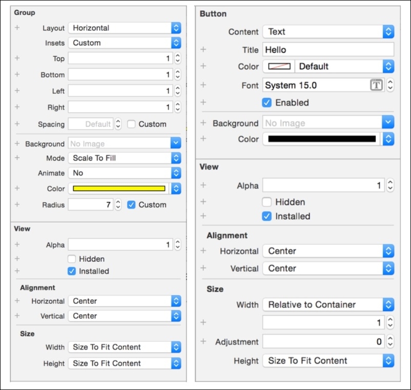
BorderGroupby selecting it in the Document Outline, hitting Return, and typing in the name. Hit Return again to enter the new name. - In the attributes Inspector, set Insets to Custom and set Top, Bottom, Left and Right to the value 1.
- Choose a color for the border—to make things simple a little later on; use the color picker to select one of the colors provided by UIColor's preset color methods. In the image you can see we have chosen yellow, which is the color returned by
UIColor.yellowColor()(which we will be using later):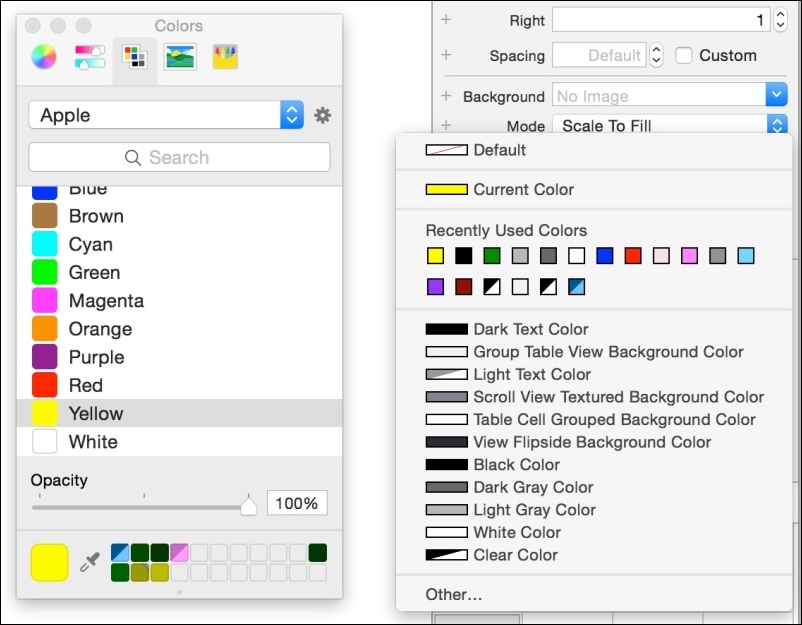
- Set the Group's Radius to Custom and enter a value of 7.
- Set the Alignment properties, Horizontal and Vertical, to Center.
- Set both Size properties, Width and Height, to Size To Fit Content.
The Group is now ready; all that remains is to put the button inside it. Again, the easiest way to do this is in the Document Outline—just drag the button onto BorderGroup.
Note
You can also do this directly in the interface, but under some circumstances this can get difficult - when you have very small elements or a large number of them, for example - and sometimes even impossible: When an element is set to be Hidden, it conveniently disappears from the interface to show how the UI will look when the view is first loaded and so can no longer be selected.
Click outside of the interface so that the button is no longer selected, and take a look at what we've got. The button now appears to have a slim border, and immediately draws attention to itself. (Okay, it doesn't have a lot of competition right now, but you get the point.)
Hit Run. Looks great. Looks even nicer on the watch. And we can do even better than that.