
Now that we have a few functioning apps under our belt, we will take a look at what else there is to do in order to produce a truly release-ready app. One of these topics, the app icon, is mandatory for any project intended for release, while the others are brief explorations of technologies that you are likely to add too many of your own app projects.
The topics covered include:
- Providing a custom icon to an app
- Using an Xcode asset catalog
- Adding an
extensionto a class - Creating the UI layout in code
- Creating sequential animations
- Adding audio and video playback to your app
I don't know about you, but I find that one of the most satisfying points in an app's development is the first time I see its icon appear on the desktop or home screen of whichever platform it runs on. It seems that at that moment the new app is promoted to the status of a real-world application, becoming a member of the exclusive club of useful projects. My hard disk is littered with sketches, try-outs, and projects that for some reason never reached completion and, indeed, my home screens are equally cluttered by the generic app icons added by Xcode to every new project. It's the good ones that get to display their own icon.
So adding an icon is, for me, a sign that an app has progressed far enough that I might be tempted to actually show it to someone.
On the Apple Watch home screen, there is actually a further imperative to add an icon and that is the fact that there are no labels to distinguish one app from another. It's all down to the icon. If you have developed several projects and run them only from within Xcode, whether on the Simulator or on a physical device, this will not have become a problem, but testing an app out in the field, far away from the Xcode's Run button, can quickly become confusing when you have to select one app from several that share the same generic icon on the home screen.
Every app submitted to the App Store needs a number of icon images of various sizes for both the iPhone and the Watch. This is mandatory, but the processes of creating and adding these images to the project are not complicated, as you will see shortly.
Although the icons appear circular on the watch's home screen, your files, or assets, as they are called in this context, will be square images and the operating system will take care of applying the circular mask.
Unlike icons on iOS home screens, watchOS icons are not accompanied by text labels, making the design of the icon that much more important. It will be the only thing that your users have to identify your app in the confined space of the watch's screen.
Firstly, a few specifications to note:
- The icon must be in
.pngformat - The image's standard bit depth is 24 bit, but other bit depths are sometimes a good idea (see Design Considerations below)
- The image must contain no transparency
- The image must not use a black background, unless it is surrounded by a border, in order to differentiate it from the home screen background
In addition to following the image assets technical specifications, there are a few things that we should bear in mind when designing an app icon for the Apple Watch.
At the risk of stating the obvious, there is one facet of the watch that exerts a huge influence on our design considerations: the screen is small and the icons are tiny! It is essential to keep the design simple. Including text in the icon is probably not a good idea and you don't want to be incorporating fine details that will be completely lost in the context of the home screen. Keep it bold and keep it simple.
The icon needs to clearly represent your app. Try to find something that expresses some essential element of your app, or is clearly related to the app's iOS icon on the iPhone.
Apple suggests keeping the colors to those available in the 8-bit palette, which will considerably reduce the size of the image assets (remember, storage on the Apple Watch is not measured in gigabytes). To what extent this is possible for you will depend to a great extent on the colors used outside of the context of your watch app, which may or may not be fixed, such as your website, a pre-existing iPhone app, or a client's corporate identity. Worth a thought, though.
I have to admit that I am hopelessly lost when faced with a multi-layered, alpha-stripped, gluten-free Adobe Photoshop template. These things are meant for graphics people and the plethora of templates that are available, from both Apple and others, are doubtless a valuable aid to those with the necessary skills to use these excellent tools. But for my own projects, where I don't have a highly experienced—and hugely expensive—designer at my disposal, I prefer to keep things as simple as I can and so we will have a very brief look at some smaller scale alternatives to the industrial might of Adobe.
You may wish to download a complete set of Apple Watch icon images for your first go at adding them to you're project. This will allow you to focus on the logistics of getting the assets into the app, while leaving the creative and graphics hurdles for later. You can access a set of icon images (for both the watch and the phone) here:
https://github.com/codingTheHole/BuildingAppleWatchProjectsBook
However, sooner or later you will need to prepare your own graphics. There are doubtless many excellent apps out there and it is beyond the scope of this book to examine a selection of them closely. One such app that I have found to be flexible and simple enough for my own use, and this is a purely subjective recommendation, is called Graphic and is available here:
It is, however, not freeware, so you may wish to search the App Store for something that is offered for free.
A second utility that I have found most useful is iConeer that will prepare all the image sizes you need for any of Apple's platforms, including the iPhone and the Apple Watch, from a single image file. It is available here:
http://www.quickgets.com/iconeer/
The price of this app was only a couple of dollars and was money well spent, though again, there will certainly be many other apps that also do a fine job, some of them for free.
Whatever software you use, design your app icon using a canvas size of 1024 x 1024 pixels. From the finished graphic you can then create the required image sizes. This large format will then serve you well for all icon-related purposes as well as the larger formats that you may end up submitting to the App Store.
This is not the place to discuss the actual creation of that first graphic, but, once it is finished, you will need to create differently sized versions of it for a number of uses. Most of these will require different sizes for the 38 mm and 42 mm watch faces. In all, you will need the following image sizes (width and height are always identical):
Xcode expresses image sizes in points, not pixels. A full discussion of the reasons for this is out of the scope of this book, but all you need to know in the case of the Apple Watch screen is that one point translates to four pixels (double the pixels in height, double the pixels in width). Thus, a 24 point image requires an image of 48 x 48 pixels, and this is underlined by Apple's convention of adding the suffix @2x to all image names intended for display on a Retina display (which includes the watch screen).
So icon images will have names such as icon-24@2x for a 48 pixel image, icon-27.5@2x for a 55 pixel image, and so on, and when we come to Xcode's xcassets, we will see the same convention.
One exception to this is the Apple Watch Companion Settings image, which must also be provided in @3x resolution (for the iPhone 6+ screen).
We will assume you have a full set of icon assets of the required sizes, which you have completed in a graphics app or downloaded from the GitHub repository listed above.
At the time of writing, a list of required assets is available from Apple here:
https://developer.apple.com/watch/human-interface-guidelines/icons-and-images/
The process we must follow is very straightforward; we simply add the files to the project and then assign the appropriate asset sizes in Xcode's asset catalog editor.
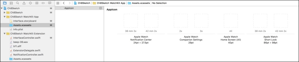
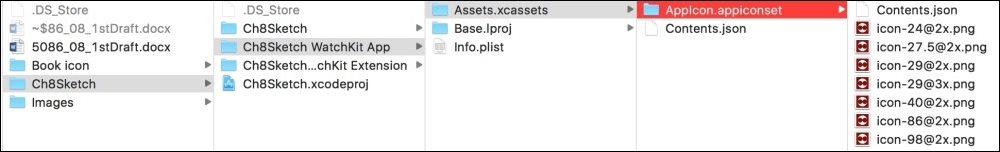
Select the Assets.xcassets file of the WatchKit App (not the iPhone app) in the project navigator and you will see the asset catalog editor showing empty fields for the required watch icon assets, as illustrated below:
The easiest way to add the icons is by dragging them directly from the finder onto the appropriate empty fields:
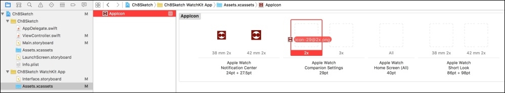
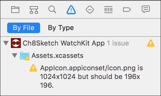
Be sure to select the right image, or you'll get a warning from Xcode:
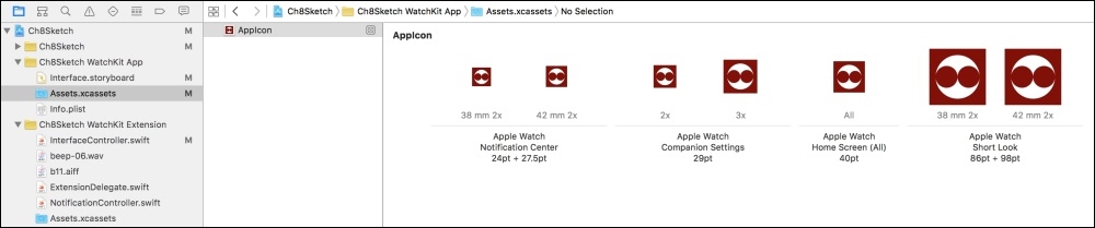
Once you have dragged in all the necessary image assets, your asset catalog should look like this:
Notice that you did not need to explicitly tell Xcode to copy the image assets into the project folder, this is done automatically, as can be seen in this screenshot from the Xcode project's folder in the Finder:
Launch the watch app in the simulator and, once it is running, type Control-Shift-H twice, which will take you to the home screen, where you will see your app represented at last by a custom icon. If you launch the iPhone app (selecting the correct scheme, of course) and open the Watch app, you'll see your app listed among the watch apps for inclusion/exclusion on the watch, also displaying the custom icon.