
Chapter 3
Creating a Quality Organization
IN THIS CHAPTER
![]() Understanding Six Sigma and its relation to other quality initiatives
Understanding Six Sigma and its relation to other quality initiatives
![]() Using various tools to implement a successful quality improvement program
Using various tools to implement a successful quality improvement program
![]() Avoiding common pitfalls that can derail your efforts
Avoiding common pitfalls that can derail your efforts
A quality mind-set must be part of the corporate culture for a company to produce true quality products. Planning for quality must begin in the executive suite, and the entire organization must embrace quality to create it and deliver it to customers.
Not long ago, quality improvement efforts were the sole responsibility of a few selected individuals in an organization. Most manufacturing plants had a quality control department, and many times those departments were located far from the factory floor. Unfortunately, those responsible for quality acted alone and at times were considered a nuisance to the personnel responsible for doing the work.
By now, most companies realize that the quality mentality must be part of what happens in every department — not just manufacturing. In this chapter, we examine the evolution of a company becoming a quality organization. We introduce the tools necessary for building such an organization and highlight the obstacles that firms face on their journey toward quality central.
Reaching Beyond Traditional Improvement Programs
Quality improvement programs aren’t a new concept or late-breaking fad in business. Companies have been using methods such as total quality management (TQM) and statistical process control (SPC) for decades. In this section, we examine how these traditional quality improvement initiatives have turned into what’s become known as Six Sigma quality.
Multiplying failures
Most companies typically operate their process at a 3 sigma quality level. This means that the process mean is 3 standard deviations away from the nearest specification limit, which defines the boundaries of a good part.
Figure 3-1 shows a process operating at 2.6, 3, and 6 sigma. The figure reveals that 1 percent of the output of a 2.6 sigma process will be defective, assuming a normal distribution. By increasing the quality level to 3 sigma, you can reduce the defective rate to 0.3 percent. Even at this level, a company can lose a significant amount of profits, because 3 of every 1,000 products it makes have a defect.

FIGURE 3-1: Six Sigma quality.
Realizing that 3 sigma just wasn’t good enough, the Motorola Corporation embarked on a quality journey starting in 1985, which led to the birth of what’s now called Six Sigma. Other companies picked up on the concept, and a quality revolution was launched in the world of business operations.
So you may be asking, if 6 sigma quality is so good, wouldn’t 7, 8, or even 9 sigma be even better? Not necessarily. You start bumping into the point of diminishing returns. In other words, Figure 3-1 reveals that after you reach 6 sigma, the defect rate is very close to zero. Going beyond 6 sigma can get very expensive because you eliminate all the easy problems to get to this point; any gains you receive from further improvement are small — perhaps not worth the effort and cost required to achieve them.
 For various obscure reasons, Motorola assumed that the mean could drift up to 1.5 standard deviations off center toward one side of the customer specifications or the other. So you may hear that a 6 sigma capability translates into a defect rate of 3.4 parts per million. In this minibook, we don’t follow this assumption but instead assume that 6 sigma means the process mean (average parameter value) is 6 standard deviations away from the nearest specification limit.
Because most products are assembled from multiple components, the quality level of each component is critical; each one has a compounding influence on the quality of the end product. Therefore, the expected quality of the end product diminishes as the number of components increases. You can calculate the expected quality of a product using this equation:
For example, operating at 3 sigma quality for each of 10 components that make up a final product may sound like a reasonable quality level because only approximately 0.3 percent of each component will be defective. But the expected end quality of the final product when the 10 components are assembled is only 97 percent; 3 percent of the final products are defective. This only gets worse as the number of components increases, as shown in Table 3-1. Here, each component is at a 3 sigma quality level.
TABLE 3-1 Final Product Quality
Number of Components |
Defective Rate of Final Product |
200-part DVR |
45% |
500-part laptop computer |
78% |
3,000-part automobile |
Approximately 100% |
Raising the bar
Six Sigma emphasizes the following set of values:
- Achieving quality improvement requires participation across the organization.
- The process characteristics must be measured, analyzed, improved, and controlled.
- To achieve high quality, a company must focus on continuous improvement.
Here are the fundamentals that separate Six Sigma from its predecessors and living relatives:
- Efforts to improve quality are prioritized by return on investment. Projects are selected based on a cost-benefit analysis.
- Decisions are made on concrete, verifiable data. Great attempts are made to remove qualitative assertions.
- Experts of different degrees with formalized training (covered in the next section) handle implementation.
- An increased emphasis is placed on benchmarking competitive performance.
The Six Sigma concept applies an increased focus on concrete results that can be measured. Improvement projects are chosen based on the potential financial results the organization can achieve. All improvement is measured and documented. The firm’s attention is squarely trained on actions that produce tangible results when Six Sigma is in action.
Varying skill levels
Perhaps one of the greatest differences that separates Six Sigma from other quality improvement programs is its emphasis on differentiated skill levels among employee training. Following the structure of martial arts training, Six Sigma uses a belt color system to designate the level of training the employee has received in the methods of Six Sigma:
- Black belts: At the top of the skill chain are the black belts. These employees are highly trained experts and are responsible for leading Six Sigma projects. In many organizations, their full-time position involves implementing projects and training others.
- Green belts: Next in line are the green belts. Although not experts, they’re proficient in Six Sigma methodologies and are part-time participants in the implementation effort.
- Yellow belts: Yellow belts make up the majority of a Six Sigma project team. Often, these people perform in the process being improved. The success of any project rests on the shoulders of these people because they not only work to improve the process but also maintain the gains after the others move on to their next project in the continuous improvement cycle.
Implementation of a Six Sigma initiative starts in the executive suite. Upper management must be fully committed to the program. Champions of the cause in upper management are usually tasked to oversee implementation of chosen projects. Although upper management may not be black belts, they do require some understanding of the dedication required to successfully implement Six Sigma in their organization.
Adding to the Tool Box
At the foundation of Six Sigma quality lies a powerful tool box of techniques and methods that employees use throughout all phases of a successful project. In this section, we introduce you to the must-have tools and explain how to best use them.
At the heart of any project is what has become known as DMAIC (define-measure-analyze-improve-control). DMAIC, pronounced “dah-may-ik,” is a standardized process in which employees follow a series of well-defined steps throughout the project and repeat the process repeatedly for continuous improvement.
Figure 3-2 shows the five phases of the DMAIC process:
- Define: Choose the project, determine what you’ll accomplish in concrete terms, select the project team, and devise a plan for executing the next phases of the project.
- Measure: Document the current state of the process that you’re targeting for improvement. After all, you need to know where you started to determine whether the process achieved improvements and met the objectives you established in the define phase.
- Analyze: Examine the current process to find out how it works. Identify the main process drivers and the causes of problems. In the “Analyzing the problem” section, later in the chapter, we describe many of the tools you use during this phase.
- Improve: Implement solutions to the problems you’ve identified. Be sure to measure and validate any improvements to find out whether your improvement efforts actually produced measurable results.
- Control: Establish a plan to monitor the ongoing performance of the changes. You can use statistical process controls to monitor and control the new process.

FIGURE 3-2: The DMAIC process.
In addition to DMAIC, Six Sigma utilizes DMADV (define, measure, analyze, design, and verify), particularly on new processes or when a process requires a radical change. The DMADV process mirrors DMAIC except the improve step is replaced with a design step.
Defining the problem
All DMAIC projects start with a well-defined problem statement that states what the issue is and what needs to be improved. After you define the problem, you write an objective statement, which outlines the project’s scope, defines its concrete and measurable goals, and provides a timeline for project completion. During the define phase of the project, you also identify all stakeholders and assemble the project team.
You can use benchmarking — comparing your performance to others — to set targets for your improvement goals. Find out who’s best in class, study what those companies do, and determine whether you can duplicate their attributes and habits in your organization.
 When benchmarking, don’t limit yourself to companies in your industry. Looking outside your immediate realm can offer new insights into the problems you’re facing and possibly help you leapfrog the performance of your competition.
Measuring the process
After defining the project and establishing objectives, you must measure the current state of the process. Although many undisciplined firms want to skip this step and consider it a waste of time, documenting the status quo is critical for successful improvement projects. You must know where you started to claim improvement victory.
Start by creating an as-is process flow diagram and include metrics such as cycle time, flow time, process capacity, and current quality levels.
Analyzing the problem
The output of any process is determined by the inputs into the process and the transformation activities that occur. Simply put, the output y is a function of the input x:
In the analyze phase, find out which inputs influence the outcome and how they do it. Be vigilant about finding the root cause of your undesirable output. Several tools can help you do this; we describe them in the following sections.
Brainstorming
Brainstorming sessions can help extract possible causes of offending outcomes. By gathering a cross-functional array of employees, including management and line workers, you can get a wide assortment of ideas and often find the reasoning behind certain ideas.
Conduct a meeting in which you encourage everyone to voice his opinion about the problem’s root causes. Place ideas on sticky notes and display them on a board. (Sticky notes allow for later rearranging.)
Companies often use affinity diagrams to organize possible causes into clusters. An affinity diagram is a tool that helps group ideas and concepts into similar sets. Affinity diagrams are useful because they make it easy to see how identified causes fit into a small number of categories, making the potential causes easier to analyze.
Brainstorming and the resulting affinity diagrams tend to open the door to meaningful discussions on the key issues influencing performance. In practice, a brainstorming session may begin with a high-level question, such as, “Why are our sales down?” Comments from employees might include “We don’t have enough salespeople to service potential customers”; “Production can’t deliver the products within the time the customer wants”; and “Our products have a bad quality reputation.” You can probably imagine how discussions may proceed from there.
Determining cause and effect
Brainstorming usually results in several potential answers to the brainstorming question. From this information you can choose an area on which to focus your effort. Because this is a chapter on quality, we focus on the quality comments, which you’d probably group together on your affinity diagram.
The next step is to get to the root cause of the problem. Poor quality may be due to many problems. To to help quantify the important reasons, you can use the following tools.
CHARTING THE CAUSES
The Pareto chart is named after the Italian economist Vilfredo Pareto. In the early 1900s he observed that 80 percent of the land in Italy was held by 20 percent of the people. Further studies showed that this principle was true for many things, and it became known as the 80-20 rule or the law of the vital few. The principle states that 80 percent of the effects (problems, complaints, sales, and so on) come from 20 percent of the causes.
The Pareto chart is a bar graph in which the independent variables or events are on the horizontal axis, and the vertical axis is the number of occurrences. The values are plotted in decreasing order of frequency. For example, you can analyze customer product-return data and graph the reasons why customers return a product and the frequency that the product is returned for that reason. Figure 3-3 illustrates a Pareto chart.
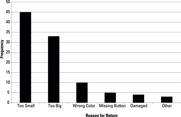
FIGURE 3-3: A Pareto chart.
Using the Pareto chart, you can quickly identify the vital few events that are causing most of your problems. You can then determine where you should focus improvement efforts.
BONING THE FISH
After you identify an event or events to address, use a cause-and-effect diagram to get to the root cause of an issue. One such tool is the fishbone or Ishikawa diagram. As the name implies, the diagram resembles the skeleton of a fish (see Figure 3-4).

FIGURE 3-4: A fishbone diagram.
At the head of the diagram is a statement of the problem. If, for example, you discover from a Pareto chart that a top reason for customer returns is that parts are missing from the package, “Missing parts” would become the problem statement in the fishbone diagram.
Running along the central spine is a list of what could cause parts to be missing from the package. These causes are grouped into categories that make up sections, and each section can contain one or more specific causes.
Although the categories can vary, many companies use the six Ms to separate the causes:
- Machines: The state or characteristics of the equipment required to perform the operations
- Management: The policies and procedures that govern the company
- Manpower: The people performing the operation, and the training or ability of the workers
- Materials: The raw materials that go into the process and the tools or materials required to complete the operation
- Measurement: The ways and accuracy of measuring the process
- Methods: The how’s of the process or the process steps necessary to complete the task
 When building a diagram, remember that these categories are flexible. However, make sure that you cover everything. A good fishbone diagram contains many sections from the spine, and each section should contain its own cluster of bones projecting from it.
ANALYZING FAILURE MODES
Cause-and-effect diagrams such as the fishbone provide a useful visual tool to identify the root cause of a problem. Another root cause determination tool is the failure mode and effects analysis (FMEA).
FMEA is a structured approach to getting at root causes. It begins by identifying all possible failure modes (what can go wrong) of your product or process. After you identify the failure modes, you assess what effect the failure mode would have if it occurred, the likelihood that the failure will occur, as well as the likelihood that the failure will be undetected.
Rank each failure mode on three dimensions and give each dimension a value of 1 to 10. Here are the dimensions and the rating systems:
- Severity (SEV): How significantly does the failure affect the customer? A ranking of 1 indicates that the customer probably won’t notice the effect or considers it insignificant; a ranking of 10 indicates a catastrophic event such as a customer injury.
- Occurrence (OCC): How likely is the cause of this failure to occur? A ranking of 1 indicates that it isn’t likely; a ranking of 10 means that failures nearly always occur.
- Detectability (DET): What are the odds that the failure will be discovered? A ranking of 1 means that the defect will most certainly be detected before reaching the customer; a ranking of 10 indicates that the failure will most likely go out undetected.
After you determine the rankings, calculate a risk priority number (RPN), which is simply the product of the three rankings:
The higher the RPN, the more critical the failure mode and the greater need for taking action. As a final step, after implementing corrective action, be sure to reevaluate the failure mode.
 FMEA is a powerful tool for analyzing possible failure modes of products and processes. But take care when using the FMEA methodology. This ranking system is very subjective because it relies on the opinions of the employees taking part in the activity and results may be biased.
Correlating the variables
It’s a safe bet to assume that every outcome will be the result of two or more factors. Therefore, you can’t study variables in isolation. Analyzing the correlation among variables is a significant component of Six Sigma projects.
Correlation is the degree to which two or more attributes show a tendency to vary together. A positive correlation means that the attributes move in the same direction — up or down. A negative correlation means that the attributes move in opposite directions; one goes up and the other goes down.
CHARTING CORRELATION
The simplest tool for looking at correlation between variables is the correlation chart, which plots two factors together and shows the visual relationship. Figure 3-5 shows a correlation chart with a positive correlation.

FIGURE 3-5: A correlation chart.
DESIGNING EXPERIMENTS
Correlation charts are useful when looking at two variables, but a more powerful tool is necessary when multiple variables can interact. Design of experiments (DOE) is a methodology in which you change the levels of one or more factors according to a predesigned plan and then record the outcome of each experiment.
You can use a properly conducted DOE to identify the effect of the variables independently or the effect of the variables’ interaction. In a typical DOE, you assign several levels of each variable and conduct experiments by changing the levels of each variable. Table 3-2 shows a DOE with three variables (X, Y, and Z) and two levels for each variable (H and L). When conducting the experiments, you want to randomize the order in which you test.
TABLE 3-2 Design of Experiments
Experiment Number |
X |
Y |
Z |
4 |
H |
H |
H |
6 |
H |
H |
L |
1 |
H |
L |
H |
8 |
H |
L |
L |
5 |
L |
H |
H |
3 |
L |
H |
L |
7 |
L |
L |
H |
2 |
L |
L |
L |
As shown in Table 3-2, eight experiments are required to capture all combinations of variables and levels. You can then statistically analyze the data using a variety of methods to determine the effects of each variable and the interactions that exist among them. Details on how to do this are beyond the scope of this book. If you’re interested in exploring this topic, check out Statistics For Dummies, 2nd Edition, by Deborah J. Rumsey (Wiley).
As the number of variables and levels that you want to test increases, the number of experiments required grows. For example, if you test three variables at three different levels, you’d have to run 27 experiments; four variables at two levels would require 16 experiments.
In general, the number of experiments in a full factorial design is equal to
Fractional factorial methods can help reduce the number of experiments without sacrificing statistical results. However, you must choose how you conduct these experiments carefully because they all carry some risk in accuracy; they do not account for all interactions of the variables.
Implementing a solution
After you identify the root cause of the problem, you need to select and implement a solution. Chances are the problem has many solutions. So a decision matrix can help you decide which solution to pursue.
A decision matrix, often called a Pugh matrix, evaluates alternative solutions by comparing each along a series of objectives. Often, the current method serves as a baseline.
Say your team comes up with three solutions (A, B, and C) to a problem. Follow these steps to construct a decision matrix (see example in Table 3-3):
-
Select the solutions you want to evaluate.
Find out what improvement you can expect from each solution. The solutions are listed in the top row of the matrix in Table 3-3.
-
Decide what the criteria for evaluation are.
Choose the most important criteria that relate to the issues that made you decide to focus your efforts on the project. The criteria are listed in the first column of the matrix in Table 3-3.
-
Score each solution against each of the criteria.
Always give the baseline a score of 0. Typically, a 3-point scale is great for this, but if more differentiation among the solutions is desirable, you can use a 5-point scale (as shown in Table 3-3). In a 5-point scale, use the following numbers:
+2
Much better than baseline
+1
Better than baseline
0
Equal to baseline
–1
Worse than baseline
–2
Much worse than baseline
-
Rate the importance of the criteria if necessary.
If one or more of the decision criteria are considered more critical than the others, you can assign a weight to each. Then multiply the score from Step 3 by the criteria ranking, giving it a final score. The matrix in Table 3-3 omits this step.
-
Sum the assigned scores.
Add the scores for each solution along the criteria to get a net score.
-
Choose your solution.
In most cases, you want to choose the solution with the highest score. (In Table 3-3, for example, solution B is best.) If all alternatives score less than zero, the baseline (current) process is considered the best option. You may want to consider other solutions if the current batch doesn’t offer improvements worth the cost of implementation.
TABLE 3-3 Decision Matrix
Criteria |
Baseline |
A |
B |
C |
1 |
0 |
+2 |
+1 |
+2 |
2 |
0 |
0 |
+1 |
+2 |
3 |
0 |
+1 |
+2 |
–1 |
4 |
0 |
–1 |
0 |
0 |
Total |
0 |
+2 |
+4 |
+3 |
Keep in mind that rating the criteria, as described in Step 4, may have a great effect on your solution decision. For example, if you rate the importance of criteria 1 in Table 3-3 higher than the others, solution C may well end up being the preferred solution.
Maintaining the gain
After you analyze the situation, identify root causes, and implement the new process, you must continue to monitor the new process to assure that you maintain the improvements you’ve achieved. One statistical method you can use to do this is the process control chart.
Two other tools, the run chart and the histogram, are also used to monitor the process. These tools are easy to set up and maintain and don’t require the statistical calculations found in a control chart.
The run chart plots an individual metric over time and makes it easy to spot trends and patterns over time. Figure 3-6 shows a sample run chart.

FIGURE 3-6: A sample run chart.
Here are some things to look for in a run chart that may indicate an unstable or problem process:
- Cluster: Several observations surrounding a certain value
- Mean shift: Several observations above or below the process average
- Oscillations: Observations that go up and down with recognizable frequency
- Trends: Several observations in a row that all go up or down
A histogram displays the frequency of different measurements. As shown in Figure 3-7, the histogram shows the distribution of the measurements and highlights measurements that are considered outliers from the rest. Histograms are useful to identify special cause variation.

FIGURE 3-7: A sample histogram.
Overcoming Obstacles
Many things stand between a company and its quality-centered end game. Among the obstacles are the tendency to lose focus on the goal of quality improvement, to get sidetracked by a seeming silver bullet that promises to solve all the quality issues, or to simply give up when the gains don’t come fast enough. In this section, we explore common obstacles and pitfalls of quality improvement efforts and offer advice to help you avoid or overcome them.
Failing to focus
Implementing quality improvement requires a great deal of time and commitment. A mistake that many organizations make is to jump headfirst into too many projects. At the start of the journey, everyone is excited about the potential that quality improvement promises, and the firm may embark on several projects at a time. This reduces the focus on any one project and often stretches resources too thin.
Instead, we advise that you start by choosing a project that involves a process that employees have a lot of knowledge about and understand well. This helps ensure that the results are successful and encourages others to get behind future projects.
When adding projects, choose carefully. Tools such as the Pareto chart (see the “Charting the causes” section, earlier in the chapter) can help you select the most important issues to address.
Prioritizing into paralysis
Some companies fall into the trap of spending so much time on prioritizing potential projects that they never get down to the real work. When selecting projects, companies typically rank them based on anticipated benefit, which is often the expected return on investment (ROI). This often leads to disagreement across the organization as to which project is the most important and should get first priority. And as you may know, benefits data — especially expected ROI — is easy to manipulate.
Don’t get caught in this trap. If you must choose between two or more improvement projects that have roughly the same value, just choose one and get started. Completing any project that provides benefit to the business is much better than waiting to find the perfect project.
You may want to start with the project that’s easiest and quickest to implement. A quick victory at the beginning of a quality improvement initiative can provide momentum to the organization on future projects.
Falling for the lure of magical solutions
Falling victim to the silver bullet quality program happens to the best of ’em. Magical, fix-it-all, pain-free programs are usually touted as the program that is going to save the company, but easy, catch-all solutions often involve a consulting agency coming into the company with grand ideas and beautiful presentations that are likely to fail because they don’t follow the proven methods (outlined in this chapter). After a few months with few results, firms that embrace such programs often end up moving on to the next program that promises quick and easy results.
This approach may ultimately sabotage your quality improvement efforts. Employees become tired and complacent about these programs, and they dismiss future programs as a waste of time; after all, none of the past programs ever panned out very well.
Lacking employee involvement
For quality improvement projects to be successful, all levels of an organization must commit to the effort. This means all employees must understand the importance of the quality projects and contribute to their success.
Employees sometimes view improvement efforts as a threat to their job security or as an examination into whether they can do the job. Therefore, when identifying and implementing any process changes, be sure to consult with and educate the people involved with performing the process targeted for improvement. Often, just knowing why the change is being made is enough to earn buy-in from the employees.
Not knowing what to do
One of the biggest obstacles to quality success is not knowing what to do if a process is discovered to be out of control, or unstable. Setting up and monitoring the control charts require significant time and resources. Employees must take samples, perform the necessary observations and measurements, and record the results on the chart. That’s the easy part.
What happens when a sample indicates that the process has changed and is now out of control? That’s the hard part. A company must establish procedures and train employees to enact them to deal with an out-of-control situation. Failure to act or acting inappropriately won’t lead to improved quality and may even make the situation worse.
Not learning from the experience
Few firms make the effort to learn from past quality projects. After completing a project, companies often just move on to the next effort and lose what they learned from the last one. Projects should have a formal documentation process (often called after-action or after-project review) to record what happened, what the results were, and why.
Companies should also conduct after-project reviews to share project lessons. But don’t limit these reviews to the project team; include personnel who may be working on other projects so they can duplicate successes and learn from mistakes.
Calling it a program
A program implies something that has a defined beginning and end. Quality improvement shouldn’t be a program; it should occur naturally as part of the everyday job. Quality must become institutionalized and become an underlying foundation for the company. Without this shift in culture, true quality success is only a passing dream.
Giving up
Achieving improvement and implementing change is a slow, continuous process. It doesn’t happen overnight. Expecting instant improvements is a recipe for disaster, and giving up too quickly because your first efforts don’t produce the desired results only leads to failure. But with continual focus and a commitment to the methods and tools presented in this book, you will see improvement. Stick with it!