
Understanding the relationship between light and color
Discovering how your camera handles light and color
Mastering f-stop settings to achieve maximum color
Trying advanced color techniques
After cracking groggy eyes in the morning, you notice rays of dusty light sweeping across your bed. You watch as the tiny specks of debris scatter about, floating aimlessly. You cough. Outside your window is a bright red cardinal among maple leaves, motionless for the moment. You grab your camera and snap. You captured the bright red bird in all its grandeur. It flies away. You are happy with your shot, and you go back to sleep. Later, when you upload your picture to your computer, you find that the crimson bird is now maroon with blue tones, and the green of the maple leaf background is olive brown. The bird doesn't even look like a cardinal. What went wrong?
Taking an art photo is more than just snapping pictures of flowers or birds. Shooting for explosive color — from cool blue hues to melting reds — is one of your major goals. Then you can take that color to its brightest, boldest, softest, or smoothest image in your shot (all the way, even, to setting your shadows and colors in Photoshop).
In this chapter, I give you the lowdown on shooting photos in color — bright vibrant colors — from the basics of understanding color to more advanced techniques that you can implement to take great photos. As Paul Simon says, "Don't take my Kodachrome away."
The techniques presented here are a guide for creating something worthy of wall space at your home or at someone else's, a spectacular framed print for a gift or to sell. Or maybe a high-resolution JPEG submission to your favorite travel mag or one of the dozens of new photography and literary publications making their way to newsstands and bookstores everywhere.
Simple light and color principles form a basis for producing a wide range of photography, from aesthetically appealing shots to those of outrageous pop — ones that people pay dollars, euros, and yen for (pun intended).
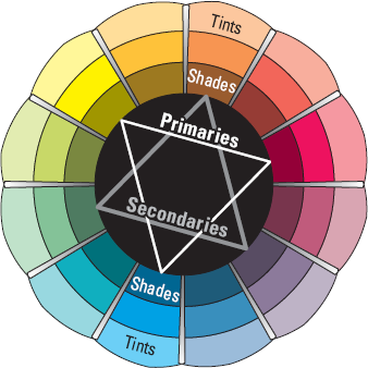
Color comes in three primary shades: red, yellow, and blue. On a printed or painted picture, these colors' reflection of light on white paper to your eye offsets the colors to yellow, cyan, and magenta. Combining two primary colors — say blue and yellow — results in a secondary color: in this case, green. Mixing a primary and a secondary color forms a tertiary color. Blue (primary) and green (secondary), for example, make bluish-green (tertiary). Figure 8-1 shows the added colors of tints (made by adding white to colors) and the shades (made by adding black to them).
Different types of materials and objects reflect different wavelengths of light. And the wavelength of that reflected light defines the color. Understanding color is critical to creating good shots because, after all, photography is all about writing with light.
Note
This short exercise can help you see how light changes color:
Place an object under ample light.
If you need, augment the light, such as setting a dimmer switch to maximum intensity.
Take a picture of the object.
Dim the light a little, watch what happens to the light reflected from the object, and take another picture of the object.
Repeat Steps 1–3 a few times.
Compare the pictures to see how the different light changes the appearance of the object.
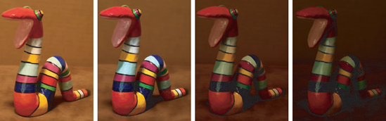
The object changes its hue or tone as the light varies. When the room darkens, black is added to the color. Red, for example, changes to maroon.
Figure 8-2 shows comparative pictures of a toy snake, each taken in manual mode at a shutter speed of 8 seconds and an f-stop of f/16. (For more about shutter speed and f-stops, see Chapter 5.) Before each shot was taken, I reduced the amount of available light by turning down the dimmer switch in the room. Notice the change of tones in the colors.
Light and color, which are both fluid and manageable most of the time, are the elements that make or break a good photograph. Throughout this section, I explain what you must know about color, how light affects color, and some basics about using color to make wonderful photos.
Note
The mood mix
How would a cowboy look dressed in green? Or a sea adventure movie preview blaring on a movie screen in pink? Colors come in all kinds of hues and tones, from primary colors mixed with white (the pastels) to blazing primary colors that pop artist Keith Haring included in his graffiti. Each makes you feel something and each makes an association with your viewer, joining the two of you in what you know about color.
Greens and blues are cool and calming. Grays and browns are dull and uneventful (but they match well with other colors). Reds and oranges are warm and inviting.
And wait — that's not all. There are light colors, the pure ones, that make you feel happy. Haring's colors, bright and medium-toned, can give you goose bumps from an invigorating mix of primary red, green, and blue. And don't forget the feelings evoked by the dark tones of the big maroon pencil you used when you were six and the deep navy blue of the mid-ocean, which can be cool and peaceful.
If you're thinking about art to use indoors — framed digital prints — think of colors and mood. Use warm colors (coral and orange and yellow) to add comfort to a cool, dark place. If you live up north, make lots of art with warm colors. People will love you for it in the winter. If you've got lots of sun (say where I live in the desert), go with some chilling blues. And if you love Keith Haring, let out your inner child and paint your digital pictures (like the one here), leaving your inhibitions behind.
Choosing objects to photograph in color requires that you be selective about how and where you aim your camera. To balance ambient lighting, you might need to shift your body position, sometimes dancing about the object to get the right light. As you move to the left or right or up or down, the object takes on different hues because light bounces off it in a variety of directions.
Note
In your effort to capture the world around you as a work of art, your goals are to eliminate glare, iron out streaks, and minimize shadows. Especially when shooting outdoors (more on that in Chapter 5), you must move around an object to find the light that's just right. Do a few stretches and then follow these steps:
Choose an object that you want to photograph.
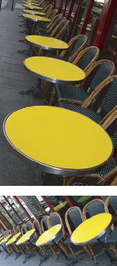
Don't get stumped on this one. Just select something with color (like the yellow tables in Figure 8-3) or get anything colorful that you can carry outside.
Focus on the object where the light is greatest and snap a shot.
You might find yourself bending and contorting your limbs in positions that you're not used to.
Photograph the same object in the same light/location but now focus on different light intensities around the object.
If you find that a lot of light on the center of the object doesn't give the enhanced color effect that you want, move the object (or yourself) to experiment.
Notice where the light falls to help you choose the best color exposure.
Sometimes (like when photographing the cardinal I describe earlier), you have but a small frame of opportunity to catch the subject's color. You must be quick, simply taking your camera from your nightstand and snapping a picture. To achieve optimal color exposure, set your camera to a general automatic mode (which I discuss further in Chapter 5) in case a photographic moment presents itself on short notice.
You have millions of ways to mix colors to create a mood. For instance, take the bright colors of fast-food restaurants. The colors that corporations use to sell fast food make you hungry, so you buy more food.
In order to make sense of color in a photo, apply what you know or see around you. Look for complementary and contrasting colors, both in man-made objects and in nature. You don't want to precisely match colors, like the dreaded bridesmaid syndrome of dyeing shoes to match the color of a dress.
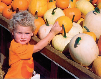
Complementing or contrasting color is more on the order of choosing a color range (family) or of finding a snippet of color in two things: like black shoes that go with an ensemble of black-and-white houndstooth. The boy's shirt in Figure 8-4 complements the other earth-toned shades surrounding him. Think of choosing colors in a photograph in the same terms as picking out clothes for an outfit that you want to wear, or perhaps you want your children to wear for a big family event.
Tip
Nature provides rich opportunities for capturing color. Think about how and why they look good. The colors in the photo shown in Figure 8-4 complement each other because the boy wore a seasonal color, perfect for taking art photos of him at the pumpkin farm. After selecting certain objects to photograph, soon you'll discover that keeping within a range of colors is better than having your viewer take in a helter-skelter range picked randomly from several objects that happen to be near each other.
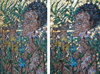
Also, while training your eye to work with color, notice how it sometimes tricks the human eye. Figure 8-5 compares the contrast effects of different color backgrounds for the same red square. Red appears more brilliant against a black background and somewhat duller against the white background. In contrast with orange, red appears lifeless; in contrast with blue-green, it exhibits brilliance and depth. Notice, too, that the red square appears larger on black than on other background colors.

If you are color-blind, don't let that stop you from taking art photographs. Think of it this way: People (designers and your potential subjects) have taken the time to do your color-matching work for you. Fashion designers mix colors to match the latest trends. They know what they are doing. They're trained in color theory, so that if you take a close-up shot of your Aunt Bea in her new Chanel blouse, the color choices have already been defined in the clothes themselves.
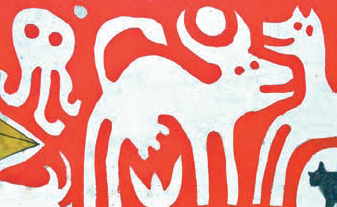
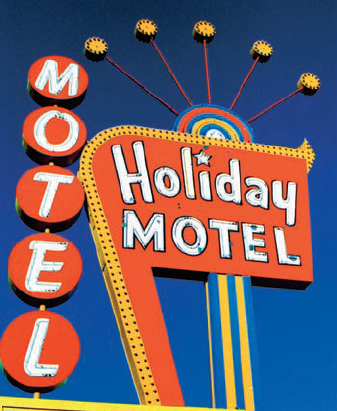
Sign makers, architects, and artists spend a lot of time making sure that the colors they use work together. For example, the sign in Figure 8-6 contains a mix of vibrant color, wonderful by itself. The color of the photo, however, is enhanced by the magnificent blue sky behind it (thank you, Mother Nature!).
Note
To see what I mean:
Find a candy package in a colorful wrapper.
Set your (digital) camera to its highest resolution, as discussed in Chapter 2.
Put the package under a lamp, position the package for the light that you want on it, and take a picture of the package.
Take other pictures of the package from different angles and under different light sources.
My candy company of choice uses a striped background on the wrapper — one that, when snapped as a close-up and printed out at high resolution, literally glows on your (or some-one else's) wall.
Figure 8-7 shows two shots of part of a candy wrapper: one shot under tungsten light (on top) and one shot under a fluorescent light. I shot these at different angles to enhance the color differences between the two.

Tip
Start capturing fantastic color with close-ups of objects:
A window display at a local shop
A sports player in uniform
A billboard
A cluster of flowers
When you prepare your camera for taking a picture, you control the exposure, or how much light is cast on the film (with a film camera) or on the sensor (with a digital camera).
A shining sun, bright and unobstructed, is necessary to get the most color on film or your digital camera's sensor. If you set your camera to aperture-driven auto settings (see Chapter 5) so that the shutter speed is automatically determined by your sensor, you do lose a bit of creative control regarding shooting for color. To maximize color on a sunny day, you need to factor in
ISO/ASA: How sensitive the film/sensor is to light; often called the film speed. Film speed is a measure of light sensitivity. When using fast film speeds, you can take a picture inside with less light (with the result of a loss of color). A slow film speed allows objects to get "soaked" — that is, saturated — with light and color. (Although ISO and ASA are similar, ASA value is based on an American standard and ISO on an international standard.)
The film speed for a digital camera is a measure of how much light it needs to take a well-exposed photo. (Obviously, a digital camera doesn't use traditional celluloid and emulsion film, per se, like an SLR or a view camera does.) Usually, film speed for a digital camera is stated as an ISO equivalency (light sensitivity expressed in the terms used to rate the same characteristic in film). Bonus: When you set the ISO for a film camera, you are stuck with that setting for the entire roll of film. For a digital camera, however, you can change the ISO for every exposure if you want.
Low ISO: A low ISO setting (50–200) generally produces better, cleaner images, but the pictures can be dark if not shot in bright sunlight or with a good flash. Images are also more susceptible to blurring because of the slower shutter speeds required when using a low ISO setting.
High ISO: Higher ISO settings (400–1600) can produce better-exposed pictures in low light but also introduce more electronic noise, or pixel distortion, which can make your image look grainy. Noise has been significantly reduced in high-end digital cameras when you shoot at high ISO; when you change ISO settings, there's no longer a discernable difference between high and low ISOs in some shots.
Figure 8-8 shows pictures taken with a Canon 350 dSLR camera, handheld indoors without a flash at ISO settings of 100 and 1600. Notice that the picture on the left in the figure is clear — and on the right, blurry. Low ISO settings are more sensitive to camera shake.
Tip
For a clear, colorful shot, set your camera to a high ISO indoors. At settings such as 1600 or 3200, you can shoot in dark cathedrals — or even in a cave lit by flashlight. However, you can expect a lot of digital noise when shooting at such high ISO settings.
Shutter speed: This is the actual amount of time that the camera's shutter remains open. The longer the shutter is open, the more light that falls on the sensor or film. (When the shutter is open too long and too much light enters the camera, the image is overexposed and looks pale and washed out. When the shutter isn't open long enough and not enough light enters the camera, the image is underexposed and appears too dark.)
f-stop: A measure that indicates the size of the lens opening (aperture). The value of an f-stop is inversely proportional to the opening of the lens. Smaller values such as f/2.8–6.3 mean that your lens is open wide, letting in more light in a given amount of time (the shutter speed). Larger f-stop numbers, such as f/18–36, create a smaller aperture, thus letting in less light at the same shutter speed.
Note
As you take more and more pictures using aperture-driven auto settings, keep these points in mind (and see Chapter 6 for more information):
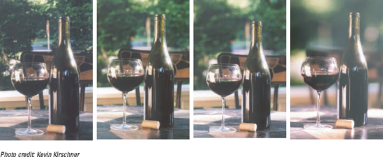
Have your camera preset to the Av mode, which is a feature that lets you set the f-stop number and automatically maintain correct exposure as the camera adjusts the shutter speed. Set your f-stop to around f/6.7 to f/8 (a moderate setting that will give you decent depth of field) and begin shooting. Use a lower f-stop to keep the subject in focus while gently blurring the rest of the image. Use a higher f-stop to keep the entire image in sharp focus. See what I mean in Figure 8-9.
Choose a position to shoot where the background of the shot is the least cluttered and offers good contrast with the object itself.
Note
When in Av mode, the smaller your aperture is set, the longer your shutter has to stay open so that at very high f-stops (say, f/36), you get blur very easily because your shutter has to stay open longer than your subject can stay still.
The first thing that you do as a film photographer before a shoot is decide what kind of film you will use: That is, choose the film's sensitivity to light. You can purchase film with speeds from ISO 100 to ISO 800 at just about any drug store around the world. Films with higher and lower ISOs are available at specialty camera shops. Although digital photographers have a wider choice in ISO settings (some digital cameras have lower and higher settings than are commonly found with film), they can also set their ISO settings to many of the same values used for film.
Tip
For the brightest, boldest colors, shoot with traditional high-resolution film and scan those images or shoot with your digital camera set at a lower ISO value.
Warning
Setting your digital camera to a film speed greater than ISO 400 or shooting with film that's over ISO 400 and scanning the prints or negatives/positives sometimes results in noise, unwanted specks of red, green, or blue and undesirable light specks in shadows and areas of solid color.
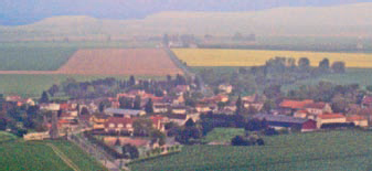
Noise isn't always bad. In fact, sometimes it's preferred to achieve a certain effect, as shown in Figure 8-10, which features a shot of a French town taken through a plane window on the way to Paris. Here, noise makes the photo look almost like a pointillist painting.
Color exists in various proportions in any lighting situation. Its hue, tone, and intensity depends upon ambient light, or lighting that seems to come from all directions (rather than from a single source) and fills a scene, shedding light on the objects you're photographing. Your camera measures ambient light with a value known as color temperature. Essentially, color temperature is the blueness or orangeness of the light that you see.
Color temperature variances can be corrected by covering your lens with a filter, offsetting odd-colored tones that are created by ambient light. For example, with a conventional film camera, you need to use a skylight filter, one that reduces the blue tones that occur at high color temperatures. While your digital camera likely has both automatic and manual white balance settings, you may still find the need (or desire) to use photographic filters in front of your lens. Your white balance choice may include Daylight, Shade (or Cloudy), Fluorescent, and Incandescent (or Tungsten). Generally speaking, you'll leave your camera set to Auto, but there may be times that you want to use an incorrect white balance setting for special effects. You might, for example, make a snow scene bluer by taking the photo with white balance set to Incandescent/Tungsten. Or you might want to make an indoor fireplace or candle scene seem even warmer and cozier by shooting with white balance set to Daylight.
Knowledge of color temperature with respect to your white balance settings can ensure that you get the optimum color results because ambient light has a color temperature value. Different light sources emit light at different color temperatures, causing your picture to lean either to a red or blue hue. A high color temperature shifts light toward blue (as in Figure 8-11), and a low color temperature shifts light toward red hues (as in Figure 8-12).
Tweaking white balance settings also enables you to deceive your camera into giving you results that will enhance your images. Toying with your white balance settings can turn deserts into icy retreats, prickly and cold, or set the indoors afire with a global warming–like result — color science that makes art "art."
Take some time and play around with your camera's white balance settings adding warmth (by increasing reds) or coolness (by increasing blue) when you're photographing in daylight. You'll need only a little while to determine your favorite settings to fool — I mean, set — your camera. Figure 8-13 illustrates the relationship between sources of light and color temperature, showing how the color temperature changes with different ambient light around your subject/scene.
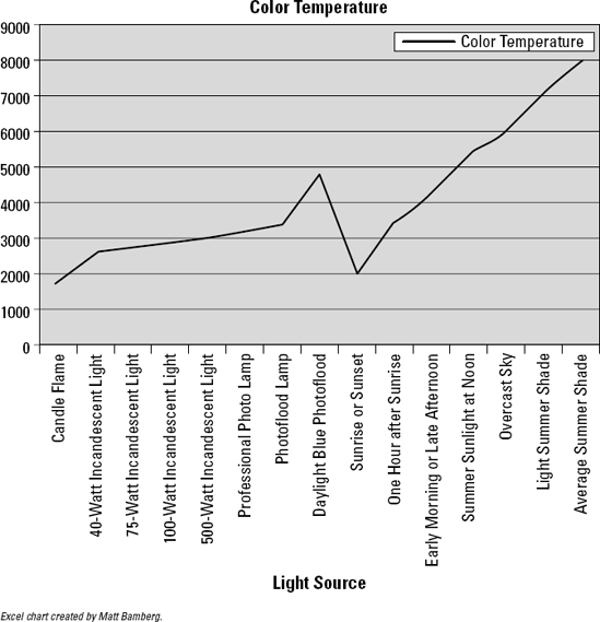
Figure 8-13. Low color temperatures (indoors) appear with red hues; high color temperatures (outdoors) appear with blue hues.
If you set the camera to a shade white balance while taking a picture in broad daylight, your digital camera adds more red tones into the scene. Check the Kelvin color temperature chart (refer to Figure 8-13) to see that overcast conditions are about 6000° K. Light shade conditions are about 7100° K. Therefore, setting your white balance to Shade adds more red tones than setting your camera to Overcast when you shoot in daylight. Some digital cameras allow you to enter the Kelvin temperature for your white balance so that you have maximum control over the amount of red or blue tones that you add to your shot.
The Auto White Balance (AWB) mode on your camera uses its sensors to calculate the white balance for the image. Usually, the Kelvin (K) temperature range for AWB is 3000–7000° K. Using AWB normally provides a good image albeit with some color temperature distortion that you see with film — for example, the same blues and reds as seen in Figures 8-11 and 8-12, respectively.
Note
Warmer light of sunrise yields to the cooler light of midmorning. After twilight, when light dims, conditions for shooting change fast. Now is when your ISO should drop to capture better color in your shots.
Warning
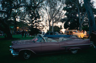
If you're shooting where shadows abound, or perhaps the sun is in front of you, you'll need to manually adjust your camera's exposure or you may have trouble with your images when you go to edit. Lackluster colors, washed with black, are likely to appear. These are colors that won't budge from stubborn hues; they're unmanageable and easily pixilated, even when you're using the best tools that Photoshop has to offer. The pink Cadillac in Figure 8-14 isn't done justice in this shot. Because the camera adjusted itself to avoid overexposing the sky in the background, the subject of the photo is too dark. Manually setting the camera to a larger aperture and a slower shutter speed could have produced a lovely photo.
For the most natural color results in a picture taken with a digital camera, set the white balance indoors to your digital camera's indoor (incandescent or fluorescent) setting. If you're shooting outdoors in the shade, set it to the Shade/Overcast setting.
Setting your digital camera to automatic is your best bet because if you go to photograph a crimson cardinal outside your window without having changed the white balance from your last (indoor) shot to either automatic or daylight, your picture will be a throw-away.
The film for a traditional camera and the sensor for a digital camera are optimized for daylight color temperature. Whether you use film and then digitize your negatives, or shoot a picture using the sensor on a digital camera, your picture will edge to one hue or the other (blue or red) as your light source varies unless the white balance setting is adjusted, either automatically or manually.
Experimenting with settings can create interesting effects — effects that people might just buy and hang on their walls. If you've made a mistake but find your image looking good, don't dump it. It could be a valuable print. Fortunately, when you manipulate your image in Photoshop, tweaking your picture to normal color levels is fairly easy — and by normal, I mean the levels that your eye would see.
The beauty of simplicity in color
Santorini, Paros, and Mykonos are Greek beach-bumming heavens, but you can also find a photographer's paradise in Greece. A mix of the Greek summer sun, the ubiquitous stucco walls, and the soft Mediterranean colors combine for some of the greatest photo ops in the world. Add in smooth arches and a couple of beveled edges, and you're almost in photography heaven. What finishes it off is the blue sky that curves through to perfect the composition.
A photographer's job is to capture the beauty of the simplicity of colors around us — to make us aware of things we might not notice. So take the time to look around and see what others might not.

I believe that good color photography begins with a bright sunny day. Some think that the best time to photograph is during fog because objects are muted and shadows disappear. However, direct sunlight on an object distinguishes its color, which produces a bold-colored image. Light, ever changing and unpredictable, is what makes or breaks a good color shot. Keep in mind that some people — that is, your potential clients — buy bold and bright colors. (That's not to say that there isn't a market for black-and-white photography or even color images with more subdued colors, but the bold and bright shots are easily marketed.)
Note
To use the sun to your advantage and produce photos with eye-popping color, go outside on a sunny day. With the light behind you (move a little if you cast a shadow over your subject), take several photos of one object. I feel that the best light for a color art photo is direct sunlight on the object being photographed, as in Figure 8-15. Whether you're shooting billboards in Havana or flowers in your garden, each will make a unique photo when the sun hits your subject directly. If the sun isn't where you want, move around the object until you see it reflecting the most light. If the object is small enough, move it in front of you with the sun at your back. If you're in a hurry — say if the object is borrowed from a shop after asking the owner for permission to photograph it — use the same f-stop setting each time. Hint: Using f/6.7 is excellent for flat objects that have direct sunlight on their faces.
For more about shooting photos outdoors, see Chapter 5.
Tip
Finding objects in direct sunlight and photographing them is a great way to make a set of images that contain bright colors. For more on shooting in shade, see the upcoming section, "Shooting colors in the shade."
In traditional photography, your goal might be to create a print of realistic impression of what you see. In art photography, however, colors (like other subjects and elements) can either be exaggerated or subdued in a wide variety of ranges: You can underexpose to saturate color, shoot in the shade, or even use pollution to your advantage.
Heavy overexposure will lighten your print and move your colors to white. Underexposing, conversely, tends to work in an opposite manner, ranging from deepening colors to blacking out your entire photo.
All cameras, digital and film, rely on their light meter to measure the light around the lens and within the frame of your shot. For ordinary exposures, most cameras use an average of all the light that the frame has in it.
However, using an average of all the light in your frame sometimes just doesn't do the job of reproducing the bright colors in the frame. You have to help it along by using the exposure compensation settings that allow you to take in more or less light in your frame. When you reduce the amount of light that you let in the camera, you deepen the colors of the image. Tauntingly deep colors can attract potential buyers of your photos.
Play with these setting to see which work best for your shots. You can over-ride how your camera exposes your film or the sensor to light. You can lighten or darken the image by using the EV (exposure value) compensation, using positive and negative fractional numbers in decimal form, like +1.0 or −0.5.
Decreasing the exposure by 0.5 (depending on the brightness of the sun) will do a much better job of saturating colors in your image than waiting to do it in Photoshop later.
Note
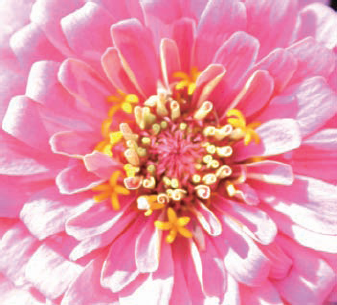
You can never have enough flowers in your life, especially when it comes to fooling around with your exposure compensation settings. (Come to think about it, you can never have enough insects and butterflies and animals and light and color, too.)
Find some flowers in your garden to photograph, making sure the flowers have the sun shining directly on them.
Set your camera to the Av setting with your f-stop set at your choice.
Remember that you're experimenting only with color enhancement and not depth of field.
Set your exposure compensation at −0.5 to underexpose the shot so that the colors appear more saturated.
Take a close-up picture of the flowers.
Repeat at an exposure compensation setting of −1.0.
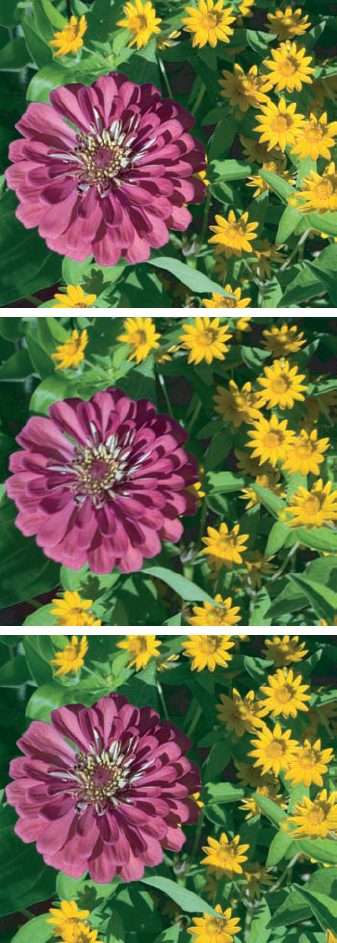
Figure 8-16 shows how shots taken at different exposure compensations (0, −.66, and −1.33, top to bottom) bring out the color of flowers.
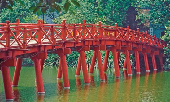
Some art photography provides viewers with a clear focus of an object or a part of an object, like this bridge in Hanoi, Vietnam (see Figure 8-17). The color red among the contrasting green background of foliage and water provides a clear focus based upon color. The f-stop was set high so that the picture has a clear foreground and background. The exposure compensation was set to −.5, making the colors appear saturated.
Tip
The rules for shooting for color are changing with the new Raw formats that are available on dSLR cameras. Even if you didn't saturate your colors while you were shooting, you can later — in Photoshop — just as if you were shooting. In your software, you can simply increase the saturation value with a slider. For more about this, see Chapter 12.
If this morning's cardinal came back at noon and the sun was shining brightly on it, the chances are great that the red of his feather coat would scream loudly off of a printed page, almost pop-like. You'll be lucky if you get time to adjust your exposure compensation in time to photograph it in the deep reds that you would hope to get. If your specialty is photographing wildlife in deep colors, you might want to have your camera preset to your favorite exposure compensation setting.
In Av (automatic) mode, if your f-stop is high (for a clear background and great depth of field) in a lower light environment, you risk blurring your picture because your camera will automatically decrease the shutter speed.
Tall downtown buildings, trees with wide girths, and very cloudy days — all casting shadows over your world — can turn photo opportunities from glamorous to pitiful. Shade can present a challenge when trying to capture color. However, you can use shade to your advantage, especially when contrasting bright and shadowed areas, such as you see in Figure 8-18. Also note in the figure that even the shady area has variations — some areas are darker than others.
Note
Varying light, whether in sun or shade, can make a shot more interesting.
Tip
When the sun pours on the green, that's a perfect time to underexpose a shot by −0.5. When you underexpose, sunlit green won't be dull, but vibrant and verdant.
Warning
When you make colors vibrant, however, watch out for the shadows and shady spots that abound because these will turn even darker when you underexpose.
Think of shade as a kind of mini-night: a time when color is blackened. Keeping your shutter open longer (a slower shutter speed) solves some of the light problems that you may have with shade. To fool the camera into exposing the scene a little longer, use your camera's Manual mode, keep the same f-stop, and slightly increase the time the shutter is open. Using a tripod will help to eliminate blur that tends to creep in when you make a handheld exposure with a longer exposure time.
When taking a photo that includes areas both sunny and shady, you should consider using your camera's spot metering mode (if offered). This enables you to designate which part of the image should be properly exposed. (With some cameras, you point the camera at the area you want the camera to consider for setting the exposure, press the shutter button halfway down, and then reframe the shot before taking the photo.) Remember, too, that when shooting a subject in the shade with a bright background, you can set your camera to fire the flash (force flash) to illuminate the subject. You'll hear the term "fill flash" used for this technique.
Color changes according to the light available, which in turn is affected by environmental variables and atmospheric conditions, including pollution, haze/fog, the season, and time/temperature of day.
Generally, the more polluted the sky is, the less intense the sun will be. Not only is there less contrast from the surface of an object to a background of smog, but you also end up with pixel separation of the browns and blues when your picture is digitized and enlarged.
On a sunny day in an area with heavy air pollution, haze on the horizon is likely. You might find this to be distracting or even that it ruins what could be an otherwise beautiful image. The more the light is scattered by air pollution, the poorer your color saturation can be.
Tip
Although mastery of your photo editing software can salvage quite a few marginal (or even potentially great) photos, you want to shoot under the best conditions possible for the subject you're capturing. When given a choice between hanging out until the light is right or spending hours in Photoshop correcting an image, sit tight (or chill out) until conditions are perfect. And then take lots of photos with a variety of settings to ensure you have the best shot possible.