
Why you should consider black-and-white (B&W) photography
Shooting in B&W
Noticing the differences between film and digital camera images
Mastering shadows, midtones, and highlights
Using lighting to make great B&W images
Ever been to a gallery or a museum exhibit that shows only black-and-white (B&W) photographs? B&W photography shows happen all the time from small coffee shops in small towns to big shows in big cities — shows such as the photography of Garry Winogrand, who photographed the streets of America throughout his lifetime during the last century. (See the sidebar on Winogrand's work later in this chapter.)
And although digital photography does affect how black-and-white images look, this newer technology won't kill its kindred and traditional B&W art form because there are more ways than ever to compose, capture, and manipulate those subtle shades of gray into images that mesmerize and captivate. Of course, you can always convert an existing color shot to B&W (see the "Manipulating a color image to become B&W" section, later in this chapter), but when you want B&W, shoot in B&W.
Shooting B&W is a serious form of art photography. Some people tend to dismiss B&W as boring or somehow less artsy because — face it — there's no color! However, there are plenty of markets for your B&W art photos, from galleries to museums to photojournalism to portraiture and architecture shots. In this chapter, I give you the basics of B&W digital photography and printmaking, whether you're shooting film or digital.
So you think that B&W is boring? Sure, who wouldn't rather have a color TV than one in B&W? Who wouldn't rather look at color photos than plain ol' B&W? And hardly anyone bothers to film movies in B&W anymore.
Still, B&W has never gone out of vogue for certain practical applications, such as capturing architecture and architectural detail (see Figure 9-1), products for publications, and photojournalism. And from an artistic perspective, using B&W can afford you very dramatic prints, especially in portraiture (including when shooting sculptures) and when capturing shadows.
After all, to shoot in B&W is to master light and shadow — which is what photography is all about. In short, to shoot in B&W is to shoot with an art focus of drama (see Figure 9-2). Also, using B&W can lend a warm feeling of nostalgia.
B&W images can comprise many shades of gray. Read more about grays in the upcoming section, "Understanding the 256 shades of gray."
Note
From an educational standpoint, mastering shooting in B&W is the training ground for serious photographers. When you shoot in B&W, you train your eye to read light and not be so distracted by the additional layer of color in our surroundings that you automatically and unconsciously process. Study the great photographers of yesteryear and today — Ansel Adams, Alfred Eisenstaedt, Alfred Stieglitz, Dorothea Lange, Henri Cartier-Bresson, and Diane Arbus, to name only a handful — to see how they were masters of B&W.
B&W photography is an aberration in art history. Before the advent of the pinhole camera, visual art images — more specifically, paintings — in galleries or museums were in color.
At one time, though, B&W photography was modern — the technology of its day. It was even portable, although photographers had to lug around bulky equipment and make their own exposure plates (what we take for granted as "film" today). And the results were quite exciting for the times, allowing everyday folks to see images of faraway and exotic locales as well as being able to obtain affordable portraits and other photographs, as shown in Figure 9-3 (compared with the luxury of a painted portrait). Too, the advent of a portable camera launched photojournalism.
With the growing acceptance of photography as an art form throughout the 19th century, some came to find that the B&W images were actually more artistic and intellectually challenging than paintings, in which viewers didn't have to imagine nature's colors.
With the advent of color film, though, B&W fell out of favor with some. People wanted this new technology and the more realistic images intrinsic to color photography. Naturally, because color processing was more costly and because color photo technology was new, B&W photography was considered by some as a poor man's photo option.
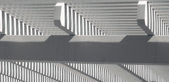
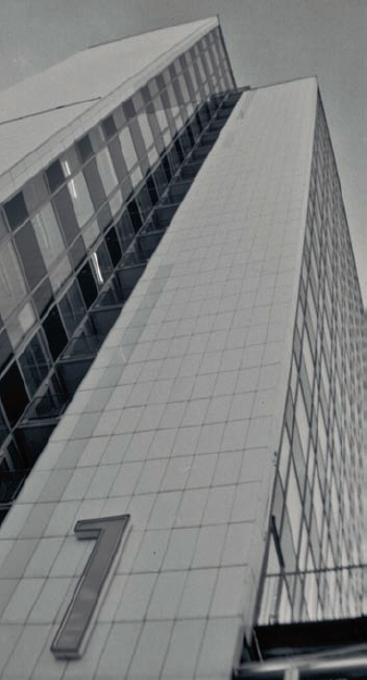
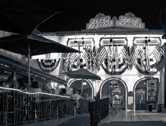
Towering buildings, old forts, walls of steel and glass ... man-made structures of our modern world stun in real life — and can in photographs, too, if you take a few steps when setting your camera before taking architectural shots in B&W.
Set your camera.
Av mode: This is aperture priority. Set the aperture to f/16 or higher.
A-DEP: The automatic depth of field mode is on the knob of the Creative Zone on a number of SLR and dSLR cameras (see Chapter 11). The A-DEP setting allows you to use multiple focusing points within the frame to keep everything in focus. It uses a very fast shutter speed on the order of the inverse of several thousand seconds (1/2000–1/4000) and wide aperture openings (f/4 to f/6).
Set your lens or zoom factor so that your frame contains what you want and no more.
For example, if you want to show a towering building like in Figure 9-4, either use a short lens (a lens whose focal length is shorter than the diagonal length of your camera's sensor) or a fish-eye lens that captures the entire structure (and possibly some framing by other structures nearby), or set an adjustable lens to a wide angle setting. For details about how different lenses are calibrated according to the size of your sensor, see Chapter 2.
Tip
The wide angle on an adjustable lens is when you "zoom out" so that the lens is set to the smallest focal length.
Note
Shooting things of an architectural nature don't always mean filming tall buildings. Just train your eye to look for structural details in all sorts of situations. To get your creative juices started, peruse the database at www.archinform.net to see literally thousands of images of international architecture, originally emerging from records of interesting buildings and their details from past to present.
To see how different the same piece of architecture looks in color compared with B&W, see the juxtaposition in Figure 9-5 of a color and a B&W image (converted to grayscale in Photoshop, in this instance, for the sake of comparison) of the same architectural shot. (Nice juxtaposition, too, of old and modern architectural styles.) Both give a different effect and feeling.
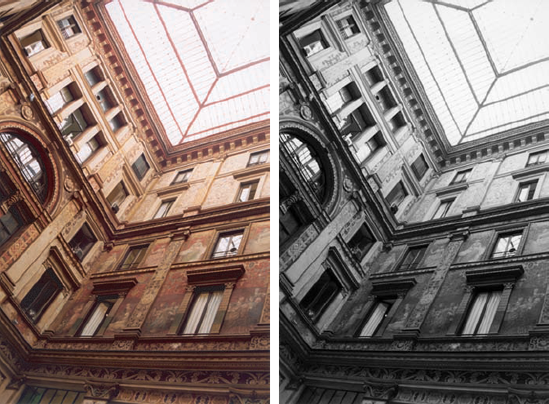
The color photo reveals the warm hues of sepia along with the creation of finer detail in the art scenes on the walls. You're more likely, in this picture, to focus on the content of the murals.
The B&W image is less distracting and gives greater focus to the architecture — especially to the melding of the shade and light (from the huge skylight) from the bottom to the top of the picture.
When shooting architecture, with its strong straight lines, watch out for vignetting and line distortion — unless, of course, you want to exploit those effects for an artsy twist to a shot. These effects are caused by the curvature and structure of your lens that can either be prevented or eliminated (or welcomed):
Vignetting: Some lenses create vignetting, whereby the sides of the shot are darker than the interior, like a fading vignette-matte effect of an old-time photo. Some, um, less-expensive lenses have this problem. You can switch to a lens with better optics (say, from the lens that came with your SLR or dSLR camera as part of a package to one of Canon's L series lenses).
Tip
Vignetting is an easy fix in Photoshop CS2. Shoot in Raw format (see Chapter 18) and fix the vignetting with a slider bar when your Raw image is opened. And to research lenses with vignetting problems, search online for equipment reviews and specs.
Line distortion: Line distortion is the subtle curvature of a line that should be straight. You can get shift lenses for your SLR or dSLR cameras (about $1,300) that straighten out lines caused by lens curvature. Photoshop CS2 also has a cure for this ill — the Lens Distortion filter, which repairs quite a few kinds of distortions.
When shooting a building, first study it in a variety of ways. Shoot so that everything in the photo moves to one vanishing point or to one direction as the viewer looks across the frame.
Shooting architecture as architecture is often best done at dusk and dawn when the light is softer and the shadows are less harsh. (For dramatic art photos, on the other hand, you might want to shoot architectural details with harsh shadows.) The time of day in which you shoot architecture changes, which in turn affects the look of your B&W photograph. A picture taken in the noon sun can provide more detail. In contrast, a picture taken at dusk can have more shadow — providing more contrast perhaps but also a little less detail in any small objects in the shot. Finding the perfect time of day for shooting in B&W is an experiment in light and shadow. You'll know when you get it right, and the results might surprise you.
Warning
Photographing at dusk when the sun is still above the horizon can be a disaster, especially when long shadows from nearby trees are cast over your architectural subjects. Figure 9-6 shows how late afternoon shadows can distract from the subject in a B&W architectural photograph.
Although the weather and the time of day (not to mention the time of year) can affect how your picture comes out, adding to and/or taking away from the focus of your structural subject, your perspective also involves some calculation.
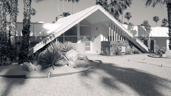
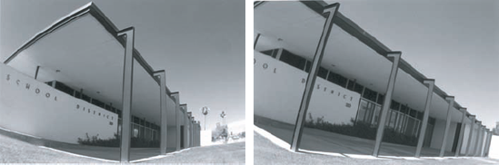
Figure 9-7 shows a picture that is divided about a third of the way so that everything moves to two vanishing points — one to the left, and one to the right. From these two points, you can tilt your camera in any direction so that the vanishing points move up or down into the corner and/or top of the frame. For more on composing a shot using the vanishing point, see Chapter 1.
Tip
You can tilt the canvas of your B&W and color images with minimal loss of sharpness in your photo by choosing the Image
The picture in Figure 9-8 was taken at night. The shutter was set to stay open for one-half second using the Tv mode (shutter priority) of a digital camera. The aperture of the camera was set automatically using the light available to determine how wide it would be for the half-second it was open. The picture didn't blur because the camera was set on a minitripod on top of a newspaper stand. For more about night photography, see Chapter 10.
Note
Photoshop has a feature for turning an image into a pen and ink style, like architecture drawings. You can read about this technique in Chapter 15.
You've probably heard the old "stop and smell the roses" expression. I like to apply this to architecture, especially the little stuff that comes attached to a fence, gate, or door, or the bigger stuff that forms patterns like that found in iron work. So when you're looking for subjects to shoot in B&W, don't forget architectural ornamentation — and get up close to capture all the detail.
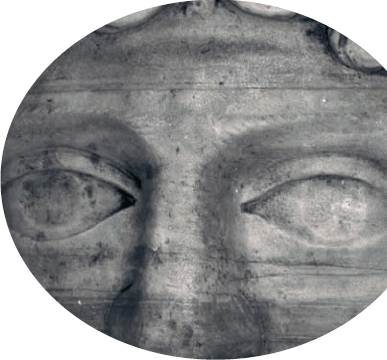
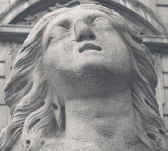
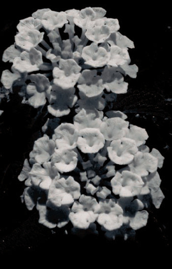
Creating B&W photos gives you experience in working with enhanced shadows, highlights, shapes, and forms without having to think about color. Some subjects are a natural for B&W photography, such as the portrait made of the stone figure shown in Figure 9-9. You can see the weathering in how B&W captures its texture: You can almost feel the statue's roughness. The camera's depth of field and the subtle blurring of the background produces a totally photographic phenomenon that's not seen as clearly in any other art medium or in person. It is this depth and texture that brings emotion to the viewer.
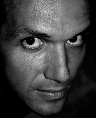
Take a look at the lighting in the following photos. The lighting affects how the shadows, midtones, and highlights come out in your photograph, each being different and dependent on how you expose the shot. (See Chapter 6 for more information about lighting with studio lights.)
Flash, indoors: Flash inside creates bright light on a face. The light from the flash and the ambient lighting mix leave a shadow in the background. The fix for this might be not using the flash and upping the ISO speed to ISO 400 (see Chapter 7). The left image in Figure 9-10 shows the powerful effect that an in-camera flash has on lighting up the face of your subjects.
Flash fill, outdoors: Using flash fill outdoors when your object is standing with his or her back to the sun is a good technique to keep the face more evenly lit, augmenting enough light to prevent muddy tones. See what I mean in Figure 9-10 (right image).
No flash, indoors: Try to get away with using no flash inside for a more natural picture. Move your subject near an outside window or some decent light to take the shot. You can also place your subject so the light reaches his or her face from different directions so that you emulate the studio lighting described in Chapter 6.
Many times photographers stay away from severe shadow — shadows so dark that they surround the subject by black. However, these kinds of shadows can enhance the physical features of a subject.
Note
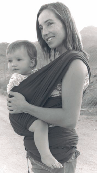
Portraiture doesn't have to be formal and composed. You can look for opportunities for more candid shots, too, like the woman with child in Figure 9-11. Get a model release from your human subjects! See the following section for more on that.
Photojournalism is a classic innovation of photography as functional art. If you've ever seen the news on TV or online or read a newspaper or magazine, you've been touched by photojournalism. Who can forget the gritty B&W newspaper photos of the Vietnam War? Who doesn't remember that even-earlier poignant kiss of a sailor returning home and happy to be there? Good photojournalism can transport you to a time and place instantly with its historic spontaneity and realism.
Being a successful photojournalist is a matter of balancing preparedness, timing, and luck. You've got to be at the right place at the right time with your camera. Take a picture of an event that soon will be history, and you've got yourself an image of merit — a document that over time becomes more interesting.
Note
To develop your own photojournalistic style, first try to emulate the best photographers — and shots — in this field. You can search for the works of Dorothea Lange, Margaret Bourke-White, and even Matthew Brady. Also peruse the grand photo mags, like Look and LIFE. Train your eye to notice what they did and develop your own style from there.
Here are places where you can find these snappable, historic events:
In your own backyard: You can be anywhere when an event happens, even your own home, say, when a lightening bolt strikes the tree in your front yard and the tree goes up in flames. If your target is to sell to local publications, these are the kinds of shots you want to be prepared for.
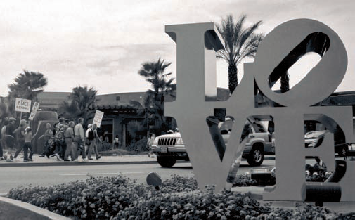
When traveling: Suppose you witness a protest march. What a great opportunity to snap pictures of the marchers or something artful that accompanies them or is installed by them. Figure 9-12 captures a peace march anchored by the classic Robert Indiana sculpture in the foreground. (Of course, remember to find out what the protest was about so you can make note of it.) Save the picture, bring it home, write an article about what you saw, and submit (and submit, and submit again). If it's an interesting enough shot and your writing is good, chances are that an Internet site, newspaper, or magazine will buy it from you.
Here are some thoughts to keep in mind if you're considering trying to sell photojournalism shots:
B&W or color? Although many publications prefer B&W images, shoot color. It's a simple matter to convert a color image to grayscale, but converting grayscale to color means hand-painting the image.
Facts, facts, facts: Be sure to document the date, time, and location of your photojournalism shots. If you sell shots to a publication, those editors need this information.
Model releases: When you capture people who are recognizable in your shots, you need to get their names and have them sign a model release form, which gives you permission to market their likeness. That's not to say that you have to get release forms for every person in a large crowd — just when it's obvious that a person is a deliberate subject of your photo. Images of public figures — like politicians and celebrities — usually don't fall under this rule. However, if in doubt, get permission. And you can always consult a publications lawyer for more advice. You can get printable release forms here:
www.dpcorner.com/all_about/releases.shtml
Simultaneous submissions: Some publications only accept submissions that you haven't sent to other publications for consideration or that have not been previously published. And some publications might want only one submission at a time from any one person. So, before you send your work to a publication, find out its policies on these issues and adhere to them.
Timeliness: Many times you'll think that you're the first person who's captured a certain photograph or reported a journalism-worthy event. Do some research before submitting your pic and/or writing. Google has a good News search: Type in a few keywords associated with the event to see whether it's been written about yet.
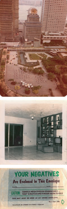
You can use many methods to get any image — those that are a hundred years old to those of today — using negatives and positives of all shapes and sizes, prints, and digital (Raw, TIFF, and JPEG) files — all printed clearly and at high resolution in B&W. Pretty amazing stuff when you think about it. (Read more about digital file types in Chapter 2.)
Creating a B&W print requires no magic wand: You can
Shoot with B&W film on a nondigital camera. Black-and-white film is probably still the best medium for the genre. The light coming onto the film can create natural sepias with realistic-looking grains that develop when the film is mixed with chemicals.
Shoot with your digital camera set to B&W mode. For what it is, it's good but can get to look a little like plastic.
Take a color image and tweak it in Photoshop to make it appear B&W. You can either desaturate your photos or scan them in grayscale mode.
Tip
Remember, too, that a digital camera actually captures a color image when set to B&W. If you shoot in the Raw file format, you can easily restore the color later in Photoshop's Camera Raw plug-in.
Not to insult your intelligence, but shooting in B&W on a nondigital camera requires using B&W film. This gives you a negative or a positive (film type depending) to enlarge to make a print. Just like color film, B&W film has an ISO rating (how sensitive it is to light; see Chapter 6 for more on ISO ratings).
Scan a B&W print or developed film to create a digitized image that you can tweak in an image editing program and then make copies. (See Chapter 3 for more on scanners and slide attachments.) In the upcoming section, "Getting the best quality image," you can read more about using B&W slide film for great results.
Obviously, digital cameras can't use B&W film, but they do have a setting with which you can shoot in B&W. The B&W mode in many cameras is among many menu items (described in Chapter 12). In some cameras, it may be hard to find without that handy roadmap, the User Guide. For example, the B&W feature on a Canon Digital Rebel XT, can be found within a setting called Parameters.
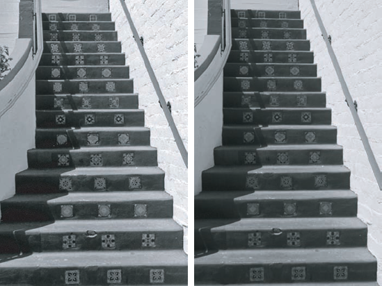
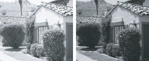
So what's better for B&W: film or digital? As a comparison, here are two images, shot at the same time and angle: one on film and one that's digital. (Okay, both are technically digital now because the film image was scanned.) But there are differences, as you can see in Figure 9-13. On the left is a B&W film image of a Spanish-style staircase taken in the P (that's point-and-shoot mode) of a film (Canon Rebel) camera and then scanned with an HP Scanner. On the right is the same image taken with a digital camera (a Canon Digital Rebel), again in the P mode. The film image has a somewhat broader tonal range, with darker shadows and brighter highlights, while the digital image shows better detail in the shadows.
Warning
There are at least a dozen parameters at work when you look at images printed on a computer or in this book that can make the two different — and those parameters aren't always because of the digital versus film format itself. And of course, there's always the factor of personal preference. So rather than declaring one medium superior to the other for B&W photography, let me caution you to remember that the quality of your digital art photos, whether originating as pixels or on film, depends on two things: the settings you use when capturing the image and the post-capture processing you do in your image editing software.
Note
Don't forget that when you capture in the Raw file format, all the image's original data is still part of the file, including color. Using Photoshop's Camera Raw plug-in (or other Raw-capable software), you can always return to the original image, as captured in the camera, complete with full color (even when the camera was set to use its B&W feature).
You can manipulate digital B&W digital images so that they look like B&W film prints. Sometimes you might need a B&W shot for certain types of publications, like catalogs or newspapers. Or, you might want to convert a color image to B&W (see the earlier section, "Creating a B&W image") to invoke a sense of nostalgia and time past.
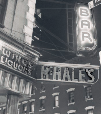
Face it, the past sells. And B&W is an important piece of the past. From deco to retro, people like to have a piece of the past. Imagine an image of a woman wearing an apron in a 1950s-style kitchen or a man outside in a bathrobe picking up the newspaper, waving happily at the neighbor in front of a 1920s Craftsman home. The old days become new again for younger folks, and the old days are relived by older folks. Figure 9-14 shows a B&W shot of a modern building — a photograph that was shot this century but looks like it was shot decades ago because of the architecture and its lack of color.
Tip
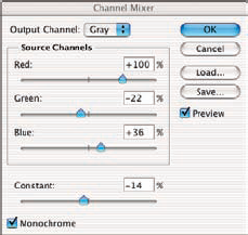
For the deepest grayscale tones, choose the Channel Mixer option in Photoshop. Knowing how to do this is a must for anyone who loves B&W photography. Here's how you do it:
Open your image in Photoshop and examine each color channel individually.
Open the Channels palette and click on each channel, one at a time, to evaluate what it offers to the final grayscale image. Which channel has the best detail in the highlights? Which channel has the best detail in the shadows?
Choose Layer

After you click OK in the New Layer dialog box, click the Monochrome check box (in the lower-left corner of the Channel Mixer dialog box; see Figure 9-15) to give your image a grayscale appearance.
Move the slider bars to tweak the black and white in your image.
Using the information you gleaned from the Channels palette in Step 1, balance the sliders to produce the best possible tonal range for your image. Increase the values of the channels that have good detail in the highlights and shadows, and compensate for their added contributions to the image by reducing the value of the third channel. Finding the perfect mix of channels is a balancing act — and of course, there can be different combinations that provide equally pleasing results.
Tip
Generally you start with a properly exposed color image; the values of the four Channel Mixer sliders should (ideally) total about 100. (Multiply the value of the Constant slider by three before doing your math — that slider is applied to all three color values.)
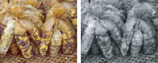
Figure 9-16 shows the original image of corn (color) and the change to B&W.
(Optional) Flatten your image by choosing Layer
Tip
Remember that the value of using an adjustment layer in Photoshop is flexibility. Unlike using an adjustment command, an adjustment layer lets you change your mind. If you don't flatten the image and you save it in Photoshop's PSD file format (or another format that supports layers), you can reopen the image and change your adjustment. If, for example, you find that your printed image is too dark in the shadows, you can simply reopen the image, reopen the adjustment layer (by double-clicking it in Photoshop's Layers palette), and change the sliders. If, however, you're quite happy with the image as is, feel free to flatten the image.
Whatever your reason for capturing and printing in B&W, you want to start with the best image possible. You won't get a quality print from a so-so image. You can't serve hamburger and pass it off as filet mignon, you know. Here's how.
To create a great print, you need to start with a great image — a quality image, that is. You want the best quality image that your camera can capture whether you shoot with B&W film (and scan those images) or with a digital camera set to B&W. For the highest-quality photographs, follow these pointers:
Film: Shoot with B&W slide film and scan the positives.
Scanning from a positive (a slide), rather than from a negative, gives you better results because your scan doesn't need to be inverted (swapping black and white). Although this isn't nearly the problem for B&W film that it is for color, you're still likely to be happier with scans of B&W slides than with scans of B&W negative film.
You can read about scanning images in Chapter 3.
Digital: Shoot in B&W mode.
dSLR: Shoot in Raw format, the highest resolution format with set standards that relates directly to the sensor on the camera. See Chapter 3 for more about Raw format, dSLRs, and how to set your camera to shoot Raw.
Non-dSLR: Shoot in highest photo quality mode that your camera dictates for non-dSLR. Most digital cameras capture images using a high-resolution JPEG format that's convertible to a high-quality TIFF format — one that can print images at 8″ × 10″ inches without pixilation.
Tip
After you make changes to a JPEG image in an image editing program, I recommend that you save in another format. Resaving as JPEG can degrade the image quality through recompression. (It's safe to open and close a JPEG as many times as you want — it's only the process of compressing during saving that causes problems.) TIFF is a non-lossy file format that is an excellent choice for digital photos.
Choose File
In the Save As dialog box that opens, click the list for choices of file type (usually JPEG).
A drop-down menu appears.
Choose TIFF from the drop-down menu.
Navigate to the location in your computer or to the location in your external hard drive where you want the file saved and then save it.
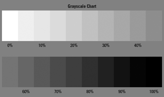
A B&W photograph comprises shades of gray that add definition and depth and detail to the image. Figure 9-17 shows a chart depicting shades of gray in 5-percent increments from darkest to lightest (including the background color, which is the 50% gray sample). The chart includes a total of 21 shades of gray.
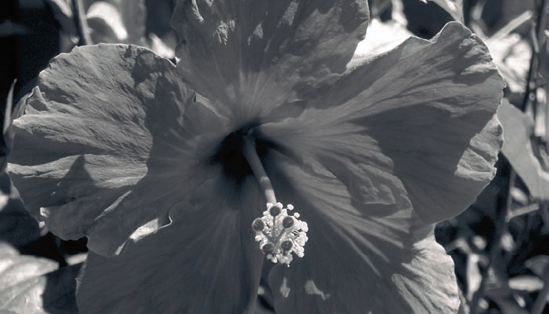
The image of a hibiscus flower (in Figure 9-18) shows the range of gray that makes up a typical B&W photo. There are 256 distinct shades of gray in the photo.
Note
Digital cameras set to 8-bit color offer 256 shades of gray from pure white to pure black. If you're shooting in Raw, your camera can capture in 16-bit color — twice as much digital data is used to record the image, producing a much greater number of subtly different shades of gray. Depending on how much processing and editing you do, and depending on your printing device, you might see no difference between 8-bit and 16-bit grayscale prints.
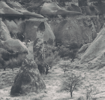
Landscape shots can provide a natural scene containing clear highlights that contrast with the midtones and shadows in the image. (A good B&W photograph has many contrasts between light and dark tones.) The photograph in Figure 9-19 shows dimension using B&W:
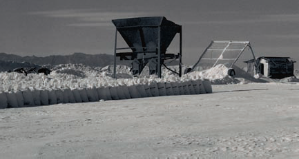
Foreground: White salt. Also note the salt bags, the face of each covered in a shadow. See the following section for more on shadows.
Contrast: Two objects in the middle ground — one dark and one light, which provide good contrast — that is, broad differences between the darkest and lightest parts of the photo.
Background: Light clouds above shadowed mountains in the background, providing more good contrast in gray tones.
To enhance tonal difference in your B&W shots, assess the tones of your subject and then choose a background that is different. If you're shooting something with a lot of highlights, choose a very dark background, as many product photographers do. See how effective this can be in Figure 9-20.
When shooting outdoors with B&W, look for great tones that nature throws your way, especially when it comes to moisture-bearing entities, like clouds, fog, haze, and steam. What's murky when shot in color can often be brought out as a very interesting highlight. Clouds can be your friend, either filtering harsh sunlight or cutting across the sun, giving you dramatic shadows. Fog and haze can provide wondrous midtones or spectacular highlights when side- or backlit. (For more on light sources, see Chapter 5.) And don't forget to look for steam — from a train, a geyser, a heating system, a tea kettle, or hot lava hitting the ocean.
Note
Your lighting source and direction help define how many highlights and shadows your shot will have.
In B&W photography, distinctions are also made in the gray tones of various colors by how dark or light they are. These distinctions become even more important in B&W because these tones are in essence the "color" of the photo. By knowing what highlights, midtones, and shadows mean, you can
Tell whether you have a decent print, exposure, or onscreen image. When I pull a B&W image onscreen, I look for clarity in the distinction of grays. Take, for instance, the picture of the Spanish architecture on the left in Figure 9-21. Check the contrast in two spots within the frame. You can see, for example, that the tiles on the roof are distinguishable from one another because each has a different shade of gray, and the place where the mountain meets the sky also differ by a couple of shades of gray, indicating good contrast.
Tip
During the evaluation of your photos and/or when you are tweaking them in Photoshop, pick out a few spots and evaluate the contrast in each. In many photos, one area can have really good contrast, while another area does not. Not a good thing in architectural or landscape photography.
Understand how to manipulate an image in an image processing program. If, indeed, one part of an image has better contrast than another, you can tweak the image using a number of options:
In Raw format, use the Temperature, Tint, Exposure, Shadows, Brightness, and Contrast sliders in Photoshop's Camera Raw dialog box.
If you shoot JPEG or TIFF, adjust your image by using Image
Add depth (the capturing of shading and light to give the illusion of dimension) to your image when shooting and when editing it.
To add depth when shooting: Look for spots with a foreground, middle ground, and background. Experiment with your f-stop (see Chapter 11) so that you can blur your backgrounds to make your subject stand out so you can see its sides in perspective.
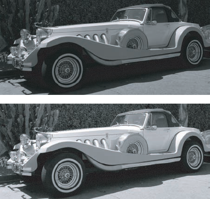
To add depth when editing: Tweak the exposure, brightness, and/or contrast sliders when the image is in Raw format so that the contrast is natural looking with no large areas of white and/or black. See a before/after example in Figure 9-22. Doing this also corrects what you've done to your image previously. Hint: This feature works especially well when there's no color in your image.
Note
So what do these terms mean?
Highlights: Just think of going to a hair salon to have highlights — lighter shades — added to your hair. Figure 9-23 shows how dramatic highlights can be during late day in summer. Shoot to where the sun was after dusk to get beautiful silhouettes with highlighted backgrounds on partially cloudy days.
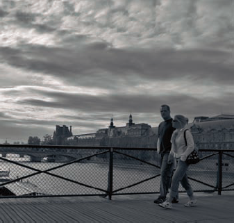
Midtones: These are the tones that make up the middle shades of gray. When shooting barren landscapes devoid of sky, you can get a photo composed mostly of midtones, as in Figure 9-24.
Shadows: Unlike the silhouette you cast on the sidewalk on a sunny day, the shadows in your digital image can include objects themselves. If your subject is between you and the light, the term shadow in photography refers not only to the shadow on the ground cast by your subject but also to the dark tones of the subject itself.
Note
Look — really look — at your surroundings in terms of identifying dark areas, light areas, and in between areas of B&W tone. Train your eye to read light and not just color.
Note
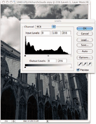
Just like you can divide any photograph into thirds, horizontally or vertically, also pay attention to the tones of your photograph, from light to middle to dark. You can use a histogram to analyze and tweak your image's exposure:
Choose Layer
Click OK in the next dialog box.
Your new layer is called Levels 1, as shown in the Layers palette. (Choose Window
Click and drag the white and dark slider bars on each end so that they match up with the beginning and end of the curves. Then slide the middle point toward the area where the curves reach up the most vertically and click OK.
As you make changes, keep an eye on your image to be sure you don't overdo it.
After you compose your image and have a digital image to work with, it's time to make a print. Yeah!
You've walked the walk. Now it's time to talk the talk — the photography talk, that is. You got hold of a good printer, say an Epson Stylus Photo 2200, and now you're ready to take your show on the road.
The print of choice for museum quality is a silver-gelatin print. Digitally speaking, though, your silver-gelatin print is going to look better on some papers than others. I use enhanced matte because it's inexpensive, takes to the ink very well, and looks great behind glass. New papers come out all the time from rag to fine art to canvas. Try www.inkjetart.com to get all the latest about new papers and their compatibility with your printer and any special settings you might have to use. For more about printing the final product, see Chapter 17. To read about print mountings and framing, hop to Chapter 18.
Tip
You can name your B&W prints by the type of paper you use and/or the type of print process you've used to make them.