
Chapter 10. Using Pivot Tables to Analyze Data
In this chapter
What Is Possible with Pivot Tables 192
Preparing Your Data for Pivot Table Analysis 192
Creating Your First Pivot Table 200
Changing the Default Layout of a Pivot Table 202
Adding New Fields to a Pivot Table 208
Eliminating Blank Cells from a Pivot Table 209
Using Pivot Table Legacy Mode 210
For 12 years, pivot tables have been the most powerful feature in Excel. However, Microsoft estimates that fewer than 10% of people use pivot tables. To make this helpful feature less intimidating in Excel 2007, Microsoft rewrote the pivot table interface to make it vastly simpler to use.
What Is Possible with Pivot Tables
Note
Although I loved the drag-and-drop functionality in pivot tables, it was a source of frustration for people new to pivot tables. With the drag-and-drop interface, it is possible to accidentally drop a field in the wrong place, essentially destroying the pivot table. When this happened to a pivot table rookie, the person was often frustrated enough to quit using pivot tables.
At the end of this chapter, I show pivot table veterans how to get back to the old interface.
Say that you have 400,000 records of transactional data. It is really easy for some people to figure out that this represents $x million. But to really learn some things about the data, you need to do some more analysis to spot trends in the data. A pivot table lets you analyze trends in data without having to worry about formulas. Your focus is more on finding trends than on worrying about writing formulas in Excel.
By using a pivot table, it is possible to create a number of views of your data, including the following:
- Breakdown of sales, by product
- Sales by month, this year versus last year
- Percentage of sales, by customer
- Customers who bought xyz in the east
- Sales by product, by month
- Top five customers, with products
Of course, these are just examples. You can use pivot tables to slice and dice your data in almost any imaginable way.
Preparing Your Data for Pivot Table Analysis
Pivot tables are best created from transactional data—that is, raw data files directly from your company’s IS department. You don’t want any totals in the data. You don’t want blank lines, blank columns, or formatting.
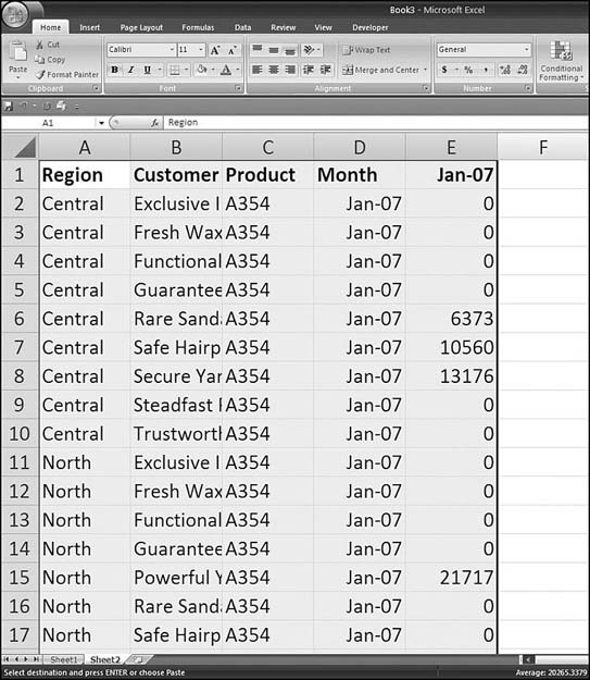
The data shown in Figure 10.1 is perfect for pivot tables. Every row in the table represents the sale of one product to one customer on one date. A pivot table could summarize one or more of the numeric fields in this data.
Figure 10.1. A transactional dataset is great for pivot tables.

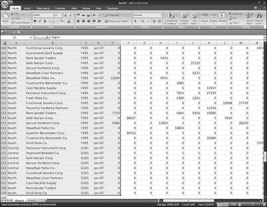
The data shown in Figure 10.2 is a typical Excel worksheet, but it has a number of problems that make it unsuitable for use in a pivot table:
Figure 10.2. This dataset is not suitable for pivot table analysis.

- The date field is going across the columns. This makes it very difficult to create a pivot table. If your data is in this format, you really need to reorganize it with the month field going down the rows. If you have 12 months going across the worksheet, you need to copy Columns A through C plus one month column to a new worksheet—possibly increasing your record count by a factor of 12.
- Totals are already built in to the data. Row 3 and Row 11 contain totals by customers. The data for use in a pivot table should contain no extra subtotal rows.
- There are many blank cells in the dataset. Cell A2 contains the word Central, and then the next 137 cells in Column A are blank. While a human can understand that all these cells belong to the central region, a computer cannot.
If you have a dataset like the one shown in Figure 10.2, go back to the source of the data. If you are in a corporate environment, you can explore with your IT department where this summary came from. If the summary came from Quickbooks or another software package, try running a trial balance report that is at the detail level. Someone must have started with transactional data in order to create this summary. If it will take six months for IT to get to your project, you might want to follow the steps outlined in the following section to make the data suitable for use in a pivot table.
Making Data Suitable for Pivot Tables
As noted in the preceding section, there are problems with the dataset shown in Figure 10.2. Many common datasets from software packages like Peachtree or Quicken or even from Oracle or SAP will have similar problems to this dataset. By using your Excel skills, you can convert the data into a suitable format. It isn’t easy. It isn’t something you should do everyday. But it is possible. Here’s what you do:
- Make a copy of the dataset. It is easy to make a mistake in this sequence of events, so you should not do all these steps on your original dataset. To copy the dataset, right-click the sheet tab and choose Move or Copy. In the Move or Copy dialog that appears, choose Create a Copy. In the To Book drop-down, choose (New Book), as shown in Figure 10.3.
Figure 10.3. You need to make a copy of the dataset.

- Ensure that there are no formulas in the data. You will later be sorting this data, and you want to make sure that you freeze all the current values. Above and to the left of cell A1, click on the light gray triangle to select all cells. Press Ctrl+C to copy them. On the Home ribbon, use the Paste drop-down to choose Paste Values, as shown in Figure 10.4.
Figure 10.4. You need to convert any formulas to values.

- Examine the data. Look for patterns in your dataset similar to the patterns in this dataset. In this dataset, the total rows happen to have a blank cell in column C. See if you can find a similar rule in your dataset. A blank cell in Column C is a total record that you do not want in the final dataset. It would be tempting to sort by Column C right now, but see if the problems in step 4 apply to you first.
- In this dataset, the region and customer information in the left columns are not repeated on every row. If your dataset has this same problem, then you will want to fill in those columns before sorting the total rows to the bottom of the data. You need to fill in those empty cells in Columns A and B first. Scroll down until you find the last row with data. Place the cell pointer in Column B of the last row. Press Ctrl+Shift+Home to select from the final row up to Cell A1.
- You want to select only the blank cells within this selection. Press the F5 key to display the Go To dialog. In the lower-left corner of the Go To dialog, click the Special button. In the Go to Special dialog that appears, choose Blanks, as shown in Figure 10.5. Click OK. You are taken to the first blank cell in Column B, and the selection includes all blank cells in the original selection.
Figure 10.5. After selecting a range in Columns A and B, use the Go to Special dialog to select only the blank cells.

- Use the three-keystroke arrow key method to enter this formula. It is best to not even look at the screen while you do this because your cell addresses will probably be different from the ones shown in the book. Press the =, the up-arrow key, and Ctrl+Enter (see Figure 10.6). All the blank cells in your selection are instantly filled with a formula that points to the cell above the current cell.
Figure 10.6. Using Ctrl+Enter fills the formula in all cells of the selection.

- Convert all the formulas in Columns A and B to values. Unfortunately, you cannot use Copy and Paste on the current selection. You need to reselect the data as you did in step 4. Select a single cell in Column B. Press the End key and then press the down-arrow key to move to the last data cell in Column B. Hold down Ctrl+Shift+Home to select up to cell A1. On the Sheet ribbon, click the Copy icon. From the Paste drop-down, choose Paste Values.
- Because you determined in step 3 that any blank cells in Column C are total records that need to be deleted, select Cell C1. From the Sort & Filter drop-down, choose Sort A-Z. In an ascending sort, any blank cells are moved to the end of the range.
- With the cell pointer still in Cell C1, press the End key and then press the down-arrow key twice. You are now in the first row without any data in Column C. Scroll down to visually verify that all these rows have the word Total in Column B, as shown in Figure 10.7. These are rows that you want to delete.
Figure 10.7. All the extra total rows are now at the bottom.

- Move to Column B. While holding down the Shift key, press End and then the down-arrow key to select the rest of the rows. Right-click in the selection and choose Delete. In the Delete dialog that appears, choose Entire Row. At this point, you have solved two of the problems described earlier. The final problem is to turn the monthly data that is spread across the columns into row-oriented data.
- To prepare to fix the final problem, insert a new column with the heading Month. In this dataset, Column D would be appropriate.
- Open a new workbook. Copy Cells A1:E1 from the original workbook to the new workbook. Change Cell E1 to Revenue.
- In the original workbook, copy Cell E1 to all the cells from D2 down to the end of your data, as shown in Figure 10.8.
Figure 10.8. Columns A:E in the original dataset can be copied to the new workbook.
Tip From

Instead of repeating step 13 for each month, you could set up a set of formulas once. To do so, you put the cell pointer in D2. Using Name a Range on the Formulas ribbon, define
UpRightas=!E1. In Cell D2, enter the formula=UpRight. In Cell D3, enter the formula=D2. Put the cell pointer in Cell D3 and double-click the fill handle to copy this formula down the rest of the column. Note that when you use this method, you can skip step 12 for each month, but you have to change the paste operation to a paste values operation in step 13. Caution: Do not use this trick if you have VBA code in your workbook! Calculations caused by the VBA code will return a value from the active sheet at the time of the calculation. - Copy Columns A:E of the original workbook. Switch to the new workbook. Paste the cells to the next blank row, in Column A. For the first month, this will be Cell A2, as shown in Figure 10.9.
Figure 10.9. Columns A:E in the original dataset can be copied to the new workbook.
- Switch back to the workbook that contains all your data. At this point, you have copied all of the January 2007 sales to the new workbook. Remember that you are working on a copy of the data. Thus, it is safe to delete the entire Column E in this workbook. The next month then moves over to Column E.
- Repeat steps 13–15 for each month column. This is the most tedious part of the process. If you have 12 months of data, you must complete these steps 12 times. If you have data for 60 months, it would almost be better to skip ahead to Chapter 36, “Automating Repetitive Functions Using VBA Macros,” to learn how to write a macro to do this step.
- The initial dataset contained 328 rows of data. At the end, you will end up with 3,936 rows of data (328×12) in the new workbook, as shown in Figure 10.10.
Figure 10.10. If all goes well, you should have 12 times more records in the new dataset as in the original.
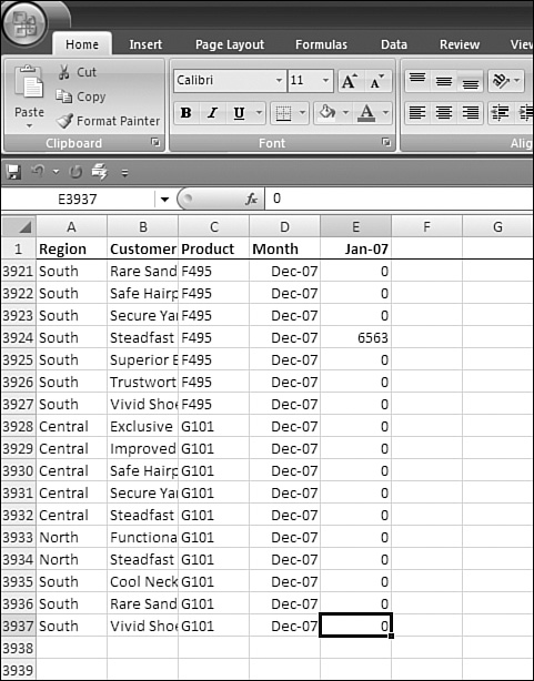
- Because there are many datapoints where the revenue was zero, you can sort the new dataset in descending order by Column E and then delete all the rows with zero in Column E. You end up with a compact dataset of 531 rows by 5 columns.
You can complete the process described here in less than 15 minutes. It is not a particularly pleasant process. But if the data came from an inflexible software package, or your IT department tells you that you cannot have the new dataview for the next month or year, you know you can rely on this process.
Recapping the Rules for Pivot Table Data
To create pivot tables, follow these rules:
- Make sure each column has a one-cell heading. Keep the headings unique; don’t use the same heading for two columns.
- If a column should contain numeric data, don’t allow blank cells in the column. Use zeros instead of blanks.
- Do not use blank rows or blank columns.
- If summary data is missing from the detail rows, use the techniques described in steps 4–7 above to fill in the missing data.
- If totals are embedded in your report, remove them using techniques similar to step 8–10 above.
- If your data has months spread across many columns, go back to the source software program to see if a different view of the data is available. If this is not an option, use techniques similar to steps 11-16 to solve the problem.
Creating Your First Pivot Table
When you have your data in the correct format, creating and manipulating a pivot table is very easy.
Let’s say that your manager has asked you to summarize some data to show revenue by region and product. To create a pivot table to do this, you follow these steps:
- Select one cell in your data.
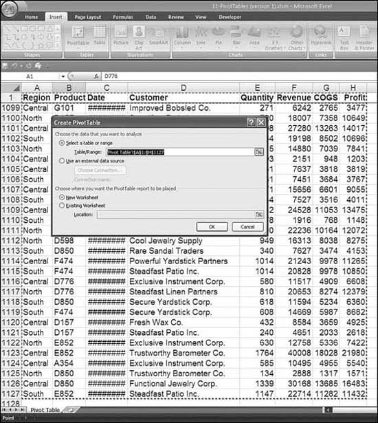
- From the Insert ribbon, click the PivotTable icon in the Tables group.
- Excel displays the Create PivotTable dialog, shown in Figure 10.11. In the top portion of the dialog, confirm that Excel’s IntelliSense chose the right range for your data. In the lower portion of the dialog, you can choose to create your pivot table on a new worksheet or in a blank portion of the existing worksheet.
Figure 10.11. Most of the time, you can simply click OK to get through this dialog.
You are now just two clicks away from the answer you need. But first, let’s take a quick look around the new look of pivot tables, shown in Figure 10.12:
- Two Pivot Table ribbons are grouped under PivotTable Tools. The Options ribbon contains most of the powerful pivot table features. The Design ribbon contains formatting icons.
Figure 10.12. The new look of pivot tables is actually far simpler than the previous three- or four-step wizard.
- The PivotTable Field List box, which looks like a task pane, appears in the right side of the screen. You can toggle it on and off by using the PivotTable Tools – Options – Show/Hide – Field List icon in the ribbon.
- There is a drop-down icon at the top of the Field List box. This drop-down offers five different views of the Field List box. You can experiment with these. Although each view is different, you may find that you don’t have a favorite and they all seem basically equivalent.
- The old red exclamation point you used to refresh a table in earlier versions of Excel has been replaced by a large Refresh icon like the one you are familiar with in Internet Explorer. This icon is located in PivotTable Tools – Options – Data group. If your underlying dataset changed, you could click the Refresh icon to recalculate the pivot table.
- Many powerful items such as Table Options, Group, and Change Data Source are now easily available on the Options ribbon. These items were buried in previous versions of Excel.
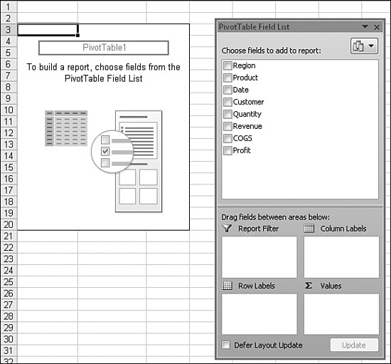
- Before you add your first field to a pivot table, a graphic appears in Column A, directing you to choose fields from the PivotTable Field List box.
To create a pivot table, you simply use the PivotTable Field List box to check which fields to include in the table. Excel makes fairly intelligent guesses based on the field type. In the current example, Excel builds a passable table using the default guesses. You have to make one adjustment to perfect the table.
In the PivotTable Field List box, you choose Region, Product, and Revenue. When you choose the Revenue field, Excel adds a new field called Sum of Revenue to the Σ Values section of the PivotTable Field List box. Excel decides that this belongs in the Σ Values section because the field is basically numeric. When you choose Region and Product, Excel moves those to the Row Labels section of the PivotTable Field List box.
At this point, the default pivot table looks as shown in Figure 10.13. In Cell B4, you can see that the central region sold $4.67 million. In Cells B5:B15, you can see the revenue for each product in the central region.
Figure 10.13. The default pivot table after five clicks. It would be easier to understand if regions went across Columns B, C, and D.

Changing the Default Layout of a Pivot Table
The annoying thing about the table in Figure 10.13 is that it would be easier to read the table if the Region field went across Columns B, C, and D, with a total for the three regions in Column E.
When you use the checkmark method for building a pivot table, Excel can’t read your mind about which fields would look better when used as column labels. Luckily, it is very easy to move fields in a pivot table, as described in the following sections.
A Quick Look Around the PivotTable Field List Box
In Figure 10.13, the PivotTable Field List box is composed of a list of fields at the top and then four distinct areas below (Report Filter, Column Labels, Row Labels, and Σ Values).
The drop-down at the top offers five different views of the Field List box. As shown in Figure 10.14, the name for the default view is Fields and Drop Zones Stacked. This view could have shortcomings if you had more than 16 fields in the field list. You can also see in Figure 10.14 that there is not quite room for the text Sum of Revenue to appear in the Σ Values section.
Figure 10.14. This drop-down offers five views of the PivotTable Field List box.

Figure 10.15 shows the Fields and Drop Zones Side by Side view. This view would allow up to 28 fields to be visible in the Field List box. It still has the problem that you can’t see the entire name Sum of Revenue in the Σ Values section.
Figure 10.15. The Fields and Drop Zones Side by Side view offers more room, for a longer list of fields.

Figure 10.16 shows the Field List box in Fields Only view. You can use this view if you can trust Excel to put the fields in the right place.
Figure 10.16. The Fields Only view can accommodate a long list of fields or fields with really long names.

Figure 10.17 shows Drop Zones Only (2 by 2) view, with the layout fields arranged in a 2×2 grid. Figure 10.18 shows Drop Zones Only (1 by 4) view, with the sections arranged in a 1×4 grid.
Figure 10.17. After the fields have been added to the layout sections, you can hide the list to concentrate on layout.

Figure 10.18. This view would be best for long field names.

The drop zone sections of the PivotTable Field List Box are as follows:
- Report Filter—You use this section to limit the report to only certain criteria. This section is analogous to the PageField section in the old pivot table model.
- Row Labels—This section is for fields that will appear on the left side of the table. If you have more than one field in the Row Labels section, they will appear in a hierarchical view, with the second field arranged under the first field.
- Column Labels—This section is for fields that will stretch along the top rows of columns of your table.
- Σ Values—This section is for all the numeric fields that are summarized in the table. By default, most fields are automatically summed, but you can change the default calculation to an average, minimum, maximum, or other calculations, as described in “Finishing Touches: Numeric Formatting in a Pivot Table.”
Rearranging a Pivot Table
Four of the five views of the PivotTable Field List box include the four drop zones described in the preceding section. These areas are the keys for rearranging the look of a pivot table.
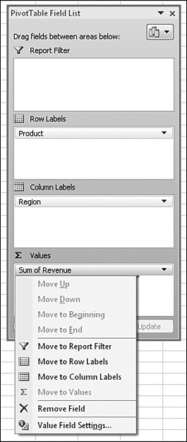
The Row Labels section from our earlier example has Region and Product fields. In your pivot table, you will have different field names. Each of these fields has a drop-down. If you choose the Product drop-down, you see the list of options shown in Figure 10.19.
Figure 10.19. Many arrangement options are available in the drop-down for each field in the layout area.

From the drop-down list in 10.19, if you choose Move to Column Labels, the data is arranged in what is called a crosstab analysis, as shown in Figure 10.20.
Figure 10.20. This crosstab analysis presents the data clearly. Creating it required six mouse clicks.

In this example, you used the drop-down shown in Figure 10.19 to move a field from one section to another. You can instead drag a field within the Field List box drop zones. To do this, in Figure 10.19, you click the Region field and drop it in the Column Labels section.
Finishing Touches: Numeric Formatting in a Pivot Table
Once you have arranged your data in the report, you will want to consider formatting the numeric fields. For example, in Figure 10.21, it would be helpful if the numbers were formatted with commas as thousands separators.
Figure 10.21. You choose Sum of Revenue, Choose Field Settings.
There is a temptation to format a pivot table just like you format any other range in a worksheet. However, as you will see later in this chapter, a pivot table is very fluid. Although the numbers in the figure currently occupy Cells B5:E16, with a couple mouse clicks, they could soon occupy Cells B4:B48 or even Cells B4:B539. Because any pivot table might be changing shape, it is best to do all formatting through the pivot table interface.
If you tell Excel that a particular field should always have the format $#,##0, then no matter how you change the pivot table, Excel will remember the format.
For example, in the PivotTable Field List box, you should click the Sum of Revenue drop-down in the Σ Values section. Be careful. Revenue appears twice in the PivotTable Field List box. There is a Revenue field with a checkbox in the Fields section. There is a Sum of Revenue button in the Σ Values section. Both Revenue and Sum of Revenue have drop-down arrows when selected. You are specifically looking for the Sum of Revenue button in the Σ Values layout section of the PivotTable Field List box.
When you choose the Sum of Revenue drop-down arrow in the Σ Values section, you should choose Field Settings, as shown in Figure 10.21.
The Summarize By tab of the Data Field Settings dialog allows you to change the summary function from Sum to Count, Average, Min, Max, etc. In the lower-left corner of this dialog, click the Number Format button, as shown in Figure 10.22. You can then choose a numeric format from a special version of the Format Cells dialog.
Figure 10.22. Numeric formats are behind the button in the lower-left corner of this dialog.

When you have a pivot table, it is easy to further customize it. For example, in the Below the Field List box, you can drag Product from the Row Labels section to the Column Labels section. Then you can choose Customer, which by default moves to the Row Labels section. In two more clicks, you have created a completely different summary of the data.
Adding New Fields to a Pivot Table
The first pivot table you created in this chapter gives a great view of sales by product by region. The fantastic thing about pivot tables is that they allow you to drill in and get more detail from your data. Once you have created your first pivot table, think about ways that you can add more data to the report in order to further explain the values you see in the summary.
As an example, say that you want to add customer data to your product/region summary report. This would be a good report to produce for a product line manager. It is incredibly easy to transform your first pivot table into a report that shows such customer detail. You have two choices. In the PivotTable Field List box, you can drag the Customer field over to be the second field in the Row Labels section. Alternatively, you can simply choose the check box next to Customer in the field list. By default, this adds the field as the last field in the Row Labels area. In your dataset, follow the same step to add the new field to the layout.
After you make either of these changes, within a second, Excel redraws the pivot table to show the customers who purchased each product, as shown in Figure 10.23.
Figure 10.23. You can choose the Customer field in the field list to add customers to a pivot table.

Eliminating Blank Cells from a Pivot Table
Once you produce a report with two or more fields, you might be frustrated by a problem common to most pivot tables. Look at Row 9 in Figure 10.23. This customer made purchases from the central and north regions of your company but did not make any purchases from the south region. By default, a pivot table shows a blank in this cell to indicate that there were no records matching for this customer in that particular region.
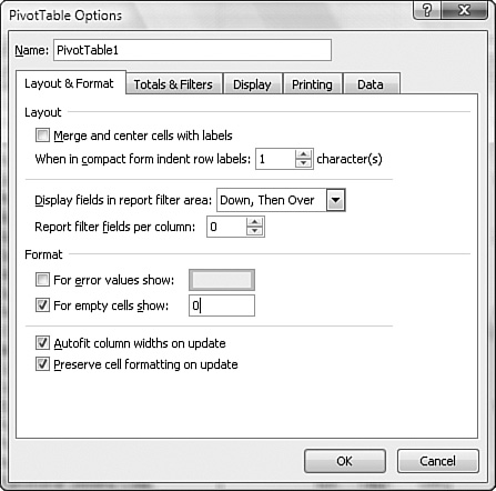
Many people would rather see a zero in this cell than see it blank. To override the blank setting, on the PivotTable Tools - Options ribbon, in the PivotTable Options group, choose the Options icon. As shown in Figure 10.24, there are five tabs in the PivotTable Options dialog that appears. The first tab, Layout & Format, has a setting called For Empty Cells Show. You should change this setting from a blank to a zero.
Figure 10.24. You can use For Empty Cells Show 0 to force Excel to fill in the empty cells in the data section of a pivot table.
Using Pivot Table Legacy Mode
If you are an expert in creating pivot tables in Excel 2003, you might be distraught that the pivot table interface has changed considerably. While the new interface will allow people new to pivot tables to create pivot tables flawlessly, you might wish to use the legacy pivot table functionality to create your pivot tables.
The Excel 95 - Excel 2003 pivot table interface allowed you to drag and drop fields right onto the pivot table. Many people did not notice the subtle visual clues that allowed you to know where the dropped field would appear. Many people would try to drop a new column field between the column area and the data area, resulting in disaster if Excel interpreted the field as a data field. Microsoft changed the interface to protect these new people from themselves.
However, if you have previously mastered the drag and drop method, you might want a way back to that mode. Microsoft provides a way, but it is fairly hidden.
- Create a new pivot table.
- On the PivotTable Tools - Options ribbon, choose the Options icon from the PivotTable Options group.
- In the Pivot Table Options dialog that appears, go to the Display tab and choose Classic PivotTable Layout (Enables Dragging of Fields in the Grid), as shown in Figure 10.25. With this option selected, you can continue to build pivot tables using the old Excel 2003 interface, as shown in Figure 10.26.
Figure 10.25. You can go back to the old drag-and-drop layout.

Figure 10.26. When you get back to the old layout, don’t accidentally drop Revenue in the Row Fields section.

Pivot Table Limitations
Pivot tables are the greatest invention in spreadsheets, but they do have a few limitations. However, as described in the following sections, many of their limitations have been significantly improved in Excel 2007.
Capacity Limitations
As shown in Table 10.1, the capacity limitations for pivot tables have been greatly improved in Excel 2007.
Table 10.1. Pivot Table Capacity Limitations

Inability to Combine Features
There are some limitations when it comes to combining features within pivot tables:
- If any field is grouped, you cannot add a calculated item to that field or any other field in the table.
- If you have grouped a field by x number of days, you can no longer group that same field by months, quarters, or years.
- If your are querying a huge underlying dataset, you may experience a delay after you make a change to the pivot table. In these cases, you can go to the bottom of the field list and select the option Defer Layout Update. This allows you to rearrange fields in the layout section and then click the Update button to implement all the changes at once. The limitation is that if you uncheck the Defer Layout Update without clicking the Update button, your changes are lost.
Changes to Underlying Data Not Appearing in a Pivot Table
Most people are shocked to learn that changes to underlying data do not appear in a pivot table. After all, you change a cell in Excel, and all the formulas derived from the cell automatically change. You would think that the same should hold true for pivot tables, but it does not.
Pivot tables are fast because the data from the worksheet is loaded into a special cache in memory. If you build a pivot table and then change the underlying data, you must click the Refresh icon in the Data group of the PivotTable Tools - Options ribbon in order to have the change appear in the pivot table.
The Disappearance of the PivotTable Field List Box
Sometimes the PivotTable Field List box seems to disappear randomly. It is not actually randomly, but it seems like it. Say you have data on Sheet1. You build a new pivot table on Sheet2. My argument is that as long as you are on Sheet2, you are clearly working with or looking at the pivot table. Microsoft disagrees with me. Microsoft’s rule is that as soon as you click in any cell outside the confines of the pivot table, Excel should put away the PivotTable Field List box and switch to a ribbon other than one of the pivot table ribbons. To solve this problem, you can select a cell within the pivot table again to redisplay the PivotTable Field List box.
The pivot table ribbons exhibit strange behavior. If you are on the PivotTable Tools - Options ribbon, you can click one cell outside the pivot table and then immediately select a cell back inside the pivot table, and Excel redisplays the PivotTable Tools - Options ribbon. However, if you are at the right edge of the pivot table and click the right-arrow key twice and then the left-arrow key twice, you have now touched two cells outside the pivot table, so the PivotTable ribbon does not redisplay until you click on the Options tab in the ribbon.
Having a Blank Cell in the Underlying Data Confuse Excel
Say your dataset has thousands of rows of data. For any reason, if one of the revenue cells happens to be blank, this completely confuses Excel. There can be 999,999 cells with numbers and 1 blank cell, but Excel will no longer realize that the Revenue column is a numeric column.
Two things tip you off to this problem. First, if you attempt to simply check the box for Revenue in the field list, Excel moves it to the Row Labels section instead of the Σ Values section. Second, if you are in the habit of dragging the Revenue field to the Σ Values section, you see numbers that are too low. If you are an $11 million company and your pivot table shows your revenue as $1,124, you can assume that you probably have one or more blank cells in the underlying revenue data. In Figure 10.27, the blank Cell F4 causes Excel to assume that Revenue is a label field. If you build the pivot table anyway, Excel counts the revenue records instead of summing them.
Figure 10.27. A single blank cell in the Revenue column makes Excel count instead of sum revenue.

You need to be aware of this limitation. To correct the problem, you have two choices. The better solution is to fill in the underlying blank cells with zeros. But the easier solution is to double-click the Sum of Revenue heading and then change Data Field Settings to Sum from Count.
Troubleshooting Tip: You Cannot Change, Move a Part of, or Insert Cells
Many times, pivot tables get you very close to the final report you want, and you just want to insert a row or move one bit of the table. You cannot do this. If you try, you will be greeted with the message shown in Figure 10.28. This is a fair limitation. After all, Excel needs to figure out how to redraw the table when you move something in the field list.
Figure 10.28. You should not try to insert a column in the middle of a pivot table.

The solution is to copy the pivot table and use Paste Special Values. You can either put this on a new worksheet or simply paste the entire table back over itself. If you go to a new worksheet, you can continue to modify the original pivot table. If you paste values over the original worksheet, the pivot table converts to a range, and you cannot pivot it further.