
Chapter 11. Formatting Pivot Tables
In this chapter
Special Considerations When Adding Data Fields to the Value Section 224
As shown in Chapter 10, pivot tables are very fast at creating summary reports from thousands of rows of data. Once you’ve developed the summary information, you might need to spend some time improving the format of the pivot table. Excel 2007 offers some exciting new options in pivot table formatting. Unfortunately, Excel 2007 still offers some annoying problems that have plagued pivot table fans for a decade.
The New Compact View
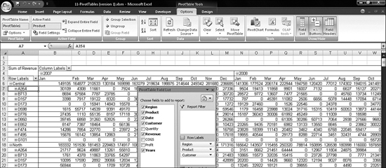
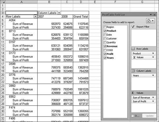
In the pivot table shown in Figure 11.1, Column A contains three different fields: Region, Product, and Customer. This is a new view in Excel 2007, and it is called the compact form of the pivot table. Microsoft thinks so much of this new view that it is the default view for any pivot table that has two or more fields in the Row Labels section of the layout area.
Figure 11.1. You can use the minus and plus buttons to collapse and expand various sections of a report.

Collapsing and Expanding Items
In Figure 11.1, Customer is the innermost field. The outer fields are Product and Region. Note that each product listed in Column A is preceded by a tiny minus button. You could use the individual minus buttons to collapse the details for a given product. For example, in Figure 11.1, A354 is collapsed to a single line in row 7.
Collapsing and Expanding Active Fields
Rather than clicking a dozen minus signs to collapse individual sections of a pivot table, you can use the icons Expand Entire Field and Collapse Entire Field. These buttons, which appear in the Active Field group of the Options ribbon, are a little tricky to use successfully.
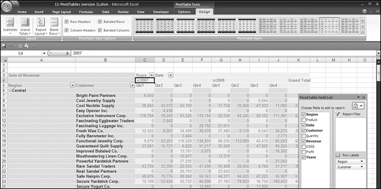
In Figure 11.2, the cell pointer is on Cell A6. This cell contains the central region. As you can see, the active field indicator shows that the active field is Region.
Figure 11.2. The active field indicator changes to a different field based on the location of the cell pointer.

Before you can make effective use of the buttons in the Active Field group of the Options ribbon, you need to figure out how to make your desired field become the active field.
The logic of which field is the active field is frustrating. Many powerful buttons in the ribbon act upon the active field, so being able to quickly make a certain field the active field is a good skill to learn. This explanation might help to clarify the bizarre rules used by Excel 2007.
It seems like there should be a drop-down in the Active Field text box to allow you to select the active field. It seems like there should be a way to touch a field in the field list to choose an active field. But neither of these methods works. Instead, you have to move the cell pointer around in order to make the ribbon realize which field is the active one.
- If you move the cell pointer to Cell A7, the active field changes to be the Product field. Moving the cell pointer to A17, A29, A42, and so on also causes the Product field to be the active field.
- If you move the cell pointer to any of Cells A8:A16, the active field changes to be Customer.
- If you move the cell pointer to any of Cells B5:Z5, the active field changes to be Date.
- If you move the cell pointer to any of Cells B4:Z5, the active field changes to be Years.
- Cells A6 and A5 are also considered to be Region fields. Not shown in the screenshot, but the other two region fields in A126 and A244 are also region cells.
- If you move the cell pointer to any of Cells B6:Z370, the active field is Revenue. Cell A3 and, surprisingly, Cell A4 are both considered to be Revenue.
Collapsing Fields Offers Improved Functionality
The expand/collapse functions were cryptic in Excel 2003. They have been promoted in Excel 2007 and improved. In Excel 2007, a field can be in a pivot table and completely hidden through the collapse button.
Imagine being in a sales meeting with one report shown on the screen. When the attendees start asking questions, without adding any new data to the report, you could click the expand buttons to show the details for the hidden field.
Here is one example to illustrate the powerful possibilites.
Putting the cell pointer in Cell A7, as shown in Figure 11.3, causes Product to be the active field. Now, if you click Collapse Entire Field in the Active Field group of the PivotTable Tools - Options ribbon, you end up with a nicely compact view of just Regions and Products, as shown in Figure 11.3. Without removing the Customer field from the pivot table, you have made the pivot table more summarized. You can imagine projecting this image on the wall in a sales meeting. When someone asks about sales of B713 in the north region, you can expand just that one group by using the plus button in Cell A18. This is a powerful feature of pivot tables.
Figure 11.3. After selecting a product cell, you can choose Collapse Entire Field to hide the detail inside a product level.
It is possible to collapse multiple fields. For example, in Figure 11.3, you can select Cell A6 and choose Collapse Entire Field to produce a summary of just the three regions and a grand total.
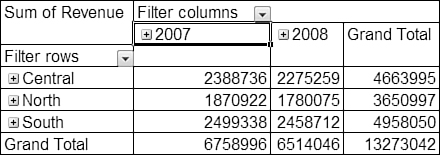
The collapse function also works for multiple fields in the column label area. For example, you can select Cell B4 and then choose Collapse Entire Field in order to hide the months and just show the years and a total. Figure 11.4 shows the pivot table collapsed down to regions and years.
Figure 11.4. A pivot table provides a tight summary when you group by regions and years.
Using the Expand Entire Field Button
The Expand Entire Field button has some surprising features. First, the button appears to have a bit of memory because it acts differently depending on how you collapsed a field. Second, when you attempt to expand a field at the lowest level of detail, Excel offers to add more fields to the table. Finally, expanding a value cell produces a cool filter report.
Say that you start with the pivot table shown in Figure 11.2. You collapse the products as shown in Figure 11.3. Then you collapse the regions as shown in Figure 11.4. If you select Cell A6 and choose Expand Entire Field, Excel expands the regions to include products, making Column A similar to the Column A shown in Figure 11.3.
On the other hand, say that you start with Figure 11.4 and collapse the Region field so you can see only the three regions. If you then expand the Region field, Excel expands the regions and the products in order to go back to the Column A shown in Figure 11.2.
In Figure 11.5, Customer is the innermost row field. Notice that Cell A8 does not contain a plus button, so there is really no way to expand the Customer field. However, if you choose a customer and then select Expand Entire Field, Excel figures that you must be trying to drill down. The Show Detail dialog appears, with a list of the database fields that are not yet in the row area of the pivot table. You can choose any of them to add it as the innermost row field. In previous versions of Excel, if you tried to expand a field that had no additional detail, you would be out of luck. In Excel 2007, Microsoft nicely assumes that someone must be asking you questions and wonderfully offers to help.
Figure 11.5. If you try to expand the innermost row or column field, Excel tries to oblige by allowing you to add another field to the pivot table.

Expanding a Value Cell
A pivot table helps you to notice things in your data. If you look at 100,000 rows of transactional data, it is hard to spot any errors. However, if you summarize that data down to a 20-row pivot table, you are more likely to notice if there are problems with the data.
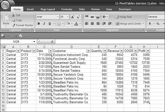
When you look at a pivot table, you might say, for example, “Wait a second, this particular customer never buys that particular product. What is going on?” A pivot table makes this question easy to answer. You can select the revenue cell for that customer. In the figure, Cell B14 is the value cell showing sales to Secure Yardstick in January 2007. At this point, you can either double-click B14 or select B14 and click the Expand Entire Field button. In response to either action, Excel goes back to the original dataset and extracts the records that comprise the sales. Excel then writes the records to a new worksheet to the left of your pivot table sheet. This trick works for any value cell in the pivot table. In Figure 11.6, choosing Expand Entire Field causes Excel to extract all the records for the central region sales of product D173 in 2008.
Figure 11.6. To query the records behind the selected number, you can double-click the cell or click Expand Entire Field.

The results of expanding Cell C10 in Figure 11.6 are shown in Figure 11.7. Excel always adds a new sheet to the left of the pivot table. Also, if you discover a problem with this data, remember that you need to go back to the original dataset to make corrections.
Figure 11.7. Excel quickly extracts just the 2008 records for D173 for the central region.
Report Layout Options
All the figures so far in this chapter have shown Excel’s new default compact form of the pivot table. If you prefer the Excel 2003 style of pivot tables, you can switch back to those styles. To do so, you need to access the Layout group on the Design ribbon in order to revert to the old style.
Figure 11.8 shows the outline form of the pivot table from the preceding example. In this view, each field in the row area takes another column in the table. Whereas the compact form puts Region, Product, and Customer all in Column A, the outline form uses Columns A, B, and C for these three fields. Note that by default the outline form shows the total for each group at the top of the group.
Figure 11.8. The outline form of a pivot table.

Figure 11.9 shows the tabular form of the same pivot table. This is the style of pivot tables that has been around since pivot tables were introduced in 1993. As you can see, a total appears at the bottom of each group.
Figure 11.9. The tabular form of a pivot table.

In addition to the three report layout options, you can choose to move the subtotals to the bottom of each group in either the compact or outline forms of the pivot table. You can choose this option from the Subtotals icon of the Layout group of the Design ribbon. Figure 11.10 shows the compact form with a subtotal at the bottom of each group.
Figure 11.10. Subtotals can move to the bottom of any layout style.

Adding Blank Rows
A new feature in Excel 2007 is that you can toggle on and off a blank row between groups in a pivot table. You do this in a drop-down below the Blank Rows icon in the Layout group of the Design ribbon. Adding a blank row between groups makes the presentation easier to read, as shown in Figure 11.11.
Figure 11.11. Blank rows between groups improve the readability of the data.

Turning Off Totals
Sometimes a pivot table is just an intermediate result. Perhaps you need to use the totals presented by a pivot table as a new database. In that case, you really would want just one row for each unique combination of region, product, and customer. The subtotal rows between products and regions would actually get in the way. In such a case, you can use the Subtotals drop-down in the Layout group of the Design ribbon to turn off the subtotals. This produces a tight table of data, as shown in Figure 11.12. You can also turn off the grand totals by using the Grand Totals drop-down in the same group.
Figure 11.12. You can turn off the subtotals to produce a dataset with one row for each unique combination of the row fields.

Despite years of requests, Microsoft still cannot provide a view of this data where the regions and products are repeated in the blank cells in Columns A and B. To solve that problem, see the section “Excel in Practice,” later in this chapter.
Removing a Field from a Pivot Table
To remove a field from a pivot table, you use the Drop zones section of the PivotTable Field List box. You can drag a field from the layout section back to the field list. When you are above the field list, the mouse cursor changes to a black X. At this point, you release the field to remove it from the pivot table.
Another way to remove a field from a pivot table is to use the drop-down associated with the field in the Drop zones area of the PivotTable Field List box, as shown in Figure 11.13. This drop-down includes the option Remove Field, which removes the field from the drop zones but leaves it available in the Field List box for future use.
Figure 11.13. To remove a field, you can either drag it from this area or use the drop-down.

Special Considerations When Adding Data Fields to the Value Section
Pivot tables take on a strange quality when you attempt to report more than one value field combined with two or more label fields. Figure 11.14 shows a fairly nice-looking pivot table that summarizes revenue by product and year.
Figure 11.14. Like most of the other examples in this chapter, this pivot table looks good because there is only one value field.

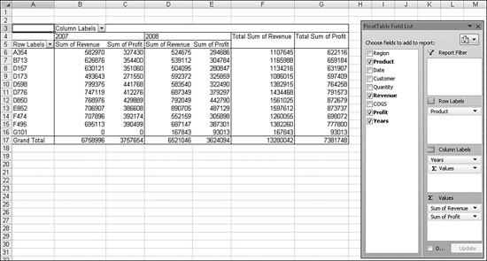
In real life, your manager would look at this table and ask if you could add a profit field to the analysis. This seems simple enough: You could drag the Product field from the field list and drop it in the Σ Values layout section of the PivotTable Field List box. When you do this, though, Excel produces the horrible-looking table shown in Figure 11.15. Revenue is reported in Columns B, D, and F. Profit is interspersed between the revenue numbers. The label Total Sum of Revenue is incredibly redundant.
Figure 11.15. Excel’s default view with two value fields is horrible.
Notice in the Column Labels drop zone section of the PivotTable Field List box that a new button has been added. You can move this Σ Values button to one of three other locations in an attempt to make the table look better.
If you move the button to be the first column label, you rearrange the revenue columns to appear in Columns B, C, and F, as shown in Figure 11.16. This table still feels disjointed, with the Total Sum of Revenue column separated from the Sum of Revenue column.
Figure 11.16. Revenue and total revenue are still disjointed.

If you move the Σ Values button to be the first row label, the resulting view (shown in Figure 11.17) actually looks fairly good, except that the Total Sum of Revenue row that should appear as Row 16 actually appears as Row 27.
Figure 11.17. If Microsoft would move Row 27 to Row 16, this view would look good.

The final option is to move the Σ Values button so that it is the second row label. As you can see in Figure 11.18, this is a noisy view of the data.
Figure 11.18. Unfortunately, this is the final option. It is difficult to decide which of the four views is the least annoying.
Tip From
![]()
The Excel team could solve this problem by adding a new option to the Totals & Filters tab of the PivotTable Options dialog. The option could be called Multiple Value Fields: Keep Grand Total with Each Value Field. There is even space for this option. If Microsoft would add this one option, pivot tables would reach a state of perfection.
Formatting a Pivot Table
Excel offers many PivotTable Styles formatting galleries on the Design ribbon and many conditional formatting choices on the Home ribbon. You can safely use either of these options to format a pivot table.
If you instead try to format individual cells in a pivot table, you will experience frustration. After you rearrange the pivot table, your manual formatting will be lost or damaged.
Using the PivotTable Styles
The PivotTable Styles group on the Design ribbon contains many built-in styles for a pivot table. These styles differ significantly from the built-in styles available in Excel 2003. Whereas the AutoFormat styles in Excel 2003 would actually change the shape of a pivot table, the formatting styles in Excel 2007 simply apply a style to the table, without changing the structure.
To start formatting a pivot table, you select a style from the PivotTable Styles group. Figure 11.19 shows a style with banded columns.
Figure 11.19. The first step in formatting should be to select a master style from the PivotTable Quick Styles group on the Styles ribbon.

Caution
There are some PivotTable Styles that do not support banded rows or banded columns. If you find that clicking Banded Rows has no effect, try selecting a different style. Hint: If you turn on Banded Rows before selecting the PivotTable Styles dropdown, the gallery will show which styles allow for banded rows.
Modifying the PivotTable Styles Group with the PivotTable Style Options
After choosing a style, you can fine-tune the gallery options.
All the icons in the Layout group turn on and off various elements of the style chosen in the Styles group. In Figure 11.20, the banded columns have been turned off to remove the alternate column formatting. Row headers have also been turned off, so the bold font has been removed from Column A.
Figure 11.20. Turning off row headers only turns off the bold formatting applied to Column A. It does not affect the row headers.

In Figure 11.21, the banded columns and row headers have been turned back on. Banded columns provide the lighter shading in Columns C, E, G, and I. Row headers make Column A appear in bold font. The column headers in this table have been turned off, which means the dark shading has been removed from Rows 3 through 5. Note that turning banded rows on or off has no effect because the selected style does not support banded rows.
Figure 11.21. The four icons in the PivotTable Style Options group turn on and off various elements of the built-in style.
Modifying the PivotTable Styles Group with the Themes Icons
On the Page Layout ribbon, you can use the Themes group to further modify the style selected in the PivotTable Styles group. The style you selected in the PivotTable Styles group in the previous section features banded columns. By using the Themes drop-down or the Colors drop-down, you can change the color scheme applied to the table. This increases the visual appeal of the pivot table immensely.
Figure 11.22. You can change the look of a pivot table by applying a new theme or color to it.
Modifying the PivotTable Styles Group by Customizing a Style
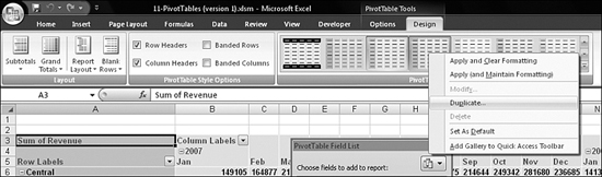
You can create new styles, but it is usually easier to modify an existing style. To do this, in the PivotTable Styles group of the Design ribbon, you can right-click a style and choose Duplicate, as shown in Figure 11.23.
Figure 11.23. Rather than build a style from scratch, you can duplicate one that is similar.
If you modify Table Style 3, Excel offers the new name Table Style 3 2. You can give the style a new descriptive name in the Modify Table Quick Style dialog. You can customize numerous elements. Without even touching the Format button, you can do some cool modifications. For example, you can use banded rows. In the Table Element list box, you choose First Row Stripe. A new setting called Stripe Size appears on the right side of the table. If you change the Stripe Size setting from 1 to 2, the color banding for the dark rows will comprise two rows. You can change Second Row Stripe so that it also has a stripe size of 2. The banded rows then use alternate stripes that are each two rows high. (Note that you have to click OK to see the change in your worksheet.) Figure 11.24 shows how the worksheet looks after you apply the setting and then redisplay the Modify Table Quick Style dialog.
Figure 11.24. Stripe Size controls how many rows or columns are in each color band.

After duplicating a style, the duplicated style will appear at the top of the PivotTable Styles gallery. Select the duplicated style in order to apply it to your pivot table.
After you specify a new style, it appears in the PivotTable Styles group in the Design ribbon. You can right-click the new style and choose Modify if you want to further refine the style. To modify a particular portion of a table, you can choose the element from the Table Element list box in the Modify Table Quick Style dialog and then click Format. You can modify the alignment, font, border, and fill for an element. In Figure 11.25, the First Header Cell setting is modified to have a 14-point bold italic typeface.
Figure 11.25. You can apply different formatting to any element of a pivot table.

Using Conditional Formatting
Doing so is a little tricky, but you can get conditional formatting to work properly for a pivot table. Before using conditional formatting, you should choose from the Styles group of the Styles ribbon a group that has minimal formatting.
To try using conditional formatting, select Cells B5:C34, as shown in Figure 11.26. This comprises the complete Sum of Revenue section, except for the grand totals. On the Home ribbon, you choose the Conditional Formatting drop-down and then choose Data Bars. If you choose one of the six styles shown, it automatically applies to just the 60 cells selected. Instead, you want to select More Rules.
Figure 11.26. The key to successfully applying a conditional format to a pivot table is to select More Rules instead of a default style.

When you select More Rules, the New Formatting Rule dialog appears. You can see in Figure 11.27 that Excel was planning to apply the rule to the selected cells. This is the default.
Figure 11.27. Even though a pivot table is selected, Excel defaults to the selected cells.
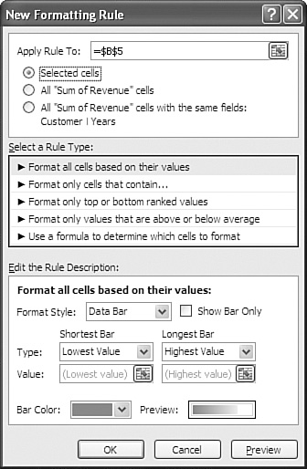
There are two additional options in the dialog. If you select the All “Sum of Revenue” Cells option button, Excel applies the formatting to the selected cells plus the grand total row and the grand total column. This will not give the right effect because the total row, with totals for 30 customers, will far and away get the largest bar. All the other customers will be relegated to short bars.
Instead, you want to choose the option button All “Sum of Revenue” Cells with the Same Fields: Customer | Years. The result is that the data bars are applied just to the interior of the pivot table, as shown in Figure 11.28.
Figure 11.28. If you limit the data bars to the customer rows of the Sum of Revenue section, the data bars scale intelligently.

By following these steps, you can pivot any other single field into the Row Labels section of the layout and still maintain an intelligent data bar. Figure 11.29 shows a pivot table showing products. Figure 11.30 shows a pivot table showing regions. Figure 11.31 shows a pivot table showing quarters. In each case, the data bars scale appropriately.
Figure 11.29. The data bars work fine as the table is changed to show products.

Figure 11.30. The data bars also work fine as the table is changed to show regions.

Figure 11.31. The data bars also work fine as the table is changed to show quarters.

The data bars somewhat fail when you add two fields to the Row Labels section. In Figure 11.32, the subtotals in Rows 5, 17, and 29 overshadow the individual product totals in the other rows. This causes the data bars for the individual products to all look relatively similar, which dampens the impact.
Figure 11.32. The conditional formatting is not as effective when the Row Labels section has two fields.

Excel in Practice: Fixing the Blank Cell Dilemma
In this chapter you have built a pivot table to find the revenue for each unique combination of region, product, and customer. Say that you now need to produce a CSV (comma-separated values) file to be imported into another system.
Using the tools in Excel, you remove the grand totals and the subtotals. You also switched to a tabular layout. The result, as shown in Figure 11.33, is nearly perfect.
Figure 11.33. Pivot tables get you 90% of the way to the final goal.

The problem with this pivot table is that Excel does not fill in the blank cells in Columns A and B. But every computer system in the world expects those cells to be filled in. Even Excel could not deal with this worksheet as the input for any data analysis tools.
To solve this problem, you follow these steps:
- Create a new blank workbook.
- Switch back to the original workbook.
- Select the entire pivot table.
- Press Ctrl+C to copy the pivot table.
- Switch to the new workbook.
- Use Home, Paste, Paste Values to paste the values to Cell A1.
- Select all the cells in Columns A and B, starting in Row 3 and extending down to the end of the data.
- Press F5 to display the Go To dialog.
- Click the Special button in the Go To dialog.
- Choose the Blanks selection in the Go to Special dialog.
- Press the = key, the up-arrow key, and Ctrl+Enter. Each blank is filled with the value from above it.
- Reselect the data in Columns A and B.
- Press Ctrl+C to copy.
- Choose Home, Paste, Paste Values to change the formulas to values.
- Use File, Save As to save this workbook for another system.