Chapter 9. Visualizing Data in Excel
In this chapter
Creating In-Cell Bar Charts with Data Bars 155
Creating Heat Maps with Color Scales 158
Using Stop if True to Improve All Conditional Formatting 164
Using the Top/Bottom Rules 166
Using the Highlight Cells Rules 168
Tweaking Rules with Advanced Formatting 174
Clearing Conditional Formats 186
Extending the Reach of Conditional Formats 187
Special Considerations for Tables 187
Special Considerations for Pivot Tables 188
Many people feel their eyes glaze over when they encounter a screen full of numbers. Fortunately, Microsoft has added terrific new data visualization features to Excel 2007 that make those screens full of numbers a little easier on the eyes.
Excel has had a weak conditional formatting feature for a decade. It was limited and tricky to use. Excel tipsters often showed the incredibly hard way to make conditional formatting just a bit more powerful.
In Excel 2007, Microsoft has made data visualization easy to use. You are just a few clicks away from features that would have required a Ph.D. in past versions of Excel. The following are some of the new possibilities in data visualization:
- Adding data bars (that is, tiny, in-cell bar charts) to cells based on the cell value.
- Adding color scales to cells based on the cell value. This is often called a heat map.
- Adding icon sets (think traffic lights) to cells based on the cell value.
- Adding color, bold, italics, patterns, and so on to cells based on the cell values.
- Quickly identifying cells that are above average. Quickly identifying the top n or bottom n% of cells.
- Quickly identifying duplicate values.
- Quickly identifying dates that are today or yesterday or last week.
- After you’ve added icons or color, sorting by color or by icon. This is a huge improvement, especially for VBA programmers who used to want to know which conditions were being met by a conditional format.
The following are some of the improved data visualization features in Excel 2007:
- A cell can meet more than one condition. If you have one rule that makes the cell bold and another rule that makes the cell red, for example, you can have some cells that are red, some that are red bold, some that are bold, and some that are normal.
- There is no longer a limit of only three rules per cell.
- You can easily manage rules. If you want to change the order in which rules are applied, it is easy to reorder the rules.
- It is now obvious that a cell’s format can be based on other cell values. This was always the case in earlier versions of Excel, but most people using conditional format never discovered the secret. Further, a big improvement is that a formula can now refer to a cell on another worksheet in the current workbook.
When you use conditional formatting in a defined table, you have the option of highlighting the entire row if a cell in the row meets the condition.
Although it is very easy to set up basic conditional formatting, you need to know a few tricks, which I tell you about later in this chapter, for creating better conditional formatting than most people will figure out on their own.
Creating In-Cell Bar Charts with Data Bars
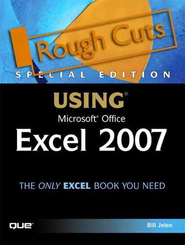
A data bar is a semitransparent swath of color that starts at the left edge of a cell. The smallest numbers in a formatted range have just a tiny bit of color in the cell. The largest numbers in the formatted range are 90% filled with color. This creates a visual effect that enables you to visually pick out the larger and smaller values.
Creating data bars requires just a few clicks. You follow these steps:
- Select a range of numeric data (but do not include the total row in this selection). This range should be numbers of the same scale. For example, select a column of sales data or a column of profit data. If you attempted to format a column with number of vehicles sold in a month and a column of total dollars from those vehicles, none of the unit sold data would be large enough to warrant any color in the cell.
- From the Home ribbon, in the Style group, select the Conditional Formatting icon.
- Choose Data Bars from the drop-down. You can then choose one of six colors for the data bars: blue, green, red, orange, light blue, or purple. If you don’t like these six basic colors, you can choose any color, as described in the next section.
The result is a swath of color in each cell in the selection, as shown in Figure 9.1.
Figure 9.1. It takes four clicks to create data bars in one of six basic colors.

The data bar demonstrates a significant improvement over conditional formatting in Excel 2003. In prior versions, conditional formatting would assign a color based on a simple true/false test. In Excel 2007, the conditional formatting is a comparison between a set of cells.
Customizing Data Bars
By default, Excel assigns the largest data bar to the cell with the largest value and the smallest data bar to the cell with the smallest value. You can customize this behavior by following these steps:
- From the Conditional Formatting drop-down on the Home ribbon, choose Manage Rules.
- From the Show Formatting Rules drop-down, choose This Worksheet. You now see a list of all rules applied to the sheet.
- Click the Data Bar rule.
- Click the Edit Rule button. You will see the Edit Formatting Rule dialog, as shown in Figure 9.2.
Figure 9.2. You can customize data bars by using this dialog.

- To change the color of the bar beyond the six basic colors, choose the Bar Color drop-down. You can choose from the theme colors or standard colors, or you can build any RGB value by choosing More Colors.
- Select the Show Bar Only check box. Excel hides the numbers in the cells and shows only the data bars. This is an interesting variation, as shown in Figure 9.3.
Figure 9.3. Showing only the data bar is an interesting alternative.
There are two Type drop-downs: Shortest Bar and Longest Bar. These drop-downs offer choices for Lowest Value and Highest Value, Number, Percent, Formula, or Percentile. These are completely explained below.
Controlling the Size of the Smallest/Largest Data Bar
Sometimes, your data might have a few outliers. This happens with any dataset. Say that 99% of your customers are over $1,000 in sales, but a couple stray accounts have sales of just a few dollars. Microsoft gives you explicit control over the cell value that gets the smallest bar.
For example, consider Column A in Figure 9.4. The values are basically in the 1000 to 2000 range. However, one outlier value of 10 forces Excel to assign a medium-sized data bar to the 1000 value in Cell A1.
Figure 9.4. The default setting for D1:D7 assigns a value of 1000 as the shortest bar. The one outlier in Row 6 doesn’t cause all the 1000–2000 values to appear the same.

For the numbers in Column D, the steps in the preceding section were used to edit the rule. In this case, you can set the Shortest Bar Type drop-down to 1000. Excel then treats any value of 1000 as the value with the shortest bar. Any value less than 1000 is given the same size bar as the 1000 bar.
Here are the rules for each of the Type options:
- For Lowest Value/Highest Value, Excel evaluates all the values in the range of cells and selects the lowest value as the shortest bar and the highest value as the longest bar. This is the default behavior.
- For Number, you enter the values that should receive the shortest and/or longest bars. For numbers that are more or less than that value, Excel simply draws the shortest or longest bar, as appropriate.
- For Percent, you enter a percentage to associate with the shortest and longest bars. For example, if the values in the selected cells range from 0 to 1000, then a minimum value associated with 10% would be 100. In this example, any cells having values equal to or less than 100 would have the shortest bar drawn in the cell.
- Percentile examines the values in the range of cells, sorts them, and then uses their positions within the sorted list to determine their percentiles. In a set of 20 ordered cells, the 30th percentile would always be the sixth cell, regardless of the value contained within it. If you choose percentile and enter 10 for the shortest bar and 90 for the longest bar, any outliers outside the 10–90 range would get the shortest or longest bar assigned to them.
- Formula allows you to enter a formula. The formula is evaluated to determine the value used for the shortest and longest bars. This is useful for developing conditional formats that aren’t easily handled by the other four choices.
The one frustrating feature with data bars is that you cannot reverse the size of the data bars. Although in some scenarios such as top 100 rankings the lowest score might deserve the largest bar, there is no way to make this happen with a data bar. If you need to do this, you should consider using color scales instead.
Creating Heat Maps with Color Scales
Color scales are similar to data bars. Instead of a variable-size bar in each cell, however, the color scale uses gradients of two or three different colors to communicate the relative size of each cell. Here’s how you apply color scales:
- Select a contiguous range within your data. Be sure not to include headings or total cells in the selection.
- On the Home ribbon, select the Conditional Formatting drop-down, and then select Color Scales.
- From the Color Scales fly-out, select one of the eight styles to apply the color scale to the range. Note that this fly-out offers subtle differences that you should pay attention to. The top four options are scales that use three colors. These are great onscreen or with color printers. The bottom four options are scales that use two colors. These are better with monochrome printers.
In a default color scale with a three-color scale, the smallest cells are assigned a value of red. The middle values are assigned a value of yellow. The largest cells are assigned a value of green. Even within the green values, the larger numbers are more green than the other numbers.
In Figure 9.5, values from 50 through 80 are various shades of green. Values such as 50 are a light yellow-green, and values of 80 are dark green.
Figure 9.5. Excel’s new 32-bit color support provides a different shade for every value.
Converting to Monochromatic Data Bar
As you can see from the black-and-white screen images in this book, color scales with three colors do not look that good when printed on a monochromatic printer. When you know you’ll be printing in black and white, one option is to convert the color scale to a monochromatic scale that will vary from white to a dark color. To do so, you follow these steps:
- Select a single cell in your formatted range.
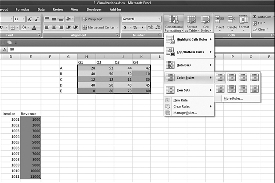
- From the Insert ribbon, choose Conditional Formatting, Manage Rules. In the Conditional Formatting Rules Manager dialog that appears, the initial drop-down defaults to Current Selection. This will work fine, provided that your selection is part of the range that has conditional formatting. The dialog shows any conditional formatting rule(s) applied to the current selection, as shown in Figure 9.6.
Figure 9.6. Manage rules in the Conditional Formatting Rules Manager dialog.
- Even if there is only one rule in the dialog, click the rule to select it and then click Edit Rule. Initially, the Edit Formatting Rule dialog shows the default three-color red-yellow-green scale, as shown in Figure 9.7. You might believe from this dialog that you can apply a color scale to only cells that are above or below average, but the dialog does not work that way. This common dialog is used to edit many types of conditional formatting, and color scales only apply to the top rule type, “Format all cells based on their values.”
Figure 9.7. The Edit Formatting Rule dialog box is used throughout conditional formatting. Only the top rule type is valid for color scales.

- For color scales, change any of the settings in the lower half of the dialog box, in the Edit the Rule Description section. The Format Style drop-down includes the options 2-Color Scale, 3-Color Scale, Data Bar, and Icon Sets. Choose 2-Color Scale from the drop-down.
- For the minimum, select the color drop-down and choose white. For the maximum, select the color drop-down and choose a dark color.
- Choose Preview to apply the effect to the range. If it is acceptable, click OK to return to the Conditional Formatting Rules Manager dialog and then click OK again to complete the operation.
Troubleshooting Color Scales
Excel 2007 considers a three-color scale and a two-color scale to be completely different visualizations. This leads to some erratic behavior when you attempt to change the color scale pattern by using the Color Scale icon on the Conditional Formatting drop-down.
Say that you use the icon to apply a three-color red-yellow-green visualization. You decide to go back to the icon and instead apply a three-color blue-yellow-red visualization. Excel 2007 is smart enough to convert the red-yellow-green pattern to blue-yellow-red. This behavior is logical enough.
However, say that you decide to choose a visualization from the second row of color scales—perhaps the green-to-yellow visualization. Even though this is accessed on the same fly-out menu, Excel 2007 considers the two-color scale to be a different visualization. Instead of replacing the visualization, Excel adds a second rule. This can lead to muting of the colors from both rules.
To avoid this problem, when switching from two-color to three-color scales, be sure to use the Manage Rules choice at the bottom of the Conditional Formatting menu in order to convert from a three-color to a two-color scale.
Using Icon Sets to Add Icons Based on Value
The final type of new conditional formatting is called an icon set. Icon sets were popular with expensive management reporting software in the late 1990s. They’ve now been added to Excel. An icon set might include green, yellow, and red traffic lights, or another set of icons to show positive, neutral, and negative meanings. Excel can automatically apply an icon to a cell based on the relative size of the value in the cell compared to other values in the range.
Initially, icon sets look like they will be cool. However, there are a few limitations that will make them annoying in Excel 2007. I suspect that the implementation of icon sets will improve greatly in future versions of Excel.
Excel 2007 ships with icon sets that contain either three, four, or five different icons. The icons are always left-justified in the cell. Excel applies rules to add an icon to every cell in the range:
- For the three-icon sets, you have a choice between arrows, flags, two varieties of traffic lights, signs, and two varieties of what Excel calls “3 Symbols.” This last group consists of a green check mark for the good cells, a yellow exclamation point for the middle cells, and a red X for the bad cells. You can either get the symbols in a circle (that is, 3 Symbols (Circled)) or alone on a white background (that is, 3 Symbols (Uncircled)). One version of the arrows is available in gray. All the other icon sets use red, yellow, and green.
- For the four-icon sets, there are two varieties of arrows, a red-to-black circleset, a series of cell-phone power indicators, and a set of four traffic lights. In the traffic light option, a black light appears indicates an option that is even worse than the red light. The ratings icons seem to have promise for working well on both a color display and a monochromatic printout.
- For the five-icon sets, there are two varieties of arrows, a set of five power bar icons, and an interesting set called five quarters. This last set is a monochrome circle. The circle is completely empty for the lowest values, 25% filled, 50% filled, 75% filled, and completely filled.
Samples of the 16 available icon sets are shown in Figure 9.8.
Figure 9.8. Excel 2007 offers 16 varieties of icon sets.

Setting Up an Icon Set
Given that icon sets are in their first Excel incarnation, they require a bit more thought than the other data visualization offerings. Before you use icon sets, you should consider whether they will be printed in monochrome or displayed in color on the screen. Several of the 16 icon sets rely on color for differentiation and will look horrible in a black-and-white report.
After creating several reports with icon sets, I have started to favor the power bar indicators made popular by cell phones. They look good in both color and black and white. These icons are available in either four-icon or five-icon sets. To set up an icon set, you follow these steps:
- Select a range of numeric data of a similar scale. Do not include the headers or total rows in this selection.
- From the Home ribbon, in the Styles group, select the Conditional Formatting icon.
- Choose Icon Sets from the drop-down. Select 1 of the 16 icon sets. In Figure 9.9, the “4 Ratings” choice is selected.
Figure 9.9. Initially, this icon set is horrible looking.

Moving Numbers Closer to Icons
In Figure 9.10, the icon set has been applied to a rectangular range of data. The icons are always left-justified. There is no way to center them. And there is no way to have an icon appear to the right of the value. This was an oversight on the part of the Excel team. In Figure 9.10, the icons for Column I appear to apply to the numbers in Column H.
Figure 9.10. With a combination of justification and indenting, you can move the numbers closer to their icons.

One way to mitigate this problem is to center all the numbers in the range. This at least puts the value and the icon closer together. Rows 12 through 16 of Figure 9.10 show this solution.
Choosing left-justified is unsatisfactory. The numbers are completely hidden by the icon set, as shown in Rows 20 through 24 of Figure 9.10.
A better solution is to left-justify the numbers and then click the increase indent button twice. Rows 28 through 32 show this solution.
Reversing the Sequence of Icons
In Figure 9.11, the values in the cells track reject rates for several manufacturing lines. The icon set offers green check marks, yellow exclamation points, and red X icons.
Figure 9.11. Excel gives green check marks to the highest reject rates.

In the default view of the data, Excel always assumes that higher numbers are better. This is not the case in this situation, where higher reject rates are bad.
Unlike with color scales or data bars, with icon sets, you can reverse the order. To do so, you follow these steps:
- Select one cell in your data.
- From the Conditional Formatting icon, select Manage Rules.
- Choose the Icon Set rule by clicking Icon Set. The rule color changes from gray to blue.
- Click the Edit Rule button. The Edit Formatting Rule dialog appears.
- In the Edit Formatting Rule dialog, choose the Reverse Icon Order check box. Click OK twice to close both open dialog boxes.
The icon order is reversed, as shown in Figure 9.12.
Figure 9.12. The bad cells now get the red X icons.

Using Stop if True to Improve All Conditional Formatting
The data visualizations described so far in this chapter cause every cell in the range to receive color, icons, or data bars. This is somewhat limiting. What if you just want an icon on the really bad cells? What if you only want a color scale on the top 20% of records? How can you do this? The process is unintuitive, but it is easy to set up. Basically, you apply the icon set or color scale to the entire range. Then, you add a new conditional format—a very boring format—to all the cells that you don’t want to have the icon. For example, you might tell Excel to use a white background on all cells with values less than 5. The final important step is to manage the rules and tell Excel to stop processing more rules if the first rule is met. This requires a bit of cleverness. If you want to apply icons to cells with values over 10, you first tell Excel to make all the cells under 10 look like every other cell in Excel. Turning on Stop if True is the key to getting Excel to not apply icons to cells with values under 10.
Figure 9.13 shows a useful visualization in which only reject rates of 10% or above receive a red icon. All the other cells have no icons.
Figure 9.13. Using Stop if True on an invisible rule for the cells that are okay is the key to having icons appear on the really bad cells.

In Figure 9.13, the goal is to have a red X appear on any cell that contains a value of 10 or above. You can use the following steps to create an analysis similar to this:
- Select the range of numeric data.
- Choose Conditional Formatting, Icon Sets, 3 Symbols (Uncircled).
- Choose Conditional Formatting, Highlight Cell Rules, Less Than. The Less Than dialog appears.
- In the Less Than dialog, enter the first number that should have the icon (10 in this example). Everything less than this number will have alternate formatting.
- The With drop-down initially shows Light Red Fill with Dark Red Text. Change this to Custom Format. Excel displays the Format Cells dialog, expecting you to choose a font color, border, fill, or number format.
- You want cells meeting this condition to stay as white cells, so simply click OK to close the Format Cells dialog.
- Click OK to close the Less Than dialog. It may appear that steps 3 through 6 had no impact. Don’t be concerned that nothing appears to be working yet!
- Choose Conditional Formatting, Manage Rules. The Conditional Formatting Rules Manager dialog appears, showing two rules. The rule that you added most recently is on top, ready to be evaluated first.
- The rightmost column contains a check box called Stop if True. Check this box for the Cell Value < 10 rule. Checking this box prevents the Icon Set rule from being run when the value is under 10.
- While still in the Conditional Formatting Rules Manager dialog, click the Icon Set rule to select it and then click Edit Rule. The Edit Formatting Rule dialog appears.
- In the Edit Formatting Rule dialog, click the Reverse Icon Order check box at the bottom of the dialog.
- The default values for the icon set now have the dialog box showing “X when value is >= 67 percentile.” Change the first Type drop-down from Percentile to Number.
- In this example, every cell with a reject rate of 10 or above needs an icon, so change the first Value text box to a value of 10.
- Although you really don’t care about the other two icon ranges, Excel presents an error message that the icon ranges overlap. You therefore have to fix the settings for the second range. Change the second Type drop-down from Percentile to Number. Change the second Value drop-down to anything that won’t interfere with the first icon.
- Click OK to close the Edit Formatting Rule dialog. Click OK to close the Conditional Formatting Rules Manager dialog. You have now achieved the desired effect.
Although this seems like an intimidating set of instructions, the Conditional Formatting Rules Manager dialog and the Edit Formatting Rule dialog are intuitive to navigate, and you can complete this process quickly.
Using the Top/Bottom Rules
The top/bottom rules are a mix of the old- and new-style conditional formatting. They are similar to the old conditional formatting because you must select one formatting scheme to apply to all the cells that meet the rule. However, they are new because rather than specifying a particular number limit, you can ask for any of these conditions:
- Top 10 Items—You can ask for the top 10, top 20, or any number of items.
- Top 10 %—If 20% of your records account for 80% of your revenue, you can highlight the top 20% or any other percentage.
- Bottom 10 Items—To highlight the lowest-performing records, you choose Bottom 10.
- Bottom 10 %—To highlight the records in the lowest 5%, you choose Bottom 10%.
- Above Average—You can highlight the records that are above the average. As with all the other rules, the average is recalculated as the numbers in the range change.
- Below Average—You can highlight the records that are below the average.
To set up any of these conditional formatting rules, you follow these steps:
- From the Home ribbon, select Conditional Formatting, Top/Bottom Rules, and then choose one of the six rule types shown in Figure 9.14.
Figure 9.14. You can choose one of these six rule types.

The dialog for above/below average does not require you to select a threshold value, but for the other four rule types, Excel asks you to enter the value for N. As you change the spin button, the Live Preview feature keeps updating the selection with the appropriate number of highlighted cells.
- The drop-down portion of the dialog initially shows Light Red Fill with Dark Red Text. When you choose the drop-down, you have the six default styles shown in Figure 9.15 and the powerful Custom Format option. If one of the six styles is suitable, choose it. Otherwise, proceed to step 3.
Figure 9.15. There are six canned format styles available for any rule. If you don’t like these, you can choose Custom Format.

- If you choose Custom Format, you are taken to a special version of the Format Cells dialog box. This version has Number, Font, Border, and Fill tabs. You can choose settings on one or more of these tabs. Click OK to close the Format Cells dialog.
- Click OK to close the dialog box for your particular rule.
Excel adds the rule to the list of rules. By default, rules added most recently are applied first.
Using the Highlight Cells Rules
The traditional conditional formatting rules appear in the Highlight Cells Rules menu item of the Conditional Formatting drop-down, along with several new rules. The traditional rules include Greater Than, Less Than, Between, and Equal To. Note that slightly obscure rules such as Greater Than or Equal To are hidden behind the More Rules option. The following are the new rules:
- Text That Contains—This rule allows you to highlight cells that contain certain text.
- A Date Occurring—With this rule, you can define conceptual rules such as yesterday, today, tomorrow, last week, this week, next week, last month, this month, next month, or in the last seven days. The conceptual rules are based on the system clock, so if you open the workbook next week, the rows highlighted change, based on the system clock.
- Duplicate Values—With this rule, you can highlight both records of a duplicate or highlight all the records that are not duplicated.
The options for Highlight Cell Rules are shown in Figure 9.16.
Figure 9.16. Many powerful and easy conditions are available in the Highlight Cell Rules menu.

Highlighting Cells by Using Greater Than and Similar Rules
You might think that Greater Than and the similar rules for Less Than, Equal To, or Not Equal To are some of the less powerful conditional formatting rules. In fact, these are the first rules described in this chapter that you can use to base the conditional format threshold on a particular cell or cells. This allows you to build some fairly complex rules without having to resort to the formula option of conditional formatting.
To set up a rule to highlight values greater than a threshold, you follow these steps:
- Select a range of data. Unlike with the other rules, you might choose to include totals in this selection.
- Select Home, Styles, Conditional Formatting, Highlight Cell Rules, Greater Than to display the Greater Than dialog box.
- Enter a threshold value in the Greater Than dialog.
- Choose one of the six formats from the With drop-down. Or, choose Custom Format from the With drop-down to have complete control over the number format, font, borders, and fill.
- Click OK to apply the format.
By way of example, let’s look at several options for filling in the threshold value in the Greater Than dialog box. Figure 9.17 shows the conditional formatting rule for all cells greater than 700. This is a simple threshold value.
Figure 9.17. You can format all cells greater than a certain value, such as 700.

If you use the reference icon at the right side of the threshold box, you can select a particular cell. In Figure 9.18, Cell B2 was selected using the reference box. Note that Excel filled in the correct format of =$B$2.
Figure 9.18. You can format all cells greater than a certain cell. You use an equals sign and an absolute reference with both dollar signs.

The fact that Excel used an equals sign is a good indication that you can fill in any formula in the Greater Than box. Furthermore, you can achieve some interesting effects by using cell references that are not absolute references.
The trick here is to pay attention to which cell is the active cell in the name box. To select the range B2:C22, you might click in C22 and drag up to B2. This would leave the active cell as C22. Or, you might click in B2 and drag down to C22. This would leave the active cell as B2. Conditional formatting formulas should always be built assuming that the top-left cell of the selection is the active cell.
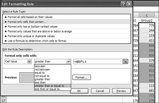
You can use the following steps to create a conditional formatting rule to highlight any cell in Column C where the value is greater than 110% of the corresponding value in Column B:
- Click in Cell C2 and drag down to the end of the data. Make sure that the name box indicates that C2 is the active cell.
- Select Home, Styles, Conditional Formatting, Highlight Cell Rules, Greater Than. The Greater Than dialog appears.
- In the Greater Than dialog box, click in the Refers To box and then click on B2. Excel enters the formula
=$B$2. - Press the F4 key twice to change the reference to
=$B2. This allows Excel to compare each cell to the value in B, but it allows the row to change for each cell. The key point here is that your active cell is in Row 2 of Column C, so the cell referred to must also be in Row 2. - The insertion point will be at the end of
=$B2. Notice that in the lower-left corner of your screen, the indicator says Point. This is a very frustrating state. If you start to type and make a mistake, using any arrow key will insert new cell addresses instead of backspacing. Before you start typing the rest of the formula, press the F2 key until the status changes from Point to Edit. - Type the rest of the formula,
*1.1, as shown in Figure 9.19.Figure 9.19. Although the greater-than concept seems simplistic, you can build some fairly complex formulas in this quick format dialog.

- Click OK to accept the formula.
Excel highlights all the cells in Column C that are 110% of Column B or greater.
The greater-than concepts discussed here apply equally well to the Less Than, Equal to, and Between rules. If you need to access other rules, such as Greater Than or Equal To, you can follow these steps:
- Set up the rule by using Greater Than.
- From the Conditional Formatting icon, choose Manage Rules.
- Select the Greater Than rule and click Edit Rule.
- Use the drop-down shown in Figure 9.20 to select Greater Than or Equal To.
Figure 9.20. After using a quick format with Greater Than, you can go to the Manage Rules option to change from Greater Than to Greater Than or Equal To.
Comparing Dates by Using Conditional Formatting
The date feature is new in Excel 2007. If you are familiar with the reporting engine in Quicken or QuickBooks, the list of available dates will seem similar. A nice feature is that Excel understands the dates conceptually. If you define a feature to highlight dates from last week, the rule automatically updates based on the system clock. If you open the workbook a month from now, new dates are formatted, based on the conditional formatting.
Some of the date selections are self-explanatory, such as Yesterday, Today, and Tomorrow. Other items need some explanation:
- A week is defined as the seven days from Sunday through Saturday. Choosing This Week highlights all days from Sunday through Saturday, including the current date.
- In the Last 7 Days includes today and the six days before today.
- This Month corresponds to all days in this calendar month. Last Month is all days in the previous calendar month. For example, if today is May 1 or May 31, the period Last Month applies to April 1 through April 30.
Figure 9.21 shows the various formatting options, with a system date of May 14, 2007.
Figure 9.21. In the Last 7 days is the odd option among the date formatting options.

The date formatting option would be particularly good for highlighting the items in a to-do list that are due, overdue, or about to be due. You can follow these steps to set up a conditional format for maintenance due dates:
- Select a range of cells that contain dates.
- From the Home ribbon, choose Conditional Formatting, Highlight Cell Rules, A Date Occurring. Choose This Week from the drop-down and a yellow font on a yellow background.
- From the Home ribbon, choose Conditional Formatting, Highlight Cell Rules, A Date Occurring. Choose Last 7 Days from the drop-down. Leave the format as a red font on a red background.
- Choose Conditional Formatting, Manage Rules. Click New Rule.
- In Select a Rule Type, choose Format Only Cells That Contain.
- In the bottom drop-down, select Dates Occurring. In the right drop-down, choose Today.
- Click the Format button. Choose a white font and a green background.
- Click the OK button to return to the Conditional Formatting Rules Manager dialog. If you followed steps 1 through 7, the Today rule should be first, followed by the Last 7 Days rule, followed by the This Week rule. Click the Stop if True check mark for each of the three rules. Click OK to apply the rules.
This set of rules highlights items due today in green. Anything that is past due in the past 6 days is highlighted in red. Future items from this week are highlighted in yellow.
Identifying Duplicate or Unique Values by Using Conditional Formatting
Conditional formatting can mark either duplicate or unique values in a list of values. It seems that Microsoft missed an opportunity to include a different version of unique values than the one that it included. It would be very useful if they had included an option to mark only the first occurrence of each unique item.
In Column A of Figure 9.22, Excel has marked the duplicate values. Both Adam and Bill appear twice in the list, and Excel has marked both occurrences of the values. You might be tempted to sort by color to bring the red-fonted cells to the top, but you will still have to carefully go through to delete one of each pair.
Figure 9.22. Marking duplicates or unique values with conditional formatting requires additional work to decide which of the duplicates to keep in order to produce a unique list.

In Column C of Figure 9.22, Excel has applied a conditional format to the unique values in the list. In Excel parlance, this means that Excel marks the items that appear only once in a list. If you would keep just the marked cells as a list of the unique names in the list, you would effectively miss any name that was duplicated.
In a perfect world, this feature would have the logic to include one of each name in the conditional format. You would end up with C3, C4, C5, and C8 highlighted. In the current implementation, you have to write a complex COUNTIF equation to mark the unique values.
Using Conditional Formatting for Text Containing a Value
The Text That Contains formatting rule is designed to search text cells for cells that contain a certain value.
Figure 9.23 contains a column of cells. Each cell in the column contains a complete address, with street, city, state, and zip. It would normally be fairly difficult to find all the records for a particular state. However, this is easy to do with conditional formatting. You simply follow these steps:
Figure 9.23. Without having to use a wildcard character, the new Text That Contains dialog allows you to mark cells based on a partial value.

- Select a range of cells that contain text.
- From the Home ribbon, choose Conditional Formatting, Highlight Cell Rules, Text That Contains.
- In the Refers To box, enter a comma, a space, and the state that you want to find. Note that this test is not case-sensitive (for example, searching for “, nj” is the same as searching for “, NJ”).
- Choose an appropriate color from the drop-down.
- Click OK to apply the format.
As with the Find dialog box, you are allowed to use wildcard characters. You can use an asterisk (*) to indicate any number of characters, and you can use a question mark (?) to indicate a single character.
Tweaking Rules with Advanced Formatting
All the formats available from icons on the Conditional Formatting group are referred to as quick formatting. According to legend, the Excel team bought a number of Excel books, and if the author spent a page trying to explain a convoluted way to format something using formulas in conditional formatting, then that option became a quick formatting icon.
Every quick formatting item has an option at the bottom called More Rules. When you click this option and get to the New Formatting Rule dialog, you find that there are options available that didn’t make it as quick formatting icons.
The next section of this chapter discusses using the formula option for conditional formatting. Almost anything is possible by using the formula option, but it is harder to use than the quick formatting icons. If Excel offers a built-in, advanced option, you should certainly use it instead of trying to build a formula to do the same thing.
The lists shown in Tables 9.1 and 9.2 are organized to show all the options for specific rule types. The six rule types are in the top of the New Formatting Rule dialog. Items listed in the right column are advanced options that are only available by clicking More Rules.
Table 9.1. Options for Formatting Cells Based on Content

Table 9.2. Options for Formatting Values That Are Above or Below Average

Using a Formula for Rules
Excel has three dozen quick conditional formatting rules and twice as many advanced conditional formatting rules. What if you need to build a conditional format that is not covered in the quick or advanced rules? As long as you can build a logical formula to describe the condition, you can build your own conditional formatting rule based on a formula.
Some basic tips can help you successfully use formulas in conditional formatting rules. When you understand these rules, you can build just about any rule you can imagine.
One new feature in Excel 2007 is that a formula is allowed to refer to cells on another worksheet. This allows you to compare cells on one worksheet to a worksheet from a previous month or to use a VLOOKUP table on another worksheet.
Getting to the Formula Box
To set up a conditional format based on a rule, you follow these steps:
- Select a range of cells.
- In the Style group of the Home ribbon, choose Conditional Formatting, Add New Rule.
- In the New Formatting Rule dialog, choose the rule type “Use a formula to determine which cells to format.” You now see the New Formatting Rule dialog box, which is shown in Figure 9.24.
Figure 9.24. The New Formatting Rule dialog is the gateway to many powerful custom formatting rules.

The following section give you some tips for building a successful formula.
Working with the Formula Box
Following are the key concepts involved in writing a successful formula:
- The formula must start with an equals sign.
- The formula must evaluate to a logical value of
TRUEorFALSE. The numeric equivalents of1and0are also acceptable results. - When you use the mouse to select a cell or cells on a worksheet, Excel inserts an absolute reference to the cell. This is rarely what you need for a successful conditional formatting rule. You can immediately press the F4 key three times to toggle away the dollar signs in the formula.
- You probably have many cells selected before starting the conditional formatting rule. You need to look at the left of the formula bar to see which cell in the selection is the active cell. If you write a relative formula, you should write the formula that would appear in the active cell. Excel applies the formula appropriately to all cells. This is a key point. If you look in Figure 9.24, you’ll see that the name box indicates that the active cell is A1. Any conditional formatting rule needs to be written as if you were writing for cell A1.
- If the dialog box is in the way of cells you need to select, you can drag the dialog box out of the way by dragging the blue title bar. If you absolutely need to get the dialog box out of the way, you can use the Collapse Dialog button at the right side of the formula box. This collapses the dialog to a tiny area. To return it to full size, you click the Expand Dialog button at the right side of the collapsed dialog.
- The formula box is one of the evil set of controls that have three possible statuses: Enter, Point, and Edit. Look in the lower-left corner of the Excel screen. The status initially says that you are in Enter mode. This means that Excel is expecting you to type characters such as the equals sign. If, instead, you use the mouse to select a cell, Excel changes to Point mode. In Point mode, the selected cell’s address is added to the formula box. The annoying thing is that from Enter mode, if you use any of the navigation keys (that is, Page Down, Page Up, Left Arrow, Right Arrow, Down Arrow, Up Arrow), Excel also changes to Point mode. This can be very frustrating if you are using the Left Arrow key to edit a portion of the formula.
- The solution to working with the formula bar is to use the F2 key. You can press the F2 key to toggle between Enter, Edit, and Point mode. Before using the Left Arrow key or Right Arrow key to move within a formula, you must press F2 until the status bar indicates that you are in Edit mode.
The following sections describe several useful conditional formatting rules. This list only scratches the surface of the possible rules you can build. It is designed to generate ideas of what you can accomplish by using conditional formatting.
Finding Cells Containing Data from Yesterday, Today, or Tomorrow
The quick formatting feature offers to highlight yesterday or today or tomorrow, but what if you need to find any cells that are either yesterday, today, or tomorrow?
There are a couple ways to approach this formula. Each way uses the TODAY() function, which returns the date from the system clock.
The first formula is to write several tests to see if the selected cell is equal to various values, as follows:
=TODAY()=B4highlights values from today.=B4=(TODAY()-1)highlights values from yesterday.=B4=(TODAY()+1)highlights values from tomorrow.
To write a formula that highlights cells that have any of these three, you have to combine the three things in the OR() function, like this:
=OR(TODAY()=B4, B4=(TODAY()-1), B4=(TODAY()+1))
Instead of using this formula, you could instead write a formula that subtracts the cell from the TODAY() function. In the preceding three scenarios, the result of TODAY()-B4 would be either -1, 0, or 1.
To simplify the formula, you could use the ABS() absolute value function to convert the result to a positive number and then see if the result is less than two.
In Figure 9.25, the formula =ABS(TODAY()-B4)<2 highlights the dates that are within one day of today. Note in this figure that the active cell is B4; hence, the use of B4 in the formula. You can generalize this formula by changing the 2. If you used 8 instead of 2, you would highlight everything within plus or minus one week of today.
Figure 9.25. This formula highlights everything within one day of today.

Finding Cells Containing Data from the Next Seven Days
In the A Date Occurring dialog, there is an option to display the last seven days. There is no corresponding feature to display the next seven days.
In Figure 9.26, the active cell is D4. The following would be the formula to find everything in the next seven days:
=D4-TODAY()<=7
Figure 9.26. This formula is a bit complex, but it gives you the equivalent of Next 7 Days. Clearly, the quick format option Last 7 Days is far easier, but because Microsoft did not give you a Next 7 Days option, you can create this on your own.

However, this would highlight everything in the past as well as items in the next week. To limit the rule to only items that are after today, you would use the following:
=D4>TODAY()
To combine these two rules into a single formula, you would use this:
=AND(D4>TODAY(),(D4-TODAY())<=7)
To generalize this formula, you could change the 7 to any number of days.
Finding Cells Containing Data from the Past 30 Days
The Excel quick formatting option offers to highlight this month or last month. However, highlighting this month or last month can mean a number of vastly different things. Highlighting this month on the second of the month shows a lot of the future and only 1 day of the past. The same rule on the 29th of the month highlights a lot of the past and only a few days of the future. It would be more predictable to write a rule that shows the past 30 days.
You create this rule similarly to the way you created the Next Seven Days rule in the preceding section. You first compare the date in the cell by using TODAY() to make sure the date in the cell is less than today. Because the active cell in Figure 9.27 is F4, you use the following formula:
=F4<TODAY()
Figure 9.27. For completeness, this conditional formatting formula can show you the last n days. If n were 7, you would use the quick formatting option. For all other values of n, you use this formula.

You then can subtract F4 from TODAY() to see if it is less than or equal to 30. This portion of the formula is as follows:
=(TODAY()-F4)<=30)
To combine these into a single formula, you use the AND() function:
=AND(F4<TODAY(),(TODAY()-F4)<=30)
To generalize this formula for other periods, such as the past 15 days or the past 45 days, you change the 30 to a different number.
Highlighting Data from Specific Days of the Week
The WEEKDAY() function converts a date to a number from 1 through 7. When used without any additional arguments, the value of WEEKDAY(date) for a Sunday is 0 and Saturday is 7.
In Figure 9.28, the active cell is H4. If you needed to highlight all the Wednesdays, you could check to see if WEEKDAY(H4)=4. To find all the Fridays, you would check to see if WEEKDAY(H4)=6. To find either date, you would use =OR(WEEKDAY(H4)=4,WEEKDAY(H4)=6).
Figure 9.28. Highlighting a particular day of the week is easy with WEEKDAY(). This formula is a bit complex to highlight dates that are either Wednesday or Friday.

To generalize this formula, you could substitute any number from 1 through 7 to highlight Sundays, Mondays, and so on.
Highlighting the First Unique Occurrence of an Item
Excel offers two quick conditions for highlighting either duplicates or unique items. However, neither of them do what you really need. Ideally, you would want a rule that highlights the first unique item in a list. Then, all the highlighted items would make up the unique items in the list. Or, you might want a rule that highlights the second, third, and fourth instance of a duplicated item but not the first item.
You can use the COUNTIF function coupled with a very strange range argument to solve this problem: =COUNTIF(A2:A10,A2) counts how many times A2 occurs in the range A2:A10. You want Excel to count the occurrence of each cell in all the cells above and including the current cell. In Cell A10, this formula would be =COUNTIF(A$2:A10,A10). If the value is 1, then you know this is the first occurrence of the value in A10. If the value is greater than 1, then this value is a duplicate of a value already in the list.
It is easier to picture the formula for the 10th row of the range than for the 1st row of the range. However, the formula remains relatively the same.
In Figure 9.29, the active cell is A2. To highlight the first unique value and not highlight the duplicates, the formula in the conditional formatting formula needs to be =COUNTIF(A$2:A2,A2)=1. The really important element of this formula is the one single dollar sign before one portion of A2 in the first argument of the formula.
Figure 9.29. Unlike the quick formatting for unique values, this rule creates a true list in which every unique value is highlighted once. The unhighlighted cells are duplicates.

Highlighting True Duplicates
The Excel quick conditional formatting rule for duplicates highlights all cells that are duplicated. This is great if you need to manually inspect each pair of duplicates and decide which record to keep. However, if you just want to blindly keep the first occurrence from each duplicate, you need a way to highlight the second and subsequent duplicates in the range.
This example is nearly identical to the previous example: You can edit that formula to check whether COUNTIF is greater than 1 instead of equal to 1.
In Figure 9.30, the active cell is A2. The conditional formatting formula needs to be =COUNTIF(A$2:A2,A2)>1.
Figure 9.30. You can delete all the highlighted cells and still have a unique list of values.

Highlighting a Specific Row
If you use the new table feature in Excel 2007, highlighting an entire row is simple: The Edit Rule dialog offers an option to highlight the entire row.
However, if you do not want to use the table feature in Excel, you can still highlight the entire row, based on the value in one column of the row.
In Figure 9.31, cell A2 is the active cell. You need to select the entire range of A2:G14. Your goal is to write a rule for all of those cells that will look at Column D for the same row as the cell. In this case and in any case in which you want to highlight the entire row based on one column, you use the mixed reference with a dollar sign before the column letter. You want to see if =$D2 is equal to the largest value in the range.
Figure 9.31. The combination of a mixed reference and the absolute reference allows you to highlight an entire row.
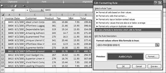
To find the largest value in Column D, you use an absolute reference to D2:D14—that is, =MAX($D$2:$D$14). The conditional formatting formula for this specific case is =$D2=MAX($D$2:$D$14).
To change this rule to highlight the smallest value in Column D, you change MAX to MIN.
To base the test on another column, you simply change D to the other column in three places in the formula.
Clearly, using the Excel 2007 table feature and the Format Entire Row check box is easier than using the formula. The formula is shown here for cases in which you are prevented from using or don’t want to use the table feature.
Highlighting Every Other Row Without Using a Table
You might find yourself using the Format as Table feature only to add alternating bands of color to a table. If you don’t need the other table features, using a conditional format can achieve the same effect.
Do you remember when you were first learning to do division? You would express the quotient as an integer and then a remainder. For example, 9 divided by 2 is 4 with a remainder of 1, sometimes written as 4R1.
The trick to formatting every other row is to check the remainder of the row number after dividing by 2. Excel has functions that make this easy. First, =ROW(A2) returns the row number of the given cell. Next, =MOD(ROW(A2),2) divides the row number by 2 and tells you the remainder. The task is then simply to highlight the rows where the remainder is equal to 1.
In Figure 9.32, the active cell is A2. The formula to achieve the banding effect is =MOD(ROW(A2),2)=0.
Figure 9.32. It is possible to create a row banding effect without using the Excel 2007 table formatting.

To generalize this formula for your particular dataset, you could change A2 to be the active cell’s address.
The Excel 2007 table formatting allows you to create alternate formatting where every other two rows are formatted. To duplicate this with conditional formatting, you have to divide the row number by 4 and examine the remainder. There are four possible remainders; 0, 1, 2, and 3. You can either look for results greater than 1 or less than 2 to be formatted. To do this, you change the preceding formula to =MOD(ROW(A2),4)<2, as shown in Figure 9.33.
Figure 9.33. By changing the divisor in the MOD function, you can create different banding effects.

Combining Rules
A major improvement in conditional formatting in Excel 2007 is the ability to have multiple conditions evaluate to TRUE. In prior versions of Excel, when a condition was met, Excel quit evaluating additional conditions. For each rule in Excel 2007, you can decide whether Excel should stop evaluating additional rules or whether Excel can continue evaluating rules.
For example, one rule might set the font color to blue. Another rule might set the font style to bold. Cells meeting both rules can be formatted in blue bold. Cells meeting one rule can be either blue or bold. Cells meeting neither rule will be in normal font style.
If two rules attempt to create conflicting formatting, Excel uses the first rule in the list. For example, if Rule 1 turns the font red and Rule 7 turns the font blue, the font is red.
There are 10 types of formatting that can be changed in each cell. Naturally, each type conflicts with others of the same type. Only the first rule that evaluates to TRUE can change the fill color.
Very few formatting styles conflict with each other. Only the cell fill and the color scale are mutually exclusive. Otherwise, you can have up to nine rules evaluate to true for any given cell. Table 9.3 illustrates the interplay between the 10 formatting styles.
Table 9.3. Cell Formatting Styles

Clearing Conditional Formats
There are a number of ways to clear conditional formats. A few quick options are available from the ribbon:
- You can highlight the entire range with conditional formatting and then use Home, Styles, Conditional Formatting, Clear, Selected Cells. This removes all conditions from the current selection.
- To clear all the conditional formats from the current worksheet, you can use Home, Styles, Conditional Formatting, Clear, Entire Sheet. This is handy if you have only one set of rules set up on the sheet. You can delete all the rules without having to select the entire range.
- If you have rules assigned to a pivot table or a table, you can select one cell in the pivot table or table. This enables new options for Home, Styles, , Conditional Formatting, Clear, This Table or Home, Styles, Conditional Formatting, Clear, This PivotTable.
Note
Deleting columns or deleting rows deletes the rules associated with those columns or rows. Using the Delete key on the keyboard or selecting Home, Editing, Clear, All or Home, Editing, Clear, Formats removes the rules.
If you have multiple rules assigned to a range and you need to delete just a portion of those rules, you can use Home, Styles, Conditional Formatting, Manage Rules. In the Conditional Formatting Rules Manager dialog, you should use the top drop-down to display rules in the current selection, this worksheet, or any other worksheet. You can then highlight a specific rule and click the Delete Rule button.
Extending the Reach of Conditional Formats
In every example in this chapter, you have been advised to highlight the entire range before setting up the conditional format. It is also possible to assign a conditional format to one cell and then extend the rule to other cells. There are two ways to copy a conditional format:
- You can select a cell with the appropriate rule and then Ctrl+C to copy it. Then you select the new range and select Home, Clipboard, Paste, Paste Special, Formats, OK to copy the conditional formatting from the one cell to the entire range.
- You can select Home, Styles, Conditional Formatting, Manage Rules. Then you select a rule. In the Applies To column you see the list of cells that have this rule. You can type a new range there or use the collapse button to make the dialog smaller so that you can highlight the new range.
When you are using conditional formats that compare one cell to the entire range, using the second method is safer to ensure that Excel understands your intention.
Special Considerations for Pivot Tables
The next three chapters discuss pivot tables in detail. This section talks about the special conditional formatting options that are available for pivot tables.
A typical pivot table contains two or more levels of summary data. In the pivot table in Figure 9.34, for example, Cells G4:I22 contain sales data. However, data in Column I contains the sum of sales for two different products. If you tried to create a data bar for this entire range, the values in Column I would make the data bars in the G:H range look too small. Similarly, the totals in Rows 4, 10, 16, and 22 would cause the data bars in the detail rows to appear too small.
Figure 9.34. The trick to a successful conditional format in a pivot table is to apply the format only to items at the same detail level.

To set up a data bar for the detail items in a pivot table, you follow these steps:
- Select a detail cell in the pivot table. In Figure 9.36, any cell in G5:H9, G11:H15, or C17:H21 would qualify as a detail cell. All these cells include sales figures, and none of them contain total rows or total columns.
- From the Home ribbon, choose Conditional Formatting, New Rule. The New Formatting Rule dialog appears.
- Because your selection is inside a pivot table, you have new options at the top of the New Formatting Rule dialog:
• Selected Cells—You can apply the rule to just the one cell. This is not what you want in this case.
• All cells showing “Sum of Sales” values—You can apply the rule to cells including the total column, grand total row, and all the subtotal rows. Remember that the size of the grand total causes all the detail items to have data bars that are too small.
• All cells showing “Sum of Sales” values for “Customer” and “Product”—This is the option you use most of the time. The meaning of this option is dependent on careful selection of a detail cell in step 1. If you selected a subtotal row instead, this option would apply the data bars only to the subtotal rows.
Your actual words in the second and third options vary, depending on the fields displayed in your pivot table. For successful pivot table formatting, choose the third option.
- Define the data bar as usual in the New Formatting Rule dialog, as shown in Figure 9.35.
Figure 9.35. New options are available in the top section of the New Formatting Rule dialog for a pivot table.

For more details about pivot tables, see Chapters 10, “Using Pivot Tables to Analyze Data,” through 12, “Using Pivot Tables in Practice.”