
Chapter 16. Enriching the Cube: Relationships and DAX
Relationships in PowerPivot
A relationship in PowerPivot is a connection between two tables that tells Analysis Services how the data between the tables should be correlated. When you import data from a relational database such as SQL Server, PowerPivot uses the foreign key information to infer the relationships between the tables.
Other times, such as when combining data from multiple sources, you need to manually provide the relationship information. Relationships are one of the features that make PowerPivot so powerful as they allow us to mash up data from many unrelated systems and analyze across these systems as long as the data has a definable relationship.
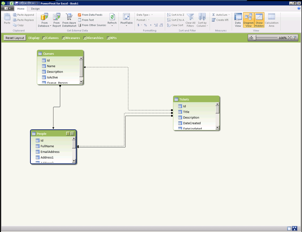
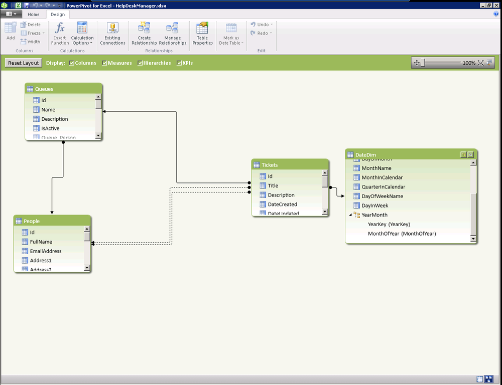
In the SQL Server 2012 release of PowerPivot, it is not possible to work with multiple relationships on a given table. In past releases, only one “active” relationship between tables could be used. The active relationship is shown as a solid line and the inactive relationships are shown as dotted lines in Figure 16-1.
You will notice that there are two relationships between Tickets and People in this example. One relationship is for the requestor of the ticket and one is for the person to whom the ticket is assigned. In PowerPivot version 1, it was only possible to traverse a single relationship between tables. In this release, an additional DAX function was added to allow use of the inactive relationships for calculations.
=CALCULATE([Sum of Measure], USERELATIONSHIP(DimDate[DateKey], FactSales[DateKey]))
This new function can be used in conjunction with the
CALCULATE function to allow aggregation of a measure
based upon a relationship that is not active. The USERELATIONSHIP function simply takes the two
columns that you would like to define the relationship between the
tables.
The active relationship is still the means that PowerPivot will travel by default when traversing the relationship between tables. When an active relationship between tables exists, fetching data from a related table is much easier.
=RELATED(TableName[ColumnName])
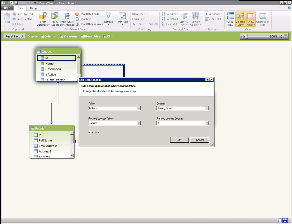
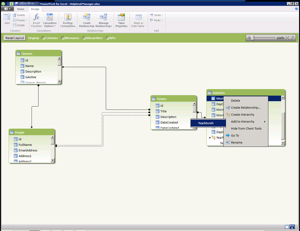
It’s easy at design time to select which relationship is active. The Diagram View (Figure 16-2) is available on the Home tab of the PowerPivot window, and it allows you to view tables in a visual way to easily add and change relationships and hierarchies. Simply double-click on a relationship in the Diagram View to edit tables and columns referenced or to toggle the active flag. Remember, you can have only one active relationship between two tables at a time.
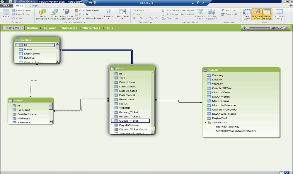
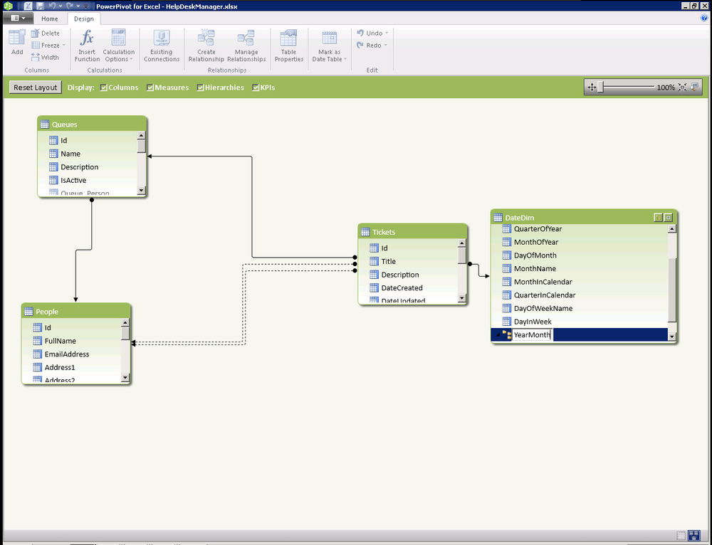
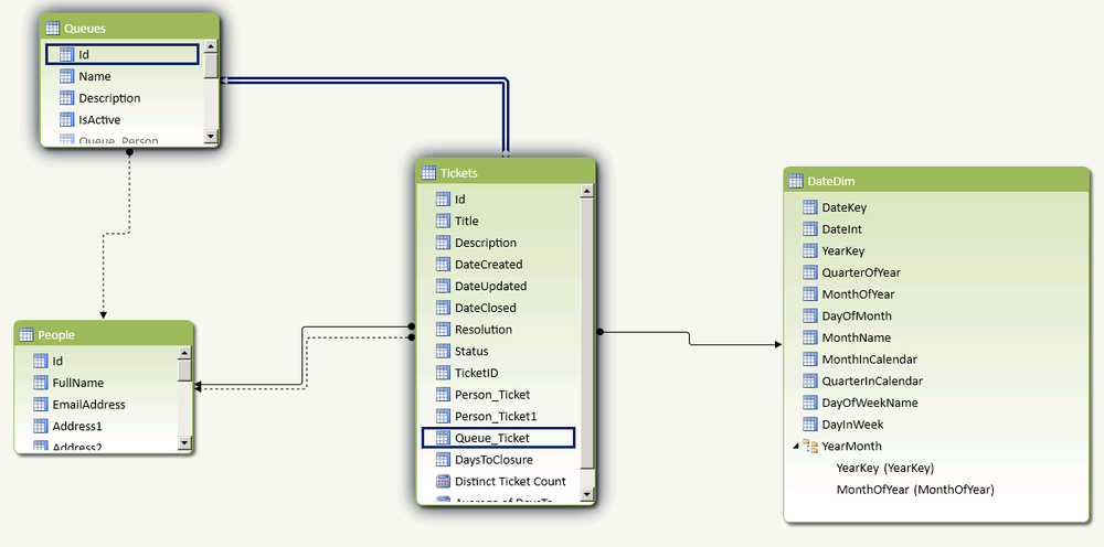
In our final state for this chapter, the Diagram pane will look as shown in Figure 16-3. As you can see, we have activated the relationships between Queues and Tickets to allow us to easily bring back information about the queue a ticket is associated with. We have also added an additional relationship between a new DateDim table that we imported from the cloud in a previous step.
Relationships in PowerPivot are both flexible and powerful. A single
active relationship can exist between any two tables that PowerPivot uses
as a default path when using the model. Additional relationships can be
used via the new USERELATIONSHIP
function in DAX.
In the next few sections we will build on the model we’re creating and enhance it using calculations in DAX.
Manually Adding Relationships
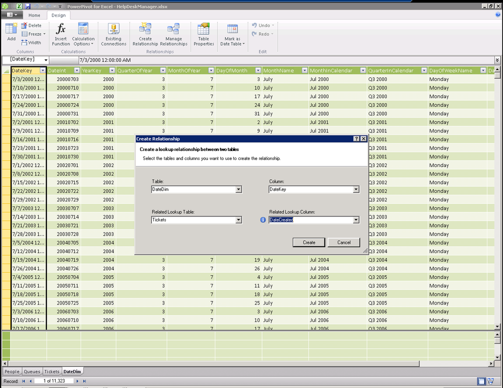
In addition to the relationships that were identified in our source database from foreign keys, we can define additional relationships in PowerPivot. These can easily relate data imported from multiple sources, providing us with the capability to mash up or combine our data with cloud data to achieve new insights. In this case, we are relating our ticket date created to our date dimension imported from the cloud. From the design ribbon, simply choose Create Relationship and supply the fields from the two tables you would like to be related (see Figure 16-4).
Traversing Relationships with DAX
In the last section, we learned about active relationships in our PowerPivot model. We discussed that an active relationship is the default path that PowerPivot will take when navigating between two tables.
In Figure 16-5, we can see a new calculated column that will pull back the name of the assigned person on each ticket. This is a great first exercise in DAX to get you going and start building some confidence in your DAX skills.
Over the next few sections, we’ll be doing a number of quick hits. These short sections are designed to introduce you to unique examples of using DAX to build out the robustness of our model.
=Related(People[FullName])

It’s actually about that easy with an active relationship between two tables. Every calculated column must begin with an equal sign just like the Excel expression syntax upon which DAX is based.
Note
Intellisense will guide you through creation of your DAX expressions by providing auto-complete as you type.
After the data is calculated, you will want to remember to double-click on the column heading and rename the column to something that makes a bit more sense than CalculatedColumn1. Once you know that columns can be renamed with a simple double-click, you’ll never think twice about doing it (Figure 16-6).
Hiding Columns and Tables from Client Tools
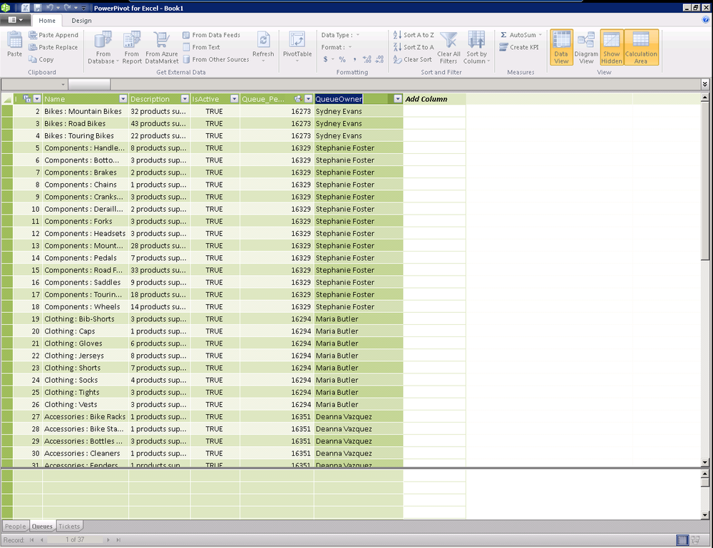
In our last section, we discussed adding a new calculated column based on looking up a value from a related column. In the example shown in Figure 16-7, it’s clear that a customer will prefer to see Maria Butler as the queue owner rather than Maria’s ID of 16924, as shown in the Queue_Person column.
This is another quick hit section on hiding columns that you don’t need your end user to see. Once you know that this is something you should think about, it’s pretty intuitive.
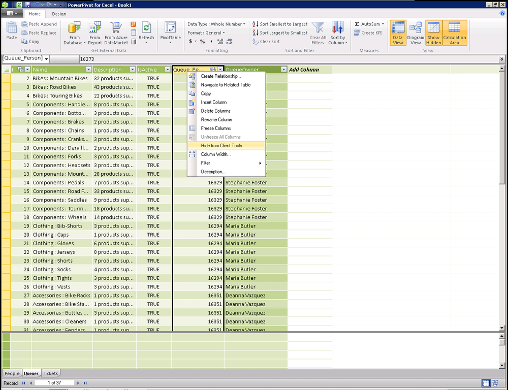
Right-click on a column and select Hide from Client Tools (Figure 16-7) and you will see the column background change to grey (Figure 16-8) to indicate that the column is hidden. You can take this same action on entire tables by right-clicking on the tab for the table at the bottom of the PowerPivot window and selecting Hide from Client Tools.
![Comment [GM2]: AU: Please insert references to figure 9 in the text.Displaying the hidden column](http://imgdetail.ebookreading.net/software_development/6/9781449324667/9781449324667__developing-business-intelligence__9781449324667__httpatomoreillycomsourceoreillyimages1715462.png)
Using DAX to Aggregate Rows in a Related Table
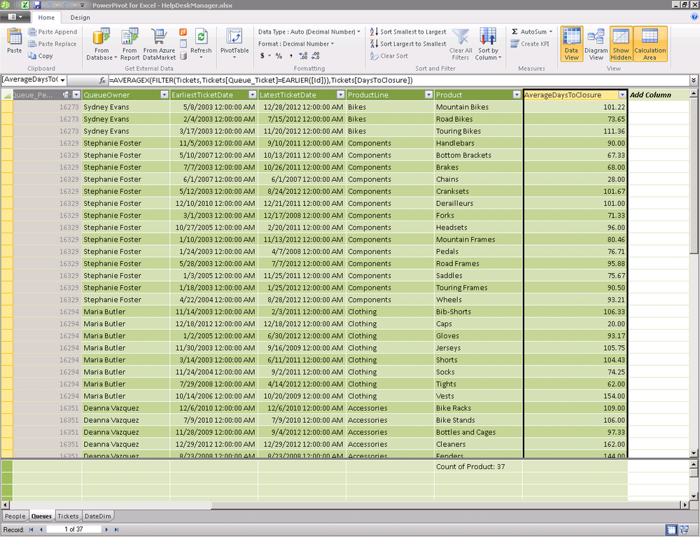
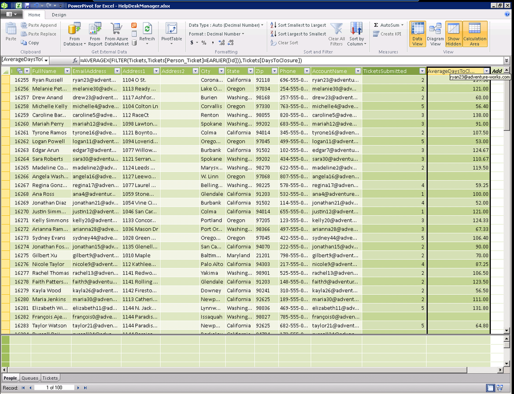
In this example, we will start with our queues table that contains data about each of our help desk queues. We will use a DAX expression to derive the average days a ticket remains open for each queue (see Figure 16-9). This is a great example of leveraging the power of PowerPivot to recalculate the answer to questions that would be costly to answer in Excel at runtime.
=AVERAGEX(FILTER(Tickets,Tickets[Queue_Ticket]=EARLIER([Id])),Tickets[DaysToClosure])
Let’s break this apart to make it easier to understand. There are three noteworthy items in this example.
AVERAGEX(TableName, ColumnToAverage)FILTER(TableName, Filter Expression)EARLIER(ColumnName)
Any of the DAX aggregate functions that end with an X, such as
SUMX, AVERAGEX, COUNTX, etc. all work in the same way. They take
a table of data as the first parameter and the column that we’d like
aggregated as the second parameter.
In our example above, we are providing a filtered subset of the Tickets table and requesting aggregation of the DaysToClosure column. The filter expression itself is also simple.
FILTER(Tickets,Tickets[Queue_Ticket]=EARLIER([Id]))
The first parameter again is the table name we’d like the
FILTER function to act upon. The second parameter is
the expression that must be true for a row to be included in the result
set. The EARLIER expression is useful
for nested calculations where you want to use a certain value as an input
and produce calculations based on that input.
In Microsoft Excel, you can do such calculations only within the context of the current row; however, in DAX you can store the value of the input from the selected row and then make a calculation using data from the entire table. In our case, we are filtering the Tickets table where the tickets belong to the queue whose ID matches the row being evaluated.
Basically for each row in the queue table, we are creating a filtered list of all tickets and then calculating the average time to closure based on that data. This sounds like a lot of work but it all happens in memory at the time the cube is processed, resulting in blazingly fast queries.
Calculating Earliest and Latest Related Dates with DAX
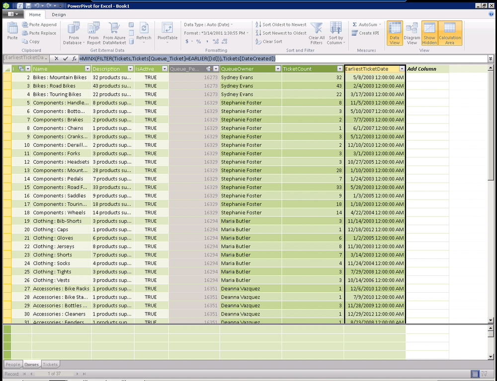
Another scenario worth discussion is retrieving the date of the first ticket entered in each of the help desk queues. There are a few variations of this scenario you may want to explore. What’s the most recent ticket added to each queue? What’s the oldest open ticket in each queue? What’s the last date we closed a ticket in each queue. All of these scenarios focus on the same concept and are just a simple variation on our last example.
Just like the COUNTX, SUMX, and AVERAGEX functions from our last example, the
MINX and MAXX functions take a table of data and a column
you’d like to run the function against.
=MINX(FILTER(Tickets,Tickets[Queue_Ticket]=EARLIER([Id])),Tickets[DateCreated])

=MAXX(FILTER(Tickets,Tickets[Queue_Ticket]=EARLIER([Id])),Tickets[DateCreated])
Once again, we are using the FILTER function to compute a table of the
tickets for each queue and using the EARLIER function to change the context of the
DAX function to reference the ID of each row as it is processed, as seen
in Figure 16-10.
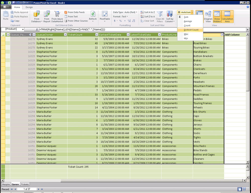
Parsing Strings with DAX
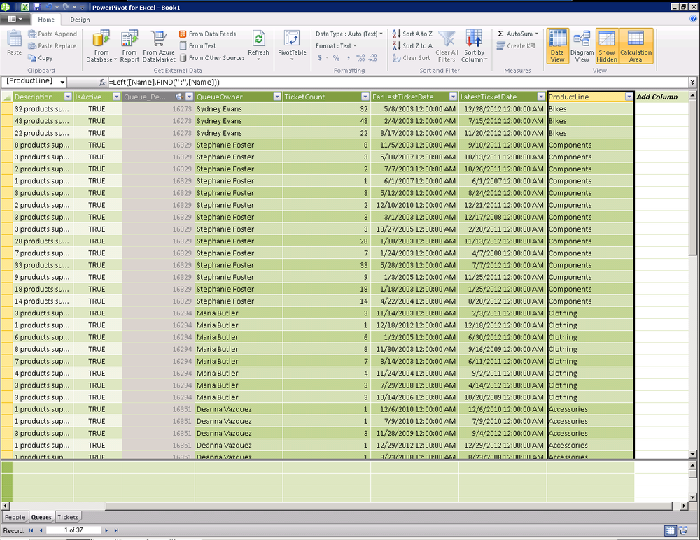
Often, you will find a scenario where you have a string that may contain multiple pieces of information. One such example is the name of our help desk queues. When we imported our sample data in the previous chapter, we named each queue using a combination of a product line and a product. For example, Bikes:Mountain Bikes. When we imported data, we assigned the same employee as owner of each queue for a given product line. You will notice that our database doesn’t capture the product line in its own column, but we can use DAX to extract it from the Queue Name column.
Looking at the example of Bikes:Mountain Bikes, we can see that
everything to the left of the space followed by a colon (:) makes up our
product line. To accomplish this in DAX, we will leverage two additional
functions, LEFT and FIND.
LEFT takes a string and a
number and returns that many characters from the string. |
FIND takes the string for
which you are searching and the string you would like to have searched
and returns the position of where the first string was found. |
You can immediately see how, when used together, these can accomplish our goal.
=Left([Name],FIND(" :",[Name]))This DAX expression takes a number of characters from the queue
name. The number of characters is the result of the FIND function returning the position of our
delimiter. The result is shown in Figure 16-11.
The same techniques can similarly be applied to take the other half
of our queue name and generate a Product column, as shown in Figure 16-12. This time, we use the RIGHT function and we find our starting location
based on the “: ” leveraging the space
on the far side of the colon as our starting point.
This technique is a bit more complicated because the RIGHT function takes the string and once again
requires us to pass in the number of characters that we would like to
take. The number of characters is a bit harder to find, but could be
represented as Total Length of the Queue Name – Location of our delimiter.
We can use the LEN function to find the
length of the string and the rest becomes easy.
=TRIM(Right([Name],LEN([Name])-FIND(": ",[Name])))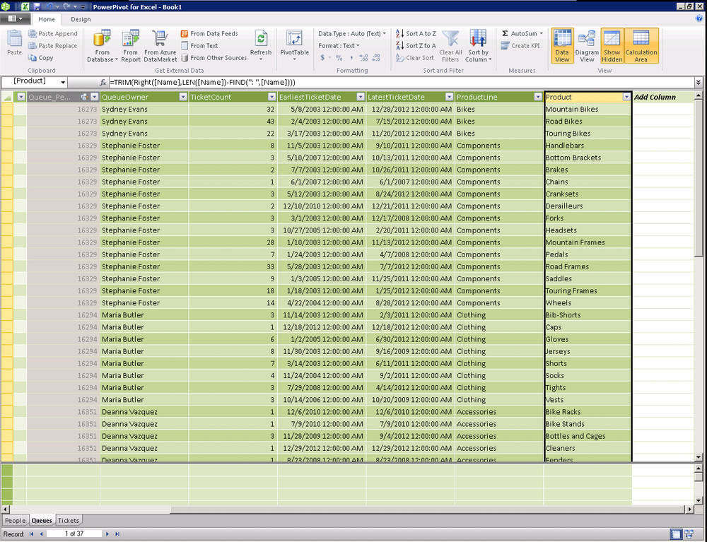
Note
When first getting started with more complex DAX formulas, many people find it easier to create a separate column for each step of the formula. In this case, we used Queue Name Length, Product Line End, Product Start, etc. Breaking apart the formula will allow you to validate each portion of your DAX formula and build confidence in your skills.
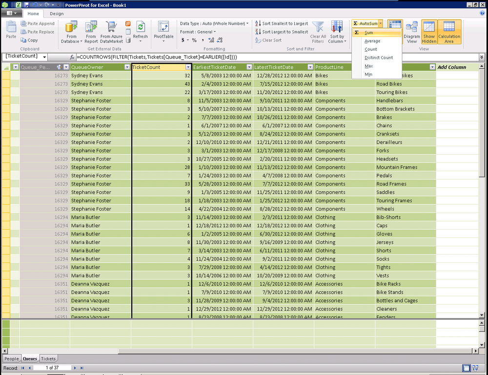
Counting and Aggregating Related Rows with DAX
This next technique, while useful, comes with a warning: usually it is better to simply use your PivotTable to slice a measure created in the original source table. In this example, creating a Distinct Count of Ticket IDs in the Tickets table is typically going to be a better idea than using DAX to calculate this in the Queues table.
First, let’s explore the DAX formula and then let’s discuss why you would think twice before using it.
=COUNTROWS(FILTER(Tickets,Tickets[Queue_Ticket]=EARLIER([Id])))
By now, the DAX syntax should be becoming somewhat familiar. We are filtering the tickets table to return only the rows whose QueueID matches the ID of the current row, as shown in Figure 16-13.
This DAX formula seems pretty simple and does the trick. Figure 16-14 shows a PivotTable comparing our DAX formula on the Queue table in the left column to a Distinct Count of Ticket IDs in the Ticket table. As we can see, at first we are returning the same result from our DAX query.
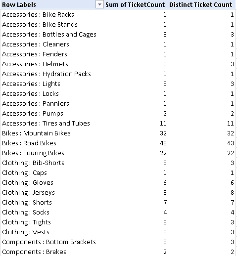
Unfortunately, when we slice our data by another dimension such as quarter of year, month, or year, this technique no longer returns the same data as the measure against our tickets table, as shown in Figure 16-15. The DAX version of our formula will always return the total number of tickets in a given queue and will ignore the added dimensions we are slicing by. It is actually very useful to be able to compare the number of tickets in a given quarter to the total number side by side.
![Tickets tableComment [GM5]: Insert figure title..](http://imgdetail.ebookreading.net/software_development/6/9781449324667/9781449324667__developing-business-intelligence__9781449324667__httpatomoreillycomsourceoreillyimages1715469.png)
Count of Distinct Values with DAX
Leveraging our new columns of Product Line and Product, we may want to create measures with the distinct count of product lines or the distinct count of products.
From the Home tab in the ribbon, simply select the column in the PowerPivot add-in and choose Distinct Count from the AutoSum drop-down list, as shown in Figure 16-16.
PowerPivot will generate a new calculated measure based on the following DAX. As we can see from this example, generating measures is just as simple as using DAX to compute column values. The first half of the expression is the name of the measure; feel free to name the measure anything that makes sense to your users.
Count of Product:=DISTINCTCOUNT([Product])
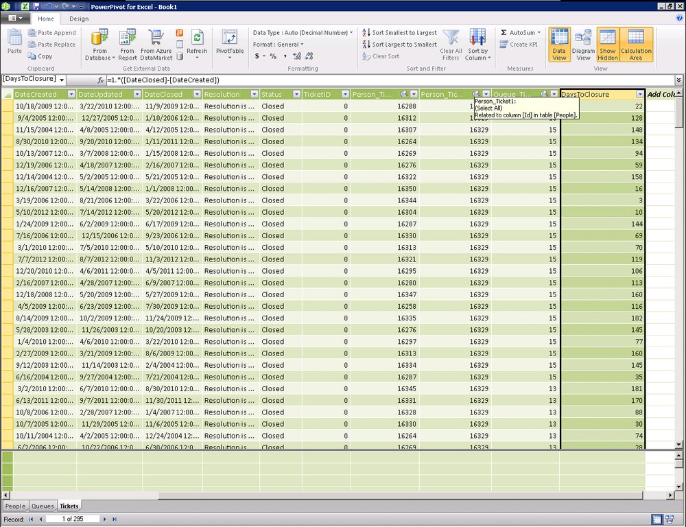
Calculating the Difference Between Dates with DAX
Back on the Tickets table, we’d like to be able to compute the number of days each closed ticket took to be completed, otherwise known as the time to closure. To do this, we need to calculate the difference between the date the ticket was created and the date the ticket was closed.
Before doing this, lets understand how Excel stores dates and times. Regardless of how you have formatted a cell to display a date or time, Excel always stores dates and times in the same way. Excel stores dates and times as a number representing the number of days since 1900-Jan-0, plus a fractional portion of a 24-hour day: ddddd.tttttt. This is called a serial date, or serial date-time.
The integer portion of the number, ddddd, represents the number of days since 1900-Jan-0. The integer portion of the number, tttttt, represents the fractional portion of a 24-hour day. For example, 12:00 PM is stored as 0.50, or 50% of a 24-hour day.
To see this serial date-time value, you can multiply a date value by 1.0. We can use this when calculating the difference between two dates in PowerPivot for Excel.
Calculation Description | Calculated Column Name | DAX Formula |
Serial date-time value for field Date1 | Date1-serial | =1 * [Date1] |
Duration in days between Date2 and Date1 | Duration-Days | =1 * ([Date2]-[Date1]) |
Duration in hours between Date2 and Date1 | Duration-Hours | =24 * ([Date2]-[Date1]) |
Duration in minutes between Date2 and Date1 | Duration-Min | =24 * 60 * ([Date2]-[Date1]) |
Duration in seconds between Date2 and Date1 | Duration-Sec | =ROUND(24 * 60 * 60 * ([Date2]-[Date1]), 1) |
To find the days between the date closed and the date created, simply subtract date created from date closed and multiply by one, as shown in Figure 16-17.
=1*([DateClosed]-[DateCreated])
One might think it’s a good idea to use DAX on the queue table to calculate the average days to closure for each queue. Once again, using DAX to aggregate data from a related table is usually a bad idea and will not slice or necessarily roll up correctly in all scenarios. I would use that technique with caution and would explicitly avoid using it here as we may want to roll up the queues to a product line level. When doing that, we’d be computing the average of the queues rather than the weighted average of the tickets producing the wrong value (trust me, I did try this, as Figure 16-18 proves).
Note
To get a correctly weighted average when rolling up to a product line, we’ll remove this example and aggregate the count from the ticket table. Using DAX to compute aggregations from other tables should always be done with caution.
Adding a Measure from the Excel Side
When viewing your data from the Excel pivot table, you will often
see additional opportunities to add new measures or calculations to answer
additional questions. As an alternative to switching over to the
PowerPivot add-in, the PowerPivot ribbon offers a New Measure dialog box
(see Figure 16-19). The end result of
creating a new measure in this dialog is identical to creating one in the
PowerPivot add-in’s user interface or in a DAX expression. Many users may
find this easier to use as each field is clearly displayed and the user
interface provides a formula builder and a Check
formula function.
![Comment [GM9]: AU: Please insert references to figures 20 in the text.New Measure dialog box](http://imgdetail.ebookreading.net/software_development/6/9781449324667/9781449324667__developing-business-intelligence__9781449324667__httpatomoreillycomsourceoreillyimages1715473.png)
In addition to creating new formulas, you can also select Measure Settings on the ribbon or right-click on a measure in the field list and select Edit Formula. If you are new to PowerPivot, you may find this Measure Settings dialog to be the easiest way to edit your measures.
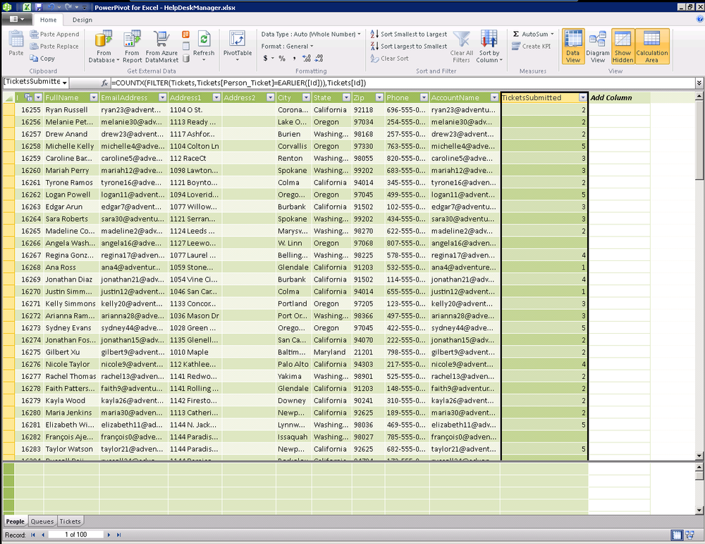
Counting Rows Across an Inactive Relationship
Earlier in this chapter, we discussed relationships in PowerPivot, specifically that you may have one active relationship between any two tables and other relationships are considered inactive.
Our primary approach for creating aggregations is to create the count, sum, and average aggregation by using the AutoSum drop-down on the Home ribbon and then slicing it or rolling it up by dimensions in other tables (see Figure 16-20).
In cases where our relationship is inactive, this is not possible so
we’ll need to get a bit more creative to determine the number of tickets
submitted by each person. You’ll notice in reviewing this DAX expression
that the pattern is very similar. The COUNTROWS function takes a table of data and
returns the number of rows. We are simply filtering the Tickets table with
an expression comparing against the ID of each row.
=COUNTROWS(FILTER(Tickets,Tickets[Queue_Ticket]=EARLIER([Id])))
Or =COUNTX(FILTER(Tickets,Tickets[Person_Ticket]=EARLIER([Id])),Tickets[ID])
Note
Remember that anytime you use this technique to create a measure of data from a related table, you should be careful. Attempts to slice this measure with data from another table such as a date dimension may not work as expected.
When we look at the ticket count we created on the Queues table, it doesn’t correctly slice over time because the measure is created via a DAX expression on the Queues table that doesn’t have our date dimension as a part of its query context. Notice that the same value is returned in every column because our model is unable to correctly slice by date, as seen in Figure 16-21. To make this type of slice work correctly, simple create a distinct count measure on the ID in the Tickets table and you’ll be able to slice it correctly by year.
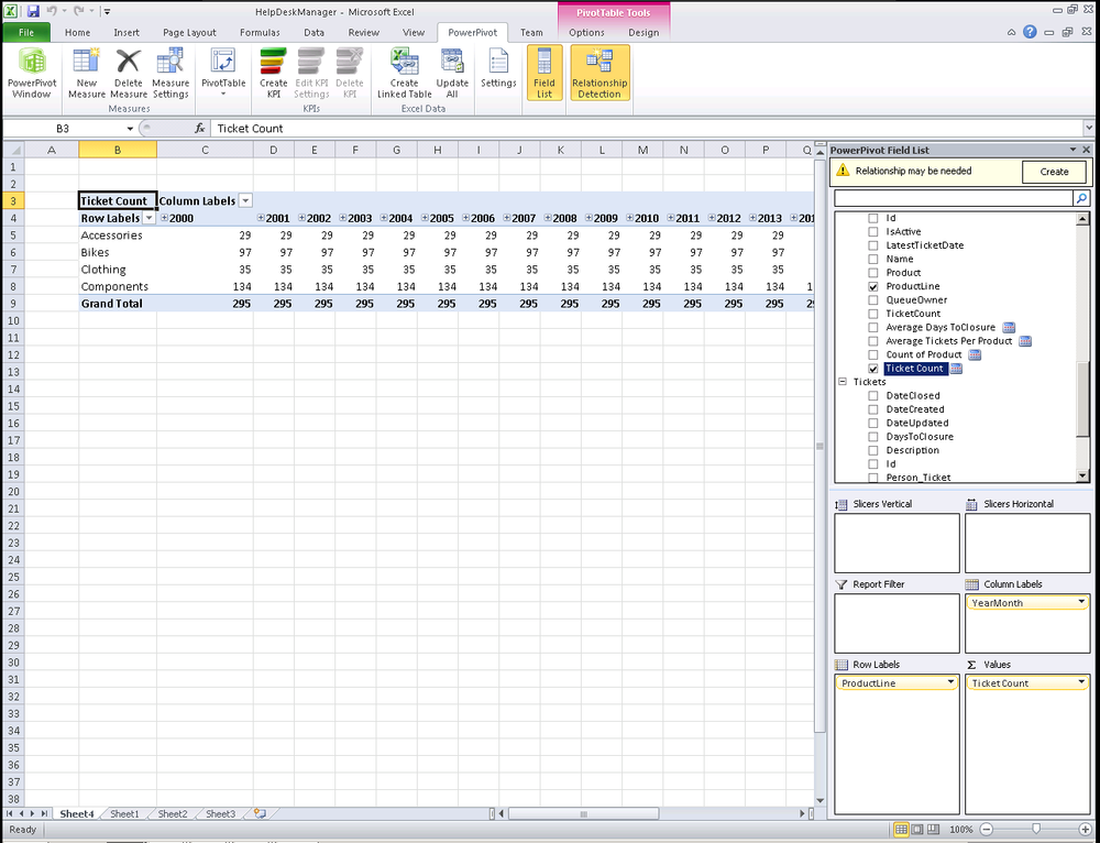
Figure 16-22 is another example of where this can go wrong. The idea for this was to trend the average days to closure over time. For example, we could use this to determine on a year-over-year basis what the average time to closure is for each queue. Because the Queues table has a calculated value with the average days to closure that has no concept of date in it, the same value would be returned for each period. This is a valid technique to roll up some data; just be careful not to slice data from this cross-table aggregation.
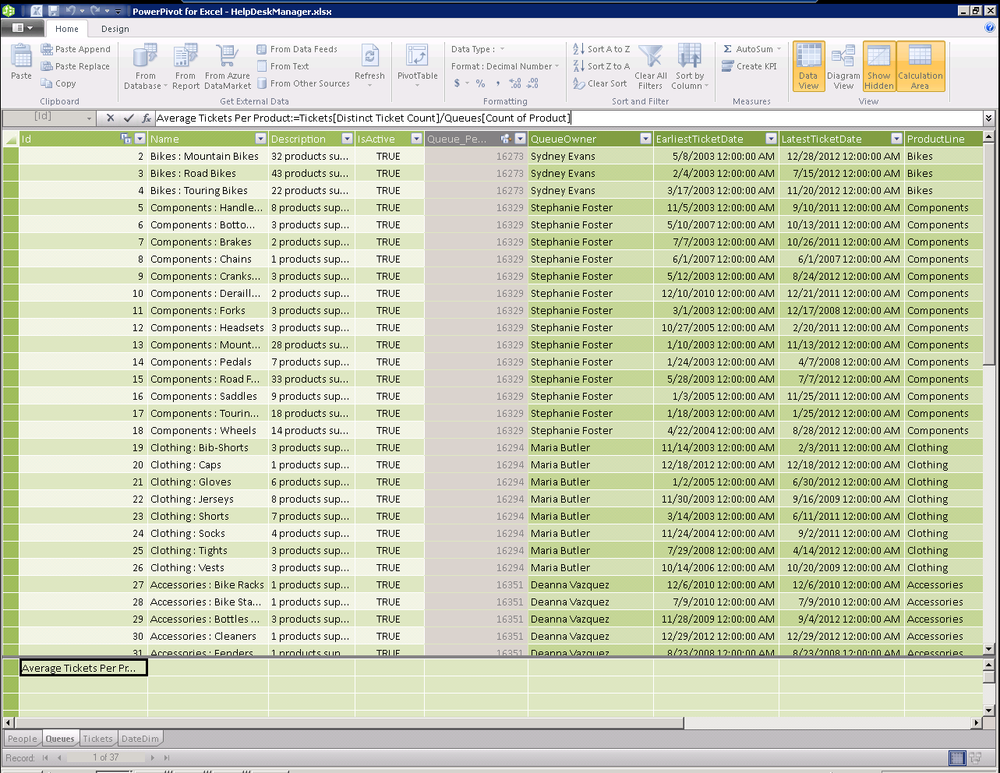
A better way to compute the average tickets per product is to reuse the ticket count from the Tickets table, as seen in Figure 16-23. Notice that our measures created using DAX are able to take advantage of measures from other tables. This is very powerful as we are now using the context from both tables and will slice the data over time correctly.
Average Tickets Per Product:=Tickets[Distinct Ticket Count]/Queues[Count of Product]
If we wanted to roll up our metrics to a product line level, we can
compute the average time to closure for each product line even though we
don’t have a table dedicated to product lines by using a DAX expression.
Using the fact that the AVERAGE
function accepts parameters with a table and the column to average, we can
provide a filtered table. At processing time, the engine will filter the
Queues table for each product line and will compute the average of the
average days to closure measures. Once again, this is a good example of
where we can go really wrong with DAX and make things more complicated
then they need to be, as seen in Figure 16-24.
=AVERAGEX(FILTER(Queues,[ProductLine]=EARLIER([ProductLine])),
      [Average of DaysToClosure])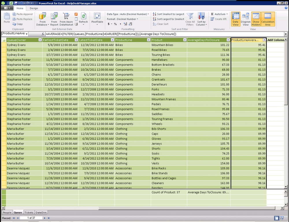
Remove both the average days to closure and the product line average days to closure from our Queues table. These filters really should be done in a pivot table where we can automatically add additional filter experssions to slice this data over time.
Because we are calculating our average off a measure that is already an average and has no concept of the ticket date, we will never be able to correctly slice data over time from the Queues table. So while it’s an interesting technique, the right answer is much simpler. Just add the the average days to closure from the Tickets table and then slice it by the product line and product from our Queues table.
Note
Here’s a tip. Always calculate a measure against the table where it is stored in its most granular form and slice it by related data from other tables.
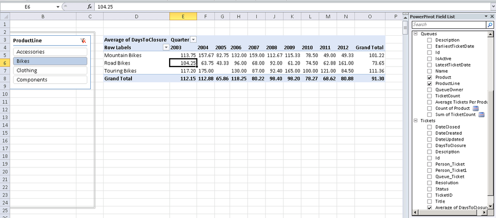
In Figure 16-25, you’ll see that the outcome is that we simply added a measure to the Tickets table to compute the average days to closure with a simple autosum average measure.
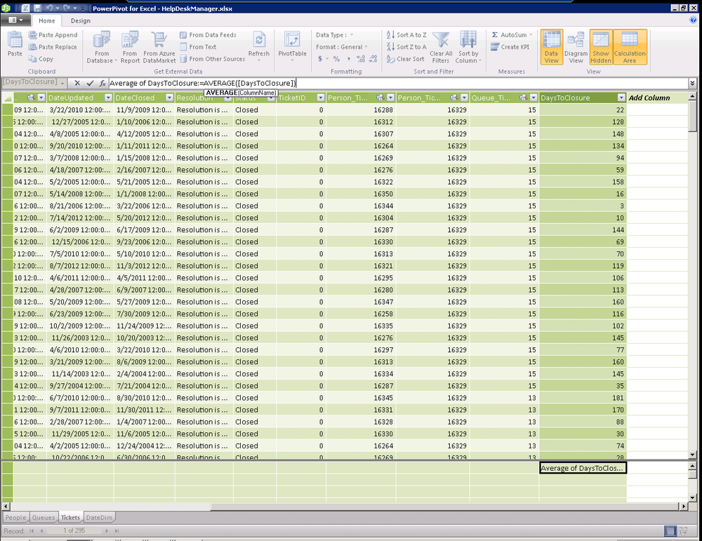
Figure 16-26 shows how we can do some really impressive analysis using the average days to closure measure from the Tickets table by slicing it by product line and product from the Queues table and by year from our date dimension. This gives us a great picture of whether our help desk team is getting better or worse over time.
Creating a Hierarchy for Dates
What is a hierarchy? A hierarchy is a collection of columns that were created as child levels in any order. Hierarchies are separated from other columns in reporting tools, making them easier for users to navigate.
Tables often have dozens or even hundreds of columns with complex names that may not be user friendly. Users might have difficulty finding and including data in a report. The client user can add an entire hierarchy with many columns in a single click. For example, in our date table, you can create a calendar hierarchy. Calendar year is used as the topmost parent level, with month, week, and day included as child levels (Calendar Year→Month→Week→Day). This hierarchy shows a logical relationship from calendar year to day.
A hierarchy can be based on columns from within a single table. To
add columns from a different table, use the RELATED DAX function to add a calculated column
before attempting to add that column to the hierarchy.
You can create, edit, and delete hierarchies from the Diagram View. You can create a hierarchy by using the columns and table context menu (right-click) or by using the Create Hierarchy button on the table header in Diagram View, as seen in Figure 16-27. When you create a hierarchy, a new parent level appears with the columns that you selected as children. When you create a hierarchy, you create a new object in your model. You do not move the columns into a hierarchy; you create additional objects. A column can exist in multiple hierarchies. You may hide the original column or leave it visible independently as a participant in hierarchies.
![Comment [GM17]: AU: Insert references to figures 27-32 in text.Creating a hierarchy](http://imgdetail.ebookreading.net/software_development/6/9781449324667/9781449324667__developing-business-intelligence__9781449324667__httpatomoreillycomsourceoreillyimages1715481.png)
As you may guess, a column can only appear once in a single hierarchy. After you add a column to a hierarchy, you cannot add it to the same hierarchy again. As a result, you will not be able to drag a column into a hierarchy, and the Add to Hierarchy context menu for the particular column will no longer reference the hierarchies to which the column has already been added. If there are no other hierarchies to which a column can be added, the Add to Hierarchy option does not appear in the menu (see Figure 16-29).
You can multiselect columns and quickly create a hierarchy with multiple child levels by If you know what columns you want created as child levels in your hierarchy, the Create Hierarchy command in the context menu enables is a great shortcut to build your hierarchy (see Figure 16-28).
To create a hierarchy from the context menu:
Select one or more columns in a table while in diagram mode.
Right-click one of the selected columns. If you want to create a hierarchy from only one column, you can right-click the column without selecting multiple columns.
Click Create Hierarchy. A parent hierarchy level is created at the bottom of the table, and the selected columns are copied as child levels.
Type a name for your hierarchy.
You can then drag more columns into your hierarchy’s parent level, which creates child levels from the columns and places the levels at the bottom of the hierarchy.
You can drag a column to create and place the child level where you want it to appear in the hierarchy.
Note
When you use multiselect to create a hierarchy, the order of the child levels is organized based on the cardinality of the columns. The highest cardinality where values are the most unique is listed first and the columns with the most variety appear at the bottom of the hierarchy.
If you rename a child level within a hierarchy, it will no longer share the same name as the column from which it was created (see Figure 16-30). By default, the source column name appears to the right of the child level. If you hide the source column name, use the Show Source Column Name command to see the column it was created from.
To hide or show a source name, right-click a hierarchy child level, and then click Hide Source Column Name or Show Source Column Name to toggle between the two options.
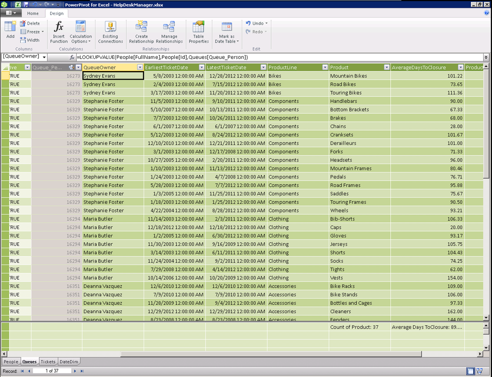
Looking Up Related Data Without an Active Relationship
As we discussed earlier, the tabular model only supports a single active relationship between any two tables. As we look at Figure 16-31, we can see that the relationship between Queues and People is inactive because of the relationship between Queues→Tickets→People.
We still need a way to look up the owner of each help desk queue and
resolve the ID into a name of a real person. If we attempt to use the
RELATED function that we often use when
we have an active relationship, we get an error as shown below.
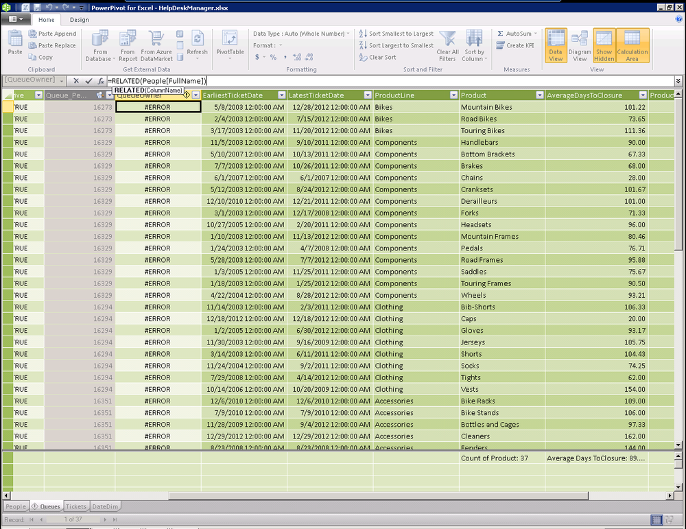
DAX provides an alternate mechanism to retrieve a value from across
an inactive relationship with the LOOKUPVALUE function. The syntax of LOOKUPVALUE is as follows.
LOOKUPVALUE( <result_column>, <search_column>, <search_value>)
The result_column is the name of an existing
column that contains the value you want to return.
The search_column is the name of an existing
column, in the same table as result_columnName or in a
related table, over which the lookup is performed.
The search_value is a scalar expression that
refers to the value we are searching for in our source table.
=LOOKUPVALUE(People[FullName],People[Id],Queues[Queue_Person])
Examining our code, we are looking for the FullName from the People table where the ID in the People table matches the Queue_Person column in the Queues table. This is really useful given that we can only have a single active relationship between any two tables and we will often need to look up data from a table without an active relationship as shown below.
Summary
In this chapter you learned how to create relationships between tables in our BI Semantic Model. We enriched this model using DAX expressions and leveraged relationships between our tables to provide better analytic data for reporting. In the next chapter we’ll publish this model to SharePoint to share it with our coworkers.