
With the know-how to access extended LinkedIn profile information, and a working knowledge of common clustering algorithms, all that’s left is to introduce a nice visualization that puts it all together. The next section applies k-means to the problem of clustering your professional contacts and plots them out in Google Earth. The section after it introduces an alternative visualization called a Dorling Cartogram , which is essentially a geographically clustered bubble chart that lets you easily visualize how many of your contacts live in each state. Ironically, it doesn’t explicitly use a clustering algorithm like k-means at all, but it still produces intuitive results that are mapped out in 2D space, and it conveys a semblance of geographic clustering and frequency information.
An interesting exercise in seeing k-means in action is to use it to visualize and cluster your professional LinkedIn network by putting it on a map—or the globe, if you’re a fan of Google Earth. In addition to the insight gained by visualizing how your contacts are spread out, you can analyze clusters by using your contacts, the distinct employers of your contacts, or the distinct metro areas in which your contacts reside as a basis. All three approaches might yield results that are useful for different purposes. Through the LinkedIn API, you can fetch location information that describes the major metropolitan area, such as “Greater Nashville Area,” in which each of your contacts resides, which with a bit of munging is quite adequate for geocoding the locations back into coordinates that we can plot in a tool like Google Earth
The primary things that must be done in order to get the ball rolling include:
Parsing out the geographic location from each of your contacts’ public profiles. Example 6-12 demonstrates how to fetch this kind of information.
Geocoding the locations back into coordinates. The approach we’ll take is to
easy_install
            geopy
and let it handle all the heavy lifting. There’s a nice getting-started guide available online; depending on your choice of geocoder, you may need to request an API key from a service provider such as Google or Yahoo!.Feeding the geocoordinates into the
KMeansClusteringclass of theclustermodule to calculate clusters.Constructing KML that can be fed into a visualization tool like Google Earth.
Lots of interesting nuances and variations become possible once
you have the basic legwork of Example 6-14 in
place. The linkedin__kml_utility
that’s referenced is pretty uninteresting and just does some XML
munging; you can view the details
on GitHub.
Note
Recall from Plotting geo data via microform.at and Google Maps that you can point Google Maps to an addressable URL pointing to a KML file if you’d prefer not to download and use Google Earth.
Example 6-14. Geocoding the locations of your LinkedIn contacts and exporting them to KML (linkedin__geocode.py)
# -*- coding: utf-8 -*-

import os
import sys
import cPickle
from urllib2 import HTTPError
from geopy import geocoders
from cluster import KMeansClustering, centroid

# A very uninteresting helper function to build up an XML tree

from linkedin__kml_utility import createKML

K = int(sys.argv[1])

# Use your own API key here if you use a geocoding service
# such as Google or Yahoo!

GEOCODING_API_KEY = sys.argv[2]

CONNECTIONS_DATA = sys.argv[3]

OUT = "clusters.kmeans.kml"

# Open up your saved connections with extended profile information

extended_connections = cPickle.load(open(CONNECTIONS_DATA))
locations = [ec.location for ec in extended_connections]
g = geocoders.Yahoo(GEOCODING_API_KEY)

# Some basic transforms may be necessary for geocoding services to function properly
# Here are a few examples that seem to cause problems for Yahoo. You'll probably need
# to add your own.

transforms = [('Greater ', ''), (' Area', ''), ('San Francisco Bay',
              'San Francisco')]

# Tally the frequency of each location

coords_freqs = {}
for location in locations:

    # Avoid unnecessary I/O

    if coords_freqs.has_key(location):
        coords_freqs[location][1] += 1
        continue
    transformed_location = location

    for transform in transforms:
        transformed_location = transformed_location.replace(*transform)
        while True:
            num_errors = 0
            try:

                # This call returns a generator

                results = g.geocode(transformed_location, exactly_one=False)
                break
            except HTTPError, e:
                num_errors += 1
                if num_errors >= 3:
                    sys.exit()
                print >> sys.stderr, e
                print >> sys.stderr, 'Encountered an urllib2 error. Trying again...'
        for result in results:

            # Each result is of the form ("Description", (X,Y))

            coords_freqs[location] = [result[1], 1]
            break

# Here, you could optionally segment locations by continent
# country so as to avoid potentially finding a mean in the middle of the ocean
# The k-means algorithm will expect distinct points for each contact so build out
# an expanded list to pass it

expanded_coords = []
for label in coords_freqs:
    ((lat, lon), f) = coords_freqs[label]
    expanded_coords.append((label, [(lon, lat)] * f))  # Flip lat/lon for Google Earth

# No need to clutter the map with unnecessary placemarks...

kml_items = [{'label': label, 'coords': '%s,%s' % coords[0]} for (label,
             coords) in expanded_coords]

# It could also be interesting to include names of your contacts on the map for display

for item in kml_items:
    item['contacts'] = '
'.join(['%s %s.' % (ec.first_name, ec.last_name[0])
                                 for ec in extended_connections if ec.location
                                 == item['label']])

cl = KMeansClustering([coords for (label, coords_list) in expanded_coords
                      for coords in coords_list])

centroids = [{'label': 'CENTROID', 'coords': '%s,%s' % centroid(c)} for c in
             cl.getclusters(K)]

kml_items.extend(centroids)
kml = createKML(kml_items)

if not os.path.isdir('out'):
    os.mkdir('out')

f = open("out/" + OUT, 'w')
f.write(kml)
f.close()

print >> sys.stderr, 'Data pickled to out/' + OUT
Warning
Location values returned as part of LinkedIn profile information are generally of the form “Greater Nashville Area,” and a certain amount of munging is necessary in order to extract the city name. The approach presented here is imperfect, and you may have to tweak it based upon what you see happening with your data to achieve total accuracy.
As in Example 6-6, most
of the work involved in getting to the point where the results can be
visualized is data-processing boilerplate. The most interesting details
are tucked away inside of KMeansClustering’s getclusters method call, toward the end of the
listing. The approach demonstrated groups your contacts by location,
clusters them, and then uses the results of the clustering algorithm to
compute the centroids. Figure 6-6
illustrates sample results from running the code in Example 6-14.
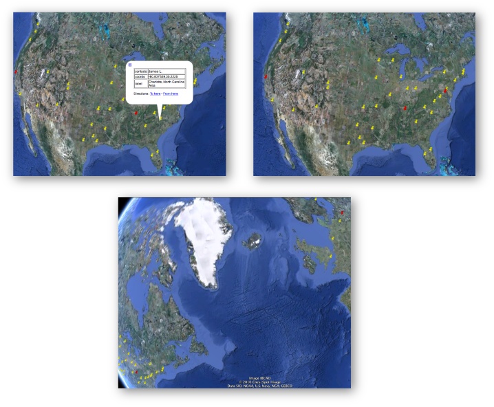
Figure 6-6. From top left to bottom: 1) clustering contacts by location so that you can easily see who lives/works in what city, 2) finding the centroids of three clusters computed by k-means, 3) don’t forget that clusters could span countries or even continents when trying to find an ideal meeting location!
Just visualizing your network can be pretty interesting, but computing the geographic centroids of your professional network can also open up some intriguing possibilities. For example, you might want to compute candidate locations for a series of regional workshops or conferences. Alternatively, if you’re in the consulting business and have a hectic travel schedule, you might want to plot out some good locations for renting a little home away from home. Or maybe you want to map out professionals in your network according to their job duties, or the socioeconomic bracket they’re likely to fit in based on their job titles and experience. Beyond the numerous options opened up by visualizing your professional network’s location data, geographic clustering lends itself to many other possibilities, such as supply chain management and Travelling Salesman types of problems.
Protovis, a cutting-edge HTML5-based visualization toolkit introduced in Chapter 7, includes a visualization called a Dorling Cartogram, which is essentially a geographically clustered bubble chart. Whereas a more traditional cartogram might convey information by distorting the geographic boundaries of a state on a map, a Dorling Cartogram places a uniform shape such as a circle on the map approximately where the actual state would be located, and encodes information using the circumference (and often the color) of the circle, as demonstrated in Figure 6-7. They’re a great visualization tool because they allow you to use your instincts about where information should appear on a 2D mapping surface, and they are able to encode parameters using very intuitive properties of shapes, like area and color.
Note
Protovis also includes several other visualizations that convey geographical information, such as heatmaps, symbol maps, and chloropleth maps. See “A Tour Through the Visualization Zoo” for an overview of these and many other visualizations that may be helpful.
All that said, assuming you’ve followed along with Example 6-14 and successfully geocoded your contacts from the location data provided by LinkedIn, a minimal adjustment to the script to produce a slightly different output is all that’s necessary to power a Protovis Dorling Cartogram visualization.[45] A modified version of the canonical Dorling Cartogram example is available at GitHub and should produce a visualization similar to Figure 6-7. The sample code connects the dots to produce a useful visualization, but there’s a lot more that you could do to soup it up, such as adding event handlers to display connection information when you click on a particular state. As was pointed out in the Warning just after Example 6-14, the geocoding approach implemented here is necessarily imperfect and may require some tweaking.
[45] The Protovis Dorling Cartogram visualization currently is implemented to handle locations in the United States only.