Once you’ve queried and discovered documents of interest, one of the next things you might want to do is find similar documents. Whereas TF-IDF can provide the means to narrow down a corpus based on search terms, cosine similarity is one of the most common techniques for comparing documents to one another, which is the essence of finding a similar document. An understanding of cosine similarity requires a brief introduction to vector space models, which is the topic of the next section.
While it has been emphasized that TF-IDF models documents as unordered collections of words, another convenient way to model documents is with a model called a vector space. The basic theory behind a vector space model is that you have a large multidimensional space that contains one vector for each document, and the distance between any two vectors indicates the similarity of the corresponding documents. One of the most beautiful things about vector space models is that you can also represent a query as a vector and find the most relevant documents for the query by finding the document vectors with the shortest distance to the query vector. Although it’s virtually impossible to do this subject justice in a short section, it’s important to have a basic understanding of vector space models if you have any interest at all in text mining or the IR field. If you’re not interested in the background theory and want to jump straight into implementation details on good faith, feel free to skip ahead to the next section.
Warning
This section assumes a basic understanding of trigonometry. If your trigonometry skills are a little rusty, consider this section a great opportunity to brush up on high school math.
First, it might be helpful to clarify exactly what is meant by the term “vector,” since there are so many subtle variations associated with it across various fields of study. Generally speaking, a vector is a list of numbers that expresses both a direction relative to an origin and a magnitude, which is the distance from that origin. A vector can very naturally be represented as a line segment between the origin and a point in an N-dimensional space by drawing a line between the origin and the point. To illustrate, imagine a document that is defined by only two terms (“Open”, “Web”), with a corresponding vector of (0.45, 0.67), where the values in the vector are values such as TF-IDF scores for the terms. In a vector space, this document could be represented in two dimensions by a line segment extending from the origin at (0,0) to the point at (0.45, 0.67). In reference to an x/y plane, the x-axis would represent “Open”, the y-axis would represent “Web”, and the vector from (0,0) to (0.45, 0.67) would represent the document in question. However, interesting documents generally contain hundreds of terms at a minimum, but the same fundamentals apply for modeling documents in these higher-dimensional spaces; it’s just harder to visualize.
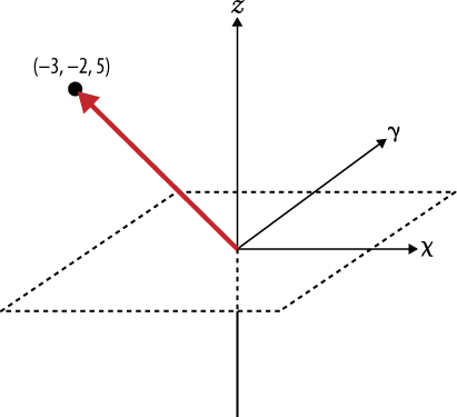
Try making the transition from visualizing a document represented by a vector with two components to a document represented by three dimensions, such as (“Open”, “Web”, “Government”). Then consider taking a leap of faith and accepting that although it’s hard to visualize, it is still possible to have a vector represent additional dimensions that you can’t easily sketch out or see. If you’re able to do that, you should have no problem believing the same vector operations that can be applied to a 2-dimensional space can be equally as well applied to a 10-dimensional space or a 367-dimensional space. Figure 7-4 shows an example vector in 3-dimensional space.
Given that it’s possible to model documents as term-centric vectors, with each term in the document represented by its corresponding TF-IDF score, the task then is to determine what metric best represents the similarity between two documents. As it turns out, the cosine of the angle between any two vectors is a valid metric for comparing them and is known as the cosine similarity of the vectors. Although perhaps not yet intuitive, years of scientific research have demonstrated that computing the cosine similarity of documents represented as term vectors is a very effective metric. (It does suffer from many of the same problems as TF-IDF, though; see Before You Go Off and Try to Build a Search Engine… for a very brief synopsis.) Building up a rigorous proof of the details behind the cosine similarity metric would be beyond the scope of this book, but the gist is that the cosine of the angle between any two vectors indicates the similarity between them and is equivalent to the dot product of their unit vectors. Intuitively, it might be helpful to consider that the closer two vectors are to one another, the smaller the angle between them will be, and thus the larger the cosine of the angle between them will be. Two identical vectors would have an angle of 0 degrees and a similarity metric of 1.0, while two vectors that are orthogonal to one another would have an angle of 90 degrees and a similarity metric of 0.0. The following sketch attempts to demonstrate:
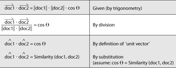
Recalling that a unit vector has a length of 1.0 (by definition), the beauty of computing document similarity with unit vectors is that they’re already normalized against what might be substantial variations in length. Given that brief math lesson, you’re probably ready to see some of this in action. That’s what the next section is all about.
If you don’t care to remember anything else from the previous
section, just remember this: to compute the similarity between two
documents, you really just need to produce a term vector for each
document and compute the dot product of the unit vectors for those
documents. Conveniently, NLTK exposes the nltk.cluster.util.cosine_distance(v1,v2)
function for computing cosine similarity, so it really is pretty
straightforward to compare documents. As Example 7-7 shows, all of the work involved is
in producing the appropriate term vectors; in short, it computes term
vectors for a given pair of documents by assigning TF-IDF scores to each
component in the vectors. Because the exact vocabularies of the two
documents are probably not identical, however, placeholders with a value
of 0.0 must be left in each vector for words that are missing from the
document at hand but present in the other one. The net effect is that
you end up with two vectors of identical length with components ordered
identically that can be used to perform the vector operations.
For example, suppose document1 contained the terms (A, B, C) and had the corresponding vector of
TF-IDF weights (0.10, 0.15, 0.12),
while document2 contained the terms (C, D,
E) with the corresponding vector of TF-IDF weights (0.05, 0.10, 0.09). The derived vector for
document1 would be (0.10, 0.15, 0.12, 0.0,
0.0), and the derived vector for document2 would be (0.0, 0.0, 0.05, 0.10, 0.09). Each of these
vectors could be passed into NLTK’s cosine_distance function, which yields the
cosine similarity. Internally, cosine_distance uses the numpy module to very efficiently compute the dot product of the
unit vectors, and that’s the result. Although the code in this section
reuses the TF-IDF calculations that were introduced previously, the
exact scoring function could be
any useful metric. TF-IDF (or some variation thereof), however, is quite
common for many implementations and provides a great starting
point.
Example 7-7 illustrates an approach for using cosine similarity to find the most similar document to each document in a corpus of Google+ data. It should apply equally as well to any other type of unstructured data, such as blog posts, books, etc.
Example 7-7. Finding similar documents using cosine similarity (plus__cosine_similarity.py)
# -*- coding: utf-8 -*-

import sys
import json
import nltk

# Load in textual data from wherever you've saved it

DATA = sys.argv[1]
data = json.loads(open(DATA).read())

all_posts = [post['object']['content'].lower().split()
             for post in data
               if post['object']['content'] != '']

# Provides tf/idf/tf_idf abstractions for scoring

tc = nltk.TextCollection(all_posts)

# Compute a term-document matrix such that td_matrix[doc_title][term]
# returns a tf-idf score for the term in the document

td_matrix = {}
for idx in range(len(all_posts)):
    post = all_posts[idx]
    fdist = nltk.FreqDist(post)

    doc_title = data[idx]['title']
    url = data[idx]['url']
    td_matrix[(doc_title, url)] = {}

    for term in fdist.iterkeys():
        td_matrix[(doc_title, url)][term] = tc.tf_idf(term, post)

# Build vectors such that term scores are in the same positions...

distances = {}
for (title1, url1) in td_matrix.keys():

    distances[(title1, url1)] = {}
    (max_score, most_similar) = (0.0, ('', ''))

    for (title2, url2) in td_matrix.keys():

        # Take care not to mutate the original data structures
        # since we're in a loop and need the originals multiple times

        terms1 = td_matrix[(title1, url1)].copy()
        terms2 = td_matrix[(title2, url2)].copy()

        # Fill in "gaps" in each map so vectors of the same length can be computed

        for term1 in terms1:
            if term1 not in terms2:
                terms2[term1] = 0

        for term2 in terms2:
            if term2 not in terms1:
                terms1[term2] = 0

        # Create vectors from term maps

        v1 = [score for (term, score) in sorted(terms1.items())]
        v2 = [score for (term, score) in sorted(terms2.items())]

        # Compute similarity amongst documents

        distances[(title1, url1)][(title2, url2)] =
            nltk.cluster.util.cosine_distance(v1, v2)

        if url1 == url2:
            continue

        if distances[(title1, url1)][(title2, url2)] > max_score:
            (max_score, most_similar) = (distances[(title1, url1)][(title2,
                                         url2)], (title2, url2))

    print '''Most similar to %s (%s)
	%s (%s)
	score %d
''' % (title1, url1,
            most_similar[0], most_similar[1], max_score)
If you’ve found this discussion of cosine similarity interesting, recall that the best part is that querying a vector space is the very same operation as computing the similarity between documents, except that instead of comparing just document vectors, you compare your query vector and the document vectors. In terms of implementation, that means constructing a vector containing your query terms and comparing it to each document in the corpus. Be advised, however, that the approach of directly comparing a query vector to every possible document vector is not a good idea for even a corpus of modest size. You’d need to make some very good engineering decisions involving the appropriate use of indexes to achieve a scalable solution. (Just a little something to consider before you go off and build the next great search engine.)
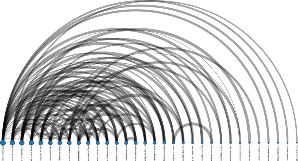
Like just about everything else in this book, there’s certainly more than one way to visualize the similarity between items. The approach introduced in this section is to use graph-like structures, where a link between documents encodes a measure of the similarity between them. This situation presents an excellent opportunity to introduce more visualizations from Protovis, an HTML5-based visualization toolkit produced by the Stanford Visualization Group. Protovis is specifically designed with the interests of data scientists in mind, offers a familiar declarative syntax, and achieves a nice middle ground between high-level and low-level interfaces. A minimal (uninteresting) adaptation to Example 7-7 is all that’s needed to emit a collection of nodes and edges that can be used to produce visualizations similar to those in the Protovis examples gallery. A nested loop can compute the similarity between the working sample of Google+ data from this chapter, and linkages between items may be determined based upon a simple statistical thresholding criterion. The details associated with munging the data and tweaking the Protovis example templates won’t be presented here, but the code is available for download online.
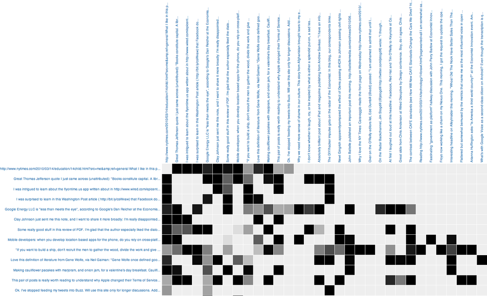
The code produces the arc diagram presented in Figure 7-5 and the matrix diagram in Figure 7-6. The arc diagram produces arcs between nodes if there is a linkage between them, scales nodes according to their degree, and sorts the nodes such that clutter is minimized and it’s easy to see which of them have the highest number of connections. Titles are displayed vertically, but they could be omitted because a tool tip displays the title when the mouse hovers over a node. Clicking on a node opens a new browser window that points to the activity represented by that node. Additional bells and whistles, such as event handlers, coloring the arcs based on the similarity scores, and tweaking the parameters for this visualization, would not be very difficult to implement (and a fun way to spend a rainy day).
A complementary display to an arc diagram is a matrix diagram, with the color intensity of each cell varying as a function of the strength of the correlation of similarity score; a darker cell represents higher similarity. The diagonal in the matrix in Figure 7-6 has been omitted since we’re not interested in having our eye drawn to those cells, even though the similarity scores for the diagonal would be perfect. Hovering over a cell displays a tool tip with the similarity score. An advantage of matrix diagrams is that there’s no potential for messy overlap between edges that represent linkages. A commonly cited disadvantage of arc diagrams is that path finding is difficult, but in this particular situation, path finding isn’t that important, and besides, it can still be accomplished if desired. Depending on your personal preferences and the data you’re trying to visualize, either or both of these approaches could be appropriate.