
In this chapter, you look at a few miscellaneous tools that might assist you in your web design project. Some are like the ones you saw in Photoshop in Chapter 8, and you can refer to those sections in that chapter for more details. One new feature that you will look at is Creating Swatch Patterns.
Note
This chapter does not have any actual projects; however, you can use the files in the Chapter 15 folder to practice opening and viewing for this lesson. They are at https://github.com/Apress/graphics-multimedia-web-adobe-creative-cloud .
Library CC
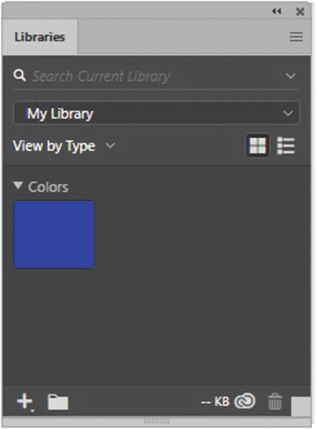
The Libraries panel in Illustrator
This panel was introduced with the Creative Cloud. In the library, you can store colors and images that you use in projects. You can then move over to a program like Photoshop or Dreamweaver, and the colors are stored there too, so that you can refer to them during your project.
Web Fonts and SVG Fonts
The Character panel , as seen in Figure 15-2.
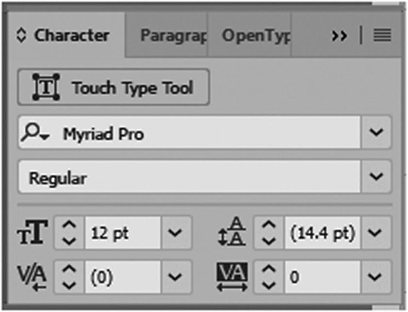
Character panel where you have access to Adobe SVG fonts
The Glyphs panel , where you can view all the options and varieties of an SVG font. It’s like having free clip art. Refer to Figure 15-3.
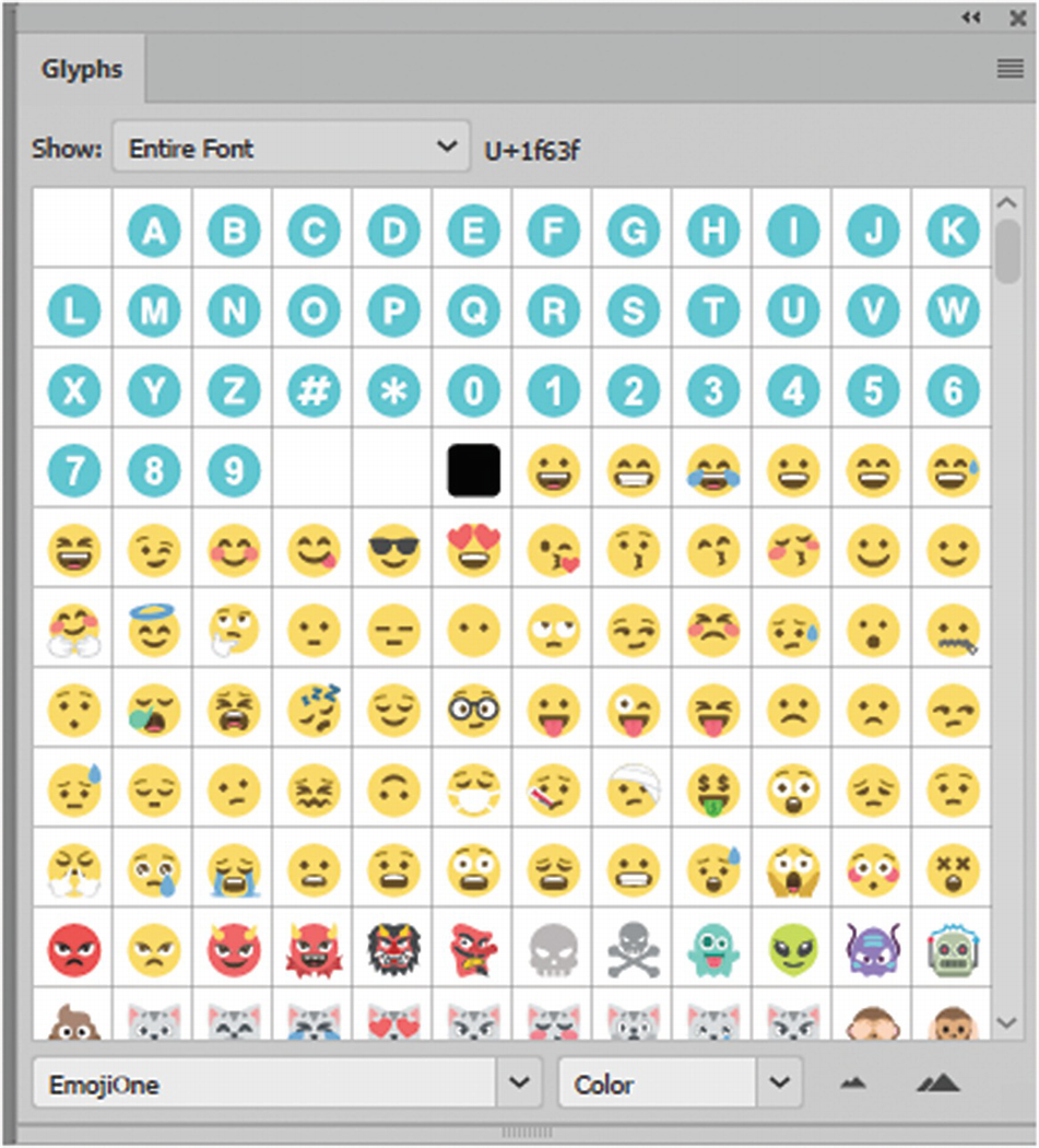
Glyphs where you have access to SVG fonts
The Control panel , when the Type tool is selected. Refer to Figure 15-4. This area in CC 2019 was updated so that you can filter your current fonts and add new fonts from Adobe easily.

Control panel where you have access to SVG fonts and other Adobe Fonts
The Properties panel , when the type tool is selected. Refer to Figure 15-5.
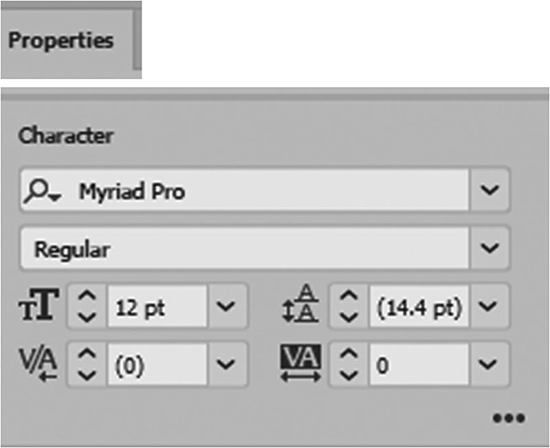
Properties panel where you have access to SVG fonts and Typekit
Creating Swatch Patterns

The Pattern Options panel in the inactive state and its menu
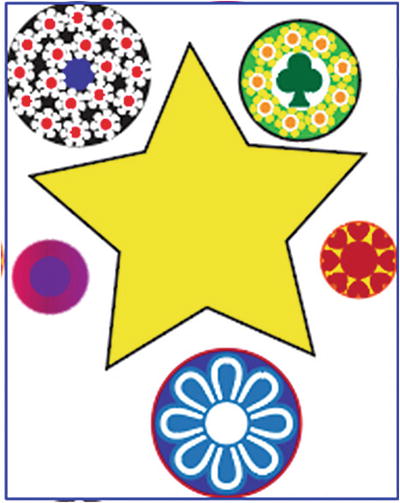
When no object or object group on the artboard is selected, the Pattern Options panel remains unavailable until you select vector objects (see Figure 15-8) with the Selection Tool (V) and choose Object ➤ Pattern ➤ Make from the main menu.
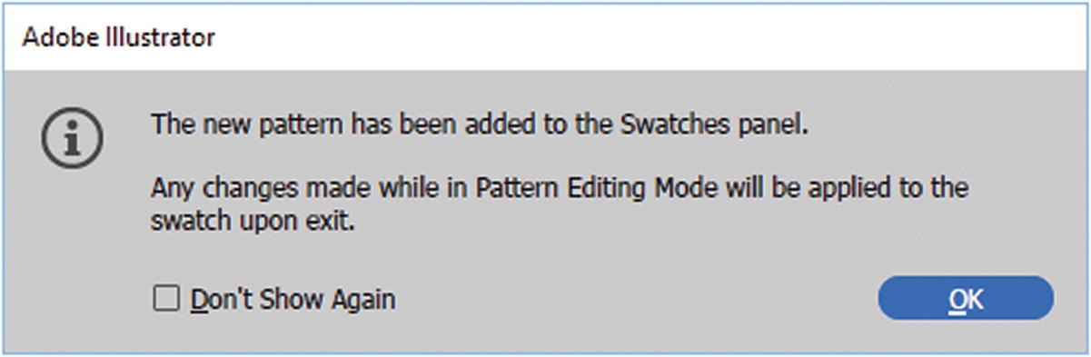
A new pattern has been added to the Swatches panel
A new pattern appears in preview
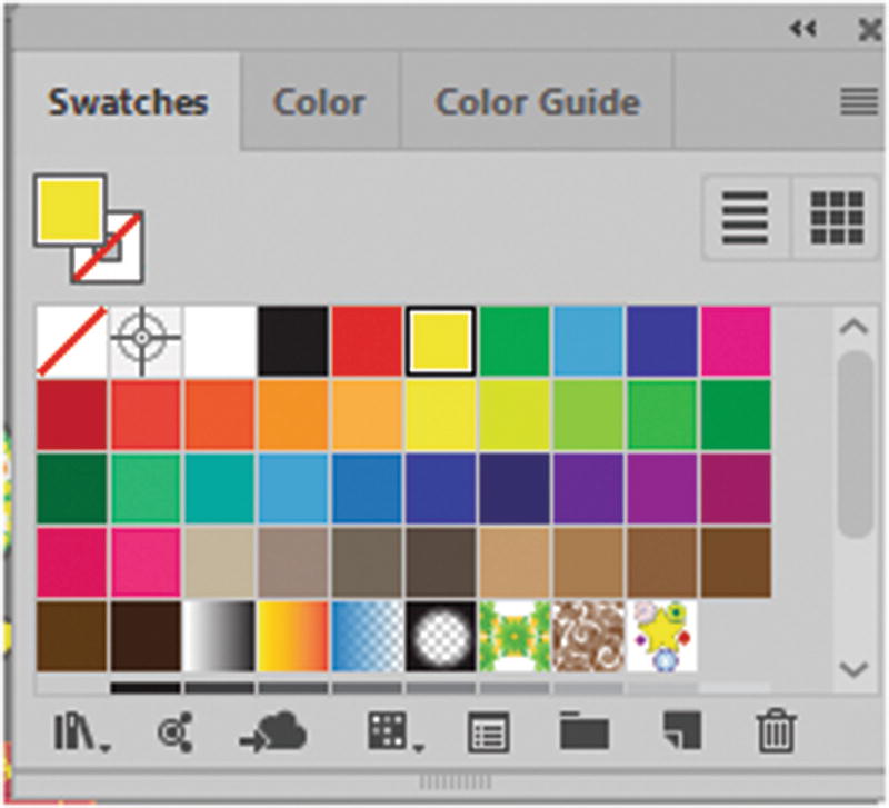
The pattern in the Swatches panel in the lower right
At this point, however, it is not yet a finished pattern. You need to start editing it in the panel.

The artboard and the Layers panel inform you that you are in pattern-editing mode
You can save a copy of the pattern, or work on the original. When finished, click Done to confirm your pattern in the swatch, or click Cancel to exit and not create a pattern at all. For now, you will stay in pattern-editing mode.
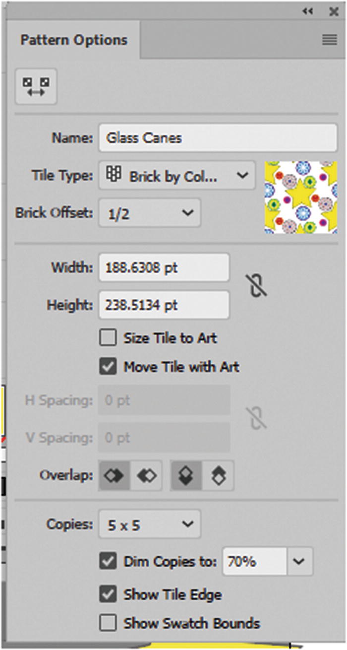
The Pattern Options panel while in pattern-editing mode
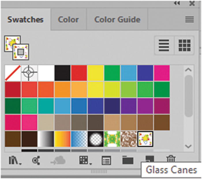
Start by giving the pattern a new name so that you can identify it in the Swatches panel. I called mine Glass Canes.
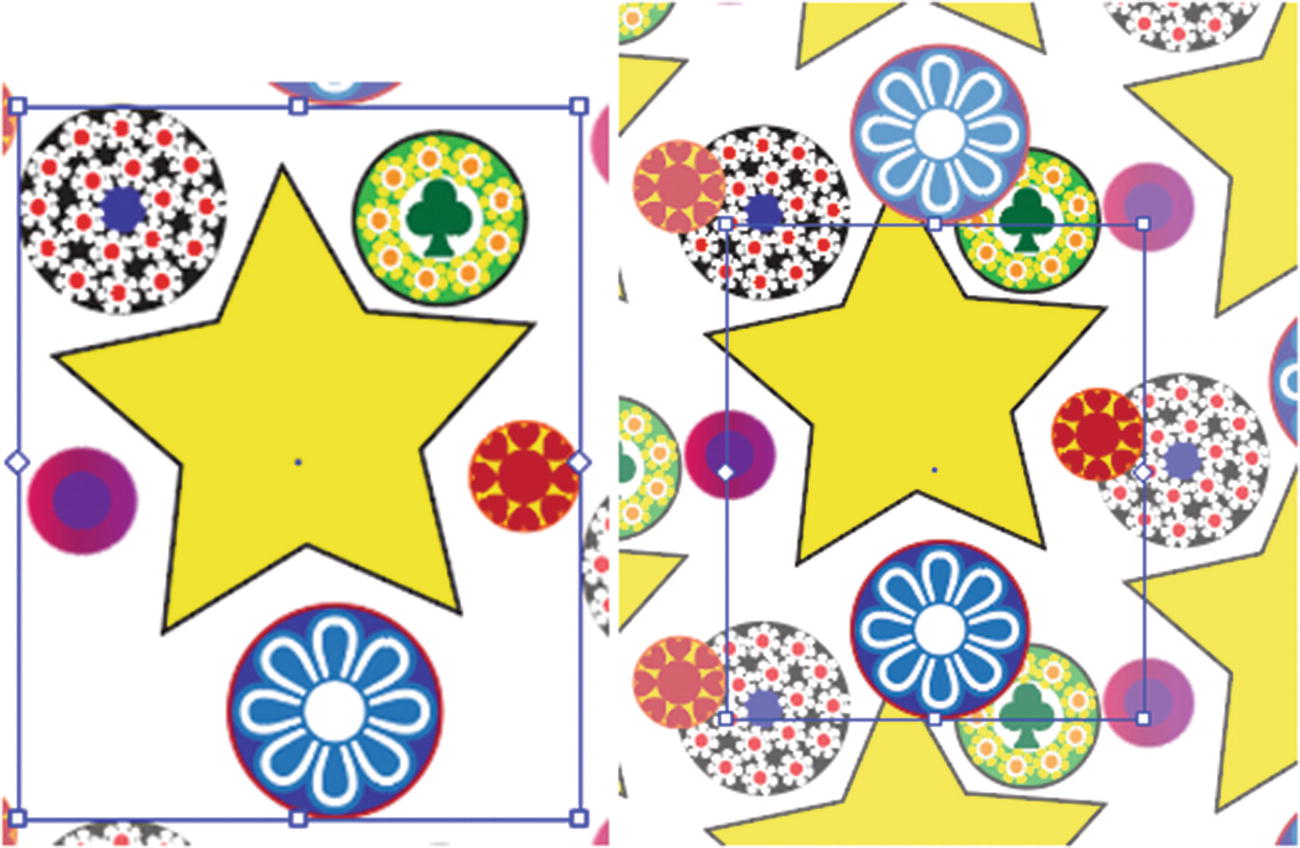
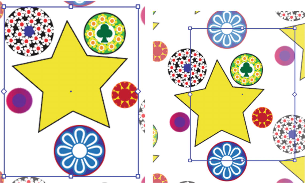
Bring the grouped objects in closer using the pattern tile tool
Note
To undo this move right away, chose Edit ➤ Undo if you need to revert backward. Holding the Shift key scales the spacing proportionately.
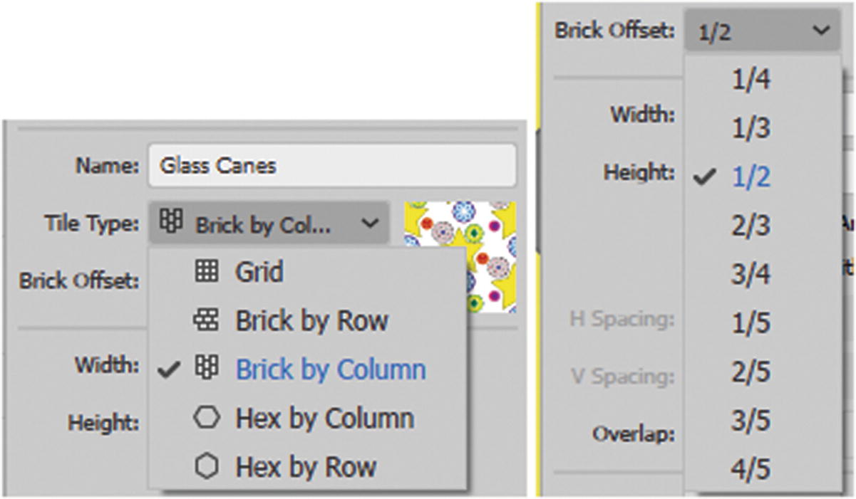
Choose Tile Type and Brick Offset
Grid : The default. It provides evenly spaced squares; however, it does not make for a very compact pattern.
Brick by Row and Brick by Column: Has a square tile and allows you to adjust the Brick Offset by degrees. The tiles are shifted vertically or horizontally, depending on what option you choose.
Hex by Column and Hex by Row: Hexagonal tiles ; it is the most compact of the patterns; however, you don’t have access to Brick Offset.
Brick Offset tiles are shifted either vertically or horizontally, depending on what option you chose in Tile Type. (I chose the 1/2 setting.)
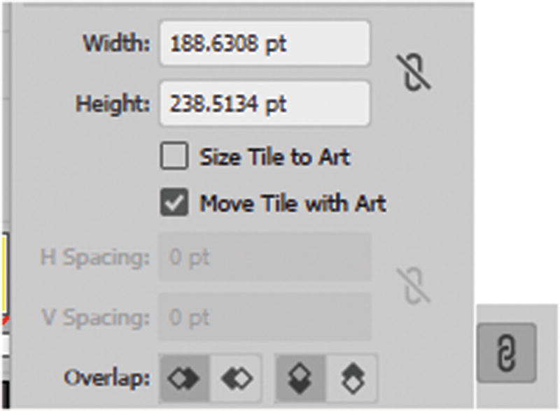
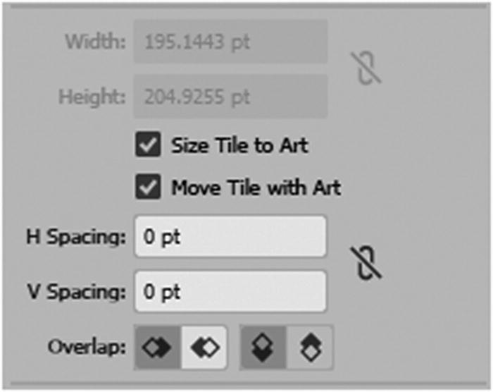
Width and Height are the same as the Pattern Tile Tool icon, except you can enter a number rather than using the handles. Clicking the Lock Icon lets you scale proportionately. This area is only accessible when the Size Tile to Art is unchecked. Refer to Figure 15-14.
Setting the width and height of the pattern in points
Setting the H Spacing and V Spacing of the pattern in points
When Size Tile to Art is checked, you can use H Spacing or V Spacing, which add or remove spacing between each shape in the pattern. A positive number spreads the space, while a negative number shrinks the space. You can also link the spacing so that it is proportionate as you scale up or down.
Move Tile with Art allows you to move the preview pattern tile with the art; if unchecked, the tile can be moved separately from the art. Refer to Figure 15-16. To undo, select Edit ➤ Undo right away.
Move the preview tile separate from the art
Overlap is how the shape overlaps when they are compressed together. Refer to Figure 15-17.

The Overlap pattern settings
left in front
right in front
top in front
bottom in front
Note
This type of overlapping may not be evident unless the shapes are touching.
Copies has to do with preview or the number of copies that are on the screen while you edit the pattern. This does not affect the final pattern layout. The default is 5×5, but you can set it to any number of copies from the pop-up list, as seen in Figure 15-18.
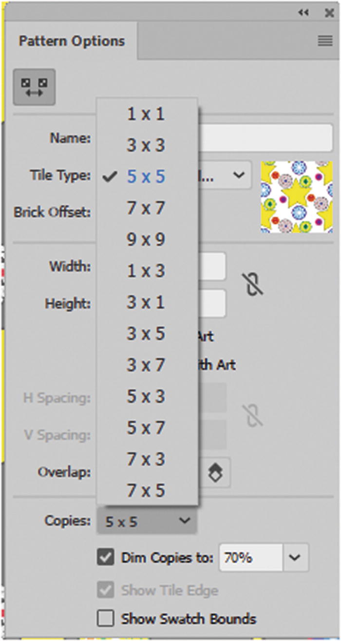
Number of copies you can preview while in Pattern Editing mode
Dim Copies to allows you to dim the preview pattern so that you can distinguish it from the original shape. The range is 0%–100% and does not affect the final pattern outcome.
Show Tile Edge lets you turn on or off the tile so that you can preview the pattern as one unit.
Show Swatch Bounds shows which areas will or will not be repeated. Anything outside the bounds is not repeated, except in this preview. Along with the tile, the swatch bounds are saved as a transparent box guide within the pattern swatch.

Apply the pattern to an object or vector shape
Only when the swatch is selected can you edit the pattern
Note
Object ➤ Pattern ➤ Tile Edge Color refers to the color of the guide that appears when you are previewing the pattern. Refer to Figure 15-21.

Change Pattern Tile Edge color if blue is difficult to see for your pattern
Note
The default is blue, but you can change it to another color if you find it hard to see or it clashes with your pattern.
Once you have completed the pattern, you can add the pattern to a box shape of a specific size and export it as a GIF, JPEG, or PNG for your background. Or, as you did in Chapter 14, you can copy it as a Smart Object into Photoshop and do further editing or cropping there. The final image pattern, used in combination with CSS, allows you to make a background pattern in Dreamweaver CC. You look at how to add background patterns in Dreamweaver in Part 6 of this book.
Note
If you do not want patterns to scale with the shape, in the Transform panel, choose Transform Object Only. Currently, it is set to Transform Both. Refer to Figure 15-22.
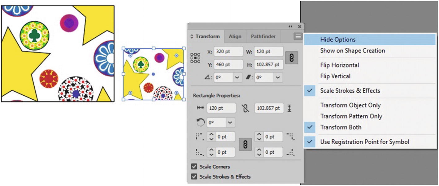
Choose how the pattern will be transformed inside the object
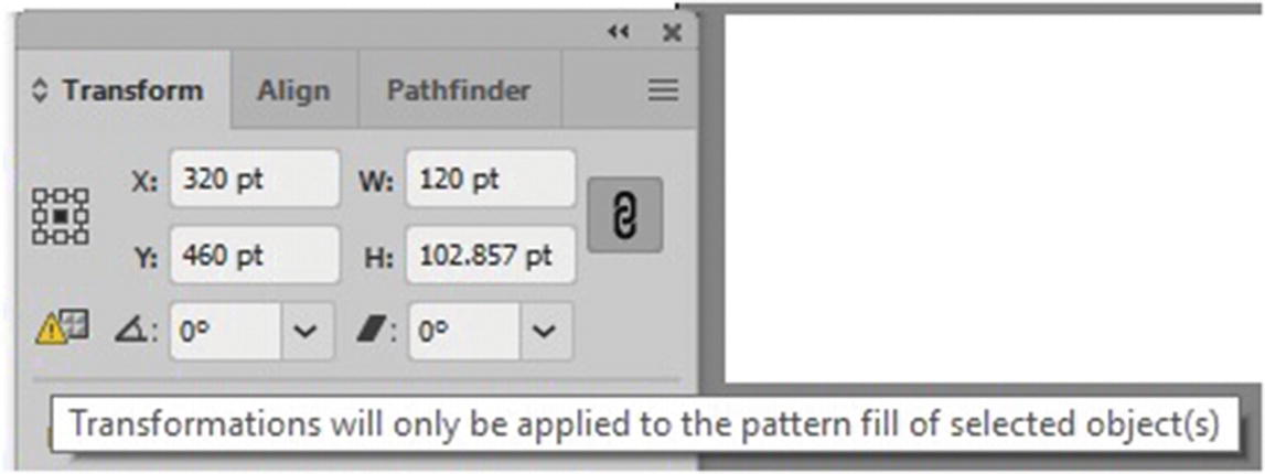
Warning that appears if you only want to transform the pattern of an object
These options allow you to scale your shape separately from the pattern swatch so that one or the other will not enlarge at the same time as you scale either the object or the pattern.
As you can see, you can create many unusual patterns in Illustrator for your next website project.
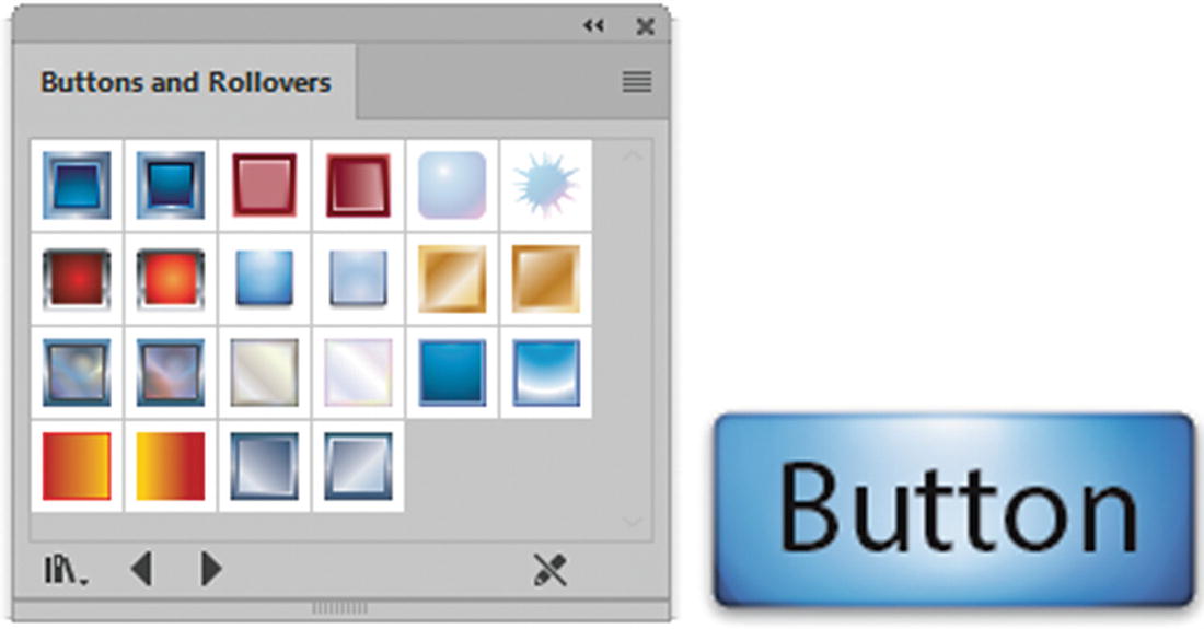
Graphic Styles for Buttons and Rollovers
Like Photoshop CC, Illustrator has styles that you can apply to buttons for the web.
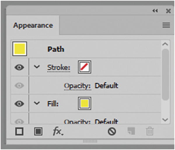
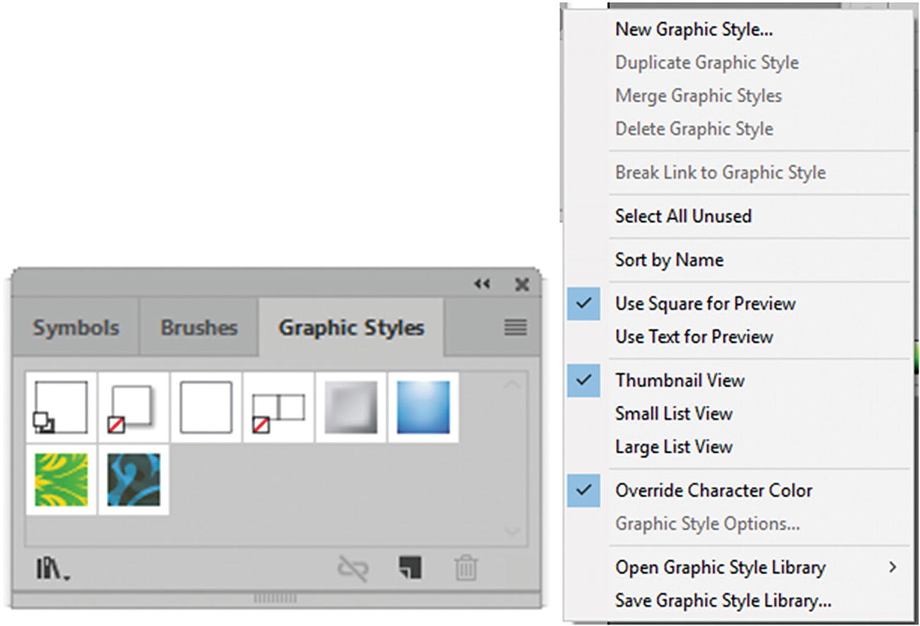
The Appearance panel and Graphic Styles panel, where you can save your new styles
Add a graphic style to an object
Symbols Panel for Web Symbol Creation
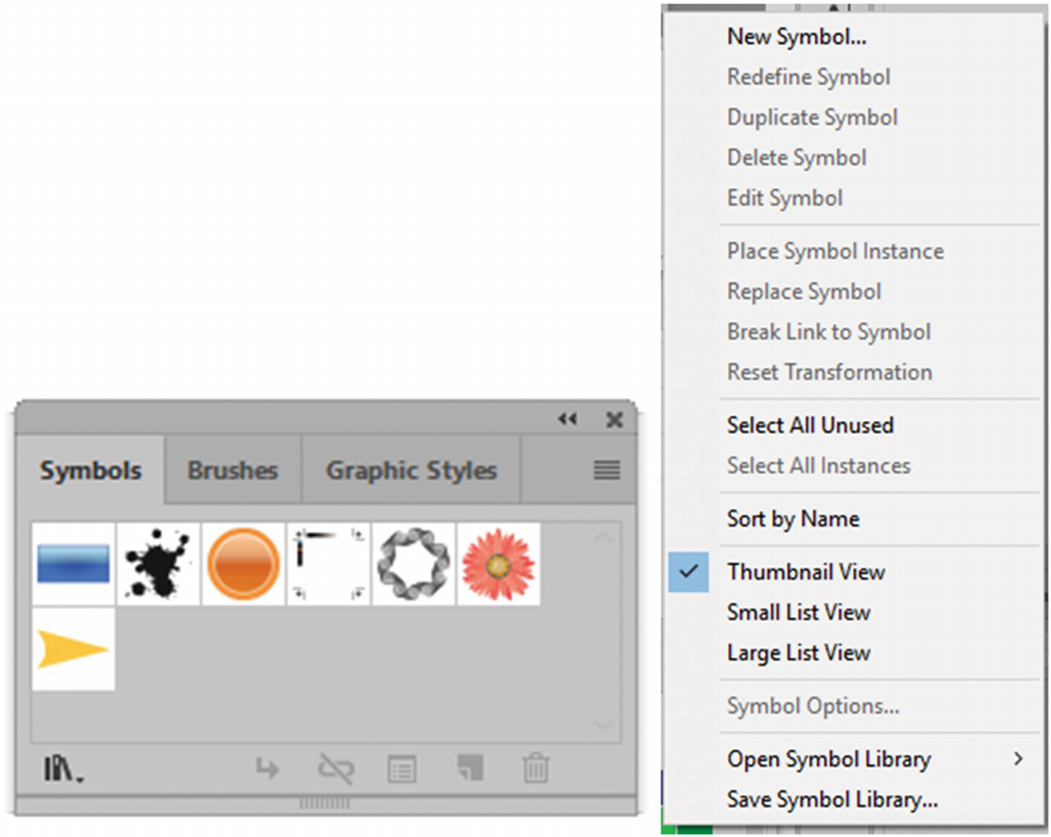
Add symbols to your Symbols panel
Mobile
Web Buttons and Bars
Web Icons

Access some of the symbols found in the symbols library for web design

Symbol Options dialog box. Note that the tip is referring to when importing into Animate.
You can also choose a dynamic or static symbol, set the registration point, and enable guides for nine-slice scaling.
Double-clicking a symbol in the Symbol panel allows you to edit it in Symbol Editing mode, which is reflected in the Layers panel.
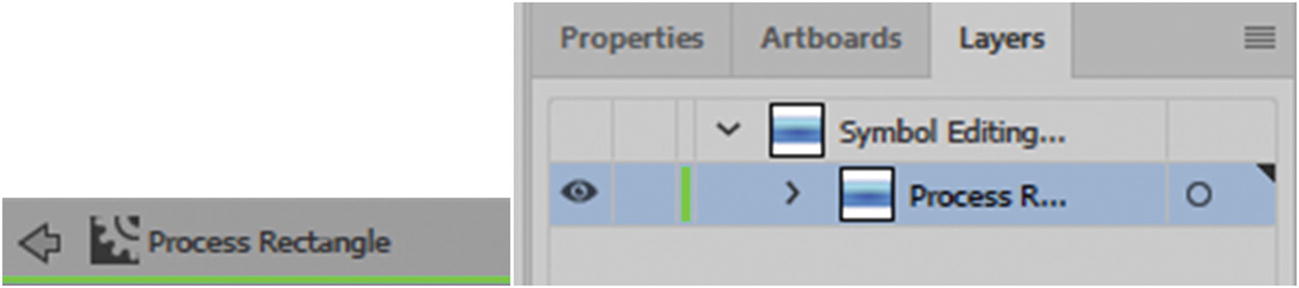
Symbol Editing mode as seen on the artboard and Layers panel

To break a symbol, whether static or dynamic, from the Symbols panel choose the Break Link to Symbol icon
This breaks the link with the symbol; the artboard object is no longer linked to the symbol .
For more information on symbols and dynamic features, refer to https://helpx.adobe.com/illustrator/using/symbols.html .
Color Blindness Proofs
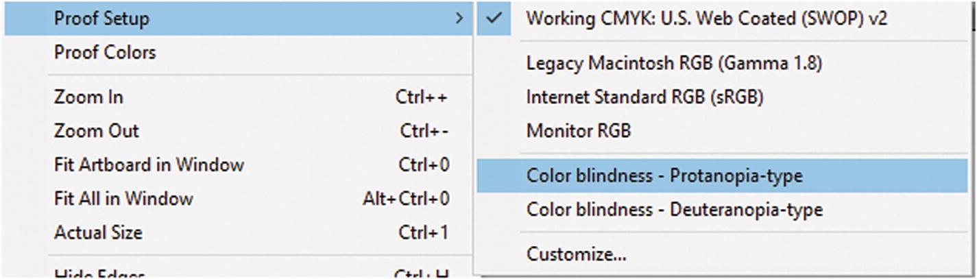
Access color blindness proofs if you need to check your colors
To return to normal settlings, choose View ➤ Proof Setup and choose the Working Proof; it can be RGB or CMYK , depending on the file that you have open.
Note
Tritanopia (blue loss) and monochromacy (all color loss) are not very common among people with color blindness, so you won’t find a proof for them here. If you need to check this type of proof, I recommend bringing the graphic as a Smart Object into Photoshop and use one of the adjustment layers, as shown in Chapter 8.
Summary
In this chapter, you looked at a few miscellaneous features in Illustrator that can assist you with your next web design project. Swatch Patterns are one of the best features, and I encourage you to experiment and create your own custom patterns.
In the last chapter of Part 3, you are going to put some of the knowledge that you learned into practice as you continue to work on the graphics for the Hot Glass Tango site.