
Chapter 23
Organic Surfaces
Organic surfaces are probably the toughest surfaces to create, because not only do you have to make them look realistic, but you also need to make them look alive, and that is by far the trickiest thing to do in texturing.
I tried, I really did, to write a step-by-step tutorial on painting human skin for this book, but failed miserably. You cannot give somebody a paint-by-numbers tutorial on painting human skin because a lot of artistic technique is involved, and it requires an approach and a certain delicacy that cannot be taught, only developed over time and with practice.
And the same really applies to any organic surface. This is because organic surfaces require a subtlety that can be demonstrated but not laid out in a series of instructions. I cannot teach you to be an artist; I can only show you my own examples and hope that by observing, you will understand what it is that is required and subsequently develop your own technique of creating what you know is needed.
As I have said time and time again, references are essential when creating textures, and this is probably the single most important piece of advice I can give you when it comes to organic substances. If you have lots of references, you simply cannot go wrong. Paint what you see and paint what you need. This is a simple philosophy, but it usually requires a lot of work.
By now you should have a clear understanding of why and how surfaces work, and what you need to manipulate in your settings in order to achieve certain effects.
If, for any reason, you are still trying to get a handle on texturing, I recommend that you stick to simpler surfaces until you have a finer grasp of them before trying to tackle organic surfaces; otherwise, there’s a good chance you will simply end up disappointed. Organic surfaces, above all, require patience, an artistic eye, extreme attention to detail, and very good painting and color skills.
There are two tutorials in this section. The first is that of an eyeball. The eyeball is a step-by-step tutorial; however, it does not involve texture painting (I have supplied an iris image for you to use). I included this tutorial solely because eyes are one of the most essential parts of a character, and all too often I see dead-looking eyes in digital characters.
The second tutorial is a guide to human face painting. The same ideas can be applied to any type of skin. As you will see, it all comes down to observation and recreation, with a large dose of careful painting and use of color.
Good luck!
Organic Tutorial 1: An Eyeball
Eyes are the windows to the soul. Well, some people say so anyway. By creating eyes that have a sense of depth, we instantly impart life to our characters, and this is why it is so important to ensure that your character’s eyes, whether they are human, alien, or animal, are believable and have a spark of life in them.
The first essential thing for eyes is to model them with details. At the very minimum, model your eyeballs in three parts: the inner eyeball, the outer liquid layer covering the inner eyeball, and the lens.
Modeling your eyes to have these three parts is the first step to a successful eyeball. I am supplying an eyeball model for this tutorial anyway, so feel free to use it as much as you like on all your characters if you’ve simply been using spheres up to now.
Some people also like to model the actual pupil separately as well, but that is only really necessary when you are going to be doing a lot of close-up animation and want to have control over animating the size of the pupil according to lighting changes.
1. Load up the 7.3-Eyeball.lws scene from the companion CD. You’ll see a lonesome eyeball staring up at you.

Figure 23-1
As always, I have already set up Image World in this scene to create an environment with an HDR image so that the eyeball has something to reflect.
I have already painted the textures for this eyeball, but let’s quickly take a look at each of them. (You’ll find the Photoshop file of this eyeball texture with a few different colored irises on the companion CD.)
First, let’s examine the color texture.
It really couldn’t be simpler. I took a photo of an iris, worked it a bit to remove lighting (this involved cloning areas onto the areas where there was light), and positioned it correctly onto the image. If you look at the Photoshop file I have included on the CD, you’ll find a blue and a brown variation of this iris as well.

Figure 23-2
Immediately surrounding the iris we have a white area with faint pink coloring in certain areas, just to offset the white slightly. And surrounding the white is a pink border, with veins of varying intensity. The pink edges and the veins are on separate layers and can therefore be adjusted separately. Please feel free to go ahead and alter these to your tastes.
Secondly, we have a bump map.
As you can see in Figure 23-3, the bump map is solely for adding a bit of bump to the veins on the eyeball. Again, the veins are on separate layers so they can be adjusted to suit your taste.
Figure 23-3
2. Back to the scene. I have already added the textures to the eyeball’s “eyeball inner” surface, which is the actual inner sphere forming the bulk of the eye itself.
Set up the rest of the basic parameters as follows:
Diffuse: 50%
Reflection: 3%
Translucency: 50%
Leave all the other values as they are. This creates a reasonably fleshy eyeball that is somewhat reflective. Having a bit of reflection on the inner eye helps to create a deeper look to it since it appears to form more layers.
3. The eyeball lens and the outer eyeball surfaces require the same settings, so all we need to do is set one up and then copy it to the other.
Select either one of them and let’s get started. Set up the basic parameters as follows:
Color: 255, 255, 255 (pure white)
Diffuse: 40%
Specularity: 80%
Glossiness: 60%
Reflection: 0% (we’ll map this in a moment)
Transparency: 0% (we’ll be mapping this one too)
Refraction Index: 1.2
Make sure that both Smoothing and Double Sided are checked. See Figure 23-4.
4. Open the Reflection Texture Editor by clicking on the “T” button next to it. Change the default layer to a gradient texture by selecting Gradient from the Layer Type pull-down list at the top right of the panel. Change the gradient’s Input Parameter to Incidence Angle.

Figure 23-4
5. Select the top key on the gradient ramp and change its Value to 5%. Now create a second key at the bottom of the ramp and set its Value to 1%. This applies a very low level of reflectivity to the surface; however, even such a low level is sufficient for this example. See Figure 23-5.
6. Open the Texture Editor for Transparency. Change this default layer also to a gradient texture and select Incidence Angle as the Input Parameter.

Figure 23-5
Select the top key that was created on the gradient ramp and change its Value to 80%. Create a second key at the bottom of the ramp and change its Value to 100%. See Figure 23-6.
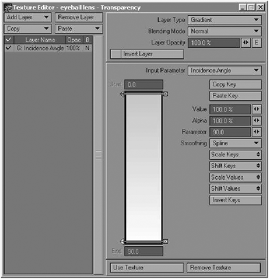
Figure 23-6
7. Copy this surface to the other surface (either the lens one or the outer eyeball one, depending on which one you just set up) by right-clicking on its name and selecting Copy, and paste the settings into it by right-clicking and selecting Paste.
Your surfaces are now set up. Rendering the eyeball should give you something like Figure 23-7.
And now you have a decent eyeball for your characters. Depending on the lighting in your scenes, you may find that you’ll have to change some of the parameters from scene to scene (especially the Diffuse parameter), but as I mentioned before, it is the modeling of the eyeball that makes all the difference.

Figure 23-7
Organic Tutorial 2: A Human Face
I chose a pirate for this exercise because such a character has the potential to have many of the kinds of details that you’ll encounter when you texture heads, such as scars, pimples and blemishes, wrinkles, dark circles under the eyes and so on. Basically he’s the ultimate exaggeration of skin texturing!
So let’s get started. When I’m texturing skin I like to start off the entire process by taking the model into Layout and setting up the lighting and the basic shading of the model. We all know what lighting is, but let me quickly explain what I mean by shading. Shading, as discussed previously, is the stage when I set up all the basic surface parameters — diffuse, specularity, reflection, translucency, and colored highlights — to get the basic look of the surface simply by assigning overall values to each so that it more or less begins to look like skin. I also add a rough procedural grain to the skin to give it some texture.
While I am doing this I also set up my lighting because the interaction between the surface and the lighting is very important for realism. For this example, I used an area light as the main light, with two spotlights (one behind, one to the side) and Backdrop Only radiosity to soften the overall lighting. I mix a little bit of red and blue into the lighting as these colors go well with skin.
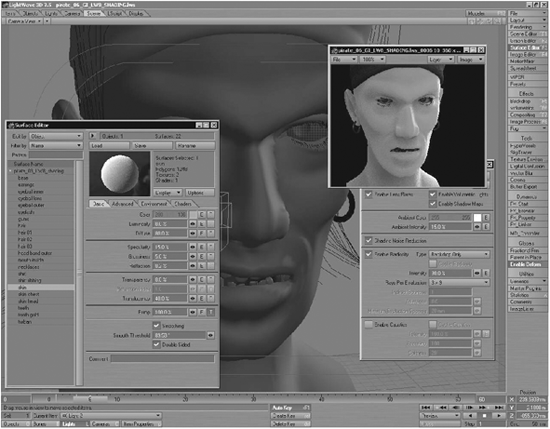
Figure 23-8
You’ll find that when working with skin, the shading values you assign can vary quite a bit depending on the lighting setup. There is no foolproof surface setting for each surface attribute that will always work in any lighting situation. However, what generally does always work is to make the skin look overly soft to begin with. Take a look at the flesh on your cheeks and try to make the entire head look like that — in other words, make it look really soft, fleshy, and, well … almost squishy. You can create specular and reflection maps later on to “harden” the areas that shouldn’t look that soft.
Once you’re happy with the way the skin looks in the shading render, it’s time to start painting your texture maps. Ideally, the textures you paint should serve only to add details to the shading you’ve already set up. In other words, we’ll make textures to add color variation, blemishes, wrinkles, etc., as well as variations in the actual surface attributes like specular, translucency, reflection, etc.
I’ve already set up my UV map for the head using a cylindrical map on the y-axis that I have edited to eliminate stretching. I then export the UV viewport out of Modeler.
Fire up Photoshop (or whatever you use for painting textures) and let’s get going.
I generally start off my texture painting by doing the color map. This is purely out of habit — there is no reason why you can’t start off with any of your other attributes. I like doing the color map first simply because I like to start off by establishing the basic look of whatever I am creating textures for, and for me the most logical choice is color. But start off with whatever you feel most comfortable with.
I start off my color map by creating a flat skin tone and then adding subtle variations to it to break up the monotony of the single color.
A nice quick way of creating subtle color variation is to create some noise using the Noise filter. Create some fairly low-level noise (don’t use the Monochrome option) and then blur it a lot.

Figure 23-9
Skin color can be a tricky thing to paint because in reality skin is actually very plain. It gets most of its perceived tonal variations from two things: its environment (i.e., reflections) and what’s going on beneath it. Generally we’ll fake what’s going on beneath it by adding those particular tones to the color map, and we’ll create a reflection map for the surface in order to allow it to reflect its environment a little. So in order to fake what’s going on beneath the surface, we basically have to create the illusion of blood beneath the skin, and this means that we add red and blue tones, particularly in the cheeks and just below the eyes where the skin is a little thinner.
The bridge and tip of the nose tend to get a little redder as well.

Figure 23-10
The key to creating successful skin textures lies in subtlety. A subtle buildup of tones creates a far more realistic look than big splotches of color. For this reason I tend to use my airbrush on a low opacity (usually around 30%) with 0% hardness (soft edges), and slowly build up my tones by gradually painting over and over certain areas until the blending looks right. I use a Wacom for most of my painting, which does make this a little easier since you have a lot more pressure control, but using an extremely low opacity with a mouse can create exactly the same effect.
I now want to make the scar and some blemishes for the face. I start off with the scar, sketching its shape out in gray using the airbrush and then the Soft Light blending mode, and taking the opacity of the layer down to create the right blend of scar tissue with the underlying skin texture. See Figure 23-11.
I sketch some faint vein details and some subtle blue tones around this area as well, to create a little more “activity” in that area. Each detail is on its own layer.
I also draw some blemishes and pimples on their own layers and find the right blending for them, in this case using the Color Burn blending mode. At this point, I also add some more detail to the lips to give them some nice tonal variations and make them look a little fleshier.
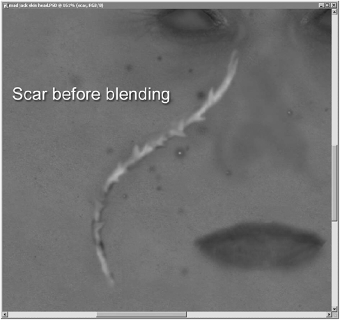
Figure 23-11

Figure 23-12
Now that I have some blemishes, pimples, and a scar, it’s time to focus on the eye areas. These areas are important because the eyes are generally the first part of a CG character that your viewers are going to focus on, so you have to ensure that they look good.
I start off by adding even denser layers of blues and reds to create dark, purplish flesh below the eyes. This is to create a sickly, gaunt look for the character. Having dark rings under the eyes also adds a creepy and dangerous air to the character. I also add some very subtle wrinkles to this area.
On top of the blues and reds, I create a new layer of little one-pixel spots in light gray. I use the Overlay blending mode for this, and set the Opacity of the layer down to create very faint spots below the eyes.

Figure 23-13
This is quite extreme coloring for this area, done intentionally for this type of character. However, you’ll see similar coloring, to a lesser intensity, on most people. So when creating textures for “normal” people, you’ll still do something along these lines, only to a lesser degree. The cool thing about having these new tones on their own layers is, of course, that should I wish to make him look a little more normal at a later stage, I can simply lower the opacity of this layer to lessen the effect.
Now it’s time to create some stubble for him. I’m going to be using Sasquatch to give him facial hair later, but creating some stubble on the actual skin surface helps to ease the transition between the model’s skin and the rendered hair.
To make stubble, I make myself a couple of stubble brushes in Photoshop by simply taking a one-pixel size paintbrush and drawing a few points, then selecting them and creating a brush from the selection. I create a few different brushes and constantly switch between them when painting the stubble layer in order to prevent any distinct patterns from developing. When painting the stubble, I don’t drag the brush but rather click, move the cursor, click, and so on. Dragging a brush like this creates horrible patterns that we don’t want.
Because hair does not generally grow on scar tissue, I avoid painting stubble in the scar area. See Figure 23-14 on the following page.

Figure 23-14
The stubble still looks a little sparse on top of the skin though, so it often helps to create a little discoloration below the stubble hairs.
I take the airbrush and paint some brown beneath the stubble layer I just created. I then use the Noise filter to add some low-level noise and blur it. This creates a nice discolored layer beneath the stubble hairs that helps to create the look of rough, older skin. Again, I avoid painting this in the scar area.

Figure 23-15
The color layers are almost done. All I do now is add some faint blue veins here and there, and also add some strong red tones to the ears to help create the bright color that ears get when lit from behind.
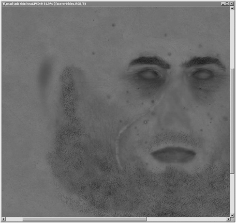
Figure 23-16
Of course this is still a pretty basic texture — I could add loads of tiny details to this to improve it, but for now it’ll do the job well enough.
So we move on to the other surface properties. I usually do the bump layers next, so I create a new layer set and create a new gray layer. I choose a neutral value of gray (128, 128, 128) so that I can create a suitable range of both light and dark details over it to create the details necessary for the bump map. Remember that with LightWave, lighter areas in the bump map create the illusion of raised details, while darker ones appear to form indentations.
I start off by adding a little noise to this first layer, and start sketching out some initial details like the eyebrows, eye area, and lips using the airbrush and pencil. I also create the forehead wrinkles using two of my favorite tools in Photoshop: the Dodge and Burn tools. These two tools are awesome for creating subtle details in your grayscale texture maps, as they are very intuitive and allow for the gradual building up of details when used on low exposure levels.
The very fine details around the eyes (crow’s-feet) are created using a one-pixel pencil, and the blending detail around them is created with the Dodge tool on the base gray layer I created initially.
I also copy the layers containing the blemishes and pimples from the color layers over to my new bump layer set, desaturate them, and adjust their brightness until I get the right level of gray that I want for them in the bump map.
Copying the layers over like this ensures that all your details remain in the right positions.
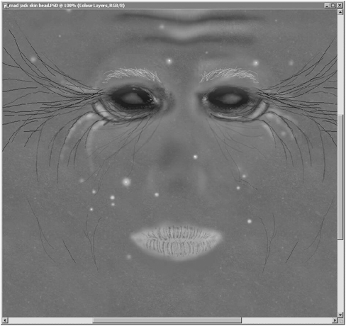
Figure 23-17
Now I also copy the stubble hair layer over from the color layers, desaturate it, and make it a bright white in the bump layer set. This is obviously to make the stubble hairs appear to protrude from the skin. Then I copy the scar layer over and adjust its opacity to get the right look for it as well, as scars can sometimes be quite lumpy and I want it to stick out a bit from the skin.
At this point I also create a new layer with a rougher grain for the skin on the cheeks. Again, I do this by roughly painting some gray, using the Noise filter (using the Monochrome option), and blurring it. This makes a nice, coarse texture for the cheeks to make them look weathered and rough. I also add some faint wrinkles to these areas. As a nice little touch I also add some pore indentations on the tip of the nose with a one-pixel airbrush, as people often tend to have larger pores in this area. See Figure 23-18.
Now it’s time to copy the layer where I created the little spots under the eyes into the bump layer set. I do this and desaturate it, then adjust the blending of the layer so that it stands out of the bump map. This will create the slightly coarser grain that our skin has directly beneath our eyes. See Figure 23-19.

Figure 23-18

Figure 23-19
That’s the bump map almost done. All I do now is copy the veins layer over from the color layers, desaturate it, and adjust it to get the right level for the bump map. I also create some other veins on the side of the head. See Figure 23-20 on the following page.

Figure 23-20
Now we move on to the specular map. I usually like to do my specular map next because it helps to enhance the bump map (when rendered) and because it’s a nice way of starting to define how the surface feels to the touch. Remember that specularity (in CG) is basically a fake form of reflection, so a properly made specular map helps to create shininess on the surface.
I’ve already assigned a basic Specularity value to the surface during the shading phase, and you may recall what I mentioned earlier about making the texture maps in such a way as to have them add details only to the surface. So how do I ensure that this map will only add details to the current specularity of the object without changing it completely? The answer is simple. I take a look at the Specularity value that I assigned to the surface when shading it, and use that value as the starting value for the gray specular map.
I take that value, which in this case was 9%, and use that as the brightness value for the gray layer that I initially create for my specular map.
I open the Color Picker in Photoshop, select a gray, and check the HSB values — the B value is the brightness value. I simply enter in a value of 9.

Figure 23-21
Now I begin to create some basic variations (in other words, some details) to the specular map, starting off with areas like the bridge and tip of the nose, the eyelids, the lips, the forehead, the chin, and the areas directly beneath the eyes. These areas are generally slightly shinier than the rest of the flesh. As you can see, at this stage the map is actually quite rough and very simple.

Figure 23-22
Once I’ve roughly established the areas for increased/lessened specularity, I copy some layers over from my bump map (specifically the wrinkles and some grain, and also the scar), and adjust the intensity of these layers to get the right effect. Since scar tissue is generally quite a bit shinier than ordinary skin, I keep the scar quite bright in the specular map, and I use the wrinkles layers to lessen the specularity in those areas simply for the sake of variation.

Figure 23-23
Believe it or not, this is enough detail for the specular requirements of this particular model. Yeah, it could certainly be improved, but again, sometimes you can get away with quite simple textures.
Okay, so now that we have a specular map, it’s also a nice idea to use a teeny bit of reflection on your surface as well. As mentioned before, specularity is just a fake reflection, but I find that adding an actual reflection map to the surface as well helps to really sharpen the highlights and adds a sense of realism to the surface. Skin gets a lot of its color from reflecting its environment and, unless you want to render with a lot of Monte Carlo radiosity, using a teeny tiny bit of reflection on the surface can help to create this effect.
The really cool thing is that you don’t necessarily need to make a new reflection map. All I do is simply take the specular map and make it really, really dark (almost black actually) and use that. So I just create a new Brightness/Contrast Adjustment layer over the specular layers, and darken it considerably to create the right levels for the reflection map.

Figure 23-24
So what’s left? The only other texture I’m going to create for this model is a translucency map. Translucency is basically the quality that most organic surfaces have whereby light can partially penetrate them. Look at anyone who is lit from behind and you’ll see how their ears almost glow. This is translucency in action.
Okay, now translucency can be a bit of a devil at times, and you kind of have to cheat it a bit. In reality, although skin is very translucent, we have muscle and bone directly beneath our skin that prevents light from penetrating beyond a certain depth. This means that in order to create this effect realistically in LightWave, you’d actually have to model a skull and everything inside your head to allow for realistic volumetric translucency, because simply assigning a value to the translucency attribute, or creating a texture map for it, is going to allow light to go all the way through the head. Unfortunately, there is no easy way around that (yet), so in the meantime I just create a translucency map that makes the skin quite translucent anyway.
The translucency value that I assigned to the model when shading it was 30%, so I create a new gray layer in Photoshop and fill it with 30% gray. I then use the Dodge tool to lighten areas like the ears and areas directly beneath the eyes where the skin is thinner and more translucent. I also copy the scar layer over from the specular map and blend it on top of this to let the scar flesh become a little more translucent as well.
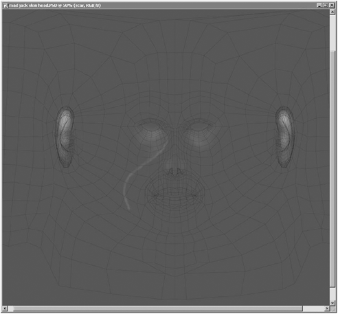
Figure 23-25
And that wraps up the texture painting for this head! As you can see, it’s actually all very simple — all you need is a good eye for detail and a decent knowledge of what sorts of details you can expect to find in skin. Over time you’ll develop an eye for detail and a collection of photographic references you can use.
As I have demonstrated, you can easily create great-looking textures that work really well simply by adopting good Photoshop/painting habits. Creating your own custom brushes can help a lot (as I showed with the stubble example), as can using tools like Dodge and Burn to gradually build up tonal variations for your grayscale maps.
Photoshop’s Adjustment layers are a great way of making tonal adjustments to entire maps if you find that the overall tone isn’t working too well when you add them to your model and render.
Of course, I can’t stress enough the importance of keeping everything on its own individual layer! I’m sure you’ve seen the usefulness of this as I have demonstrated, so make sure you do the same in order to avoid having to make destructive changes, and just to generally make life a lot easier.
Remember: Look at your textures, examine them, and compare them to photographic references. Any discrepancies in your textures will be immediately obvious. You have your own face, so look in a mirror if you’re unsure about any particular type of detail.
I have managed to get together a couple of character and head models for the companion CD. Please go ahead and create textures for them!
Summary of Tips for Creating Organic Surfaces
• Use lots of reference materials.
• Subtlety is essential. Don’t paint large splotches of color, but rather build up your tones gradually to form new variations.
• Change the opacity and sizes of your brushes constantly while working to ensure a more natural look. Using the same opacity and sizes tends to form subtle patterns that wreck the texture.
• Pay attention to the tiny details, as these make all the difference. Make sure that you always have loads of color and shading variations across your surfaces, and be sure to add many imperfections, whether subtle or obvious.