
Chapter 11
Image Maps
Conventions for the Creation of Image Maps
Images used for texturing are usually called image maps or texture maps.
The art of creating image maps is an involved process and a very exciting one! But before we start exploring this fascinating task, we need to discuss some of the conventions and options that you must take into consideration before you start painting.
NOTE: This entire chapter requires that the reader have access to and a working knowledge of a 2D painting application such as Adobe Photoshop.
Deciding on Image Resolution and Size
Deciding on an appropriate size for your image maps is very important for a number of reasons, and the size you select in the end will be decided upon according to your needs as well as your computer resources.
The first thing that you need to consider is the size at which the final frames will be output. This will depend on the intended output format: video for television, film, CD-ROM, or larger formats like IMAX.
Some common broadcast and film resolution sizes are as follows:
Broadcast resolutions:
Film resolutions:
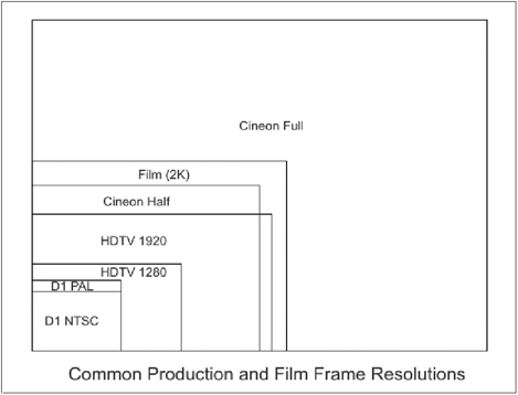
Figure 11-1
Now that you know your final output size, you need to ensure that your textures are going to look great when viewed at this size.
Since image maps are raster images (images made out of pixels, as opposed to vector graphics), they are prone to losing detail and tend to appear jagged (pixelated) when viewed up close. Pixellation is basically when your image becomes ruined due to the pixels within it being stretched beyond their original size or being overly compressed. This results in the image being pretty horrible to look at since it loses all its clarity. Since you want to ensure that your textures will always look good, no matter how big they appear on-screen, you need to make sure that your image maps are large enough to be viewed at such sizes without any loss of clarity.
The best way to do this is to roughly work out the largest size at which any portion of the texture will appear on-screen. If, for instance, you are texturing a face that is seen full-screen at any point in time, then you want to make sure that your texture maps that are used on the face will look good if they fill the screen. If the camera zooms in on the face, and there is a close-up shot of, for example, the character’s mouth, you are going to have to ensure that the image maps for the face are so large that they will look good even when only that small portion of them is viewed full-screen.
If this latter shot were to be broadcast on television at a resolution of 720 × 576 pixels, then you would have to consider that the image maps used on the face are going to have to be large enough to ensure that the textures around the mouth will look fine even though they will fill the entire screen. This means that your texture maps for the entire face are going to have to be pretty big, to be sure that just the section around the mouth does not look jagged or blurry.
Once you have roughly ascertained the largest size at which any portion of the image map will appear on the screen, you can work out an appropriate size by then multiplying that size by two, and working out the size of the entire map like that.
To illustrate that a little more simply, let’s assume that you are texturing a human face, and that the largest the face appears in the final cut is in a shot where the face fills the screen. This means that the entire image map for the face will appear at a size of 720 × 576 pixels at this point. The safest way to calculate an appropriate size for the image maps for the face would then be to multiply 720 pixels by two, to get a total of 1440 pixels. If you were to texture this face with UV maps, which are always square-shaped, you would then ensure that you make all your UV-mapped images a minimum size of 1440 × 1440 pixels.
Obviously, as illustrated previously, this calculation can be a little trickier if there are any major close-ups involved.
Let’s return now to the previous example of the mouth close-up. Let’s assume that in the close-up shot of the mouth, approximately one-third of the face will appear on the screen. This means that one-third of the face will be appearing at a size of 720 × 576 pixels, and therefore the image map for that area of the face has to be at least twice that size, for that area alone. In order to ensure that the image map remains crisp at such a close-up view, you will first need to multiply that number by three, to get the total size (at a one-to-one ratio) for the image maps for the entire face, and then double it to get a safe size, to ensure that the quality remains acceptable. This means that your safest bet for the size of your image maps for that face would therefore be 4320 × 4320 pixels.
Although using this double image size is highly recommended for the best clarity possible for your textures, you may find that your computer may not always be able to handle such large images, especially if you are going to be rendering for film, in which case your image sizes are going to be huge.
Large images use a lot more system memory, both during the actual creation process and during rendering. If you are working on a computer that is slightly older or not particularly powerful, it is advisable to take your system’s resources into consideration. An image’s size in megabytes will use approximately 10 times that amount of system memory when used within LightWave. In your Image Editor (see Chapter 12) you can monitor the total amount of memory being used by the images in your scene.

Figure 11-2
Naturally, if you are using a computer that has low resources, this can significantly slow things down.
This means that sometimes you may be forced to use smaller images in order to increase the speed of your workflow and rendering. If this is the case, it is still important to try to keep your images as large as you possibly can; however, should you be in a situation where you cannot even match a one-to-one size with the image maps, as compared to the final frame size, then perhaps it is time for a system upgrade!
If you have a super fast and powerful workstation, then by all means go wild with your image sizes, since the larger they are, the crisper and clearer your textures are going to appear, and the more delicate details you can include in them.
Using Grayscale Images to Control Attribute Values
As discussed in the upcoming sections detailing the creation of image maps, the only image maps that we use color for when making textures are the color maps. All the maps for the other attributes, from Luminosity to Bump maps, are best done in shades of gray.
This is simply because it is easier to predict the manner in which the gray values will be translated into attribute values within LightWave itself, and because grayscale images work best to describe these attributes.
Basically what happens is that gray values within an image are translated as equivalent percentage values for the attribute to which you are assigning the image map. As a general rule of thumb, pure white is 100% and pure black is 0%, while all shades of gray in between range from 1% to 99%.
So if, for example, you load a gray map into your specular channel that contains pixels that have gray values of 24%, those pixels will have a specular value of 24% when the object is rendered.
NOTE: You can check the gray value of a pixel in Adobe Photoshop by selecting the pixel with the Eyedropper tool, opening the Color Picker dialog, and checking the percentage value in the box labeled “B” just below the swatch preview. Be sure that the gray is pure gray — the RGB values should all be equal.
These values can be dependent, however, on the overall settings assigned within the Surface and Texture Editors themselves. If your overall setting for Specularity in the Surface Editor is 0%, and the opacity of the layer itself in the Texture Editor is set to 100%, then loading images will work exactly as I described above. However, when you start adjusting these settings, bear in mind that this slightly alters the way in which the gray images are treated.
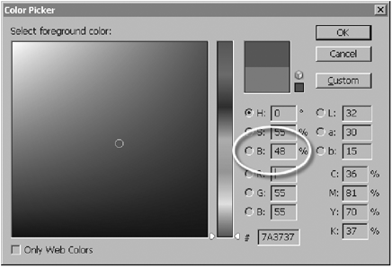
Figure 11-3: Checking the gray value of a pixel in Photoshop.
If you were to set your overall Specular setting in the Surface Editor to 10%, and you added a gray image that contains black pixels, these black pixels will not be 0% as per normal, but rather 10%. This overall value basically sets the lowest value at which the range of grays in your texture maps will be interpreted.
However, when mapping with images, it is usually simplest to leave this overall value at 0% and instead control the channel with the images.
This overall value will take on a more meaningful role when we start using procedural textures.
Creating Image Maps for Individual Surface Attributes
Overview of Creating and Using Image Maps
Now that we have explored the use of gradients and procedural textures for creating details within your surfaces, let’s move on to how we go about creating images to use as textures.
The really cool thing about using images for texturing is that you can create any detail you want on your surfaces simply by painting them. Easy. The tricky thing about using images is that they require projection parameters, discussed in greater detail in Part 4 of this book. Once we have gotten over the initial phase of mapping your model, or of planning your different texture projections, we move to the texture creation phase, which is definitely my favorite part of the entire texturing process.
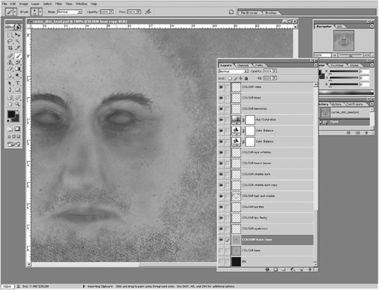
Figure 11-4
You can use any paint software to paint textures, from 2D painting programs like Adobe Photoshop or Corel PHOTO-PAINT (among many others) to 3D painting packages such as Right Hemisphere’s Deep Paint 3D, Maxon’s BodyPaint 3D, Pixologic’s ZBrush (a full 3D package that includes a 3D painting toolset), or Alias’s StudioPaint (a slightly older package that is no longer developed but is still used in some studios). You may think that 3D painting programs do not work with images, but that is essentially what they actually do. Even though you are painting directly onto the model when using them, they are outputting those brush strokes to an image that is then applied to the model. The following image shows the workspace of Deep Paint 3D.
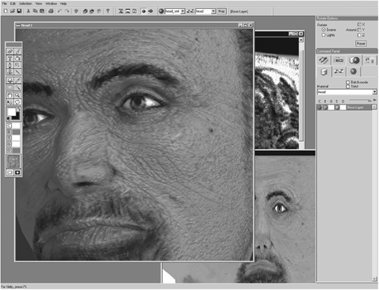
Figure 11-5
Painting textures does not necessarily require an enormous amount of artistic talent, but it does require a good eye for detail and an excellent knowledge of your painting package. Of course, artistic talent can certainly aid you in creating interesting and detailed textures, but the process of painting textures can also be a purely straightforward and logical one. Paint what you see and paint what you need. The reason that I say a good knowledge of your painting program is essential is because there are so many ways to go about creating textures that involve a lot more than merely painting strokes onto a canvas. Good work habits within your paint program are also important, such as managing your image layers efficiently and knowing the right tool for the right job.
Textures can be created in so many ways, from painting everything totally from scratch to using photographs or textures baked directly from LightWave (using the Surface Baker shader, described in Chapter 5, as a starting point) or using a combination of all of these. The methods you use can depend entirely on the project at hand, the type of texture you need to create, and the amount of time that you have at your disposal to complete the work.
Some people are texturing purists who like to paint everything by hand without using anything besides their own brush strokes, and while this does indeed allow the artist to create absolutely everything in precisely the way that he or she wants it, this method is not always the most practical. You shouldn’t feel bad about using photographs as a starting point or blending them with other photos or painted textures to create different effects. Sometimes you may find that a photograph of a dirty piece of metal makes a really great grunge map for a piece of wood, or a photograph of noodles makes a good image of a hook and loop type fastener. You just never know! Textures like skin, wood, and metal are often tricky to create entirely from scratch, while using a lot of photographic reference and even parts of the photos within the texture can actually work really well.
Preparing and Using Photographs for Image Maps
When you are working with photographs that will be incorporated into your textures, the most important thing that you need to attend to is the lighting that is in the image. Unless they are taken in extremely controlled environments that are designed to avoid noticeable lighting information appearing in the photo, all photographs have highlights, shadows, and other lighting information in them.
Take a look at Figure 11-6. You can clearly see highlights and shadows within this photograph, which would make it unsuitable, as it is, for use within a texture.
You often notice beginners using photographs such as this one as textures. The problem with using images like this is that you end up with discrepancies in your renders because the shadows and lighting in the photograph do not match the lighting rig in your 3D scene. Because of this, it is important to remove all traces of lighting from photographs that you use in your texturing.
Figure 11-6
The method you use to remove the lighting can differ according to what kind of texture you actually want to use the photograph for. For example, removing the lighting because you want to use the photo as a color map will involve different steps than removing lighting from a photo that you wish to use as a bump map. Although in my personal experience photos are generally fine as color maps, once prepared, they are generally grossly misused as bump maps, specular maps, etc., since they are usually too generic in detail and totally inaccurate, especially in the case of bump maps. A photo of a brick wall can be prepared to make a great color map, but all too often people simply desaturate it and then use it as a bump map. Why won’t this work? It should be obvious. Take a look at Figure 11-7.
Figure 11-7
While we can obviously quickly remove the shadows appearing in certain areas using tools like cloning or even straight painting to create a color map, this image would not necessarily be suitable as a bump map. The problem is that many artists think nothing of simply desaturating the image to gray, so that they end up with the image in Figure 11-8 that they then apply to their model as a bump map.

Figure 11-8
If you are looking at this image now and thinking “Ummm, why can’t I use that as a bump map?” then give yourself a slap and listen up. Take a close look at the color version of that photo (see the color image on the companion CD) and then at the gray version. As we know, the different gray levels in an image will create different levels of amplitude when applied as a bump map. In the color photograph, we can clearly see that all of the bricks are more or less protruding the same distance from the wall, with the exception of a few of the bricks that have slightly rough edges that protrude a little farther.
Look now at the gray version. Because some of the bricks have much lighter colors than some of the other bricks, we have light gray bricks as well as dark gray bricks in the image. This means that if we apply this as a bump map, we are going to get very uneven looking bricks that are going to look very little like the original photo. And when you are creating this brick wall as part of an architectural model, believe me, the clients are not going to be too impressed that you have created sloppy, uneven brick work on the model they are paying you to make.
Ideally, the gray version would have to be edited to look something like Figure 11-9, where all the bricks are more or less the same lighter shade of gray while the mortar in between is darker so that it works correctly when applied as a bump map. I have also darkened all the mortar to the same shade.

Figure 11-9
All too often I see people using this dreaded “Oh, just convert your color map to gray and use that as your bump map” philosophy when it really doesn’t make sense if you are aiming for accuracy.
So, how do we quickly and efficiently remove lighting from images? One of the most popular methods of doing this is to use the Lab color model found in programs like Adobe Photoshop.
The Lab color model includes a channel for lightness. The cool thing about this is that you can then go into the Lightness channel and edit it so that you can even out the lighting.
Let’s look at a practical example. See Figure 11-10.

Figure 11-10
The middle part of the manhole has a highlight on it. Leaving this highlight in the image and then applying it as a texture could cause problems if the lighting you create in your LightWave scene does not match it. So we need to remove it. Basically, we need to equalize the highlighted area so that it no longer appears to have the highlight on it.
If I open the image in Adobe Photoshop and go to Image>Mode>Lab Color, the image is converted into a Lab image. Going to my Channels palette, I now find the Lightness channel.

Figure 11-11
If I select the Lightness channel, I get the following channel appearing in my canvas.
Yes, it looks very much as the image would look if you were to convert it to gray. The cool thing, however, is that by editing this channel, we can even out the lighting in the color channels.

Figure 11-12
I now go in with my Rubber Stamp (clone) tool, and carefully clone the darker areas onto the lighter areas in the middle of the manhole and use my Burn tool to clean areas up (the Burn tool makes things darker), until it looks like Figure 11-13.
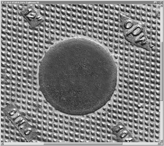
Figure 11-13: Zoomed-in view of image after highlight is removed.
Switching back to the color channels of my image, you can see that the highlight is now gone from that area!
This method isn’t 100% foolproof, as most images will invariably need some careful attention to areas with other tools, sometimes even directly onto the color channels, but this is a quick way to remove lighting initially, leaving the small tweaking until later for the areas that need it. Sometimes I even find myself manually painting or cloning areas directly in the color channel to remove shadows and highlights. It really depends on the image.
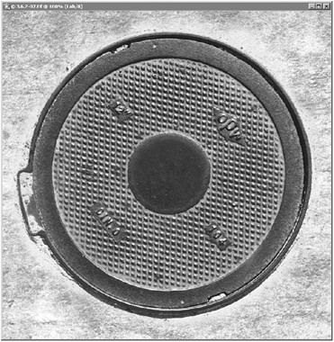
Figure 11-14
But as you can see, removing lighting from images is very important for ensuring accuracy and consistency when placing it into a digitally lit environment. So no more laziness! Get that lighting out of your images.
Creating Seamless Textures
Very commonly used for game models, seamless textures can also be useful for tiling onto areas in the background when you simply don’t have the time to create intricate detailed textures for arbitrary things like walls or ground that you are not going to see in great detail in a moving shot (thus not giving the viewer time to register that the background textures repeat themselves).
Of course, in order to tile an image repeatedly onto a surface, you need to ensure that all its edges meet without visible seams. Luckily when dealing with non-UV textures (where seams are dealt with differently since they have a shaped template to work with), the process of making an image seamless at its edges is really quick and extremely simple.
Figure 11-15 shows a block that has a texture tiled a number of times onto it. Of course you’ll obviously notice that the edges of the texture are quite conspicuous.
I need to edit the image so that the edges meet up seamlessly. I open the image in Adobe Photoshop.

Figure 11-15
I need to first shift the edges around so that I can see why it is that they are not meeting up properly. To do this in Photoshop you can use the Offset filter, found under Filter>Other>Offset. You can use this filter to shift your image so that the edges move inward. If I shift the image 500 pixels to the right and 500 pixels down, using the Wrap Around option, the edges shift to the side and down as shown in Figure 11-16.

Figure 11-16
I can now apply the filter and use the clone tool to remove the darker areas. The image ends up looking like Figure 11-17.

Figure 11-17
When I apply this image now to my model, the seams are now no longer visible! In fact, it’s not even that noticeable that the texture is tiled.
Figure 11-18
Creating and Using Images with Alpha Channels
Alpha channels, as discussed in numerous other parts of this book, are additional channels contained within an image that define areas of transparency. Only 32-bit images, such as TGA or TIFF files (saved in 32-bit format), can contain alpha channels.
When creating alpha channels in images, the white areas of the channel will allow those areas of the actual image to remain opaque, while the black areas will be transparent.
Take a look at Figure 11-19. The color channels of the image are shown on the left, and the image’s alpha channel is shown on the right.

Figure 11-19
When we apply this image as a texture to the wall we saw in the previous example (the image is applied as a new texture layer above the brown wall texture in the Texture Editor for the color attribute in LightWave), we can see that the areas not included in the alpha channel are ignored by LightWave.
Figure 11-20
Remember to make sure that the Alpha Channel option is enabled in the Image Editor in LightWave in order for it to work properly.
This is a simple example showing a simple alpha channel, but remember that you can make far more complex alpha channels using shades of gray to vary the transparency in areas. Using more complex alpha channels can be useful for blending multiple textures using multiple projections in LightWave. Techniques for blending textures are discussed in Part 4, which deals with projections.

Figure 11-21
Only Use RGB and Grayscale Images!
Although you may, by personal preference, work in different color models such as CMYK or Lab color while creating your color textures, it is very important to make sure that when you save your images as color textures to use in LightWave, you save them in the RGB color mode. This is because LightWave cannot correctly work with images using other color models, and you’ll find yourself staring at the preview pane in the Image Editor asking yourself, “What on earth happened to my image?!” as it will show up as a weird distorted mess, as demonstrated in Figure 11-22 (bear in mind that the image itself is a lovely deep red brick wall).

Figure 11-22
When saving images that use shades of gray only, such as your Bump, Specularity, Reflection, etc., maps, you can convert the images to grayscale color mode. This saves on RAM usage while rendering since they are smaller files that use less memory.
Practical Examples for Painting Image Maps
As discussed in the previous section, painting textures requires, probably most of all, an attention to detail. And a healthy dose of common sense. Don’t just paint a few strokes and call it a texture. You need to put thought and effort into it so that it is believable and interesting to look at. Of course I cannot demonstrate how to paint every type of texture you’ll ever need to make, but the principles of painting textures apply across the board.
It’s a mindset and an eye for detail that you need to develop. Once you understand what it is that makes a good texture, you’ll no longer need tutorials. You’ll be able to paint your own without having to ask questions or refer to tutorials. As I have said time and time again, texturing is simply a process of painting what you see and what you need. If you need to paint a face, look at a photo of a face, look at the details, and paint the same thing. No two ways about it really. You even have a face of your own. So look in the mirror if you’re in doubt. Don’t stop halfway through and ask someone, “How do I paint the wrinkles around the eyes?” because when you do that you just aren’t using your brain. And you’ll just end up annoying the person you are asking. You know what wrinkles look like, you know how to paint a line, so paint the wrinkles — because a wrinkle is really just a line.
Eventually you’ll get to the point when you don’t even need to look at references all the time as you develop a sense for instinctively knowing what sorts of details you need.
Let’s look at the process of painting textures for each of the surface attributes that we can map in LightWave. These are just examples demonstrating the process I have gone through to create certain textures, and not actual step-by-step tutorials. For step-by-step tutorials, refer to Part 7 of this book.
The purpose of these examples is to demonstrate my thought process while texturing, and the steps I take to create the details that I need in my textures.
NOTE: All the textures shown in this chapter were created in Adobe Photoshop CS, so I use a lot of terminology from that particular package.
There are those who believe that people simply don’t learn anything from step-by-step tutorials because they show you a bunch of steps to take without you actually understanding why those steps are necessary. Consequently, you don’t actually learn anything since all you are doing is observing and copying a single way of doing something. It basically doesn’t teach you to think, and thinking is the only way to learn.
Of course, for absolute beginners, they are useful since they show what tools can be found and how to use them, but once you have progressed past the beginner stage, you should do yourself a favor and give your brain more to feed on.
However, since a book generally requires tutorials, I have included some in Part 7 for those beginners who need some pointers regarding tools and quick techniques for introducing them to the art of texturing. I recommend that all beginners try the step-by-step tutorials and then immediately dive into some major experimentation. Trust me, you’ll have loads of fun, and then if you get stuck on any areas, have a look through this section and see how I tackle things. By observing the examples of others, we encourage ourselves to adapt those concepts into our thought process, and consequently develop our own techniques of using those concepts.
So for those of you who love to engage your brain, I have written this section for you.
Making a Color Map
There is no rule that dictates that your texturing should always begin with color (or any other surface attribute for that matter), but I personally am a creature of habit and tend to create my color maps first, most of the time. There is no real reason for this, apart from the fact I just prefer to do it that way. If you want to start off your texturing process by creating your bump maps, or your specular maps, or any other maps, by all means please go ahead.
It is important to make a mention here before we get started of the tendency that people often have to paint shadows and highlights into their textures. I should hope that by now (providing you have read all the preceding chapters of this book) you understand how the different attributes of a surface work, and that shadows and highlights are created by the lights in your scene, and are therefore not needed (or wanted!) in your textures. So if you feel that weird urge to go and paint shadows in your character’s nostrils or a shiny highlight on the hilt of a dagger, then STOP!!! Unless you are painting textures for a game engine (where these are often needed), then stop yourself right now, slap your hand for doing such a thing, and think properly. No shadows or highlights are welcome here.
Okay, let’s get back to painting color maps, and have a look at the color textures for a human head, as a human head has lots of cool color variations that make it a good example for demonstrating color maps.
A good way to begin a color map is simply to create a general wash of color for the entire thing. Figure 11-23 shows the initial color layer I have made for the skin for the character’s face, which will eventually be a very fair-skinned, unshaven male character. I’ve left the UV map visible so that you can see where the facial features will be.
NOTE: Color images of the figures are on the companion CD.
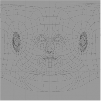
Figure 11-23
As you can see, this is simply a flat layer of a suitably fleshy color. I don’t have to worry too much about the overall tone of the layer, as it can always be changed at a later stage with an adjustment layer (in Adobe Photoshop) or even by altering the actual tone of the layer itself. The current RGB values are 171, 158, 124.
In fact, I decide to make the color a little more pink right now. So I simply create an adjustment layer (Color Balance) and adjust it so that the red tones become stronger and the overall tone of the layer becomes less yellow.
Now, a very lazy person would leave this layer as it is. However, this will not look great if it is supposed to look realistic (and that lazy person will never make a good texturing artist). If you look in the mirror, you’ll see that your skin has loads of different little details and color variations in it. So we need to make some of those here. Remember, paint what you see!
Figure 11-24 is a photo of part of a face. As you can see, there are subtle color variations everywhere, as well as freckles and spots.
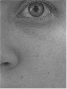
Figure 11-24
I’m going to need some details like that.
My personal method of quickly adding variations and little details to textures is to use the Dodge and Burn tools in Photoshop. However, you can use any method you want for this, including painting them with a paintbrush. Find tools that you are comfortable using. It’s the final look that counts, not the method you use. What I do is make a very small brush with a very low intensity setting, and make lots of tiny, almost imperceptible little brownish dots on the flesh. Yes, this does take some time. Basically they are like faint freckles. I then make the brush slightly bigger and create beauty spots (small moles). Once I am happy with my spots and moles, I make the brush size of the Dodge and Burn tools even larger, and simply create larger spots of color variations all over the place. I always keep these tools on very low intensity, as they can really wreck an image if used too strong.
My base color layer now looks like Figure 11-25. The variations are very subtle, but far better than a plain flat color, don’t you think?
If you are interested in what colors these spots are, the RGB values are 167, 132, 94.
The overall skin tones now have many variations. Some of them are 198, 167, 138, which is a fairly light fleshy color, and others are 181, 146, 116, which is a slightly darker fleshy color.
Figure 11-25
Next up are the eyebrows. Eyebrows are really simple. What are eyebrows made of in reality? Hairs. And what are hairs? Lines. Lines are the simplest things in the universe to paint, so I just make a new layer, select some brown tones, and paint strokes on a medium level opacity, constantly varying the color. I build up the strokes until they eventually form solid eyebrows. If you need references for eyebrows, simply look in a mirror. Paint what you see. This texture is for a male, so I make fairly thick eyebrows in the texture.

Figure 11-26
I painted them first using a layer of brown with the RGB values of 88, 65, 46, a rather dark, chocolatey brown. I then created slightly lighter brown strokes, using the values 113, 84, 61.
Simple so far, isn’t it? Well, this is the part where it now gets a little more arty. I know I said before that there isn’t always a great deal of artistic talent needed for textures, but having a sense of color and a delicate yet steady approach to painting can definitely help here, especially since the color variations we need to add to the face now require a great deal of subtlety and delicacy.
When we look at Caucasian human faces, we see a lot of reds and blues in the skin. These colors actually come from beneath the surface (more specifically, from the blood beneath the surface), and are not actually directly on the surface itself. However, when painting skin textures we need to add them in, because we have to cheat a lot in the world of CG.
Figure 11-27 is a photo of a person who seems delighted by the dancing hamster he is holding.
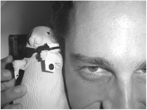
Figure 11-27
If we look closely, particularly at the area immediately surrounding the eyes, we see some subtle blue tones, and farther downward toward his cheeks and also on his nose, we see stronger pink and red tones. These redder tones are rather more apparent than they would be ordinarily because this person is in a state of insobriety, but images that show extremes generally make the best practical examples. And interestingly enough, I often find that making textures that show slightly more exaggerated tones work best. Especially since it is better to initially create something where the tones are too strong, since they can always be lessened by changing opacity levels at a later stage. Making tones that are too subtle stronger at a later stage generally proves to be slightly more difficult.
So let’s get back to painting. I now make a whole bunch of new layers, so that I can vary their opacity levels to obtain the right blending once I have had fun with my paintbrush, painting red and blue tones where I want them, each area of tones on its own layer, for that extra control.
Once again, I use my brush on a medium level opacity, and build up my tones gradually and intuitively.
NOTE: It is for this kind of work that I can highly recommend using a digital stylus (such as a Wacom) to paint the details, since it allows pressure sensitivity and provides a far more intuitive approach to digital painting. It is not impossible to paint with a mouse, but I find painting with my Wacom far more comfortable and efficient.
I pay particular attention to the nose and the area directly beneath the eyes. This is because these are the areas where the blue and red tonal changes on a real person’s skin are the most apparent. Again, this is a very intuitive process. You can look at a human face, see where these tones are, and simply paint what you see and what you know needs to be there.
My texture now looks like Figure 11-28. I’ve made some nice, relatively subtle red and blue tones, and even darker purple tones to build up the effect of the blood beneath the surface of the skin.
Just as a reminder as to where these details are actually situated, Figure 11-29 is a shot of the texture with the UV map showing over it.
Figure 11-28

Figure 11-29
Next on the agenda is some stubble. When I create stubble, I generally do so with the aid of a few little custom brushes. Making brushes in your paint program (if you have the option) can greatly speed up the process of creating often-needed details. Stubble is something I often have to paint, so I have a few stubble brushes that I always use.
To make a stubble brush (or any kind of brush for that matter) in Adobe Photoshop, you need to start off with a new layer. I generally just create a new document, and start from there. I then take a small fine brush (usually one or two pixels in diameter) and paint a little stubbly pattern in black ink, as shown in Figure 11-30. Make sure that you have created the little dots on a totally new layer with transparency.
Figure 11-30
Once you have a pattern that you are happy with, select the layer by holding down the Ctrl key and clicking on the layer name in the Layers palette. Once the little dots are selected, go to Edit and select Define Brush Preset. A new window pops up with a preview of the brush and a field into which you can type a name for the brush.

Figure 11-31
This creates a new brush that you can use in your textures. Create a few different variations and constantly switch between them when painting your stubble to avoid creating regular repeating patterns.
With my current character, I start off by first defining some fairly coarse stubble on the upper lip, the chin, and the sideburn areas.

Figure 11-32
I now want to make a softer stubbly layer, not only for the beard but also for the actual hair on the head. Even if you are going to use something like Sasquatch for the hair, I still recommend painting some semblance of hair on the head to create a slightly thicker-looking head of hair.

Figure 11-33
For this latter example I actually paint some solid color with a soft-edged airbrush on a medium opacity. I then take the Eraser tool and, using the stubble brush I made previously, I erase areas from this new stubble layer. This creates a slightly more solid, yet patchy-in-places layer of almost dirty-looking stubble.
Now, I could leave the stubble the way it is and get away with it, but I won’t. I am going to go that extra mile and add some shaving rash. These are the kinds of details that separate okay-looking textures from cool-looking ones. Anyone can paint stubble, but will everyone paint shaving rash too?? I think not. Well, perhaps (hopefully) after reading this, you will.
A rash is easy to paint. Simply take a soft-edged brush and paint some pinkish dabs in a few places. Easy.
My texture is coming along quite nicely now. And this has taken very little time too — about half an hour.

Figure 11-34
What next? Ah yes, I want to make the ears a little red. You know how people’s ears glow when they are lit from behind? I’ll let you in on a little secret of mine, and that is that I often add a tinge of pink to the ears in my color map to help enhance that effect. At this point I also add some spots to the face (just a sprinkling of little light brown spots as blemishes helps to enhance realism) as well as some very faint veins.
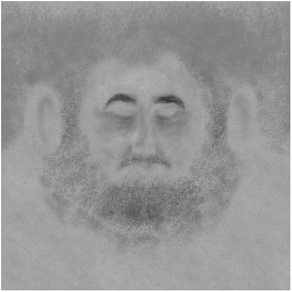
Figure 11-35
One more detail remains — the lips. I want this guy to have quite dark, fleshy lips, so I paint a rather bold shade of red for them. While I am going wild with the red tones again, I add some darker reds to the cheek areas and also to the eyelid areas. I also add some more dark reds to the ears. Once I have painted a basic dark red base for the lips, I use the Burn tool to add some variations to them so that he doesn’t end up looking like he’s wearing lipstick.
I’m almost happy with the texture now. I just realize that perhaps the overall color needs a bit of adjusting. The best (and safest) way to do this is to use our trusty adjustment layers. The reason I say this is the safest way to do it is because the adjustment layer does not actually directly change the color of the pixels in your texture layers; it simply alters the color of the layers below it. If I then decide I don’t like the change, I simply kill the adjustment layer or change its setting. This way the original layers I painted are never actually changed directly.

Figure 11-36
I use a Color Balance adjustment layer to shift the overall tone of all the layers to a more saturated red and yellow tone that I feel will suit the character more.
I am now satisfied with the way that the color texture looks for my model. I quickly whip up my remaining textures, slap them on the model, and voilà! I am happy with the way my character looks.

Figure 11-37
If you are hungering for more, please refer to Part 7 of this book for a more in-depth tutorial on creating human skin textures.
Let’s now look at another color texture example — wood. More specifically, the wood of a guitar. Wood is something that a lot of people struggle with (as well as metal). This is where photographs come in handy. You should never feel ashamed of creating textures using photographs, as long as you use the photos correctly. If you have not read the section “Preparing and Using Photographs for Image Maps,” then you should do so now.
Figure 11-38
Now back to the subject at hand, the guitar. I have taken a screen shot of the front of the model to use as a template for painting the texture. So I take this into Adobe Photoshop. I then scrounge through my rather vast texture library, and locate two nice wood images from my RansomActive texture collection. I like the look of the maple for the body, but I also want a knot in the wood, which the rosewood image has.
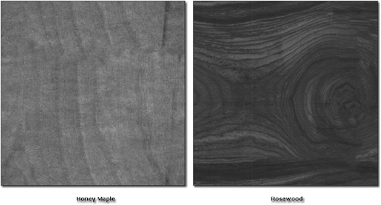
Figure 11-39
I now drag the maple image into my guitar texture template. I size the image down somewhat and copy it over so that it covers the entire space that the guitar body occupies within the image. See Figure 11-40.
Then I take the Rubber Stamp (clone) tool and remove the darker streaks from the middle of the image, and also make some random changes to certain areas of the image so that it is no longer obvious that the maple image is repeated.
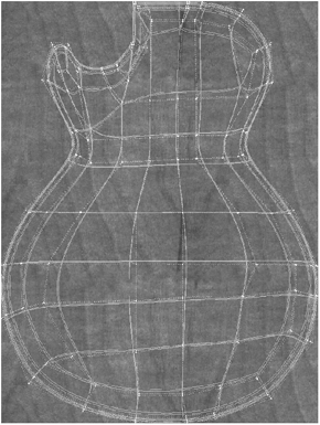
Figure 11-40

Figure 11-41
Now it’s time to add the wood knot to the body. I copy the entire rosewood image into my guitar file, and then take a soft-edged eraser and erase all around the image so that I am only left with the knot detail. I then desaturate the layer to gray and use the Hue/Adjustment tool (found under Image>Adjustments) to match the color of the knot to the color of the maple. See Figure 11-42.
Developing an eye for matching colors may not come immediately to you, but trust me, with time you’ll find it becomes a lot easier.
So far I have a decent-looking wood for the body of the guitar. I am happy with the way that the wood grain and knot look, so it’s time to add the paint detailing to the bodywork. I simply take a large, very soft-edged airbrush with a very dark maroon color, and carefully detail the edges of the guitar to create what is known as a sunburst pattern on a guitar. I do this painting on a new layer so that if I make a mistake, it is easy to erase.

Figure 11-42
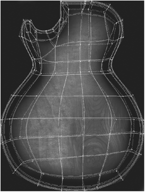
Figure 11-43
Luckily, the contours of the actual model in the screen shot I used help me to position the painting details with perfection. Figure 11-44 is a shot of the texture so far without the model showing.
I am happy with the way that the wood is looking, but it is just a little too light for my taste. So I create a new Hue/Saturation adjustment layer on top of everything and adjust the lightness and the saturation so that the wood is now a darker shade of brown, as shown in Figure 11-45.

Figure 11-44
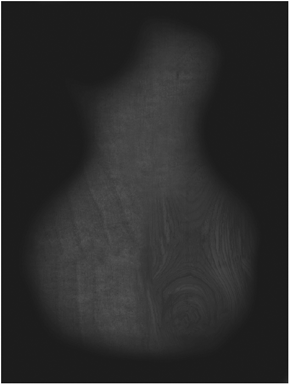
Figure 11-45
This looks perfect for my needs. I go back into LightWave and slap the texture onto my model, give it some specularity, glossiness, and a touch of reflection, and I have a great-looking guitar!

Figure 11-46
Making a Luminosity Map
Luminosity maps are the easiest things in the world to create. If you want something to be luminous, make it really bright in the texture and leave the areas that you don’t want luminous plain old black. Simple.
Of course you can always take a more creative route when the chance arises. For instance, say you were working on a scene that takes place at night, and in the scene is a window with frosted glass that is lit from the inside. Frosted glass is generally opaque, so it would probably work best if you were to paint a luminosity map for the window instead of trying to make it appear solid and shine a light through it and all that. Well, I have actually created a scene just like this for this example. How nice of me.
Take a look at Figure 11-47. Sure, the glass does work in that it appears to be lit from within, but it looks really boring. The surrounding walls are pretty grimy and skanky, so I would imagine that these windows probably don’t get washed all that often either.

Figure 11-47
So I decide to make a nice grungy luminosity map. I start off by taking a screen shot of my glass panes in Modeler, and then going into (you guessed it) Adobe Photoshop and initially making both panes totally white.
If I were to apply this texture now as it is, it would give me exactly the same effect as we saw in the previous render, where I had simply taken the Luminosity value of the window surface up to 100%.

Figure 11-48
First, I want to create some old drips on the window. My absolute favorite method of creating drippy details is to use the Wet Edges option on my brushes (I am sure that most paint applications have something similar), and then set the brush to a medium to low level of opacity with a soft edge. Painting with this type of brush is fantastic for things like thin layers of actual paint, water damage, streaks, etc. I paint a few drippy bits on the window, and also build up some layers of darker shades at the bottom and corners of the window panes.

Figure 11-49
Obviously, these darker areas will lessen the luminous effect of the surface. We need more though, as these are simply watery marks that are not actually solid grit or dirt. One of the quickest ways to make dirt is to use a technique commonly known as grunge mapping. This technique involves taking detailed photographs, especially of things that have gritty details in them, making them high contrast, and then using them to make selections or blending them with layers to get the desired effect.
I look through my texture library and find a suitable image as shown in Figure 11-50. I then take this image, desaturate it, and pump up the contrast until it looks like Figure 11-51.
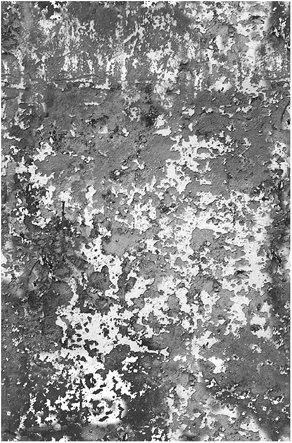
Figure 11-50

Figure 11-51
I then drag this image into my luminous texture file, change the blending mode to Multiply (so that the white areas become transparent), and use a soft-edged eraser to erase the details from the middle of the pane, so that the grit lies only along the sides, top, and bottom of the window pane.

Figure 11-52
I want more drippy details, so I look for another image to use as a grunge map to create them. I choose the image shown in Figure 11-53.
I then desaturate and increase the contrast of this image as well, and drag it into my luminous texture file. I switch the blending mode of the layer again to Multiply, and adjust the opacity so that the streaks are gray in the image. I then take my eraser to the layer and erase the parts I don’t want, until I am left with something like Figure 11-54.

Figure 11-53

Figure 11-54
Of course this grime is only on the left-hand pane, and I want some more grime on the right-hand side as well. I find yet another image that will make a suitable grunge map.
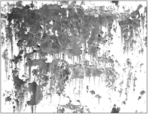
Figure 11-55
Once again I increase the contrast of this image until it becomes very high contrast, and add it to the layers of my texture. I take the Eraser tool and erase the parts of the texture that I don’t want, until I have a nice layer of grime on the window on the right.
Figure 11-56
Looking at this image now, we have a great sense of grime build-up in all the appropriate areas for a dirty, unkempt window. Applying this now to the window and rendering it gives the effect shown in Figure 11-57.
Figure 11-57
Far more interesting and suitable than just a plain luminous piece of window, wouldn’t you say?
Making a Diffuse Map
A diffuse map is one of those things that is usually not all that necessary, since simply adjusting the overall Diffuse amount is generally sufficient for preventing the surface from becoming oversaturated. However, in some cases you can use diffuse maps to darken areas, such as if a character’s clothes have liquid spilled on them, which changes the diffuse property of the surface. You can also use a diffuse map as a dirt map for adding grime to a surface without actually adding it to the color map.
Another use for diffuse maps is to prevent reflections from textures from becoming too milky; using a diffuse map can help to deepen reflections. For this purpose I often find that simply inverting my reflection map and placing it in the Diffuse slot works perfectly.
Creating Procedural Diffuse Textures
Let’s have a look at making a diffuse map for the purposes of grunging up a surface. I know this section is about painting textures, but for this particular example I will simply create a procedural texture in my Diffuse slot to dirty up the surface a bit.
So I have this crate model (incidentally, you’ll find a tutorial on creating the textures for it in Part 7), and it has some nice flaky paint on it.
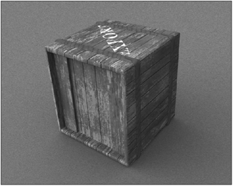
Figure 11-58
Since I am going to map the diffuse values entirely with a texture, I change my Diffuse value in the Surface Editor to 0.0% and open the Texture Editor for Diffuse.
I change the default layer that is created to a Procedural Texture layer, and change the Procedural Type to FBMNoise. I invert the procedural because I want the actual darker diffuse areas to be small, while the majority of the surface remains normal (by default, this particular procedural covers most of the surface, so inverting it creates the opposite effect of the majority of the surface remaining unchanged while small areas acquire little details). I set the Texture Value to 80%. This means that the majority of the surface will have a value of 80% Diffuse, while the darker areas of the procedural patterns will create lower values of diffuse.

Figure 11-59
I set the scale to 300mm on all three axes.
Rendering the crate, I now have the image shown in Figure 11-60. The procedural texture has created a very quick and easy and decent-looking dirt to the crate that almost looks like burn damage or wood damp rot from being in storage.

Figure 11-60
And the really cool thing about this is that since I have a UV map created for this object already, I can simply bake this diffuse texture out to my UV map now, so that if I so wished, I could take it into Photoshop and edit it a bit.
Another very nifty use of this method is if you have a number of cloned items of the same object in a scene, you could apply a procedural diffuse to the surface that will then randomize the clones from each other somewhat, as demonstrated in Figure 11-61.

Figure 11-61
Very useful indeed, eh?
Making a Specular Map
We know that specularity in CG is a fake reflection, so why bother mapping it? Well, it’s useful because it provides a very quick way of giving a surface some shine without using reflections, and creating shininess on a surface helps to convey a lot of information to the viewer about what a surface feels like to the touch.
Specularity (and reflection) is something that is never consistent across a surface, which is why it is one of the more important surface attributes to create textures for. Creating variations in your specularity helps to convey a sense of imperfection on a surface without adding dirt. Sure, adding dirt is fun, but you don’t always want everything to look like it’s just been pulled out of a swamp.
Let’s look at specularity in human skin.
We all know, without even looking, that on a human face the skin is shinier in some areas than others. Generally, on a “normal” human face in “normal” conditions (in other words, the person does not suffer from a bizarre skin disorder and is not sweaty or suffering from dry, flaky skin), areas like the bridge and tip of the nose, the area directly beneath the eyes, the middle of the forehead, and the lips are shinier than the cheeks and the chin. The cheeks and chin are generally fleshier and softer looking (although they do have a certain amount of shine — they are not dry looking). Generally, the driest-looking area of a person’s face is the little patch where the nostril meets the cheek — the skin in this area is often slightly rougher and drier.

Figure 11-62
Of course, these are generalizations and there are always exceptions, but these are good general guidelines for the average face.
So when painting a specular map for a face, we need to take these guidelines into account. We can see that some areas are very shiny, some areas are relatively shiny, and other areas are soft and fleshy with a broader falloff of light on them.
So I start off my specular map for the face by roughly defining these areas, as shown in Figure 11-63. I start off the entire map with a relatively dark shade of gray — the RGB values are 25, 25, 25 — the equivalent of a specular shading value of 10% assigned to the Surface Editor in LightWave. This is a relatively natural fleshy value for specularity, as it is not too plastic looking.
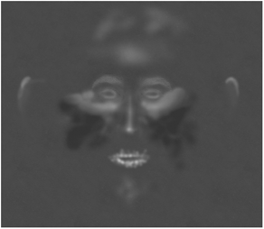
Figure 11-63
NOTE: I have brightened all the shots of my specular maps by 35% so that the details will be more clearly visible in print. Ordinarily such light grays would be a little too high for human skin.
As you can see, I’ve simply used the Dodge and Burn tools to intuitively lighten and darken certain areas, respectively. As with all organic textures, a delicate approach is essential. Simply going in with an airbrush and painting large splotches of white and black (yes, I have actually seen people doing exactly that) is going to look awful. Of course I don’t mean that you can’t use the Airbrush or Paintbrush tools at all, because by all means you must use the tools that you are comfortable with. It’s your technique that makes the difference. The key lies in slowly building up the different tones using subtlety and delicacy, using low intensity settings on the tools (whether you are using a brush tool or a touch-up tool like dodge or burn), and gradually working the areas to be lighter or darker where necessary, and always with a soft edge. It is essential that you adopt careful painting habits for textures, especially with organic textures, where variations on surfaces are generally not harsh, but rather gradually changing between different areas, which is why using soft-edged brushes is usually the safest route.
You’ll notice that I also have the eyebrows included in the specular map. This is because on this particular model, I have the eyebrows in the texture instead of creating them with Sasquatch. And of course hair has a different specularity than skin, and since it is often quite shiny, I copied the painted eyebrow hairs from the color map where I already made them, desaturated them, and lightened them in the specular map so that the hair will appear nice (and different from the surrounding skin) and shiny when rendered. It is important to remember that where there is a different substance or a change of surface quality on a single surface, you always need to reflect this in your textures.
Next up I need to add some details to the eye rims, because these areas are generally wet from the liquid around your eyeballs. So I create a new layer and paint some light values around the edges of the eye, building up the lighter tones until they are really quite bright.
This particular character (which some of you may have seen before in Keyframe magazine) has a scar running down his cheek, and since scar tissue is generally quite shiny, I need to make that area have a higher level of specularity. Since I have already painted my color textures for the face, I have the scar already painted on its own layer, so I simply copy that layer into my specular map layers, desaturate it, and adjust its brightness. When I feel that I have the right level of brightness, I have a specular texture like the one shown in Figure 11-65.
Figure 11-64

Figure 11-65
I am relatively happy with the actual overall look of the map, but it is a little too plain for my liking. Sure, I have all the necessary variations in the appropriate areas, but I would prefer for the map to have a little more detail to it. When I created the bump maps for the character, I gave him a lot of wrinkles and blemishes in his skin, and I would like for those areas to have a variation in the specular map as well. So I copy those layers from my bump map (the wrinkles and blemishes), and blend them with my specular layers. I have chosen to have the wrinkles less shiny, so that they will break up the overall levels of specularity across the face, providing a nice irregular and rough specular appearance to the face as a whole.
When applied to the model, the specularity of the skin works as it should, with the nose, forehead, lips, the areas directly beneath his eyes, and the scar on his cheek being shinier than the rest of the face.
Figure 11-66
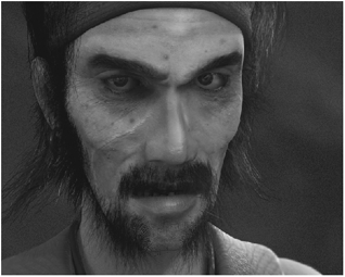
Figure 11-67
Without the specular map applied to it, the skin would look like dull cardboard, since the specularity really helps to create a sense of fleshiness to the surface.
Making a Glossiness Map
Glossiness, like diffuse, does not always require a texture map. This is because in most cases, simply adjusting the overall value of it suffices, since it is essentially an extra control for specularity, as opposed to an entirely new surface parameter.
The only time I have ever actually painted a texture map for glossiness is when I had already created the specular map for something, and then wanted certain areas of that specular map to look slightly wet, while the other areas would simply have “normal” specularity, the falloff of which was already controlled by the value assigned to Glossiness in the Surface Editor in LightWave. So basically I allowed the overall gloss value to determine the falloff of the specularity created by the specular map (as is the function of the Glossiness value), and then used the gloss map to allow just some of those areas to have a higher degree of glossiness so that they appeared to be moist.
One such character that I used a gloss map on was a Lord of the Rings-style orc that I made some time ago, and actually don’t particularly like, but I thought it would make a good example of what glossiness mapping can do. For this particular character, I used the gloss map to make him look very sweaty on parts of his face, to make the areas around his piercings look as if they were seeping liquid, to make his eyelids appear wet, to make a cut in his forehead appear to be oozing fresh blood, and to coat his lips with spittle issued forth from his war lust.

Figure 11-68
The reason you can’t create wet areas with a specular map and an overall Glossiness value in the Surface Editor alone is because in order to make things look wet, you need to have similar values (usually with approximately 10% to 5% difference) of the two surface attributes, generally at rather high percentages, such as 80% Glossiness and 100% Specularity. However, once the gloss values begin to exceed the specular values, even when the specularity is from a texture, the entire surface begins to look wet. So if I were to apply my specular map and then simply push the Glossiness value up, the entire surface would begin to look wet. Instead, I create a gloss map with very light areas in the areas that I want to appear wet, while leaving the rest of the map on a suitable overall value for the rest of the surface. Make sense?
Remember, the function of Glossiness is essentially to “tighten” the specular highlights. High values of both Specularity and Glossiness produce a plastic look with small, tight highlights, while lower levels of Glossiness produce broader, softer highlights. So the function of the glossiness map is simply to tighten certain areas of shininess created by the specular map, instead of tightening the highlights of the entire surface equally.
So let’s first take a look at the specular map for the orc’s head. As you can see in Figure 11-69, there are many variations on this particular map, especially since not only is he sweating, but he also has some war paint on his face that has a different specular quality than the skin. I also used the same guidelines I would use for painting a specular map for a human head, making areas like the forehead, nose, and the area directly beneath his eyes shinier than the other parts of his face.
Note that I have made the areas that I want to have wet looking very bright in the specular map, since it requires a high value of both specularity and glossiness to create an ideal wet look.

Figure 11-69

Figure 11-70
Now let’s take a look at the glossiness map as shown in Figure 11-70. I basically copied all the layers from the specular map into my glossiness layer set and played around with all their values, deleting some of the layers that I didn’t need.
Notice how I’ve increased the gloss values on all the areas where I want tighter highlights. The forehead has higher values so that it will appear slightly sweaty. Notice the lines running down the forehead to create rivulets of sweat. Also note how areas like the cut and his lips have very high values to create that very wet look. You’ll also see that the area of war paint has a very low level of glossiness because I wanted the paint to remain fairly dry looking. I have also created very bright spots at all the “exit” points of his facial piercings to create that icky, seeping liquid look around them. The bright areas beneath his nose create a look on his skin as if his nose has been dripping down onto his upper lip.
Figure 11-71 shows how the head would look if this map was not applied to it, and a simple Glossiness value was assigned to it in the Surface Editor. Not very nice at all.
This very clearly demonstrates how the glossiness map “tightened” up the specularity of the surface, because without it the shiny areas created by the specular map simply become blown out and white.

Figure 11-71
Making a Reflection Map
Reflection maps are one of my favorite types of maps to paint. Using them carefully can actually help to create far more realistic highlights on your surface when placed in nice environments (especially HDR image-based environments that project a lot of color onto your models, particularly when used in conjunction with radiosity) with good lighting rather than using regular specular maps.
When creating reflection maps for things like skin or wood, I often find that a really quick way of making them is simply to take your specular maps and darken them a lot, and use those as reflection textures. This is because substances like these are not mirror-like by any stretch of the imagination, so they require very low levels of reflection.
But for the purposes of this example we are looking at something that is very reflective: metal. The key to making realistic metal lies in creating good reflection maps for it and placing the objects into environments that give the metal a lot to reflect in its surface. The trick is to avoid overdoing it — when we all started learning 3D, we loved making perfectly reflective chrome objects, didn’t we? Objects that have too much reflection are one of the telltale signs of a beginner artist. We need to learn to control those urges to make everything chromey, and begin to concentrate on more realistic looks for our metal.
Of course, there are some occasions when you can get away with really over-the-top chrome-looking metal, especially for fantasy swords and armor or really slick cars. Figure 11-72 shows a piece of armor that I created for an elf character.
Okay, so I made it really chrome-like and probably far too reflective to be realistic, but hey that’s fantasy for you (well, that’s the excuse I use).
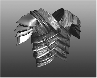
Figure 11-72
But what happens when this metal begins to rust or it has been exposed to extreme weather conditions for a few years? This is when a good reflective map becomes very important, since unrusted metal has very different reflective properties than rusted metal, which is very dull and generally very dry looking.
So I start off my reflection map with a fairly light shade of gray, and add some noise to it simply so that the reflections in the reflection bits will have some noise in them. I use Photoshop’s noise filter for this, since it’s the easiest and quickest way of adding noise.
I then create a new layer on top of this layer, and with a low opacity brush I paint darker, scratchy areas where the armor has been damaged.

Figure 11-73

Figure 11-74
Now I add a new layer with additional darker areas in it for where the little leather straps that hold the rings in place are (the little rings that connect each piece of armor). I figure that all the rubbing from that leather over the years would probably wear those areas quite a lot. This area is also likely to build up some dirt from the leather, which would also lessen the reflectivity in those areas.
The next layer is one that I often make when creating metal textures—abrushed detail. Many metals have brush marks in them from machining, resulting in what is usually called a brushed steel look. Of course I am using artistic license here, because a piece of ancient armor would not have been machined, so for this particular piece of armor I will put the brushed layer on a very low opacity.

Figure 11-75
Creating the brushed look is simple. All you do is create a new gray layer, then add some monochrome noise with a fairly high contrast. Once you have a contrasted black and white noise, simply add some horizontal motion blur to it using a fairly long distance. Easy! You’ll get something that looks like Figure 11-76.
So I make a layer like this, and then take the layer’s opacity down a lot. Why do I bother doing it when it’s barely visible in the texture? Because it makes me feel better and it does actually make a bit of a difference.
Figure 11-76
Now it’s time to add the rust to the reflection map. Obviously, rust is matte and powdery, so we don’t want it to reflect at all in the render. I have already created my color textures for this particular model, and because I am very careful always to keep everything on its own layer, I have all the different rust details on their own layers. So all I have to do is copy these layers into my reflection layer set, desaturate them, and darken them to black.
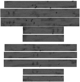
Figure 11-77

Figure 11-78
Everything seems to be as it should. I apply the texture to my model as a reflection map, and render it in a scene with an HDR image in Image World to create an environment for it to reflect. I now have the image shown in Figure 11-79.
The rusty areas look nice and dry and powdery, while the non-rusty areas remain relatively shiny and reflective. Perfect!
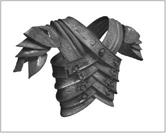
Figure 11-79
Making a Transparency Map
First of all, I think it is worth mentioning that transparency maps are not for making objects vanish out of your scene. Transparency is not the same as invisibility. Are glass objects in the real world invisible? No, they aren’t. They are transparent. So there is no point in using transparency maps if you are trying to fade objects in and out of your scene or anything like that. If you need to do that, use a Clip Map in your Object Properties panel in Layout.
Transparency is for transparent surfaces, of course, such as glass, plastic, and liquids. As we have seen previously in this book, setting up transparency usually requires the use of gradients or Fresnel shaders for realism, so why map it with a texture? You would use a transparency texture when you are making a glass or plastic object dirty or adding a decal to a transparent object (without actually modeling that decal and applying a separate surface to it, of course).
NOTE: Liquids wouldn’t ordinarily require that textures be applied to them since they move around, which makes image-based textures a little tricky and cumbersome. If you need to add murkiness or any other kind of transparency variation to liquid, try using procedural textures instead.
Remember the dirty window from the luminosity texture example? Let’s go back to that and have a look at making some transparency textures for the glass.
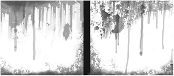
Figure 11-80
Making the transparency map for the glass will be very easy because I already created those nice textures for it in the luminosity section. All I need to do is alter them a little for the transparency texture. Figure 11-80 shows the color map for the glass, which is simply a copy of the luminosity texture that I then saturated with color.
This is pretty much the same kind of thing that I need to create the transparency map, because the streaks will have lower transparency than the clean glass, which needs to be 100% transparent.
So all I do is take the dirty, streaky layers and simply alter their blending so that I have some nice variations of gray. This is because I don’t want the glass to just be 100% transparent where it is clean and 0% transparent (opaque) where there is dirt. I want variations so that there are different levels of transparency because it is more interesting to have variations.

Figure 11-81
Looking at this texture we can see that the clean areas will be perfectly transparent, while the streaky bits and the grime along the bottom of the panes will create different levels of transparency.
When I apply this to the model and render, I get the image in Figure 11-82.
You’ll notice that I don’t have refraction on in these renders. Sorry about that, but it was simply taking far too long to render them with refraction!

Figure 11-82
And that’s it for transparency maps.
Making a Translucency Map
Moving on to translucency now, we find yet another of those surface properties that doesn’t always necessarily require mapping. Generally, you only really need to create translucency maps for organic surfaces, as substances like fabric or translucent liquids can get away with a simple shading value of the attribute.
For this example we are looking at a heart model. I want to make a translucency texture with veins in it, so that when I place a light inside the heart and switch off all other lighting in the scene, I get a cool-looking effect with all the veins showing.
I create a square texture in Photoshop, and apply a base layer of light gray. This will provide a fairly high initial translucency value for the flesh of the heart model.
On top of this I create a new layer and draw some fairly bold, thick veins in dark gray.
These darker veins now decrease the translucency of the model, so that light will not pass through them as much as it passes through the light areas. However, simply having thick bold veins on a plain gray base is boring, so I take my Dodge tool and, with a soft edge, I build up nice light patches around the veins. These brighter areas will now appear even more translucent when applied to the model.
Figure 11-83
Now to add some more veins. Obviously, I want a nice variety of veins for my heart, so I create another layer and paint a bunch of medium thickness veins in a slightly lighter gray than the thick veins I created previously.
Figure 11-84
And now for the final bunch of veins — nice little thin ones running along the surface. I create two different layers, each containing small veins of different thickness. The really thin ones I make a rather light shade of gray, so that they will be a lot more translucent than the thicker veins.

Figure 11-85

Figure 11-86
Now it’s time to apply the texture to the model. I go into Layout, load the model, and apply the texture to the heart. I then create a point light inside the model so that we get the translucent effect correctly.
Next, I select the default light in the scene and open its Properties panel. I switch off Affect Diffuse but leave the Affect Specular option on. This is so that this light will not actually affect the surface in the normal way of affecting its diffuse properties, but will allow specularity to show on the surface. So basically it won’t actually light the surface as such, but instead will create some specular highlights on the surface.
Figure 11-87 shows the rendered heart. Note that the only textures applied to this model are the translucency map and the bump map. There is no color map applied at all — all the vein details come purely from the translucency map, where the light is able to pass through the lighter areas and the darker veins block it to varying degrees.

Figure 11-87
Pretty cool, huh? I’ve used this same technique on things like dinosaur and dragon wings in the past, so that when they fly in front of the sun (or any other light source for that matter), you can see all the veins.
Creating a translucency map for a character’s head where the ears are a light shade of gray is another popular use of translucency mapping, because it creates that glowing ear look when your character is lit from behind, as seen in Figure 11-88.
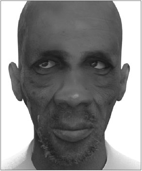
Figure 11-88
Making a Bump Map
Finally we get to bump maps. Bump maps are probably one of the first types of textures that most people make when they begin to experiment with texturing their models, and a lot of people actually like to start off their entire texturing process by creating them.
Oddly enough, though, many people struggle with them. The first law of bump mapping (as mentioned at the end of Chapter 4) is that a bump map should never be used to compensate for a lack of geometry. It should only be used for minor topographical details such as scratches, small dents, minor irregularities, cellular grain, machining, light wrinkles, blemishes (on skin), and anything else that can be successfully cheated as an illusion on the surface.
Let’s look at a bump map for a face.
The bump map in Figure 11-89 is that of a character who is middle aged and therefore has a lot of lines in his face.
Let’s look at each of the elements in this bump map, beginning with the basic facial features — the mouth and eyes. I start off by taking the base color layer that I created (the same way that I created that initial color base layer in the color map example at the beginning of this chapter). Desaturating that layer gives me a base for the bump map that has some minor details in it, so it is not a plain gray layer. You can even add a little bit of noise into it to make it slightly rough.
Figure 11-89
Now on to the mouth. Take a look at your lips and you’ll notice that they are pretty bumpy and have little sharp lines in them. Your bump map needs to include these lines. What sometimes works quite well is to take a photo of your lips and use that as a guideline for painting them. You can actually incorporate it into your texture (if you can get the lighting in the photo suitable enough) or simply use it as a guideline to paint over. Not only do your lips have these delicate little grooves, but they also have a larger unevenness to them. So first you would paint the little fine lines, and then paint a slightly blotchy layer to give them a bit of lumpiness.
Moving to the eyes now, I paint some basic crow’s-feet wrinkles coming out from the outer corners of each eye. Most people over the age of 15 have begun to develop these fine wrinkles.
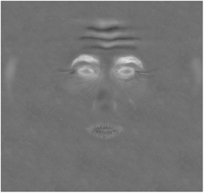
Figure 11-90
The trick with bump mapping is making sure that your details are fine enough. This means that bump maps should ideally be created in large files (dimension wise), so that a one-pixel brush creates a very fine line. This is to avoid having big ugly thick wrinkles where there should be fine wrinkles, for example.
The other trick to bump mapping lies in the way that each layer you create blends with the layers beneath it. While you may initially paint your wrinkles as plain thin lines, leaving them like that will create an effect like a cut, such as you would get if you were to etch in wet clay with a fine piece of wire. Figure 11-91 shows some wrinkles that look fine, shape-wise, but will make the skin look hard if applied as they are.
The trick is to go in and gradually work around these wrinkles so that the skin dips into the wrinkles and rises between them to create a fleshier look, as shown in Figure 11-92.

Figure 11-91
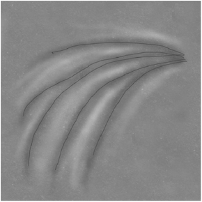
Figure 11-92
As always, it is absolutely essential that you use soft-edged brushes so that the effect isn’t blotchy. It also helps to keep the brush on a relatively low intensity so that you can gradually build up these tonal changes. As I have said before, it is about subtlety and delicacy. Approaching your painting in this manner is crucial to intuitively building up lovely textures.
As you can see in Figure 11-93, I did the forehead wrinkles in this manner so that they would appear softer on the skin.
Next up I continue working wrinkles into the face. These wrinkles are really roughly painted initially — I create rough crisscrossing lines and then go into the area and work the area around the wrinkles as I showed above.
The veins are next. I create these with a low opacity white brush, and then once I have painted the actual shapes, I use a soft-edged eraser and erase the starting and ending points of the veins so they gradually fade in and out of the rest of the map.
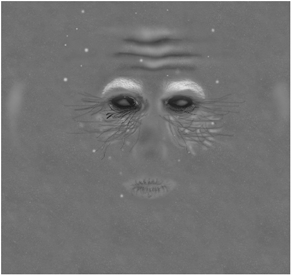
Figure 11-93
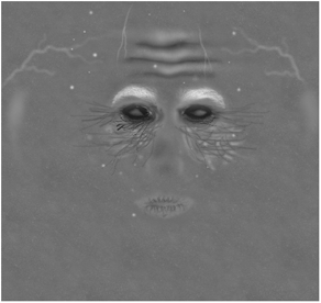
Figure 11-94
Bump maps are very intuitive to create because they are easy to visualize. Unlike specular or reflection maps, you can look at a bump map and instantly visualize exactly what effect it is going to have on the surface. With textures for specularity, reflection, translucency, etc., you often find that once you apply it, it was brighter than you thought it would be and has created an effect that is too strong, or even the opposite, that the effect is too weak. So you have to lighten or darken or increase the contrast of those textures to tweak them. However, with bump mapping, it is much more intuitive since you are interactively raising or lowering the terrain of your model’s surface with a touch of a brush. Looking at a bump map you can instantly get a feel for how it will affect the model, with all the lighter areas raised and all the darker areas indented into the surface.
You’ll notice that I have also added bright spots onto the bump map — these are for facial blemishes that were in the color map, which I created first. Remember, it is very important to ensure that your different surface textures match each other and share details that affect each surface property independently, and in different ways. It is no good creating abrasions or other details in your bump map that are not going to show up in the color map in any way. For this reason, a lot of people like to take their bump map details and blend them with their color maps on low opacity. Of course, I work the other way around generally, like in this example, so I simply copy the blemish layer from my color map into my bump map and desaturate and blend it accordingly.
I now do the same with the layer of stubble I created for this character. I simply copy the layer into my bump map, and increase its brightness until it is white. This will create a nice roughness on the beard area of his skin when rendered.
Finally (and this is the most fun part), I simply go mad with my Dodge and Burn tools.

Figure 11-95
As you can see, I have painted even more wrinkles into the skin, very bold this time. I’ve taken my Dodge tool and worked in between the grooves and wrinkles to soften it and give it a fleshier look.
Figure 11-96 shows this without all the other layers, so that you can more clearly see what I have done.
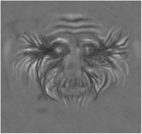
Figure 11-96
It looks oddly like Albert Einstein. This process of building up all the wrinkles and grooves in the skin is just great fun, and only took a few minutes. Because I was using the Dodge and Burn tools, I was working directly on the initial base layer that I created. But whenever I do that, I always copy the layer so that if I make a mistake or mess it up really badly, I can always delete it and I’ll still have a copy of the original unedited one to start with again.
Always play it safe like this. Texturing often involves a lot of trial and error, so be sure to keep your important layers safe because, believe me, you will make a massive mess of your textures at some stage.
Good File Habits
This section is about files. More specifically, the Photoshop files (or whatever paint program you are using) and the files that you save your textures to.
There have been many occasions in the past few years when I have had to fix the texturing on other people’s models and have found myself wanting to pull my hair out because their files were so disorganized. It is extremely important, especially when working in a studio environment where a lot of artists are assigned to work on various aspects of the same models, to adopt a logical file naming structure and a clear way of organizing your texture files.
First, let me show you how I arrange my Photoshop files. Whenever I start working on a new texture, I create layer sets. Layer sets in Photoshop are folders of layers contained within an image. As I have mentioned many times before, it is really important to keep your different details within your textures on separate layers. This is not only to keep things safe (because carefully erasing a bunch of wrinkles painted directly onto your base skin layer that didn’t turn out too well is going to take a lot longer than simply trashing the wrinkle layer and creating a new one), but also because you can then easily copy those different layers into each of your new texture layers for the other surface attributes.
This means that you generally end up with a lot of layers in your file, and this can make navigating the file a bit cumbersome. So I arrange my layers into layer sets. When I start my new Photoshop file, I create all the layer sets I am going to need, for example, color layers, bump layers, reflection layers, etc. I create input layers, such as the imported UV map and any matte layers, on top of the layer sets.
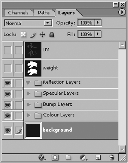
Figure 11-97
The useful thing about layer sets is that you can switch off all the layers within each by simply clicking on the eye icon next to the layer set’s name, instead of having to switch off the visibility of each layer, which is a pain.
The other important thing with your main texture creation files is naming your layers appropriately. The tiny preview next to each layer name is useless if the details painted on that layer are so small or faint that you cannot see them in the preview. So naming your layer appropriately, such as “wrinkles” or “pimples” or “dragon scales” not only helps to improve your own efficiency when navigating between layers, but it also helps anyone else who may have to use your files.
Once you have created all your different textures, save them using logical names. It is really frustrating when you are working in a studio and there are hundreds of models in the project, and someone is using stupid names like “color head” when there are 13 characters in the scene. Whose head is the texture for? It would be more appropriate to name it “Franky head color” so that anyone looking in the directory would instantly know which model the texture was for. I tend to shorten the texture terms to simple things like “col,” “spec,” “ref,” etc. For example, the color texture for a Tyrannosaurus rex I am working on is saved as “T-Rex_head_col” and its specular map is saved as “T-Rex_head_spec.” This makes things simpler for everyone, and also makes your workflow more efficient since it saves you (and everyone else) the time of having to constantly search for items that you have forgotten the names of because you gave them stupid, non-specific names.
3D Paint Solutions
Of course paint applications like Adobe Photoshop and Corel PHOTOPAINT are not the only available tools for painting your textures. There are several other 3D painting applications available on the market these days, including Deep Paint 3D (by Right Hemisphere), BodyPaint 3D (by Maxon, the makers of Cinema 4D), and ZBrush 2 (by Pixologic). These programs allow you to paint directly onto your model in a real-time 3D viewport. For people who struggle with the sometimes frustrating concept of UV maps (especially when you have quite a few of them applied to your model, making it rather complex to match up different maps to each other), and also simply for the sheer comfort of it, these 3D painting solutions can make great additions to your working toolset.
I personally use a combination of 2D and 3D paint programs when creating textures, although I still do the majority of it in 2D (simply because I am so used to it). But as the quality of 3D painting applications has really improved over the last few years, I’ll probably be using these 3D programs a lot more in my workflow.
So I thought it worth mentioning these particular applications, all of which have working demos available for download from the developers’ sites.
Deep Paint and BodyPaint support LightWave natively; ZBrush does not. This makes it very simple to take your models into them for painting since you don’t need to export them to another format, which can sometimes be a bit of an inconvenience as well as an annoying interruption of your workflow.
To give proper coverage and examples of these programs would require an entire book on its own, so for the purposes of this book we’ll just take a quick look at each program, and you can make up your own mind as to whether or not you would like to check them out further.
Exactly the same texturing theory principles apply to creating textures in 2D and 3D environments. It is just the workflow that differs. Many people find it more intuitive to paint in 3D simply because it feels more natural than painting on a flat image that will then wrap around the model.
In the case of ZBrush, it goes a bit further from just texture painting on 3D models; you also have the ability to subdivide and sculpt your meshes. So read on, then download the demos and see which one fits your style and workflow the best.
Right Hemisphere’s Deep Paint 3D
Deep Paint 3D is a program developed by Right Hemisphere for painting directly onto your models in real-time 3D. Basically, you just load your LightWave models into it, and paint directly on them using a variety of brushes.
Figure 11-98: Deep Paint 3D interface
The really cool thing about Deep Paint 3D is that it lets you paint onto your different surface channels independently (color, bump, shine, glow, opacity), or together, allowing you to set up the appropriate values for each beforehand. Because of the nature of this painting process, you do not need to worry too much about seams, because not only are you painting directly onto all your applied UV maps, you also have a brilliant tool called Projection Paint that specifically lets you paint directly onto the seams.
The program is intuitive and relatively easy to use, giving you a variety of textures or natural media that can be brushed directly or projected onto 3D models and scenes loaded into the program.
Program Overview
The environment supports an integrated workflow with 3ds max, Maya, Softimage, and, of course, LightWave, and comes complete with a bidirectional interface to Photoshop and supports Wacom tablets. (Many Deep Paint 3D tools respond to changes in pen pressure, angle, direction, or speed of movement. Extra features are provided for Wacom tablets and the Intuos Airbrush and 4D-Mouse.)
Figure 11-99
The program can be used standalone or in conjunction with Deep UV, an application also developed and released by Right Hemisphere for creating and editing UV maps.
Brush cursors display the true brush shape in 2D and 3D modes, while the brush stroke preview window in the Presets panel displays an example stroke of the current preset.
Deep Paint 3D works with layers, similar to those found in paint programs like Adobe Photoshop. Layers are stacked on top of one another, and can be reordered and arranged as desired.

Figure 11-100
Each layer has its own Opacity slider for controlling its visibility, as well as a number of different blending modes for blending it with underlying layers.

Figure 11-101
Presets are combinations of brush and paint settings that can be quickly changed, created, or edited, and saved for later use.
Texture Paint, a preset category, lets you paint with images as brush tips, much like using custom brushes in Adobe Photoshop.
One of the drawbacks to Deep Paint 3D is that it does not support LightWave’s subdivision surfaces, so the model appears in the viewport as it does when your object is in Polygon mode within Modeler.
For more information about Deep Paint 3D, visit Right Hemisphere’s site at www.righthemisphere.com.
Maxon’s BodyPaint 3D
A slightly newer addition to the 3D painting market, Maxon’s BodyPaint 3D feels very much like a 3D version of Photoshop, since its toolset is very similar. For artists who are familiar with Photoshop, learning BodyPaint will be a relatively easy task.
BodyPaint also has built-in UV tools, which can help to extend your UV mapping toolset as it offers some tools that LightWave does not, such as a Relax function.
Another handy thing about it is that unlike Deep Paint 3D, it supports subdivision surfaces, so your model appears smooth in the BodyPaint viewport.
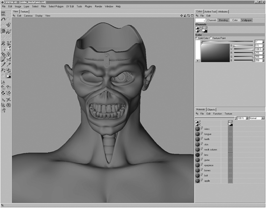
Figure 11-102: BodyPaint 3D interface
In terms of its features, it offers a very similar package of tools to that which Deep Paint 3D offers. Let’s take a brief look at these features.
Program Overview
BodyPaint is powered by a technology called RayBrush, a very powerful real-time rendering engine that gives you a superb ray-trace quality view of your model while painting. This means that you can see your specularity, transparency, and reflection maps in real time, which is really convenient since you don’t have to keep going back and forth between LightWave and BodyPaint to see how these surface attributes look.
The Multibrush function allows you to paint directly onto a maximum of 10 textures simultaneously. Like Deep Paint 3D, BodyPaint also has a Projection Paint feature for covering up seams between UV maps and painting distortion-free textures.
The program also supports third-party Adobe Photoshop filters for those of you who like to use them.
One of my favorite things about BodyPaint, as mentioned before, is its similarity to Photoshop. The layers work in the same way, and it even has Dodge, Burn, and Sponge tools like Photoshop. Additionally, if you have been working on your textures in Photoshop beforehand, you can import your entire PSD file into BodyPaint, with all the layers and blending modes intact, and continue working on that file while it is applied to your model in real time.
The brush tools are intuitive to set up (see Figure 11-103) with lots of controls for defining their appearance and effect, and the program itself is very fast and handles large images well without slowing down too much.
And if you want to switch to 2D painting mode, all you have to do is go to the Texture tab at the top of the viewport to switch to a 2D image painting mode.
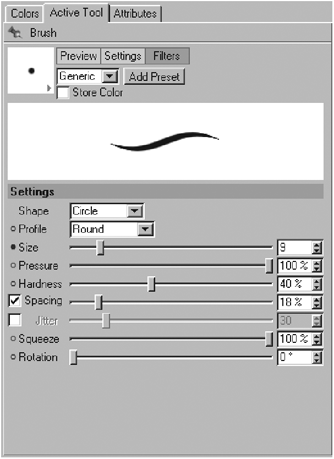
Figure 11-103

Figure 11-104
The program’s interface is also totally customizable, with docking windows that you can rearrange as you wish.
Of course there are loads of other features, but going into them now will make me sound like an ad for Maxon! I highly recommend checking this program out, especially if you are comfortable with Photoshop’s workflow.
For more information about BodyPaint 3D, visit Maxon’s site at www.maxon.net.
Pixologic’s ZBrush 2
ZBrush is one of my favorite tools to complement LightWave. It has become extremely popular in the last few years with individual artists as well as production studios in general, mostly due to its ability to add incredible detail to your objects and then export this to a displacement map or normal map that can then be applied in your 3D program of choice. LightWave v9 has native support for both displacement and normal maps from ZBrush. Its odd-looking interface might appear somewhat intimidating at first, but after a session or two you will be navigating through it with ease. Those of you who dread UV mapping will find that ZBrush basically automates this process for you so you can avoid the technicalities of UV mapping and concentrate on doing what you like to do best — be creative!
The ZBrush canvas is quite unique as well, as it operates with a technology called “pixols” where the pixels hold depth and material information. Keep in mind that when an object is dropped on the canvas and the Edit button is no longer active, your mesh will be converted to this 2.5D environment and you will no longer be able to edit your mesh with the intention of using it in an external package.
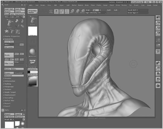
Figure 11-105: ZBrush interface
Program Overview
ZBrush has a very complete toolset for the creation of displacement maps, normal maps, and texture maps, but the most important asset of ZBrush is probably its speed. You can add detail to your objects and reshape the general forms of the mesh with hardly any slowdowns. In order to achieve the fine details, you subdivide your mesh in increments, so at high levels of subdivision you add the finer details and at low levels you change the general shape. Since this subdivision is hierarchical, changes made in a particular level get propagated up or down the hierarchy. In addition to the great modeling tools, you have access to several brushes to aid you in the texturing process. I personally use the Blur, Highlighter, and Colorize brushes quite often. Pressing the Alt key lets you switch the brush between the Sharpen, Burn, and Saturation tools.
Another great feature is Projection Master, which lets you use alphas (black and white images) to add detail to your objects by projecting the alphas onto your mesh and thus deforming it. With Projection Master you can also bring in texture maps, apply an alpha, and texture your object so you can paint textures, deformations, or both at the same time.
Painting textures in ZBrush is a lot of fun as well, especially painting bump maps. If you apply the Bump Viewer Material to your object, you can paint bumps as they would actually look in LightWave when rendered!
These are just a few of the features available in ZBrush 2. For more information, see Chapter 25, “Light-Wave ZBrush Workflow,” where I’ll show you the workflow between LightWave and ZBrush by guiding you throught the creation process of an alien head, including covering modeling details, creating displacement, normal, and texture maps, and combining them in LightWave for final rendering.

Figure 11-106: Projection Master