
Chapter 9
Gradients
Introduction to Using Gradients
Gradients are extraordinary things! If the thought of gradients conjures up images of colors fading into one another such as those that are found in most vector and bitmap editing programs, leaving you to wonder what purpose they may serve for texturing purposes, then banish that concept from your mind! Gradients in LightWave are a rather different affair.
Gradients allow you to set values for any of the basic surface attributes (Color, Diffuse, Luminosity, etc.) based on definable input parameters. In essence, they are actually just a less intimidating, more pictorial method of constructing graphs. Although they are essentially rather complex by nature, constructing gradients is actually very simple once you understand how they work.
The gradient is controlled by the gradient ramp, which is the colored bar that you see when you create a gradient layer in the Texture Editor.
You create keys within the ramp that correspond to various attribute values, defined by the input parameters that are discussed in more depth in the next section. These keys act like points on a graph that control its spline. See Figure 9-2.
Gradients have many uses. You can use them to add extra details to your textures and extra effects to the overall look of your objects. With a little cunning and creativity, you can use gradients to create a variety of cool effects and to simulate certain looks, which we explore in the tutorials in this chapter.

Figure 9-1
The power of gradients really lies, I believe, in using them in a very creative sense, since they can fake many different effects and enhance your surfaces in subtle, yet effective ways.

Figure 9-2
Input Parameters
The input parameter that you set defines the information contained within another aspect of your model, or the actual LightWave scene, upon which the gradient will be dependent. You select an option from the Input Parameter drop-down list in the gradient panel. We are going to cover the input parameters available in the Texture Editor, but keep in mind that these options change, depending on what you are working on at the moment. There are different input parameter options unique for HyperVoxels where you can create a gradient to drive surface attributes like color and opacity according to the particle age. Adaptive Pixel Subdivision (APS) also has unique input parameters to help you control the subdivision of the mesh at render time. For more information on HyperVoxels and APS, consult your user manual.
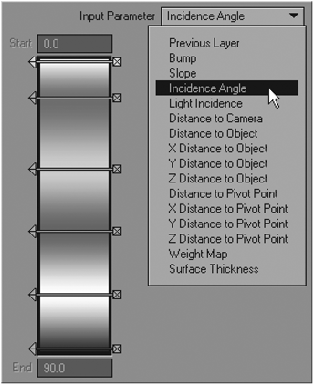
Figure 9-3
Previous Layer
The first type of input parameter is Previous Layer. This option is simply looking for a “previous” layer. Previous Layer bases the gradient on the brightness levels of the previous (underlying) layer in the Texture Editor layer stack.
This can be useful for varying colors based on a procedural texture in the previous layer, such as a Turbulence or Fractal Noise pattern, where you could assign colors to the various shades of gray within the procedural. You can also use it to assign opacity values to different values within the underlying layer, when used as an alpha layer type.
Bump
This option uses the settings from the surface’s bump map as the input. This can be especially handy for changing settings like color or specularity or diffuse value based on the depth of the bump map, since these attributes often change according to scratches and dents in a surface.
For example, if you were texturing a red car with chipped paint, you could set the gradient up so that the body would be red, but where there are dents that create gaps in the paint, the gray metal could be showing through.

Figure 9-4: Bump gradient
Another example would be using this option to change specularity according to the bump map. For instance, a scratch in a shiny surface would often be less shiny, so you can use the gradient in your Specular channel to create this effect.
Slope
This input parameter uses the slope angle of the surface to define it. The slope angle changes according to the angle (in degrees) relative to the ground upon which the surface lies (flat on the y-axis).
The gradient ramp for Slope gives you a range from 0 to 1, representing the slope angle, measured as illustrated in Figure 9-6.
Figure 9-5: Slope gradient
As you can see, the top of the gradient ramp corresponds to the areas that lie parallel to the ground, while the bottom of the ramp corresponds to those areas that lie along the other angles in relation to the ground.
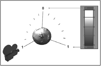
Figure 9-6
In this example, a white color is used for all the areas that are parallel to the ground plane, while the darker tones are used for those areas that lie at other angles. This sort of effect can be very useful for creating snow on a mountainous surface, as the white areas, which could represent snow, will all lie on the areas facing up from the ground, as would happen in real life, since these are the areas that would receive the snow.
Incidence Angle
This input parameter is probably one of the most useful gradient types. Used to create a variety of effects, including the Fresnel effect (discussed later) and rim lighting, Incidence Angle allows you to change the appearance of the surface according to the angle (in degrees) at which it is viewed by the camera. The parts of the surface that are facing directly toward the camera are therefore lying at an angle of 90°, while the areas sloping away are measured at increasingly lower angles.
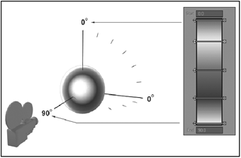
Figure 9-7
In the illustration, we can see the effect of changing the surface color according to the incidence angle, from white at 90° to black at 0°.
Light Incidence
Similar to the Incidence Angle, Light Incidence uses a selected light to set the initial parameter instead of the camera, so the angle measured is relative to the position of the light, which you select from a drop-down list.
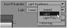
Figure 9-8
This particular gradient can be useful for a number of creative effects, since it essentially allows you to let your lights determine the appearance of the surface.
Figure 9-9 shows the previously used Incidence Angle gradient switched to use the Light Incidence gradient instead.
As you can see, the colors that were previously at a 90° angle to the camera when using the Incidence Angle gradient are now instead facing the light at 90°.
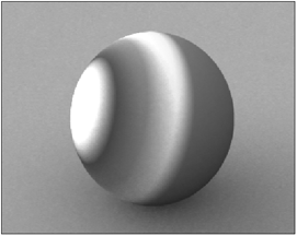
Figure 9-9: Light Incidence gradient
Using light incidences can be extremely useful for organic textures, especially when dealing with skin, since they can simulate effects like skin’s translucency without having to actually use translucency, which is tricky when texturing thick, solid models like human body parts. (See Part 7 of this book for a tutorial on skin texturing.)
Distance to Camera
This is rather self-explanatory. The Distance to Camera input parameter simply changes the gradient according to the distance that the surface to which it is applied is from the camera.
You set the distance by entering in the amount at the bottom of the gradient ramp, where it says End.
Distance to Object
Much the same thing as the Distance to Camera option, this parameter uses another object in the scene as the starting point. You select the object from a drop-down list, and enter the distances in the same fashion as Distance to Camera.

Figure 9-10
X Distance to Object, Y Distance to Object, and Z Distance to Object
Once again, these input parameters use a selected object as the starting point for the gradient, except in these instances the parameters are constrained to the distance along the particular axis that you have chosen to use.
Distance to Pivot Point
This parameter sets the gradient to take its input from the surface’s distance to the pivot point of the object to which the surface is applied.
X Distance to Pivot Point, Y Distance to Pivot Point, and Z Distance to Pivot Point
This is the same as the previous parameter, only it uses selected axis distance like the axis-dependent Distance to Object parameters.
Weight Map
This extremely useful gradient type works in conjunction with weight maps, which you create within Modeler. Since this technique is rather more involved than the others discussed here, refer to Chapter 10 for a full demonstration and tutorial.
Surface Thickness
This gradient allows you to use the object’s thickness to apply changes to the appearance of the surface. This can be useful for translucency effects in particular.
In order to have the gradient effects render correctly, you need to have the Double Sided option selected in the Surface Editor, and Ray Trace Transparency needs to be selected in your Render Settings, even if your surface has no degree of transparency.
Working with Keys
Creating and Editing Keys
Working with keys is relatively easy. Creating them is simply a matter of clicking anywhere in the ramp, while you can make fine adjustments to their positions and values by entering the desired amounts in the appropriate fields. You can also simply adjust them by manually sliding them into place with the ramp itself. Should you wish to lock the key in place, you can right-click on the little arrow on the left side of the key. Doing this flips the little arrow to face toward the ramp, locking the key in place.

Figure 9-11
Notice that doing this not only locks the key in place, it also locks all the key’s parameters, excluding it from any changes you make to the ramp as a whole, such as Shift Keys or Scale Values, discussed in a moment.
To delete a key, you simply click on the little cross on the right side of the key.

Figure 9-12
You can also copy and paste key values on the ramp using the Copy Key and Paste Key options. So if you want to apply the settings of one key to another, simply click on the key that you wish to copy and click Copy Key, then select the key to which you wish to apply the settings and click Paste Key. This will apply all the settings from the first key to the second.
Value
The Value setting determines the percentage value of the keys on a gradient applied to any channel, with the exception of color. When a gradient is applied to the Color channel, the Value amount sets the color of the key.
You can manually enter the value percentage or adjust the slider marked with the two arrows accordingly. In the case of a gradient applied to a color channel, the usual text field is replaced instead with RGB values and a color swatch, which you can click on to change to a desired amount. You can also simply drag your cursor on the RGB values themselves to change them.
Alpha
As you may have noticed when creating keys, there is a field for entering in an alpha amount for each key. This amount controls the opacity of the key within the ramp. This can be useful for blending the gradient nicely with underlying layers with the Texture Editor. As with the Value property, you can adjust the Alpha setting by manually typing in a desired amount or by dragging the arrow button next to the text field backward or forward.
A gray and white checked pattern shows through the keys to indicate a degree of transparency is applied.
Parameter
The Parameter field allows you to place the position of your keys within the gradient ramp with absolute precision.
As with the Alpha setting, you can adjust the Parameter setting by using the little arrow button next to the text field.

Figure 9-13
Smoothing
The smoothing of the key determines the way in which the different keys flow into one another, in exactly the same way as the curves in Layout’s Graph Editor work. You select the Smoothing type from the drop-down list.
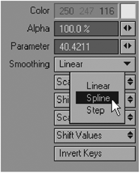
Figure 9-14
The default smoothing mode is Spline, which is a blend from one amount to the next that eases in and out from one point to the next, much like the splines that you find in LightWave’s Graph Editor.
The Linear smoothing mode is similar in effect to Spline, except that it is a straight blend from one key to the next, without any easing in or out.

Figure 9-15: Spline smoothing

Figure 9-16: Linear smoothing

Figure 9-17: Step smoothing
The Step smoothing mode removes any smoothing in the transition between keys, and instead just makes each key totally flat, in a manner of speaking. The value/color of each key basically holds right up until the next key. This smoothing mode is great for achieving a cel-shaded look.
Using combinations of these different smoothing modes can create some very interesting and unusual effects.
Scale and Shift Keys
Below the Smoothing option are the Scale Keys and Shift Keys buttons.
You use these to scale and shift the positions of all keys on the gradient ramp.
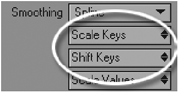
Figure 9-18
Scaling keys up brings the keys on the gradient ramp closer together, while scaling them down spreads them farther apart.
Shifting keys simply shifts the positions of the keys up and down the gradient ramp itself.
This is useful for making mass changes that would otherwise be tedious to do key by key. Note, however, that if any keys have been locked (as discussed earlier), they will be unaffected by these changes.
Scale and Shift Values
Next are the Scale Values and Shift Values buttons.
Similar to the aforementioned buttons, these do exactly the same thing, except in this case they apply to the values of the keys, as opposed to their positions.

Figure 9-19
Scaling the values up increases the individual numeric percentage values of each of the keys, while scaling them down decreases them.
Shifting values simply shifts the overall base percentage value of all the keys from high to low.
Gradient Tutorials
Tutorial 1: Making a Velvet Surface for an Old Hat
In this tutorial, we will use a combination of a few different kinds of gradients, as well as some procedural textures, to create a velvet surface. This technique can be varied and applied to any type of surface that requires a soft look, such as fabric or skin.
1. Open Layout and load the 3.4.4-Tutorial_01.lws scene from the Tutorials Scenes folder on the companion CD-ROM. A scene loads, consisting of a hat object on a ground surface, lit by area lighting. Feel free to adjust the lighting or rendering settings to suit yourself.
Figure 9-21
2. Open the Surface Editor. Notice the hat has two different surfaces applied to it, one for the hat itself and one for the satin band wrapped around it.
Let’s set up the satin surface first.
Assign the following values to the surface attributes:
Color: 13, 14, 28
Luminosity: 0%
Diffuse: 90%
Specularity: 30%
Glossiness: 20%
Reflection: 0%
Transparency: 0%
Translucency: 0%
Smoothing: on
3. Click on the “T” button next to the color values in the Color channel.

Figure 9-22

Figure 9-23
This opens the Texture Editor for the Color channel. What we want to do now is set up some gradients to simulate the falloff effect of lighting on fabrics. This is indeed a faking of the effect, but since it works, we will do it!
4. Make a new gradient layer by clicking on the Add Layer button and specifying Gradient.

Figure 9-24
We now have a gradient layer. Change the Input Parameter of the gradient to Incidence Angle. We will set up this gradient to mimic the light falling and creating that soft glow that we see along folds of fabric.
5. Create a new key near the middle of the gradient ramp. In the Parameter field, type in a value of 30; the key will now move to that position on the ramp. Set the color of this key to 243, 243, 243 and set its Alpha value to 60%, as shown in Figure 9-25.
6. Create another key at the very bottom of the gradient ramp. Make sure that its Parameter value is 90. Change its color to black and set the Alpha to 0%.
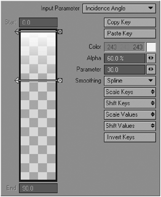
Figure 9-25
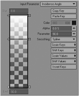
Figure 9-26
7. Create another key, this time a bit above the bottom key. Set its Parameter to 75, its color to black, and its Alpha to 0%.
Take a look at the preview window in the Surface Editor, and notice how this gradient affects the surface. It has created a nice “lit” edge to the surface. Now, if we were to render this as it is, it would appear very strange, because all the edges would appear to be lit, when in fact the only areas that would appear this way in reality would be the ones receiving direct light from the lighting source in the scene.

Figure 9-27
So, what do we do to rectify this? The answer is rather simple — we use another gradient, this time a Light Incidence gradient.
8. Create a new gradient layer on top of the first one. This layer will act as a mask for the underlying layer so that the effect will appear to be caused by the lighting.
Set the Input Parameter for this gradient as Light Incidence, and select Area Light from the Light drop-down list.
9. Create a key at the very top of the gradient, and another key at the very bottom. Select the top one and set its color to white (255, 255, 255) and its Alpha to 100%. Select the bottom one and set its color to black (0, 0, 0) and its Alpha to 100% as well.
Now create a third key in between the other two. Set its Parameter to 50, and leave its color as it is.
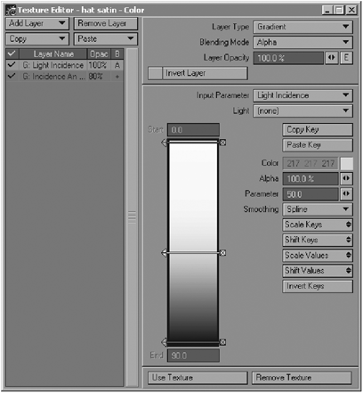
Figure 9-28
10. Because we want this gradient to act as a mask, we need to set up the layer so that it does exactly that. We do this by changing the Blending Mode of the layer to Alpha. This uses the data in the layer as an alpha channel for the underlying layer. By doing this, the gradient will now essentially mask the effect of the first gradient, so that it appears as if the “lit edges” look we created is actually created by the area light. Pretty clever!
11. However, this overall effect is perhaps just a little too strong. Go to the first gradient and set the Blending Mode of that layer to Additive. Change Layer Opacity to 80%. This softens the effect somewhat.
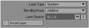
Figure 9-29
Look in the preview window in the Surface Editor; your surface should now look something like Figure 9-30.
Figure 9-30
12. This is just a little too smooth though, so we need to add a slight bump to it, just to give it a little more texture.
Click on the little “T” button next to Bump in the Surface Editor to open up the Bump attribute’s Texture Editor.
13. Create a new layer and choose Procedural as the Layer Type. This creates a Procedural Texture layer. For the Procedural Type, choose Turbulence. (See Figure 9-31.)
Set the Turbulence up as follows:
Texture Value: 10%
Frequencies: 15
Contrast: 20%
Small Power: 2.0
Then, on the Scale tab at the bottom of the panel, enter 100mm for each axis, as shown in Figure 9-32.
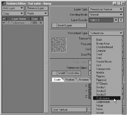
Figure 9-31

Figure 9-32
That adds a slight texture to the satin material, which gives it a little more substance.
We now move on to the velvet surface.
14. Go to the “hat velvet” surface in the Surface Editor, and enter the following values for each attribute:
Color: 64, 9, 9
Luminosity: 0%
Diffuse: 80%
Specularity: 10%
Glossiness: 0%
Reflection: 0%
Transparency: 0%
Translucency: 0%
Ensure that Smoothing is on.
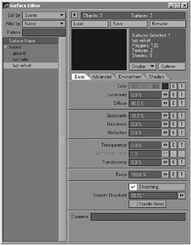
Figure 9-33
15. Open the Texture Editor for the Color attribute by clicking the little “T” button next to it and create a new gradient layer.
16. This process is, for the most part, almost exactly the same as for the satin surface.
Because of this, we can actually copy the gradients that we previously made into this surface. To do this, go back to the “hat satin” surface and open the color Texture Editor. Select the first gradient that we made (the Incidence Angle one) and click on the Copy button above the layer list. Select Selected Layer(s). This copies the surface into memory.

Figure 9-34
Go back to the Texture Editor for color in your velvet surface. Select the layer that you made there and press the Paste button above the layer list. Select Replace Selected Layer(s). This pastes all the settings from the gradient you copied into this one.

Figure 9-35
17. We do not want these settings to remain exactly the same in this particular surface, as it is a different type of material. Keep all the keys in their current positions; they are fine the way they are. Select the first gradient, the Light Incidence one, and change its Layer Opacity to 40%. This lessens the effect of the gradient, making it a little softer and more velvet-like.
18. We need to set up the bump map so that the velvet appears nice and fuzzy. Click on the “T” button next to the Bump channel to open the Bump Texture Editor.
Create a new Procedural Texture layer by selecting Procedural from the Add Layer list.
From the Procedural Type menu, select Turbulence, and set it up as follows:
Texture Value: 80%
Frequencies: 15
Contrast: 20%
Small Power: 2.0
On the Scale tab at the bottom of the panel, enter 100mm for each axis.
This creates a perfect fuzzy texture for the velvet.
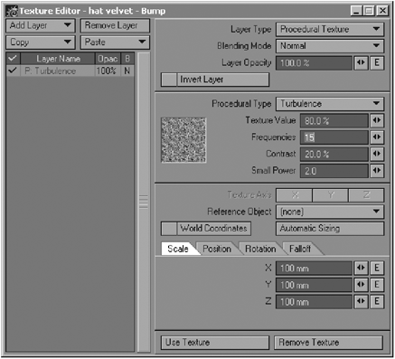
Figure 9-36
19. Close the Texture Editor, and go to the Advanced tab in the Surface Editor. Change the Color Highlights setting to 50% and the Diffuse Sharpness to 40%. This just creates a softer, more appropriate light hotspot falloff for the velvet surface.
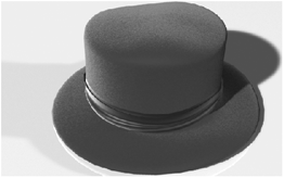
Figure 9-37
20. Render the image. You now have a velvet hat!
Tutorial 2: Snowy Mountain
Okay, let’s make some snow on a big mountain. For this tutorial we’ll be using the Slope gradient to place snow on the more horizontal areas of the mountain so that the steep slopes remain rocky, as well as the Y Distance to Pivot Point gradient in conjunction with some procedurals to create some greenery around the foothills.
1. Open Layout and load the 3.4.4-Tutorial_02.lws scene from the Tutorials Scenes folder on the companion CD-ROM. You see a scene with a volcano object (3.4.4-volcano.lwo in the TutorialsObjects folder) sitting on a plain ground plane object.

Figure 9-38
2. Open up the Surface Editor and select the “volcano rock and snow” surface. Set up the basic surface attributes as follows:
Color: 65, 40, 35 (a dark reddish brown)
Diffuse: 70%
Specularity: 5%
Glossiness: 20%
Bump: 100%
Leave all the other surface values at 0%. This sets up a plain brown surface that has a very slight shine to it. This will be the basic dull rock-like surface of the mountain.
3. Let’s start off by creating the bump mapping for the rocks. Click on the “T” button next to Bump to open the Texture Editor for the surface’s bump attribute. Create a procedural texture on the default layer, using the Crumple Procedural Type.
Set up the texture settings as follows:
Texture Value: 100%
Frequencies: 4
Small Power: 0.75
Set the Scale parameters to 1m for X, 6m for Y, and 1m for Z in the Scale tab.
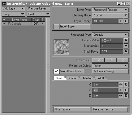
Figure 9-39
On top of this procedural texture, create a new Procedural Texture layer by clicking on Add Layer> Procedural. Select Hetero Terrain as the Procedural Type and set the texture settings as follows:
Texture Value: 30%
Increment: 0.5
Lacunarity: 2.0
Octaves: 6.0
Offset: 0.35
Noise Type: Perlin Noise
Set each of the Scale parameters to 20m in the Scale tab.
We have now created a fairly generic, bumpy rockiness for the surface. Now let’s make some snow.
4. Go back to the Surface Editor and click on the “T” button next to Color to open the Texture Editor for the surface’s color attribute. Change the default layer that is created to a gradient layer by clicking on the Layer Type button at the top right and selecting Gradient.
Change the Input Parameter to Slope. When you create this gradient, a key is automatically created for you at the top of the gradient ramp. We can leave this key exactly as it is. Click a little way below this top key to create another key. Change its Alpha value to 90% and the Parameter value to 0.2. We are now creating snow that lies on the horizontal and slightly sloping areas of the mountain object.
Click again just below the second key to create a third one. Make sure that its Parameter value is 0.3, and change its Alpha value to 0%.
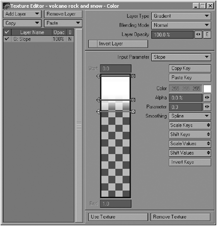
Figure 9-40
This now makes the snow completely disappear as the object slopes downward. If you render your object now, you should get something that looks like Figure 9-41.

Figure 9-41
NOTE: I have set the lighting up in the scene to use pure radiosity to light it. If you find that the render is too slow for your machine, simply go to your Global Illumination panel and switch the Radiosity option off, then set the Global Intensity value back to 100%.
Okay, so we have a mountain that now has some decent snowfall on it. How about adding a touch of greenery along the bottom of the slopes to show some forest areas or just some grassy knolls? This will help to break up the monotony of the brown color on the slopes.
5. Create a new procedural layer (below the Slope gradient layer), and select Turbulence (my most favorite procedural for doing practically anything). Set its color to a nice medium green with the following RGB values: 35, 80, 25. Set up the actual texture as follows:
Frequencies: 5
Contrast: 90%
Small Power: 1.0
Set the Scale values on the Scale tab to 500mm for each axis, as shown in Figure 9-42.

Figure 9-42
The problem with this procedural is that right now it covers the entire surface. We only really want it along the foothills of the mountain, so we need to have it only growing up to a certain height. This is where the Y Distance to Pivot Point gradient comes in handy.
6. Create a new gradient layer by clicking on the New Layer button and choosing Gradient. Place this gradient above the procedural layer, so that it sits between the procedural and the Slope gradient layers.
Change the Input Parameter of this gradient to Y Distance to Pivot Point. Now, if you select the mountain object in Layout, you’ll notice that its pivot is exactly at the bottom of the object, on the ground.

Figure 9-43
So this particular gradient will take its information and allow variations according to the distance along the y-axis from that pivot point.
Let’s set up the gradient so that it will mask the procedural, and allow it to show only along the base of the mountain.
7. Change the Blending Mode of the layer to Alpha. This is because we want this gradient to act as a mask for the underlying procedural texture.
NOTE: Refer to Chapter 13 for more information on blending layers correctly and effectively.
Right now, the entire gradient is white, so it is not masking anything, as the white areas of an alpha layer are the areas that allow the underlying layer to show through. Since black areas mask the underlying layer, we need to mask the procedural as it climbs higher along the y-axis of the object. To do this, we need to first specify the maximum height that we would like the green areas to grow up to.
8. Click in the field at the bottom of the gradient ramp where it says End and enter a value of 15m. Now create a key at the bottom of the ramp (ensure that the Parameter value is set at 15m), and set its color to black (RGB 0, 0, 0).
This allows the green procedural texture to be visible only up until it reaches a distance of 15m above the pivot point at the base of the object.
And that pretty much does the trick! Rendering your scene out now, you should get something that looks like Figure 9-45.

Figure 9-44
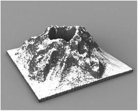
Figure 9-45
Mmmm … reminds me of mint chocolate for some reason. And there you have it! A snowy mountain peak. Simple, yet effective for those long-distance shots that call for faraway snowy peaks.
Tutorial 3: Simulating the Fresnel Effect in Glass
Although LightWave does include two different Fresnel shaders (discussed in the Shaders section of Chapter 5) to create this effect, we can also create it very simply using gradients. This tutorial demonstrates setting up a glass surface using gradients to simulate this effect on the LightWave logo.

Figure 9-46
The Fresnel effect is the phenomenon that we observe in the real world whereby the amount of reflection that we see on a surface differs according to the angle at which we view it.
This effect is not just found in transparent substances, but in anything that is reflective to any degree.
Now let’s get down to business and make it ourselves!
1. Open up the 3.4.4-Tutorial_03.lws scene file from the TutorialsScenes folder on the companion CD-ROM. The scene should load with a LightWave logo (3.4.4-LW_logo.lwo) placed in the center of the camera view.

Figure 9-47
Because we are working with a glass surface, we need to give the object an environment to reflect. Check that the Beach_Probe HDR image (located in the TutorialsImages folder) is loaded in the scene and has been added to the Image World in your Backdrop options (Ctrl+F5).
2. Okay, now that we know that the scene is all ready to be worked with, let’s go to the Surface Editor. If you have ever tried making glass surfaces before, you may know that they can be pretty darn tricky sometimes. Select the surface “logo glass” in the Surface Editor, and enter the following amounts for each of the basic attributes:

Figure 9-48
Color: 0, 0, 0 (pure black)
Luminosity: 0%
Diffuse: 0%
Specularity: 30%
Glossiness: 20%
Reflection: 0%
Transparency: 0%
Refraction Index: 1.5
Translucency: 0%
Ensure that Smoothing and Double Sided are on.
You are probably wondering why we have entered in values of 0% for the Reflection and Transparency channels when we are making reflective glass! The reason for this is that when we create the gradients in each channel, we do not need to enter in an overall amount, as LightWave will take all its input for each channel from the gradient itself.
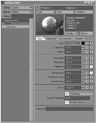
Figure 9-49
3. Now that we have determined all the basic attributes, we need to create the gradients. Go to the Transparency channel and open its Texture Editor by clicking on the “T” button. Create a new gradient layer in the Texture Editor, and set the Input Parameter of the gradient to Incidence Angle.
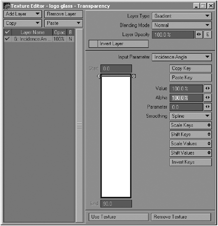
Figure 9-50
4. Now, create a new key at the bottom of the gradient. Make sure that the Parameter value for this key is 90.0. Leave its Alpha at 100%. See Figure 9-51.

Figure 9-51
This key represents any part of the surface that is facing us at 90°, in other words, the part of the logo that faces us straight on. Having this value set to 100% means that these parts of the surface will appear to be 100% transparent when we look at the logo.
5. Go back to the top key at Parameter 0, and change its Value setting to 0%. This should make the color of this key in the gradient go to black. See Figure 9-52.
This key represents the parts of the surface that face us at an angle of 0°. These are the areas that are sloping away from our direct vision, and we have entered in a value of 0, which means that these areas will not appear to be transparent.
6. However, to make the effect a little easier to observe, let’s add another key to the gradient to allow for a little more transparency, so that the transparency will appear stronger for a further few degrees.
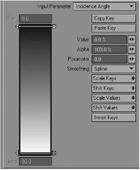
Figure 9-52
Create a key a little above the bottom key, and then ensure that its Parameter value is 70 and its Value is 100% as well, as in Figure 9-53.
This means that the effect of the transparency will remain at 100% for a bit more than it would have without this extra key. This is really just for effect, and is not entirely necessary ordinarily.
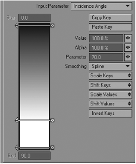
Figure 9-53
7. Okay, now we have set up the Transparency channel as we want it. According to the way in which the Fresnel effect works, we understand that the reflection should basically be the exact opposite of the transparency, because the reflection increases as the transparency decreases.
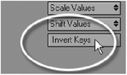
So all we need to do now to set up the reflection properties is to copy this gradient and paste it into the Reflection channel. Once you have done this, simply press the Invert Keys button to invert the gradient.
What this does now is give you the exact counterpart of the Transparency channel’s gradient. The reflection and transparency values of this surface should now be creating the Fresnel effect perfectly, as the gradients are now creating the effect of decreasing transparency toward the edges of the object, while the reflection gradient is increasing the reflection value at the edges.
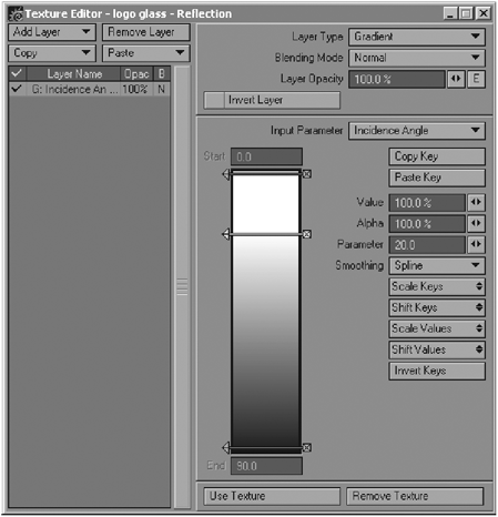
Figure 9-54
8. We need to adjust one more setting to this surface before it is ready to be rendered. Go to the Advanced tab in the Surface Editor. You see the setting called Color Highlights? Change its value to 50%. This is handy for preventing an overblown look on the glass when it is rendered, which is a common problem when making glass.
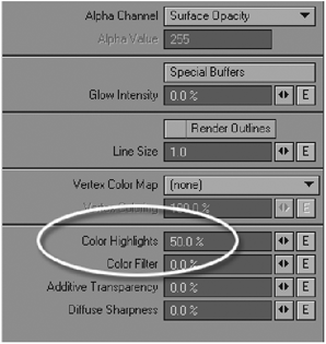
Figure 9-55
9. Now we are ready to render! Ensure that you have activated all your necessary ray-tracing options (Shadows, Reflection, Refraction) in your Render Options panel to ensure that it renders correctly. You can set the Ray Recursion Limit to 8 to save on rendering time.
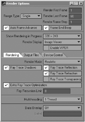
Figure 9-56
10. Hit the render button (F9)! To improve the chunkiness of the logo when it renders and give it a smoother glass look, you can change the Render SubPatch Level in the Object Properties dialog to a higher value to increase its smoothness when rendered.
When you render, your logo should look like Figure 9-58.

Figure 9-57
Notice how the Fresnel effect can be observed in the glass. The reflection becomes much stronger as the surface slopes away from your direct vision.
If we had not used the gradients to create the Fresnel effect on the surface, the glass would have looked like it does in Figure 9-59.
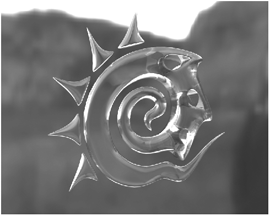
Figure 9-58

Figure 9-59
As you can see, it is a rather big difference! Render the logo from a few different angles and see how the effect works. As I am sure you will agree, this effect is great for added believability in reflective objects, as its behavior is much more realistic. Remember to incorporate this effect into all your reflective objects!