
The A11yHCM plugin, depending on your background and experience, may give you a clue about what we want to build. A11y is the accepted shorthand for Accessibility or Web Accessibility. W3C defines web accessibility at https://www.w3.org/WAI/intro/accessibility.php as follows:
HCM is an acronym for an accessibility-related term—High Contrast Mode. HCM, in its simplest form, modifies the colors on a display to help visually impaired users view content.
However, different tools for enabling HCM may render differently, and some web pages may not actually improve the experience of a visually impaired user in HCM. Let's take a look at a couple of examples of MyPhoto in HCM using two different tools.
First, we will use macOS X El Capitan's built-in high contrast options, Invert colors and Increase contrast:
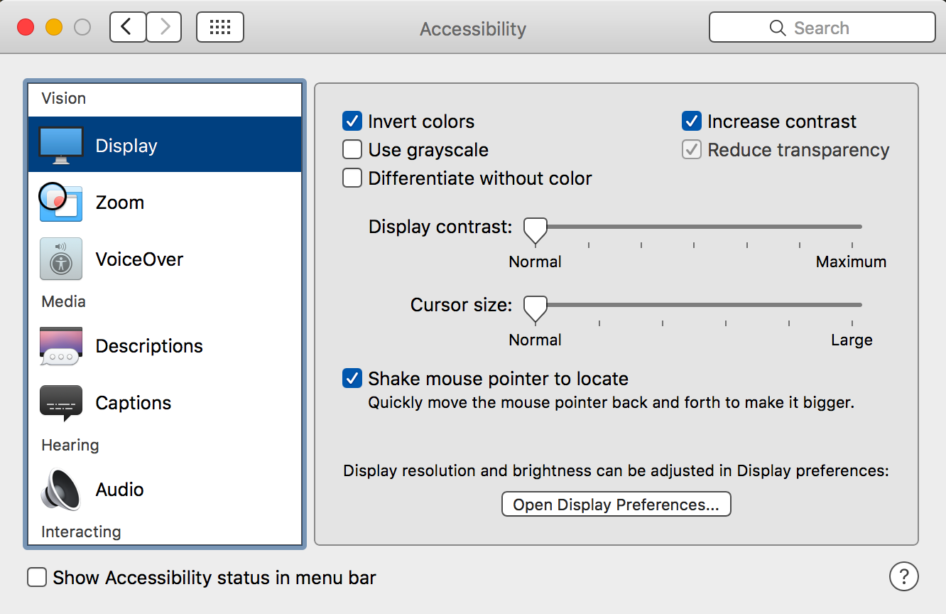
With the Invert colors and Increase contrast settings enabled, MyPhoto is displayed quite differently:

Let's take a look at another tool—Google Accessibility's High Contrast Chrome plugin (https://chrome.google.com/webstore/detail/high-contrast/djcfdncoelnlbldjfhinnjlhdjlikmph?hl=en).
With the High Contrast Chrome plugin installed, a high contrast button is added to Google Chrome:

Let's see how MyPhoto displays with this High Contrast plugin enabled:
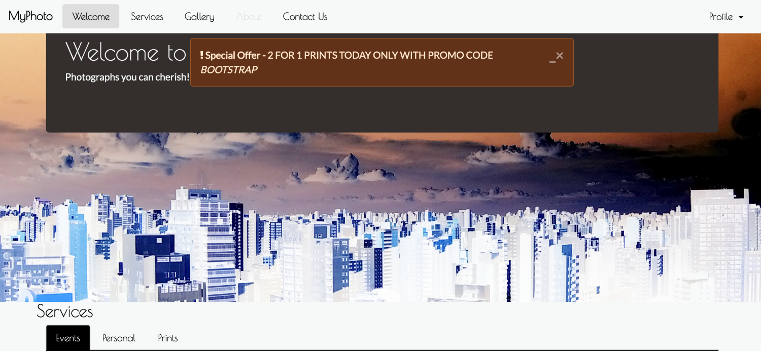
The result of using the High Contrast Chrome plugin is similar to OS X's built-in high contrast options, but there are slight differences. For instance, the background color of our Services section and our special offers alert changes between the different tools.
At least one element of our page is clearly poor when displayed in HCM—the focused state of our navigation links. In HCM, the focused state of our navigation links—in this case, the Welcome link—is practically illegible.
So, what can we do here, without actually changing our default styles? The first thing that comes to mind is to simply check whether the display is in HCM and apply the appropriate styling, either through JavaScript or CSS. Unfortunately, high contrast may be applied in different ways by different tools, different browsers, operating systems, and devices. Programmatically, it may be very difficult, or even impossible, to always recognize when your page is being displayed in HCM.
It's time for plan B. Rather than figuring out programmatically when a page is being viewed in high contrast, let's allow the user to simply tell us when they are viewing the page in HCM. Plan B is what our A11yHCM plugin will allow us to do.