
Bootstrap offers a large collection of fundamental user interface (UI) components that allow you to quickly construct any type of user interface. Specifically, Bootstrap offers Modal dialogs, progress bars, navigation bars, tooltips, popovers, a carousel, alerts, drop-down menus, input groups, tabs, pagination, cards, forms, list groups, breadcrumbs, and a jumbotron (refer to figure 1.4). All of these components, in addition to collapsible content—such as accordions—come out of the box and ready to use.
In addition, they can be styled using one of four context colors introduced in the previous subsection or customized to suit specific needs.
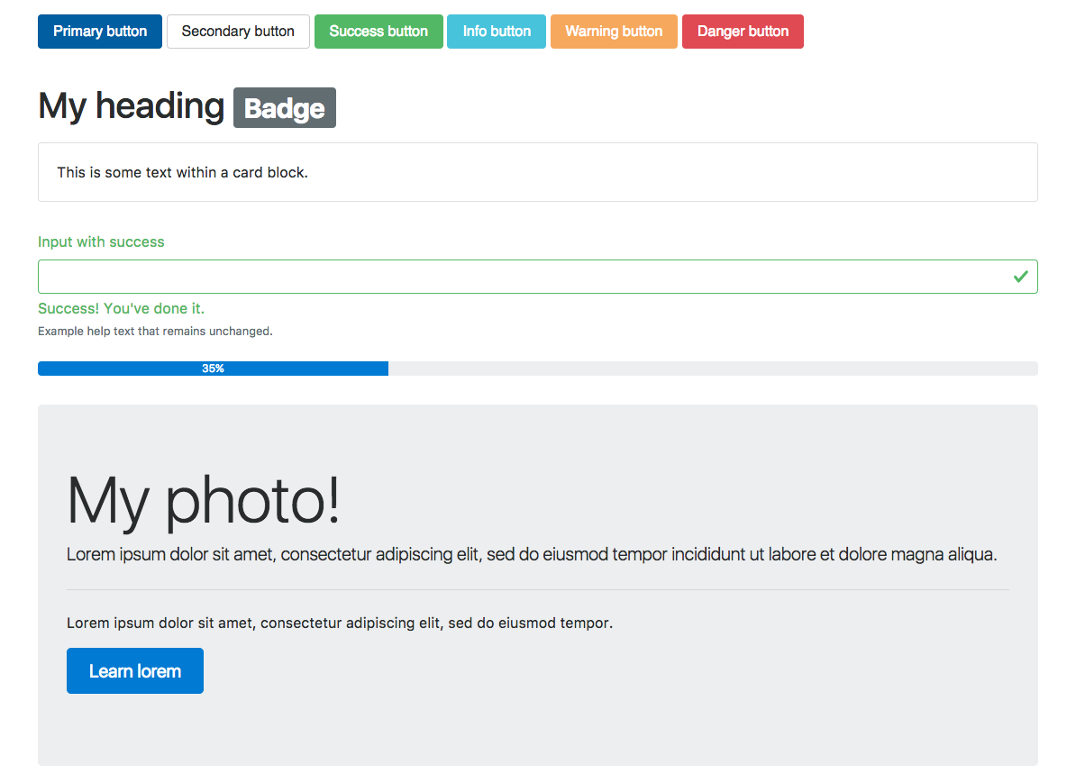
Readers familiar with Bootstrap 3 will have noted that panels, wells, and thumbnails do not feature in the preceding screenshot, figure 1.4. That is because these components have been replaced with a new concept—cards. To readers unfamiliar with the concept of wells, a well is a UI component that allows developers to highlight text content by applying an inset shadow effect to the element to which it is applied. A panel, on the other hand, also serves to highlight information, but by applying padding and rounded borders. Neither panels nor wells, however, took into account different types of contents.
Cards address this shortcoming by being less restrictive and giving the developer the flexibility to support different types of content, such as images, lists, or text, and allowing for the adding of footers and headers; look at figure 1.5:

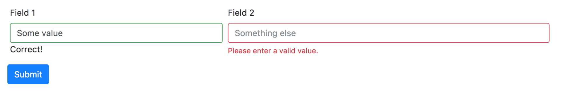
Forms in Bootstrap 4 have also been overhauled and now offered for the configuration of different layout options (refer to Figure 1.6) as well as shipping with input validation classes (check out Figure 1.7):

By applying these classes, the developer can quickly indicate erroneous input or inform the user of the successful submission of the form; doing so in the past required the use of third-party libraries or a manual implementation. Individual form controls - such as buttons - can now also be adjusted in size - a feature that seems trivial, but is often widely required:
The form controls can also be themselves customized while maintaining cross-browser consistency across input elements by applying the custom-* classes (refer to figure 1.7). In essence, these classes allow one to replace the default checkbox, radio, select and file upload input controls (check out figure 1.8, as follows) while maintaining a consistent look:
