
We can also use Hover to improve a user's interaction with our Salvattore-powered testimonials component. The testimonials component already leverages Animate.css to add an interesting transition when rendering the grid, but we can use Hover to add an interesting transition when a user actually interacts with it.
The grid is quite flat and fails to grab the user's attention once loaded. The individual columns also fail to gain focus. To solve this, we can use Hover to increase the size of the column when a user hovers on the column. One of the classes provided by Hover is hvr-grow-shadow, which adds a hover state to an element that expands the column and adds a drop-shadow, but doesn't affect the other columns or rows within the grid. All we need to do here is add hvr-grow-shadow to each testimonial column:
    <div class="myphoto-testimonials-grid animated fadeIn" data-
     columns>
        <div class="myphoto-testimonial-column hvr-grow-shadow">
            <h6>Debbie</h6>
            <p>Great service! Would recommend to friends!</p>
        </div>
        <div class="myphoto-testimonial-column hvr-grow-shadow">
            <h6>Anne</h6>
            <p>Really high quality prints!</p>
        </div>
        <div class="myphoto-testimonial-column hvr-grow-shadow">
            <h6>Oscar</h6>
            <p>Declared their greatness, exhibited greatness.</p>
        </div>
        <div class="myphoto-testimonial-column hvr-grow-shadow">
            <h6>Joey</h6>
            <p>5 stars! Thanks for the great photos!</p>
        </div>
        <div class="myphoto-testimonial-column hvr-grow-shadow">
            <h6>Mary</h6>
            <p>Made a stressful event much easier! Absolute
            professionals!</p>
        </div>
        <div class="myphoto-testimonial-column hvr-grow-shadow">
            <h6>Alice</h6>
            <p>Wonderful! Exactly as I imagined they would turn out!
            </p>
        </div>
        <div class="myphoto-testimonial-column hvr-grow-shadow">
            <h6>Jack & Jill</h6>
            <p>So happy with how the photos turned out! Thanks for
            capturing the memories of our day!</p>
        </div>
        <div class="myphoto-testimonial-column hvr-grow-shadow">
            <h6>Nick</h6>
            <p>Perfectly captured the mood of our gig. Top notch.</p>
        </div>
        <div class="myphoto-testimonial-column hvr-grow-shadow">
            <h6>Tony</h6>
            <p>Captured our Cup final win! Great stuff!</p>
        </div>
    </div>
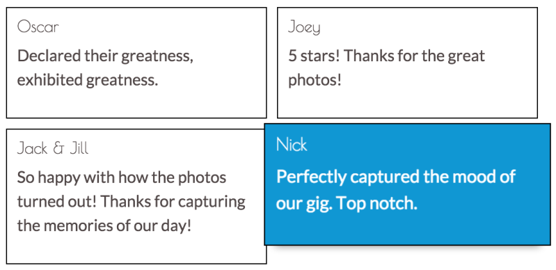
Take a look at the following screenshot:

Now, when a user hovers over a column, the individual column grows, without affecting the rest of the grid. One of the cool things about Hover is that all the classes play nicely with each other, following the cascading nature of CSS. There's no JavaScript magic, just pure CSS. To see an example of this, we will add another Hover class. This one is from the range of Hover background transition classes, hvr-sweep-to-top. The hvr-sweep-to-top class animates a change in the background color with a fill effect from the bottom to the top. Let's add hvr-sweep-to-top to the testimonial columns:
    <div class="myphoto-testimonials-grid animated fadeIn" data-
     columns>
        <div class="myphoto-testimonial-column hvr-grow-shadow
        hvr-sweep-to-top">
            <h6>Debbie</h6>
            <p>Great service! Would recommend to friends!</p>
        </div>
        <div class="myphoto-testimonial-column hvr-grow-shadow
        hvr-sweep-to-top">
            <h6>Anne</h6>
            <p>Really high quality prints!</p>
        </div>
        <div class="myphoto-testimonial-column hvr-grow-shadow
        hvr-sweep-to-top">
            <h6>Oscar</h6>
            <p>Declared their greatness, exhibited greatness.</p>
        </div>
        <div class="myphoto-testimonial-column hvr-grow-shadow
        hvr-sweep-to-top">
            <h6>Joey</h6>
            <p>5 stars! Thanks for the great photos!</p>
        </div>
        <div class="myphoto-testimonial-column hvr-grow-shadow
        hvr-sweep-to-top">
            <h6>Mary</h6>
            <p>Made a stressful event much easier! Absolute
            professionals!</p>
        </div>
        <div class="myphoto-testimonial-column hvr-grow-shadow
        hvr-sweep-to-top">
            <h6>Alice</h6>
            <p>Wonderful! Exactly as I imagined they would turn out!
            </p>
        </div>
        <div class="myphoto-testimonial-column hvr-grow-shadow
        hvr-sweep-to-top">
            <h6>Jack & Jill</h6>
            <p>So happy with how the photos turned out! Thanks for
            capturing the memories of our day!</p>
        </div>
        <div class="myphoto-testimonial-column hvr-grow-shadow
        hvr-sweep-to-top">
            <h6>Nick</h6>
            <p>Perfectly captured the mood of our gig. Top notch.</p>
        </div>
        <div class="myphoto-testimonial-column hvr-grow-shadow
        hvr-sweep-to-top">
            <h6>Tony</h6>
            <p>Captured our Cup final win! Great stuff!</p>
        </div>
    </div>
Take a look at the following screenshot:
Now we have both the expanded columns, with a drop-shadow, along with the fill effect provided by the hvr-sweep-to-top class. As we have seen, Hover provides very simple-to-use but very elegant transitions to add an extra layer of interaction for users. Being pure CSS, Hover is also exceedingly simple to integrate with most libraries and frameworks.