
A row is used to define a selection of elements that should be dealt with as a horizontal group. As such, rows reside within a container element. The power of the row lies in being able to stack content vertically, almost like containers within a container, or defining a section of the page. Creating a row is as simple as applying the row class to the desired element:
<body>
    <div class="container">
        <h1>Help, I'm trapped in a container!</h1>
        <div class="row">
            <div>Section 1</div>
        </div>
        <div class="row">
            <div>Section 2</div>
        </div>
        <div class="row">
            <div>Section 3</div>
        </div>
    </div>
    <div>
        <h1>I'm free!</h1>
    </div>
</body>
Take a look at Figure 2.4, as follows:
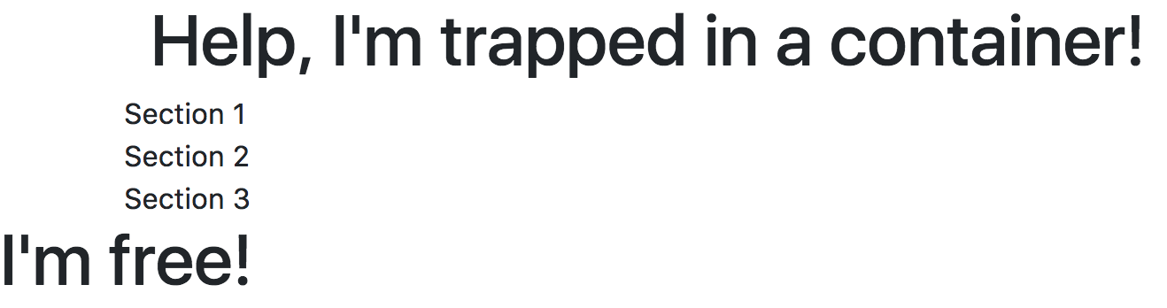
Figure 2.4: Using rows (example03.html)
The true power of rows only becomes apparent when they are used with columns.
Flexbox is now on by default, so support for IE9 was dropped from Bootstrap 4.