
Popovers are used to display additional content when a user hovers over or clicks on an element, and they are similar to tooltips, except that the content contained in them can be much richer. Just as with tooltips, Bootstrap 4 relies on the third-party plugin Popper.js to position popovers.
Similar to tooltips, popover elements are denoted using the data-toggle attribute set to popover. The title attribute is used to denote the popover's title, while the data-content attribute should point to its content: top, bottom, left, and right:
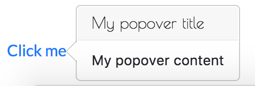
<a href="#"
    data-toggle="popover"
    title="My popover title"
    data-content="My popover content">
    Click me
</a>
As there is some overhead involved in initializing the popovers, Bootstrap does not initialize them automatically. As such, we must do so ourselves:
$('[data-toggle="popover"]').popover()
Using the data-placement attribute, we can specify the placement of the popover relative to the element triggering it:
- data-placement="top" will place the popover above the element
- data-placement="bottom" will place the popover below the element
- data-placement="left" will place the popover to the left of the element
- data-placement="right" will place the popover to the right of the element
Note: Hidden elements or empty title attributes will prevent the popover from being shown.
As noted in the official Bootstrap documentation, a common scenario is the need to be able to dismiss the popover when the user clicks outside the content area. To achieve this, simply apply the data-trigger attribute and set it to focus. Then add the following JavaScript to your HTML document: