
Salvattore (http://salvattore.com/) is a JavaScript library that allows for more flexible grid system definitions. For instance, with the help of Salvattore, we can define grid system rules that will allow three rows of four columns, but the position of each column is relative to the height of the corresponding column in the preceding row. Salvattore is a pure JavaScript library, meaning that it doesn't depend on any other library (such as jQuery) to work.
Let's add Salvattore to our project. Download Salvattore using NPM:
npm install salvattore
Then, ensure that you include it in our markup at the bottom of the page. Including the JavaScript file at the bottom of our page is the suggested practice by Salvattore as it needs the DOM to be loaded before it takes effect:
<script src="node_modules/jquery/dist/jquery.min.js"></script>
<script src="node_modules/popper.js/dist/umd/popper.min.js"></script>
<script src="node_modules/bootstrap/dist/js/bootstrap.min.js"></script>
<script src="js/alert.js"></script>
<script src="js/carousel.js"></script>
<script src="js/a11yhcm.js"></script>
<script src="node_modules/jquery.browser/dist/jquery.browser.min.js"></script>
<script src="node_modules/bootpag/lib/jquery.bootpag.js"></script>
<script src="node_modules/datatables/media/js/jquery.dataTables.min.js"></script>
<script src="node_modules/datatables.net-bs4/js/dataTables.bootstrap4.js"></script>
<script src="node_modules/ekko-lightbox/dist/ekko-lightbox.min.js"></script>
<script src="node_modules/salvattore/dist/salvattore.min.js"></script>
Next, we need to rewrite our testimonials grid to work with Salvattore. One big difference between how we constructed the grid initially and how we need to construct it for Salvattore is that we won't be grouping the testimonials by row; Salvattore will do the grouping for us.
Currently, we have the following:
 <div class="row myphoto-testimonial-row">
     <div class="col-3 myphoto-testimonial-column">
         <h6>Anne</h6>
         <p>Really high quality prints!</p>
     </div>
     <div class="col-3 myphoto-testimonial-column">
        <h6>Mary</h6>
         <p>Made a stressful event much easier! Absolute
         professionals!</p>
     </div>
 </div>
Here, we are creating a row and then constructing the columns within that row. That is not how Salvattore works. Let's rewrite our grid. This time, we will simply be listing the testimonials:
<div role="tabpanel" class="tab-pane" id="services-testimonials">
  <div class="container">
    <div class="row">
      <div class="myphoto-testimonials-grid">
        <div class="myphoto-testimonial-column">
          <h6>Debbie</h6>
          <p>Great service! Would recommend to friends!
          </p>
        </div>
        <div class="myphoto-testimonial-column">
          <h6>Anne</h6>
          <p>Really high quality prints!</p>
        </div>
        <div class="myphoto-testimonial-column">
          <h6>Oscar</h6>
          <p>Declared their greatness, exhibited
          greatness.</p>
        </div>
        <div class="myphoto-testimonial-column">
          <h6>Joey</h6>
          <p>5 stars! Thanks for the great photos!</p>
       </div>
       <div class="myphoto-testimonial-column">
         <h6>Mary</h6>
         <p>Made a stressful event much easier!
         Absolute professionals!</p>
       </div>
       <div class="myphoto-testimonial-column">
         <h6>Alice</h6>
         <p>Wonderful! Exactly as I imagined they
         would turn out!</p>
       </div>
       <div class="myphoto-testimonial-column">
         <h6>Jack & Jill</h6>
         <p>So happy with how the photos turned out!
         Thanks for capturing the memories of our day!
         </p>
         </div>
       <div class="myphoto-testimonial-column">
        <h6>Nick</h6>
        <p>Perfectly captured the mood of our gig.
        Top notch.</p>
      </div>
      <div class="myphoto-testimonial-column">
       <h6>Tony</h6>
       <p>Captured our Cup final win! Great stuff!
       </p>
     </div>
    </div>
  </div>
 </div>
</div>
Note how we encapsulated our testimonials inside a row in the preceding code snippet. This is due to a nasty quirk: the page is not reacting to Salvatorre's data-columns hook, so the tab is rendered with a height of 0. Encapsulating the columns in a row forces the height, thus solving our problem without requiring us to write any custom CSS. Furthermore, we have added a parent div wrapper around all the testimonials, with the myphoto-testimonial-grid class. As we are no longer referencing Bootstrap's grid system, each column entry no longer has the col-3 class, and we have also removed the myphoto-testimonial-column classes. The final thing we need to do with the markup is add a data-columns attribute to the parent grid element. Observe the following code snippet:
<div id="myphoto-testimonials-grid" data-columns>
The data-columns attribute is the hook Salvattore needs to know which elements to act upon. All we need to do now is add some CSS.
Open up myphoto.css and replace the code that we added on page 3 of this chapter (the style rules for .myphoto-testimonial-column) with the following:
    .myphoto-testimonials-grid[data-columns]::before {
        content: '4 .column.size-1of4';
    }
    .column {
        float: left;
    }
    .size-1of4 {
        width: 25%;
    }
So what's happening here? First, we are using the before pseudo-selector to define how many columns we want and the classes we want applied. In this case, we want four columns, and we want to apply the column class and the size-1of4 class. The column class ensures that column elements are rendered as close to the left of the element's container element as possible, and any elements with the size-1of4 class are to only take up a quarter of the available space.
If we planned on only having three columns, then we could define and apply a size-1of3 class with a rule to only take up 33.333% of the available space, and so on. Salvattore will split the testimonials into four groups, as evenly as possible, and apply the classes defined by .myphoto-testimonials-grid[data-columns]::before to the column groups. For instance, in our example, the first group of columns has the following markup:
    <div class="myphoto-testimonials-grid" data-columns>
        <div class="column size-1of4">
            <h6>Debbie</h6>
            <p>Great service! Would recommend to friends!</p>
        </div>
        ...
        <div>
            <h6>Mary</h6>
            <p>Made a stressful event much easier! Absolute
            professionals!</p>
        </div>
        <div>
            <h6>Tony</h6>
            <p>Captured our Cup final win! Great stuff!</p>
        </div>
    </div>
    ...
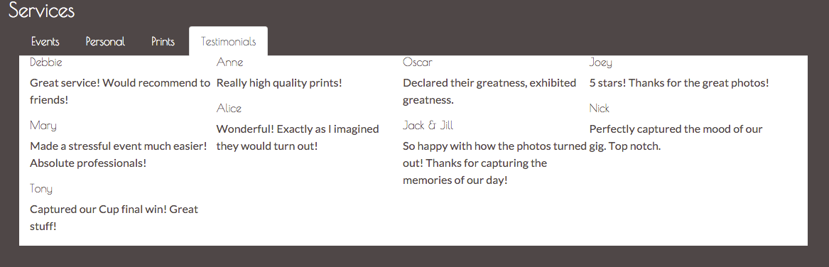
Let's see how this renders:
Great! Now, all we need to do is add some styling!
The first thing that we want to do is create some space between the top and the content. As you can see, the top of the panel is very close to the list tab. We have a parent class for our grid, myphoto-testimonial-grids, that we can leverage. Add the following style rules:
    .myphoto-testimonials-grid {
        padding-top : 30px ;
    }
Take a look at the screenshot in figure 7.3:

Next up, we want to make the testimonials distinguishable. For this, we'll leverage the myphoto-testimonials-column. Remove any previous rules for this class and add the following:
    .myphoto-testimonials-column {
        padding: 10px;
        border: 1px solid #000000;
        margin: 5px;
    }
We have simply created a border around the element, added an internal spacing of 10px between the element contents and its border, and lastly, we have created a margin of 5px between each of the elements. Add the myphoto-testimonial-column class to each of our testimonial elements:
    <div class="myphoto-testimonial-grid" data-columns>
        <div class="myphoto-testimonial-column">
            <h6>Debbie</h6>
            <p>Great service! Would recommend to friends!</p>
        </div>
        <div class="myphoto-testimonial-column">
            <h6>Anne</h6>
            <p>Really high quality prints!</p>
        </div>
        <div class="myphoto-testimonial-column">
            <h6>Oscar</h6>
            <p>Declared their greatness, exhibited greatness.</p>
        </div>
        <div class="myphoto-testimonial-column">
            <h6>Joey</h6>
            <p>5 stars! Thanks for the great photos!</p>
        </div>
        <div class="myphoto-testimonial-column">
            <h6>Mary</h6>
            <p>Made a stressful event much easier! Absolute
            professionals!</p>
        </div>
        <div class="myphoto-testimonial-column">
            <h6>Alice</h6>
            <p>Wonderful! Exactly as I imagined they would
            turn out!</p>
        </div>
        <div class="myphoto-testimonial-column">
            <h6>Jack & Jill</h6>
            <p>So happy with how the photos turned out! Thanks
            for capturing the memories of our day!</p>
        </div>
        <div class="myphoto-testimonial-column">
            <h6>Nick</h6>
            <p>Perfectly captured the mood of our gig. Top notch.</p>
        </div>
        <div class="myphoto-testimonial-column">
            <h6>Tony</h6>
            <p>Captured our Cup final win! Great stuff!</p>
        </div>
    </div>
That's a little better. Now we can at least differentiate each of the testimonials from one another (refer to figure 7.4). Compare this with the testimonial component we built using just Bootstrap's grid system; the visual improvements are obvious. We have a much more natural, flowing visual now as compared to the clunky, almost awkward original visual.
Now, let's see how we can leverage Bootstrap's grid system to ease the use of Salvattore.
Take a look at the screenshot in figure 7.4:

Now that we have a working Salvattore grid, let's animate. Animate.css (https://daneden.github.io/animate.css/) is a cross-browser, pure CSS library that provides a huge number of easy-to-use classes to add animations to a page, that is, the library has zero dependencies and can be layered upon any web page.