
To understand how we can integrate React with our application, we will make a reusable Gallery component using React. The first thing we will do is create a new file, src/app/components/gallery.js, and include it in the head of index-react.html:
<script type="text/babel" src="app/components/gallery.js"></script>
Note the type attribute, again set to text/babel, so that gallery.js will be compiled to JavaScript at runtime. As you can imagine, this is a slow operation. This method is recommended to be used only for development purposes. For production, all JSX should be precompiled into JavaScript. For the purposes of this example, we will continue with the runtime-compile method.
Let's add some code to gallery.js. Take the gallery markup, the div element with the id gallery-carousel, and its nested elements, and add it to gallery.js as the first argument for ReactDOM.render. Ensure that you also change the class attributes to className:
    ReactDOM.render(
        <div id="gallery-carousel" className="carousel slide"
        data-ride="carousel" data-interval="3000">
            <div className="carousel-inner" role="listbox">
                <div className="carousel-item
                active">
                    <img className="d-block img-fluid" data-modal-
                    picture="#carouselModal"
                    src="images/brazil.png">
                    <div className="carousel-caption">
                        Brazil
                    </div>
                </div>
                <div className="carousel-item">
                    <img className="d-block img-fluid" data-modal-
                    picture="#carouselModal"
                    src="images/datsun.png">
                    <div className="carousel-caption">
                        Datsun 260Z
                    </div>
                </div>
                <div className="carousel-item">
                    <img className="d-block img-fluid" data-modal-
                    picture="#carouselModal"
                    src="images/skydive.png">
                    <div className="carousel-caption">
                        Skydive
                    </div>
                </div>
            </div>
            <a className="left carousel-control" href="#gallery-
            carousel" role="button" data-slide="prev">
                <span className="icon-prev" aria-hidden="true"></span>
            </a>
            <a className="right carousel-control" href="#gallery-
            carousel" role="button" data-slide="next">
                <span className="icon-next" aria-hidden="true"></span>
            </a>
            <ol className="carousel-indicators">
            <li data-target="#gallery-carousel" data-slide-to="0"
            className="active"></li>
            <li data-target="#gallery-carousel" data-slide-to="1"></li>
            <li data-target="#gallery-carousel" data-slide-to="2"></li>
            </ol>
        </div>,
            document.getElementById('react-gallery')
    )
The second argument we pass is an element selector, targeting an element with an id of react-gallery. Replace the gallery-carousel element in index-react.js with the target element for the gallery.js React component:
<div id="react-gallery"></div>
Open index-react.html and we should see the Gallery component, but this time it is being generated by React:

Oh, that isn't what we want. Obviously, something has gone wrong here. Let's check out the browser's Developer Console to see whether there are any errors reported:
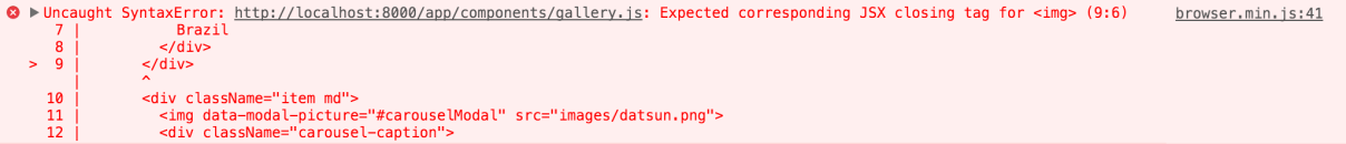
So, Babel has thankfully given us an explicit error; it is expecting a closing tag for the img tags in gallery.js. Let's ensure that all of our img tags are closed in gallery.js:
    <div className="carousel-item active">
        <img className="d-block img-fluid" data-modal-
        picture="#carouselModal" src="images/
        brazil.png"/>
        <div className="carousel-caption">
            Brazil
        </div>
    </div>
    <div className="carousel-item">
        <img className="d-block img-fluid" data-modal-
        picture="#carouselModal" src="images/datsun.png" />
        <div className="carousel-caption">
            Datsun 260Z
        </div>
    </div>
    <div className="carousel-item">
        <img className="d-block img-fluid" data-modal-
        picture="#carouselModal" src="images/skydive.png"
        />
        <div className="carousel-caption">
            Skydive
        </div>
    </div>
In the preceding example, note that we need to ensure that we use handlebar expressions when defining inline styles, as React parses the style attribute as an object, rather than a string.
Let's give index-react.html another go, and we should now have our React-powered Gallery tab:
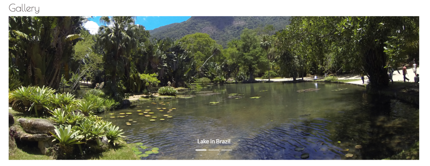
That's great! We now have a functioning React component, but it isn't exactly reusable in terms of a carousel. If we wanted another carousel elsewhere, we would need to create another component. Let's make the carousel reusable by passing in options to the React component.