
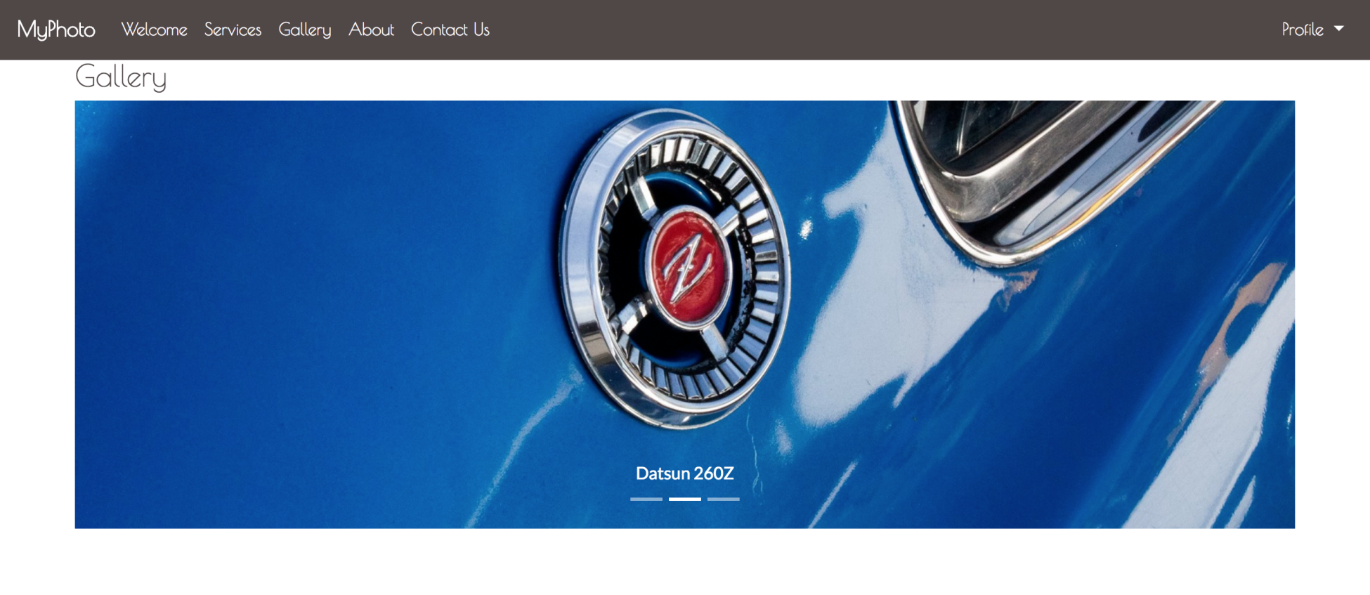
Now that we have fixated the navbar at the top of the page, it will no longer disappear as the user scrolls down the page. However, now we are faced with a new problem. As the user clicks on a navbar item, they have no way of telling which section of the site they are visiting, or whether the section has loaded successfully, without actually examining the section's content (refer to the screenshot in figure 4.2). Wouldn't it be nice if the user could tell which section they are currently visiting by looking at the navbar? To this end, we will need to find a way of highlighting the navbar items based on the user's navigation. For example, if the user is browsing the Services section, then we will need to update the color of the Services navbar item:
Luckily, Bootstrap comes equipped with a plugin that allows us to automatically update the navbar items based on the user's navigation: meet Scrollspy. Scrollspy allows us to automatically update navigation targets based on the user's current position within the page. In other words, Scrollspy allows us to denote scrollable areas within our page and update elements to denote when the user enters a specific scrollable area. It also allows us to add scroll animations to our page.
Scrollspy is already included in our installed Bootstrap build, so there is no need for any additional downloads. The first thing that we must do is denote our scrollable area.
By adding data-spy="scroll" to the element that contains our contents, we are, in essence, telling Bootstrap to use anything contained within the given element as our scrollable area. Typically, data-spy="scroll" is added to the body element of our page:
<body data-spy="scroll">
    ...
</body>
The data-spy attribute is by far the most important attribute when using Scrollspy, as without it, Bootstrap wouldn't know what to do with the remainder of the Scrollspy instructions. It is also important to note that Scrollspy will only work with container elements whose position is relative.
Next, we must tell Scrollspy how to identify our navbar element. After all, how else will the plugin know where the navbar items that it has to update are located? It is important that you point to the parent element that contains the list of navbar items. If you point to any other element, the feature will not work. Before we can tell Scrollspy about our list of nav items, we must first be able to uniquely identify them. To do so, we will use our navbar's class name, navbar. Alternatively, we can assign our navbar an id by adding id="navbar" to our navbar element. We will then make Scrollspy aware of the navbar using the data-target attribute:
<body data-spy="scroll" data-target=".navbar">
   <nav class="navbar navbar-expand-lg navbar-myphoto fixed-top">
      <a class="navbar-brand" href="#">MyPhoto</a>
      <button class="navbar-toggler" type="button"
       data-toggle="collapse" data-target="#navigation">
          <span class="navbar-toggler-icon"></span>
      </button>
      <div class="collapse navbar-collapse" id="navigation">
         <ul class="nav navbar-nav mr-auto">
         ...
         <ul/>
      </div>
   </nav>
   ...
</body>
Note that when using the data-target attribute, class names must be preceded by a . (period), while each id must be preceded by # (hash). Since the active class automatically gets applied to selected menu (link) elements, we should add some custom styles to adequately highlight the active menu item:
.navbar-myphoto .nav-item > .active {
     color: gray !important;
     text-decoration: underline;
}
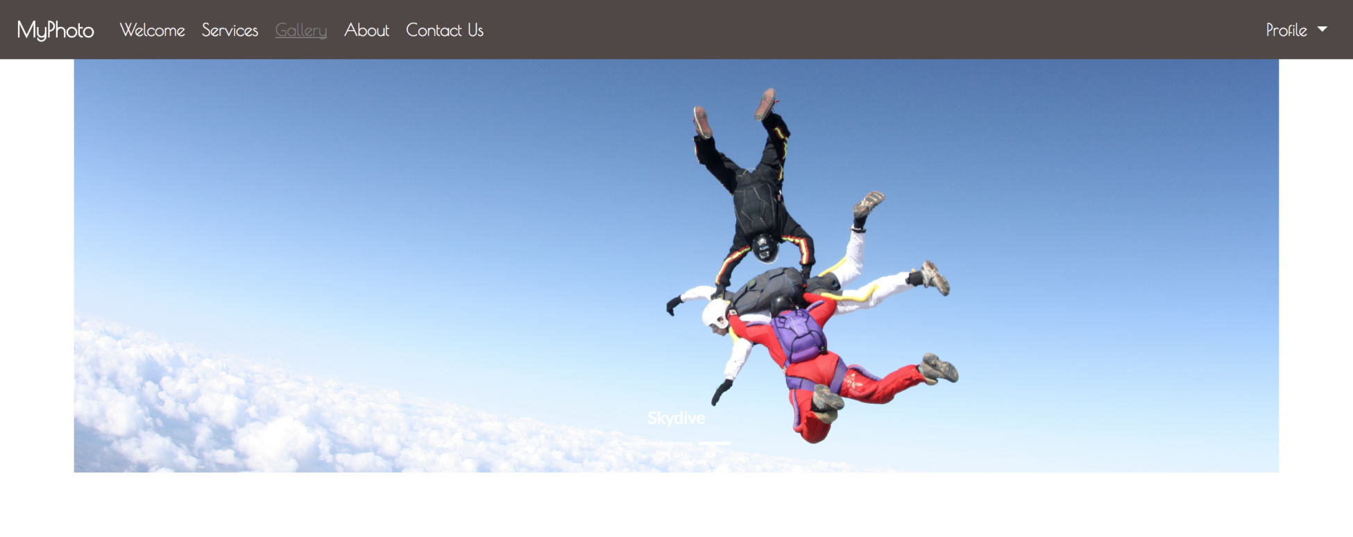
Now save and refresh, and then try to navigate between sections and observe the navbar's behavior. Items are automatically highlighted (refer to figure 4.3) as you change position. Take a look at the following screenshot:
As an alternative to the navbar-nav list element, we can also style our menu items as pills, using the nav-pills class. Scrollspy will also work, applying the active class to the nav-link elements. At times, this may look nicer (take a look at figure 4.4):
<ul class="navbar-nav nav-pills mr-auto">
   <li class="nav-item">
        <a class="nav-link active" href="#welcome">Welcome</a>
   </li>
   <li class="nav-item">
        <a class="nav-link" href="#services">Services</a>
   </li>
   <li class="nav-item">
        <a class="nav-link" href="#gallery">Gallery</a>
   </li>
   <li class="nav-item">
        <a class="nav-link" href="#about"> About</a>
   </li>
   <li class="nav-item">
        <a class="nav-link" href="#contact"> Contact Us</a>
   </li>
</ul>
