
The customization of our MyPhoto navbar is coming along nicely. We now have a nice scroll animation in place as well as a set of navbar items that update themselves based on the user's scroll position. However, we are not quite there yet. The items in our Profile drop-down menu still look quite plain. Wouldn't it be nice if we could use icons to increase each drop-down menu item's readability? Adding icons to controls and menus helps draw attention to important functionalities while clearly outlining a control's intended purpose.
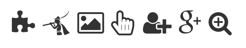
When it comes to icons, a popular choice among web developers is the Font Awesome icon library (https://fortawesome.github.io/Font-Awesome/), which is a free collection of over 500 icons that were made to be used with Bootstrap websites; refer to sample icons in figure 4.5:
To download the icon library, run an NPM install as follows:
npm install font-awesome
Once the download completes, you will see that a new subdirectory named font-awesome has been created inside your node_modules directory:
- node_modules/
- font-awesome/
- css/
- fonts/
- less/
- scss/
- font-awesome/
Font Awesome icons ship as fonts. In order to be able to use the downloaded icons, all that you will need to do is include the Font Awesome style sheet that is located inside your node_modules/font-awesome/css directory. Insert the following link into the head of our HTML document:
<link rel="stylesheet" href="node_modules/components-font-awesome
/css/font-awesome.min.css" />
The complete head of our HTML document should now look as follows:
<head>
   <meta charset="utf-8">
   <meta name="viewport" content="width=device-width, initial-scale=1,
   shrink-to-fit=no">
   <meta http-equiv="x-ua-compatible" content="ie=edge">
   <title>ch04-example04</title>
   <link rel="stylesheet"
   href="node_modules/bootstrap/dist/css/bootstrap.min.css" />
   <link href='https://fonts.googleapis.com/css?family=Poiret+One'
   rel='stylesheet' type='text/css'>
   <link href='http://fonts.googleapis.com/css?
   family=Lato&subset=latin,latin-ext' rel='stylesheet'
   type='text/css'>
   <link rel="stylesheet" href="styles/myphoto.css" />
   <link rel="stylesheet" href="node_modules/font-awesome/css/font-
   awesome.min.css" />
</head>
To use an icon, just apply the icon's class name to an HTML element. The class names for individual icons can be determined by looking at either the Font Awesome documentation or using GlyphSearch (http://glyphsearch.com/), a handy little search engine that lets you search for icons, preview them, and then copy their class name to use within your HTML document. It is important to note that each (Font Awesome) icon must be a child of a special class—the fa class; that is, to use an icon, you must first apply the fa class to the selected element, followed by the icon's name. For example, if your icon's class name is fa- user, then you will set your element's class attribute to class="fa fa-user":
<span class="fa fa-user"></span>
Note that while it is perfectly acceptable to apply a fa class to any HTML element, the convention for icons is to use the <i> element, which is as shown:
<i class="fa fa-user"></i>
Having applied an fa class to our desired element, we can now style it just as we would style any other element. For example, use this to change its color:
<i class="fa fa-user" style="color: red;"></i>

Now that we know how to include icons in our page, let's go ahead and customize our Profile drop-down menu so that the individual drop-down menu items contain both text and a descriptive icon. Feel free to select your own icons; however, appropriate choices for each item would be as follows:
- fa-user for Profile
- fa-cog for Settings
- fa-sign-out for Logout
To add the individual icons to our drop-down menu, simply create a new <i> in front of the menu item's text and apply the appropriate class:
<ul class="navbar-nav pull-right">
   <li class="nav-item dropdown ">
      <a href="#" class="nav-link dropdown-toggle" data-toggle=
      "dropdown" role="button"
         aria-haspopup="true" aria-expanded="false"> Profile <span
         class="caret"></span>
      </a>
      <div class="dropdown-menu dropdown-menu-right">
         <a class="dropdown-item" href="#" data-toggle="modal" data-
         target="#profile-modal">
             <i class="fa fa-user"></i> Profile
         </a>
         <a class="dropdown-item" href="#" data-toggle="modal" data-
          target= "#settings-modal">
             <i class="fa fa-cogs"></i> Settings
         </a>
         <div class="dropdown-divider"></div>
         <a class="dropdown-item" href="#">
            <i class="fa fa-sign-out"></i> Logout
         </a>
      </div>
   </li>
</ul>
Take a look at the screenshot in figure 4.7:
