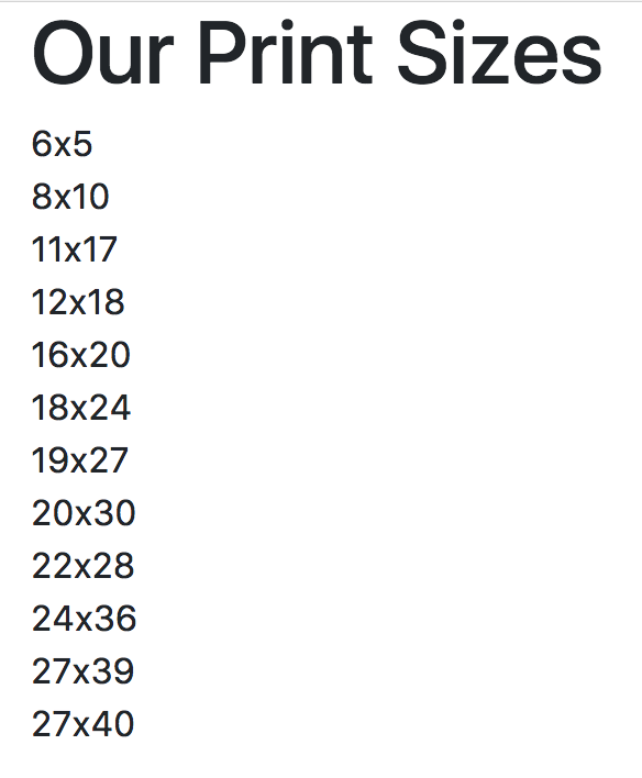
Arguably, columns are the most important piece of the grid system. Rows exist within containers, and those rows are split up into 12 equal columns. Before we get into the nitty-gritty details, let's take a look at an example by taking the first step to create the print sizes section of MyPhoto. There will be 12 print sizes offered. Let's list those sizes horizontally:
<div class="container">
    <h1>Our Print Sizes</h1>
    <div class="row">
        <div class="col-sm-1">6x5</div>
        <div class="col-sm-1">8x10</div>
        <div class="col-sm-1">11x17</div>
        <div class="col-sm-1">12x18</div>
        <div class="col-sm-1">16x20</div>
        <div class="col-sm-1">18x24</div>
        <div class="col-sm-1">19x27</div>
        <div class="col-sm-1">20x30</div>
        <div class="col-sm-1">22x28</div>
        <div class="col-sm-1">24x36</div>
        <div class="col-sm-1">27x39</div>
        <div class="col-sm-1">27x40</div>
    </div>
</div>
As usual, we first define our container. Within that container, we created a row, and within that row, we created 12 individual elements with col-sm-1. This produces a very neat list of evenly spaced elements in a single row on the page. take a look at the screenshot in Figure 2.5:

Let's break down col-sm-1 and explain each part individually:
- col: This means that we want this element to act as a column
- sm: This is a reference to all viewports above or equal to 576 px. This class means we apply this rule for all viewports equal to or larger than 576 px
- 1: This means that the element takes up one column width of the row (1/12 of the row width)
As col-sm-1 references viewports larger than 576 px, smaller viewports (such as phones) revert to a stacked view. Take a look at the screenshot in Figure 2.6:
Columns are split up into five distinct breakpoints:
- col-: This is for viewports below 576 px (extra-small)
- col-sm-: This is for viewports of 576 px or greater (small)
- col-md-: This is for viewports of 768 px or greater (medium)
- col-lg-: This is for viewports of 992 px or greater (large)
- col-xl-: This is for viewports of 1200 px or greater (extra-large)
The Bootstrap 3 column breakpoints
Bootstrap 3 did not have col-xl. Furthermore, its four distinct breakpoints were as listed:
- col-xs-: This was for viewports below 768px (extra-small)
- col-sm-: This was for viewports of 768px or greater (small)
- col-md-: This was for viewports of 992px or greater (medium)
- col-lg-: This was for viewports of 1200px or greater (large)
These classes are then appended with the number of columns an element should cover.
As previously noted, the number of grid columns as well as the individual breakpoints can be changed globally by modifying the $grid-columns and $grid-breakpoints variables defined in _variables.scss. If modifying the $grid-columns variable, one will also need to update the $grid-gutter-width variable.
As noted in the official Bootstrap 4 documentation, $grid-columns is used to generate the width (in percent) of each individual column, while $grid-gutter-width allows breakpoint-specific widths that are divided evenly across padding-left and padding-right for the column gutters.
(Source: http://getbootstrap.com/docs/4.0/layout/grid/.) Note that we do not advise this, however, as modifying these variables may result in an unintended side.
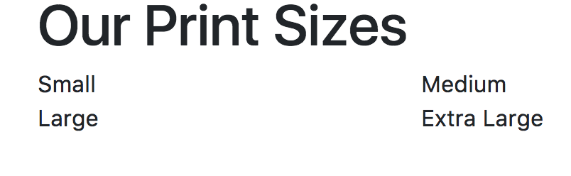
Now that we understand the column notation, let's go ahead and split the print sizes into five separate categories, namely, Extra Small, Small, Medium, Large, and Extra Large. As we know, a row is split into 12 columns. We have four print size categories, so we divide the number of columns by the number of elements, and that is the number of columns we want the element to cover. So, we append the number 3 to the col-sm-* class name:
<div class="container">
    <h1>Our Print Sizes</h1>
    <div class="row">
        <div class="col-sm-3">Small</div>
        <div class="col-sm-3">Medium</div>
        <div class="col-sm-3">Large</div>
        <div class="col-sm-3">Extra Large</div>
    </div>
</div>
This markup will render the page as shown in the screenshot in figure 2.7:

Again, on an extra-small viewport, we will see the elements stacked, that is, the elements will appear one on top of the other. However, what if we do not want this to happen? What if we would like the elements to take up a different number of columns as the viewport size changes? Well, luckily, Bootstrap allows you to define the column widths for all breakpoints, and it will decide which rule to apply. Let's try the following:
<div class="container">
    <h1>Our Print Sizes</h1>
    <div class="row">
        <div class="col-sm-6 col-md-3">Small</div>
        <div class="col-sm-6 col-md-3">Medium</div>
        <div class="col-sm-6 col-md-3">Large</div>
        <div class="col-sm-6 col-md-3">Extra Large</div>
    </div>
</div>
We have retained col-md-3, but now we have included col-sm-6. This means that for viewports below 768 px in width, we want each element to take up six columns. This will result in the first two elements displaying on one line and the last two below that.
On a viewport 768 px or wider, the categories appear in one horizontal row (as previously suggested, this is a drastic change from Bootstrap 3; with the previous version of Bootstrap, using the code, categories would appear in a horizontal row for viewports of 768 px or wider). Look at the screenshot in Figure 2.8:

On a viewport of less than 768 px wide, the categories are split across two rows, as shown in figure 2.9: