
SharePoint 2010 has some very noticeable differences compared to SharePoint 2007's user interface (UI). Microsoft has added more to the end user experience, where the most noticeable change is the use of the Ribbon, which was first introduced to the Office 2007 products. The following screenshot is the typical 2007 toolbar menu style:
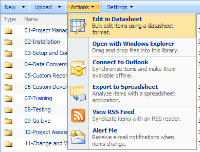
Notice with this interface there are a lot of different icon-based tool bars. The Ribbon contains tabs to expose different sets of control elements eliminating the dropdowns.
Some end users had problems accepting the 2007 interface in the Office products because they did not spend any time understanding it, and tried to use it as if it was the 2003 version. This does not increase personal productivity, so we strongly suggest that you embrace the new SharePoint 2010 UI and understand the features that are available. In time, you will find that the UI will grow on you and help you actually find functions more easily.
Note
The Ribbon is becoming the universal UI across all of Microsoft Office's product offerings, so it really has to be embraced.
This chapter's focus is on UI outline and we will expand on functionality in later chapters. For now, take a look at this website that explains and demonstrates the UI in detail:
The Ribbon is a key user interface feature that extends toolbar functionality. The intention behind the Ribbon UI is to make editing and content search simpler, allowing the user to drill into the Ribbon, and create and edit content more easily.
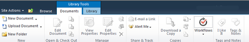
The preceding screenshot shows the Ribbon UI (highlighted) on a typical SharePoint page. By clicking on the Page tab, further Ribbon functionality that is purposely hidden is displayed.
In the preceding example, functionality has been categorized into sections that include Edit, Manage, Share & Track, Page Actions, and Page Library. These represent categorized functionality that is available, and so if you wish to edit a document, the button will be in the Edit section of the Ribbon.
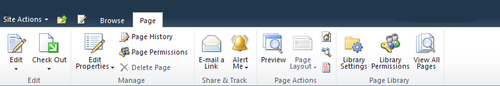
When clicking on the Edit button on the left-hand side, the Ribbon will change again and display text-editing functionality.
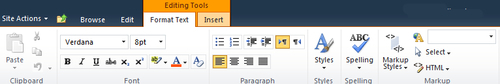
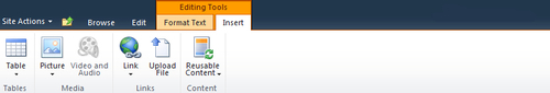
In the preceding example, notice an Editing Tools section has appeared on the Ribbon. This is because the user is currently editing text. If there was a requirement to insert a file or image, the Insert tab would be clicked and the Ribbon would change further, displaying functionality to add/insert content to the page as in the following screenshot:
The dynamically changing UI theme is consistent with SharePoint 2010. The advantage of this navigational method is that the user is always on the same screen for editing and creating content and is not redirected to another screen, only to be taken back to the screen they are editing afterwards.
Note
To add and create content, it is just a matter of the user reaching up to the Ribbon to select what they want to do. The user's editing actions are deliberately directed to a single area of the screen to simplify the editing process.
Clearly, the Ribbon UI in SharePoint is replicating the Office 2007/2010 interface so there is a single interface experience with Microsoft's suite of applications.