
7
Enhancing Moodle’s Look and Feel
Your system is now fully operational with users, courses, and roles in place. It is now time to change its look and feel to create a more engaging user experience and ensure compliance with your corporate branding.
There is a wide range of building blocks that impact the look and feel of your Moodle system, as demonstrated in the following diagram:
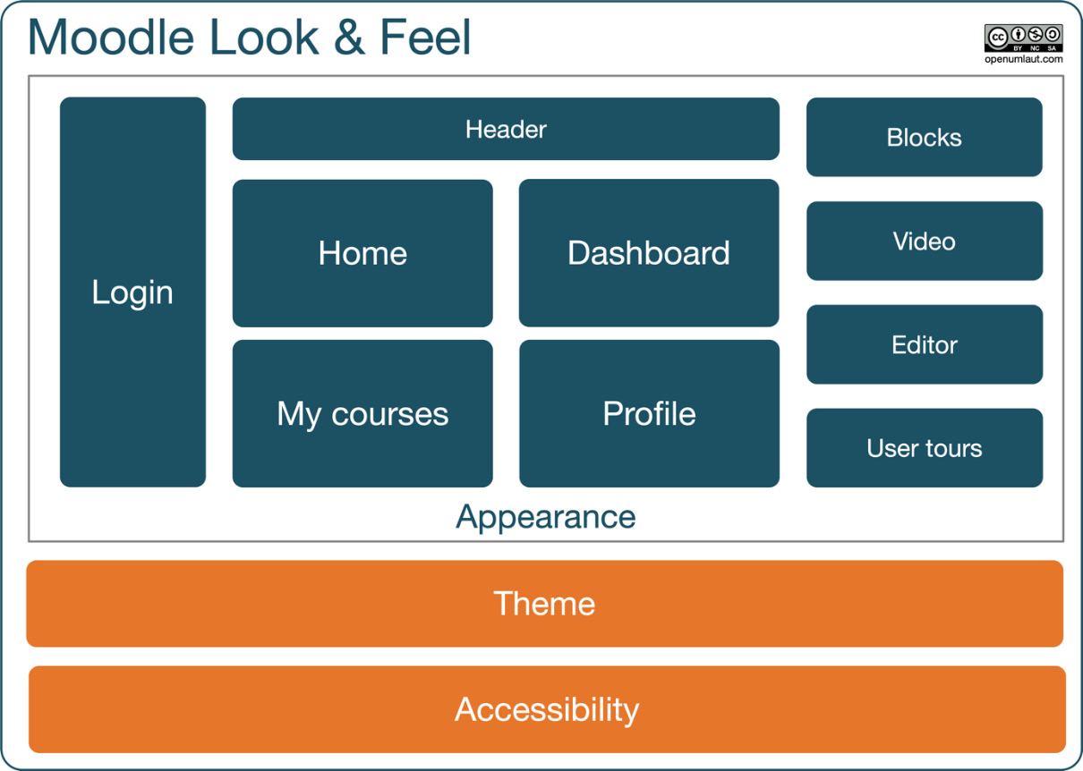
Figure 7.1 – Moodle’s look and feel components
We have divided Moodle’s look and feel components into three parts, which also form the structure of this chapter:
- Appearance: These are modifications that can be configured in administration settings. You will learn how to change the layout of key pages (Home, Dashboard, My courses, and user profiles) before we deal with different login workflows and how to adjust the header. We will then cover some appearance tools that impact the look and feel throughout the site: the block drawer, the Atto HTML editor, video and audio, and finally, user tours.
- Themes: These are modifications that require CSS styling. The main topics are theme selection, theme types, and theme customization.
- Accessibility: These are modifications required to be compliant with accessibility regulations relevant to you. To support users with different types of accessibility issues, we will equip you with tools to ensure system, theme, and content accessibility.
Tip
Theme creation is not covered in this book as it is not the task of an administrator but a designer with good CSS skills. Moodle Theme Development by Silvina Paola Hillar, Packt Publishing, is a good book to familiarize yourself with the basics of Moodle’s themes and designs.
In this chapter, we will be covering the following main topics:
- Exploring Moodle’s look and feel elements
- Customizing Moodle’s appearance
- Moodle video and audio
- Creating walk-throughs with user tours
- Moodle themes
- Accessibility
By the end of this chapter, you will be familiar with Moodle’s visual elements that you can customize via the administrator interface. Before we start customizing the appearance of our site, let’s explore Moodle’s look and feel elements first.
Exploring Moodle’s look and feel elements
Moodle can be fully customized in terms of layout, branding, and device support. It has to be stressed that certain aspects of changing the look and feel require advanced design skills. While you, as an administrator, can make some adjustments, getting a professional frontend designer involved will be necessary, especially when it comes to styling.
Before covering the three pillars of Moodle’s look and feel, let’s explore some key visual elements. It is not always obvious which page elements can be adjusted via settings (appearance) and which ones require styling (theme). Have a look at the following screenshot of the home page:
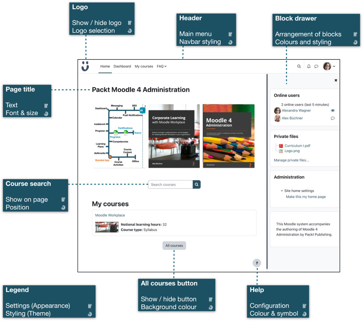
Figure 7.2 – Sample home page (Boost theme)
We have highlighted a few selected visual elements and annotated them with a feature that can be customized via appearance settings and one that can be adjusted by the theme (indicated by the color palette symbol). While this list is by no means complete, it hopefully gives you an idea that various elements drive the site’s look and feel. It should also give you an idea about the elements that can be modified via appearance settings and that require theme changes.
In short, appearance (such as home page settings and menu configuration) dictates what content users will see. In contrast, themes are responsible for the design scheme or branding, that is, the header and footer, colors, fonts, icons, and so on.
Now that you are familiar with some key elements of Moodle’s look and feel, let’s get started by customizing the appearance of our site.
Customizing Moodle’s appearance
We will kick off the customization of your Moodle system by covering its appearance elements. As shown in the overview of the chapter’s introduction, we have divided this part into six elements we will customize: login, home page, my courses, dashboard, user profile, and header.
Customizing the login
There are three (and a half) pathways to log in to Moodle. What’s that got to do with the look and feel of the LMS? The chosen workflow potentially impacts the layout and design of the home page because it can be shown before and after login.
Have a look at the pathways shown in the following diagram:
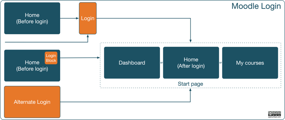
Figure 7.3 – Moodle login pathways
In the standard login workflow that has been activated by default, users navigate to the home page, select the Login link at the top right, log in to the site, and end up at the start page. To jump directly to the Login page, go to <yoursite>/login/index.php. We have discussed various login mechanisms in Chapter 5, Managing Users, Cohorts, and Authentication, when dealing with authentication, including the option to bypass the Before login page and force the Login page.
The second login option is to place the Login block in the block drawer, effectively moving the dedicated login page inside the home page. Once authenticated, the users will be directed to the start page.
The alternate login option is to log in to Moodle from a different website, maybe your organization’s home page, effectively avoiding Moodle’s onboard login screens. To implement this, you will have to add some HTML code on the remote page from which you wish the user to log in:
<form class="loginform" name="login" method="post"
  action="https://[yourmoodlesite]/login/index.php">
  <p>Username <input size="10" name="username" /> </p>
  <p>Password <input size="10" name="password"
     type="password" /> </p>
  <p><input name="Submit" value="Login"
     type="submit" /></p>
</form>
The form will pass the credentials to your Moodle system. You will have to replace the URL of [yourmoodlesite] with the URL of your Moodle instance; this address must be entered in the Alternate Login URL field by navigating to Site administration | Plugins | Authentication | Manage authentication.
By default, authenticated users will see the Dashboard screen after they have logged in. You can change the start page in Site administration | Appearance | Navigation, where you have the option to specify Start page for users. The options are Site, Dashboard (default), My courses, and User preference. If the latter is chosen, users can choose it in the Start page setting in Preferences in their user profiles.
Which login pathway is best depends on your existing infrastructure and personal preference. Whatever option you choose, users will always have access to the home page, which we will customize next.
Customizing the home page
The home page is identical for all users. Well, its structure is static, whereas its content changes depending on the user who is logged in. For example, every home page might contain a block that displays the courses a user is enrolled in, which is unlikely to be the same for every user. This page is also known as Site home or, for legacy reasons, front page.
As we just mentioned, Moodle’s home page is shown before a user has logged in, and changes after authentication has taken place. The content and layout of the page before and after login can be customized. Look at the following screenshot. It is the same site that was shown in the preceding screenshot, but before a user had logged in:
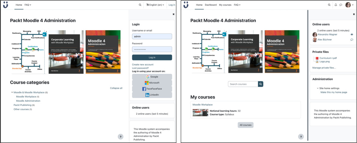
Figure 7.4 – Sample home page before and after login
In this particular example, the Login block is shown in the block drawer, and Course categories are displayed in the center. Once logged in, the Login block is hidden, the Private files block is shown, the language selector has been replaced with the user profile menu, and two more items appear in the main menu. I am sure you can spot a few more differences!
To change the home page’s appearance before and after login, we need to change the Site home settings.
Modifying the Site home settings
To customize the home page, select Settings on the home page or go to Site administration | General | Site home | Site home settings:
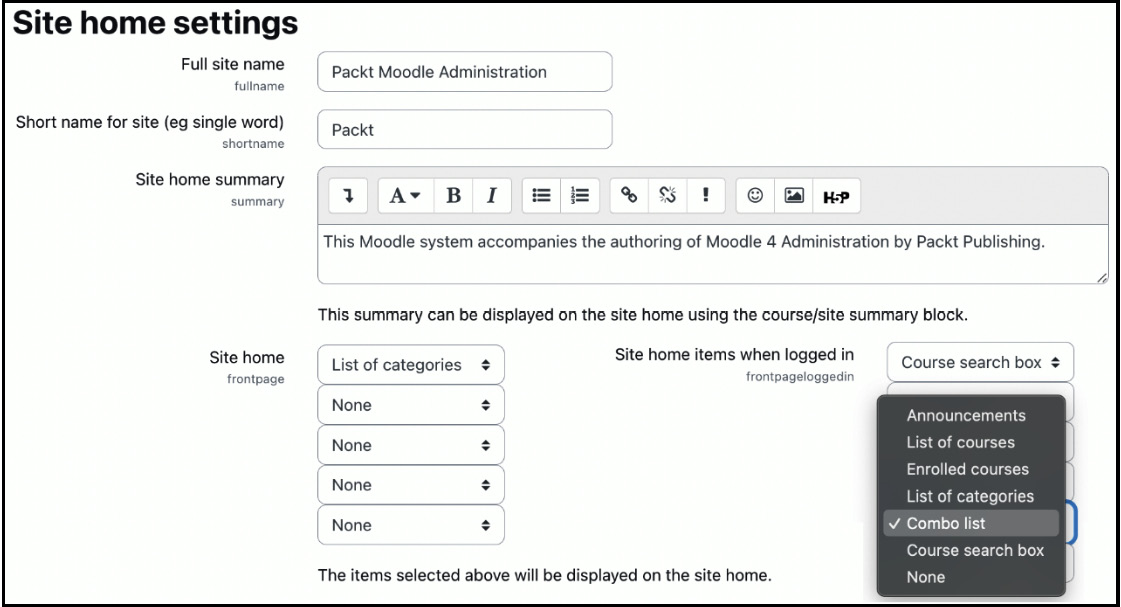
Figure 7.5 – Home page settings
The following parameters are available on the Site home settings page:
- Full site name: This is the name displayed on the home page and in the browser’s title bar. It is usually the name of your organization or your Moodle system.
- Short name for site: This is the internal name of your site that is used at various places, for instance, as part of the backup name or when networking the site.
- Site home summary: This site description can be displayed via the Course/Site summary block. The description text is also picked up by the Google search engine crawler if allowed.
- Site home: Moodle can display up to five elements in the center column of the home page when not logged in: Announcements, List of courses, List of categories, Combo list (categories and courses), and Course search box. The order of the elements is the same as the one chosen in the pull-down menus.
- Site home items when logged in: This is the same as Site home, but it’s used after a user is logged in. A sixth item is provided to be displayed, namely, Enrolled courses, which wouldn’t make any sense before users have been authenticated.
- Maximum category depth: This setting specifies how many hierarchy levels are displayed when course categories are shown. Limiting this if your category hierarchy’s depth exceeds three or four is recommended.
- Maximum number of courses: This setting determines the number of courses shown on the home page. If more courses are available, the More courses link is shown.
- Include a topic section: If ticked, an additional topic section (just like the topic block in a course) appears in the home page’s center column. It can contain any mix of resources or activities available in Moodle. It is often used to provide information about the site or show an image or trailer video.
- Number of announcements: This includes the number of news items displayed.
- Comments displayed per page: This setting dictates how many entries are shown in the Comments block if used on the front page.
- Default site home role: A default front page role should be set if logged-in users need to be allowed to participate in home page activities.
The Moodle home page is treated like a course (internally, it has course ID=1). Therefore, most available settings are identical to their course counterparts: reports, question bank, content bank, filters, and course reuse. The same holds for the Participants menu item: the home page has its own context in which groups can be created, and roles can be assigned to users. This allows a dedicated user to design and maintain the home page without accessing any other elements in Moodle. Since the home page is treated like a course, a Teacher role is usually sufficient.
Moodle provides a great set of tools to customize the home page. Sometimes, you might want to replace this with a custom front page, which we deal with in the following subsection.
Replacing the home page
To replace the home page, Moodle lets you add a custom script. To implement this feature, you will have to add the following line to your config.php file:
$CFG->customfrontpageinclude="<dirroot>/local/<yourfrontpage>";Bear in mind that this will display the output of the <yourfrontpage> PHP file at the top of the content area, in addition to any elements of the home page. This way, you have the best of both worlds: the Moodle elements (disable the ones you don’t require) and your custom elements.
While users cannot modify the home page itself, its content is personalized for each user, for example, calendar entries or private files. The same holds for the My courses page, which we will customize in the following subsection.
Customizing My courses
As the name suggests, the My courses tab shows the courses a user is enrolled in by displaying the Course overview block in the content area (center of the page). In the My courses view, users can star and archive courses; they can also reduce the number of displayed courses they are enrolled in by applying any combination of the following filters:
- Status: All, In progress, Future, Past, Starred, and Archived
- Text
- Ordering: Sort by course name and Sort by last accessed
- Details: Card, List, and Summary
The following screenshot shows the My courses page I see on my Packt demo system:
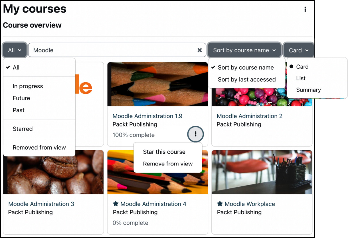
Figure 7.6 – My courses view
You can specify appearance settings and available filters by navigating to Site administration | Plugins | Blocks | Course overview. The Display categories setting shows the course category name underneath the course name. You can further customize Available layouts and Available filters. Specifying the Custom field option lets you add your own items to the Status filter, a great way to align the user experience to the subjects taught in your organization.
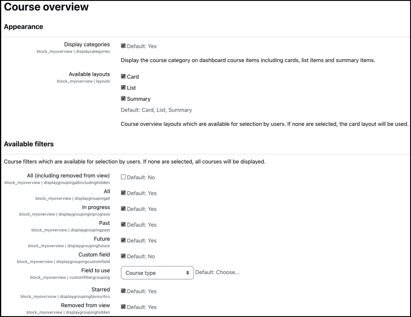
Figure 7.7 – Course overview block settings
The Future and Past statuses can be adjusted by two grace period settings in Site administration | Appearance | Navigation: Grace period for future courses and Grace period for past courses.
Courses can (and ideally should) have a course image. If the optional picture is missing, it will be replaced with a patterned course card. The colors used in those cards can be specified in Site administration | Appearance | Course card colours:
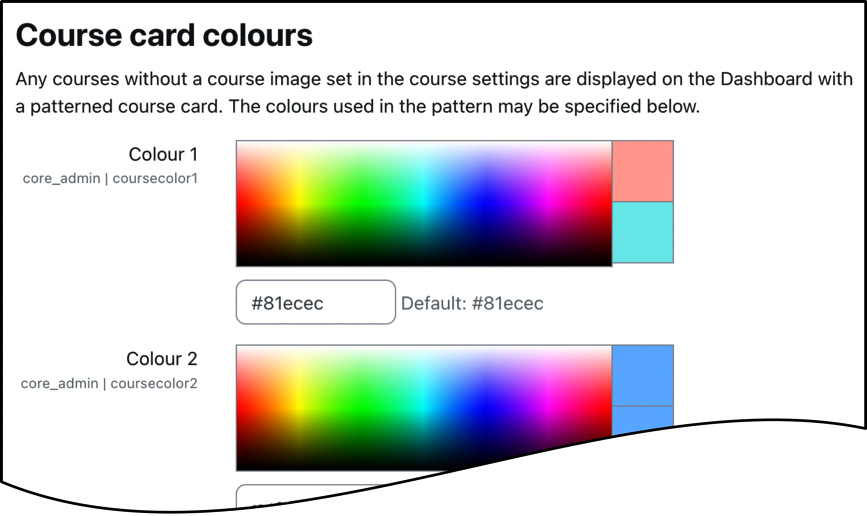
Figure 7.8 – Course card colors
You can use the standard color picker to select ten colors, which are applied to course images in random order.
In Site administration | Appearance | Courses, some settings let you specify how courses are presented to users and what level of course detail is displayed:
- Course contacts: The users that are shown alongside the course description. Teacher is the most often used choice here.
- Display extended course names: If enabled, short and long course names will be displayed; otherwise, only the long name is shown.
- Courses per page: This is a threshold setting used when displaying courses within categories. If there are more courses in a category than specified, the page navigation will be displayed at the top of the page. Also, when a combo list is used, course names are only displayed if the number is less than the specified threshold.
- Courses images file limit: By default, only one file can be attached to a course; you might need to increase this limit, especially if you want to add PDF to the list of valid Course image file extensions, for instance, to attach a curriculum.
The My courses page is concerned with courses that users are enrolled in. What about navigating through courses and categories users are not enrolled in? We will look at this in the following subsection.
Course navigation
The list of courses seen throughout Moodle can be overwhelming, and it might be difficult for users to navigate through the entire category hierarchy. Examples of where courses and categories are visible to users are the All courses link in the Courses block, by selecting List of categories or Combo list in the site page settings, or through the Courses listing in the Navigation block.
Some settings in Site administration | Appearance | Navigation deal with the level of detail shown in courses and categories. Bear in mind that these mainly apply to the Navigation block and some navigational features in Classic-based themes:
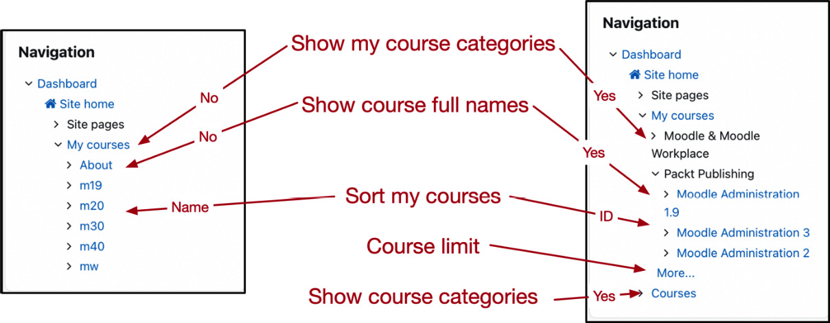
Figure 7.9 – Course navigation settings
Once course selection has taken place – either in My courses or via Navigation – users will be inside a course where two look and feel elements can be configured.
Inside a course
Courses are where learning takes place, and course creators are responsible for their content, structure, and layout. There are two tools that you should set up to ensure an enjoyable experience for your content creators:
- Course formats: A course format dictates how course content will be presented to the learner; we already looked at them in Chapter 4, Managing Courses and Enrolments. You can configure or disable course formats at Site administration | Plugins | Course formats | Manage course formats. Additional course formats can be installed, which we will cover in Chapter 8, Understanding Moodle Plugins. Popular course formats are Tiles, Collapsed topics, and Designer.
- Activity chooser: The activity chooser appears when in editing mode inside a course and content creators wish to add an activity or resource. You can determine which tabs should be displayed in the activity chooser in Site administration | Courses | Activity chooser | Activity chooser settings. Here, you can also show or hide the link to MoodleNet in Activity chooser footer. Popular activities and resources can be added to the Recommended tab via Site administration | Courses | Activity chooser | Recommended activities. Bear in mind that these settings apply to all (editing) users across the system.
To ensure consistency across courses and to simplify course authoring, it is recommended to implement a course templating mechanism. There are two ways such course skeletons can be provided:
- Course templates via on-board tools: Moodle doesn’t provide a dedicated facility, but you can mimic a course template workflow using several different tools, namely course backup, course restore, and course upload. All three operations have been covered in the Managing courses in bulk section in Chapter 4, Managing Courses and Enrolments.
- Course templates via third-party plugins: There are various options available, Kickstart (moodle.org/plugins/format_kickstart) being my favorite.
The home page and My courses are predefined by the administrator (or a user with appropriate permissions). The intention is that the two pages are static and identical for all users. On the other hand, dashboards and the profile page have been designed to be adjusted by users to match their personal preferences. Let’s look at dashboards next.
Customizing dashboards
Dashboards are like personal home pages that each user can customize. For legacy reasons, this top-level page is sometimes referred to as My Moodle or My home (even the URL is <YOURSITE>/my).
Important note
A dashboard is a personal page that each user can customize.
So, what’s the role of the administrator when users have permission to create their own dashboards? There are two main obligations you have:
- Create a default dashboard
- Set up and configure dashboard elements that users cannot change or delete
Once logged in, users can edit the dashboard by adding blocks to the respective areas and changing any blocks that have already been added by default. They also can reposition certain elements. You, as the administrator, can specify what these default blocks are and where they are positioned, and control how much customization can be carried out. Users can reset the respective pages to these defaults when they customize their dashboards.
By default, the dashboard shows three blocks: Timeline, Calendar, and Recently accessed items. The default Dashboard page can be found by navigating to Site administration | Appearance | Default Dashboard page, where you must switch to Edit mode. Any blocks you place on the default page will appear on the users’ pages. Using the standard Move handle, you can place blocks freely on the page; the allowed locations (left, center, and right) depend on the active theme—more on block handling shortly.
There might be blocks that you wish to display on every page, effectively making them compulsory blocks that cannot be modified or deleted. To facilitate these sticky blocks, go to the block configuration and change the Select pages setting from This specific page to Any page matching the above. The block will appear on all subpages, that is, all user dashboards, and cannot be deleted, effectively making the block sticky.
One impactful feature is Reset Dashboard for all users. As the name suggests, all user dashboards in your system will be reset to your default layout. This action is useful if you have changed the default dashboard and wish to push it out to all users.
To prevent users from editing their dashboard, adjust the moodle/my:manageblocks capability in the Authenticated user role. To completely disable dashboards, untick the Enable dashboards parameter in Site administration | Appearance | Navigation. To prevent guests from accessing the dashboard, you must untick the Allow guest access to Dashboard parameter.
The second page that users can modify is the profile page, where the customization is similar to that of dashboards. Let’s look at it in the following subsection.
Customizing the user profile page
The user profile page provides information about the user. We already came across this view when looking at user profile details in Chapter 5, Managing Users, Cohorts, and Authentication.
To change the profile page layout, go to Site administration | Appearance | Default profile page and turn on editing mode. By default, this page is empty, and you can decide which blocks you wish to add, if any.
The information shown on the user profile page (user details, course details, etc.) cannot be changed. These pseudo-blocks are hard-coded and cannot be modified like standard blocks.
There are three capabilities to impact the level of customization of user profiles. These self-explanatory values are shown in the following filtered list of capabilities in the Authenticated user role:
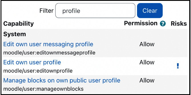
Figure 7.10 – User profile capabilities
We have now covered the main non-course pages in Moodle: Home, My courses, Dashboard, and User profile. A quick summary from a user’s perspective is shown in the following table:

Figure 7.11 – Home vs Dashboard versus My courses versus User profile
There is one key layout element missing: the header.
Customizing the header
The Moodle header is shown on every page in Moodle and comprises different navigational elements, as shown in the following annotated toolbar:
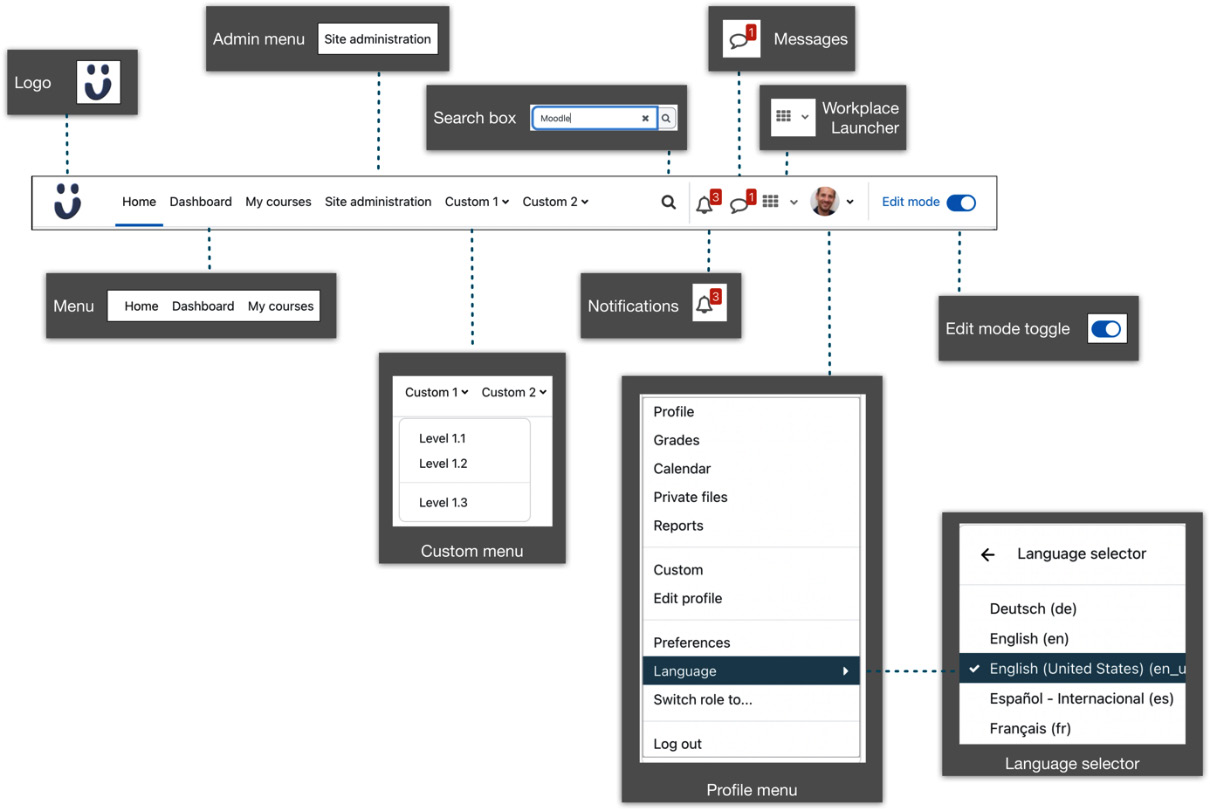
Figure 7.12 – Moodle header
The different header items include the following (from left to right), including pointers on where to change their appearance:
- (Compact) logo of your site (Site administration | Appearance | Logos), where you can also specify Favicon. If no logo is provided, the site name is displayed instead (Site administration | General | Site home | Site home settings).
- Main menu items (Dashboard is hidden when disabled in Site administration | Appearance | Navigation).
- Admin menu (only site administrators see this).
- Custom menu (additional menu items can be added via the custommenuitems setting in Site administration | Appearance | Themes | Theme settings. Each entry represents a menu item in the form of <Indent><Text>[|<URL>][|<Tooltip>][|<Language>].
<Indent> is a series of hyphens: no hyphens indicate a top-level menu; one hyphen, a submenu; two hyphens, a sub-submenu; and so on. The Boost theme does not support submenus; other themes may overcome this restriction. <Text> is the label of the menu item, <URL> is the internal or external link, and <Tooltip> is the optional balloon help. You can add a <Language> code or a separated list of code as the last item, which will only be shown if the user has currently selected the listed language. ### creates a separator.
- The following sample Custom menu items entry will generate the menu shown in the Moodle header image:
Custom 1
- Level 1.1|URL
- Level 1.2|URL
-###
- Level 1.3|URL
Custom 2
- Language 2.1|URL EN||en, en_us
- Sprache 2.1|URL DE||de, de_du, de_kids
- Level 2.2|URL|Shown in Boost
-- Level 2.2.1|URL|Not shown in Boost
-- Level 2.2.2|URL|Not shown in Boost
- Search box (enable Global search in Site administration | General | Advanced features).
- Notifications indicator and notification menu toggle (always shown).
- Messaging indicator and messaging toggle drawer (always shown).
- Workplace launcher (Moodle Workplace only).
- Profile menu (menu items can be hidden via the customusermenuitems setting in Site administration | Appearance | Themes | Theme settings. You can specify which menu items will appear in the top part of the profile menu. The syntax for each entry is as follows: <Item><URL>.
<Item> is either a text entry (in our example, Custom) or a pair <langstringname><componentname>. The former is the language pack entry, and the latter is the name of the Moodle component, for example, to provide a direct link to edit a user’s profile: editmyprofile,core|/user/edit.php.
- Language selector (Display language menu and Languages on language menu in Site administration | General | Language | Language settings).
- Edit mode toggle.
This concludes the customizing of appearance pages and the header. Next up are the visual elements that appear across the entire system, starting with blocks.
Configuring blocks
Every page we have come across so far contains blocks. In fact, bearing a few exceptions, every page in Moodle can contain blocks. You must switch to Edit mode and open the block drawer to configure blocks. Once turned on, you will see the Add a block item, which lets you add all the available blocks to the home page (except the ones that have already been added and only allow a single instance):
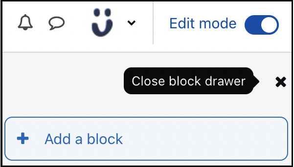
Figure 7.13 – Adding blocks to the block drawer
Every block has a purpose usually tied to a particular Moodle feature, for instance, showing deadlines in the calendar, getting access to the user’s private files, or showing the latest announcements. An exception is the Text block that lets you add any HTML code, useful for content that cannot be displayed using standard Moodle blocks.
Throughout the book, we deal with specific blocks whenever they are relevant to the covered topic. Here, we focus on the block configuration.
Blocks have up to three types of settings, which can be accessed through the Configuration icon:
- Block settings: These are unique to the block, and not all blocks provide configuration parameters. For example, the Mentees block we used when we created the Parents role in the previous chapter allows you to specify a block title.
- Where this block appears: Where the block will be displayed and what the default properties are.
- On this page: Properties in the current context.
A sample block configuration (of the Mentees block) is shown in the following screenshot:

Figure 7.14 – Block configuration
The following parameters are available:
- Original block location: This shows the context in which the block has been created (here, Site home). As with roles, pages may inherit blocks from a parent context.
- Page contexts (not available in all contexts): This setting determines on which pages the block will be shown; the self-explanatory options that are available are: Display on the site home only, Display on the site home and any pages added to the site home, and Display throughout the entire site. In other contexts, such as Courses, other (context-sensitive) options are available, depending on the original block location and your current location.
- Display on page types (unavailable on the home page): The available options depend on the block’s context. Examples in the Courses context are Any page, Any course page, and Any type of course main page.
- Default region: This determines the block’s position, and the options available depend on how they have been defined in the theme. Usually, the options are Left (or side-pre), Content, and Right (or side-post).
- Default weight (-10 to 10): Think of a block as a balloon – the lighter the weight of the block, the higher up its position, and the heavier the weight, the further down it will be placed.
- Visible (Yes or No): This determines whether the block is shown or hidden.
- Region (Left or Right): This is the same as Default region. On pages that allow the positioning of blocks in the center column, for example, Dashboard and the user profile page, Content is offered as a third option.
- Weight (-10 to10): This is the same principle as Default weight.
The concepts of blocks weight and region have been illustrated in the following (block) diagram:
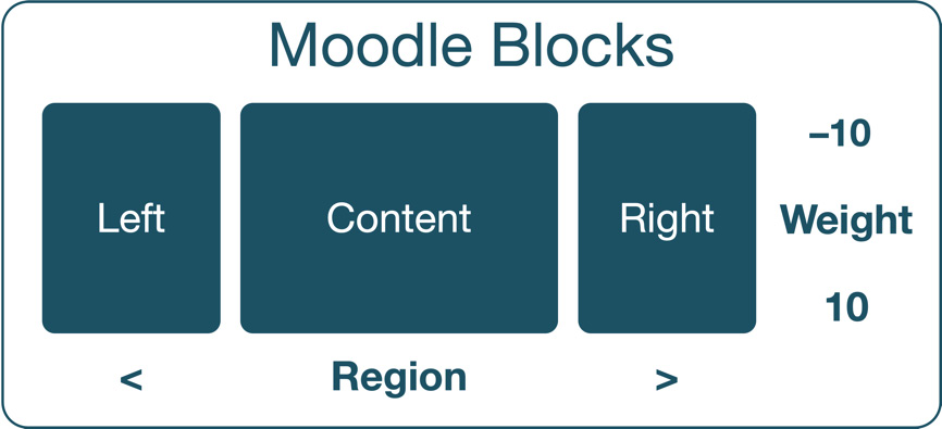
Figure 7.15 – Moodle blocks weight and region
While teachers have permission to configure blocks inside their courses, it often requires some support since the concepts of weight and region are not super-intuitive.
The editor covered next is another visual element that users will use throughout the site.
The Moodle editor
The editor is central to any user experience in Moodle since it is used throughout the site for a wide range of operations. These include posting in forums (learner), providing feedback to submissions (teacher), and editing content (editing teacher). You, as the administrator, should ensure that the editor is configured to facilitate your users’ requirements.
Moodle’s default editor is called Atto, which has been developed by Moodle for Moodle. Atto has been designed to work with responsive themes, support left-to-right as well as right-to-left strings, provide accessibility support, and is fully configurable.
TinyMCE used to be Moodle’s standard editor, which is still supported but uses an outdated version. Moodle HQ has communicated the following text editor strategy: the latest version of TinyMCE will be incorporated into Moodle, and all Atto plugins will be ported across. Once this process has been completed, Atto is expected to be phased out over future releases. So, in this book, we will only cover Atto since this is currently the best Moodle editor available; soon, you will be dealing with TinyMCE, and all essential features are expected to be available and, hopefully, some more.
Additionally, Moodle contains a built-in plain text editor implemented to enter any text that does not require formatting, for instance, source code.
To get access to the available editors and their settings, go to Site administration | Plugins | Text editors | Manage editors:

Figure 7.16 – Managing text editors
The idea of the Text editors plugin area is that additional editors can be installed and utilized throughout Moodle (refer to Chapter 8, Understanding Moodle Plugins). These can either be replacements for default editors or editors that enter specialized content. Furthermore, each button in Atto is implemented as a Moodle subplugin, which allows for the flexible extension of editor functionality.
Tip
It is recommended that you use Atto as the default editor as this is the one that will be maintained in the future and also fully supports mobile devices.
You can enable/disable each editor, change the order (in which they will be displayed when choosing an editor), and adjust the editor’s settings through the Settings link.
By default, the editor toolbar is configured to look like this (when expanded):
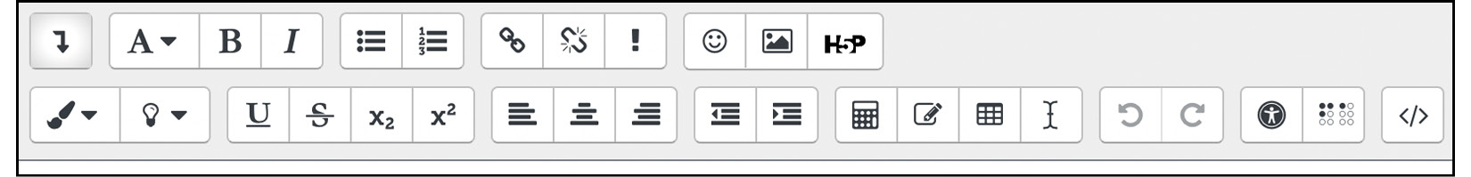
Figure 7.17 – Atto editor toolbar (default)
The toolbar can be configured in the Toolbar config setting under the list of Atto plugins:
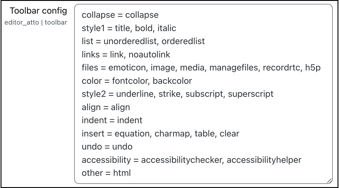
Figure 7.18 – Atto toolbar configuration
Toolbar buttons are organized in groups, for example, collapse, style1, and list. Group names must be unique, and the order determines in which order button groups are arranged. The format of each entry is as follows:
group = button1[, button2][,button3][…]
For example, the color group contains two buttons: foreground and background.
When you navigate to Site administration | Plugins | Text editors | Atto HTML editor | Collapse toolbar settings, you can specify via the Show # first groups when collapsed option which buttons are shown when the editor toolbar is not expanded.
You can install Atto’s editor plugins, adding additional buttons to your editor. Examples of moodle.org/plugins/?q=type:atto are word counter, inline corrections, and MS Word import.
Atto autosaves its content in predefined intervals, which is helpful if users close their page by accident since the content will be restored the next time they return to the same form. You can adjust this Autosave frequency setting by navigating to Site administration | Plugins | Text editors | Atto toolbar settings. Beware, a very high frequency, such as a second, will potentially harm the performance of your system.
There exists a wide range of options to expand Atto’s functionality without installing any add-ons:
- Extending the functionality of tables: Atto contains a powerful table mode, which supports the formatting and customization of tables. To equip your users with the full functionality, you might turn on the available features by going to Site administration | Plugins | Text editors | Atto HTML editor | Table settings.
- Supporting mathematical equations: If some of your users use mathematical equations regularly, you have two options. The first is Equations via TeX, a typesetting language supporting a wide range of mathematical operations. The second is Equations via MathJax; MathJax is a JavaScript library that displays a mathematical notation in web browsers using various markups, including TeX. You will need to enable the filters in Site administration | Plugins | Filters | Manage filters. Once you have activated one or both filters, you can specify their details in the filter settings and the toolbar options by navigating to Site administration | Plugins | Text editors | Atto HTML editor | Equation editor settings.
- Giving a smile ;-): Whether you like them or not, emoticons have come to stay, and educational settings make no exception. To configure or add emojis, go to Site administration | Appearance | HTML settings, where you will find the list of emoticon values, alongside a good explanation at the bottom of the table. Ensure that the Emoji picker setting in Site administration | General | Advanced features is enabled.
- Adding some awesomeness: FontAwesome is a font icon toolkit that, at the time of writing, contains more than 2,000 fully scalable vector icons. To support this great set of features, you will have to install the Font Awesome Icon Filter plugin from moodle.org/plugins/filter_fontawesome. Refer to Chapter 8, Understanding Moodle Plugins, on how to do this. Alternatively, you can add FontAwesome via Mustache templates. Once you have activated the filter in Site administration | Plugins | Filters | Manage filters, your users will be able to add icons via a text input like this:
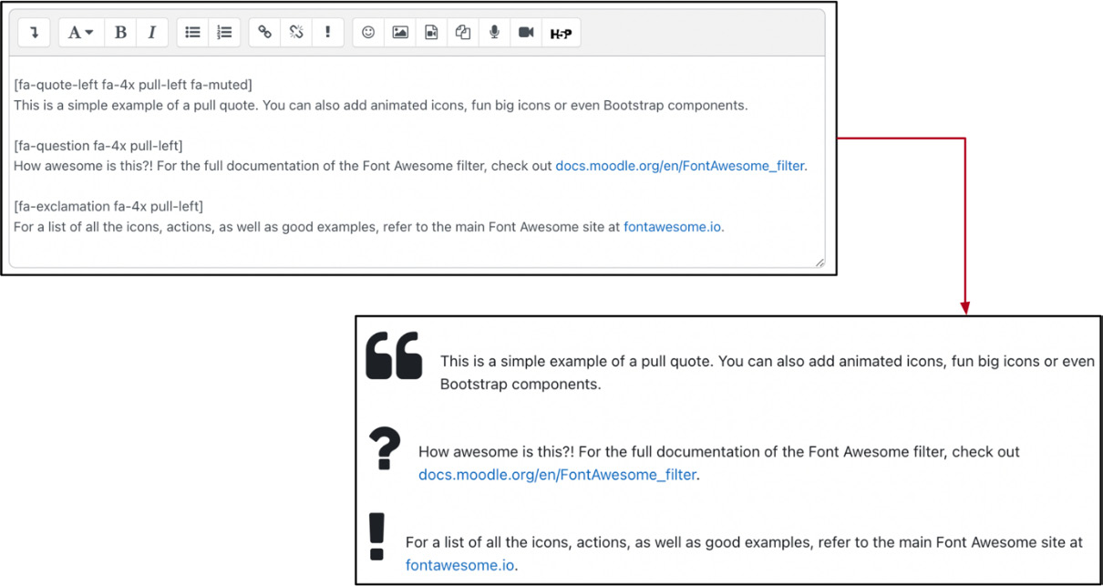
Figure 7.19 – Filter FontAwesome
Atto is utilized throughout Moodle whenever content has to be entered. So far, we have mainly focused on textual content and ignored multimedia; this is going to change in the following section when we deal with video and audio.
Enabling Moodle video and audio
Video and audio content are essential for building engaging learning experiences. Moodle supports playing various media formats as well as the recording of audio and video.
We will cover both modes: first, we will look at media players before dealing with media recorders.
Media players
Users nowadays expect to incorporate media formats in their teaching and learning content. Whether it is teachers providing videos as learning resources or learners embedding audio clips in their assignments, it is taken for granted that different media formats are supported. Your job as a Moodle administrator is to ensure that these media files are played correctly.
So how does Moodle handle media content in different formats? In simple terms, every time Moodle detects a link that points to a multimedia resource or <video> and <audio> HTML tags, it replaces them with an appropriate media player code. A multimedia filter is used to facilitate this conversion process (more on filters in Chapter 10, Configuring Technical Features), as shown in the following visualization:
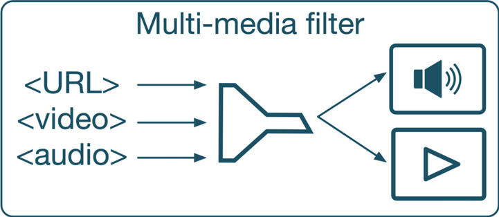
Figure 7.20 – Multimedia filter in action
Moodle does a pretty good job playing media formats, and most setups require little or no tweaking. You can see the players supported in Site administration | Plugins | Media players | Manage media players:
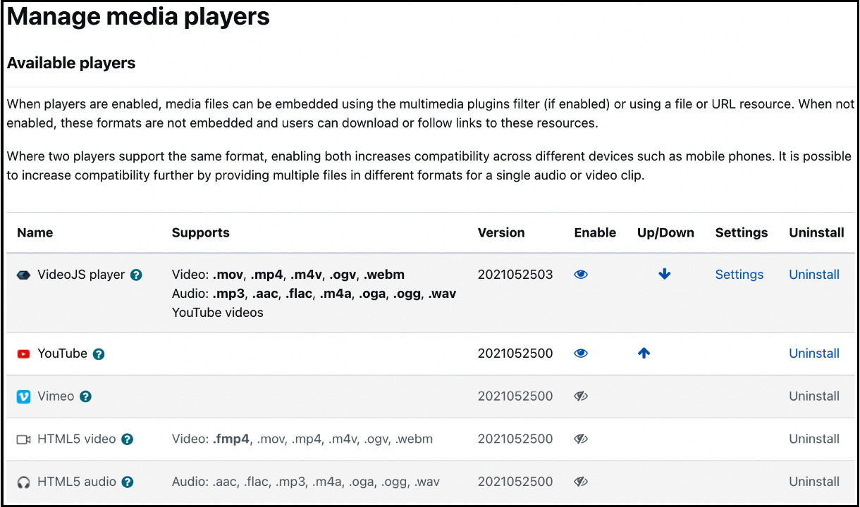
Figure 7.21 – Media players
Out of the box, Moodle uses VideoJS, a popular open source player, supporting HTML5 video, audio, and streaming services, such as YouTube and Vimeo. VideoJS also delivers content to users with accessibility issues. Due to its pluggability and simplicity to style, it has become the de facto standard for web applications. VideoJS is sufficient to play all content unless your users have specific media format requirements.
There are a couple of checks you should carry out to ensure media can be played on your site:
- Ensure Multimedia filter is enabled in Site administration | Plugins | Filters | Manage filters.
- Double-check VideoJS Settings. In Video file extensions and Audio file extensions, you can specify which file formats are supported. While there is a dedicated YouTube media player, VideoJS also supports YouTube videos. You can disable the standalone player if your users don’t use playlists. CSS class for video and CSS class for audio lets you customize the player. Check out the available classes on docs.videojs.com. The Limit size option defines whether Default width and Default height are applied when no dimensions are specified or the video is stretched to its maximum possible width.
- Enable Vimeo support in the list of available players if the streaming service is in use.
There are various ways to spice up your site with video-related third-party plugins. One highly-recommended example is Video Time (moodle.org/plugins/mod_videotime). The Video Time product family contains a set of plugins to integrate videos into Moodle. Videos can be hosted locally in Moodle, externally, and on YouTube or Vimeo. Supported features are simplified video embedding, an adjustable and customizable tab interface, activity completion, video tracking, resume, interactive transcript, and many more.
Media recorders
In Moodle, everyone can be a content creator. Teachers can record assignment feedback by voice, and students might want to add recorded videos to forum posts. Some users will use their desktop PC or Mac; others might want to use their mobile devices for recording.
Moodle fully supports media recording through its Atto text editor. Internally, RecordRTC is utilized, an open source JavaScript library using WebRTC for audio and video recording. You can configure its settings in Site administration | Plugins | Text editors | Atto HTML editor | RecordRTC:

Figure 7.22 – Media players
The options are worth looking at since they have an impact on server resources, both in terms of bandwidth and disk usage:
- Allowed types: You can specify whether Audio and video recording are supported or Audio only or Video only. There are two capabilities to control access to the Atto buttons: atto/recordrtc:recordaudio and atto/recordrtc:recordvideo.
- Audio bitrate and Video bitrate: The lower the bitrates, the smaller the file sizes, and vice versa. The default bitrate for recorded audio (128000) should generate files of about 15 KB per minute; the default bitrate for recorded video (2500000) to files of approximately 20 MB per minute.
- Audio time limit in seconds and Video time limit in seconds: The default time limit is 2 minutes for audio and video recording. Again, the longer the maximum recording length, the bigger the resulting files.
Recordings are stored in subdirectories of $CFG->dataroot>/filedir. You might want to double-check the section on files and upload limits in Chapter 2, Exploring the Moodle System.
Important note
Make sure post_max_size and upload_max_filesize are configured in line with your expected maximum recording sizes.
This concludes the section on audio and video. Next up are user tours to assist your learners and teachers while familiarizing themselves the first time they encounter a page or a feature.
Creating walk-throughs with user tours
User tours allow you to create simple walk-throughs, highlight key areas, or demonstrate new features with on-screen step-by-step guides. The following is a sample mini-tour we are going to create in this section:
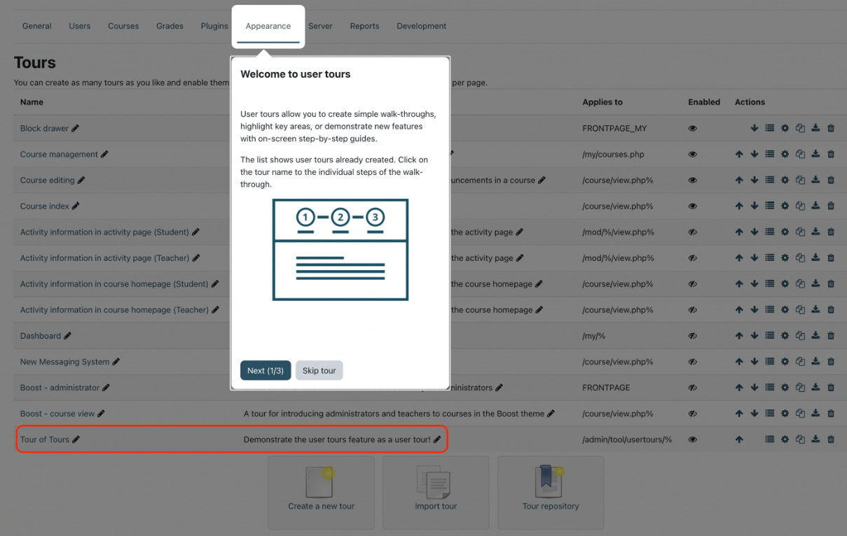
Figure 7.23 – Managing user tours
A tour comprises multiple steps, each being associated with a target. A target is a page element that is one of the following three target types:
- Block: A Moodle block to display the step next to it
- Selector: A CSS selector on the page where the step is displayed next to
- Middle of the page: General information not associated with any elements on the page
Each tour step has a title, some content, and a target. Each target is associated with a block, a CSS selector, or the page center. There is no limit to the number of pages in a tour. The structure of a user tour is shown in the following diagram:
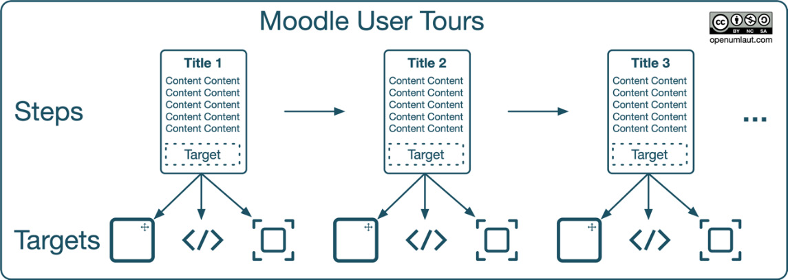
Figure 7.24 – User tours overview
Our sample tour contains three steps where the first one is associated with the Appearance menu, which is of target type Selector.
Enough of the theory; let’s create your first user tour.
Creating a tour
To get to the user tours feature, go to Site administration | Appearance | User tours. Moodle ships with a number of user tours, which you will see listed. Let’s make our first guide using the Create a new tour button.
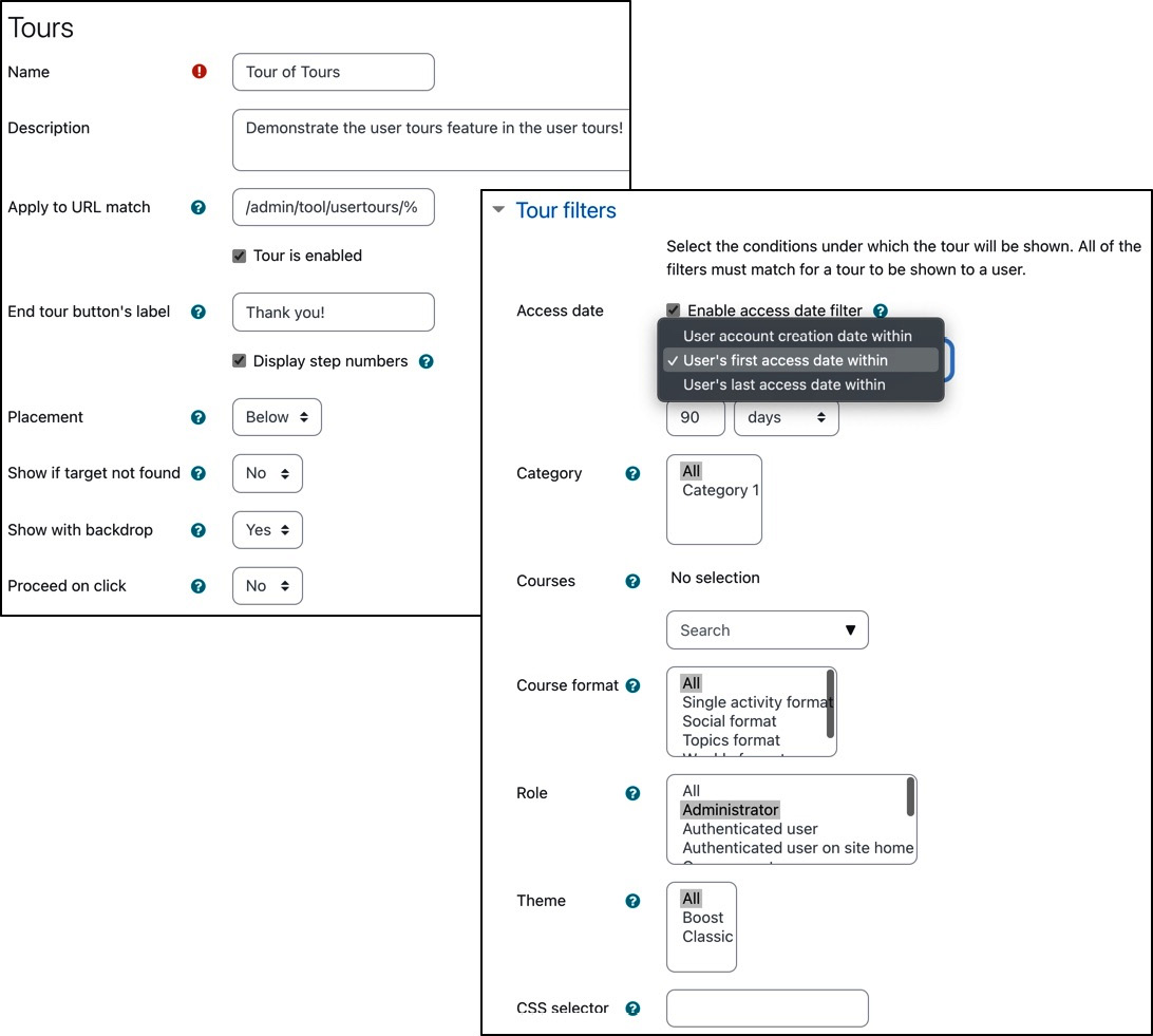
Figure 7.25 – Creating a user tour
While Name and Description should be self-explanatory, the other settings require some explanation:
- Apply to URL match: Tours will be displayed on any page in Moodle whose URL matches the specified path value. The percentage sign is used as a wildcard to catch multiple pages, for instance, /admin/tool/usertours/% in our “Tour of Tours” tour. The wildcard can also be preceded with any URL fragment, for example, %add=scorm%, for a user tour explaining the various aspects of setting up a SCORM activity.
Other useful URLs to match are /my/% (dashboard), /course/view.php% (all courses), /course/view.php?id=x (course with id x), and /user/profile.php% (user profile). To match the home page, the FRONTPAGE value has to be used.
- Tour is enabled: Initially, a tour is disabled. You can have multiple tours for the same page destination, but you should only have one per page enabled at a time.
- End tour button’s label: By default, the button on the last step is labeled Got it for single-step and End tour for multi-step tours. You can specify a custom label if you wish.
- Display step numbers: Whether to display a step counter, such as 2/4, to indicate the tour length. Such an indicator is handy on longer tours.
- Placement: The step can be placed Above, Below, Left, or Right of the target (matching block or CSS selector). The two horizontal options should be avoided since this may cause issues on mobile devices. If the size exceeds the available space, Moodle will auto-position the step.
- Show if target not found: There are cases when the specified target is not displayed, for example, when the user’s capabilities won’t allow it. In such cases, the step is not shown unless this setting is changed.
- Show with backdrop: When ticked, this option will cause the target to be highlighted and the rest of the screen to be dimmed down. We have applied this setting in our example. Some parts do not support backdrops, for instance, the main menu bar.
- Proceed on click: If enabled, the next step will be shown when the user clicks the target, mimicking a learning-by-doing feature.
Additionally, you can specify several Tour filters, which are conditions that must be met for the tour to be displayed. The available filters are the following:
- Access date: The filter restricts a user tour according to account creation, first access, and last access. This is useful if you wish to limit the tour to new users or users who haven’t accessed the site for a specified period.
- Category: Only show the tour on pages within courses in the selected categories.
- Courses: Only show the tour on pages within any selected courses.
- Course format: Only show the tour on pages within courses where the selected course format has been applied.
- Role: Only show the tour to users who have a selected role in the context where the tour is shown.
- Theme: Only show the tour when the selected theme is in use by the user.
- CSS selector: Only show the tour when the specified CSS selector is on the page. More on CSS selectors when we add steps, which we will cover next.
Adding steps to your tour
A tour comprises multiple steps, simulating a simple walk-through. In the screenshot, you can see the three steps of our Tour of Tours tour:

Figure 7.26 – Tour steps
A step contains the following three main elements:
- Target: This is the page element the step is associated with. There are three target types:
- Block indicates that the step is displayed next to a Moodle block. You can select one of the many Moodle blocks from the drop-down list.
- The CSS selector target is the most versatile but also the least intuitive approach since you need to identify the relevant CSS selector using the inspector in the browser’s development tools. Every browser has implemented its dev tools differently, so you will need to consult your browser’s help page. In our case, the CSS selector that must be matched is a.nav-link.active.active_tree_node, representing the active tab of the admin menu.
- Use the Middle of the page option to display general information not associated with any elements. The last two steps in our Tour of Tours tour use this target type.
- Content: This element comprises a title and the step’s explanatory text; the latter can also contain images and even instructional videos. Both compulsory fields will be shown to the user.
To display your step in the language the user has selected, use language string IDs, which can be entered once you have selected the option from the Content type menu instead of Manual. The standard format for the language string ID is identifier,component (see the Managing localization section in Chapter 10, Configuring Technical Features, for more details, including how to incorporate images in string texts).
All tours that ship with Moodle make use of the language string feature. Bear in mind that when modifying any of these onboard tours, they may be overridden during the next upgrade.
- Options: The available step settings (Placement, Show if target is not found, Show with backdrop, and Proceed on click) are identical to those specified in the tour settings. You can override each, for instance, when the backdrop doesn’t display correctly or stick to the inherited default values.
When you add a new step to your tour via the New step link at the bottom, you will find the mentioned elements on the following form:
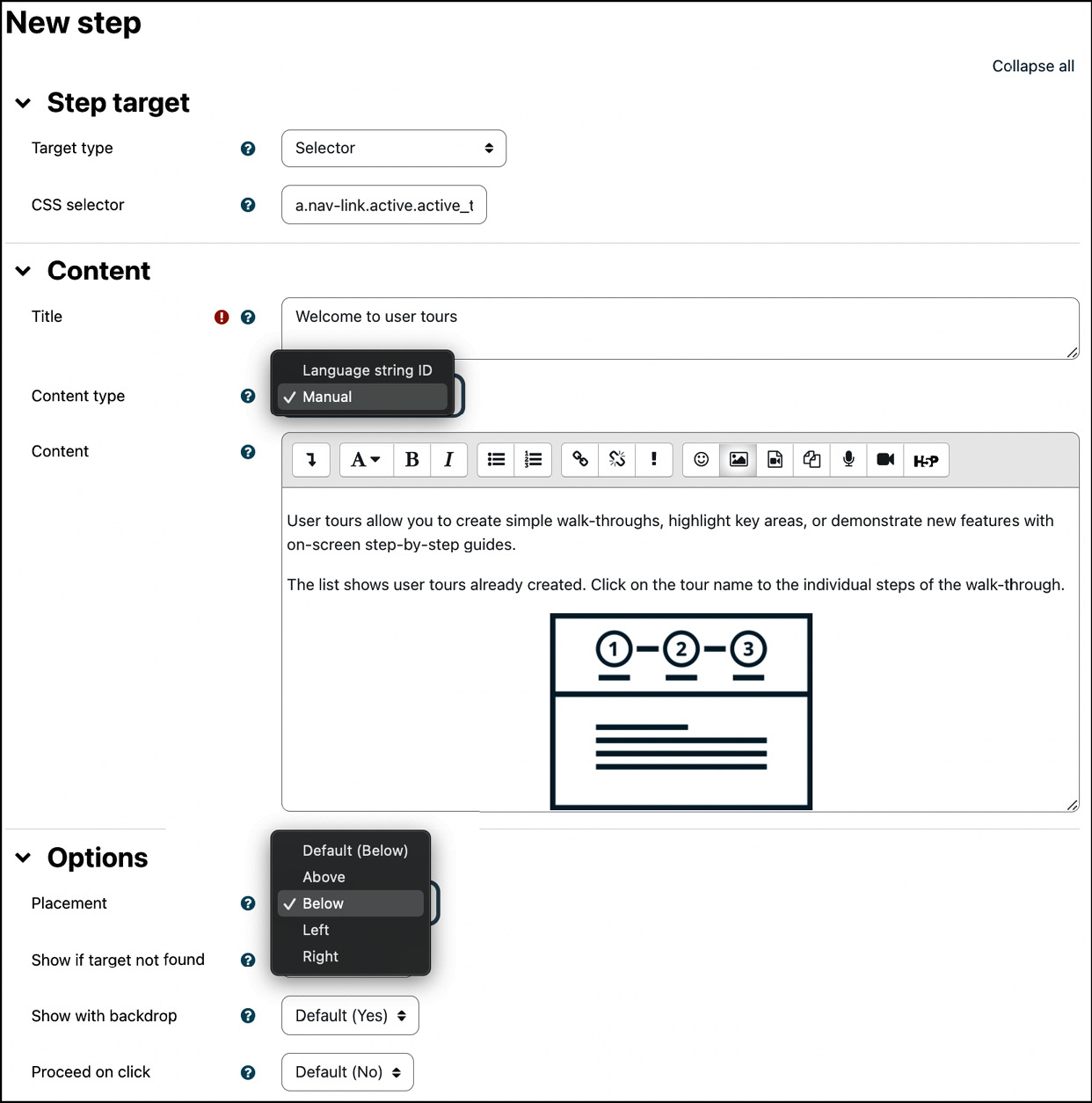
Figure 7.27 – Adding a tour step
After saving the form, you can add as many steps to your user tour as required. You can also amend a tour at a later stage or simply modify any existing content. When the structure of the tour changes, Moodle will recognize this and display the tour to all users, including those who have already viewed the previous version. When you only change small parts of the tour, you can use the force the tour to be displayed link at the top of the screen to reset the internal store that records who has already viewed the tour.
Now that you are familiar with creating tours with multiple steps, let’s look at sharing tours by importing and exporting them.
Importing and exporting tours
You can download a tour using the Export button in the list of tours. Moodle creates a JSON file that can be imported to another Moodle site. The Import tour button takes you to the standard upload feature of Moodle.
A valuable resource for mostly high-quality user tours is the tour repository. Once you have selected its button, you will be directed to the public User tours site on moodle.net. At the time of writing, there have been approximately 100 user tours in different languages, which might interest you. All you need to do is select the chosen file and click on the JSON filename, which will download the user tour, which you can then load to your Moodle site using the import mechanism already explained. Ensure that the user tour matches your Moodle version to avoid any inconsistencies.
If you feel that you have created a useful user tour that might be of interest to others, feel free to share it in the tour repository. All you need to do is to export your tour and, using your Moodle account, upload it to the repository on moodle.net.
This concludes the section on user tours, the last building block of appearance elements. Next up are Moodle themes, which have an impact across the entire Moodle site.
Using Moodle themes
Moodle provides a flexible skinning mechanism to brand your site to follow corporate design guidelines. As mentioned in the introduction, we will only cover the theme settings that can be accessed from the Moodle administration menu. For details on how to create Moodle themes, refer to Moodle Theme Development by Silvina Paola Hillar, Packt Publishing, or contact your Premium Moodle Partner, who will be able to offer professional theme design services. There are also some good pointers at docs.moodle.org/dev/Themes, which assumes that you have a good understanding of HTML and CSS.
While Moodle supports fixed-width and fluid themes, utilizing (or developing) responsive themes is highly recommended. We exclusively cover responsive themes here.
Important note
The future of e-learning is mobile, as reflected by Moodle, which only ships two responsive themes: Boost and Classic.
Responsive themes automatically adapt to the device, screen resolution, and screen orientation. Additionally, responsive themes adjust to the learning content that is displayed and the navigation that is used. Moodle themes are based on Bootstrap 4 and fully support SASS.
Important note
All modern browsers (the latest versions of Firefox, Edge, Chrome, and Safari) are fully supported by Moodle.
Internet Explorer 11 and other legacy browsers are not supported!
In this themes section, we first select a theme for your site before looking at different theme types. We then customize your theme, a topic categorized in general, advanced, and feature theme settings.
Selecting a Moodle theme
Standard or custom themes can be selected by going to Site administration | Appearance | Themes | Theme Selector. On our site, you can see the two core themes (Boost and Classic) as well as the two most popular third-party themes according to the statistics on moodle.org, Moove and Adaptable:
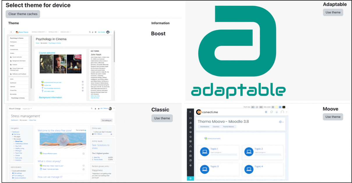
Figure 7.28 – Theme selection
The new skin will be applied immediately by selecting a theme via the Use theme button. However, some of your users might experience issues after a theme change, so it is recommended to clear theme caches when a new theme has been applied or an existing theme has been updated.
Important note
Ensure that the selected theme is compatible with your version of Moodle. Older themes will not be rendered correctly by the Moodle 4 theme engine.
So far, we have applied a single theme for the entire Moodle system. To apply different themes in different contexts, we need to grasp the concept of theme types, which is the topic of the following subsection.
Understanding theme types
To understand most theme settings, we require a little bit of background. Like roles, themes are assigned in different contexts: Site (system), User (covering Cohort), Category, and Course. Two additional areas, Session and Page, are supported by Moodle. These theme types are explained in the following table:
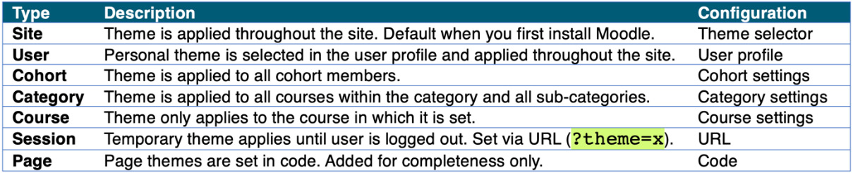
Figure 7.29 – Theme types I
The table briefly describes each theme scope and where configuration takes place. As a side note, you can change the precedence order (priority of themes) by modifying the $CFG->themeorder parameter in config.php. The default is set to array('course', 'category', 'session', 'user', 'cohort', 'site'.
To force themes to be applied in different areas, two configurations must be carried out:
- Different theme types have to be enabled, which takes place in Site administration | Appearance | Themes | Settings. You will see a tick box for each theme type, except site themes, which cannot be disabled, and page themes, which have been preserved for developers.
- A theme has to be selected for the respective theme type via the Force theme option. This selection can be made by users who have sufficient permissions in that context; for example, editing teachers are allowed to change a course theme.
The two configurations are shown in the following figure:
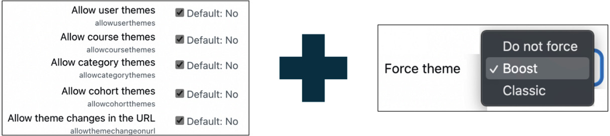
Figure 7.30 – Theme types II
There is a trade-off when allowing theme types other than the site theme: while allowing different theme types, additional processing is required that will add some overhead to your system and place an increased demand on your server. However, not allowing these themes limits the level of customization that can be carried out on your site. To assist you in resolving this uniformity versus personalization balancing act, here are some scenarios where the theme selection feature might be helpful:
- Provision of themes for users with accessibility issues (a high-res theme in the user profile)
- Branding of courses of a qualification (category themes)
- Creation of a theme gallery (session theme via URL: <yoursite>/?theme=<themename>)
There are two remaining theme parameters in Site administration | Appearance | Themes | Theme settings that are worth mentioning in the context of theme types:
- Theme list: To limit the number of available themes, name them in the textbox, separated by commas, and with no spaces.
- Theme designer mode: This setting is relevant to designers and developers, effectively turning off theme caching. Do not use this on a production site, as it will slow down your system significantly!
Now that we have the skill set to work with themes, it is time to customize the existing themes.
Customizing themes
As an administrator, you are unlikely to be involved in creating a full-blown custom theme as this task requires strong design skills and deep knowledge of CSS and HTML. However, you will be able to make basic modifications to existing themes.
Theme customizations can be grouped into three categories. While not all themes follow this approach, it gives a good indication of what types of customizations you can carry out via theme settings:
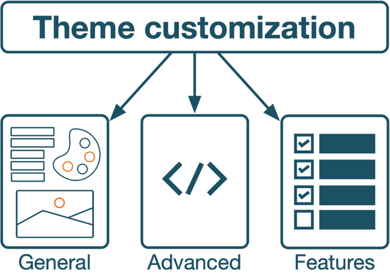
Figure 7.31 – Theme customizations
General settings deal with some basic parameters, images, and colors; advanced settings let you add custom CSS code, and feature settings add new functionality to your system. We are going to cover the three types in the following subsections.
General theme settings
General theme settings let you specify a few basic options, background images, and brand colors. We cover the two core themes (their settings are almost identical) since many custom themes are based on them. Third-party themes will likely have additional settings, for example, more color fields, font sizes, or button styles.
Go to Site administration | Appearance | Themes and select either Classic or Boost, where you can configure the following options:
- Use a dark style navbar: Toggle between dark and light style navigation bars (Classic only).
- Unneeded blocks: Some blocks are not needed or supported in certain themes. Here, you can disable them without having to hide them for other themes.
- Theme preset and Additional theme preset files: Presets contain SCSS instructions used to generate the new stylesheets for the theme. More on presets and SCSS in the following subsection.
- Background image and Login page background image: These two settings should be self-explanatory.
- Brand colour: Menu items and buttons are changed to the selected color.
General theme settings are usually insufficient to style a site to your needs. CSS gives you more flexibility, which we are covering next.
Advanced theme settings
Moodle uses Cascading Style Sheets (CSS) to describe the presentation of each element that is displayed. CSS defines different aspects of the HTML presentation, including colors, fonts, layouts, and so on.
To learn more about theme basics, go to docs.moodle.org/dev/Themes_overview, where you will find a well-documented and detailed help section. Ensure you are familiar with your browser’s Inspect tool to identify CSS styles and attributes.
Moodle uses consistently plain English for the naming of styles. For the login page elements that are displayed in the following two screenshots, a few sample styles have been labeled (original on the left original and modified version on the right):
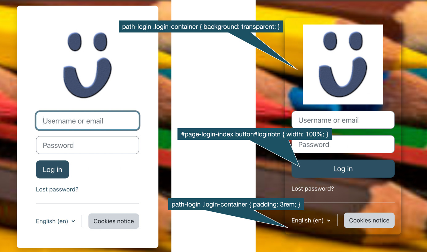
Figure 7.32 – CSS style samples
You can see that a style represents each element of Moodle. There are literally thousands of styles in Moodle, which gives designers a high degree of freedom.
Moodle supports Sassy CSS (SCSS), a superset of CSS providing additional features such as variables and nesting. SCSS is a preprocessor language that is converted to CSS before it is applied to any site. For the sake of simplicity, we are going to stick to CSS throughout this chapter.
Tip
If you already have any SCSS code or libraries, feel free to use these for your visual customizations.
Any code you wish to inject side-wide should be applied directly in the theme at Site administration | Appearance | Themes | <Theme>. On the Advanced settings tab, you will find two settings that let you override the initial SCSS variables and add new SCSS to themes without modifying any code in the backend: Raw initial SCSS (code injected before any other code) and Raw SCSS (injected at the end of the style sheet). In the following example, we have added three variables to add some weight to all fonts throughout the site:
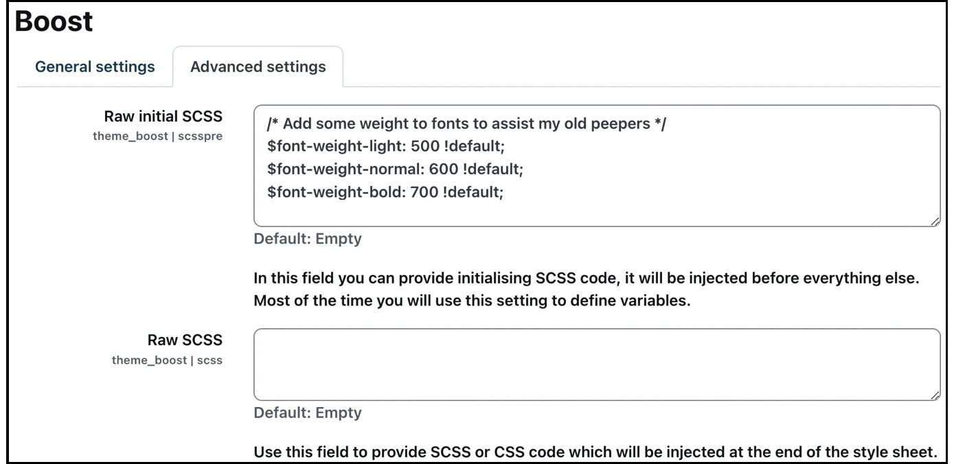
Figure 7.33 – Advanced theme settings
The second concept we already came across in the general settings is theme presets. According to the developer documentation, a preset is an SCSS file designed to be added to the Boost theme or a child of it. It combines the Bootstrap 4 SCSS files with the required Moodle SCSS files and adds a layer of customization. Preset files can be uploaded into the admin settings for the theme and then chosen from a list of installed presets.
Moodle also supports Mustache templates to render HTML output. For more information on Moodle’s use of Mustache, check out the Moodle developer documentation at docs.moodle.org/dev/Templates.
Technically, you can customize your entire site using SCSS and theme presets. However, unless there are only a handful of adjustments, its usage is cumbersome and its maintenance potentially tricky. Third-party or custom themes overcome this shortcoming and also have the potential to introduce new features.
Feature theme settings
The beauty of themes is that they can’t just control the look and feel elements but also add new functionality. All popular themes make use of this ability and add new features.
There is a plethora of themes on moodle.org/plugins/?q=type:theme. There are also plenty of design and development companies that offer paid-for Moodle themes via their websites. According to the statistics on moodle.org, the three most popular themes are Moove, Adaptable, and Fordson. To give you an idea of what the configuration options in a professional theme can look like, have a look at the snippet from the Adaptable theme:
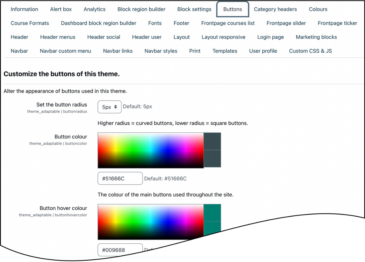
Figure 7.34 – Adaptable theme
Just have a look at the sheer volume of menu items! The theme provides a plethora of customization options, ranging from custom menus, front page slide shows, news tickers, and marketing spots to social networking icons and analytics support. Refer to Chapter 8, Understanding Moodle Plugins, for how to install third-party themes.
The topic of themes and customization is hugely complex, and Moodle administrators are usually not involved in the design and branding process. We have covered theme basics that can be customized via the admin interface and, hopefully, this gave you a little insight into the topic. Closely related to theme customization is accessibility, which has to be ensured on your site.
Ensuring accessibility
In most educational settings, accessibility is now a legal requirement. So, it is crucial to ensure compliance of your system with the respective standards.
Important note
Accessibility is the ability for users with certain disabilities to access Moodle’s functionality.
An area has been dedicated to Moodle accessibility in Moodle Docs, which you can access at docs.moodle.org/en/Accessibility. It provides useful links to standards, guidelines, legislation, and subject-related tools and resources.
Three main accessibility areas affect accessibility in Moodle:
- System accessibility
- Theme accessibility
- Content accessibility
We will cover all three accessibility types in the following subsections.
System accessibility
Moodle fully complies with major accessibility standards and has obtained WCAG 2.1 level AA Accreditation. Moodle enforces XHTML 1.0 Strict, which only allows the usage of compliant HTML constructs and the implementation of the Moodle forms library. These restrictions guarantee consistency across pages and ensure support for standard screen readers without further configuration.
Moodle provides links to external validation sites, checking the current page for standard compliance. Go to Site administration | Development | Debugging and check the Show validator links box to activate these. Links to Validate HTML and Web Content Accessibility Guidelines (WCAG) check will be displayed at the bottom of your page (if supported by your theme):
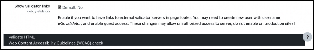
Figure 7.35 – Validator links
External validation sites will be opened with the URL as a parameter when selecting the respective links. For the validation sites to be able to check pages on your Moodle system, you need to create a new user with username w3cvalidator and enable guest access to your site. Only do this on a staging or test site since these settings potentially compromise the security of your system.
The validation sites not only check for any page issues but also for theme problems, which are covered next.
Theme accessibility
CSS is Moodle’s representation layer independent of the system layer, represented in XHTML 1.0 Strict. Thus, accessibility also has to be ensured in the theme itself.
Once you have implemented your accessibility styles, either directly in the theme or through custom CSS, ensure these have been validated against any issues.
One popular choice is to incorporate accessibility options and offer them in the theme as options, such as different color schemes, font styles, text sizes, and readability choices. You can install the Accessibility tool from github.com/sharpchi/moodle-local_accessibilitytool, and the following selection will be available to all users via their Preference menu (if supported by your theme):
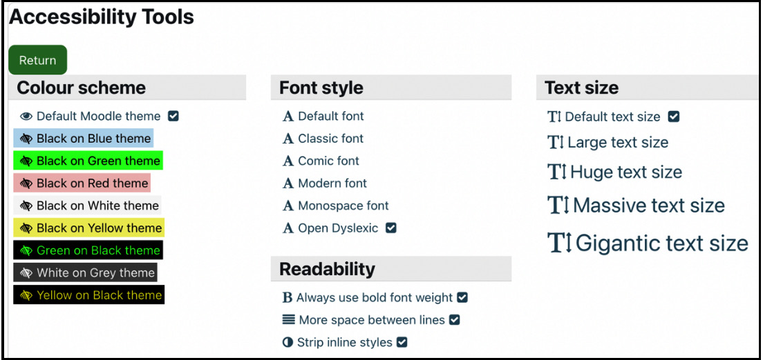
Figure 7.36 – Accessibility tool
System and theme accessibility are issues you, as an administrator, have full control over; content accessibility, on the other hand, is more difficult to achieve since you are relying on content creators. How to assist them will be covered in the following subsection.
Content accessibility
Accessibility compliance is only guaranteed for Moodle pages (assuming that the theme follows all standards) but not for your teachers’ and instructors’ newly created and uploaded content.
Moodle has some basic built-in tools that assist your content creators:
- The HTML tidy text filter checks whether the HTML code is XHTML-compliant, tidying it up wherever necessary. You must activate the filter by navigating to Site administration | Plugins | Filters | Manage filters. Ensure that PHP has been compiled with the libtidy option.
- The Accessibility checker button in Atto carries out some basic checks against the entered HTML code to ensure conformity with accessibility guidelines.
- The Screenreader helper button in Atto checks whether images have been tagged correctly to ensure screenreader compatibility.
While these tools provide some basic assistance, they are insufficient in helping content creators to ensure accessibility compliance. To achieve full accessibility conformance, the Accessibility toolkit should be facilitated. To understand the principle behind the tool, have a look at the following diagram:
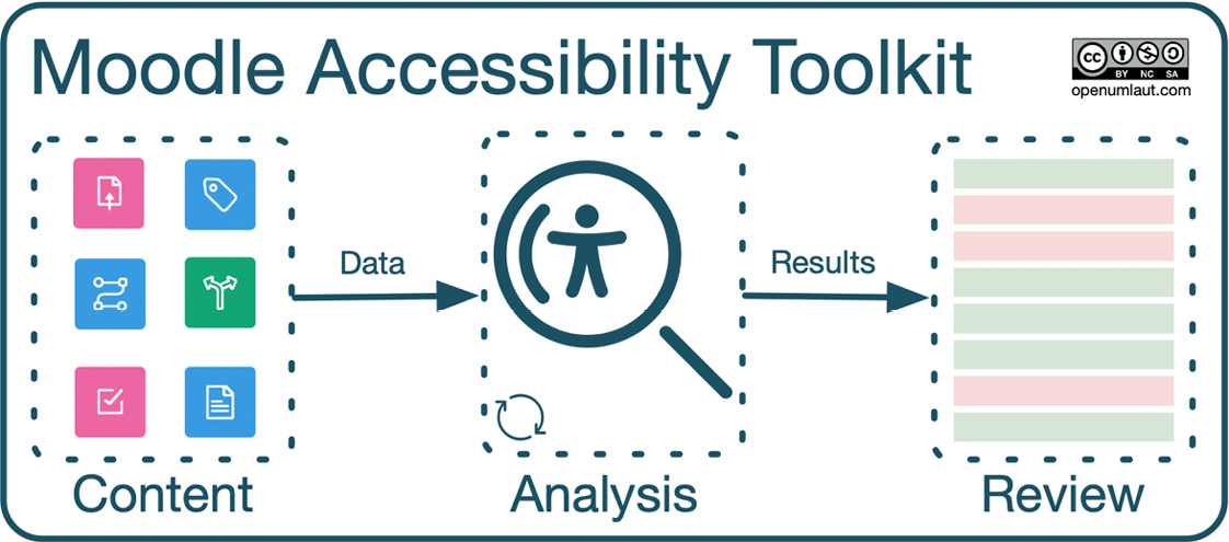
Figure 7.37 – Accessibility toolkit process
The accessibility toolkit comprises the following steps:
- The course content is preprocessed, and the data required for analysis is extracted. This data contains any relevant content for analysis and information about the content, such as HTML tags.
- Data analysis takes place on your Moodle server in the background; no content is transferred off your site. (The only data being transferred off the Moodle site is for one purpose only: to send a regular summary of overall data for statistical and progression purposes, such as the number of courses, the number of users, analysis check errors, and so on.)
- The results are available via the Accessibility review block and, in more detail, on different data breakdown pages in the toolkit.
The beauty of the system is that every time content is updated, only the delta of the data is analyzed. This mechanism reduces the load on your Moodle site and performs analyses faster on your server.
As an administrator, you have to ensure that the tool has been configured correctly, which requires the following steps:
- Ensure accessibility tools are enabled in Site administration | General | Advanced features.
- Register the accessibility toolkit with Brickfield Education Labs. Go to Site administration | Plugins | Admin tools | Accessibility | Brickfield registration and follow the registration link. You will need to create an account and add your site details before receiving your API key and Secret key. These keys will enable your toolkit once submitted on the registration page on your Moodle site.
- Go to Site administration | Plugins | Admin tools | Accessibility | Accessibility toolkit settings and Enable analysis requests. The analysis is updated automatically for requested courses on an ongoing basis with course content edits; Delete historical checks results allows the toolkit to delete older analysis records that have been superseded by newer records. Batch limit sets the limit of analysis batches run periodically by scheduled tasks:
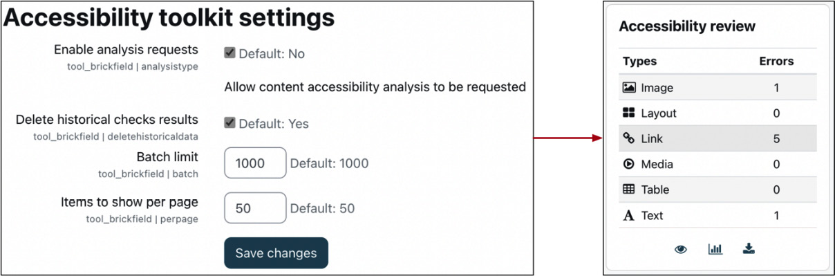
Figure 7.38 – Accessibility toolkit settings and review block
- Go to Site administration | Plugins | Blocks | Accessibility review and ensure the What to show on the course page, Display errors in this format, and Toolkit page to show settings are appropriately configured.
- Go to Site administration | Server | Tasks | Scheduled tasks, search for tool_brickfield, and change the first four tasks to be run every minute (change the Minute settings to *). The default has been set to 5 minutes to avoid potential overloading during the initial analysis. Check out the Cron management and scheduled tasks section in Chapter 15, Optimizing Moodle Performance, for more details.
The accessibility starter toolkit that ships with Moodle contains some helpful tools to assist content creators in producing accessibility-compliant learning materials. The Enterprise Accessibility Toolkit has a complete set of features to help your organization improve the accessibility of your courses. Check out www.brickfield.ie/brickfield-accessibility-toolkit for details.
This concludes the section on the complex task of accessibility and ends the chapter on configuring Moodle’s appearance.
Summary
In this chapter, we tackled the not-so-appealing look and feel of a vanilla Moodle site and touched upon a significant number of areas supporting customization.
We first looked at pages that can be customized by the administrator: login, home, dashboard, my courses, and the user profile. We then covered appearance elements visible or usable throughout the site: the header, blocks, video and audio, the Atto editor, and user tours.
The second part of the chapter was concerned with the customization of themes. Before customizing your theme via general, advanced, and feature theme settings, we looked at different theme types.
The last topic covered was accessibility, a legal requirement in most educational settings. We dealt with system, theme, and content accessibility.
Important note
Double-check what your site looks like when you are not logged in. Ensure no information is visible that should only be accessible to logged-in users.
The main objective of adapting the look and feel of your Moodle system is to ensure a consistent user experience alongside ease of use. However, the level of customization is constrained by two factors, as shown in the following triangle:
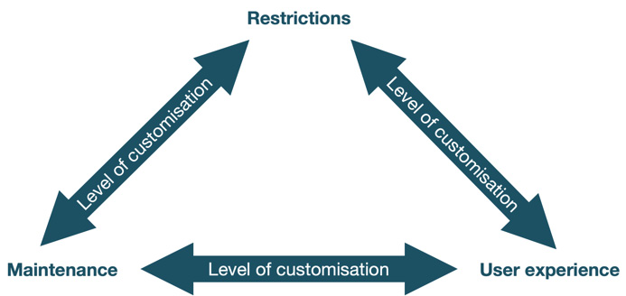
Figure 7.39 – Level of customization
The appearance of your site is subject to restrictions, usually the corporate design guidelines of your organization and accessibility regulations. Also, the higher the level of customization, the higher the potential maintenance effort when you upgrade the site to a newer version. It is recommended to consider these aspects when you modify any visual Moodle elements or outsource the task to a Moodle Partner.
Now that your Moodle looks (hopefully) the way you want it to, it is time to enable all the functionalities you wish to offer your users. Plugins are a versatile way to add new features to your Moodle system, which we will deal with in the following chapter.