
C H A P T E R 29
Buttons and Collapsible Blocks
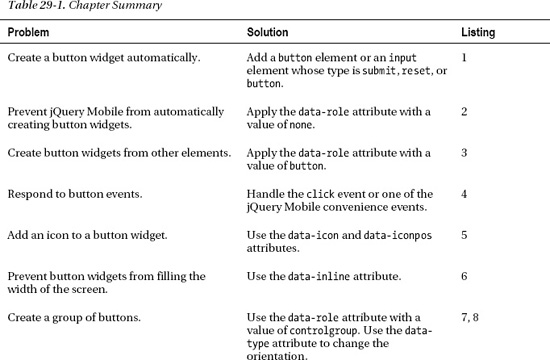
In this chapter, I describe two of the jQuery Mobile widgets: buttons and collapsible blocks. The jQuery Mobile button widget works in a very similar way to the jQuery UI buttons you saw earlier in the book, with the exception that you can create and use simple buttons without using any custom JavaScript code at all. A collapsible block is like a single panel from an accordion; in fact, you can use collapsible blocks on their own or combine several together to form a simple accordion. Table 29-1 provides the summary for this chapter.
Using jQuery Mobile Buttons
I already used some button widgets in earlier examples, but now it is time to loop back and explain how they work.
Understanding Automatically Created Buttons
As part of the automatic page-enhancement process, jQuery Mobile creates buttons widgets from button elements or input elements whose type attribute is set to submit, reset, button, or image. You don't have to take any special action for these element types because jQuery Mobile does all the work for you. Listing 29-1 shows a page that contains some of these automatically handled elements.
Listing 29-1. Relying on the automatic creation of button widgets
<!DOCTYPE html>

<html>

<head>

    <title>Example</title>

    <meta name="viewport" content="width=device-width, initial-scale=1">

    <link rel="stylesheet" href="jquery.mobile-1.0.css" type="text/css" />

    <script type="text/javascript" src="jquery-1.6.4.js"></script>

    <script type="text/javascript" src="jquery.mobile-1.0.js"></script>

</head>

<body>

    <div id="page1" data-role="page" data-theme="b">

        <div data-role="header">

           <h1>Jacqui's Shop</h1>

        </div>
        <div data-role="content">

            <button>Button</button>

            <input type="submit" value="Input (Submit)" />

            <input type="reset" value="Input (Reset)" />

            <input type="button" value="Input (Button)" />

        </div>

    </div>

</body>

</html>
You can see how a button widget is created for each type of element in Figure 29-1.
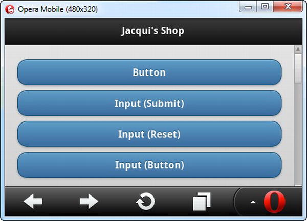
Figure 29-1. Button widgets created automatically by jQuery Mobile
Preventing Automatic Button Creation
If you want to stop jQuery Mobile from creating a button widget automatically, apply the data-role attribute to the element with a value of none, as shown in Listing 29-2.
Listing 29-2. Preventing jQuery Mobile from automatically creating a button widget
<!DOCTYPE html>

<html>

<head>

    <title>Example</title>

    <meta name="viewport" content="width=device-width, initial-scale=1">

    <link rel="stylesheet" href="jquery.mobile-1.0.css" type="text/css" />

    <script type="text/javascript" src="jquery-1.6.4.js"></script>

    <script type="text/javascript" src="jquery.mobile-1.0.js"></script>
</head>

<body>

    <div id="page1" data-role="page" data-theme="b">

        <div data-role="header">

           <h1>Jacqui's Shop</h1>

        </div>

        <div data-role="content">

            <button>Button</button>

            <input type="submit" value="Input (Submit)" />

            <input type="reset" value="Input (Reset)" data-role="none" />

            <input type="button" value="Input (Button)" />

        </div>

    </div>

</body>

</html>
Configuring jQuery Mobile Buttons
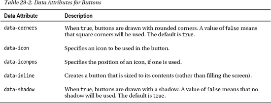
jQuery Mobile defines a number of data attributes you can use to configure buttons and to create buttons from different element types. These attributes are described in Table 29-2.
Creating Buttons from Other Elements
jQuery Mobile can also create buttons widgets from other elements. In earlier chapters, you saw me create a button widget from an a element by applying the data-role attribute with a value of button. You can also do this for other types of elements, such as div. Listing 29-3 contains an example.
Listing 29-3. Creating buttons from other elements
<!DOCTYPE html>

<html>
<head>

    <title>Example</title>

    <meta name="viewport" content="width=device-width, initial-scale=1">

    <link rel="stylesheet" href="jquery.mobile-1.0.css" type="text/css" />

    <script type="text/javascript" src="jquery-1.6.4.js"></script>

    <script type="text/javascript" src="jquery.mobile-1.0.js"></script>

</head>

<body>

    <div id="page1" data-role="page" data-theme="b">

        <div data-role="header">

           <h1>Jacqui's Shop</h1>

        </div>

        <div data-role="content">

            <a href="document2.html" data-role="button">A Element</a>

            <div data-role="button">DIV Element</div>

        </div>

    </div>

</body>

</html>
You can see how jQuery Mobile deals with the elements in this example in Figure 29-2.
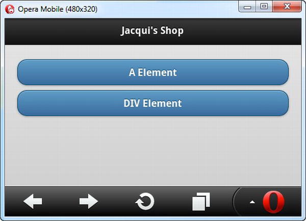
Figure 29-2. Creating button widgets using other elements
Dealing with Button Events
If you create a button from an input element or from an a element, there is a default action that will be performed when the button is clicked. For input elements, the default action is to submit the form that contains the element. (I'll explain more about using forms with jQuery Mobile in Chapter 30.) For a elements, the default action is to navigate to the page specified by the href attribute.
Because of the complexity around touch events that I described in Chapter 26, my advice is to use only the input and a elements when the default actions are useful to you. If you want to create a different effect, use another element to create a button widget and handle the element that suits you best. For me, that's usually the tap event. Listing 29-4 shows how you can handle the events emitted from a button, even when it has been created from a non-button element.
Listing 29-4. Handling events from button widgets
<!DOCTYPE html>

<html>

<head>

    <title>Example</title>

    <meta name="viewport" content="width=device-width, initial-scale=1">

    <link rel="stylesheet" href="jquery.mobile-1.0.css" type="text/css" />

    <script type="text/javascript" src="jquery-1.6.4.js"></script>

    <script type="text/javascript">

        $(document).bind("pageinit", function() {

            $('button, #divButton').bind("tap", function() {

                $.mobile.changePage("#page2");

            })

        });

    </script>

    <script type="text/javascript" src="jquery.mobile-1.0.js"></script>

</head>

<body>

    <div id="page1" data-role="page" data-theme="b">

        <div data-role="header">

           <h1>Jacqui's Shop</h1>

        </div>

        <div data-role="content">

            <button>BUTTON Element</button>

            <div id="divButton" data-role="button">DIV Element</div>

        </div>

    </div>

    <div id="page2" data-role="page" data-theme="e">

        <div data-role="header">

           <h1>Jacqui's Shop</h1>

        </div>

        <div data-role="content">

            You pressed a button!

            <a href="#" data-role="button" data-rel="back">OK</a>

        </div>

    </div>

</body>

</html>
In this example, I created a page that contains a button element and a div element, both of which will be transformed by jQuery Mobile into button widgets. To respond to the user clicking on these buttons, I use the bind method to handle the tap event, which I described in Chapter 26. When either button is pressed, I use the changePage method to navigate to another page in the same document.
 Tip Notice that I wait for the
 pageinit event to be triggered before I register my handler functions with the button and div elements. I explained the pageinit event in Chapter 26, along with a brief explanation of why you must use it instead of the standard jQuery ready event.
Adding Icons to Buttons
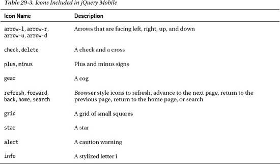
jQuery Mobile includes a set of icons that can be used in buttons. These are included in a single image file in the images directory you installed in Chapter 26. Table 29-3 shows a list of the icon names and a brief description of each.
You apply the icons to a button using the data-icon attribute, where the value specifies the name of the icon to use. You can also use the data-iconpos attribute to specify where the icon will be located in the button. The default is left, but you can also specify top, right, and bottom. If you set data-iconpos to notext, only the icon is displayed. Listing 29-5 provides an example of using both of these attributes.
Listing 29-5. Adding icons to buttons
<!DOCTYPE html>

<html>

<head>

    <title>Example</title>

    <meta name="viewport" content="width=device-width, initial-scale=1">

    <link rel="stylesheet" href="jquery.mobile-1.0.css" type="text/css" />

    <script type="text/javascript" src="jquery-1.6.4.js"></script>

    <script type="text/javascript" src="jquery.mobile-1.0.js"></script>

</head>

<body>

    <div id="page1" data-role="page" data-theme="b">

        <div data-role="header">

           <h1>Jacqui's Shop</h1>

        </div>

        <div data-role="content">

            <div class="ui-grid-b">

                <div class="ui-block-a">

                    <button data-icon="home">Home</button>

                </div>

                <div class="ui-block-b">

                    <button data-icon="home" data-iconpos="top">Home</button>

                </div>

                <div class="ui-block-c">

                    <button data-icon="home" data-iconpos="notext"></button>

                </div>

            </div>

        </div>

    </div>

</body>

</html>
In this example, I created three buttons, all of which display the home icon. The first button uses the default icon position, the second button uses the top position, and the last button uses the notext value, which creates an icon-only button. You can see how these buttons appear in Figure 29-3.
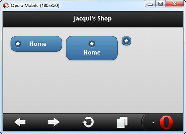
Figure 29-3. Creating icon buttons
You can see that each button has a distinctive style. The most striking is the last button, which displays no text. This looks visually appealing, but my experience with this kind of button is that they are hard to hit with a finger and not all users immediately recognize them as a means of navigating elsewhere in the application.
Creating Inline Buttons
By default, jQuery Mobile buttons span the entire width of the screen. You can see an example of the default button width in Figure 29-1. I used the layout grid to create smaller buttons in later examples, but I could have achieved a similar effect using inline buttons, which are just big enough to accommodate their content. Listing 29-6 provides an example.
Listing 29-6. Using inline buttons
<!DOCTYPE html>

<html>

<head>

    <title>Example</title>

    <meta name="viewport" content="width=device-width, initial-scale=1">

    <link rel="stylesheet" href="jquery.mobile-1.0.css" type="text/css" />

    <script type="text/javascript" src="jquery-1.6.4.js"></script>

    <script type="text/javascript" src="jquery.mobile-1.0.js"></script>

</head>

<body>

    <div id="page1" data-role="page" data-theme="b">

        <div data-role="header">

           <h1>Jacqui's Shop</h1>

        </div>

        <div data-role="content">

            <div>

                <button data-icon="home" data-inline=true>Home</button>

            </div>

            <div>

                <button data-icon="home">Home</button>

            </div>

        </div>

    </div>

</body>

</html>
You create inline buttons by setting the data-inline attribute to true. In the example, there are two buttons, one of which is inline. You can see the effect in Figure 29-4.
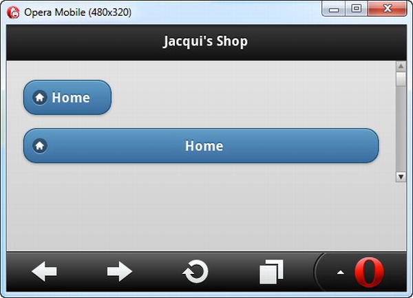
Figure 29-4. Using inline buttons
Creating Grouped Buttons
You can create a group of buttons that have no spacing between them by creating a control group. You do this by applying the data-role attribute with a value of controlgroup to the parent element for two or more button widgets. Listing 29-7 provides a demonstration.
Listing 29-7. Creating a set of grouped buttons
<!DOCTYPE html>

<html>

<head>

    <title>Example</title>

    <meta name="viewport" content="width=device-width, initial-scale=1">

    <link rel="stylesheet" href="jquery.mobile-1.0.css" type="text/css" />

    <script type="text/javascript" src="jquery-1.6.4.js"></script>

    <script type="text/javascript" src="jquery.mobile-1.0.js"></script>

</head>

<body>

    <div id="page1" data-role="page" data-theme="b">

        <div data-role="header">

           <h1>Jacqui's Shop</h1>

        </div>

        <div data-role="content">

            <div data-role="controlgroup">

                <button data-icon="back">Back</button>

                <button data-icon="home">Home</button>

                <button data-icon="next">Next</button>

            </div>

        </div>

    </div>

</body>

</html>
In this example, there are three buttons, all of which are children of a div element whose data-role is control group. You can see the effect in Figure 29-5. Notice how only the top and bottom buttons have rounded corners.
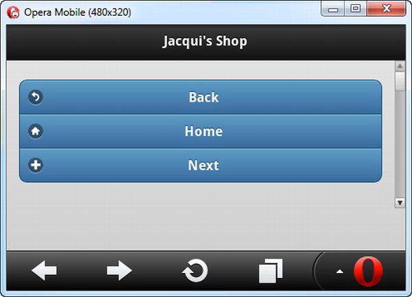
Figure 29-5. A set of buttons displayed in a group
You can change the orientation of the button group by setting the data-type attribute to horizontal, as shown in Listing 29-8.
Listing 29-8. Creating a horizontal button group
<!DOCTYPE html>

<html>

<head>

    <title>Example</title>

    <meta name="viewport" content="width=device-width, initial-scale=1">

    <link rel="stylesheet" href="jquery.mobile-1.0.css" type="text/css" />

    <script type="text/javascript" src="jquery-1.6.4.js"></script>

    <script type="text/javascript" src="jquery.mobile-1.0.js"></script>

</head>

<body>

    <div id="page1" data-role="page" data-theme="b">

        <div data-role="header">

           <h1>Jacqui's Shop</h1>

        </div>

        <div data-role="content">

            <div data-role="controlgroup" data-type="horizontal">

                <button data-icon="back">Back</button>

                <button data-icon="home">Home</button>

                <button data-icon="next">Next</button>

            </div>

        </div>

    </div>

</body>

</html>
You can see how the browser displays a horizontal button group in Figure 29-6. Once again, notice how the rounded corners are applied only to the outside elements.
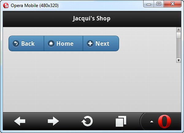
Figure 29-6. Creating a horizontal button group
Using Collapsible Content Blocks
jQuery Mobile includes support for creating collapsible content blocks, which are sections of content with a header that can be closed so that only the header is available. This is very similar to a single panel of a jQuery UI accordion, which I described in Chapter 19. In fact, you can create a simple accordion by combining multiple collapsible elements together.
Creating a Single Collapsible Block
A collapsible block has a specific structure you need to follow in order to give jQuery Mobile the elements it needs. Listing 29-9 contains an example.
Listing 29-9. Creating a single collapsible block
<!DOCTYPE html>

<html>

<head>

    <title>Example</title>

    <meta name="viewport" content="width=device-width, initial-scale=1">

    <link rel="stylesheet" href="jquery.mobile-1.0.css" type="text/css" />

    <script type="text/javascript" src="jquery-1.6.4.js"></script>

    <script type="text/javascript" src="jquery.mobile-1.0.js"></script>
</head>

<body>

    <div id="page1" data-role="page" data-theme="b">

        <div data-role="header">

           <h1>Jacqui's Shop</h1>

        </div>

        <div data-role="content">

            <div data-role="collapsible">

                <h1>New Delivery Service</h1>

                <p>We are pleased to announce that we are starting a home delivery

                service for your flower needs. We will deliver within a 20 mile radius

                of the store for free and $1/mile thereafter.</p>

            </div>

        </div>

    </div>

</body>

</html>
The first thing you have to do is create a div element and apply the data-role attribute with a value of collapsible. This tells jQuery Mobile that you want a collapsible block and that it should look for a header element as the first child of the div. You can use any of the header elements, h1 through h6. I used an h1 element, but jQuery Mobile treats all of the headers equally for this kind of widget. The remaining child elements of the div are used as the content for the collapsible element, creating the effect that is shown in Figure 29-7.
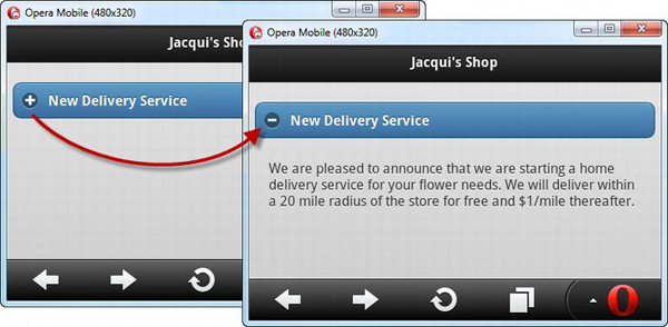
Figure 29-7. Expanding a collapsible block
The block is collapsed when it is first displayed, meaning that the content is hidden and only the header can be seen. As a cue for the user, a plus icon is drawn at the left edge of the header area (which is styled in the same way as a non-inline button). Clicking on the header reveals the content and replaces the icon with a minus sign, indicating that the block can be collapsed again.
Configuring jQuery Mobile Collapsible Content Blocks
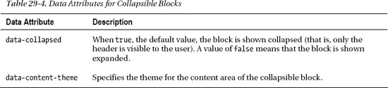
jQuery Mobile defines two data attributes you can use to configure collapsible blocks. These attributes are described in Table 29-4.
Setting the Swatch for the Content Area
You can use the data-theme attribute to apply a swatch to the header in the normal way, but you can also apply the data-content-theme attribute to set a swatch for the content area of the collapsible block. This is a useful feature for increasing the contrast between the block's content and the surrounding area, as demonstrated in Listing 29-10.
Listing 29-10. Applying a swatch for the content area
<!DOCTYPE html>

<html>

<head>

    <title>Example</title>

    <meta name="viewport" content="width=device-width, initial-scale=1">

    <link rel="stylesheet" href="jquery.mobile-1.0.css" type="text/css" />

    <script type="text/javascript" src="jquery-1.6.4.js"></script>

    <script type="text/javascript" src="jquery.mobile-1.0.js"></script>

</head>

<body>

    <div id="page1" data-role="page" data-theme="b">

        <div data-role="header">

           <h1>Jacqui's Shop</h1>

        </div>

        <div data-role="content">

            <div data-role="collapsible" data-content-theme="e">

                <h1>New Delivery Service</h1>

                <p>We are pleased to announce that we are starting a home delivery

                service for your flower needs. We will deliver within a 20 mile radius

                of the store for free and $1/mile thereafter.</p>

            </div>

        </div>

    </div>

</body>

</html>
In this example, I used the data-content-theme attribute to apply swatch E to the content area of the collapsible block. The header has inherited swatch B from the page element. You can see the effect in Figure 29-8.
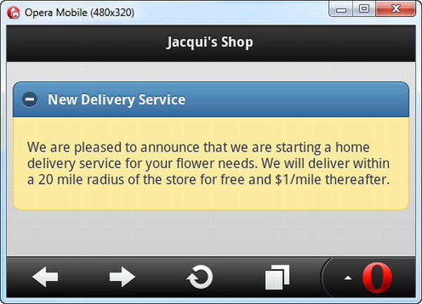
Figure 29-8. Applying a swatch to the content area of a collapsible block
Setting the Initial State
You can use the data-collapsed attribute to control the initial state of the collapsible block. If the value is false, the content elements are displayed. The default value, true, means that only the header is displayed initially. Listing 29-11 contains an example of this attribute in use.
Listing 29-11. Setting the initial state of a collapsible block
<!DOCTYPE html>

<html>

<head>

    <title>Example</title>

    <meta name="viewport" content="width=device-width, initial-scale=1">

    <link rel="stylesheet" href="jquery.mobile-1.0.css" type="text/css" />

    <script type="text/javascript" src="jquery-1.6.4.js"></script>

    <script type="text/javascript" src="jquery.mobile-1.0.js"></script>

</head>

<body>

    <div id="page1" data-role="page" data-theme="b">

        <div data-role="header">

           <h1>Jacqui's Shop</h1>

        </div>

        <div data-role="content">
<div data-role="collapsible" ?data-collapsed=true data-content-theme="e">

                <h1>New Delivery Service</h1>

                <p>We are pleased to announce that we are starting a home delivery

                service for your flower needs. We will deliver within a 20 mile radius

                of the store for free and $1/mile thereafter.</p>

            </div>

            <div data-role="collapsible" data-collapsed=false data-content-theme="e">

                <h1>Summer Specials</h1>

                <p>We have a wide range of special summer offers.

                    Ask instore for details</p>

            </div>

        </div>

    </div>

</body>

</html>
I defined two collapsible blocks in this example, one of which is expanded initially. You can see the effect in Figure 29-9, which also emphasizes how collapsible blocks can be used to put a lot of information at the disposal of the user in a relatively small amount of screen space.
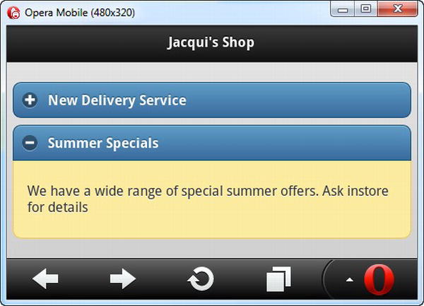
Figure 29-9. Setting the initial state of a collapsible block
Using Collapsible Block Events
The collapsible block widget supports two events: collapse and expand. As the names suggest, these events are triggered when the block is collapsed and expanded. Listing 29-12 shows how you can use these events.
Listing 29-12. Using the collapse and expand events
<!DOCTYPE html>

<html>

<head>

    <title>Example</title>

    <meta name="viewport" content="width=device-width, initial-scale=1">

    <link rel="stylesheet" href="jquery.mobile-1.0.css" type="text/css" />

    <script type="text/javascript" src="jquery-1.6.4.js"></script>

    <script type="text/javascript">

        $(document).bind("pageinit", function() {

            $('#colBlock').bind("collapse expand", function(event) {

                $('#status').text(event.type == "expand" ? "Expanded" : "Collapsed");

            })

        });

    </script>

    <script type="text/javascript" src="jquery.mobile-1.0.js"></script>

</head>

<body>

    <div id="page1" data-role="page" data-theme="b">

        <div data-role="header">

           <h1>Jacqui's Shop</h1>

        </div>

        <div data-role="content">

            The block is <b><span id="status">Expanded</span></b>


            <div id="colBlock" data-role="collapsible" data-content-theme="e"

                    data-collapsed=false>

                <h1>New Delivery Service</h1>

                <p>We are pleased to announce that we are starting a home

                delivery service for your flower needs. We will deliver within a

                20 mile radius of the store for free and $1/mile thereafter.</p>

            </div>

        </div>

    </div>

</body>

</html>
In this example, I use the bind method to listen for the expand and collapse events. I do this in a single call to the bind method by listing the events I am interested in, separated by spaces. When one of the events is triggered, I update the content of a span element to reflect the status of the collapsible block. You can see the change in status in Figure 29-10.
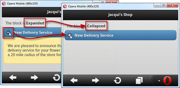
Figure 29-10. Responding to the expand and collapse events
Controlling Collapsible Blocks Programmatically
jQuery Mobile doesn't define methods for programmatically expanding and collapsing collapsible blocks. However, you can explicitly trigger the expand and collapse events, which causes the widget to change its state. You can see how to trigger these events in Listing 29-13.
Caution This is an undocumented feature and might change in future releases. I found this feature by reading the jQuery Mobile source code, which is a useful way of understanding how jQuery Mobile works.
Listing 29-13. Triggering events to expand and collapse collapsible blocks
<!DOCTYPE html>

<html>

<head>

    <title>Example</title>

    <meta name="viewport" content="width=device-width, initial-scale=1">

    <link rel="stylesheet" href="jquery.mobile-1.0.css" type="text/css" />

    <script type="text/javascript" src="jquery-1.6.4.js"></script>

    <script type="text/javascript">

        $(document).bind("pageinit", function() {

            $('button').bind("tap", function() {

                var eventName = this.id == "exButton" ? "expand" : "collapse";

                $('#colBlock').trigger(eventName)

            })

        });

    </script>
<script type="text/javascript" src="jquery.mobile-1.0.js"></script>
</head>
<body>
<div id="page1" data-role="page" data-theme="b">
<div data-role="header">
<h1>Jacqui's Shop</h1>
</div>
<div data-role="content">
<div class="ui-grid-a">
<div class="ui-block-a"><button id="exButton">Expand</button></div>
<div class="ui-block-b"><button>Collapse</button></div>
</div>
<div id="colBlock" data-role="collapsible" data-content-theme="e"
data-collapsed=false>
<h1>New Delivery Service</h1>
<p>We are pleased to announce that we are starting a home
delivery service for your flower needs. We will deliver within a
20 mile radius of the store for free and $1/mile thereafter.</p>
</div>
</div>
</div>
</body>
</html>
In this example, I placed two buttons in a grid and used the bind method to listen for the tap event, triggering a function when the user taps either of the buttons. I use the id attribute to work out which button has been tapped and trigger the event that corresponds to the button. To trigger an event, you use jQuery to select the element and then call the trigger method, passing in the name of the event you want—in this case, either expand or collapse. jQuery Mobile configures the collapsible block widget so that it responds to these events, as illustrated by Figure 29-11.
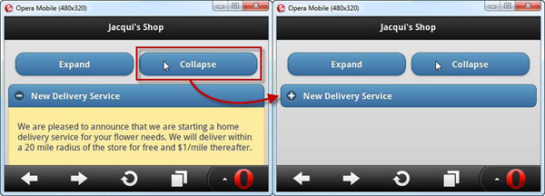
Figure 29-11. Triggering events to expand and collapse a block
Creating jQuery Mobile Accordions
You can create an accordion by wrapping multiple collapsible blocks in a single parent element and applying the data-role attribute to that parent with a value of collapsible-set. You can see how this is done in Listing 29-14.
Listing 29-14. Creating a jQuery Mobile accordion
<!DOCTYPE html>

<html>

<head>

    <title>Example</title>

    <meta name="viewport" content="width=device-width, initial-scale=1">

    <link rel="stylesheet" href="jquery.mobile-1.0.css" type="text/css" />

    <script type="text/javascript" src="jquery-1.6.4.js"></script>

    <script type="text/javascript" src="jquery.mobile-1.0.js"></script>

</head>

<body>

    <div id="page1" data-role="page" data-theme="b">

        <div data-role="header">

           <h1>Jacqui's Shop</h1>

        </div>

        <div data-role="content">

            <div data-role="collapsible-set" data-content-theme="e">

                <div data-role="collapsible">

                    <h1>New Delivery Service</h1>

                    <p>We are pleased to announce that we are starting a home

                    delivery service for your flower needs. We will deliver within a

                    20 mile radius of the store for free and $1/mile thereafter.</p>

                </div>

                <div data-role="collapsible" data-collapsed=false>

                    <h1>Summer Specials</h1>

                    <p>We have a wide range of special summer offers.

                        Ask instore for details</p>

                </div>

                <div data-role="collapsible">

                    <h1>Bulk Orders</h1>

                    <p>We offer discounts for large orders. Ask us for prices</p>

                </div>

            </div>

        </div>

    </div>

</body>

</html>
In this example, I defined a div element with the collapsible-set value for the data-role attribute, which contains three collapsible blocks.
Tip Notice that I applied the data-content-theme attribute to the outer container. This has the same effect as using the attribute on each individual collapsible block.
The default is for all of the collapsible blocks to be collapsed initially, so I applied the data-collapsed attribute to one of the blocks with a value of false so that it is expanded when the page is first displayed. When the user clicks on a header, the presently expanded element is collapsed. You can see the effect in Figure 29-12.
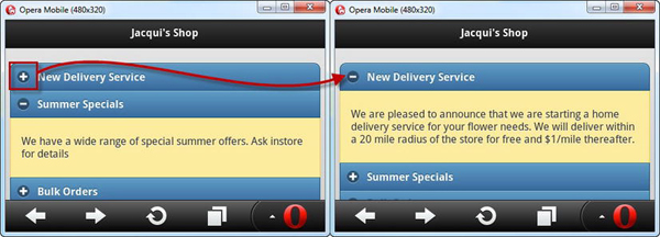
Figure 29-12. Expanding a block in a jQuery Mobile accordion
Summary
In this chapter, I described two of the jQuery Mobile widgets: buttons and collapsible blocks. For the most part, you can use these widgets without any JavaScript code at all, especially if you are using a elements as the basis for the button widgets.