
Now that we are able to sample and collect a lot of data, it is important that we can capture and analyze it. We will make use of a Python library called matplotlib, which includes lots of useful tools for manipulating, graphing, and analyzing data. We will use pyplot (which is a part of matplotlib) to produce graphs of our captured data. For more information on pyplot, go to http://matplotlib.org/users/pyplot_tutorial.html.
To use pyplot, we will need to install matplotlib.
Note
Due to a problem with the matplotlib installer, performing the installation using pip-3.2 doesn't always work correctly. The method that follows will overcome this problem by performing all the steps PIP does manually; however, this can take over 30 minutes to complete.
To save time, you can try the PIP installation, which is much quicker. If it doesn't work, you can install it using this manual method.
Try installing matplotlib using PIP with the following commands:
sudo apt-get install tk-dev python3-tk libpng-dev
sudo pip-3.2 install numpy
sudo pip-3.2 install matplotlib
You can confirm matplotlib has installed by running python3 and trying to import it from the Python terminal, as follows:
import matplotlib
Use the following steps to install matplotlib manually:
- Install the support packages as follows:
sudo apt-get install tk-dev python3-tk python3-dev libpng-dev
sudo pip-3.2 install numpy
sudo pip-3.2 install matplotlib
- Download the source files from the Git repository (the command should be a single line) as follows:
wget https://github.com/matplotlib/matplotlib/archive/master.zip - Unzip and open the
matplotlib-masterfolder created, as follows:unzip master.zip rm master.zip cd matplotlib-master
- Run the setup file to build (this will take a while) and install it as follows:
sudo python3 setup.py build
sudo python3 setup.py install
- Test the installation in the same way as the automated install.
We will either need the PCF8591 ADC module (and wiringPi2 installed as before), or we can use the data_local.py module from the previous section (just replace data_adc with data_local in the import section of the script). We also need to have data_adc.py and data_local.py in the same directory as the new script, depending on which you use.
- Create the following script,
log_adc.py:#!/usr/bin/python3 #log_adc.c import time import datetime import data_adc as dataDevice DEBUG=True FILE=True VAL0=0;VAL1=1;VAL2=2;VAL3=3 #Set data order FORMATHEADER = " %s %s %s %s %s" FORMATBODY = "%d %s %f %f %f %f" if(FILE):f = open("data.log",'w') def timestamp(): ts = time.time() return datetime.datetime.fromtimestamp(ts).strftime( '%Y-%m-%d %H:%M:%S') def main(): counter=0 myData = dataDevice.device() myDataNames = myData.getName() header = (FORMATHEADER%("Time", myDataNames[VAL0],myDataNames[VAL1], myDataNames[VAL2],myDataNames[VAL3])) if(DEBUG):print (header) if(FILE):f.write(header+" ") while(1): data = myData.getNew() counter+=1 body = (FORMATBODY%(counter,timestamp(), data[0],data[1],data[2],data[3])) if(DEBUG):print (body) if(FILE):f.write(body+" ") time.sleep(0.1) try: main() finally: f.close() #End - Create a second script,
log_graph.py, as follows:#!/usr/bin/python3 #log_graph.py import numpy as np import matplotlib.pyplot as plt filename = "data.log" OFFSET=2 with open(filename) as f: header = f.readline().split(' ') data = np.genfromtxt(filename, delimiter=' ', skip_header=1, names=['sample', 'date', 'DATA0', 'DATA1', 'DATA2', 'DATA3']) fig = plt.figure(1) ax1 = fig.add_subplot(211)#numrows, numcols, fignum ax2 = fig.add_subplot(212) ax1.plot(data['sample'],data['DATA0'],'r', label=header[OFFSET+0]) ax2.plot(data['sample'],data['DATA1'],'b', label=header[OFFSET+1]) ax1.set_title("ADC Samples") ax1.set_xlabel('Samples') ax1.set_ylabel('Reading') ax2.set_xlabel('Samples') ax2.set_ylabel('Reading') leg1 = ax1.legend() leg2 = ax2.legend() plt.show() #End
The first script, log_adc.py, allows us to collect data and write it to a logfile.
We can use the ADC device by importing data_adc as dataDevice or we can import data_local to use the system data. The numbers given to VAL0 through VAL3 allow us to change the order of the channels (and if using the data_local device, select the other channels). We also define the format string for the header and each line in the logfile (to create a file with data separated by tabs) using %s, %d, and %f to allow us to substitute strings, integers, and float values, as shown in the following table:

The table of data captured from the ADC sensor module
If logging in to the file (when FILE=True), we open data.log in write mode using the 'w' option (this will overwrite any existing files; to append to a file, use 'a').
As part of our data log, we generate timestamp using time and datetime to get the current
Epoch time (this is the number of milliseconds since Jan 1, 1970) using the time.time() command. We convert the value into a more friendly year-month-day hour:min:sec format using strftime().
The main() function starts by creating an instance of our device class (we made this in the previous example), which will supply the data. We fetch the channel names from the data device and construct the header string. If DEBUG is set to True, the data is printed to screen; if FILE is set to True, it will be written to file.
In the main loop, we use the getNew() function of the device to collect data and format it to display on screen or log to the file. The main() function is called using the try: finally: command, which will ensure that when the script is aborted the file will be correctly closed.
The second script, log_graph.py, allows us to read the logfile and produce a graph of the recorded data, as shown in the following figure:

Graphs produced by log_graph.py from the light and temperature sensors
We start by opening up the logfile and reading the first line; this contains the header information (which we can then use to identify the data later on). Next, we use numpy, a specialist Python library that extends how we can manipulate data and numbers. In this case, we use it to read in the data from the file, split it up based on the tab delimiter, and provide identifiers for each of the data channels.
We define a figure to hold our graphs, adding two subplots (located in a 2 x 1 grid and positions 1 and 2 in the grid – set by the values 211 and 212). Next, we define the values we want to plot, providing the x values (data['sample']), the y values (data['DATA0']), the color value ('r' which is Red or 'b' for Blue), and label (set to the heading text we read previously from the top of the file).
Finally, we set a title, x and y labels for each subplot, enable legends (to show the labels), and display the plot (using plt.show()).
Now that we have the ability to see the data we have been capturing, we can take things even further by displaying it as we sample it. This will allow us to instantly see how the data reacts to changes in the environment or stimuli. We can also calibrate our data so that we can assign the appropriate scaling to produce measurements in real units.
Besides plotting data from files, we can use matplotlib to plot sensor data as it is sampled. To achieve this, we can use the plot-animation feature, which automatically calls a function to collect new data and update our plot.
Create the following script, live_graph.py:
#!/usr/bin/python3
#live_graph.py
import numpy as np
import matplotlib.pyplot as plt
import matplotlib.animation as animation
import data_local as dataDevice

PADDING=5
myData = dataDevice.device()
dispdata = []
timeplot=0
fig, ax = plt.subplots()
line, = ax.plot(dispdata)

def update(data):
  global dispdata,timeplot
  timeplot+=1
  dispdata.append(data)
  ax.set_xlim(0, timeplot)
  ymin = min(dispdata)-PADDING
  ymax = max(dispdata)+PADDING
  ax.set_ylim(ymin, ymax)
  line.set_data(range(timeplot),dispdata)
  return line

def data_gen():
  while True:
    yield myData.getNew()[1]/1000

ani = animation.FuncAnimation(fig, update,
                              data_gen, interval=1000)
plt.show()
#End
We start by defining our dataDevice object and creating an empty array, dispdata[], which will hold all the data collected. Next, we define our subplot and the line we are going to plot.
The FuncAnimation() function allows us to update a figure (fig) by defining an update function and a generator function. The generator function (data_gen()) will be called every interval (1,000 ms) and will produce a data value.
This example uses the core temperature reading that, when divided by 1,000, gives the actual temperature in degC.

The Raspberry Pi plotting in real time (core temperature in degC versus time in seconds)
The data value is passed to the update() function, which allows us to add it to our dispdata[] array that will contain all the data values to be displayed in the plot. We adjust the x axis range to be near the min and max values of the data, as well as adjust the y axis to grow as we continue to sample more data.
Note
The FuncAnimation() function requires the data_gen() object to be a special type of function called generator. A generator function produces a continuous series of values each time it is called, and can even use its previous state to calculate the next value if required. This is used to perform continuous calculations for plotting; this is why it is used here. In our case, we just want to run the same sampling function (new_data()) continuously, so each time it is called, it will yield a new sample.
Finally, we update the x and y axes data with our dispdata[] array (using the set_data() function), which will plot our samples against the number of seconds we are sampling. To use other data, or to plot data from the ADC, adjust the import for dataDevice and select the required channel (and scaling) in the data_gen() function.
You may have noticed that it can sometimes be difficult to interpret data read from an ADC, since the value is just a number. A number isn't much help except to tell you it is slightly hotter or slightly darker than the previous sample. However, if you can use another device to provide comparable values (such as the current room temperature), you can then calibrate your sensor data to provide more useful real-world information.
To obtain a rough calibration, we shall use two samples to create a linear fit model that can then be used to estimate real-world values for other ADC readings (this assumes the sensor itself is mostly linear in its response). The following figure shows a linear fit using two readings at 25 and 30 degrees Celsius, providing estimated ADC values for other temperatures:
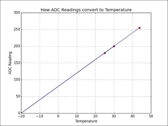
Samples are used to linearly calibrate temperature sensor readings
We can calculate our model using the following function:
  def linearCal(realVal1,readVal1,realVal2,readVal2):
    #y=Ax+C
    A = (realVal1-realVal2)/(readVal1-readVal2)
    C = realVal1-(readVal1*A)
    cal = (A,C)
    return cal
This will return cal, which will contain the model slope (A) and offset (C).
We can then use the following function to calculate the value of any reading by using the calculated cal values for that channel:
  def calValue(readVal,cal = [1,0]):
    realVal = (readVal*cal[0])+cal[1]
    return realVal
For more accuracy, you can take several samples and use linear interpolation between the values (or fit the data to other more complex mathematical models), if required.