
Chapter 11 Progressing with Animations
In This Chapter
In Chapter 3, “Playing with XAML Transforms and Animations,” we learned how to create animations in XAML. Back then, we mentioned that Expression Blend creates a different type of animation, using keyframes. In fact, you can also type a DoubleAnimationUsingKeyFrames by hand in XAML if you want (everything you do in Blend can be done in XAML directly), but it’s not very easy. In such a case, using a tool is a better idea.
Animating Elements in Blend
The main difference in an animation using keyframes is that instead of defining the duration of the timeline, you specify how an element looks at given points in time. The Silverlight framework calculates the transition to be applied to the scene between the keyframes. Let’s try it together with the following steps:
1. Open Expression Blend and create a new Silverlight 2 application. Name it AnimationInBlend.
2. In the Objects and Timeline category, select the top UserControl and name it TopUserControl (the Name text box is on top of the Properties panel).
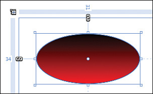
3. In the Grid LayoutRoot, add an ellipse and set its Fill brush to a LinearGradientBrush from black to red (see Figure 11.1).
Figure 11.1. Ellipse with Linear Gradient Fill
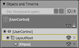
4. In the Objects and Timeline category, next to the (No Storyboard open) box, as shown in Figure 11.2, click on the + sign to create a new storyboard.
Figure 11.2. Manage storyboards
5. In the dialog, enter the name EllipseStoryboard and click OK.
Tip
When we talk about animations in Silverlight, you will hear the words “timeline,” “animation,” and “storyboard.” In fact, they are similar. Animation and storyboard are types of timelines. A storyboard is a group of one or more animations.
6. Notice how the workspace is now in Timeline recording mode: A red border appears around the Design panel, and a small red dot (similar to the Record button of a sound recorder) is displayed in the title bar (see Figure 11.3).
Figure 11.3. Timeline Recording mode

7. At this point, you may want to change the workspace layout to get more space: You can do this by selecting Window, Active Workspace, Animation Workspace from the menu. You can also switch between workspaces by pressing the F6 key.
8. Move the vertical yellow timeline to “2” (this is 2 seconds). Alternatively, you can enter the time “0:02.000” in the playhead position text box.
9. Click on the Record Keyframe button. This is the small button with a green “+” icon, next to the playhead position text box. Figure 11.4 shows the button with a black circle around it. This adds a keyframe at 2 seconds for the ellipse.
Figure 11.4. Timeline workspace
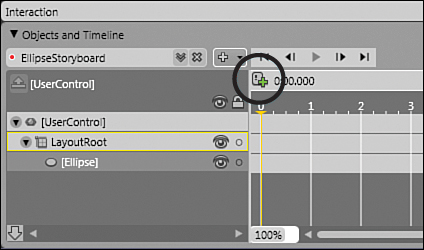
If your element didn’t have a name before, Blend automatically names it when you create an animation for it. In our case, the ellipse is automatically named “ellipse.”
10. Without touching anything else, modify the ellipse so that it looks like it should appear after 2 seconds:
 Resize the ellipse on the Designer panel to make it smaller than it is now.
Move it to the bottom-right corner of the page.
In the Properties panel, select the Fill property. Then, select the red gradient stop and change its color to yellow.
In the Transform category, rotate the ellipse by 360 degrees.
11. To test your animation, click on the Play button located above the playhead position text box. You should see the ellipse move, shrink, rotate, and change color as you specified. As you can see, it is possible to animate even the gradient stops of a gradient brush (be it a Background, an OpacityMask, and so on).
Testing the Application
Blend creates the storyboard as a resource in the top UserControl. You can verify this by checking the XAML panel in Blend. The EllipseStoryboard should be placed towards the top of the page, in the UserControl.Resources section.
This is all very nice, but we need to trigger the storyboard now. For example, we want the animation to run when the user clicks on the ellipse, with the following steps:
1. Save all your files in Blend by choosing File, Save All (Ctrl+Shift+S) from the menu. Then, right-click on the Solution in the Project panel and select Edit in Visual Studio. This starts Visual Studio.
2. Open the file Page.xaml.
3. Locate the ellipse in the XAML markup, and add an event handler for MouseLeftButtonDown. To do this, simply start typing “Mouse” and see how Intellisense helps you to enter the correct event.
4. Notice how, after you enter the MouseLeftButtonDown event, Visual Studio presents a button that you can click to create a new event handler, as shown in Figure 11.5. If you had a list of event handlers in your code already, Visual Studio would also ask you to choose from this list.
Figure 11.5. New event handler in XAML
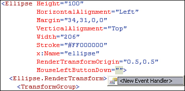
5. The new event handler is automatically named ellipse_MouseLeftButtonDown. This is a good convention, and it is recommended to keep the event handlers’ names this way.
Tip
Remember that you can also add the new event handler in Blend. We did something similar in Chapter 8, “Programming Silverlight with JavaScript.” You can either choose to copy the event handler code to the clipboard, or to use the integration with Visual Studio.
6. Right-click on the event handler ellipse_MouseLeftButtonDown in the XAML editor, and select Navigate to Event Handler from the context menu. This opens the file Page.xaml.cs and positions the cursor in the new event handler.
7. Now get the storyboard from the resources and start it. This is what Listing 11.1 does:
private void ellipse_MouseLeftButtonDown(object sender,
MouseButtonEventArgs e)
{
Storyboard ellipseStoryboard
= TopUserControl.Resources[″EllipseStoryboard″] as Storyboard;
ellipseStoryboard.Begin();
}
The Resources collection contains elements of type object. This allows you to store just about anything in resources, but it also means that you need to cast the element back to Storyboard.
8. Run the code by pressing Ctrl+F5. You should now be able to start the animation by clicking on the ellipse.
Editing the Animation’s Properties
This animation is a little too linear to be really interesting. Additionally, it would be nicer if it was reversing to come back to its original state. Let’s do this with the following steps:
1. Save everything in Studio. Then, in Blend, check whether the name EllipseStoryboard appears on top of the Objects and Timeline category. If it’s the case, jump to step 5.
2. If no storyboard is open, you should see the words “(No Storyboard open)” in the box. On the right-hand side of this box, click on the button with an arrow pointing down (Open a Storyboard).
3. In the storyboard management pop-up, select the EllipseStoryboard. This reopens the storyboard and puts Blend in recording mode.
4. We don’t want to change the timeline, but only edit some properties of the storyboard. Switch the Timeline recording mode off by clicking on the red Record button on top of the workspace (refer to Figure 11.3).
5. Click on the storyboard’s name, EllipseStoryboard.
6. In the Properties panel, check the AutoReverse check box.
7. Run the application to see the result (press F5). When one “run” of the storyboard is completed, you can click again on the ellipse to repeat it.
8. In Blend, set the RepeatBehavior property to 3x, as shown in Figure 11.6. Then run the application. The ellipse will now go back and forth three times before stopping.
Figure 11.6. Animation properties
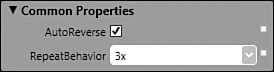
9. If you change the value of RepeatBehavior to Forever, the animation will never stop.
Easing In and Out
You can also edit the way an animation is “eased” in and out with the following steps, to make it look more lifelike and less linear.
1. In the Objects and Timeline category, expand the elements until you find the translation animation. It should be under LayoutRoot/ellipse/RenderTransform/Translation.
Warning
Blend generates a Rotation animation (under which you see the Angle property), a Scale animation (with its ScaleX and ScaleY properties), and the Translation animation we want to edit (with X and Y properties).
2. Click on the Translation. In the Properties panel, you’ll see the Easing graph. Using the small yellow dots, move them with the mouse until the KeySpline looks like Figure 11.7.
Figure 11.7. Easing the Translation animation
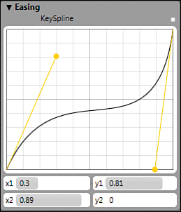
3. You can also enter the x1, y1, x2, and y2 values manually. Each value pair (x,y) defines the position of a yellow point, between (0,0) and (1,1).
4. Click on the Play button. See how the ellipse’s movement decelerates first, and then accelerates again, following the Easing line: When the line is steep, the animation goes faster; when it is flat, the animation decelerates.
Synchronizing Animations
Animations grouped into a storyboard are synchronized. They all run relatively to each other. To demonstrate this, we create a shorter animation with the following steps, and see how it “waits” on the longer one before reverting.
1. Add a green rectangle to the LayoutRoot grid, below the ellipse.
2. Make sure that the EllipseStoryboard is open.
3. In the Objects and Timeline category, select the green rectangle.
4. Move the vertical yellow line to 1 second.
5. Add a keyframe at 1 second, by clicking on the Record Keyframe button.
6. If the workspace is not in Timeline recording mode anymore, you can set it again by clicking on the small recording dot (refer to Figure 11.3). It should be red.
7. Select the Opacity property and set it to 0%.
8. Play the animation. Notice how the opacity animation “waits” on the ellipse before it reverts to the original state: The animations are synchronized because they belong to the same storyboard.
9. Stop the recording mode by clicking on the small recording dot in the title bar.
Understanding the Animation Elements
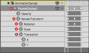
The Objects and Timeline category offers a nice way to see and interact with each animation element separately. Follow the steps:
1. Expand all the elements under the top user control.
2. The tree displays many animation elements, each with a double arrow icon (this icon is shown in Figure 11.9 for a different Silverlight application).
Warning
The animation elements are displayed only if the storyboard is selected in the Objects and Timeline category. If you don’t see these elements, reopen the storyboard like we did before.
3. Using the tree, you can understand how the animations are structured. Try to compare this with the XAML markup. For example, the ellipse gets animated by six separate animations. One of them is shown in Listing 11.2 (some values might vary in your version though):
<DoubleAnimationUsingKeyFrames
Storyboard.TargetName=″ellipse″
Storyboard.TargetProperty=″(UIElement.RenderTransform)
.(TransformGroup.Children)[3]
.(TranslateTransform.X)″
BeginTime=″00:00:00″>
<SplineDoubleKeyFrame KeyTime=″00:00:02″ Value=″434.5″ >
<SplineDoubleKeyFrame.KeySpline>
<KeySpline ControlPoint1=″0.3,0.814000010490417″
ControlPoint2=″0.889999985694885,0″/>
</SplineDoubleKeyFrame.KeySpline>
</SplineDoubleKeyFrame>
</DoubleAnimationUsingKeyFrames>
The XAML markup was formatted to fit these pages.
The animation targets the element named ellipse.
As usual, the property path is the most complex element:
The path starts from the ellipse (which is a UIElement), and then targets its RenderTransform.
In this case, the RenderTransform is a collection of transforms. So the property path targets the TransformGroup.Children and selects its children of index 3 (that’s the fourth child in a zero-based collection). Because the transforms are generated by Blend, it is possible that the index is set to something different.
That fourth child is a TranslateTransform, and the animation targets the X property. This is what will be animated.
The animation above starts 0 seconds after the storyboard.
A keyframe of type SplineDoubleKeyFrame is added to the animation, at a key time of 2 seconds. The value of the X property is set to 434.5 (your value might be different) which is located on the right of the page. If we had defined additional keyframes, they would be visible under this one.
Because we “eased” the translation animation, the SplineDoubleKeyFrame contains a KeySpline with four coordinates. These define the two yellow points we set earlier in the Easing graph (refer to Figure 11.7).
As you can see from this example, creating an animation using keyframes is complex in markup. As for “normal” animations, the most complex task is to get the property path right. The easiest way to create animations is to create the basis in Expression Blend, and if needed to tweak the XAML markup to refine the animation’s behavior.
Reversing a Storyboard
Blend has a really great feature that allows you to easily create an animation running exactly in the opposite way to an existing one. Simply follow these steps:
1. In Blend, select the EllipseStoryboard. If you don’t remember how to select it, check the “Editing the Animation’s Properties” section earlier in this chapter.
2. Uncheck the AutoReverse check box.
3. In the Objects and Timeline category, select the ellipse and add a keyframe at 0 seconds. This is needed to specify a known state for when we will be reversing the storyboard. Don’t touch anything else. If needed, you can switch off the Timeline recording mode.
4. Just on the right of the + button located next to the storyboard’s name, there is a menu that you can expand. From this menu, select Duplicate. This creates a copy of the current storyboard. Note that the original is untouched.
5. From the same menu, choose Reverse.
6. Play the animation. Notice how the Ellipse goes from the end position back to the start.
This feature is useful when you need to restore an object’s initial state.
PointAnimation
We already saw that many properties of many objects can be animated in Silverlight: You can rotate, translate, skew, add colors, adjust opacity, and so on.
However, just as working with graphics primitives (rectangle, ellipse, and so on) is sometimes (often) not sufficient, working with basic animations is also not enough, and you need to create more advanced animations. This is where the PointAnimation comes in handy. In this section we learn how to use such an animation to create a collapse effect with the following steps:
1. In Blend, create a new Silverlight application, named PointAnimationTest.
2. Create a rectangle; set its Width to 640 and Height to 480.
3. Reset the rectangle’s Margin to 0,0,0,0 and position it so that it covers the whole user control.
4. Reset the rectangle’s Fill to No Brush.
5. Right-click on the project in the Project panel; select the menu Add Existing Item and use it to add a 640x480 picture to your project. If you don’t have such a picture handy, you can download one here: www.galasoft.ch/SL2U/Chapter11/pic.jpg.
6. Locate the rectangle in the XAML editor, and modify the markup like in Listing 11.3. If needed, change the value of ImageSource to match your picture’s name.
<Rectangle Width=″640″ Height=″480″>
<Rectangle.Fill>
<ImageBrush ImageSource=″pic.jpg″/>
</Rectangle.Fill>
</Rectangle>
7. Make sure that the rectangle is selected, and select Object, Path, Convert to Path from the menu.
Tip
To locate the rectangle element easily in the XAML editor in Design mode, right-click on the element in the Objects and Timeline category, and select View XAML.
8. Select the Pen tool in the toolbar. Make sure that the path is selected in the Objects and Timeline category.
9. Add a number of points to the path. To do this, move the cursor anywhere on the path’s border until it turns into the Pen insert cursor (a pen with a small + sign). Then, click to add a new point. Repeat this operation until you have 15 points or more, all around the path.
10. Create a new storyboard using the exact same process we used in the section titled “Animating Elements in Blend.” Name it CollapseStoryboard. The environment should be in Timeline recording mode.
11. Move the yellow timeline to 1 second (0:0:1) and add a keyframe at this position using the Record Keyframe button.
12. Click on the Direct Selection tool. Start moving points closer together, to create a new smaller nonrectangular path (see Figure 11.8).
Figure 11.8. Collapsing an ImageBrush

13. Add a new keyframe after 2 seconds, and continue collapsing the path by closing up the points.
14. Eventually, add a last keyframe and collapse the path until all the points are just next to each other.
15. For this last keyframe, set the Opacity to 0%, so that the animation ends nicely by a fade-out effect.
16. Press the Play button to observe the effect.
Warning
If you want to run this animation in the web browser, you need to trigger it, like we did with the ellipse’s animation in the section titled “Testing the Application.” You can do this by adding a MouseLeftButtonDown event handler on the path.
This basic example can be expanded to other, more complicated paths, and allow a great range of advanced animations.
Starting and Stopping the Animation
In this chapter, we saw in the section titled “Testing the Application” how to get a stored storyboard from the resources, and to “begin” it in code.
In Windows Presentation Foundation, there is another way to start a storyboard, using triggers. In Silverlight 2, however, triggers are not completely supported. There is a way to trigger a storyboard when a control is loaded (we did that in Chapter 3, Listing 3.7), but the Silverlight documentation recommends against it. It is better to not use triggers in Silverlight 2 altogether, and to use code-behind instead.
Sometimes, you also need to stop the storyboard. When a storyboard is animating a property, it has a tight grip on that property as long as it is running. In fact, the animation system has a high precedence on the property’s value.
If your application wants to set a property while it is being animated, it needs to stop the storyboard first. For example, consider the markup in Listing 11.4 (you can copy this in a new Silverlight application to test it yourself):
<Grid x:Name=″LayoutRoot″ Background=″Orange″>
<Grid.Resources>
<Storyboard x:Name=″EllipseStoryboard″
AutoReverse=″True″ RepeatBehavior=″Forever″>
<DoubleAnimation Storyboard.TargetName=″ellipse″
Storyboard.TargetProperty=″Opacity″
To=″1″ Duration=″0:0:2″ />
</Storyboard>
</Grid.Resources>
<Ellipse Height=″100″ Width=″200″ Fill=″#FFFF0000″
x:Name=″ellipse″ Opacity=″0.2″
MouseLeftButtonDown=″ellipse_MouseLeftButtonDown″ />
<Button Height=″50″ Width=″150″
VerticalAlignment=″Bottom″
Content=″Make Transparent″
x:Name=″MakeTransparentButton″
Click=″MakeTransparentButton_Click″ />
</Grid>
and the code-behind in Listing 11.5:
private void ellipse_MouseLeftButtonDown(object sender,
MouseButtonEventArgs e)
{
Storyboard ellipseStoryboard
= LayoutRoot.Resources[″EllipseStoryboard″] as Storyboard;
ellipseStoryboard.Begin();
}
private void MakeTransparentButton_Click(object sender,
RoutedEventArgs e)
{
ellipse.Opacity = 0;
}
If you start the storyboard by clicking on the Ellipse, and then try to set the Opacity with the Button, it will fail. The storyboard continues undisturbed.
To force the Opacity, you need to stop the storyboard first. This can be done with the code in Listing 11.6:
private void MakeTransparentButton_Click(object sender,
RoutedEventArgs e)
{
Storyboard ellipseStoryboard
= LayoutRoot.Resources[″EllipseStoryboard″] as Storyboard;
ellipseStoryboard.Stop();
ellipse.Opacity = 0;
}
First we get the running storyboard from the resources; then we stop it, and eventually we can modify the Opacity property.
Working on the Thumbnails Gallery
Our Thumbnail application is already interactive; let’s face it, though, the user experience is not the best. How about leveraging some of Silverlight’s features to make it smoother and nicer to watch? Open this application in Visual Studio first.
Making a Scenario
In the current state, the clicked media element is displayed in a display rectangle, which doesn’t move. It is only there as a placeholder for the media. Now we want a smoother animation:
We need a placeholder in addition to the Display frame. This placeholder will be animated when a thumbnail enters the stage. This way we can use an animation to create a smooth user experience.
The “expanding” animation will be started when the user clicks on a thumbnail. The placeholder will move smoothly from the clicked media’s original place to the display frame. Additionally, the placeholder’s opacity will go from 0% to 100% in the same time.
If the clicked media is a video, the video will start playing when the user clicks on it.
If a media is displayed in the Display frame, it will fade out when it needs to be removed from the scene.
Setting the Stage
For the placeholder to move easily, we place a Canvas panel in front of everything. To avoid disturbing the application, the Canvas must fulfill two criteria:
It must be transparent.
It must not block any mouse click.
We know already how to realize this. Let’s simply add a transparent Canvas to the Grid LayoutRoot and make sure that its property IsHitTestVisible is set to false. Because the Canvas must appear in front of the whole application, add the XAML markup in Listing 11.7 inside the LayoutRoot Grid, but at the very end of it, after the Grid with the display frame that we added in Chapter 6, “Blending a Little More.”
Additionally, we create one rectangle in XAML to serve as placeholder.
<Canvas Grid.RowSpan=″2″ Grid.ColumnSpan=″2″
IsHitTestVisible=″False″ x:Name=″AnimationCanvas″>
<Rectangle Height=″120″ Width=″160″
Opacity=″0″ x:Name=″ThumbDisplay1″
RenderTransformOrigin=″0,0″>
<Rectangle.RenderTransform>
<TransformGroup>
<ScaleTransform />
<SkewTransform />
<RotateTransform />
<TranslateTransform />
</TransformGroup>
</Rectangle.RenderTransform>
</Rectangle>
</Canvas>
Also, we need to address the main user control by name, so let’s add a property x:Name to it. If your user control has additional properties, just add the x:Name property and leave the others; they have been added by Expression Blend.
<UserControl xmlns=″http://schemas.microsoft.com/client/2007″
xmlns:x=″http://schemas.microsoft.com/winfx/2006/xaml″
x:Class=″Thumbnails.Page″ x:Name=″TopUserControl″>
Making the Draft Animation
We use two animations, as mentioned previously. One is simple, and we create it in code-behind directly. The other is more complex, and we create a draft in Blend. Then, we adapt this draft to the clicked thumbnail in the code-behind. Follow the steps:
1. If it’s not done already, open the Thumbnails project in Expression Blend.
2. In the Objects and Timeline category, double-click on AnimationCanvas until it is selected with a yellow border. Then expand it and select the rectangle named ThumbDisplay1.
Tip
Working with the same project open in both Visual Studio and Blend is a common scenario when you develop Silverlight applications. To open a Solution in Blend from Visual Studio, the easiest way is to right-click on the Solution in Visual Studio. Then select Open Folder in Windows Explorer. Then right-click on the file Thumbnails.sln in Windows Explorer and choose Open With, Microsoft Expression Blend.
3. Set the rectangle’s Fill property to red and its Opacity to 100%, so that you see it better (it is in the top-left corner).
4. Add a new storyboard and name it ExpandStoryboard.
5. Move the yellow timeline to 1 second and add a keyframe.
6. Move the rectangle on top of the display frame. Don’t worry if it’s not perfect, we will set the exact coordinates in code later. Don’t resize it yet! Make sure that you select only the rectangle in the Design panel, not any other element. If you are unsure, you can also move the rectangle using the keyboard’s arrows.
7. In the Transform category of the Properties panel, set the Scale to X=2 and Y=2.
8. Move the timeline to 0 seconds and add a keyframe. The rectangle moves back in place and “shrinks” back to its original size.
9. At this keyframe, move the red rectangle on top of the first thumbnail. Here also, no need to be exact; this is only a draft animation. Do not resize the red rectangle, we’ll do that in code.
10. Set the red rectangle’s Opacity to 0%. When the animation starts, we want the placeholder to be transparent.
11. Move the yellow timeline to 0.5 seconds. Do not add a keyframe. The rectangle is now half transparent, and half expanded.
12. In the Transform category, add a RotateTransform of 15 degrees. Make sure that the RenderTransformOrigin (in the Miscellaneous category) is set to “0,0”, or we will have a problem with the ScaleTransform.
Warning
If you add a keyframe manually at 0.5 seconds, this additional keyframe is added to each animation, which will cause problems later. By simply setting the RotateTransform’s Angle, we add a keyframe only for this animation, and not for the others.
13. Play the animation to make sure that it is okay. Then switch the Timeline recording mode off.
14. Reset the rectangle’s Fill property back to No Brush. You must change this property only after the Timeline recording mode has been switched off, or the system will make this change part of the storyboard, which we don’t want.
We now have a draft storyboard placed in the user control’s resources. You can take a look at the markup in the XAML editor. When we need this storyboard, we will get it in code and customize it.
Easing the Translate Animation
In this section, we will ease the animation to make it look more natural with the following steps:
1. In Blend, make sure that the storyboard named ExpandStoryboard is open, then expand the tree until you find the translate animation (see Figure 11.9). This is the animation we want to ease.
Figure 11.9. Finding the Translate animation
2. Click on the translate animation in the tree and open the Properties panel. Blend displays a warning in the Easing category. Click on the hyperlink labeled “Click here to deselect keyframes at time 0.”
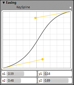
3. Set the Easing properties as shown in Figure 11.10. Note that this will ease both the X and Y animations with the same parameters.
Figure 11.10. Easing the Translate animation
Triggering the Animation in Code
The next step is to modify the code-behind to use the animation we just created.
Initializing
Let’s prepare the code first with the following steps:
1. Open Page.xaml.cs in Visual Studio.
2. On top of the class, just below the _expandedMedia declaration, add the following two attributes as shown in Listing 11.8. They will hold information while animations are executed:
private double _expansionFactor = 1.0;
private Storyboard _fadeStoryboard = null;
3. In the Page constructor, right after the call to InitializeComponent, place the code in Listing 11.9:
Storyboard expandStoryboard
= TopUserControl.Resources[″ExpandStoryboard″] as Storyboard;
expandStoryboard.Completed
+= new EventHandler(expandStoryboard_Completed);
This adds an event handler that will be called when the storyboard ends. The code for this event handler is shown in Listing 11.10. Add it below the Page constructor and try to build the application to check that there are no errors.
void expandStoryboard_Completed(object sender, EventArgs e)
{
Canvas.SetLeft(Display, Canvas.GetLeft(ThumbDisplay1));
Display.Width = ThumbDisplay1.ActualWidth * _expansionFactor;
Display.Fill = ThumbDisplay1.Fill;
Display.Opacity = 1;
if (_fadeStoryboard != null)
{
_fadeStoryboard.Stop();
_fadeStoryboard = null;
}
ThumbDisplay1.Opacity = 0;
(sender as Storyboard).Stop();
}
This code is executed when the placeholder finished its “expansion” and is located on top of the Display frame. Since there might be margins on the sides of the Display (we calculate these margins later in code), we reposition the Display rectangle and resize it. Then, we assign the placeholder’s Fill (an ImageBrush or VideoBrush) to the Display rectangle. We stop the “fade” storyboard if needed, and hide the placeholder. Finally, we stop the expanding storyboard.
These operations are needed because Silverlight requires that you stop the storyboards when they are not in use, to avoid that they keep their “grip” on the values as we saw earlier in this chapter.
Note that this method relies on knowledge of what we do later in code. For example the attribute _expansionFactor is calculated in Listing 11.11 below. Also, the Display rectangle will be faded in code, in Listing 11.16.
Handling the MouseLeftButtonDown Event
We already added an event handler to each media, and we have a handler in code, named media_MouseLeftButtonDown. We can reuse this and just modify it to trigger the animation.
1. Calculate the position of the placeholder when it is expanded, because not all pictures have the same width. We did that already in Chapter 10, “Progressing with .NET” now we need to adapt the code. Replace the seven lines coming after the comment Set size and position of DisplayRectangle with the code in Listing 11.11. Instead of setting the position of the Display rectangle immediately after the thumbnail is clicked, we store the value locally for later use. We also calculate the factor by which we need to expand the placeholder to fill the DisplayBackground rectangle’s height or width. There might be a margin on each side or on the bottom of smaller pictures.
// Set size and position of the displayed media
double sizeFactor
= castedSender.ActualWidth / castedSender.ActualHeight;
double newHeight = DisplayBackground.ActualHeight;
double newWidth = newHeight * sizeFactor;
double sideMargin
= (DisplayBackground.ActualWidth - newWidth) / 2;
_expansionFactor
= DisplayBackground.ActualHeight / castedSender.ActualHeight;
if (sideMargin < 0)
{
newWidth = DisplayBackground.ActualWidth;
newHeight = newWidth / sizeFactor;
sideMargin = 0;
_expansionFactor
= DisplayBackground.ActualWidth / castedSender.ActualWidth;
}
2. Now set the size of the placeholder to be the exact same size as the clicked thumbnail. Remember that we casted this sender to a FrameworkElement, so we can read its ActualHeight and ActualWidth. Add the code in Listing 11.12 after what we wrote in step 1.
// Set the placeholder’s size and calculate its proportions
ThumbDisplay1.Width = castedSender.ActualWidth;
ThumbDisplay1.Height = castedSender.ActualHeight;
3. Here is a tougher part: We need some coordinates. Remember how the placeholder is moving on a transparent Canvas? We need to know exactly where the clicked thumbnail is located in relation to this Canvas. That will be our starting point, and we also need to know where the ending point is. This is the location of the DisplayBackground rectangle (plus possible margins) relative to the Canvas. The code in Listing 11.13 comes right below what we inserted in point 2. Then, build the application.
// Getting the coordinates of the clicked thumbnail
GeneralTransform gtStart =
castedSender.TransformToVisual(AnimationCanvas);
Point offsetStart = gtStart.Transform(new Point(0, 0));
ThumbDisplay1.SetValue(Canvas.LeftProperty, offsetStart.X);
ThumbDisplay1.SetValue(Canvas.TopProperty, offsetStart.Y);
// Getting the coordinates of the DisplayBackground rectangle
GeneralTransform gtDisplay =
DisplayBackground.TransformToVisual(AnimationCanvas);
Point offsetDisplay = gtDisplay.Transform(new Point(0, 0));
Note
Getting these coordinates is relatively easy when you know how, but explaining how it works exactly is rather complex. It relies on the Visual class, which is a representation of the space occupied by the UI element on the screen, and on a MatrixTransform.
Setting the Animations’ Properties
Now it’s time to set all the animations’ parameters according to our calculations. Note that some of the animations do not need to be parameterized:
The opacity animation is always the same for all the thumbnails.
Similarly, the RotateTransform animation doesn’t need to be parameterized.
Add the code in Listing 11.14 to the method media_MouseLeftButtonDown, right under the spot where we calculated the value of offsetDisplay.
1 // Get the storyboard and set the animations’ parameters
2 Storyboard expandStoryboard
3 = TopUserControl.Resources[″ExpandStoryboard″] as Storyboard;
4
5 foreach (Timeline child in expandStoryboard.Children)
6 {
7 string property = Storyboard.GetTargetProperty(child).Path;
8 if (property.IndexOf(″TranslateTransform.X″) > -1)
9 {
10 (child as DoubleAnimationUsingKeyFrames).KeyFrames[0].Value = 0;
11 (child as DoubleAnimationUsingKeyFrames).KeyFrames[1].Value
12 = offsetDisplay.X - offsetStart.X + sideMargin;
13 }
14 if (property.IndexOf(″TranslateTransform.Y″) > -1)
15 {
16 (child as DoubleAnimationUsingKeyFrames).KeyFrames[0].Value = 0;
17 (child as DoubleAnimationUsingKeyFrames).KeyFrames[1].Value
18 = offsetDisplay.Y - offsetStart.Y;
19 }
20 if (property.IndexOf(″ScaleTransform.ScaleX″) > -1)
21 {
22 (child as DoubleAnimationUsingKeyFrames).KeyFrames[0].Value = 1;
23 (child as DoubleAnimationUsingKeyFrames).KeyFrames[1].Value
24 = _expansionFactor;
25 }
26 if (property.IndexOf(″ScaleTransform.ScaleY″) > -1)
27 {
28 (child as DoubleAnimationUsingKeyFrames).KeyFrames[0].Value = 1;
29 (child as DoubleAnimationUsingKeyFrames).KeyFrames[1].Value
30 = _expansionFactor;
31 }
32 }
Lines 2 and 3 get the storyboard from the resources.
We loop through all the animations in the storyboard. Remember how we added the DoubleAnimationUsingKeyFrames in XAML in the storyboard tag? Effectively, this filled the Children collection with the animations. In code-behind, we can use this collection in a foreach loop.
The Children collection is of type TimelineCollection (you can see this by holding the mouse over the Children in the C# editor, and read the Intellisense documentation).
Line 7 stores the attached property Storyboard.Target in a local variable. Note the use of the method Storyboard.GetTargetProperty to get this attached property. Since this method returns an instance of type PropertyPath, we use its Path property of type string.
Lines 8 to 13 check whether the current child is the X (horizontal) translate animation. If that’s the case, we set the value of the first keyframe to “0”. At the beginning of the animation, the placeholder is firmly placed on top of the clicked thumbnail (we moved it there in code earlier). As for the second keyframe (after 1 second), we place the placeholder on top of the DisplayBackground rectangle. Note how we use the sideMargin value we calculated before to align the expanded media in the middle of the display frame.
Lines 14 to 19 do the same operation for the Y (vertical) translation.
Lines 20 to 31 set the scaling factor that we calculated earlier for the scale animation. At the first keyframe, the value is always “1” because we set the placeholder to the exact same size as the clicked thumbnail earlier in code. At the second keyframe (after 1 second), the placeholder must have grown to the size of the DisplayBackground rectangle.
Remember that all the animation types in Silverlight inherit the Timeline basic class. By using the generic Timeline type in the loop, we make our code able to handle other kinds of animation if needed. We could use the DoubleAnimationUsingKeyFrames type instead, (since we know that all the animations in the storyboard are of this type), but this way we just made our code more robust and extendable.
Setting the Placeholder’s Fill
The last change we must do for the “expanding” animation is set the Fill property on the placeholder instead of the Display rectangle. Below the code shown in Listing 11.14, we check if the clicked thumbnail is a MediaElement or an Image. This code was already added in Chapter 10. Replace both lines reading Display.Fill = brush; with ThumbDisplay1.Fill = brush;
This last operation assigns the VideoBrush or the ImageBrush to the placeholder instead of the Display frame directly. This way, we can animate the placeholder to create a smooth transition.
Starting the Animation
Now we are ready to start our storyboard and see the “expanding” animation work. Starting a storyboard in Silverlight is easy: Simply call the method expandStoryboard.Begin. This call (Listing 11.15) is placed right before the end of the method:
_expandedMedia = castedSender;
//Start the Storyboard
expandStoryboard.Begin();
}
Now you can run the application by pressing Ctrl+F5. Click on a thumbnail and see how the animation runs to move and expand the thumbnail on the display frame.
Creating the “Fading” Animation in Code
In this section, we fade the currently expanded media (in the Display frame) to ensure a smooth transition when a thumbnail is clicked. Follow the steps:
1. Find the code starting with If needed, pause movie in the method media_MouseLeftButtonDown. Delete the whole if block and replace it with the code in Listing 11.16:
1 // If needed, pause movie and fade display
2 if (_expandedMedia != null)
3 {
4 if (_expandedMedia is MediaElement)
5 {
6 (_expandedMedia as MediaElement).Pause();
7 }
8
9 FrameworkElement currentMedia = _expandedMedia;
10 _expandedMedia = null;
11
12 _fadeStoryboard = new Storyboard();
13 _fadeStoryboard.Completed += new EventHandler(_fadeStoryboard_Completed);
14
15 DoubleAnimation anim = new DoubleAnimation();
16 Storyboard.SetTarget(anim, Display);
17 Storyboard.SetTargetProperty(anim, new PropertyPath(″Opacity″));
18 anim.Duration = new Duration(TimeSpan.FromSeconds(0.9));
19 anim.To = 0;
20 _fadeStoryboard.Children.Add(anim);
21
22 _fadeStoryboard.Begin();
23
24 if (castedSender == currentMedia)
25 {
26 return;
27 }
28 }
Lines 4 to 7 pause the media if needed. Of course this is only done if the currently expanded media is a video. Remember that we store a reference to the expanded media at the end of the method media_MouseLeftButtonDown.
Lines 9 and 10 store the currently displayed media and then set the stored reference to that media to null. This way, we don’t keep an unneeded reference. The garbage collector can only free an object from memory if it is not referenced anywhere in the code. Setting the references to null when they are not needed anymore is a good programming practice!!
Note
The most attentive readers will notice that this storyboard’s creation could be optimized. Because the storyboard must be created only once and never changes, we could perform this step in the Page constructor. Alternatively, we could also define the storyboard in XAML. Creating a new storyboard every time that a thumbnail is clicked is not optimal for static storyboards.
In lines 12 to 22, we create a whole new storyboard in code. We set its Completed event to a new event handler named fadeStoryboard_Completed which we will implement in just a moment.
On lines 15 to 19, we create a new DoubleAnimation in code, targeting the Display frame that must be faded.
On line 18, notice the usage of the static method TimeSpan.FromSeconds. Other static methods of the TimeSpan class allow constructing various durations.
To work, the animation must be added to the storyboard. This is what we do on line 20. Notice how we use (again) the Children collection.
On line 22, the storyboard starts. 0.9 seconds later, the expanded media will be totally transparent, and the fadeStoryboard_Completed event handler will be called.
On lines 24 to 27, we check if the clicked thumbnail is the media that is already displayed. If so, we just exit the method. The media must fade out, but no new media must be displayed.
The last step before we run our application is to implement the event handler _fadeStoryboard_Completed. The code is simple: We reset the Display to transparent (by setting its Fill property to null) and stop the running storyboard (this is the event handler’s sender). Add the code in Listing 11.17 under the method media_MouseLeftButtonDown but still inside the Page class.
void _fadeStoryboard_Completed(object sender, EventArgs e)
{
Display.Fill = null;
(sender as Storyboard).Stop();
}
You can now run the application and test the thumbnails to make sure that the implementation works fine.
Summary
The animation system is probably one of the most exciting features of Silverlight (and WPF). Without a visual tool, complex animations can be difficult to program, however. Expression Blend offers a great interface to create animations, which can be “polished” by editing the XAML markup later. This interaction between the visual tools and the XAML (text) editors is one of the major strengths of the new UI framework.