
Chapter 15 Digging into Silverlight Elements
In This Chapter
Silverlight not only delivers a rich programming framework, it also provides a collection of panels and controls, ranging from basic (Canvas, TextBlock) to complex (DataGrid, MultiScaleImage). Understanding how these controls work, and how they relate to each other is important when you must choose the best control for the task.
With new controls appearing in every new release of the Silverlight framework, it is not possible to give a detailed explanation of each of these. This chapter and the next give you a good overview of the most common controls (and of a couple of advanced ones).
At the time of writing, Microsoft is working on a new set of new controls such as Charts, WrapPanel, DockPanel, ViewBox, TreeView, Expander and more. These controls will be published in a different release model, comparable to the ASP.NET AJAX controls set on CodePlex (www.codeplex.com). More information about these controls will be posted at http://blog.galasoft.ch where I will post demos and tutorials when available.
Exploring the Class Hierarchy
If you check the documentation (we downloaded and installed it in Chapter 1, “Introducing Silverlight,”), you’ll see that a class (for example TextBlock) has a parent class, and that this parent class also has a parent class, and so on. Understanding this inheritance hierarchy is a good way to get more familiar with the Silverlight controls.
All the classes described in this section are abstract (with the notable exception of Object). This means that you cannot directly use them. You cannot write, for example:
DependencyObject myObject = new DependencyObject( ); // Doesn′t compile
UIElement myElement = new UIElement( ); // Doesn′t compile
These classes are only used as a basis class for the framework. One might wonder where this hierarchy comes from, and why we have UIElement and FrameworkElement, instead of having only one class fulfilling both roles. In fact, don’t forget that Silverlight has a “big sister” named Windows Presentation Foundation (WPF). Silverlight is (more or less) a subset of WPF, and the class hierarchy is also the same in both frameworks.
Exploring the Object
In the .NET framework, everything is an Object. This class contains a set of basic methods that every object ever instantiated automatically inherits. Note that System. Object and object are both exactly equivalent (as we saw before with System. String and string).
Your new classes will probably need to override the Object’s methods. We saw that earlier when we overrode the ToString method (in Chapter 10, “Progressing with .NET”).
Exploring the DependencyObject
This next class in the hierarchy is an important basic class for Silverlight elements. DependencyObject is the building block for the whole animation system and for data binding (we talk about that in a few chapters), and a parent class for most of the objects delivered in the Silverlight framework. To put it bluntly, without DependencyObject, Silverlight (and WPF) would simply not work.
DependencyProperty
If DependencyObject is a building block, then DependencyProperty is the mortar between the blocks, holding Silverlight together.
The DependencyProperty system was invented for Windows Presentation Foundation and is also an important part of Silverlight. When you use a Timeline to animate a property, that’s a DependencyProperty. When you data bind two properties together, these are (mostly) DependencyProperties. When you define a style and resources for a control (we talk more about this in Chapter 17, “Using Resources, Styling, and Templating,”) you use DependencyProperties.
Exploring the UIElement
With UIElement, we add graphics capabilities to our types, for example, finding out which object is currently getting the mouse input and handling some of the events triggered by a user when he enters data. It is the basis class for all the elements involved in a user interface (that’s what UI stands for).
This class is also responsible for various layout operations, such as calculating its own size (and its children’s sizes too), and arranging them on the screen. While most of the derived classes override these functions and define their own, UIElement is the basis for measuring and arranging.
Remember in Chapter 6, “Blending a Little More,” when we played with an element’s opacity and the opacity mask? That’s also one of the roles of the UIElement class.
Exploring the FrameworkElement
As we navigate down the family tree, the classes become more and more specialized. FrameworkElement is responsible for extending the layout capabilities, for watching an element’s life time, and for providing a support for data binding (which we study in Chapter 18 “Data Binding and Using Data Controls”).
FrameworkElement also defines properties such as Width, Height, ActualWidth, ActualHeight, alignment properties, margins, style, and many others. All these properties are defined as DependencyProperties, meaning that you can animate them, reference them in styles, and data bind them.
Choosing XAML or Code-Behind
Let’s take a moment to understand (or remember) the relationship between XAML and the code-behind.
XAML is, in fact, a serialization language. We talked about serialization already, and explained that this is a mechanism used to save an object’s state to a file, for example. We did the same thing in our Thumbnails application, to serialize a User to a file in the isolated storage.
XAML is no different. It is a representation of .NET objects. These objects are, in the case of Silverlight, user interface objects. But XAML can also be used to describe any type of object, as we see when we talk about resources.
In fact, XAML is not directly linked to Silverlight. It is also used in WPF and in a technology having no ties to the user interface, called Windows Workflow Foundation. In your own applications, you can also use the XamlReader class to dynamically load fragments of XAML markup stored in a file or in a string.
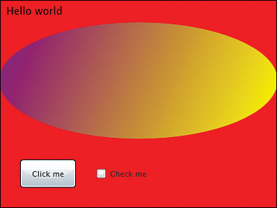
The consequence of all this is that anything you can do in XAML can also be done in code-behind. For example, the markup in Listing 15.1 and the code in Listing 15.2 are exactly equivalent and both create the result shown in Figure 15.1. The examples in this chapter are displayed in XAML and in C#. You can choose which one you want to test. To try these examples, create a new Silverlight application and enter the markup or the code as follows.
 The XAML markup should be placed within the
 UserControl tag.
The C# code should be placed in the Page constructor, right after the call to the method InitializeComponent.
To make it more interesting, remove the Width and Height attributes from the UserControl tag in Page.xaml. This way, the Silverlight application will take the whole space, and you can resize it, observing the effect on the layout.
<Grid x:Name=“LayoutRoot” Background=″Red″>
<Grid.RowDefinitions>
<RowDefinition Height=″Auto″/>
<RowDefinition />
<RowDefinition Height=″100 />
</Grid.RowDefinitions>
<TextBlock Text=″Hello world″ Margin=″10,5,5,5″ />
<Ellipse Grid.Row=″1″>
<Ellipse.Fill>
<LinearGradientBrush StartPoint=″0,0″ EndPoint=″1,1″>
<GradientStop Offset=″0″ Color=″Purple″ />
<GradientStop Offset=″1″ Color=″Yellow″ />
</LinearGradientBrush>
</Ellipse.Fill>
</Ellipse>
<StackPanel Orientation=″Horizontal″ Grid.Row=″2″>
<Button Margin=″30″ Width=″80″ Content=″Click me″ />
<CheckBox Content=″Check me″ />
</StackPanel>
</Grid>
Listing 15.2 C# Elements
Grid LayoutRoot = new Grid( );
LayoutRoot.Background = new SolidColorBrush(Colors.Red);
RowDefinition row1 = new RowDefinition( );
row1.Height = GridLength.Auto;
RowDefinition row2 = new RowDefinition( );
RowDefinition row3 = new RowDefinition( );
row3.Height = new GridLength(100);
LayoutRoot.RowDefinitions.Add(row1);
LayoutRoot.RowDefinitions.Add(row2);
LayoutRoot.RowDefinitions.Add(row3);
TextBlock title = new TextBlock( );
title.Text = ″Hello world″;
title.Margin = new Thickness(10, 5, 5, 5);
LayoutRoot.Children.Add(title);
Ellipse ellipse = new Ellipse( );
Grid.SetRow(ellipse, 1);
LinearGradientBrush brush = new LinearGradientBrush( );
brush.StartPoint = new Point(0, 0);
brush.EndPoint = new Point(1, 1);
GradientStop stop1 = new GradientStop( );
stop1.Offset = 0;
stop1.Color = Colors.Purple;
GradientStop stop2 = new GradientStop( );
stop2.Offset = 1;
stop2.Color = Colors.Yellow;
brush.GradientStops.Add(stop1);
brush.GradientStops.Add(stop2);
ellipse.Fill = brush;
LayoutRoot.Children.Add(ellipse);
StackPanel panel = new StackPanel( );
panel.Orientation = Orientation.Horizontal;
Grid.SetRow(panel, 2);
LayoutRoot.Children.Add(panel);
Button button = new Button( );
button.Margin = new Thickness(30);
button.Width = 80;
button.Content = ″Click me″;
panel.Children.Add(button);
CheckBox checkBox = new CheckBox( );
checkBox.Content = ″Check me″;
panel.Children.Add(checkBox);
this.Content = LayoutRoot;
What do we learn from Listings 15.1 and 15.2?
It usually takes more lines to create a scene in code-behind than in XAML.
XAML uses many converters (we talked about that already). For example, Background =″Red” will convert Red into Colors.Red and then into a SolidColorBrush.
Many operations are implicit in XAML, but they must be explicit in code-behind. For example, adding an element to a Grid in XAML is simple, just enclose the element between the <Grid> opening tag and the </Grid> closing tag. In C#, you must explicitly add the element to the Children collection.
But most important, the biggest difference is that XAML is well suited for tools such as Expression Blend. You will find yourself working in XAML sometimes, in code other times, and also in Expression Blend! The important thing to remember is that the result is equivalent.
Although it is true that you can do in code everything that you do in XAML, the contrary is not true. There are a few operations that you can do only in code. For example, data binding converters or event handlers can only be written in code-behind, not in XAML.
Packing and Laying out with Panels
Directly under FrameworkElement in the class hierarchy, we find another abstract class named System.Windows.Controls. Panel. This important class is responsible for grouping children, measuring them, and arranging them on the screen. This allows defining new ways to organize the children on the screen, with creativity as your only limit.
In addition to being able to create your own Panel, the Silverlight framework also contains enough of them for most situations. Let’s talk about them.
Composing Elements
When we started playing with XAML in Chapter 2, “Understanding XAML,” we saw an important feature of Silverlight: Since a Panel can contain UIElements, and since a Panel is itself a UIElement, it means that a Panel can contain other Panels too. This allows the developer to store a StackPanel in a cell of a Grid and to store a Button next to a Border next to a Canvas inside this StackPanel. You can compose and arrange elements in any way you want.
Discovering the Canvas
Canvas is the simplest panel there is. It doesn’t do much: Its children are positioned using the Canvas.Top and Canvas.Left attached properties. If the Canvas is resized, the children are not repositioned. Because it is simple, it was also the only panel available in Silverlight V1.
To add a control to a Canvas is simple, but every layout operation must be implemented explicitly. For example (see Table 15.1):
Table 15.1 Canvas in XAML and in Code
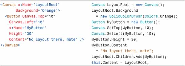
Enter the C# code in the Page constructor first and run the application. Then remove it, enter the XAML markup in Page.xaml and run the application again. You’ll see that the orange Canvas fills the whole space (because its Height and Width properties are not set, and take the default value Auto). The button automatically sizes to display the whole content, but not more and not less. If you resize the browser window, the button doesn’t change its size.
There is a way to detect whether a Canvas (or any panel) changes its size, with the following steps:
1. Modify the XAML markup of the Canvas in Table 15.1 by adding the SizeChanged event.
<Canvas x:Name=″LayoutRoot″
Background=″Orange″
SizeChanged=″LayoutRoot_SizeChanged″>
2. In the file Page.xaml.cs, handle the event and set the Button’s size according to the panel’s size.
private void LayoutRoot_SizeChanged (object sender, SizeChangedEventArgs e)
{
Panel senderAsPanel = sender as Panel;
MyButton.Width = senderAsPanel.ActualWidth - 20;
}
3. Run the application and resize the web browser’s window. The button’s width will also get resized. Using this mechanism, you can calculate the layout of a Canvas’ children if needed (but honestly, it’s easier to use a Grid…)
We use ActualWidth instead of Width. Since we didn’t set the Canvas’s Width property (because we want it to occupy the whole space), trying to read this property returns the value NaN (Not a Number). Any mathematical operation on NaN results in an error. On the other hand, ActualWidth is always set to a numeric value.
Using a Canvas to Drag an Element
With the possibility to position its children in an absolute way using the Canvas.Left and Canvas.Top properties, the Canvas is great when you must move an element on the screen, for example with the following steps:
1. Create a new Silverlight application in Visual Studio and name it CanvasDrag.
2. Create a XAML scene within the UserControl in the file Page.xaml as in Listing 15.3:
Listing 15.3 XAML Scene for Dragging
<Grid x:Name=″LayoutRoot″ Background=″Red″
MouseMove=″LayoutRoot_MouseMove″
MouseLeave=″LayoutRoot_MouseLeave″>
<Grid.ColumnDefinitions>
<ColumnDefinition />
<ColumnDefinition />
</Grid.ColumnDefinitions>
<Button Grid.Column=″1″ Height=″30″ Margin=″10,0,10,0″
Content=″Click me″/>
<Canvas x:Name=″DragCanvas″ Width=″0″ Height=″0″
HorizontalAlignment=″Left″ VerticalAlignment=″Top″>
<Rectangle Width=″30″ Height=″30″ x:Name=″MyRectangle″
Fill=″Orange″
MouseLeftButtonDown=″MyRectangle_MouseLeftButtonDown″
MouseLeftButtonUp=″MyRectangle_MouseLeftButtonUp″/>
</Canvas>
</Grid>
Notice how the Canvas is placed in the Grid, on top of the button (because it’s the last element added to the Grid). It has a Width and Height of 0x0 pixels. Even though the Canvas is dimensionless, its children will be drawn on the screen, because the Canvas doesn’t do any layout and doesn’t care whether its children are inside or outside.
Since the Canvas alignment is Left and Top, the reference point will always be the top-left corner of the Grid. Perfect for what we need to do.
3. Implement the event handlers below the Page constructor as in Listing 15.4:
Listing 15.4 Code-behind for Dragging
1 private UIElement _draggedElement;
2 privatePoint _lastMousePosition;
3
4 private void MyRectangle_MouseLeftButtonDown(object sender,
5 MouseButtonEventArgs e)
6 {
7 _draggedElement = sender asUIElement;
8 _lastMousePosition = e.GetPosition(DragCanvas);
9 }
10
11 private void LayoutRoot_MouseMove(object sender,
12 MouseEventArgs e)
13 {
14 if (_draggedElement != null)
15 {
16 Point newPosition = e.GetPosition(DragCanvas);
17 double offsetX = newPosition.X - _lastMousePosition.X;
18 double offsetY = newPosition.Y - _lastMousePosition.Y;
19
20 Canvas.SetTop(_draggedElement,
21 Canvas.GetTop(_draggedElement) + offsetY);
22 Canvas.SetLeft(_draggedElement,
23 Canvas.GetLeft(_draggedElement) + offsetX);
24 _lastMousePosition = newPosition;
25 }
26 }
27
28 private void MyRectangle_MouseLeftButtonUp(object sender,
29 MouseButtonEventArgs e)
30 {
31 _draggedElement = null;
32 }
33
34 private void LayoutRoot_MouseLeave(object sender,
35 MouseEventArgs e)
36 {
37 _draggedElement = null;
38 }
Lines 1 and 2 define private attributes to store the element being dragged (the rectangle) and the last-known position of the mouse.
Lines 4 to 9 handle the event raised when the mouse button is pushed down on the rectangle: It saves the sender (which tells the application that the element is being dragged), and also saves the mouse position (relative to the Canvas).
Lines 11 to 26 handle the event raised whenever the mouse moves within the Grid LayoutRoot.
First we check whether the dragged element is null. If it is, the application doesn’t need to do anything (it means the orange rectangle has not been clicked).
If the dragged element is not null, we must indeed drag it. We need the current mouse position. Then we calculate how much the mouse moved since last time we saved its position. This is offsetX and offsetY.
Knowing how much the mouse moved, we can set the rectangle’s new position. Finally we save the mouse position again as the last known one.
Lines 28 to 32 handle the event raised when the mouse is lifted up from the rectangle. In that case, we simply set the _draggedElement back to null. This way we tell the application that it doesn’t need to drag anything anymore.
Finally, lines 34 to 38 handle the event raised when the mouse gets out of the main Grid. In that case, we also stop dragging the rectangle.
Run the application, then click on the small orange square and drag it on the screen. Because the Canvas is set to 0x0 pixels, it doesn’t block the clicks to the button (the button doesn’t have an event handler, but you’ll see its appearance change when you pass the mouse over it or click on it).
There are other ways to drag an element, for example using its Margin if it is in a Grid. But using a Canvas is easy and straightforward. Generally, a Canvas is good whenever you need an absolute positioning of an element. Instead of using a rectangle, the element of choice for drag functionality is called the Thumb control. We study this control in Chapter 16, “Digging Deeper into Silverlight Elements.”
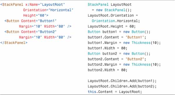
Stacking Elements in a StackPanel
Another simple panel is called the StackPanel. As the name shows, it is used to stack elements one below the other (if the orientation is vertical, which is the default) or next to the other (if the orientation is horizontal) as seen in Table 15.2. Here too, you can copy either the markup in Page.xaml, or the C# code in the Page constructor and run it.
Table 15.2 StackPanel in XAML and in Code
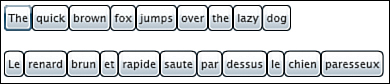
Using a StackPanel for “Flow Layout”
StackPanels are great when you want to position elements, but you don’t know yet how many you will have, or what their size is going to be at runtime. For example, let’s imagine an application where each button represents one word of a sentence. Whatever the sentence, and whatever the language, the layout will always flow as shown in Listing 15.5. Copy this code in a new Silverlight application, in the Page constructor (under the call to InitializeComponent) and run the application.
Listing 15.5 Flow Layout with StackPanel
List<string> sentences = new List<string>( );
sentences.Add(″The quick brown fox jumps over the lazy dog″);
sentences.Add(″Le renard brun et rapide saute par dessus le chien paresseux″);
StackPanel LayoutRoot = new StackPanel( );
this.Content = LayoutRoot;
foreach (string sentence in sentences)
{
StackPanel panel = new StackPanel( );
panel.Margin = new Thickness(10);
panel.Orientation = Orientation.Horizontal;
string[ ] words = sentence.Split(new char[ ] { ′ ′ });
foreach (string word in words)
{
Button button = new Button( );
button.Content = word;
panel.Children.Add(button);
}
LayoutRoot.Children.Add(panel);
}
this.Content = LayoutRoot;
With this code, you don’t need to worry about calculating the number of buttons, or the buttons’ width. They will be stacked nicely next to each other (see Figure 15.2).
Figure 15.2 The quick brown fox
Using a Grid to Align Elements
The Grid is without a doubt the most powerful panel available in Silverlight. It is flexible, yet easy to use. The most powerful feature is that you can combine Grids to build very complex layouts.
Another great thing with Grids is that they will resize their children if needed. That makes it a perfect container when you need to arrange elements on a surface of varying size.
Do not be afraid to use Grids (or any panel) even to arrange elements on small surfaces. We see later that a Button, for example, can have a Grid as its Content. This allows creating complex layouts even on small controls.
Before you start adding elements to a Grid, you need to specify its layout. This is done with the Grid.RowDefinitions and Grid.ColumnDefinitions collections as shown in Table 15.3.
Table 15.3 Grid Layout in XAML and in Code
A ColumnDefinition’s Width and a RowDefinition’s Height are of type GridLength. You can give them one of three possible values in XAML (for the C# equivalent, refer to Table 15.3):
A number of pixels, making this a fixed-size column or row.
The word Auto: The column or row automatically adapts its size to the size of the content.
A fraction of a “star,” for example 0.6*. This means “60% of the rest of the space after all other columns (or rows) have been computed.”
For instance, let’s imagine that the grid in the preceding code has a height of 400 pixels and a width of 600 pixels.
The first row has a fixed height of 25 pixels.
The last row has a height of Auto so it will adapt its height to the content. If its content is a StackPanel with a height of 75 pixels, then that will be the height of the row too.
The second and third rows have a height of “1 star,” so each of them will take a height of (400 –25 –75) / 2 = 150 pixels.
For the columns, the same calculation goes:
The second column has a fixed Width of 65 pixels.
The first column has a Width of 0.4*, so it will get 40% of the remaining space, which is (600 –65) * 0.4 = 214 pixels.
As for the second column, it gets (600 –65) *0.6 = 321 pixels.
The beauty of the “star” dimension is that it will automatically be recalculated every time that the size of the Grid changes. Using a Grid enables dynamic and flexible layout. This is why the Grid is used as the default layout for new Silverlight applications.
Setting Up a Minimum and Maximum Size
For each ColumnDefinition and RowDefinition, you can also specify a minimum and maximum size. This way, you make sure that the elements inside a cell remain visible even if their size is set to Auto and the Grid’s parent becomes very small.
For a ColumnDefinition, you can use MinWidth and MaxWidth. For a RowDefinition, the corresponding properties are MinHeight and MaxHeight. These properties define an absolute minimum or maximum size, in pixels.
Adding Elements to a Grid
Elements can be added in any order to a Grid. You use the attached properties Grid.Column and Grid.Row to specify in which cell the element should be placed. Remember that the first column or row has the index “0”. This is also the default value so it doesn’t need to be specified explicitly.
Two additional attached properties Grid.ColumnSpan and Grid.RowSpan allow you to place the element across multiple columns or rows. This way, you can create relatively complex layouts using only one Grid.
For more complex layouts, however, it might be necessary to nest a Grid inside a Grid, or to use other panel types. Also, you can position an element within a Grid’s cell using the Margin property.
1. Copy the Grid layout markup from Table 15.3 in a new Silverlight application named GridLayoutTest, in Page.xaml (inside the top user control).
2. Remove the Height and Width properties from the UserControl tag.
3. Then, add the children in Listing 15.6 inside the LayoutRoot Grid. Run the application and resize the web browser window to observe the automatic layout as shown in Figures 15.3 and 15.4.
Listing 15.6 Laying out Elements in a Grid
<StackPanel Grid.Row=″3″ Grid.ColumnSpan=″3″
Orientation=″Horizontal″
Height=″80″ Background=″Green″ />
<Ellipse Grid.Column=″1″ Grid.ColumnSpan=″2″
Grid.Row=″2″ Fill=″Red″ Margin=″20″ />
<Rectangle HorizontalAlignment=″Center″
VerticalAlignment=″Center″
Grid.Column=″1″ Grid.Row=″1″
Fill=″#FF7800FF″
Width=″30″ Height=″30″ />
<Rectangle Margin=″20,20,40,20″
Grid.Column=″2″ Grid.Row=″1″
Fill=″#FF0000FF″ />
<Rectangle Margin=″10″
Grid.Row=″1″ Grid.RowSpan=″2″
Fill=″#FFFFFF00″ />
<TextBlock HorizontalAlignment=″Center″
Text=″This is a Grid″
FontSize=″14″ Grid.ColumnSpan=″3″ />
Figure 15.3 Small Grid
Figure 15.4. Big Grid
Adding Elements to a Grid in Code-Behind
The elements can as usual be created and added to the Grid in code-behind. To set attached properties in C#, use the method Grid.SetXXX. For example, Listing 15.7 shows how the red Ellipse from Listing 15.6 can be added to the Grid in C#:
Listing 15.7 Adding Elements to a Grid in Code
Ellipse ellipse = new Ellipse( );
Grid.SetColumn(ellipse, 1);
Grid.SetColumnSpan(ellipse, 2);
Grid.SetRow(ellipse, 2);
ellipse.Fill = new SolidColorBrush(Colors.Red);
ellipse.Margin = new Thickness(20);
LayoutRoot.Children.Add(ellipse);
Scrolling and Bordering
Two additional containers can be used in Silverlight to enclose elements. Both of them can contain only one child (as you guessed, these two are not panels!). Since this only child may be a panel, you can end up creating the desired layout anyway.
Using a ScrollViewer to Scroll Big Areas
We used a ScrollViewer already in Chapter 6 and also in our Thumbnails application. The purpose of this container is to provide scrollbars so that the element inside the ScrollViewer can be bigger than the ScrollViewer itself.
Using a ScrollViewer in XAML is straightforward as shown in Listing 15.8:
Listing 15.8 ScrollViewer in XAML
<ScrollViewer Width=″500″
ScrollViewer.HorizontalScrollBarVisibility=″Auto″
ScrollViewer.VerticalScrollBarVisibility=″Disabled″>
<Grid x:Name=″LayoutRoot″
Width=″1000″>
<!-- ... -->
</Grid>
</ScrollViewer>
Or in C# (Listing 15.9):
Listing 15.9 ScrollViewer in Code
ScrollViewer scrollViewer = new ScrollViewer( );
scrollViewer.Width = 500;
ScrollViewer.SetHorizontalScrollBarVisibility(scrollViewer,
ScrollBarVisibility.Auto);
ScrollViewer.SetVerticalScrollBarVisibility(scrollViewer,
ScrollBarVisibility.Disabled);
Grid LayoutRoot = new Grid( );
LayoutRoot.Width = 1000;
scrollViewer.Content = LayoutRoot;
this.Content = scrollViewer;
You can control the way the scrollbars are displayed with the attached properties ScrollViewer.HorizontalScrollBarVisibility and ScrollViewer.VerticalScrollBarVisibility.
Auto—The scrollbar will only be displayed if needed. If the ScrollViewer becomes smaller than its content, then the scrollbar will appear.
Disabled—The scrollbar will never appear. This can be useful if you want only the vertical scrollbar but not the horizontal one, for example.
Hidden—Here too, the scrollbar will never appear. We will talk about the difference between Disabled and Hidden in just a minute.
Visible—The scrollbar will always be displayed, even if it is not needed.
Disabling or Hiding a ScrollBar
A ScrollBar can be Hidden or Disabled. There are a couple of subtle differences between both these settings. The most important one is that when the scrollbar is Hidden, even if it doesn’t appear, the content can still be scrolled programmatically using the methods ScrollToVerticalOffset and ScrollToHorizontalOffset.
In practice, you will mostly use the Disabled setting, but Hidden can be useful if you want to implement your own scrolling mechanism.
Surrounding an Element with a Border
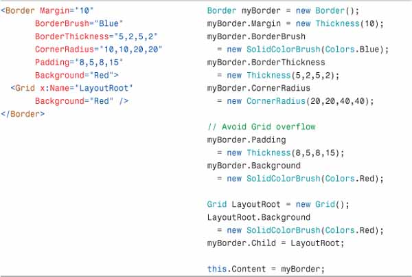
Here is another container used to enclose an element and add some functionality: The Border element. Its purpose is to surround an element (typically a panel) with a border. Border is not a panel. In fact, Border derives directly from FrameworkElement. It is not a ContentControl either (unlike ScrollViewer). The Border doesn’t have a Content property; it has a Child property instead. Table 15.4 shows the markup and C# code for a Border and its properties. As usual, you can create a new Silverlight application and try this markup (in Page.xaml) or the C# code (in the Page constructor).
To set the color of the Border, use the BorderBrush property. Note that as usual in Silverlight, this is a brush, so you can use a SolidColorBrush, but you can also use a gradient brush, an image brush, a video brush, or any kind of brush.
Use the BorderThickness property to specify how thick the Border must be. Since this property is of type Thickness (like the Margin property), you can set a different value for left, top, right, and bottom.
You can round each corner separately using the CornerRadius property. Note that CornerRadius can be tricky. If you round a Border’s corners too much, the element it contains might overflow the Border as shown in Figure 15.5. To avoid this, you can set a smaller corner radius or use some padding (see the C# code in Table 15.4).
Figure 15.5 Grid overflowing a Border (and the cure)
Also very useful, a Border has a Padding property. Also defined as a Thickness, you can use it to set the spacing between the border and its content.
Table 15.4 Border in XAML and in Code
Using Pop-Ups
The last container we will study in this chapter is the Popup. As the name suggests, it is a control that pops up. It is handy when you need to display a dialog of some kind, for example, the settings for an application.
Like Border, Popup is not a panel, and not a ContentControl either, but derives directly from FrameworkElement, and uses the Child property to set its content as shown in Table 15.5.
Table 15.5 Popup in XAML and in Code
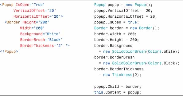
To open the Popup, use the property IsOpen and set it to True.
The Popup is placed on the screen using the properties VerticalOffset and HorizontalOffset. These values are relative to the top-left corner of the Silverlight application.
Popups don’t have any graphic attributes. A Popup without any content will remain invisible. This is why they will typically have a Border as their Child. The Border will have its Background, BorderBrush, and BorderThickness set.
Even though the properties Height, Width, VerticalAlignment, and HorizontalAlignment can be set on a Popup, they don’t currently have any effect. The only way to position a Popup is by using the VerticalOffset and HorizontalOffset properties.
Drawing Shapes
We already talked about shapes earlier in this book, and there is not too much to add. Shapes belong to the namespace System.Windows.Shapes. Their basis class is abstract, and it is named Shape (logically).
Since a Shape derives from FrameworkElement, it can be handled in many ways like a control. It can be animated, it can be placed in a panel, and you can also use data binding. Through their common basis class, all shapes share properties such as the following:
The Fill property (a brush used for the Shape’s background)
The Stroke (also a brush used for the external line of the Shape)
The StrokeThickness (defining how thick the Stroke will be)
Other properties used to specify the “fine look” of the shape, such as dashes, the way the strokes join, and so on.
A Shape can also raise events, for example, when the mouse is clicked on it (MouseLeftButtonDown event), or other events to collect user input and enhance your application.
There are multiple types of shapes: We already encountered the most basic ones: Rectangle, Ellipse, and Line. Other more complex shapes can also be used:
Polygon is a group of connected straight lines, defined by a collection of Points. The shape will always be closed.
Polyline is also a group of connected straight lines, similar to a Polygon except that the shape is not necessarily closed. If you want the Polyline to be closed, you must set the last Point of the collection to the same value as the first Point.
Path is the Ferrari of the shapes! It can be pretty much anything, straight lines and curves. It can be closed or open, filled or not. Its shape is defined by the Data property.
The Data Property
To define a Path, you have to specify its Data property. This property can take either a geometry object, such as EllipseGeometry, RectangleGeometry, LineGeometry, or a group of simple geometries to form complex shapes. It can also be specified using a complex language called the Path Mini-Language.
It is outside the scope of this book to explore Paths more. Often, Paths are created with a drawing tool such as Microsoft Expression Design. For more information about shapes, Paths, and the Path Mini-Language, refer to the documentation in the SDK, or online. Note also that the shapes are the same as those used in Windows Presentation Foundation. More information can be found in books or web pages about this technology too.
Listing 15.10 and Figure 15.6 show multiple shapes on a Canvas. You can test this by creating a new Silverlight application and replace the LayoutRoot in the Page.xaml with this markup.
Listing 15.10 Shapes
<Canvas Background=″#FFFFFFFF″ Width=″400″ Height=″300″>
<Polygon Points=″10,10 100,100 30,100″
Stroke=″Red″ StrokeThickness=″4″
Fill=″Blue″ Canvas.Top=″10″ Canvas.Left=″10″ />
<Polyline Points=″10,10 100,100 30,100″
Stroke=″Red″ StrokeThickness=″4″
Fill=″Green″ Canvas.Left=″134″ Canvas.Top=″10″″/>
<Path Height=″135″ Width=″235″
Canvas.Left=″153″ Canvas.Top=″142″
Data=″M2,2 C151.34538,-58.838524
238,-56.998932 235,2
L235,88 C229.7094,37.716103
148.02191,10.250371 2,2 z″
Fill=″Yellow″ Stretch=″Fill″
Stroke=″Red″ StrokeThickness=″4″ />
<Rectangle Height=″49″ Width=″109″
Canvas.Left=″25″ Canvas.Top=″155″
Fill=″Blue″ Stroke=″Red″
StrokeThickness=″4″/>
<Line X1=″10″ Y1=″100″ X2=″80″ Y2=″30″
Stroke=″Red″ StrokeThickness=″10″
Canvas.Top=″-16″ Canvas.Left=″238″ />
<Line X1=″10″ Y1=″100″ X2=″80″ Y2=″30″
Stroke=″Red″ StrokeThickness=″10″
StrokeDashArray=″2 2″ StrokeDashCap=″Round″
Canvas.Left=″257″/>
<Line X1=″10″ Y1=″100″ X2=″80″ Y2=″30″
Stroke=″Red″ StrokeThickness=″10″
StrokeDashArray=″3 3″ StrokeDashCap=″Triangle″
Canvas.Left=″276″ Canvas.Top=″17″ />
<Ellipse Height=″54″ Width=″282″
Canvas.Left=″40″ Canvas.Top=″223″
Fill=″Green″ Stroke=″#FFFF0000″ StrokeThickness=″4″ />
</Canvas>
Figure 15.6 Various types of shapes on a Canvas

Summary
After using many of Silverlight’s elements in previous chapters, we got a much closer look at some of them in this chapter. Using Grids, StackPanel, or even the simple Canvas, adding ScrollViewers and Borders, you can create elaborate layouts for your Silverlight application. Adding shapes, you can give freedom to your artistic side and make your application look beautiful.
In Chapter 16 we continue our exploration and spend more time with Silverlight controls.