
Chapter 4 Expression Blend
In This Chapter
Together with the new framework come new tools: The Microsoft Expression Studio. This new line of tools is primarily aimed at graphics designers. In fact, Microsoft didn’t think that developers would be interested in them, and for some time didn’t even market them for developers. Thankfully, after some rather loud reactions in the developer community, Microsoft changed its mind and included Expression Blend in the MSDN subscription, acknowledging the value of this tool for developer work.
The Expression Studio in Short
The Expression Studio is composed of five tools. All these tools can be used for Silverlight development at some level:
 Expression Design—Creates graphic design assets and exports them to a number of formats, including XAML.
Expression Blend—Creates WPF and Silverlight applications and provides a visual designer for the UI.
Expression Encoder—Encodes and publishes video, and optionally creates a Silverlight video player for them.
Expression Web—Builds web pages, includes an advanced CSS designer, and an HTML visual designer.
Expression Media—Manages media assets. This is the only tool in the Studio that is not directly useful for Silverlight applications.
Installing Expression Blend
To install Expression Blend 2 SP1, follow these steps:
1. If you didn’t do this yet, install the Silverlight tools from the page www.silverlight.net/GetStarted.
2. Go to the URL www.microsoft.com/expression/try-it
3. Scroll down until you find “Expression Blend 2” and click on “Try It”.
4. On the same page, locate and install Expression Blend 2 SPI. This service pack gives you the ability to create and edit Silverlight content in Blend.
Starting Expression Blend
When you start Expression Blend the first time, a Welcome screen displays with options to create a new project, to start the Help system, or to see samples (Figure 4.1). Unfortunately, the samples are all for WPF and not for Silverlight (yet…). Still, you can select the samples to see what you can create using Blend, XAML, and WPF.
Figure 4.1 Expression Blend Welcome screen
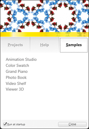
A check box asks whether you want to see the Welcome screen every time that you start the application. If you uncheck this box, you can retrieve the Welcome screen by selecting Help, Welcome Screen from the Blend menu.
Setting Options
Before you create your first project in Blend, you’ll want to take a look at the options first with the following steps:
1. Select Tools, Options from the menu.
2. Under Workspace, you can modify the way the application looks with two settings:
You can select a theme for your working environment. Currently two themes are available, Expression dark and Expression light. Change the theme and observe how the whole environment’s look and feel changes.
You can set the zoom factor for the environment. This is especially useful if you have an extra-small screen resolution (for example, when you give a beamer presentation about Expression Blend) or an extra big screen.
You can also drag the level of the zoom bar with your mouse to see how WPF handles the resizing. This is done using transforms as you learned in Chapter 3, “Playing with XAML Transforms and Animations.”
3. Under Project, you find options related to how Blend creates and saves projects.
If you want Blend to require a path for the new project as soon as it is created, check the Save New Projects check box (this is the first check box). It is recommended to check this option.
Similarly, it is recommended to use a Grid panel as the default layout for new items. The Grid panel (which we will study more later) is the most flexible and powerful panel available in Silverlight 2.
The other options can be left untouched.
4. Under Code Editor, you find settings for the XAML editor.
You can choose which font you want to use. Although you can use any font installed on your system in theory, we recommend using a fixed-size font (such as Consolas or Courier New) to enhance readability.
You can also use the Tab Size setting and the Insert Space or Keep Tabs setting to specify how your XAML markup will be indented. There is a small religion war going on among developers to decide which settings are the best. A good combination is 2 and Insert Spaces, but you’re free to decide for yourself.
If you want long lines of markup to wrap according to the size of the application’s window, check the Word Wrap check box.
5. Under Event Handlers, specify which editor should be used to implement event handlers in the code-behind. Expression Blend cannot handle C# code on its own. A good idea is to use Visual Studio for event handlers, if you have it. This setting applies only if you work with Silverlight 2 (with .NET), instead of Silverlight 1 and JavaScript.
6. Under Artboard, you’ll find options about Snap grid, Gridlines, default Margin, and default Padding, the color of Blend’s background.
7. Under Documents, you can choose the default view for your pages. You can use Split view if your screen is big enough, because it gives a good view on both the XAML markup and the visual representation of the elements.
Creating a New Project
To start a new project, you can either select the Projects tab on the Welcome screen, or select File, New Project from the menu. Then follow these steps:
1. In the Create New Project dialog shown in Figure 4.2, select the version of Silverlight that you want to use. Depending on your installation, you may have the choice between Silverlight 1 Site (with JavaScript only) and Silverlight 2 Application (with .NET).
Figure 4.2 The Create New Project dialog box
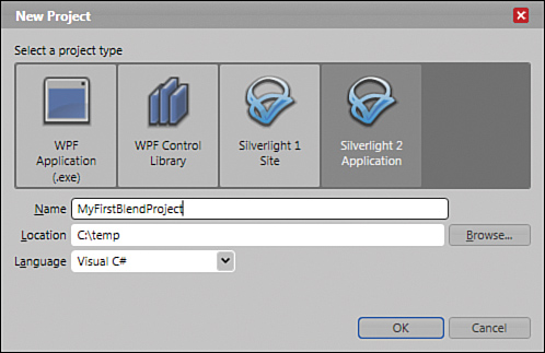
2. Select the option “Silverlight 2 Application”.
3. Enter a name and a location for your project and press “OK”. Note that even though Blend allows it, it is not recommended to use spaces in a project’s name. It’s better to use dots, for example “MyFirm.MyProject”.
Understanding the Panels
Blend creates a new Silverlight project and displays the new user control in the central panel. Let’s review the panels, as shown in Figure 4.3. Because Blend is a full-fledged WPF application and features two themes, the look and feel of your Blend installation may be slightly different from the one displayed here, depending on the theme setup. You can change the theme in the Options dialog.
Figure 4.3 Blend bars and panels
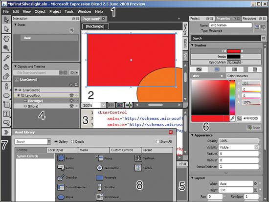
Figure 4.3 displays the following panels and bars:
1. Menu bar.
2. Designer panel, where the XAML markup is rendered visually.
Only available in Design or Split mode.
3. XAML editor panel, where the XAML markup can be edited manually.
Only available in XAML or Split mode.
4. Interaction panel: all the objects in the page are displayed in a tree and animations can be created and managed in the Objects and Timeline category.
A control’s states and transitions can be managed in the States category of the same panel. We’ll talk about that in Chapter 17, “Using Resources, Styling, and Templating.”
5. Results panel. We will use this panel when we program Silverlight with C#.
6. Project/Properties/Resources panels. The Project panel gives easy access to all the files and data in the application. The Properties panel allows setting and editing the elements’ properties. The Resources panel will be used later, when we talk about resources, styles and templates.
7. Toolbar, providing an easy access to all the tools we will use to create visual content.
8. Asset Library, where all the built-in and custom controls can be managed.
Looking at the Files
Let’s select the Project panel and take a look at the files that Blend created for us, as in Figure 4.4.
Figure 4.4 Silverlight 2 files
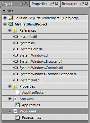
The top file is a solution file. We will talk more about solutions in Chapter 9, “Understanding .NET.” For the moment, it is enough to remember that a solution is a container for projects. In the file system, the solution file has a .sln extension (for example, MyFirstBlendProject.sln).
Next in the hierarchy is the project file. One solution can contain multiple projects, but Blend creates only one by default. The project file is a way to organize all your files neatly and to specify how they are built to create the application. Additionally, the project file can contain references to other components. In Windows Explorer, this file has the extension “.csproj” (for a C# project) or “.vbproj” (for a VB.NET project). Again, we detail the project file and its properties in Chapter 9.
The References folder contains links to all the components needed to run the application. The components present by default are the core components provided by the Silverlight framework. Later we will add references to additional components.
The Properties folder contains “meta-information” about the application. This is where we will define later the name of your firm, the copyright information, the assembly’s version, etc…
App.xaml and the linked file App.xaml.cs contain global resources and information valid for the whole application.
The file Page.xaml contains the XAML user interface for your Silverlight application. This is the only file that we will use in this chapter.
The file Page.xaml.cs contains the code-behind defining the actions and operations of your application.
We spend more time using these files in later chapters. For the moment, we concentrate on the XAML file only.
Executing in the Web Browser
Expression Blend creates the infrastructure needed to run a Silverlight application in the web browser, including a web server embedded in Blend. That’s right, you can test your web application in a real web server without installing anything.
1. In Expression Blend, press the F5 key. This will open the page in the default browser defined in your operating system. Notice how a web server was started for your application. The application runs in HTTP!
2. Alternatively, select the menu Project / Test Solution.
The HTML page in which the Silverlight application runs is here for tests only. It is created “on the fly” by Expression Blend. To deploy your application on the Internet, you will need a website or a web application. We will take care of this in Chapter 7, “Deploying to a Web Page,” and later.
Of course, a white panel on a white HTML page is not very spectacular. Make sure to run your application again after we create content for your Silverlight page!
Working with Shapes
Blend allows working with three types of primitive shapes: rectangle, ellipse, and line (other shapes such as polyline or path can be created manually, as we’ll see later). Use the following steps to draw on the Design panel.
1. To select a Rectangle, simply press on the corresponding tool in the toolbar. To select an Ellipse or a line, press and hold the same tool. This displays a choice where you can select Rectangle, Ellipse, or line as you want.
2. After a Rectangle, Ellipse, or line has been selected, the cursor turns into a cross. You can draw on the white page as shown in Figure 4.5. Draw the line first, then the Rectangle, then the Ellipse on top of the line.
Figure 4.5 Drawing shapes in Expression Blend
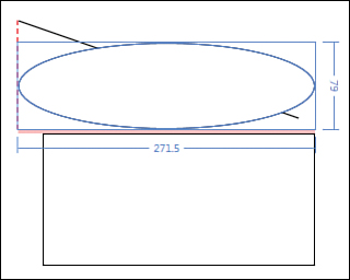
3. When you draw multiple shapes, you will see that Blend provides a visual aid (red lines) to help you align the shapes, or to space them. Figure 4.5 shows a line, a Rectangle, and an Ellipse. The Ellipse’s width and height appear on the screen as you draw. Additionally, a red dashed line appears when the Ellipse is lined up with the end of the line. Finally, a thicker light red line appears when the Ellipse is exactly 4 pixels away from the Rectangle, or 8 pixels away from the container’s border (here the container is a Grid).
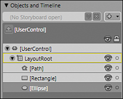
4. Notice how all the objects drawn on the page appear in the Objects and Timeline category as shown in Figure 4.6. It’s also interesting to note that a line in Blend is actually a Path in Silverlight (there are no line objects in XAML). On the other hand, Silverlight knows a Rectangle object and an Ellipse object.
Figure 4.6 Simple objects hierarchy
Expression Blend can “remember” a huge number of operations that you perform. By selecting Edit, Undo from the menu (or by pressing Ctrl+Z), you can undo the operations and retrieve a previous state of the scene. Should you change your mind again, selecting Edit, Redo (or pressing Ctrl+Y) will move you forward again in time and re-create everything you just undid.
Other keyboard shortcuts can really speed up your work! The shortcuts are visible when you place the mouse over a tool in the toolbar (in the tooltip), or when you select a menu.
Using the Properties Panel
The Properties panel is a powerful feature of Blend. It allows setting (most of) the attributes of the XAML elements without typing markup, and for some properties, with visual editors, such as in the following steps:
1. Select the Ellipse in the Objects and Timeline category. Then select the Properties tab in the Project/Properties/Resources panel on the right of the screen.
2. All the properties that you can set are listed and grouped by category.
3. The Properties panel features a useful Search box. Type a few letters and see how the properties are filtered. Note that you may type any part of the word: For example, typing “tran” leaves the RenderTransform and the RenderTransformOrigin, because both contain the string “tran”.
Using the Color Picker
The color picker is a very useful component of Expression Blend. It allows selecting any color in a variety of ways, and provides visual feedback as shown in Figure 4.7. Later we will see that it allows creating gradient brushes, and changing the transparency of a color.
Figure 4.7 Brushes Category and Color Picker
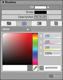
1. The small tabs under the OpacityMask property are used to set which kinds of brush you want to use on the selected element. With the Fill property selected, select the first tab on the left (the one with “No brush” as a tooltip). If you select this tab, notice how the background color of the ellipse disappears: You can now see the line located underneath.
2. If you select the second tab with the tooltip “SolidColorBrush”, you can use the color picker to drag the small dot (currently located in the top-left corner corresponding to the white color). Using the vertical slider on the immediate right of the color picker, you can display other color groups.
3. If you want, you can set the R, G, B and A components of the color directly, or write the hexadecimal code of the color in the box with the “Hex value” tooltip (the one reading “#FFFFFFFF”). You can also type a color name (such as Red or Blue) in the box instead of the hexadecimal code. The value will automatically be converted to the corresponding code (if it exists).
4. If you want to use another color selection system, click on the letters R, G or B to display a choice. You can choose between HLS, HSB, RGB or CMYK.
Creating a LinearGradientBrush
In Chapter 2, “Understanding XAML,” we typed a LinearGradientBrush by hand. Needless to say, if your brush has many colors, this can become a tedious job. Fortunately, the color picker can also be used to create gradient brushes, like shown with the steps below:
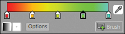
1. Selecting the third tab allows you to visually edit gradient brushes. This is an exciting feature of Silverlight. The gradient brush editor features a GradientStop slider, located directly under the color picker.
2. For the moment, there are only two GradientStops, a black one and a white one. By selecting the black one, you can change its color to anything else, using the color picker.
3. By clicking on the GradientStop slider bar, you can place additional GradientStops. By moving them, you can change the way the gradient is calculated as shown in Figure 4.8. To remove a GradientStop, move it out of the slider.
Figure 4.8 LinearGradientBrush, GradientStop slider
4. It is not easy to place GradientStops exactly on the slider. This is where the XAML Split view is useful: Locate the XAML markup corresponding to the Ellipse, and you can manually edit the position of the GradientStops. Try it for yourself! Each GradientStop can be moved from 0 to 1, using the Offset attribute!
The XAML markup created by Blend is not very nicely formatted. In fact, Blend doesn’t care much about the human eye trying to read the markup. Fortunately, after the markup has been formatted, Blend will not mess it up anymore. Don’t lose too much time reformatting the markup manually, though. We will see ways to format the XAML markup automatically when we talk about Visual Studio.
Changing the Gradient Vector
A gradient is defined by a series of GradientStops, but also by a direction. In XAML, we use a StartPoint and an EndPoint attribute to specify from where to where the gradient must “flow.” Expression Blend has a great tool to help you specify this vector: The Brush Transform tool (located in the toolbar). To use it, follow the steps:
1. Click on the tool. This adds a vector arrow to the ellipse.
2. Place your mouse next to the arrow’s tip (or end) until you see the small “rotation” cursor. Then click and rotate the vector (see Figure 4.9). If you press and hold the Shift key, it rotates in increments of 15 degrees.
Figure 4.9 Rotating the gradient vector
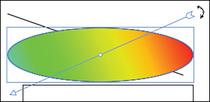
3. Place your mouse on the arrow’s middle point (with the small white circle). The mouse cursor changes into a cross. You can move this point to change the gradient’s position.
4. Place your mouse directly on the arrow’s tip (or end). The mouse cursor changes into a hand. Then drag the tip (or end) of the arrow to the selected location. Note that you can place the tip (or end) of the arrow anywhere you want, inside or outside the ellipse. This allows creating virtually any gradient you want.
5. In the XAML markup, see how the StartPoint and EndPoint are set by Blend. The points are set relatively to the ellipse “0,0” point, which is the Ellipse’s top-left coordinate.
Creating a RadialGradientBrush
You can also create another type of gradient: a RadialGradientBrush. Directly under the GradientStop slider, there are two small buttons. The left one (currently selected) is the LinearGradientBrush button. The right one is the RadialGradientBrush. Click on it and see how the Ellipse’s fill color changes. Then with the Brush Transform tool still selected, drag the tip, end, or center point of the vector to modify the gradient.
Creating a 3D Border Effect Using RadialGradientBrush
It is interesting to see how brushes can be applied to various objects. In Chapter 3, Listing 3.7, we used a LinearGradientBrush as the Foreground property of a TextBlock. In the steps below, we see how to use a RadialGradientBrush to create a simulated 3D effect for the border of an Ellipse.
1. Select all the elements on the page (keyboard shortcut Ctrl+A) and then press Delete.
2. Use the Ellipse tool to draw a circle on the page.
3. Select the Fill property and create a brush.
4. In the Appearance category, change the StrokeThickness to 24.
5. Select the Stroke property. For the moment, a solid black color is used.
6. Click on the Gradient Brush tab. Then click on the RadialGradientBrush button.
7. Select a darker color for the outer GradientStop (on the right) and a lighter color for the inner one (on the left).
8. Using the Color eyedropper, you can easily select any color on your screen, even outside Blend! Also, note how the last selected color is available just next to the eyedropper.
9. Move both GradientStops to the far right of the bar. Move them slowly until you get the desired 3D effect (see Figure 4.10).
Figure 4.10 Circle with simulated 3D border

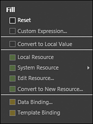
Resetting Properties to Their Default Value
It’s easy in Blend to reset properties to the default value. When you do so, the corresponding XAML markup will be removed from the source file. This can be a good occasion to clean up your markup with the following steps:
1. There is a small square next to all the properties, for example, the Fill property for the Rectangle object. If the property is set to anything else but the default value, the small square is white. If it is not set, the square is black. Later in this book we will also see that the color can be different: Green if the property is set through a resource, Orange if it is set through a binding.
2. Click on the small square to open the context menu. Select the first item Reset, shown in Figure 4.11, to erase the corresponding XAML markup, thus resetting the value to its default.
Figure 4.11 Pop-up menu for the Fill property
Composing the Elements Hierarchy
In Chapter 2, you saw that XAML is a hierarchical language. Some elements can contain children. In turn, some of the children can also contain children. This is reflected in Blend’s Objects and Timeline tree. Let’s create a new composition:
1. Create a new Silverlight 2 application.
2. Double click on the Grid named “LayoutRoot” until it has a yellow border in the Objects and Timeline category. This special type of selection means that every new element will be added to that selected panel.
3. In the toolbar, click and hold the Grid tool. This is the button right under the Rectangle, Ellipse and Line tool you used before. In the expanding menu, select a Canvas. This doesn’t add a Canvas to the page yet. It simply makes the Canvas tool available in the toolbar.
4. Double click on the Canvas button. This adds a Canvas in default size to the LayoutRoot grid.
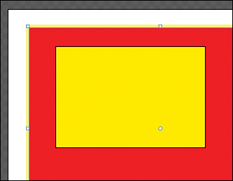
5. Resize the Canvas to a bigger size, and make it red.
6. Double click on the Canvas to select it with a yellow border.
7. Using the toolbar, add a Rectangle to the Canvas and make it yellow (see Figure 4.13).
8. See how the Objects and Timeline category reflects the hierarchy, called the Logical tree (Figure 4.12).
Figure 4.12 Logical tree
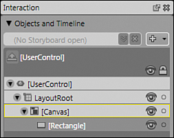
Figure 4.13 Rectangle inside the Canvas
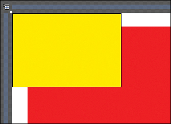
9. Then, select the Rectangle in the tree in the Objects and Timeline category. Drag it on the LayoutRoot. See in the Design panel what happened: The rectangle is now placed on the page, outside of the red canvas and overlapping it. Its position has been reset to 0, 0 (that’s the default value, see Figure 4.14).
Figure 4.14 Rectangle outside the Canvas
10. In the Objects and Timeline tree, select the Canvas and drag it below the Rectangle. See how the Canvas now appears on top of the Rectangle. This is because the tree reflects the markup: The last element in the code is the one with the highest Z-Index and will appear on top of the others.
11. Clicking on the small vertical arrow at the very bottom of the Interaction panel toggles the order of elements between “XAML order” and “Z-Index order”.
Summary
Expression Blend is probably one of the most innovative UI tools developed lately, and it’s nice to see a full-featured WPF application used to develop other Silverlight and WPF applications. In this chapter, you had the occasion to play with some of Blend’s features. During following chapters, we will keep on using Blend to study additional features and effects.
However, do not give up on typing XAML! Some developers actually prefer to use markup instead of the visual tools. Some others prefer Blend, but all should have a good knowledge of both worlds. Later, we will use Visual Studio and enjoy the comfort of a very good XAML editor, which makes typing much easier than anything we did until now. This way, you can truly enjoy XAML as markup and XAML as visuals!