
Chapter 3 Playing with XAML Transforms and Animations
In This Chapter
Probably the most exciting feature of Silverlight is the ability to transform and animate visual elements with XAML alone, without writing one line of C# code-behind. In this chapter, we build on the knowledge gained in the previous chapter and learn new constructs to enhance our Silverlight XAML applications.
Transforming Visuals
Silverlight and WPF provide a powerful way to modify the appearance of an element using transforms. More specifically, the transforms used in Silverlight and WPF are affine transforms, meaning that parallel lines will always remain parallel. This will become clearer as we try all the transforms in SilverlightPad.
To transform an element, you use the RenderTransform property of any UI element. The RenderTransform doesn’t affect the layout of the elements: it is applied to the element after all the layout operations have been computed. This means that neighbors of the transformed element will not be affected by the transform, and they will appear just as if the transformed element had not moved at all.
For example, let’s enter the XAML markup shown in Listing 3.1 in SilverlightPad.
<!--Transforms.xaml - Transforming a scene in XAML-->
<Canvas xmlns=″http://schemas.microsoft.com/client/2007″
xmlns:x=″http://schemas.microsoft.com/winfx/2006/xaml″
Width=″640″ Height=″480″>
<Ellipse Width=″190″ Height=″160″
Fill=″Red″ Stroke=″Black″
Canvas.Left=″8″ Canvas.Top=″8″ />
<Grid Width=″330″ Height=″190″
Background=″Orange″
Canvas.Left=″115″ Canvas.Top=″107″
RenderTransformOrigin=″0.5,0.5″>
<Grid.RenderTransform>
<RotateTransform Angle=″30″ />
</Grid.RenderTransform>
<TextBlock Text=″Hello″
FontSize=″36″ Foreground=″Gray″
HorizontalAlignment=″Center″ />
</Grid>
</Canvas>
Figure 3.1 shows two elements, a red Ellipse and an orange Grid; the Grid contains a TextBlock.
Figure 3.1 Transforming an XAML scene
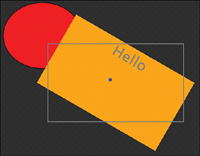
To make things clearer, I added a small blue dot marking the point of origin, and a fine gray line showing the original Grid’s position in Figure 3.1 and the next. The following features are important in Figure 3.1:
 The orange
 Grid doesn’t appear horizontal like it should. Instead, it is rotated by 30 degrees. Notice how the Grid’s child (the TextBlock) is also rotated. Transforms applied to an element also affect the children!
The rotation’s point of origin is located in the exact center of the orange Grid, because of the RenderTransformOrigin=″0.5,0.5″ attribute. The value 0.5 is relative to the element’s width, respectively height. The point of origin is the only point that is not modified by the transform.
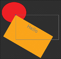
The default value for RenderTransformOrigin is “0,0”, so removing that attribute creates Figure 3.2. The Grid now rotates around its top-left corner.
Figure 3.2 Default point of origin
Types of Transforms
There are four basic transforms that can be applied to a Silverlight element and modify it in a simple way. We will talk about these basic transforms in this section. Additionally, a more complex mathematic transform can be applied (on its own, or in addition to the basic ones) and modify the element in almost any way possible. Remember however that parallel lines will remain parallel.
RotateTransform
We saw the effect of this transform already. RotateTransform rotates all the points of a figure around the point of origin. The amount by which the figure is rotated is set by the Angle property. The value (in degrees) can be any number, positive or negative.
You can test variations of this transform:
1. In SilverlightPad (or KaXaml), modify the Angle property of Listing 3.1 to see the effect on the Grid.
2. Since the Angle property is a Double, you can also enter noninteger values. For example, -43.6, 723.2, 465, -512.9 are all valid values.
3. A value of 360 degrees creates a full turn, so that the figure appears unchanged. 720 degrees rotates the figure twice, and so on.
In static transforms, rotating a figure by 360 degrees doesn’t make much sense, but it will be useful when we animate the transforms later in this chapter.
TranslateTransform
This transform is slightly less exciting, but can be useful, especially in animations. The effect of a TranslateTransform is to move a figure by a certain amount of pixels along the X, respectively Y axis.
Follow these steps to see how this transform affects the scene:
1. In SilverlightPad, copy again Listing 3.1; then remove the RotateTransform markup and replace with the following TranslateTransform (see Listing 3.2):
<Grid.RenderTransform>
<TranslateTransform X=″50″
Y=″40″ />
</Grid.RenderTransform>
2. The X and Y values are Doubles (like the Angle property before); try entering noninteger values and parse again.
3. Try entering negative values. Notice how a positive value moves the figure along the positive axis, and vice versa.
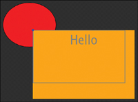
4. Enter a different value for the RenderTransformOrigin attribute. The scene will not change, because the transform’s effect is the same, no matter where its origin is located. The result for a default RenderTransformOrigin is shown in Figure 3.3.
Figure 3.3. TranslateTransform

ScaleTransform
This transform takes a figure and multiplies its size by a factor (bigger or smaller than 1), along the X and/or Y axis. Let’s try a ScaleTransform in our scene now with the following steps, and see the result in Figure 3.4:
1. In SilverlightPad, set the RenderTransformOrigin to ″0.5,0.5″ again.
2. Replace the TranslateTransform with the markup in Listing 3.3. Notice how the ScaleX, respectively ScaleY properties transform the Grid’s apparent size. Notice again how the transform applies to the children too: The TextBlock now looks distorted, because the ScaleX value is not equal to the ScaleY value.
<Grid.RenderTransform>
<ScaleTransform ScaleX=″1.1″
ScaleY=″1.3″ />
</Grid.RenderTransform>
3. Try changing the RenderTransformOrigin to ″0,0″, then to ″1,1″ and observe what the effect is: The figure is scaled relatively to the point of origin! Here also, the point of origin is the only point that is not modified by the transform.
4. Enter a negative value for the ScaleX property. This is probably the most interesting feature of the ScaleTransform: A negative value flips the scene and shows it reversed! This will prove useful when we animate a scene!
5. The ScaleTransform has two additional attributes CenterX and CenterY. These have the same effect as the RenderTransformOrigin. The figure “grows” relatively to the point defined by these two attributes.
Figure 3.4 ScaleTransform with origin in “0,0”
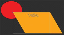
SkewTransform
Skewing an element “bends” the borders of the element, keeping them parallel (remember, the transforms in Silverlight are affine). The following steps present an example (and the result is shown in Figure 3.5):
1. In Listing 3.1, replace the RenderTransform with the markup shown in Listing 3.4:
<Grid.RenderTransform>
<SkewTransform AngleX=″30″ />
</Grid.RenderTransform>
2. As usual, the AngleX (and AngleY) properties are Double, so they can be set to noninteger values and to negative values. Try this in SilverlightPad and observe the effect.
3. Moving the RenderTransformOrigin in different locations modifies the action of the skew. Again, the point of origin is the only point that is not modified by the transform.
4. This transform also has CenterX and CenterY properties. Note that they are slightly confusing: The CenterY affects the AngleX, and the CenterX affects the AngleY. Try different values of CenterY to see what the effect is on the SkewTransform above. Again, remember that CenterX and CenterY are not relative to the dimensions, but absolute!
5. In SilverlightPad, try combining AngleX and AngleY and see how you can “distort” an element using the SkewTransform.
Figure 3.5 SkewTransform with origin in “0,0”
MatrixTransform
The four basic transforms are actually just a convenience, or simplification of the transformation process. An element is always transformed by a 3x3 matrix, looking like this:
M11 |
M21 |
0 |
M12 |
M22 |
0 |
OffsetX |
OffsetY |
1 |
The matrix transformation can be explained in detail with mathematics, but this is not the scope of this book. Fortunately, it’s not really complicated. First a few basics:
The transforms in Silverlight are, as already mentioned a few times, affine. This is a simplification, which is sufficient for most cases. This is the reason why the last column in the preceding matrix is set to “0, 0, 1” and cannot be changed.
If more complex transforms are needed, it is possible to move the points of a shape, causing its appearance to be modified in a non-affine way. But that’s not possible for every type of element! We’ll talk about that in Chapter 11, “Progressing with Animations,” in the section about PointAnimation.
By setting the values M11, M12, M21, M22, OffsetX, and OffsetY, we can reproduce all the transforms we saw in this chapter. These basic transforms are here to make your life easier, but if you need a more complex transform, you can always resort to the MatrixTransform.
If all the values in the matrix’s diagonal are set to 1, the effect is the same as doing nothing at all. So by setting M11 and M22 to ″1″, and all other values to ″0″, you create a void transform.
Let’s create a scene now and transform it. Copy the markup shown in Listing 3.5 in SilverlightPad or KaXaml.
<!--MatrixTransform.xaml - Transform using a Matrix in XAML-->
<Canvas xmlns=″http://schemas.microsoft.com/client/2007″
xmlns:x=″http://schemas.microsoft.com/winfx/2006/xaml″
Width=″640″ Height=″480″>
<Grid Width=″330″ Height=″190″
Background=″Orange″
Canvas.Left=″115″ Canvas.Top=″107″>
<Grid.RenderTransform>
<MatrixTransform>
<MatrixTransform.Matrix>
<Matrix M11=″1″ M12=″0″ OffsetX=″0″
M21=″0″ M22=″1″ OffsetY=″0″ />
</MatrixTransform.Matrix>
</MatrixTransform>
</Grid.RenderTransform>
<TextBlock Text=″Hello″
FontSize=″36″ Foreground=″Gray″
HorizontalAlignment=″Center″ />
</Grid>
<Rectangle Width=″330″ Height=″190″
Stroke=″Gray″
Canvas.Left=″115″
Canvas.Top=″107″ />
</Canvas>
Listing 3.5 creates an orange Grid with a TextBlock in it. The matrix’s values are set to their defaults, so the scene is not transformed (yet). A gray border marks the original location and size of the Grid.
You can experiment more by setting the values M11, M12, OffsetX, M21, M22, and OffsetY to transform the scene. Compose multiple transforms, and try to remember the action of each component.
Composing Transforms
Another way to create complex transforms, next to using a MatrixTransform as in the preceding section, is to compose simple transforms. To do this, we use a TransformGroup. This object is actually also a transform, like all the basic transforms discussed previously, but its purpose is only to group and combine other transforms! Does it make sense? Consider the example shown in Listing 3.6.
<!--TransformGroup.xaml - Composing transforms-->
<Canvas xmlns=″http://schemas.microsoft.com/client/2007″
xmlns:x=″http://schemas.microsoft.com/winfx/2006/xaml″
Width=″640″ Height=″480″>
<Grid Width=″330″ Height=″190″
Background=″Orange″
Canvas.Left=″115″ Canvas.Top=″107″>
<Grid.RenderTransform>
<TransformGroup>
<RotateTransform Angle=″45″ />
<ScaleTransform ScaleX=″1.5″
ScaleY=″0.5″ />
</TransformGroup>
</Grid.RenderTransform>
<TextBlock Text=″Hello″
FontSize=″36″ Foreground=″Gray″
HorizontalAlignment=″Center″/>
</Grid>
<Rectangle Width=″330″ Height=″190″
Stroke=″Gray″
Canvas.Left=″115″ Canvas.Top=″107″ />
</Canvas>
Figure 3.6 shows the effect of composing a RotateTransform and a ScaleTransform. The effects of each transform are added. By using additional transforms, a wide range of effects can be achieved.
Figure 3.6 Composing transforms

Creating a Basic Animation
The animation system is the “flesh” of Silverlight. You just saw how to transform an element and a scene by using static transforms and composing them. The next step is to animate our static scene, and that’s easy using animations.
Just as there are multiple types of transforms, there are multiple types of animations. In fact, there are as many types of animations as there are types of properties to animate. Because so many properties in Silverlight are of type Double, the DoubleAnimation is the one you will use the most. But other types exist, too, and we use some of them later in this chapter. Let’s start with a simple rotating example, shown in Listing 3.7.
<!--Animation.xaml - Animations in XAML-->
<Grid x:Name=″WelcomePanel″
xmlns=″http://schemas.microsoft.com/client/2007″
xmlns:x=″http://schemas.microsoft.com/winfx/2006/xaml″
Background=″#FFFFCA68″ Height=″150″
RenderTransformOrigin=″0.5,0.5″>
<Grid.RenderTransform>
<TransformGroup>
<RotateTransform x:Name=″WelcomeRotateTransform″
Angle=″0″ />
</TransformGroup>
</Grid.RenderTransform>
<Grid.Triggers>
<EventTrigger RoutedEvent=″Grid.Loaded″>
<BeginStoryboard>
<Storyboard RepeatBehavior=″Forever″
AutoReverse=″True″>
<DoubleAnimation Storyboard.TargetName=″WelcomeRotateTransform″
Storyboard.TargetProperty=″Angle″
From=″0″ To=″360″ Duration=″0:0:2″ />
</Storyboard>
</BeginStoryboard>
</EventTrigger>
</Grid.Triggers>
<TextBlock Text=″*** Welcome ***″
FontSize=″72″
HorizontalAlignment=″Center″
VerticalAlignment=″Center″>
<TextBlock.Foreground>
<LinearGradientBrush StartPoint=″0,0.5″ EndPoint=″1,0.5″
x:Name=″ForegroundBrush″>
<GradientStop Color=″Red″ Offset=″0″ />
<GradientStop Color=″Lime″ Offset=″0.5″ />
<GradientStop Color=″Blue″ Offset=″1″ />
</LinearGradientBrush>
</TextBlock.Foreground>
</TextBlock>
</Grid>
As shown in Figure 3.7 the scene contains a Grid with a light-orange background, and a colored TextBlock. The TextBlock’s Foreground is set to a LinearGradientBrush.
Figure 3.7 Scene for animation
Modify the animation’s parameters:
1. If you don’t like it, feel free to change the colors, to add GradientStops, to change the text, and so on.
2. Copy Listing 3.7 in KaXaml. The rotating animation starts automatically as soon as the Grid is loaded.
Understanding the Animation’s Elements
Let’s review the important elements of Listing 3.7:
The Grid.Triggers section defines the way the system reacts to certain events. The EventTrigger is set to ″Grid.Loaded″. This means that the action will be executed when the Grid is fully loaded, and the corresponding event fires.
When the ″Grid.Loaded″ event fires, a Storyboard will begin (that’s what the BeginStoryboard section means). A Storyboard is a collection of animations executed together. In our case, the Storyboard has only one animation (for now).
The Storyboard will never stop, because the RepeatBehavior attribute is set to ″Forever″. Other possible values are ″1x″, ″2x″, ″3x″ (for once, twice, three times, and so on). The default value is ″1x″. Try modifying this attribute to see the difference in KaXaml.
The Storyboard will automatically reverse and the scene will go back to its original state. This is because of the AutoReverse attribute. The default value for this attribute is false, so normally an animation does not reverse!
The DoubleAnimation targets an element named ″WelcomeRotate″. This is the RotateTransform of the light-orange Grid. This is possible, because the animation will only start after the scene is fully loaded, when all the elements have been created already. Note that the TargetName property is an attached property, according to the syntax learned in Chapter 2.
The TargetProperty (another attached property) specifies which property (here, the ″Angle″ property) will be animated. In this case, we named the targeted transform to allow an easy identification. This is not always possible, in which case the TargetProperty will become more complex. You see additional examples and learn more about the TargetProperty syntax later in this book.
The From and To attributes are easy to understand. Note that the From value is not compulsory: If you leave this blank, the scene will simply start in the current state and cycle to the To value.
You can also replace the From and To attributes with the By attribute. The By value specifies by how many units the scene will be modified. From=″0″ To=″360″ can be replaced with By=″360″. Try this in KaXaml!
The Duration specifies the time it takes for the animation to run. Note that if AutoReverse is set to ″True″, the whole animation (one way and back) takes double as much time. The syntax to set the Duration in XAML is DD.HH:MM:SS.mmm with the following meanings:
DD—Days
HH, MM, SS—Hours, minutes, and seconds
mmm—Milliseconds
This is what it takes to make a basic animation. It may sound complex at first, but with time you will grow more comfortable with these parameters, and they will become familiar. Do not hesitate to experiment in KaXaml!
Silverlight knows another kind of animation, using key frames. For example, the equivalent of DoubleAnimation would be DoubleAnimationUsingKeyFrames (long name!). We create key frames animations when we talk about Expression Blend more in detail.
Adding a Scale Animation
Let’s add some movement to our animation with a scaling effect. We want the scene to come from far away and to grow while rotating, before going back into the background. The modifications needed to do this are easy. First, we need something to animate, so add a ScaleTransform to Listing 3.7 with the following steps:
1. In KaXaml, add a ScaleTransform to the TransformGroup section. Note that we start with ScaleX = ScaleY = ″0″. If we don’t animate the scene, we will not see anything, because scaling an element to 0 makes it disappear. The RenderTransform becomes Listing 3.8:
<Grid.RenderTransform>
<TransformGroup>
<RotateTransform x:Name=″WelcomeRotateTransform″
Angle=″0″/>
<ScaleTransform x:Name=″WelcomeScaleTransform″
ScaleX=″0″ ScaleY=″0″ />
</TransformGroup>
</Grid.RenderTransform>
2. Then add the following animations to the Storyboard. Simply add the markup under the existing DoubleAnimation (the one targeting the RotateTransform named ″WelcomeRotateTransform″). Note that there are two properties to animate (ScaleX and ScaleY), so there are two animations shown in Listing 3.9!
<DoubleAnimation
Storyboard.TargetName=″WelcomeScaleTransform″
Storyboard.TargetProperty=″ScaleX″
From=″0″ To=″1″ Duration=″0:0:3″/>
<DoubleAnimation
Storyboard.TargetName=″WelcomeScaleTransform″
Storyboard.TargetProperty=″ScaleY″
From=″0″ To=″1″ Duration=″0:0:3″/>
3. After you make the changes, the animation should start automatically in KaXaml.
4. Notice how the rotation takes 2 seconds, while the scaling animation lasts 3 seconds all together. Also notice how well the animations are coordinated: After the animation reverses, the rotation starts with a 1-second delay. This works because all the animations are placed in the same Storyboard, which synchronizes the animations, and because the AutoReverse and RepeatBehavior attributes are placed on the Storyboard and not on each animation separately.
5. To understand the previous point better, try to remove the AutoReverse and RepeatBehavior from the Storyboard, and add them on each animation instead. The animations run and revert independently from each other.
Using Other Types of Animations
Transforms are not the only things you can animate in Silverlight. In fact, you can animate a lot of properties, as long as they are dependency properties (DP). This special type of property is registered with the Silverlight framework. DPs are useful in Silverlight, not only because they can be animated, but also because they enable other useful features such as data binding.
In this section, we add two animations to the scene we are creating. First, we want to introduce a smoother effect by fading the scene in and out. An element (and its children) can be made transparent using the Opacity property, which takes a Double value from 0 (0%, fully transparent) to 1 (100%, fully visible). Smooth transitions are trendy at the moment, especially in Windows Vista where pretty much all transitions use fade in and fade out to create a better user experience. Follow the steps:
1. Add the animation in Listing 3.10 to the Storyboard:
<DoubleAnimation
Storyboard.TargetName=″WelcomePanel″
Storyboard.TargetProperty=″Opacity″
From=″0″ To=″1″ Duration=″0:0:3″/>
2. Wait for KaXaml to parse the XAML markup and start the new smooth animation.
Eventually, we will add a shiny effect at the end of the animation, when the scene is fully expanded. We will target the various gradients of the LinearGradientBrush with a ColorAnimation. That’s right, you can also animate colors!
To start the color animation when the TextBlock is at its biggest size, we will delay the start of that specific animation using the BeginTime property. It uses the same syntax as Duration (DD.HH:MM:SS.mmm). Follow these steps:
1. Add the animations in Listing 3.11 to the Storyboard. They target specifically the outer gradient stops of the brush. After you add the animations, wait and observe the result.
<ColorAnimation
Storyboard.TargetName=″ForegroundBrush″
Storyboard.TargetProperty=″(GradientBrush.GradientStops)[0]
.(GradientStop.Color)″
BeginTime=″0:0:3″ Duration=″0:0:0.100″ To=″Lime″/>
<ColorAnimation
Storyboard.TargetName=″ForegroundBrush″
Storyboard.TargetProperty=″(GradientBrush.GradientStops)[2]
.(GradientStop.Color)″
BeginTime=″0:0:3″ Duration=″0:0:0.100″ To=″Lime″/>
2. The two animations are similar. But because they target different properties, we need both. The most difficult part to understand is the TargetProperty. As we mentioned earlier, this attribute can sometimes be complex. The system needs to find the property it will animate, starting from a given element. This is what the property path syntax does.
Navigating the Property Path
Until now, we used only simple property paths, for example ″Angle″ or ″ScaleX″. Here, we need something more complex. We start from the LinearGradientBrush, identified by the name ″ForegroundBrush″. From there, we navigate to the (GradientBrush.GradientStops). This is a collection of GradientStops. In the first animation, we target the first stop. This is what the index [0] means.
Once we have the first GradientStop, we target the Color property. This is what (GradientStop.Color) means.
The full property path is
(GradientBrush.GradientStops)[0].(GradientStop.Color)
To avoid having too long lines of markup, the path is broken in two lines. This is perfectly legal and allowed in XML (and XAML). The line-break and the white spaces are simply ignored.
The second ColorAnimation does the same, but it targets the last GradientStop of the collection. This is the third stop, so it is located at the index [2]. The GradientStop in the middle (the one with the index [1]) remains untouched: It is Lime already!
Deploying the Scene to a Web Page
To show your work to your friends and family, you need to deploy the application to a web server and place the scene on a web page. This is how Silverlight works, remember: We don’t create standalone applications, but applications embedded in a web page.
You learn how to deploy XAML and other Silverlight applications in Chapter 7, “Deploying to a Web Page.” It involves setting up a web server and creating (or modifying) an HTML page. In the meantime, have patience, and show off your work in KaXaml!
Summary
Without writing one single line of C# or JavaScript code, we were able to create an animated scene, using a combination of transforms, animations, fade in and out, and color effects to bring life into our static scenes.
Transforms and animations are probably two of the most exciting features of Silverlight (and of WPF). With just a few lines of XAML markup, it is possible to create effects that would have taken pages of code in classic technologies (or that would not even have been possible at all). Do not hesitate to experiment more in KaXaml and to explore what the combinations of attributes do to change the scene. You will use this new knowledge a lot in future chapters, when we build applications.