
Chapter 6 Blending a Little More
In This Chapter
We already learned to know Expression Blend as a creative tool allowing us to design, compile, and run Silverlight (and WPF) applications. Later we will use this tool in collaboration with Visual Studio (for the source code), but for now we will continue to create XAML markup visually in Blend.
Creating Transforms
We studied the transforms available in Silverlight in Chapter 3, “Playing with XAML Transforms and Animations,” and saw how to apply them to UI elements. Using Blend, it is easy to create all these transforms using the following steps:
1. Create a new Silverlight 2 Application project in Expression Blend.
2. Add a rectangle in the visual designer, and change its color and borders to make it look colorful.
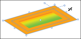
3. Make sure that the rectangle is selected. Place the mouse cursor next to one of its corners, and observe how it changes to a “rotate” cursor. Click and drag to rotate the rectangle.
4. Place the mouse on the small white dot located in the center of the rectangle. The cursor changes into a cross. You can move the point to another location. This is the RenderTransformOrigin point we saw in Chapter 3. Move it to a different location and try rotating the rectangle again.
5. Now place the cursor next to the point in the middle of the rectangle’s short side. See how the cursor changes to a “skew” symbol. By clicking and dragging along the side of the rectangle, you apply a SkewTransform.
6. Since we’re talking about the small decorations (called adorners; see Figure 6.1) placed around the rectangle, see what happens when you select the small dot at the end of a scattered line near the rectangle’s angle: This will round the corners. You can also set the values in the Properties panel, using the RadiusX and RadiusY properties under the Appearance category. (It’s not strictly speaking a transform, so forgive me for placing it in this part of the text.)
Figure 6.1 Adorners and SkewTransform cursor
You can also create more transforms using the Properties panel by following these steps:
1. In the Properties panel, click on the Transform category to expand it if needed.
2. See all the transforms we studied in Chapter 3 (except the matrix transform, which Blend cannot handle!). Try to play with the various transforms to see the effect on the rectangle.
3. Notice how the last tab, Flip, uses transforms to change the rectangle’s aspect.
When you create a simple transform in Expression Blend, the tool creates a TransformGroup in XAML, and sets all the basic transforms to their default values. This produces more XAML markup than needed, but this markup may safely be removed manually if you want.
Creating an OpacityMask
Brushes can be used for a variety of effects: backgrounds, foregrounds, fills (for shapes), strokes, and so on. There is an additional effect that we haven’t studied yet: OpacityMask.
We saw already how an element’s Opacity property can be used to make it (fully or partially) transparent. This setting applies to the whole element (and its children). But sometimes, you want to define an element’s opacity following a certain pattern. This is where OpacityMask can be useful, with the following steps:
1. In Expression Blend, create a new project (Silverlight 2 Application).
2. Make the LayoutRoot’s background a plain yellow.
3. Create a blue ellipse.
4. Create a Grid next to the ellipse, overlapping it; set its Background property to a plain Red.
5. In the Grid, add a TextBlock. You can select the TextBlock tool and draw on the Grid. Alternatively, you can double-click on the Grid in the Objects and Timeline category until it gets a yellow border. Then you can double-click the TextBlock tool.
6. Set the TextBlock’s Text property to Hello and its HorizontalAlignment property to Center.
7. Set the TextBlock’s font to 48, and its Foreground property to Orange.
8. Select the Grid, and then its OpacityMask property. For the moment, it is set to No brush.
9. Select the Gradient brush tab.
10. In the gradient bar, select the left gradient and set its Alpha channel to 0%. This creates the result shown in Figure 6.2. Note that even though OpacityMask is a brush, the colors you define will be ignored, and only the Alpha channel matters.
Figure 6.2 Grid with linear OpacityMask
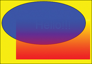
Just like the Opacity property, an OpacityMask applies to the element and its children! The TextBlock we added to the Grid is also changed by the OpacityMask.
By adding gradient stops to the gradient slider, or by moving them, you can achieve different effects. Also, don’t forget the Brush Transform tool in the toolbar, to change the orientation of the gradient (we worked with this tool in Chapter 4, “Expressing Yourself with Expression Blend,” in the section “Changing the Gradient Vector”).
For some elements, it can be interesting to use a RadialGradientBrush instead of a LinearGradientBrush for the OpacityMask. Try it:
1. Select the red Grid. Make sure that the OpacityMask property is selected.
2. Using the small buttons under the gradient bar, select the Radial gradient.
3. Now the center of the Grid is transparent, and you can see all the way down to the blue ellipse. The edges of the Grid are opaque.
4. Here also, you can change the aspect of the mask by using the brush transform tool, or by adding or moving gradient stops in the gradient slider (see Figure 6.3).
Figure 6.3 Grid with radial OpacityMask

We will reuse this scene in the next chapter, so make sure that you save your project carefully!
Using Paths
After you’re finished playing with ellipses and rectangles, you will likely feel the need for more. Thankfully, we are not limited to these two primitives, but using drawing tools like Expression Design and Expression Blend, we can create any shape we want in XAML, and use them in Silverlight.
Creating a Path from Scratch
In Blend, paths are created using the Pen tool (P) or the Pencil tool (Y), as shown in Figure 6.4. Both tools are available in the tool group in the eighth button from the top in the toolbar.
Figure 6.4 Pen and Pencil tools
You can draw a path with the following steps:
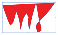
1. Select the Pencil tool, and draw freehand on the page. Alternatively, you can use the Pen tool to create polygons.
2. Using the color picker, set the Fill color to Red. See how the Fill is disposed, to cover all the inner areas of Figure 6.5.
Figure 6.5 Freehand path with Solid Color Fill
3. Select the Pen tool in the toolbar. Notice how additional “markers” appear along the path. These are the anchor points defining the shape.
4. With the Pen tool selected, move the cursor near an anchor point. Notice how the Pen cursor changes depending on whether you are passing over an anchor point, next to it, or on the path or not.
Blend offers many ways to modify a path by adding, removing, or moving anchor points, and by changing curves. These operations are triggered by a combination of the tool chosen, the position of the mouse, and keyboard shortcuts. A complete list of all the possible operations is given in Expression Blend help, available by selecting Help, Keyboard Shortcuts from the menu, and then choosing the hyperlink titled Pen and selection shortcuts in Expression Blend.
Using Splines to Modify a Path
Drawing freehand shapes is difficult, especially if you don’t have a graphic tablet. It is easier to start with one or more paths, and to modify them, for example with the following steps:
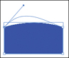
1. Delete everything and then draw a rectangle on the screen.
2. From the menu select Object, Path, Convert to Path. This turns the Rectangle object into a Path object. This command is also available for ellipses.
3. Select the Pen tool from the toolbar.
4. Place the cursor on one of the rectangular path’s long sides, and press the Alt key. This turns the cursor into the Convert Segment cursor.
5. Click and drag the long side and see how it turns into a curve.
6. Click on the Direct Selection tool (A) in the toolbar. Use this tool to click and drag the tangent anchored on the corner point (see Figure 6.6).
Figure 6.6 Tangent and spline
Combining Shapes
Sometimes, you want to use existing paths and combine them to create a more complex one. The steps below show you how.
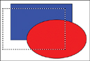
1. Delete everything on the screen and draw a blue rectangle. Then draw a red ellipse overlapping the rectangle.
2. Select both paths. You can do this either by selecting the two paths with the Shift key pressed, or with the Ctrl key pressed, or by clicking anywhere on the LayoutRoot grid (outside a path) and dragging the selection rubber band to touch both the rectangle and the ellipse (see Figure 6.7).
Figure 6.7 Selection rubber band
3. From the menu select Object, Combine to make one single path out of the rectangle and the ellipse. As you see, you have the following options: Unite, Divide, Intersect, Subtract, and Exclude Overlap.
4. Select Unite from the menu and see the result. Then press Ctrl+Z to undo the last operation, and try all the other possibilities. Notice how the unified shape takes the color of the last element you select (either the blue rectangle, or the red ellipse).
5. From the menu select Object, Path, Release Compound Path. This splits the combined path into two objects, as shown in Figure 6.8.
Figure 6.8 Two shapes—Exclude Overlap and Release Compound Path

Clipping Path
When we started talking about Silverlight, we mentioned an exciting feature: It is possible to create nonsquare areas, so that not only the visual but also the hit test area is nonsquare. This allows you to easily create nonsquare controls.
The support for nonsquare shapes is extensive, and it is actually possible to give any shape to any element, even images and videos! This amazing feat is accomplished using clipping paths. Follow these steps.
1. Set LayoutRoot’s color to yellow.
2. In Blend, in the Project panel, right-click on the project file (the one directly under the solution) and select Add Existing Item.
3. Use the File Explorer to select a WMV file on your disk. If you don’t have a WMV file available, you can download one from www.galasoft.ch/SL2U/Chapter05.
4. Drag the movie from the Project panel to the LayoutRoot grid. This creates a new MediaElement. Alternatively, use the method we mentioned in Chapter 5, “Using Media,” in the section titled “Adding Video.” Position this new element on the grid and size it.
5. Make sure that the MediaElement is selected and set the Cursor property to Hand.
6. Use the shape created previously (refer to Figure 6.8) and place it on the MediaElement. You may need to change the order of the elements in the Objects and Timeline category so that it appears on top of the MediaElement, and you may need to resize it.
7. Make sure that both the MediaElement and the shape are selected. Then from the menu select Object, Path, Make Clipping Path.
8. Run the project in the web browser by pressing F5 (see Figure 6.9).
Figure 6.9 MediaElement with clipping path

Notice how the clipping path modifies even a video element. The underlying LayoutRoot is visible in the excluded overlap, and the cursor only turns to a Hand when it is on the visible video. The hit test area follows the shape exactly, and if you click on an excluded area, you will effectively click on the element underneath.
The ability to modify not only an element’s shape, but also its hit test area opens the door to creativity without any limits. Any XAML shape can be turned into a movie screen. Later we will see how we can use templates to create controls (buttons, check boxes, and so on) from scratch. Here too, we can use paths to shape the control and blend it in the environment.
Paths in XAML
In XAML, paths are created with a specific notation named Path Markup Syntax. An example of the Path Markup Syntax can easily be seen in Blend with the following steps:
1. Right-click on the clipped MediaElement created in the previous section and select View XAML.
2. In the XAML editor, scroll until you see a property named Clip, which contains an apparently incoherent suite of numbers and letters. In fact, this is a code, which translates the visual path into a text form. This is called the Path Mini Language.
Explaining this notation is outside the scope of this book, but more details can be found at http://msdn2.microsoft.com/en-us/library/bb412389.aspx.
Grouping Controls
Often, when you design an application, you suddenly realize that some components belong together. You may want to move them together, resize the group, and so on. Other times, you want to duplicate a group of controls and copy the group multiple times in your application, with just minor changes. Blend can assist you in these tasks and make them easier.
Grouping Elements
Every good drawing application allows grouping elements together. In Blend, you can do this too but remember that we don’t draw a static picture, we create XAML markup. Grouping elements modifies the markup too, as shown in the following steps:
1. Create a new Silverlight 2 Application in Blend.
2. Create a few elements on the screen (rectangle, ellipse, path, button, and so on).
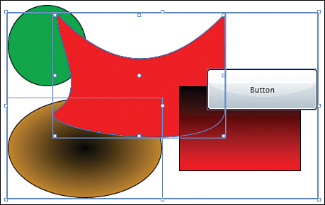
3. Select some of the elements by pressing the Ctrl key and clicking on the ones you want to group. Make sure to leave some elements unselected.
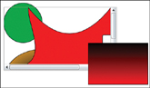
4. In the scene shown in Figure 6.10, the black-orange ellipse, the red path, and the button are selected. The two other elements are not part of the selection.
Figure 6.10 Scene with paths and button
5. Once done, from the menu select Object, Group Into, Grid.
6. The three elements selected are now part of a new Grid, as shown in Figure 6.11, which was inserted in the tree (see the Objects and Timeline category).
Figure 6.11 Elements grouped into a Grid
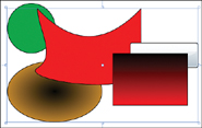
Notice how the Button now appears under the black-red rectangle. This is because the Grid is inserted between the green circle and the black-red rectangle. Thus the Z-Index of the Button is now the highest within the Grid but lower than the black-red rectangle’s Z-Index.
1. Select the bottom-right corner of the selected Grid containing the three grouped elements, and resize it.
2. Then move the group to another location (see Figure 6.12).
Figure 6.12 Resized group
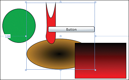
The three elements now act as a group, and can get resized or moved together. If you resize the group too small, some elements may disappear out of sight!
Trying Other Panels
When choosing Object, Group Into from the menu, you can select different types of panels. For example, selecting a StackPanel will stack the three elements above each other, creating a very different effect. We will study all the panels and their features in Chapter 15, “Digging into Silverlight Elements.”
One useful choice is the ScrollViewer. If a scene is too big for a given area, the ScrollViewer can host it and will display horizontal and/or vertical scrollbars if needed for example with the following steps:
1. Press Ctrl+Z a few times until you restore the scene as it was in Figure 6.10.
2. Now choose Object, Group Into, ScrollViewer from the menu.
By default, only the vertical scrollbar appears. The horizontal one is disabled. You can enable it by selecting the ScrollViewer and then setting the property HorizontalScrollBarVisibility to Visible (it is located under the Miscellaneous section).
3. If you now resize the ScrollViewer, the scene contained into it doesn’t get resized, but the scrollbars will appear.
4. Try enabling and disabling the scrollbars, and resizing the scene to understand how the ScrollViewer reacts to resizing.
5. Finally, run the application and use the scrollbars to scroll the scene (see Figure 6.13).
Figure 6.13 Scene with ScrollViewer
Scrolling the Thumbnails
Remember our Thumbnails application? We have four thumbnailed media elements into a StackPanel. If you run that application and resize the web browser to a small width, the thumbnails on the bottom will disappear. One solution to that problem is to set them into a ScrollViewer with the following steps:
1. Open the Thumbnails application into Expression Blend.
2. In the Objects and Timeline category, select the StackPanel containing the four Borders.
3. Right-click on the StackPanel in the Objects and Timeline category.
4. Select Group into, ScrollViewer from the menu. Technically, we didn’t “group” anything, since we have only one element. This is just a convenient way to insert a ScrollViewer in the scene.
5. When the logical tree gets modified, Blend often modifies the layout properties. Select the ScrollViewer, and in the Properties panel, make sure that the Margin is set to 0,0,0,0. The Width and Height should be Auto. The Column should be 1 and the RowSpan should be 2. The HorizontalAlignment and VerticalAlignment properties should be set to Stretch.
6. Under the Layout category, expand the advanced properties and check that the HorizontalScrollBarVisibility is Disabled and the VerticalScrollBarVisibility is Visible (this is the default).
7. Finally, reset the StackPanel’s Height to Auto. Leave its Width set to 170.
8. Run the application and resize the browser window to be less high than the four thumbnails; notice how the vertical scrollbar can be used to scroll if needed.
Making a User Control
Grouping elements into a panel is a nice feature, but it doesn’t cover all scenarios. Sometimes, you want to reuse a group of elements in your application. Granted, you could simply copy/paste the group of elements. But this is not satisfactory if the group contains a great number of elements. Also, the instances of this group may vary slightly in their behavior. It would be nice if each instance of the group could get a code-behind file to give some “intelligence” to the group. This is what a UserControl does.
In Silverlight 2, each Silverlight application’s top container is in fact a UserControl. This provides a nice model throughout the Silverlight application: A main UserControl contains XAML elements and other controls. We talk more about user controls and other types of controls in Chapter 19, “Creating User Controls and Custom Controls.” In this section here, we study the automatism that Blend provides to create a new user control.
Creating a User Control
With the following steps, we will build a control named a SpinButton, and then use it to build a basic (and nonfunctional) date picker, composed of three such SpinButtons.
1. Create a new Silverlight 2 Application in Blend and name it DatePickerControl.
2. Copy the Grid in Listing 6.1 inside the top UserControl container. This creates the scene shown in Figure 6.14.
<!--Page.xaml - SpinButton and DatePicker-->
<Grid x:Name=″LayoutRoot″>
<Grid.RowDefinitions>
<RowDefinition Height=″25″ />
<RowDefinition Height=″*″ />
</Grid.RowDefinitions>
<Grid.ColumnDefinitions>
<ColumnDefinition Width=″75″ />
<ColumnDefinition Width=″75″ />
<ColumnDefinition Width=″75″ />
<ColumnDefinition Width=″*″ />
</Grid.ColumnDefinitions>
<!--Spin Button Basis-->
<Border HorizontalAlignment=″Stretch″ VerticalAlignment=″Stretch″>
<Grid>
<Grid.RowDefinitions>
<RowDefinition Height=″0.5*″ />
<RowDefinition Height=″0.5*″ />
</Grid.RowDefinitions>
<Grid.ColumnDefinitions>
<ColumnDefinition Width=″*″ />
<ColumnDefinition Width=″20″ />
</Grid.ColumnDefinitions>
<Button Grid.Column=″1″ Cursor=″Hand″ />
<Button Grid.Column=″1″ Grid.Row=″1″ Cursor=″Hand″ />
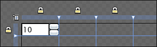
<TextBox Grid.RowSpan=″2″ Text="10″ FontSize=″14″ />
</Grid>
</Border>
</Grid>
Figure 6.14 SpinButton
3. Select the Border immediately under LayoutRoot in the Objects and Timeline category.
4. From the menu select Tools, Make Control or press the F8 key.
5. In the Make Control dialog, enter the name SpinButton. The Leave Original Content check box should be unchecked.
This creates two new files: SpinButton.xaml and SpinButton.xaml.cs. Additionally, a new instance of the SpinButton control is placed instead of the Border we had previously. The SpinButton will need some code to work. In the current implementation, nothing happens when you click on the Up or Down buttons. However, we don’t know how to write this code yet and will not implement the functionality.
Using the User Control
Now we will use our SpinButton to create an additional control with the following steps:
1. Open Page.xaml and open the Asset Library by pressing the corresponding button (it is the lowest button in the toolbar).
The Asset Library (see Figure 6.15) contains all the controls that you can use in Silverlight 2, including those that we know already: all the panels, the TextBlock, the TextBox, the Button, and so on.
2. Click on the Custom Controls tab. This tab contains all the controls that you create yourself (in addition to the top Page).
Figure 6.15 Asset Library
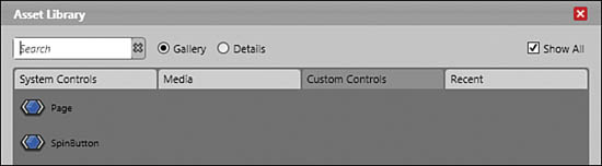
3. Select the SpinButton. This places the corresponding tool in the toolbar, just above the Asset Library button.
4. Make sure that LayoutRoot is selected with a yellow border; then double-click twice on the SpinButton tool. This adds two new controls to the Grid.
5. In the Objects and Timeline category, select the second SpinButton in the tree. In the Properties panel, set the Column to 1, and if needed reset the HorizontalAlignment and VerticalAlignment to Stretch.
6. Do the same with the third SpinButton, but this time set the Column to 2.
You now have all three SpinButton instances neatly lined up.
7. Finally, select all three SpinButtons, and choose Tools, Make Control from the menu. Name the new control DatePicker.
After saving, selecting Page.xaml and having rebuilt the application, you see now only one control in LayoutRoot, and this control is named DatePicker. Notice also how its ColumnSpan property is set to 3 (meaning that the control is spread over there columns) to replace the layout we had before we created that control.
Working on the Thumbnails Gallery
We are going to reuse what we learned to enhance our Thumbnails gallery with additional features. In Blend, open the Thumbnails project again.
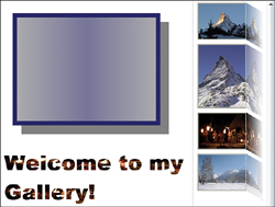
Adding a Display Frame
We will use this display frame only in Chapter 10, “Progressing with .NET,” but let’s add it already with the following steps.
1. Open the file Page.xaml in the XAML editor.
2. Copy the XAML markup in Listing 6.2 into the main Grid, at the very end, after the StackPanel containing the TextBlocks. Make sure that this markup is inside the LayoutRoot.
<Grid Width=″340″ Height=″260″ Margin=″30,30,0,0″
VerticalAlignment=″Top″ HorizontalAlignment=″Left″>
<Rectangle Fill=″#FF000000″ Opacity=″0.5″ Margin=″20,20,-20,-20″ />
<Rectangle Fill=″#FF000A70″ />
<Rectangle x:Name=″DisplayBackground″ Margin=″10,10,10,10″>
<Rectangle.Fill>
<LinearGradientBrush StartPoint=″0,0.5″ EndPoint=″1,0.5″>
<GradientStop Color=″#FFABABAF″ Offset=″0″ />
<GradientStop Color=″#FFABABAF″ Offset=″1″ />
<GradientStop Color=″#FF767499″ Offset=″0.5″ />
</LinearGradientBrush>
</Rectangle.Fill>
</Rectangle>
<Rectangle x:Name=″Display″ Margin=″10,10,10,10″ Fill=″Transparent″ />
</Grid>
 We add a shadow under the display frame. This is done by placing a rectangle in the
 Grid, behind all other elements (that’s the first rectangle). We set its background to black, its opacity to 50%, and then we use margins to move it down and to the right. Note that if an element has negative margins, parts of it will appear out of its parent container.
We will display the expanded thumbnails in the Display rectangle. Note that it is fully transparent for the moment.
Right underneath it, we place a background rectangle, which will be visible if no media is displayed, or if the expanded media is smaller than the whole frame (for example for narrow pictures). Note the LinearGradientBrush used for this rectangle’s Fill.
Adding a Reflection under the Thumbnails
Now that we know how to use VideoBrush and ImageBrush (studied in Chapter 5), transforms (studied in Chapter 3), and the OpacityMask (studied earlier in this chapter), we have all we need to make a cool reflection effect next to our Thumbnails with the following steps:
1. In the Objects and Timeline category, select the first of the four Borders containing the thumbnailed media.
2. Right-click and choose Group Into, Grid.
3. Select the newly created Grid around the Border, and reset the Width and Height to Auto. Make sure that HorizontalAlignment and VerticalAlignment are both set to Stretch. Then set the Margin to 10 (left), 10 (right), 5 (top) and 5 (bottom).
4. Double-click on the Grid until it is surrounded by a yellow border. Make sure that this Grid is in Grid layout mode (refer to Figure 5.7).
5. In the toolbar, make sure that the Selection tool is selected. Then pass the mouse on the light blue border on top of the Grid. Using the orange vertical line that appears, create a column at approximately two-thirds of the Grid’s width as shown in Figure 6.16. Do not worry if this messes up the layout somehow. We will take care of this in a moment.
Figure 6.16 Creating a column
6. Click just next to the small lock on the left and set its width to 0.75 Star (this is 75% of the whole width). Then set the second column to 0.25 Star.
7. In the Objects and Timeline category, expand the Grid you just created and select the Border it contains.
8. Make sure that the Column is set to 0 (the first column); reset the ColumnSpan to 1 and the Margin to “0,0,0,0”. The layout should look better again now.
9. With the small Grid still selected with a yellow border, add a Border to it and use the Properties panel to place it in Column 1 (the second column). Reset its Width and Height to Auto and its Margin to “0,0,0,0”.
10. Double-click on that new Border to select it with a yellow border and add a Rectangle to it. Again, set its Width and Height to Auto, Margin to “0,0,0,0", HorizontalAlignment and VerticalAlignment to Stretch.
11. Open the Designer in Split mode by clicking on the small tab on top-right of the Designer panel.
12. In the Objects and Timeline category, select the Rectangle you just added. The XAML markup of this rectangle is now shown in the XAML panel.
13. Replace this Rectangle with the markup in Listing 6.3:
<Rectangle>
<Rectangle.Fill>
<ImageBrush ImageSource=″pic1.png″/>
</Rectangle.Fill>
</Rectangle>
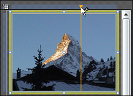
You should now see a smaller Matterhorn directly next to the bigger thumbnail. We will now transform it to make it look like a reflection.
14. Now we want to flip the reflection rectangle. Make sure that it is selected in the Objects and Timeline category (not the Border, but the Rectangle!).
15. In the Transform category (in the Properties panel), select the rightmost tab, Flip, and then use the corresponding button to flip along the X axis.
16. We will now use the OpacityMask to make this reflection look more real: Select the Rectangle’s OpacityMask property, and click on Gradient brush.
17. The new gradient brush is oriented from top to bottom. Use the Brush Transform tool (G) to rotate the gradient so that it points from left to right.
18. In the gradient bar, set the right gradient stop’s Alpha channel to 0%.
19. Set the left gradient stop’s Alpha channel to 90%. If needed, move the gradient stops, or use the Brush Transform tool to make the reflection look more real.
Finally, we will “skew” the reflection. This way it will look as if it is reflecting on a nonflat surface. Follow these steps:
20. Select the Border containing the reflection.
21. Find the Skew transform and set the Y angle to 30.
22. In the Properties panel, locate the RenderTransformOrigin property (under the Miscellaneous category) and reset it to “0,0”. This is the top-left corner, the corner that should remain unchanged by our transform.
The next picture is going to stand in front of the reflection, somehow breaking the effect. This is why you will take care of repeating the steps for all the images.
Reflecting Video
Using the same steps, but replacing the ImageBrush with a VideoBrush, you can add a reflection effect under the video thumbnail. The reflection will play when the original media element plays too. That’s a rather impressive effect!
Execute steps 2 to 13 in the preceding list of steps for the third Border, containing the video.
Then, enter the markup in Listing 6.4 for the rectangle:
<Rectangle>
<Rectangle.Fill>
<VideoBrush SourceName=″Media2″/>
</Rectangle.Fill>
</Rectangle>
Then, execute steps 14 to 22.
To see your changes, press F5 in Blend. Make sure that you click on the video thumbnail to start the video and see the video reflection!!
Just One Last Thing
When you run the application and resize the browser window to test the scrolling, you’ll see that the last reflection is cut on the bottom side. This is because the “skewed” reflection does not count when the total height of the StackPanel is computed. The reflection is outside its normal boundaries.
To avoid cutting the last reflection, we can simply add a margin on the bottom side of the StackPanel containing the thumbnails with the following steps.
1. In the Objects and Timeline category, select that StackPanel (inside the ScrollViewer).
2. Set the bottom Margin to 60.
3. Run the application again. The reflection should now appear uncut (see Figure 6.17).
Figure 6.17 Video and image reflections
Summary
In this chapter, we built on our basic knowledge of Expression Blend and expanded it to create advanced graphics effects and animations. We saw how the tool can make the programmer’s life easier by supporting us when we create complicated XAML markup visually.