
Chapter 16 Digging Deeper into Silverlight Elements
In This Chapter
Let’s continue our exploration of Silverlight elements. After discovering the features of panels and shapes, we now talk about controls.
When Silverlight 1 was released, it didn’t include any controls except the most simple one: TextBlock. To build a Button or any other interactive control, you had to use shapes and handle the mouse events. This is the reason why Silverlight video players shipped with Expression Blend are not using any controls (except, yes, TextBlock).
With Silverlight 2, on the other hand, we get a wealth of controls. Some are basic building blocks for your application, but others are sophisticated. This chapter is not a reference, so not all the properties, events, and methods are explained in detail. The SDK documentation will help you there. This chapter gives you a good insight on most of the controls included in Silverlight 2.
Understanding the Control Class
The Control class derives directly from FrameworkElement, which ensures a nice transition from the previous chapter! In addition to visual states and templates, a Control has a set of methods that will apply to all its descendants:
 A
A Control can be “focused,” which means that it gets the keyboard’s attention.
Typically, the focus is being passed to a Control by pressing the Tab key, but you can also give the focus programmatically by using the Focus method.
You can find out whether a Control has the focus by using the IsFocused property.
You can also specify in which order the controls will get the focus by using the IsTabStop and the TabIndex properties.
A Control’s look can be modified by using a set of properties such as Background, BorderBrush, BorderThickness, and all the font properties (we’ll talk more about them in just a minute).
A Control’s content can be aligned using the HorizontalContentAlignment (see Figure 16.1) and VerticalContentAlignment properties. These properties can take the value Left, Center, Right, or Stretch (meaning that the content will occupy the whole space within the control).
Figure 16.1 HorizontalContentAlignment
A Control ’s appearance can be totally changed using a template and a collection of states. The class has a set of methods to help you in handling those. We describe this in Chapter 17, “Using Resources, Styling and Templating” and also Chapter 19, “Creating User Controls and Custom Controls.’
Enabling and Disabling Controls
Depending on the state of your application, it can be necessary to disable some of the controls. For example, if your application displays a collection of pictures, the button Next Picture shouldn’t be active when the last picture is displayed.
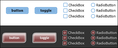
Some controls (but not all) have a property named IsEnabled. Its default value is true. By setting it to false, you prevent any activation of the control by the user. A slightly different style is used when the control is disabled, to inform the user (see Figure 16.2).
Figure 16.2 Enabled and disabled Button and CheckBox

Styling and Templating Controls
One fascinating feature of Silverlight (and Windows Presentation Foundation) is the ability to modify a control’s appearance without changing its functionality. This is done using a combination of styles and templates. We talk about this in Chapters 17 and 19, but as a preparation, take a look at Corrina Barber’s control templates for Silverlight at http://blogs.msdn.com/corrinab/archive/2008/06/16/8602865.aspx.
By redrawing the controls, but keeping their core functionality untouched, it is possible to create skins for your application—that is, a set of styles and templates that redefine the looks of your application (see Figure 16.3).
Figure 16.3 Flat skin and Red skin
About Fonts
The default font for all controls is called Portable User Interface. It is in fact a composite font based on the Lucida font, and on other East Asian fonts. You can set any of the following fonts, and they will automatically be supported by Silverlight: Arial, Comic Sans MS, Courier New, Georgia, Lucida, Times New Roman, Trebuchet MS, Verdana and Webdings.
If you want another font, you must include it in the XAP file for download. We see how to do that in Chapter 17.
Discovering Basic Controls
Let’s talk shortly about the most basic Silverlight controls. We actually used some of them in previous chapters, so we are already familiar with some of their features.
Presenting and Inputting Text
The most basic interaction between an application and the user is text. The application will output information, and the user will input data if needed. This section talks about these controls that may seem basic at first, but are in fact quite sophisticated.
TextBlock
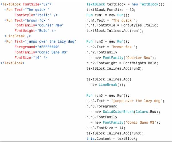
TextBlock is the most basic of all controls and fulfills only one goal: presenting text to the user. Note that even this simple control can display complex content: By adding inline elements such as instances of Run or LineBreak, you can structure your text. Each Run instance can have a different font setting! We test this with the code in Table 16.1. You can copy the markup inside the LayoutRoot Grid, or copy the C# code inside the Page constructor, after the call to InitializeComponent, and run the application.
Table 16.1 TextBlock in XAML and in Code
If you want your TextBlock to automatically wrap when its container becomes too small, set the property TextWrapping to Wrap. Note that even though the default value for this property is NoWrap, Expression Blend automatically sets it to Wrap when you add a new TextBlock.
TextBox
The TextBox is used whenever the user must enter text into the application. Note that unlike HTML, there is only one control for that purpose, but it can accept multiline input (like the HTML textarea control) by using the AcceptsReturn property.
In multiline mode, it might make sense to display scrollbars. These are controlled by the two properties HorizontalScrollBarVisibility and VerticalScrollBarVisibility, which we know from our study of the ScrollViewer in Chapter 15, “Digging into Silverlight Elements.”
Other properties that we studied for the TextBlock also apply here, for example, TextWrapping, FontFamily, FontSize, FontWeight, and so on.
The property IsReadOnly is useful if you want to allow the application’s user to copy some text, but not to modify it.
To find out which text the user selected, use the properties SelectionStart and SelectionLength in code. These two indexes can be used together with the method Substring on the Text property of the TextBox.
string selectedText = textBox.Text.Substring(textBox.SelectionStart,
textBox.SelectionLength);
Discovering the ButtonBase
What do a Button, Checkbox, and RadioButton have in common? When you click on them something happens. This is enough to make them share a base class: the ButtonBase.
This class defines one important event: the Click event. By handling this event, you define what the reaction of the application must be.
ButtonBase derives from ContentControl. All subclasses get a Content property that is of type object. You can store anything in the Content property, for example, a string (which will become the text of the control), but also an image, any control, or even a panel containing other controls.
You can use the property ClickMode to define when the Click event must be raised: Press raises the event when the mouse is pressed down, Release when it is not pressed anymore, and Hover when the mouse just passes over the control.
Other properties help you to find out what the state of the button is—for example, IsFocused, IsPressed, IsMouseOver. Like all the properties starting with the Is prefix, these are boolean values.
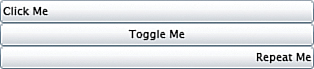
Button, HyperlinkButton, RepeatButton, and ToggleButton
Let’s talk about four important controls deriving from ButtonBase and thus sharing its functionality:
A Button is pretty obvious. Click it and something happens. To specify what, handle the Click event. It’s as simple as can be.
The HyperlinkButton looks just like an HTML hyperlink. You can also simulate this by using a TextBlock and handling its events. However, using the HyperlinkButton is actually a clever move. Since it’s a Control, it has states (MouseOver, Unfocused, Focused, Pressed, and so on) for which you can easily create a different look and feel, for example, in Blend. We talk about that in later chapters.
A RepeatButton also has a Click event. The difference is that, if the user holds down the mouse button, the Click event will be raised again in a rapid succession until the mouse button is released.
You can control the timing with the Delay (milliseconds before rapid succession starts) and the Interval property (milliseconds between two Click events).
Finally, a ToggleButton is a button that switches between two states (toggled or untoggled) when you press it. The visual aspect of the button changes to notify the user. The state of the control is saved in the IsChecked property.
In fact, the ToggleButton has a 3rd state. If you look at the ToggleButton class in the SDK documentation, you will see that the property IsChecked is a nullable boolean (we talked about them briefly in Chapter 10, “Progressing with .NET”). It means that this value can be true, false or null. In that last case, the ToggleButton is said to be in indeterminate state.
CheckBox and RadioButton
CheckBox and RadioButton are derived from ToggleButton. Since these controls all switch between a toggled and untoggled state (and don’t forget the indeterminate state), and since the only difference between the states is really just a matter of graphics design, it makes sense to reuse the capabilities of the ToggleButton.
A CheckBox is really just a ToggleButton. It adds strictly no functionality; it just looks different.
A RadioButton is similar to a CheckBox. There is one big difference though: The GroupName property. Setting this property adds the RadioButton to a group. Only one button in each group can be checked. Note that the buttons of the same group are mutually exclusive wherever they are placed in the user control. They don’t need to be all in the same panel, for example.
Scrolling and Dragging
Besides reading and inputting text, and clicking on elements, the user needs to move things around. Let’s see how controls can help you there.
Scrollbar and Slider
These two controls are derived from another class named RangeBase. Since RangeBase itself derives from Control, the Scrollbar and the Slider controls have all the properties we discussed previously. In addition, the RangeBase class defines properties to help these controls fulfill their tasks.
The controls deriving from RangeBase can have a Value comprised between a Minimum and a Maximum.
The LargeChange and SmallChange properties define by how much the Value changes when corresponding areas of the control are pressed (see Figure 16.4).
Figure 16.4 Slider and ScrollBar, LargeChange and SmallChange
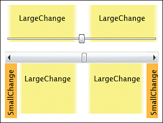
Both the Slider and the Scrollbar can also be used vertically. This is controlled by the Orientation property. Note, however, that this property is not available on the RangeBase basis class.
The Slider has an additional property named IsDirectionReversed. By default, when the Slider is dragged to the right (or down, if it is vertical), the Value is increased. If you set this property to true, the Value will be increased in the other direction.
Understanding Value Coercion
When any object has a Value comprised between a Maximum and a Minimum, the developer needs to think of the following issues:
What happens when the Minimum is set to a number higher than the current Value ?
What happens when the Minimum is set to a number higher than the current Maximum ?
In the Scrollbar and Slider controls, Silverlight uses coercion to handle these issues. Let’s imagine a scenario:
1. Minimum is set to 0, Value to 5, Maximum to 10.
2. The application sets Minimum to 20.
3. Automatically, Value and Maximum are set to 20, to comply with the ground rule Value and Maximum may not be smaller than Minimum.
4. In a second operation, the application attempts to set Maximum to 15. This is hurting the ground rule, so the actual value remains set to 20.
5. Later, the application sets Minimum to 8.
6. The framework remembers that Maximum should be set to 15. This doesn’t hurt the ground rule anymore, so the framework allows it.
7. The framework remembers that Value was set to 5 before. This still hurts the ground rule, however, so Value is set to 8.
Using coercion to force an application to respect a set of ground rules ensures that the properties can be set in any order. This is one of the important conditions to enable XAML to work: The properties of a control can be set in any order, and yet the rules are ensured.
Thumb
The Scrollbar and the Slider we just saw have a middle part that the user can drag on either side. This functionality is implemented by a Thumb control.
Deriving directly from Control, the Thumb class is placed into the namespace System.Windows.Controls.Primitives. Even though you can use a Thumb directly in your application, it is typically used as a part of other controls (such as the Scrollbar). This is typical from Silverlight, where we speak of the parts and states model.
To drag a Thumb control, you must handle its DragDelta event. You can reposition the Thumb using the Canvas.Top and Canvas.Left properties (if the parent is a Canvas), or using the Margin property (on a Grid).
To test this, create a new application and copy the markup in Listing 16.1 into Page.xaml, replacing the existing LayoutRoot Grid.
Listing 16.1 Dragging a Thumb, XAML Markup
<Grid x:Name=″LayoutRoot″ Background=″White″>
<Grid.RowDefinitions>
<RowDefinition Height=″*″ />
<RowDefinition Height=″25″ />
</Grid.RowDefinitions>
<Thumb x:Name=″MyThumb″ Width=″50″ Height=″50″
DragStarted=″MyThumb_DragStarted″
DragDelta=″MyThumb_DragDelta″
DragCompleted=″MyThumb_DragCompleted″
HorizontalAlignment=″Left″ VerticalAlignment=″Top″ />
<TextBlock Grid.Row=″1″>
<Run Text=″Events: ″ />
<Run x:Name=″EventRun″ FontStyle=″Italic″/>
</TextBlock>
</Grid>
Then copy the code in Listing 16.2 into the Page class, in Page.xaml.cs. Once this is done, build and run the application (you will have to add a using directive) and drag the Thumb control around using the mouse.
Listing 16.2 Dragging a Thumb, C# Code
private void MyThumb_DragStarted(object sender, DragStartedEventArgs e)
{
EventRun.Text = ″DragStarted″;
}
private void MyThumb_DragDelta(object sender, DragDeltaEventArgs e)
{
EventRun.Text = ″DragDelta″;
double marginLeft = MyThumb.Margin.Left;
double marginTop = MyThumb.Margin.Top;
MyThumb.Margin = new Thickness(marginLeft + e.HorizontalChange,
marginTop + e.VerticalChange, 0, 0);
}
private void MyThumb_DragCompleted(object sender, DragCompletedEventArgs e)
{
EventRun.Text = ″DragCompleted″;
}
Adding the System.Windows.Controls Assembly
Some of the new controls in Silverlight 2 are defined in an external assembly named System.Windows.Controls. This assembly can be added manually to the Silverlight application using the following steps.
1. In Visual Studio, right-click on the Silverlight project and choose Add Reference... from the context menu.
2. In the Add Reference dialog, on the .NET tab, select the assembly System.Windows.Controls and click OK.
3. Inside the XAML file where you want to use the control, add an XML namespace to the UserControl tag, for example:
<UserControl x:Class=″SilverlightApplication2.Page″
xmlns=″http://schemas.microsoft.com/winfx/2006/xaml/presentation″
xmlns:x=″http://schemas.microsoft.com/winfx/2006/xaml″
xmlns:controls=″clr-namespace:System.Windows.Controls;assembly=System.Win-
dows.Controls″
Width=″400″ Height=″300″>
The controls prefix you added in step 3 must be used when you reference the control located in System.Windows.Controls.dll. We will use this assembly a few times in the course of this chapter.
Alternatively, you can drag and drop the UI element from the Visual Studio toolbox on the XAML markup, at the position where you want to include the element. This will automatically take care of steps 1 to 3 above.
Note that you can find in the SDK documentation in which assembly each control is placed. For example, this information is available on top of the GridSplitter class page.
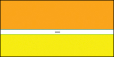
GridSplitter
When a Grid has multiple rows (or columns) you would often like to be able to resize them. It’s easy with a GridSplitter (see Figure 16.5). You can test it yourself by copying the markup in Listing 16.3 in a new Silverlight application’s Page.xaml and running the application.
Figure 16.5 Grid with a GridSplitter
Listing 16.3 Using a GridSplitter
<Grid x:Name=″LayoutRoot″
Background=″White″>
<Grid.RowDefinitions>
<RowDefinition Height=″*″ />
<RowDefinition Height=″10″ />
<RowDefinition Height=″*″ />
</Grid.RowDefinitions>
<Rectangle Fill=″Orange″ />
<controls:GridSplitter Grid.Row=″1″ Height=″Auto″ Width=″Auto″
HorizontalAlignment=″Stretch″ />
<Rectangle Fill=″Yellow″ Grid.Row=″2″ />
</Grid>
The easiest way to use a GridSplitter is to dedicate a whole Grid cell (or Row, or Column) to it, and to set its dimension so that it is clear in which direction the other cells should be resized. Note, however, that it is also possible to place the GridSplitter in a cell shared by other elements. In that case, the direction in which the GridSplitter acts is determined by its size, its alignment, and so on. For more information about the GridSplitter and its features, check the SDK documentation.
Presenting Media
We studied the two media controls Image and MediaElement in detail in Chapter 5, “Using Media,” and later chapters. One interesting thing to note is that, even though Image and MediaElement are placed in the namespace System.Windows.Controls, they are not actually deriving from Control. In fact, they derive directly from FrameworkElement. This means that they don’t enjoy the added functionality that we described earlier in this chapter.
But in fact, it doesn’t matter. Since Image and MediaElement can be placed within a Control (for example a Button), and since the Button’s template can be modified at will (for example so that only the Image appears), you can also tab through the “image buttons,” check when they get the focus, execute a Click event, and so on. We’ll talk about templates soon.
Picking Dates with Calendar and DatePicker
The purpose of these two controls is specialized and easy to understand: They help pick a date.
Using the Calendar
The Calendar displays the current date in a month view. The user can select a date that the application can read and use. Note that the Calendar control is included in the assembly System.Windows.Controls.dll we discussed earlier. This assembly must be referenced, as explained in the section “Adding the System.Windows.Controls Assembly” in this chapter.
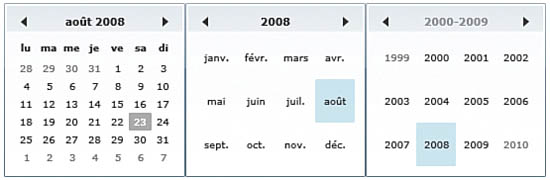
The Calendar control can display various modes. Use the DisplayMode property. When the Calendar is displayed, the user can switch from Month to Year, and from Year to Decade by clicking on the Calendar’s title (see Figure 16.6). The opposite way goes by a click on a year, then on a month.
Figure 16.6 Calendar with DisplayMode Month, Year, and Decade
The range of dates displayed by the Calendar is set by the properties DisplayDateStart and DisplayDateEnd.
The date currently displayed in the Calendar can be set or read with the property DisplayDate. Note that an error occurs if DisplayDate is not included between DisplayDateStart and DisplayDateEnd.
The property FirstDayOfWeek tells the Calendar when the week starts for the current user (depending on its regional settings).
The mode of selection can also be customized using the SelectionMode. The possible values are
None—No date can be selected.
SingleDate—This is the default. Only one date can be selected and is stored in the SelectedDate property.
SingleRange—A period of time between two dates is selected. The chosen dates are stored in the property SelectedDates (with an “s”).
MultipleRange—Multiple periods of time are selected. Here too, the SelectedDates property stores the chosen dates.
Note that the property SelectedDate can also be used to set the Calendar to a different date, for example, when you initialize it. It must be included between DisplayDateStart and DisplayDateEnd. It may not be one of the dates into the BlackoutDate collection (see the last item in this list).
If you don’t want today’s date (or month or year) to be highlighted, set the property IsTodayHighlighted to false.
You can add dates to the BlackoutDates collection. All the dates within this collection will be displayed disabled in the Calendar.
The Calendar control is automatically localized, that is, adapted to the user’s regional settings. In Figure 16.6, notice how the names of days and months are in French.
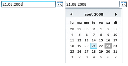
Using the DatePicker
A Calendar all alone can be useful, but in some case what you really need is a DatePicker—a control that uses a Calendar to pick a date and display it (see Figure 16.7). This control is also included in the System.Windows.Controls assembly. Refer to the section titled “Adding the System.Windows.Controls Assembly” in this chapter for more information about adding a reference to this assembly to your application.
Figure 16.7 DatePicker in closed and open state
Most of the DatePicker’s properties are actually mapped to the Calendar properties. We saw them all in the previous section.
In addition, you can control the DatePicker popup with the property IsDropDownOpen. By setting it to true, you can force the Calendar to open programmatically.
Catching Errors
Since the DatePicker has a TextBox, the user can enter any text she wants, and the DatePicker will attempt to convert it into a valid DateTime. This is not always possible: The user may type meaningless text, enter a typo, or use a format that is not recognized.
The default behavior when an error occurs is that the previous valid date will simply be displayed again. You can change this by handling the DateValidationError event. To test this, create a new Silverlight application and enter the markup in Listing 16.4 in the Page.xaml.
Listing 16.4 Using a DatePicker and Catching Errors, XAML Markup
<StackPanel x:Name=″LayoutRoot″ Background=″White″>
<controls:DatePicker Width=″200″ Margin=″10″
DateValidationError=″DatePicker_DateValidationError″
HorizontalAlignment=″Center″ />
<TextBlock x:Name=″ErrorDisplay″
Foreground=″Red″ Margin=″10″
HorizontalAlignment=″Center″/>
</StackPanel>
Then, open Page.xaml.cs and implement the event handler in the Page class (see Listing 16.5):
Listing 16.5 Using a DatePicker and Catching Errors, C# Code
private void DatePicker_DateValidationError(object sender,
DatePickerDateValidationErrorEventArgs e)
{
ErrorDisplay.Text = ″This is not a valid date: ″ + e.Text;
//e.ThrowException = true;
}
By setting the property e.ThrowException to true, you raise an Exception (an error) in the application. If you don’t handle this error somewhere in the application, it will crash. By default, the error will not be raised. We will talk about Exceptions and how to handle them in Chapter 23, “Placing Cross-domain Requests and Handling Exceptions.”
Writing with Ink
The InkPresenter control allows you to draw strokes on a surface. This element derives from Canvas (so it’s not a control, but a panel). You can set its Background, its size (or leave it to Auto if you want it to fill the whole surface), and so on. What’s special about the InkPresenter is that it contains a collection of Stroke elements. Each one is a tiny graphic element drawn on the InkPresenter. When it is created, you can specify its color, Width, and Height. Each Stroke contains a collection of StylusPoint elements.
With today’s input devices becoming more sophisticated, such as tablet devices, tablet PCs with touch screens, and the multi touch screens such as the Surface computer made by Microsoft, alternative user interfaces will become more and more popular. The InkPresenter plays an important role in this new landscape.
Making a Simple Drawing Application
We are going to use the knowledge gained in this chapter and in Chapter 15 to build a small but interesting application that allows the user to draw on the computer screen. The functionality of the application is basic: The user can choose a pen color and size, and then draw on the InkPresenter.
Preparing the Scene
Let’s create a scene in XAML for our application with the following steps:
1. Create a new Silverlight application in Visual Studio named SilverlightDraw. Then open the Page.xaml and set the Grid LayoutRoot as in Listing 16.6:
Listing 16.6 SilverlightDraw, Setting the Scene
<Grid x:Name=″LayoutRoot″ Background=″#FFFEFE00″
MouseLeave=″LayoutRoot_MouseLeave″>
<InkPresenter x:Name=″MyInkPresenter″ Background=″#FFFFCF77″ Cursor=″Stylus″
MouseLeftButtonDown=″InkPresenter_MouseLeftButtonDown″
MouseMove=″InkPresenter_MouseMove″
MouseLeftButtonUp=″InkPresenter_MouseLeftButtonUp″ />
</Grid>
Notice the mouse events that we will handle in code later.
We set the Cursor property to Stylus. This gives the cursor the shape of a dot, with which it is easier to draw.
2. Now create a settings section, in the form of a Popup containing Sliders. First create the Popup below the InkPresenter, and position it as in Listing 16.7. Copy this markup inside the LayoutRoot Grid.
<Popup x:Name=″SettingsPopup″
HorizontalOffset=″10″ VerticalOffset=″10″>
</Popup>
3. Within the Popup, we need a Border to serve as a visual background for the settings controls. This Border will host a Grid for the layout (Listing 16.8).
Listing 16.8 Settings Border and Grid
<Border BorderBrush=″#FF000000″ BorderThickness=″2,2,2,2″
Width=″180″ Height=″200″>
<Grid>
<Grid.RowDefinitions>
<RowDefinition Height=″*″ />
<RowDefinition Height=″*″ />
<RowDefinition Height=″*″ />
<RowDefinition Height=″*″ >/
</Grid.RowDefinitions>
<Grid.ColumnDefinitions>
<ColumnDefinition Width=″0.3*″ >/
<ColumnDefinition Width=″0.7*″ >/
</Grid.ColumnDefinitions>
</Grid>
</Border>
Notice that the Border doesn’t have its Background property set. If we leave it like this, it will be transparent. However, we set the Background in code-behind to add a nice effect when we set the stroke’s color.
4. Within the Grid located inside the Border, copy the two controls in Listing 16.9. In addition to a label marked “R” for red, we place a Slider control going from 0 (the default value) to 255 (the decimal value for FF[16]).
Listing 16.9 Color Slider
<TextBlock Text=″R:″ Margin=″0,0,5,0″ Grid.Row=″0″
HorizontalAlignment=″Right″ VerticalAlignment=″Center″ />
<Slider x:Name=″ColorRSlider″
LargeChange=″10″ SmallChange=″1″
Maximum=″255″ Value=″255″
ValueChanged=″ColorSlider_ValueChanged″
Margin=″0,0,5,0″ Grid.Column=″1″ Grid.Row=″0″ >/
5. Copy the same markup again, but this time change the text to G: (for green). Set the Grid.Row property to 1 for both the TextBlock and the Slider. Name the Slider ColorGSlider.
6. Finally, copy the same markup a third time, this time for B: (blue) and set Grid.Row to 2 for both controls. Name the Slider ColorBSlider. Notice that all three Sliders (R, G, and B) use the same event handler named ColorSlider_ValueChanged:.
7. We need a last Slider for the Stroke’s Width and Height. We use only one Slider for both dimensions to keep it simple (Listing 16.10).
Listing 16.10 Size Slider
<TextBlock Text=″Size:″ Margin=″0,0,5,0″ Grid.Row=″3″
HorizontalAlignment=″Right″
VerticalAlignment=″Center″ >/
<Slider x:Name=″SizeSlider″
LargeChange=″2″ SmallChange=″1″
Minimum=″2″ Maximum=″20″ Value=″2″
ValueChanged=″SizeSlider_ValueChanged″
Margin=″0,0,5,0″ Grid.Column=″1″ Grid.Row=″3″ >/
8. The last control we need is a Button to show the settings Popup on the screen. Place the markup in Listing 16.11 outside the Popup control, but still inside the Grid LayoutRoot.
Listing 16.11 Settings Button
<Button x:Name=″SettingsButton″ Height=″30″ Width=″30″
HorizontalAlignment=″Left″ VerticalAlignment=″Top″
Margin=″10,10,0,0″ Cursor=″Hand″
Click=″SettingsButton_Click″ />
9. Before we start writing C# code, remove the Height and Width properties on the top UserControl, to make the application fill the whole space.
Handling the Events
If you run the application at this stage, the initial animation (Figure 7.5) will never disappear and you get an error on the web page. Depending on the web browser you use and on your settings, the error might appear as a yellow warning sign in the bottom left corner on the web browser (Internet Explorer). By clicking on this sign, you get more information.
In Firefox, the error is more difficult to find: You need to display the JavaScript console by typing the text javascript: (including the colon) in the browser’s location bar, and click enter.
The cause of the error is that the XAML markup references event handlers that don’t exist in code yet. We will implement them now.
Drawing a New Stroke
First we will let the user draw on the presenter, which is the main purpose of the application, with the following steps:
1. Open Page.xaml.cs and a private attribute to the Page class:
private Stroke _currentStroke = null;
2. In the Page constructor, below the call to InitializeComponent, add the initialization code in Listing 16.12:
Listing 16.12 Initialization Code
Color strokeColor = GetColor( );
SettingsButton.Background = new SolidColorBrush(strokeColor);
(SettingsPopup.Child as Border).Background = SettingsButton.Background;
This code uses a private method named GetColor (we define it later) to get the color corresponding to the three color Sliders.
We then use this color as the Background of the SettingsButton (in the top-left corner) and of the SettingsPopup.
3. The private method GetColor is getting the values of the three Sliders, and using it to build a new Color and to return it. Note that we fix the Alpha channel to 255 (fully opaque). Copy the code in Listing 16.13 in the Page class, under the Page constructor. To make sure that there are no mistakes, you can build the application, but don’t run it yet.
Listing 16.13 Method GetColor
private Color GetColor( )
{
if (ColorRSlider = = null
| | ColorGSlider = = null
| | ColorBSlider = = null)
{
return Colors.Black;
}
Color strokeColor = Color.FromArgb(255,
(byte) ColorRSlider.Value,
(byte) ColorGSlider.Value,
(byte) ColorBSlider.Value);
return strokeColor;
}
4. Let’s now handle what happens when the mouse is pressed down on the InkPresenter. Copy Listing 16.14 in the Page class, after the code we entered in step 3. Here too, you should be able to build the application.
Listing 16.14 Event Handler InkPresenter_MouseLeftButtonDown
1 private void InkPresenter_MouseLeftButtonDown(object sender,
2 MouseButtonEventArgs e)
3 {
4 SettingsPopup.IsOpen = false;
5 _currentStroke = new Stroke(e.StylusDevice.GetStylusPoints(MyInkPresenter));
6 _currentStroke.DrawingAttributes = new DrawingAttributes( );
7
8 Color strokeColor = GetColor( );
9 _currentStroke.DrawingAttributes.Color = strokeColor;
10 _currentStroke.DrawingAttributes.OutlineColor = strokeColor;
11
12 _currentStroke.DrawingAttributes.Height =
13 _currentStroke.DrawingAttributes.Width = SizeSlider.Value;
14 MyInkPresenter.Strokes.Add( _currentStroke);
15 }
On line 4, we close the SettingsPopup every time the mouse is clicked. Note that most of the time, this is not necessary because it will already be closed. However, this simple operation makes it unnecessary to check every time whether the Popup is open or not.
Line 5 creates a new Stroke instance, adds the current StylusPoints to it and saves it in the private attribute we declared in step 1. Then we create its DrawingAttributes on line 6.
On lines 8 to 10, we get the color corresponding to the three Sliders, and we set the Stroke’s color. Note that each Stroke can have a different outline color. In our case we set both to the same value.
On lines 12 and 13 we set the Height and Width of the Stroke to the value of the SizeSlider.
Finally we add the new Stroke to the InkPresenter (line 14).
5. We must now handle what happens when the mouse moves. It’s in fact easy: Since we get a MouseEventArgs parameter and since we saw that it contains information about the StylusDevice, we can simply add this to the current Stroke. Note that this is only done if the mouse is pressed, which is made evident by the value of the _currentStroke attribute as shown in Listing 16.15. Add this code below the method we implemented in step 4.
Listing 16.15 Event Handler InkPresenter_MouseMove
private void InkPresenter_MouseMove(object sender,
MouseEventArgs e)
{
if (_currentStroke != null)
{
_currentStroke.StylusPoints.Add(e.StylusDevice.GetStylusPoints (MyInkPresenter));
}
}
6. We must end drawing sometimes: When the mouse button is not pressed anymore, or when the mouse cursor leaves the Grid, we set the Stroke to null, which ends the action of the MouseMove event handler. The code in Listing 16.16 comes below the method we implemented in step 5.
Listing 16.16 Event Handlers InkPresenter_MouseLeftButtonUp and LayoutRoot_MouseLeave
private void InkPresenter_MouseLeftButtonUp(object sender, MouseButtonEventArgs e)
{
_currentStroke = null;
}
private void LayoutRoot_MouseLeave(object sender, MouseEventArgs e)
{
_currentStroke = null;
}
The current Stroke has already been added to the InkPresenter, so any change made to it is saved in memory already. When you work with objects in C#, you work with references to them. There may be multiple references to the same object in memory. Working with the same object from multiple “clients” (adding points to the Stroke, drawing the same Stroke on the screen) is an illustration of the advantages of object-oriented programming.
Handling the Settings
We still have three events to handle with the following steps:
1. First open the SettingsPopup when the SettingsButton is clicked. The code in Listing 16.17 comes inside the Page class:
Listing 16.17 Event Handler SettingsButton_Click
private void SettingsButton_Click(object sender,
RoutedEventArgs e)
{
SettingsPopup.IsOpen = true;
}
2. Handle what happens when the user moves the slider’s cursors. Remember that all three color sliders use the same event handler in Listing 16.18, to be copied inside the Page class.
Listing 16.18 Event Handler ColorSlider_ValueChanged
private void ColorSlider_ValueChanged(object sender,
RoutedPropertyChangedEventArgs<double> e)
{
if (SettingsButton = = null | | SettingsPopup = = null)
{
return;
}
Color strokeColor = GetColor( );
SettingsButton.Background = new SolidColorBrush(strokeColor);
(SettingsPopup.Child as Border).Background = SettingsButton.Background;
}
This handler checks whether the UI elements are already created (if not, their value is null and we exit without doing anything). This is needed, because the Silverlight framework calls this event handler as soon as the Sliders are created. However, the rest of the UI may not be ready yet.
Then we use the method GetColor to calculate the current color, and we set the button’s background as well as the Popup’s border’s Background to this new color. This gives the user feedback about the color he picks.
3. The last Slider sets the size of the Stroke. Here too, we check whether the UI is ready, and then we act on the Popup’s border’s thickness for feedback. This is Listing 16.19, to be copied at the end of the Page class.
Listing 16.19 Event Handler SizeSlider_ValueChanged
private void SizeSlider_ValueChanged(object sender,
RoutedPropertyChangedEventArgs<double> e)
{
if (SettingsPopup = = null)
{
return;
}
Thickness borderSize = new Thickness(SizeSlider.Value);
(SettingsPopup.Child as Border).BorderThickness = borderSize;
}
Setting the Popup’s border’s attributes like that is dangerous. What happens if the designer decides to change the way the UI is built and removes the Border, or adds something between the Border and the Popup? The code will fail with an error!! In Chapter 18, “Data Binding and Using Data Controls,” we see a much better way to handle this scenario! This is why you should save this application somewhere, and we will reopen it in two chapters.
Running the Application
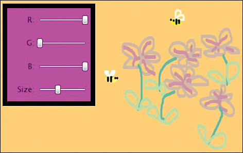
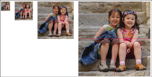
That’s it; we’re done. Run the application from Visual Studio, and see how you can now draw on the screen (Figure 16.8, with a drawing courtesy of the artist Gigi Lee!). This application is basic, and already we get ideas on how to make it better: An Undo operation is really needed, setting the InkPresenter’s background color would be nice, using a color picker instead of the three Sliders would make it easier to choose a color, and so on. Maybe you also have your own improvements you want to add. Don’t hesitate!
Figure 16.8 Silverlight Draw application
Presenting Data with ItemsControls
Often in an application, you need to present data to the user, but you don’t know exactly how many data items you will get. For example, you place a request with Flickr for images tagged with the word “Silverlight.” The service can send 0, 1, 100, or more items as a response. Also, there are multiple data sources. We mentioned XML data already. There are also services, databases, files, objects collections, and so on.
The best way to display a variable number of data items is to use a control derived from ItemsControl. A couple of them are included in Silverlight 2, such as the ListBox that we study in Chapter 18. In this section, we talk about another class deriving from ItemsControl.
Using the TabControl
A TabControl doesn’t look anything like a ListBox, but both display a variable collection of items. For the TabControl, the items are of type TabItem.
That a TabControl and a ListBox share functionality but look completely different is another example of the separation of appearance and functionality, one of the core principles of Silverlight.
Note that a TabItem is not a panel but a ContentControl. To set a TabItem’s content, simply set its Content property. The content may, as usual, be anything, including a panel with multiple children. The markup in Table 16.2 can be copied into a new Silverlight application, into the LayoutRoot in the Page.xaml file. Or you can copy the C# code in the Page constructor in Page.xaml.cs. Then run the application. This control is also included in the System.Windows.Controls assembly that must be added manually to the Silverlight application, as explained earlier in this chapter.
Table 16.2 TabControl in XAML and in Code
The TabItems are added to the TabControl’s Items collection. This is typical of a class deriving from ItemsControl.
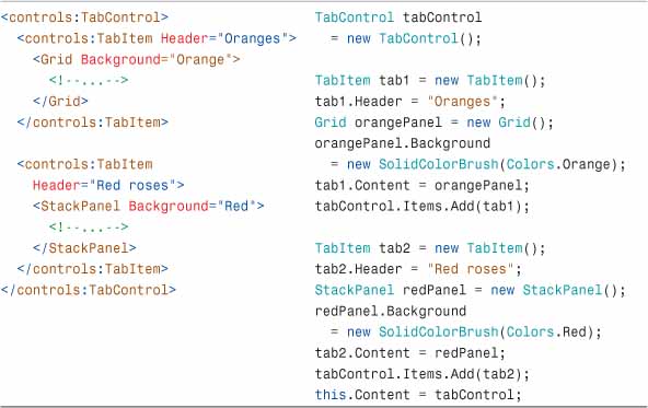
To set on which side the tabs will be placed, use the property TabStripPlacement. It can take the value Dock.Left, Dock.Top, Dock.Right, or Dock.Bottom (see Figure 16.9). The default is Dock.Top.
Figure 16.9 TabStripPlacement Dock.Top, Dock.Bottom, and Dock.Left
To be notified when a tab is selected by the user, you can handle the SelectionChanged event.
The selected tab can be found in different ways:
The SelectedItem property contains a reference to the selected TabItem.
The SelectedContent property returns the content included in the selected TabItem.
Finally, the SelectedIndex property returns the index of the selected TabItem in the Items collection.
The Items of an ItemsControl can either be set explicitly as we just did in Table 16.2, or they can be data bound as we see in Chapter 18. For a TabControl, typically, the number of TabItems is set when the application starts and doesn’t change. But having the possibility to data bind the TabItems to a collection of data objects can be useful in some circumstances.
Deep Zooming Your Image Collection
We talked about DeepZoom shortly in Chapter 1, and you probably took a look at the excellent application made by Vertigo for the Hard Rock Café memorabilia at www.hardrock.com/memorabilia.
How Does It Work?
DeepZoom uses a pyramid of pictures of different sizes. All the pictures in the pyramid are based on the same high-resolution picture, the one you want to “deep zoom” in.
At runtime, the DeepZoom control (named a MultiScaleImage) loads the pictures in the pyramid according to the level of zoom applied by the user. Thanks to .NET’s power of calculation, the transition between the images is usually smooth.
Creating a DeepZoom Image Pyramid
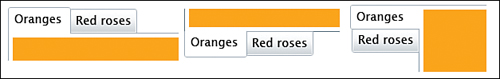
Creating a DeepZoom control is easy thanks to the DeepZoom Composer. This application takes an image (or a collection of images) as input and processes them to create an image pyramid as shown in Figure 16.10. Note that for each image processed, the image pyramid starts with an image of 1x1 pixels and ends with the size of the original image. You can create an image pyramid with the following steps.
1. Download and install DeepZoom Composer, available at http://silverlight.net/GetStarted. Click on the link labeled “Install Deep Zoom Composer.”
2. Start the Composer and create a new project.
3. You are now in the Import phase. Click on the Add Image button. You can choose one or multiple images as you want. Note that after the images are imported, you cannot edit them. You must do this before you load the images in the DeepZoom Composer.
4. Click on the Compose button on top of the Composer window.
5. Drag and drop the images you want to use on the workspace. You can either use one image only, or multiple ones. The DeepZoom Composer helps you to align the pictures, resize them, and arrange them on the workspace.
6. Click on the Export button on top of the window.
7. Select the Silverlight Export tab, then enter a name and an export location.
8. You can export the images as a Composition (only one big image will be created) or as a Collection (each image remains independent). For now, choose the Collection option. You can also select the output format (PNG or JPG).
9. In the Output Type section, select to export the images and a Silverlight project.
10. Click Export.
After processing the images, DeepZoom Composer gives you a choice, as shown in Figure 16.11.
Figure 16.11 Deep Zoom Composer after processing
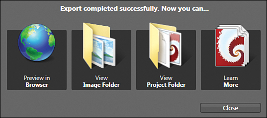
Preview in Browser starts your favorite web client and displays the DeepZoom image for you. In fact, a Silverlight application has automatically been created and is now displayed. Use the mouse wheel to zoom in and out smoothly, clicking on one point of the picture to zoom in. You can also use your mouse to move the pictures around. Notice how smooth the movement is.
View Image Folder shows the folder containing the image pyramid. You can explore the folders to see how the DeepZoom Composer cut the pictures to create the pyramid.
View Project Folder displays the Visual Studio (or Blend) project location. You can open the SLN file in Studio or in Blend to modify the Silverlight application.
Learn More opens the Expression team blog.
The MultiScaleImage Control
The DeepZoom functionality is packed into a control named MultiScaleImage deriving from FrameworkElement. This is where the magic happens. This control has one property, Source, that must be set to the XML file dzc_output.xml generated by the DeepZoom composer.
This XML file is located in the folder that you open when you click View Image Folder. If you choose the option to export a Silverlight project, the Composer automatically creates a web application too and places the generated images, the XAP file, and an HTML test page in the web application’s ClientBin folder.
It is outside the scope for this book to examine DeepZoom further, but to see a nice example of how one or multiple MultiScaleImage controls can enhance your web page, take a look at Jose Fajardo’s interview at http://delicategeniusblog.com/?p=692.
Summary
In this chapter, we met many new controls and consolidated our knowledge about others that we had met before. But in truth, to really know the controls you must use them in an application (or two or three) and also browse through the documentation. Also, don’t hesitate to look for answers online when you encounter a specific issue, or to find samples.
In later chapters, we continue to use controls in our applications. We also learn how to use styles and templates to change the controls’ appearance, and spend more time with data controls. Finally, we see how to combine controls and other FrameworkElements to create custom controls.