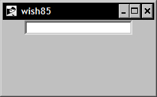
Perhaps the most commonly used widget for collecting information from the end user is the entry widget. The entry widget displays a single-line input area. The widget allows the end user to enter or edit the string within the widget.
|
Standard keyword |
Interpretation |
|---|---|
|
|
Specifies the background color to be used when drawing the element. |
|
|
Specifies a non-negative value indicating the width of the 3D border to draw around the outside of the window. |
|
|
Specifies the mouse cursor to be used for the window. |
|
|
Specifies if a selection within the widget should also be the X selection. This keyword accepts a Boolean value such as |
|
|
Specifies the font to use when drawing the element. |
|
|
Specifies the normal foreground color to be used when drawing the element. |
|
|
Specifies the color to display in the traversal highlight region when the window does not have the input focus. |
|
|
Specifies the color to use for the traversal highlight rectangle that is drawn around the window when it has the input focus. |
|
Standard keyword |
Interpretation |
|
|
Specifies a non-negative value indicating the width of the highlight rectangle to draw around the outside of the window. |
|
|
Specifies the color to be used as the background color in the insertion cursor. |
|
|
Specifies a non-negative integer value to indicate the width of the 3D border to draw around the insertion cursor. |
|
|
Specifies a non-negative integer value to indicate the number of milliseconds the insertion cursor should remain off in each blink cycle. If set to |
|
|
Specifies a non-negative integer value to indicate the number of milliseconds the insertion cursor should remain on in each blink cycle. |
|
|
Specifies the width of the insertion cursor in pixels. |
|
|
This keyword is used to specify the justification to apply within the input widget element. Acceptable values are |
|
|
Specifies the 3D effect desired for the window. Acceptable values are |
|
|
Specifies the background color to use for selected items. |
|
|
Specifies the width of the 3D border to draw around selected items. |
|
|
Specifies the foreground color to use for selected items. |
|
|
Determines whether or not the window accepts the focus during keyboard traversal. |
|
|
Specifies the name of a text variable that contains text to be displayed within an element. |
|
|
Specifies the command to be called during a scroll event. If this value is not set, no command will be executed. |
|
|
Specifies the desired height for the window. |
|
|
Specifies the state of the widget. Acceptable values are |
|
|
Specifies the desired width for the window. |