Through the button the user is provided with a means to interact with the GUI and our program. This is accomplished through the button's ability to manually execute commands in your application. These actions may be default, as in the exit command, or custom procedures that we have written.
The keywords are described in the Tk main pages as follows:
|
Standard Keywords |
Interpretation |
|---|---|
|
|
Specifies the background color to be used when drawing the element. The active background is the color used when the mouse is over the element and when pressing the mouse button will initiate an action. |
|
|
Specifies the foreground color to be used when drawing the element. The active foreground is the color used when the mouse is over the element and when pressing the mouse button will initiate an action. |
|
|
Specifies how the information (text, bitmap, and so on) is displayed within the widget. Acceptable vales are:
|
|
|
Specifies the background color to be used when drawing the element. |
|
|
Specifies a bitmap to display within the element. |
|
|
Specifies a non-negative value indicating the width of the 3D border to draw around the outside of the window. |
|
|
Specifies if the widget should display both text and bitmaps/images simultaneously and the placement of where to display the image in relation to the text. Acceptable values are:
|
|
|
Specifies the mouse cursor to be used for the window. |
|
|
Specifies the color to use when displaying a disabled element. |
|
|
Specifies the font to use when drawing the element. |
|
|
Specifies the normal foreground color to be used when drawing the element. |
|
|
Specifies the color to display in the traversal highlight region when the window does not have the input focus. |
|
|
Specifies the color to use for the traversal highlight rectangle that is drawn around the window when it has the input focus. |
|
|
Specifies a non-negative value indicating the width of the highlight rectangle to draw around the outside of the window. |
|
|
Specifies the image to display within an element. The image must first have been created using the image create command. |
|
|
When multiple lines of text exist, this keywords specifies the justification to apply within the element. Acceptable values are: |
|
|
Specifies a non-negative value indicating how much extra space to request for the window in the X-direction. |
|
|
Specifies a non-negative value indicating how much extra space to request for the window in the Y-direction. |
|
|
Specifies the 3D effect desired for the window. Acceptable values are |
|
|
Specifies the number of milliseconds a key or element must be held down before it will auto-repeat. |
|
|
Used in conjunction with |
|
|
Determines whether or not the window accepts the focus during keyboard traversal. |
|
|
Specifies a string to be displayed within the element. |
|
|
Specifies the name of a text variable that contains text to be displayed within an element. |
|
|
Specifies the integer index of a character to be underlined, zero-based. |
|
|
Specifies the maximum line length at which point the text will be wrapped for those elements that support word wrap. |
|
|
Specifies a Tcl command to be activated by a button. |
|
|
Specifies the default state of the element (See state). |
|
|
Specifies the desired height for the window. |
|
|
Specifies an alternate relief for a button to display during mouse-over. |
|
|
Specifies the state of the widget. Acceptable values are |
|
|
Specifies the desired width for the window. |
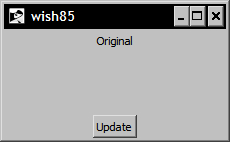
In the following example, we will create a button with specific keywords designed to update the text in a label widget. Enter the following commands:
1 % proc updater { } {
	.l configure -text "Updated"
}
2 % label .l -width 70 -borderwidth 3 -text Original
.l

3 % button .b -text Update -command updater
.b

4 % pack .l -side top
5 % pack .b -side bottom
At this point, your window should look like the following: