The menubutton command is very similar to the menu command. However, as opposed to creating a standard or pop-up menu, it creates a menu consisting of buttons, as the name implies. The syntax is as follows:
menubutton name option value …
The menubutton command accepts one or more option value pairs, as detailed in the following table:
|
Option |
Interpretation |
|---|---|
|
|
Specifies the background color to be used when drawing the element. The active background is the color used when the mouse is over the element and when pressing the mouse button will initiate an action. |
|
|
Specifies the foreground color to be used when drawing the element. The active foreground is the color used when the mouse is over the element and when pressing the mouse button will initiate an action. |
|
|
Specifies how the information within the widget is displayed. Acceptable values are |
|
|
Specifies the background color to be used when drawing the element. |
|
|
Specifies a bitmap to display in the menu instead of a textual label. This is not available for |
|
|
Specifies if the button should display both an image and text and where the image should be displayed. Acceptable values are |
|
|
Specifies the mouse cursor to be used for the window. |
|
|
Specifies the color to use when displaying a disabled element. |
|
|
Specifies the font to use when drawing the element. |
|
|
Specifies the normal foreground color to be used when drawing the element. |
|
|
Specifies the color to display in the highlight region when the button does not have focus. |
|
|
Specifies the color to display in the highlight region when the button does have focus. |
|
|
Specifies the width of the highlight region (rectangle) to draw around the outside of the button when it has focus. |
|
|
Specifies an image to display in place of a bitmap or textual label. This is not available for |
|
|
Specifies how to display textual information when the button contains multiple lines of text. Acceptable values are |
|
|
Specifies the amount of additional x-space to allot for the button. |
|
|
Specifies the amount of additional y-space to allot for the button. |
|
|
Determines whether or not the window accepts the focus during keyboard traversal. |
|
|
Specifies where the pop up menu will be displayed in relation to the button. Acceptable values are |
|
|
Specifies the height of the menu button. If an image or a bitmap is used, the value is supplied as screen units, if textual then it refers to the number of lines. If not specified the button height is computed based on the contents. |
|
|
A Boolean value is provided to determine if a small indicator rectangle is displayed to the right of the button. |
|
|
Specifies the pathname of a menu to associate with the button. |
|
|
Specifies the state of the menu button. Acceptable values are |
|
|
Specifies the height of the menu button. If an image or bitmap is used the value is supplied as screen units, if textual, it refers to the number of lines. If not specified, the button height is computed based on the contents. |
Creation of the menubutton widget additionally created a new Tcl command of the same name. These commands are accessed using the following syntax:
name command arguments
The commands are as follows:
|
Specific commands |
Interpretation |
|---|---|
|
|
Returns the current configuration value for the option specified. |
|
|
Query or modify the option of the menu. |
In the following example, we will create a menu button that contains an option to exit a window. Create the following text file and save it in your working path with the name my_menubutton.tcl:
# Load the TK Package
package require Tk
#Define our interface
wm geometry . 320x240
wm title . "Menu Example"
# Create a menubutton to exit our window
menubutton .menu1 -text File -menu .menu1.m -underline 0 -relief
raised
# Add a pull down
menu .menu1.m
.menu1.m add command -label Quit -command exit
# Pack the menubutton
pack .menu1 -anchor nw
Now launch the program by invoking the following command line command.
tclsh85 my_menubutton.tcl
You should now see the following window:
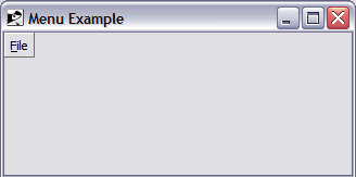
Access your cascading menu and select the Exit option to close the window.