Controlling layout with the grid command

Care must be taken in packing the widgets to ensure that the desired layout is obtained. The pack command provides a convenient method of geometry management for simple forms. However, for more complex forms, the grid command allows you to manage your widget placement by creating and configuring rows and columns for widget placement.

To illustrate this better, think of the grid as being similar to a table or a spreadsheet, as it contains rows and columns, as follows:


Column 0

Column 1

Column 2

Row 0


Row 1


Row 2


Please note that the column and row numbering are zero-based. This is the grid layout that we will use in the following example.

Based on the options provided, when invoked, the grid command assumes several forms. The syntactical options are as follows:

Option

Interpretation

grid widget row column

Behaves in the same manner as grid configure.

grid anchor parent anchor

Controls placement of the grid itself. Acceptable values are n, ne, e, se, s, sw, w, or nw (default).

grid bbox parent column1 row1 column2 row2

When no arguments are provided this command will return the size of the bounding box in pixels as a four digit integer. The first two are the pixel offset for the top-left corner from the parent. The second two are the size of the bounding box (width and height). If a single column and row are provided, the bounding box for the individual cell is returned. If two column and row pairs are provided the values for the bounding box spanning the rows is returned.

grid columnconfigure parent column option value

Query or set the properties of the column referenced for the parent provided. The valid options are:

-minsize: Set the minimum size for the column.

-weight: Set the relative weight for assigning extra space within the column. A value of 0 indicates that the column will not deviate from its defined size. A positive value determines the rate at which the column will increase in size.

-uniform: When a value is supplied, the column is placed into a group with other defined columns. All the members of the group have their space allocated in strict proportion to their weight value.

-pad: Specifies the number of screen units to be added to the largest widget contained within a column. If no value is specified the current value is returned. If only the parent and column are provided all current settings are returned in a list containing option/value pairs.

grid configure widget options

Accepts one or more widgets followed by option/value pairs to configure. Acceptable values are:

-column n: Insert the widget such that it occupies the column referenced by n. If this option is not utilized the widget is placed to the right of the previous widget configured by the command.

-columnspan n: Insert the widget such that it occupies n columns.

-in parent: Place the widget within the parent referenced. For example, placing a button within a frame.

-ipadx value: Specifies the amount of internal horizontal padding to utilize. Value must be a valid screen distance (default value is 0).

-ipady value: Specifies the amount of internal vertical padding to utilize. Value must be a valid screen distance (default value is 0).

-row n: Insert the widget such that it occupies the row referenced by n. If this option is not utilized the widget is placed on the same row as the last widget configured by the command.

-rowspan n: Insert the widget such that it occupies n rows.

-sticky style: Used to configure placement of the widget within a cell in the event the cell is larger than the widget. Style accepts a string containing 0 or more of the n, s, e, or w characters as well as optional spaces or commas. If ns or ew are specified, the widget will be stretched to occupy the entire height or width of the cell as appropriate. Default placement is at the center of the cell.

grid forget widget widget

Remove one or more widgets from the grid. Configuration values for the widget specified are discarded. If the widget is then returned to the grid all desired configurations must be specified.

grid info widget

Returns a list containing the option/value pairs for the current configuration of the widget referenced.

grid location parent x y

Based on the screen location as referenced by x and y this command returns the column and row number. For locations above and left of the grid a -1 is returned.

grid remove widget widget

Remove one or more widgets from the grid. Configuration values for the widget specified are not discarded. If the widget is then returned to the grid, all the desired configuration is reapplied.

grid size parent

Returns the size of the grid as column the row.

grid slaves master option value

If no options are provided, this command will return a list of all widgets contained within master. The acceptable values for option are row or column. If these values are provided, only those widgets in the row or column referenced are returned.

How to do it…

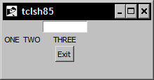
In the following example, we will create several widgets and arrange them using the grid command. Enter the following commands:


1 % entry .e -width 10
.e

2 % label .1 -text ONE
.1

3 % label .2 -text TWO
.2

4 % label .3 -text THREE
.3

5 % button .b -text Exit -command exit
.b

6 % grid .e -row 0 -column 2
7 % grid .1 -row 1 -column 0
8 % grid .2 -row 1 -column 1
9 % grid .3 -row 1 -column 2
10 % grid .b -row 2 -column 2

At this point, your window should look like the following:

How to do it…

How it works…

Based on the placement instructions passed to the grid command, we have placed our widgets at various locations within the grid as illustrated in the following table:


Column 0

Column 1

Column 2

Row 0


Entry Widget

Row 1

Label

Label

Label

Row 2


Button

..................Content has been hidden....................

You can't read the all page of ebook, please click here login for view all page.
Reset
18.222.184.200