In Tk the menu is not just a name for a part of your GUI, but also the actual widget command name as well. The menu command will create a new menu widget.
The syntax is as follows:
menu name option value…
The menu command accepts one or more option value pairs, as detailed in the following table:
|
Option |
Interpretation |
|---|---|
|
|
Specifies an accelerator or keyboard hotkeys to be displayed to the right-hand side of the menu text. The specific acceptable values are dependent on the display manager in use. For example, in a Windows application, Control+N would be an acceptable value. |
|
|
Specifies the background color to be used when drawing the element. The active background is the color used when the mouse is over the element and when pressing the mouse button will initiate an action. |
|
|
Specifies the width of the 3D border to draw around the active item. |
|
|
Specifies the foreground color to be used when drawing the element. The active foreground is the color used when the mouse is over the element and when pressing the mouse button will initiate an action. |
|
|
Specifies the background color to be used when drawing the element. |
|
|
Specifies a non-negative value indicating the width of the 3D border to draw around the outside of the window. |
|
|
Specifies the mouse cursor to be used for the window. |
|
|
Specifies the color to use when displaying a disabled element. |
|
|
Specifies the font to use when drawing the element |
|
|
Specifies the normal foreground color to be used when drawing the element. |
|
|
Specifies the 3D effect desired for the window. Acceptable values are raised, sunken, flat, ridge, solid, and groove. |
|
|
Determines whether or not the window accepts the focus during keyboard traversal. |
|
|
If specified, this provides a command to execute each time the menu is posted. |
|
|
Specifies the color to display as the background for menus containing check or radio buttons when they are selected. |
|
|
This option accepts a Boolean value and specifies if a menu should include a tear-off entry. A tearoff entry allows the user to detach the menu item and display it independent of the menu. |
|
|
If specified, this provides a command to execute each time the menu is torn off. |
|
|
Specifies the title to display for the window created if a menu is torn off. If not specified, the window title will display the label for the top level menu item. |
|
|
Specifies the type of menu. Acceptable values are menubar, tearoff, or normal.. |
Creation of the menu widget additionally created a new Tcl command of the same name. These commands are accessed using the following syntax:
name command arguments
Several of the menu commands accept an argument to indicate which menu entry to affect. These are referred to as the indexes and may be specified in any of the following manners. Note that those items displayed in italics are not keywords but indicate a specific numeric or textual value placeholder.
|
Index |
Interpretation |
|---|---|
|
number |
A numeric designation of the index with a base of 0. |
|
|
The menu item that is currently active. |
|
|
Last entry in a menu. |
|
|
Last entry in a menu. |
|
|
Normally used with the activate command, this is used to deactivate all menu items. |
|
@number |
When utilized in this manner, the number is treated as a y-coordinate and the entry closest to the coordinate is used. |
|
pattern |
Used to perform pattern matching on the label of each entry when none of the above index methods is sufficient. |
The commands are as follows:
|
Specific commands |
Interpretation |
|---|---|
|
|
Set the menu item at index to activated. |
|
|
This command adds a new menu item at the bottom of the menu. The type of entry is specified by
|
|
| |
|
|
Returns the current configuration value for the |
|
|
Create a clone of the menu with the name as specified in |
|
|
Query or modify the |
|
|
Delete all menu items between |
|
|
Returns the current configuration value for the |
|
|
Query or modify the |
|
|
Returns the index for the corresponding |
|
|
This is the same as the add command except it inserts a new item after the item located at index. |
|
|
Invoke the action for the item specified by |
|
|
Display the menu at the coordinates provided by |
|
|
Display the submenu associated with the cascade item specified by |
|
|
Returns the type of item as specified by |
|
|
Remove the menu from display. Not available on Windows or Macintosh. |
|
|
Returns the x-coordinate of the leftmost pixel in the item specified in |
|
|
Returns the y-coordinate of the leftmost pixel in the item specified in |
In the following example, we will create a menu that contains an option to exit the application. Create the following text file and save it in your working path with the name my_menu.tcl:
# Load the TK Package
package require Tk
#Define our interface
wm geometry . 320x240
wm title . "Menu Example"
# Create a menu to exit our application
menu .myMenu
.configure -menu .myMenu
# Add a pull down
set File [menu .myMenu.myfile]
.myMenu add cascade -label File -menu .myMenu.myfile
# Add the Exit entry
$File add command -label Exit -command exit
Now launch the program by invoking the following command line command.
tclsh85 my_menu.tcl
You should now see the following window:
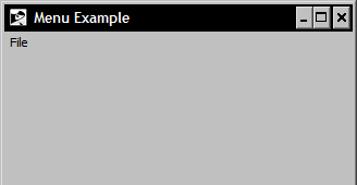
Click on the File menu item to display the Exit option. Select this option to exit the window.