

Job:03171 Title:Typography Referenced (Rockport)
Page: 62
Job:03171 Title:Typography Referenced (Rockport)
Page: 62
052-067 03171.indd 62 9/22/11 9:17 AM
Text
Job:03171 Title:Typography Referenced (Rockport)
Page: 62
Text
Job:03171 Title:Typography Referenced (Rockport)
Page: 62
62
Typography, Referenced
Seemingly
perfect geometric
forms make up
character shapes.
Sans Serif Geometric
Simple geometric shapes heavily infl uence the construction of these typefaces. Strokes
appear like strict monolines, and seemingly perfect geometric forms make up the character
shapes. Geometric sans tend to be less readable (330) than Grotesques (60).
Simple geometric
shapes
Strokes appear as
strict monolines.
052-067 03171.indd 62 9/22/11 9:17 AM
Job:03171 Title:Typography Referenced (Rockport)
Page: 63
Job:03171 Title:Typography Referenced (Rockport)
Page: 63
052-067 03171.indd 63 9/22/11 9:17 AM
Text
Job:03171 Title:Typography Referenced (Rockport)
Page: 63
Type Classifi cation and Identifi cation
63
Text
Job:03171 Title:Typography Referenced (Rockport)
Page: 63
Defi nite squaring
of normally
curved strokes
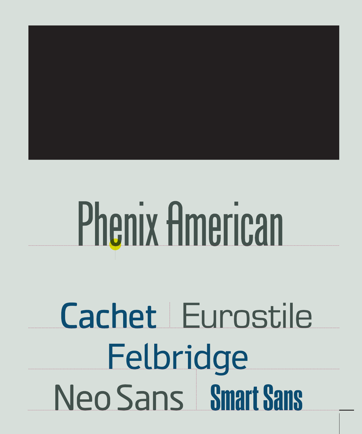
Sans Serif Square
These designs, generally based on Grotesque (60) character traits and
proportions, have a defi nite and at times dramatic squaring of normally
curved strokes. They usually have more latitude in character spacing than
their sans serif cousins, and tend to be limited to display designs.
Condensed
typeface
052-067 03171.indd 63 9/22/11 9:17 AM

Job:03171 Title:Typography Referenced (Rockport)
Page: 64
Job:03171 Title:Typography Referenced (Rockport)
Page: 64
052-067 03171.indd 64 9/22/11 9:17 AM
Text
Job:03171 Title:Typography Referenced (Rockport)
Page: 64
64
Typography, Referenced
Text
Job:03171 Title:Typography Referenced (Rockport)
Page: 64
Script Formal
Script Casual
Script Calligraphic
052-067 03171.indd 64 9/22/11 9:17 AM

Job:03171 Title:Typography Referenced (Rockport)
Page: 65
Job:03171 Title:Typography Referenced (Rockport)
Page: 65
052-067 03171.indd 65 9/22/11 9:17 AM
Text
Job:03171 Title:Typography Referenced (Rockport)
Page: 65
Type Classifi cation and Identifi cation
65
Text
Job:03171 Title:Typography Referenced (Rockport)
Page: 65
These typefaces derive from seventeenth-century (10) formal writing
styles. Many characters have strokes that join them to other letters.
These script typefaces intentionally look informal or quickly drawn. Often they appear
drawn with a brush. Typically, character strokes connect one letter to the next.
These script faces mimic calligraphy. They can be connecting or nonconnect-
ing in design. Many appear written with a fl at-tipped writing instrument.
052-067 03171.indd 65 9/22/11 9:17 AM

Job:03171 Title:Typography Referenced (Rockport)
Page: 66
Job:03171 Title:Typography Referenced (Rockport)
Page: 66
052-067 03171.indd 66 9/22/11 9:17 AM
Text
Job:03171 Title:Typography Referenced (Rockport)
Page: 66
66
Typography, Referenced
Text
Job:03171 Title:Typography Referenced (Rockport)
Page: 66
Script Blackletter/Lombardic
Ornamental Antiques,
Art Nouveau, and Art Deco
Ornamental Decorative
052-067 03171.indd 66 9/22/11 9:17 AM
..................Content has been hidden....................
You can't read the all page of ebook, please click here login for view all page.