
Job:03171 Title:Typography Referenced (Rockport)
Page: 88
068-121 03171.indd 88 9/22/11 4:55 PM
Typography, Referenced
Text
Job:03171 Title:Typography Referenced (Rockport)
Page: 88
Adrian Frutiger
Swiss, –
Typefaces: Phoebus (1953),
Formal Script, Ondine, President (1954),
Egyptienne (1955), Meridien, Univers (1957),
Opera (1959), Apollo (1962),
Serifa (1967), OCR-A, OCR-B (1968),
Iridium (1972), Frutiger (1976), Glypha (1979),
Breughel, Icone, Versailles (1982),
Janson (1985), Centennial (1986),
Avenir (1988), Westside (1989),
Herculaneum (1990), Vectora (1991),
Pompeijana, Rusticana (1992), Nami (2006)
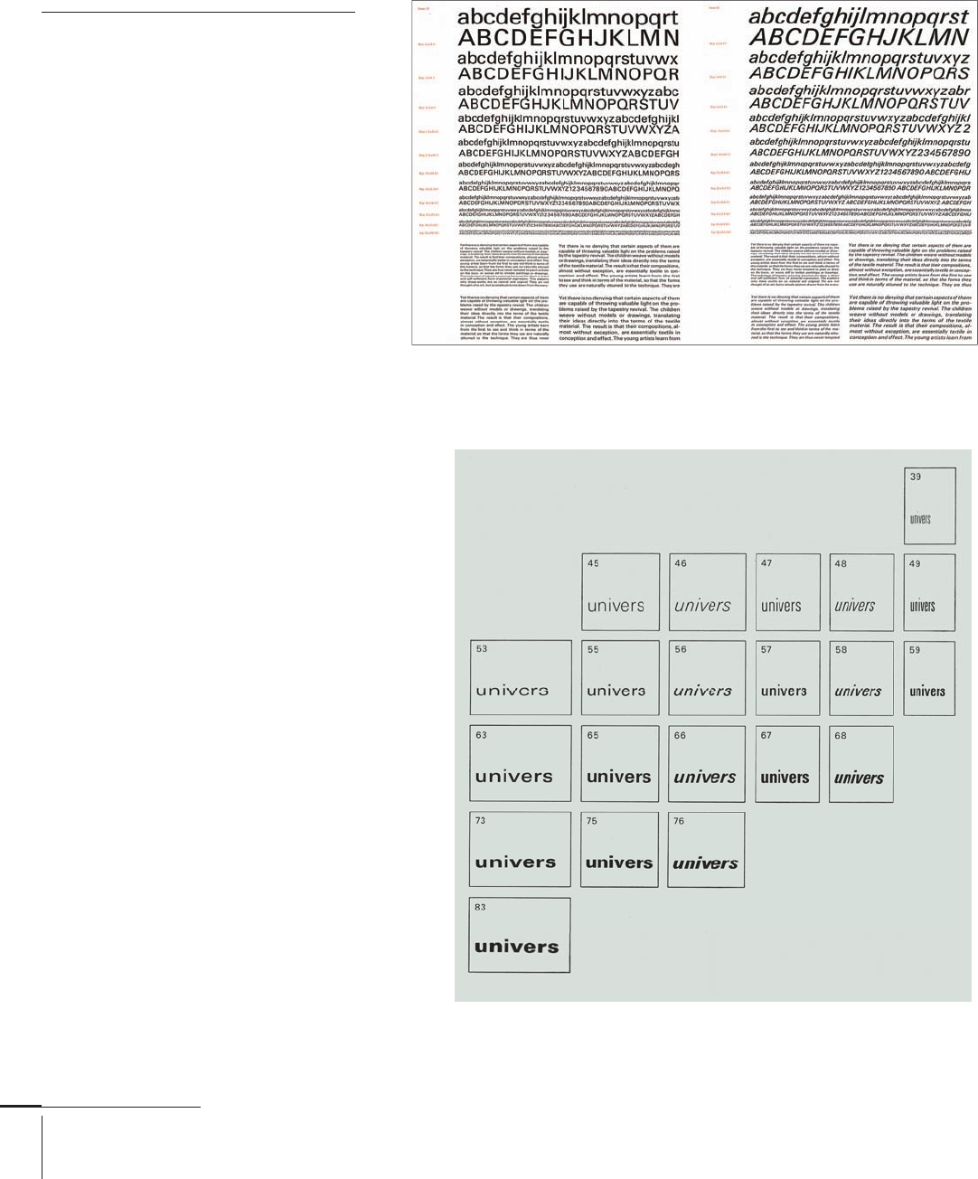
Adrian Frutiger is one of the greatest
typographers and typeface designers of the
twentieth century (). He created more
than typefaces, many of which have
become notable fonts, including Univers
() and Frutiger (). He also was one of
the fi rst type designers to create type for
fi lm and photocomposition.
Frutiger was born in Switzerland in
near Interlaken and apprenticed
as a compositor to a local printer. From
to , he was a student at the
Kunstgewerbeschule, where he was
studied graphic design, calligraphy, wood
engraving, and sculpture. Following his
studies, he relocated to Paris, where he
worked at the renowned Deberny & Peignot
type foundry until , the year he started
his own graphic design studio in Arcueil,
a Paris suburb.
He has taught typography and
illustration at École Estienne () and
École nationale superieure des Arts
Décoratifs in Paris. In , Frutiger
received the Gutenberg Prize for Technical
and Aesthetic Achievement in Type.
Univers,
Univers,
068-121 03171.indd 88 9/22/11 4:55 PM
Job:03171 Title:Typography Referenced (Rockport)
Page: 89
068-121 03171.indd 89 9/22/11 4:55 PM
Type Designers
Text
Job:03171 Title:Typography Referenced (Rockport)
Page: 89
Eric Gill
British, –
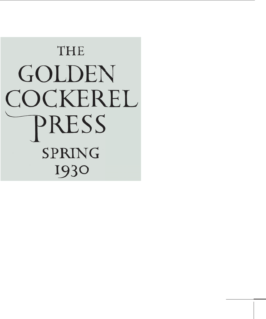
Typefaces: Gill Sans, Perpetua (1928), Golden Cockerel, Solus (1929),
Joanna (1931), Aries (1932), Jubilee, Pilgrim (1934)
Eric Gill was a prominent British letter cutter,
sculptor, wood engraver, and type designer. He
was born in in Brighton and studied at
the Chichester Art School before becoming an
apprentice to a London architect. While working
in London, he attended classes taught by British
calligrapher Edward Johnston at the Central
School of Arts and Crafts, launching him into a
career as a stonecutter and letterer.
Gill designed his fi rst typeface, Perpetua,
in for Stanley Morison (), typographic
advisor for Monotype Corporation ().
Perpetua takes it name from the fi rst book in
which it was used (in its fi rst size), The Passion of
Perpetua and Felicity. The original italic, cut in
, was called Felicity, but is not the same as
the Perpetua italic fi nally released.
Gill Sans (), designed during the same time
period and for Morison, was conceived as a text
face, in comparison to New Johnston designed
by Edward Johnston, specifi cally developed for
the London Metro sign system, and the many
geometric () sans serif faces being released in
Europe at the time.
In , Gill became an Associate of the Royal
Institute of British Architects and an Associate of
the Royal Academy of Art. In , Gill was part
of the fi rst group of individuals to receive the title
“Royal Designer of Industry.”
Golden Cockerel,
068-121 03171.indd 89 9/22/11 4:55 PM
Job:03171 Title:Typography Referenced (Rockport)
Page: 90
068-121 03171.indd 90 9/22/11 4:55 PM
Typography, Referenced
Text
Job:03171 Title:Typography Referenced (Rockport)
Page: 90
Frederic Goudy
American, –
Typefaces: Camelot (1896), DeVinne (1898),
Copperplate Gothic (1901), Pabst (1902),
Powell (1903), Kennerley (1911), Forum (1912),
Goudy, Goudy Old Style (1915), National Oldstyle (1916),
Hadriano (1918), Garamont (1921), Cushing Antique,
Deepdene (1927), Kaatskill, Remington Typewriter (1929),
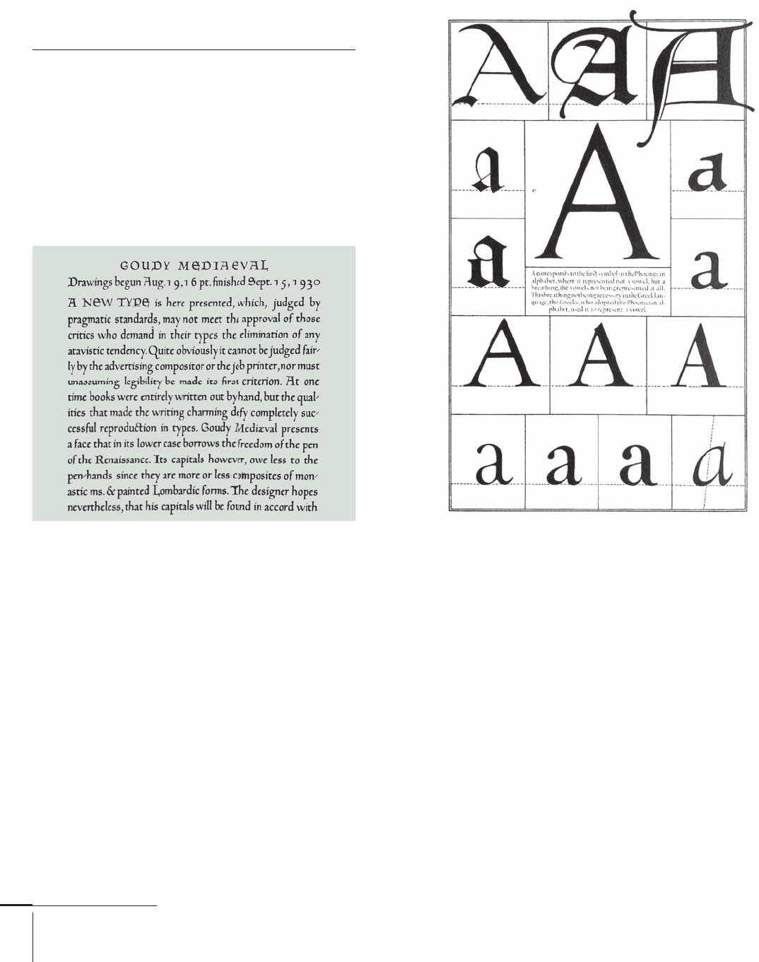
Mediaeval, Truesdell (1930),
Village (1932), Bertham (1936), Friar (1937),
Berkeley Oldstyle, Californian (1938), Bulmer (1939)
Frederic Goudy was one of the most pro-
lifi c U.S. type designers of the twentieth
century (). By his own account, he
designed faces (though he counted
each italic as a separate typeface).
Goudy, born in Bloomington, Illi-
nois, in , was interested in type at an
early age. He held several jobs in various
cities before founding a printing busi-
ness, the Booklet Press, in Chicago in
. Renamed the Camelot Press, he
printed the journal American Cap-Book
before selling his interest a year later. In
his next successful endeavor, he sold a set
of capitals of his own design to the Bruce
Type Foundry in Boston, which encour-
aged him to become a freelance lettering
artist. He also taught lettering and design
at the Frank Holme School of Illustration.
In , Goudy started The Village Press
in partnership with Will Ransom in Park
Ridge, Illinois.
Goudy’s breakthrough with type
design came in when he designed
Kennerley Old Style for the publisher
Mitchell Kennerley. He set up the Village
Letter Foundry to cast and sell Kenner-
ley and a titling font, Forum. These two
typefaces established his reputation
and became particularly popular in the
United Kingdom. Subsequently, Ameri-
can Type Founders commissioned Goudy
to design a typeface, resulting in Goudy
Old Style, regarded by many critics as
one of his fi nest designs. In , with
forty types to his name, Goudy became
Lanston Monotype’s appointed art
adviser; in this capacity, he worked on
the revival Garamont.
As one of his fi nal infl uences on the
type-design world, Goudy wrote about
type and the origins of his work in his
book A Half Century of Type Design and
Typography: 1895–1945, completed when
he was nearly eighty years old.
Mediaeval,
A Variations
068-121 03171.indd 90 9/22/11 4:55 PM
Job:03171 Title:Typography Referenced (Rockport)
Page: 91
068-121 03171.indd 91 9/22/11 4:55 PM
Type Designers
Text
Job:03171 Title:Typography Referenced (Rockport)
Page: 91
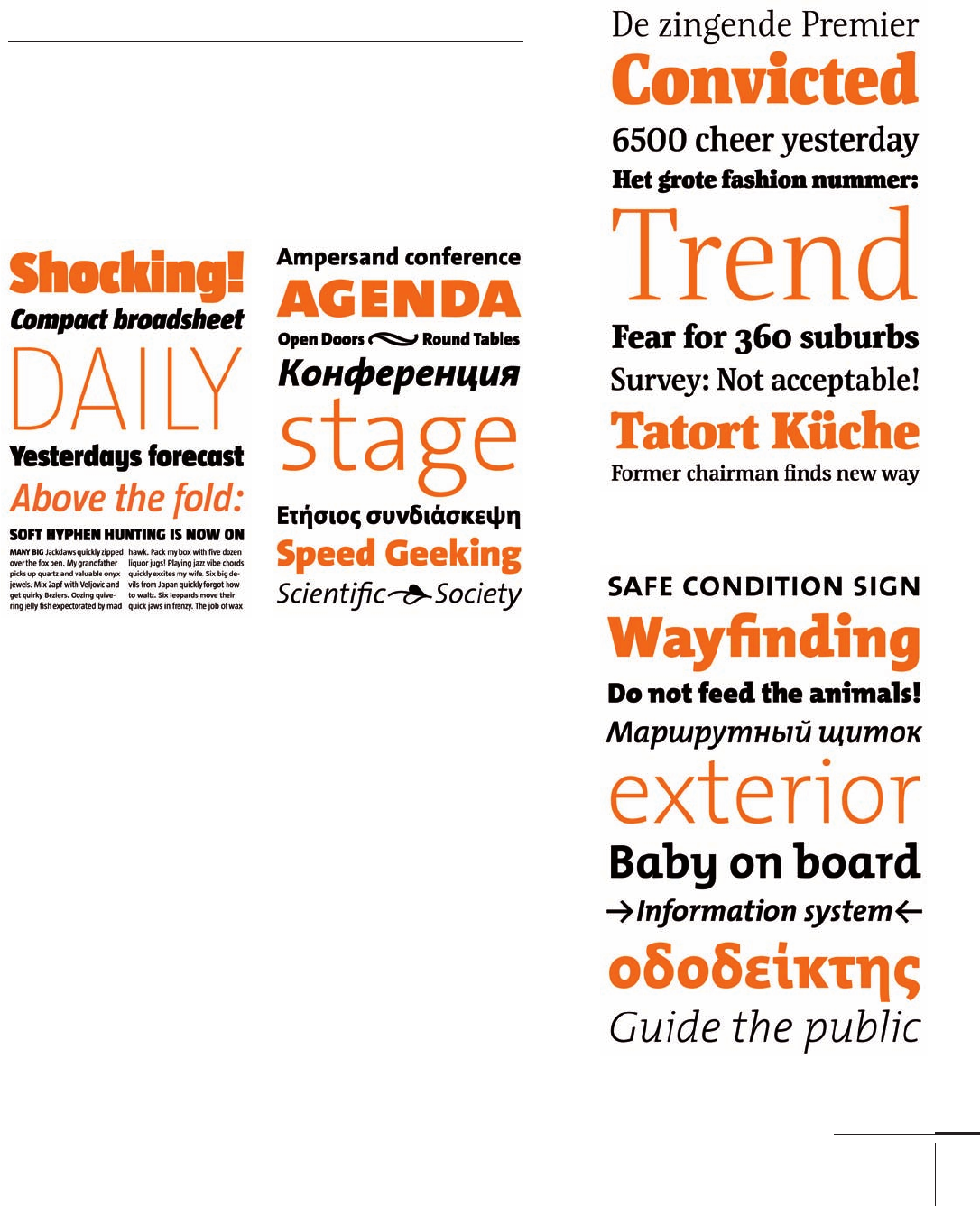
Born in Noordwijkerhout, The
Netherlands, Luc(as) de Groot is a
Berlin-based Dutch type designer,
graphic designer, educator, and
head of the type foundries Font-
Fabrik and LucasFonts (). He is
widely known for the popular and
large font family, Thesis (TheSans,
TheSerif, TheMix, TheSansMono,
and TheAntiqua), and Corpid (also
known as AgroSans).
He also has designed custom
fonts for prestigious international
publications and newspapers
such as Folha de S. Paulo (Brazil),
Le Monde (France), Metro (the
free, international paper), and
Der Spiegel (Germany), as well as
for international corporations
including Sun Microsystems, Bell
South, Heineken, Siemens, and
Miele. De Groot designed two
font families for Microsoft: the
monospaced font family Consolas,
a new alternative to Courier, and
Calibri, a new default typeface for
Microsoft Word.
In addition, de Groot is a
member of the design faculty of
the University of Applied Sciences
in Potsdam, Germany.
Luc(as) de Groot
Dutch, –
Typefaces: Folha Serif, Jesus Loves You All, Nebulae,
TheMix, TheSans, TheSerif, Thesis (1994),
TheSansMonospace, TheSansTypewriter (1996),
Corpid III, Spiegel (1997), Taz (2000), Sun (2001),
Punten (2002), Tazzer (2006), Floris (2007),
Calibri, Consolas, Qua (2008), TheAntiqua (2010)
Taz,
Floris,
TheMix,
TheSans,
068-121 03171.indd 91 9/22/11 4:55 PM
Job:03171 Title:Typography Referenced (Rockport)
Page: 92
068-121 03171.indd 92 9/22/11 4:55 PM
Typography, Referenced
Text
Job:03171 Title:Typography Referenced (Rockport)
Page: 92
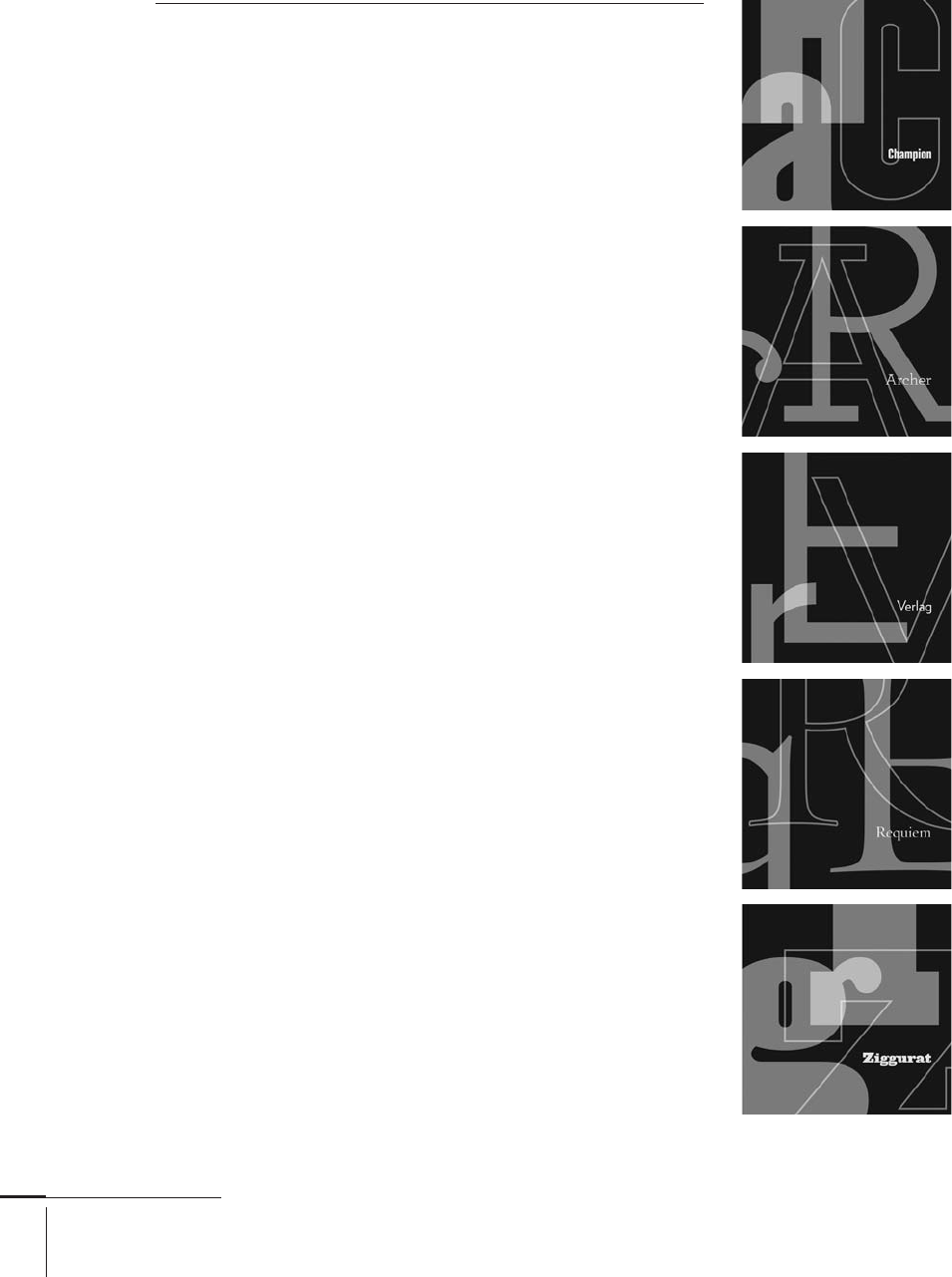
Jonathan Hoefl er
American, –
Typefaces: Egiziano Filigree (1989),
Bodoni Grazia, Champion Gothic (1990),
Gestalt, Hoefl er, Ideal Sans, Mazarin, Requiem, Ziggurat (1991),
Didot (1992), Acropolis, Fetish, Leviathan, Quantico, Saracen (1993),
Knockout, Troubadour (1994), Jupiter, Pavisse (1995),
Giant, New Amsterdam, Plainsong, Verlag (1996), Radio City (1998),
Cyclone, Deluxe, Mercury, Topaz (2000), Ideal Sans (2011)
Jonathan Hoefl er is a typeface
designer and type historian who
specializes in designing original
typefaces. He established Hoefl er
Type Foundry in .
Named one of the forty most
infl uential designers in America
by I.D. Magazine, his work
includes award-winning origi-
nal typeface designs for Rolling
Stone, Harper’s Bazaar, the New
York Times Magazine, Sports
Illustrated, and Esquire. His
institutional clients range from
the Solomon R. Guggenheim
Museum in New York City to the
rock band They Might Be Giants.
Hoefl er’s best known work
is the Hoefl er Text family of
typefaces, designed for Apple
Computer, Inc., and now part of
the Macintosh operating system.
His work has been exhibited
internationally and is included in
the permanent collection of the
Smithsonian’s Cooper-Hewitt,
National Design Museum in New
York City.
In , he teamed up with
Tobias Frere-Jones () and
the pair’s foundry became
known as Hoefl er & Frere-Jones
(). In , the Association
Typographique Internationale
() presented Hoefl er with its
most prestigious award, the Prix
Charles Peignot for outstanding
contributions to type design.
068-121 03171.indd 92 9/22/11 4:55 PM
..................Content has been hidden....................
You can't read the all page of ebook, please click here login for view all page.