
Job:03171 Title:Typography Referenced (Rockport)
Page: 192
166-205 03171 C2.indd 192 10/12/11 10:07 AM
Text
Job:03171 Title:Typography Referenced (Rockport)
Page: 192
192
Typography, Referenced
Blackletter
B
lackletter has existed
as a typographic style
for centuries.
It is a hybrid of both
Carolingian and Old English
writing, bearing resemblance
to ancient scribes’ handcrafted
writing from ninth-century Italy
and France, and as far east as
Germany. Johannes Gutenberg’s
invention of movable type in
the 1450s made blackletter
popular throughout Germany,
thanks mostly to Gutenberg’s
initial printing and distribution
of the Bible.
Peter Schöff er took over Guten-
berg’s production facility when
Schöff er’s father-in-law, Johann
Fust, foreclosed on Gutenberg,
and the two of them fi nished the
Bible production—leaving Guten-
berg penniless. From then on, a
long line of German type found-
ries and printers made names
for themselves and distributed
a wealth of printed goods set in
blackletter. Notable among them
were Conrad Sweynheym and
Arnold Pannartz, who established
a press in the Benedictine
monastery of Subiaco in 1465.
Over time, blackletter spread to
northern Europe.
Centuries later, in the s
(), Adolf Hitler and the Nazis
plastered Germany with pro-
paganda using blackletter
Fraktur as the de facto type
style. But by 1941, Hitler’s secre-
tary, Martin Bormann, decreed
that blackletter—specifi cally
Fraktur—was not to be used
because of its supposed Jewish
origins. Despite its use by the
Nazis and Bormann’s unusual
ruling, blackletter remains a ver-
satile typographic choice, and
has enjoyed modern-day reviv-
als by some of the industry’s
most celebrated type designers.
Today, it appears in news-
papers, on beer labels, and in
religious scriptures, connoting
a sense of reverence, reliability,
and timelessness. And in popular
culture, blackletter has graced
fl eshy canvases as tattoos and
has been used as wordmarks for
heavy metal and hip-hop bands.
Editor’s note: We do not recom-
mend using these blackletter
typefaces for long bodies of text.
TYPEFACES AND SPECIMENS
Blackletter
166-205 03171.indd 192 9/23/11 4:18 PM

Job:03171 Title:Typography Referenced (Rockport)
Page: 193
166-205 03171 C2.indd 193 10/12/11 10:07 AM
Text
Job:03171 Title:Typography Referenced (Rockport)
Page: 193
193
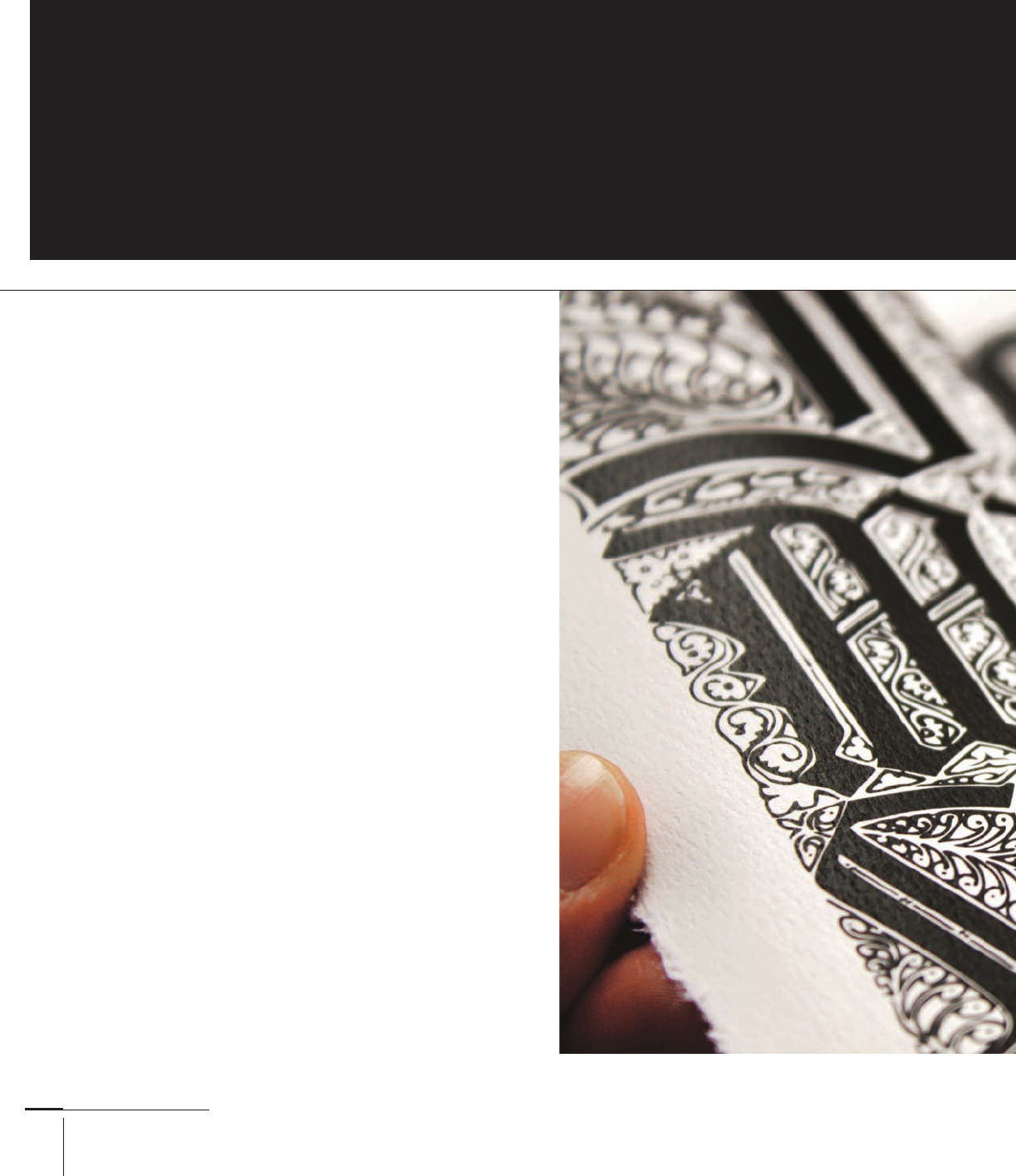
Typefaces and Specimens
Memories in black-
letter, by Creatives,
United Kingdom
BLACKLETTER SERIF CHARACTERISTICS
Typography
Typography
Typography
Typography
Bastarda (set in Lucida
Blackletter): References to
Carolingian minuscules,
highly legible compared to
other blackletters, angled
ascenders and descenders,
many curved strokes
Fraktur (set in Fette Fraktur):
Dramatic and exagger-
ated strokes, descending
feet and stems, swashed
terminals, curved tails
Rotunda (set in San
Marco): Highly legible,
thick terminals, angled
stress in counters, straight
stems, and downstrokes
Textura (set in Old English):
Hairline second strokes and fl our-
ishes, angular and narrow body
width, split terminals, looped
tails, various straight stems
Crane Lettra broadside,
by /Michael Osborne
Design, United States
166-205 03171.indd 193 9/23/11 4:18 PM

Job:03171 Title:Typography Referenced (Rockport)
Page: 194
ABCDEFGHIJKLM
NOPQRSTUVWXYZ
a bcdefghijklmnopqrstuvwxyz
166-205 03171.indd 194 9/23/11 4:18 PM
Text
Job:03171 Title:Typography Referenced (Rockport)
Page: 194
194
Typography, Referenced
Background Traits
Clairvaux was part of a program that called on twelve font
designers to represent styles from across the ages, for a series
called “Type Before Gutenberg.” Designer Herbert Maring was
charged with developing Clairvaux, and he based his design on
early Gothic typefaces.
Clairvaux’s letters look more like those found in the Roman
alphabet, and they are more readable () when set in the
English language. Maring based many of its forms on those
found in Carolingian manuscripts, especially the minuscule
letters such as the lowercase () a.
Clairvaux
YEAR
ORIGINAL DESIGNERS
Herbert Maring
CLASS
Bastarda
A designer’s job will become even
more challenging as the quantity
of information and noise increases
during the twenty-fi rst century. Those
who possess a broad typographic
understanding will best meet the
communicative and creative challenge,
especially during a time when
people know the difference between
one font and another—and which
ones read better or worse with…
ABCDEFGHIJ
KLMNOPQR
STUVWXYZ
1234567890 abcdefghijk
lmnopqrstuvwxyz
The quick brown fox jumped
over the lazy dog.
SELECTED CLAIRVAUX ALPHABETS
-point Clairvaux
EXAMPLE
-point Clairvaux
166-205 03171.indd 194 9/23/11 4:18 PM

Job:03171 Title:Typography Referenced (Rockport)
Page: 195
ABCDEFGHIJKLM
NOPQRSTUVWXYZ
abcdefghijklmnopqrstuvwxyz
166-205 03171.indd 195 9/23/11 4:18 PM
Text
Job:03171 Title:Typography Referenced (Rockport)
Page: 195
195
Typefaces and Specimens
Background Traits
Linotype () issued Gottfried Pott’s design in during a
blackletter revival that celebrated many of the typographic
styles and infl uences from the s and s. The
typographic forms owe much to the French blackletter
traditions, with more open counters and curvilinear strokes.
Duc de Berry’s capital letters have a number of fl ourishes and
hairline strokes, some with rectangular terminals that give the
letters a rigid appearance. With its Romanesque qualities and
lighter typographic color, Duc de Berry reads well when set as
text type () compared to other blackletter typefaces.
Duc de Berry
YEAR
ORIGINAL DESIGNERS
Gottfried Pott
CLASS
Bastarda
A designer’s job wi become even
more cha enging as the quantity
of information and noise increases
during the twenty- rst century.
Those who possess a broad
typographic understanding wi best
meet the communicative and creative
cha enge, especia y during a time
when people know the di erence
between one font and another—
and which ones read better or worse…
ABCDEFGHIJ
KLMNOPQR
STUVWXYZ
1234567890 abcdefghijk
lmnopqrstvwxyz
The quick brown fox jumped
over the lazy dog.
SELECTED DUC DE BERRY ALPHABETS
-point Duc de Berry
EXAMPLE
-point Duc de Berry
166-205 03171.indd 195 9/23/11 4:18 PM
Job:03171 Title:Typography Referenced (Rockport)
Page: 196
ABCDEFGHIJKLM
NOPQRSTUVWXYZ
abcdefghijklmnopqrstuvwxyz
166-205 03171.indd 196 9/23/11 4:18 PM
Text
Job:03171 Title:Typography Referenced (Rockport)
Page: 196
196
Typography, Referenced
Background Traits
Punchcutter Johann Christian Bauer designed Fette Fraktur in
, and the C. E. Weber Foundry later published a version in
. Other versions have been produced during the twentieth
century (), such as one in by the D. Stempel AG foundry.
Fette Fraktur has a vivid sense of contrast () thanks in part
to its varied stroke widths and terminals. It possesses as many
angular forms as it does curvilinear ones. With its fat, broken
appearance, Fette Fraktur is best read in sizes larger than
point to ensure good legibility () and reproduction.
Fette Fraktur
YEAR
ORIGINAL DESIGNERS
Johann Christian Bauer
CLASS
Fraktur
A designer’s job will become
even more challenging as the
quantity of information and
noise increases during the
twenty-fi rst century. Those who
possess a broad typographic
understanding will best meet
the communicative and creative
challenge, especially during
a time when people know the
difference between one font…
ABCDEFGHI
JKLMNOPQR
S T U V W X Y Z
1234567890 abcdefghijk
lmnopqrstuvwxyz
The quick brown fox jumped
over the lazy dog.
SELECTED FETTE FRAKTUR ALPHABETS
-point Fette Fraktur
EXAMPLE
-point Fette Fraktur
166-205 03171.indd 196 9/23/11 4:18 PM
..................Content has been hidden....................
You can't read the all page of ebook, please click here login for view all page.