
Job:03171 Title:Typography Referenced (Rockport)
Page: 52
052-067 03171.indd 52 9/22/11 9:17 AM
Text
Job:03171 Title:Typography Referenced (Rockport)
Page: 52
52
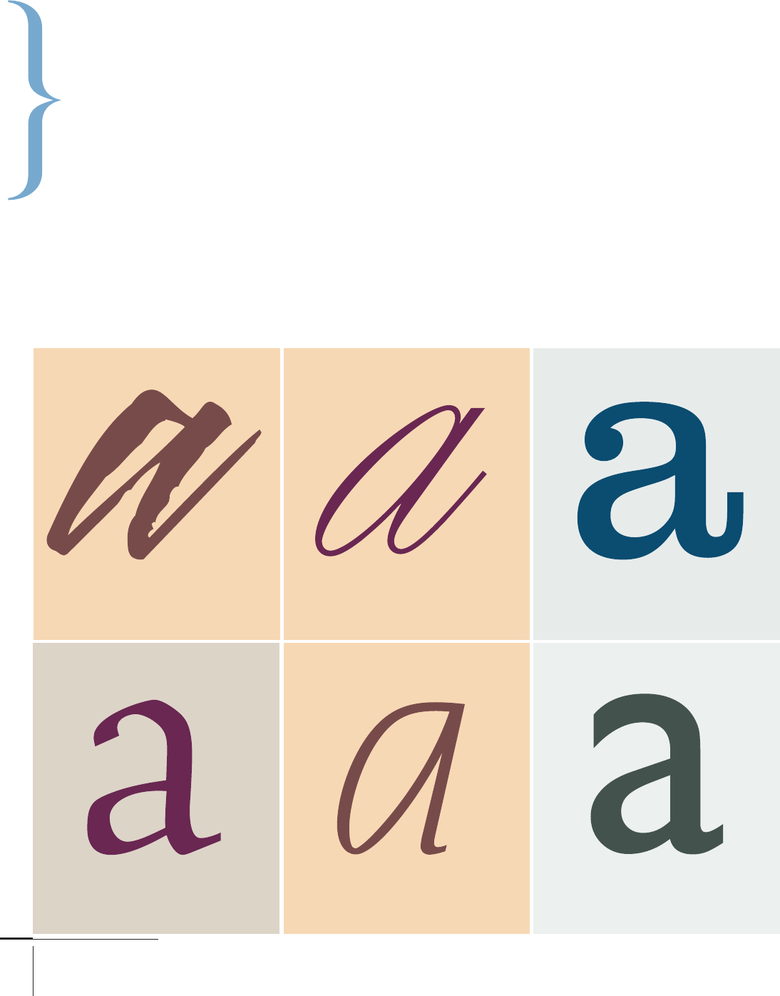
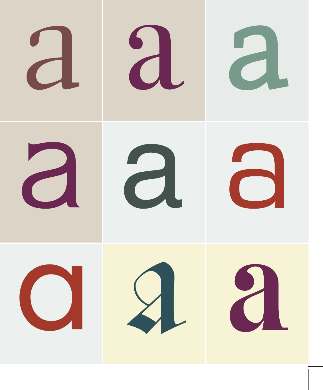
Typography, Referenced
M
ost typefaces fall into one of three basic groups: those with serifs (little feet and tails), those without
serifs, and scripts (designed to look like cursive handwriting). Many more defi nitive classifi cation
systems have been developed, some with more than 100 diff erent categories.
A classifi cation system can help identify and combine various typefaces. Though three categories
may be inadequate, hundreds become self-defeating. Here we present fi fteen groups of type styles, listed in
chronological order of their appearance. In all likelihood, larger systems would break down into subdivisions of these.
Type Classifi cation
and Identifi cation
By Allan Haley
Blaze
Script
Calligraphic
Young Baroque
Script
Formal
Clarendon
Serif
Clarendon
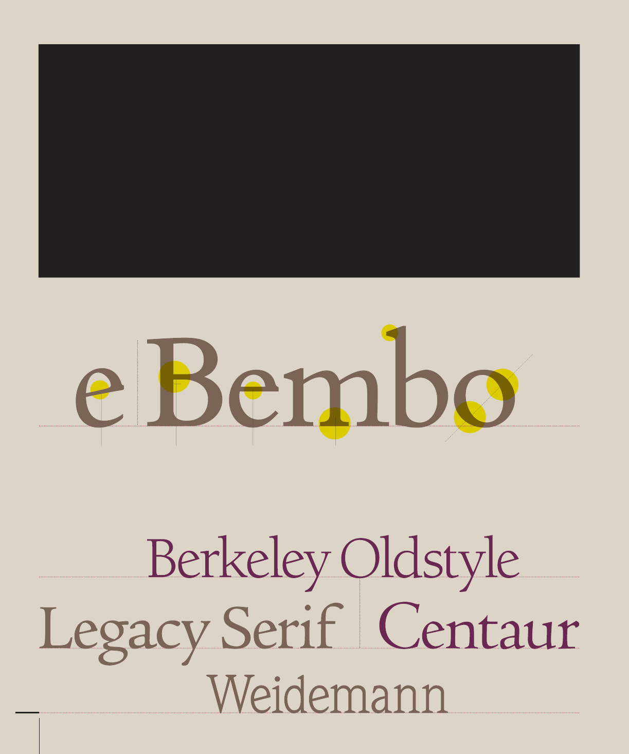
Centaur
Serif
Old Style
Nadianne
Script
Casual
Gill Sans
Sans Serif
Humanist
052-067 03171.indd 52 9/22/11 9:17 AM
Job:03171 Title:Typography Referenced (Rockport)
Page: 53
052-067 03171.indd 53 9/22/11 9:17 AM
Text
Job:03171 Title:Typography Referenced (Rockport)
Page: 53
53
Electra
Serif
Transitional
Bodoni
Serif
Neoclassical/Didone
Silica
Serif
Slab
Élan
Serif
Glyphic
Helvetica
Sans Serif
Grotesque
Eurostile
Sans Serif
Square
Futura
Sans Serif
Transitional
Cresci Rotunda
Script
Blackletter/Lombardic
Raphael
Ornamental
Art Nouveau
052-067 03171.indd 53 9/22/11 9:17 AM
Job:03171 Title:Typography Referenced (Rockport)
Page: 54
Job:03171 Title:Typography Referenced (Rockport)
Page: 54
052-067 03171.indd 54 9/22/11 9:17 AM
Text
Job:03171 Title:Typography Referenced (Rockport)
Page: 54
Text
Job:03171 Title:Typography Referenced (Rockport)
Page: 54
54
Typography, Referenced
These are the fi rst Roman types, faces originally created between the late- fi fteenth century (9) and
mid- eighteenth century (10) or patterned after typefaces originally designed during this period.
The axis of curved strokes normally inclines to the left in these designs, so that weight stress
falls at approximately eight o’clock and two o’clock. The contrast (230) in character stroke weight
is not dramatic, and hairlines tend to be on the heavy side. Some versions, such as the earlier
Venetian Old Style designs, are distinguished by the diagonal cross stroke of the lowercase (332)
e. Serifs are almost always bracketed in Old Style designs and head serifs are often angled.
Serif Old Style
Some versions
have a diagonal
cross stroke of
the lowercase e.
Weight stress
falls at two
o’clock and
eight o’clock.
Contrast in
stroke weight is
not dramatic.
Serifs are
bracketed.
Head serifs
are angled.
Hairlines
tend to
be on the
heavy side.
052-067 03171.indd 54 9/22/11 9:17 AM
Job:03171 Title:Typography Referenced (Rockport)
Page: 55
Job:03171 Title:Typography Referenced (Rockport)
Page: 55
052-067 03171.indd 55 9/22/11 9:17 AM
Text
Job:03171 Title:Typography Referenced (Rockport)
Page: 55
Type Classifi cation and Identifi cation
55
Text
Job:03171 Title:Typography Referenced (Rockport)
Page: 55
Axis of curve
strokes have a
vertical stress.
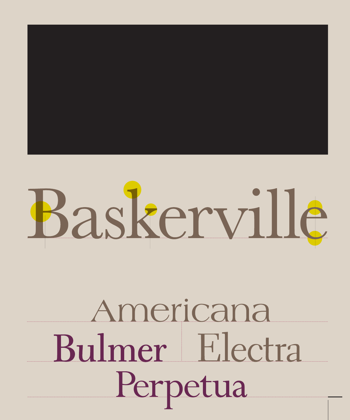
The English printer and typographer John Baskerville (70) established the style for these
typefaces in the middle of the eighteenth century (10). His work with calendared paper and
improved printing methods (both of which he developed) allowed for the reproduction of
much fi ner character strokes and the maintenance of subtler character shapes.
While the axis of curve strokes can be inclined in Transitional designs, they generally have a
vertical stress. Weight contrast (230) is more pronounced than in Old Style (54) designs. Serifs
are still bracketed and head serifs are oblique. These typefaces represent the transition between
Old Style and Neoclassical (56) designs, and incorporate some characteristics of each.
Serif Transitional
Weight contrast is
more pronounced
than in Old
Style designs.
Head serifs
are oblique.
Serifs are
bracketed.
052-067 03171.indd 55 9/22/11 9:17 AM
Job:03171 Title:Typography Referenced (Rockport)
Page: 56
Job:03171 Title:Typography Referenced (Rockport)
Page: 56
052-067 03171.indd 56 9/22/11 9:17 AM
Text
Job:03171 Title:Typography Referenced (Rockport)
Page: 56
Text
Job:03171 Title:Typography Referenced (Rockport)
Page: 56
56
Typography, Referenced
Contrast between
thick and thin
strokes is abrupt
and dramatic.
Serif Neoclassical/Didone
Axis of curved
strokes is vertical,
with little or no
bracketing.
In many cases,
stroke terminals
are ball shapes.
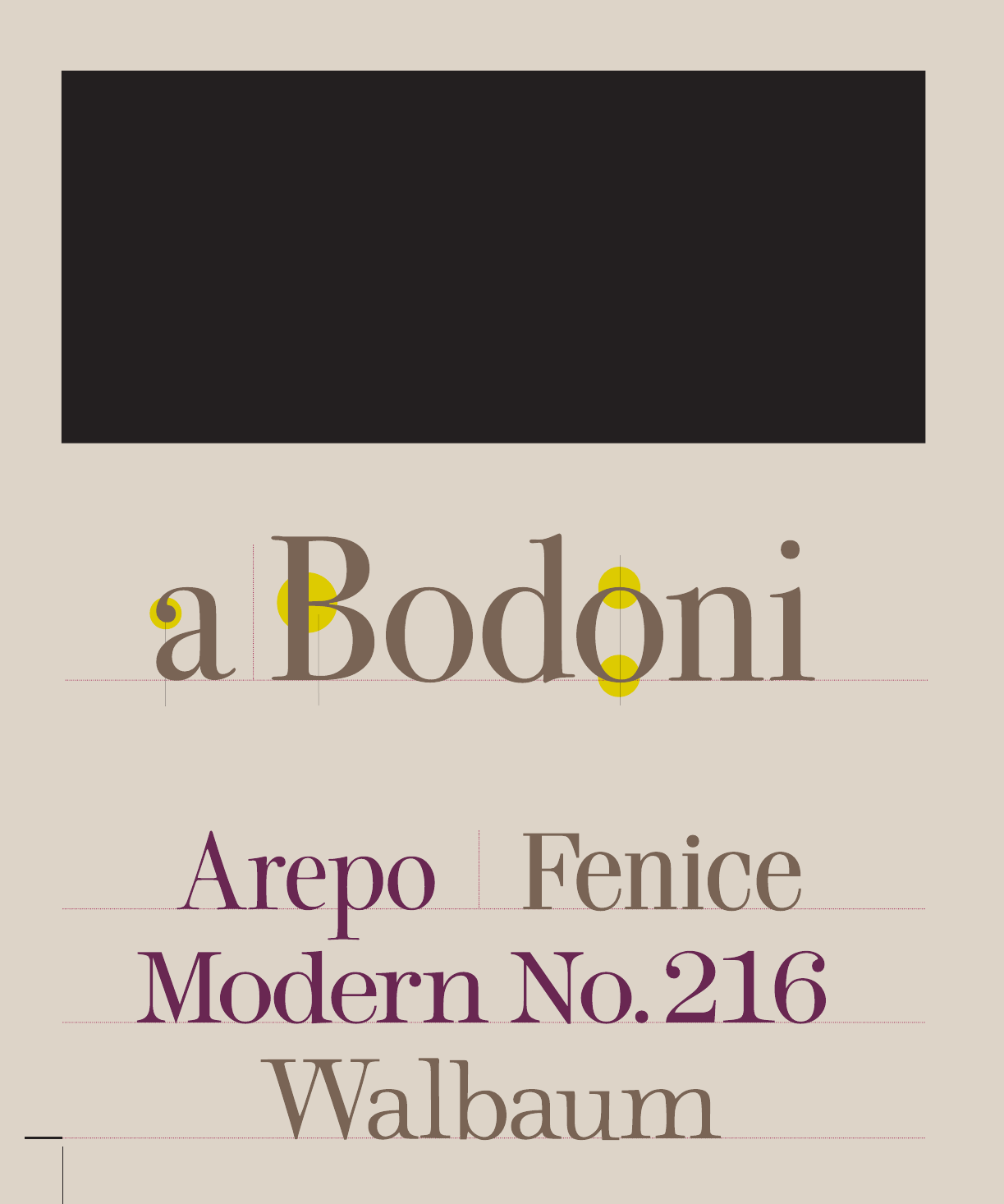
These are typefaces created during the late eighteenth century (10), or their direct descendants. The
work of Giambattista Bodoni (71) epitomizes this type style. When fi rst released, these typefaces were
called Classical designs. Early on, however, it became apparent that rather than updated versions of
classic type styles, these were altogether new designs. As a result, their classifi cation name was changed
to Modern. Because they are no longer modern today, they are also classifi ed as Neoclassical or Didone.
Contrast (230) between thick and thin strokes is abrupt and dramatic here. The axis of curved strokes
is vertical, with little or no bracketing. In many cases, stroke terminals are ball shapes rather than the
refl ection of a broad pen. These tend to be highly mannered designs, which are obviously constructed.
052-067 03171 C2.indd 56 10/12/11 9:20 AM
..................Content has been hidden....................
You can't read the all page of ebook, please click here login for view all page.