
Job:03171 Title:Typography Referenced (Rockport)
Page: 212
206-233 03171.indd 212 9/23/11 5:23 PM
Text
Job:03171 Title:Typography Referenced (Rockport)
Page: 212
212
Typography, Referenced
TYPOGRAPHIC PRINCIPLES
Typography Selection
One of the best methods to decide which typeface to use is to have a clear understanding of its applica-
tion. Will the type be digital or in print? Will it require a range of weights and postures? If it requires a
variety of fractions and numerals, does the typeface have a complete set of OpenType options for numbers?
While every typeface has a distinct look and feel, its application ultimately dictates its usefulness.
The Adris Group’s
Good Ideas Glow in
the Dark annual
report uses a
readable Minion
Pro set in varying
weights and styles
to separate bodies
of information.
Bruketa&Žinić
, Croatia
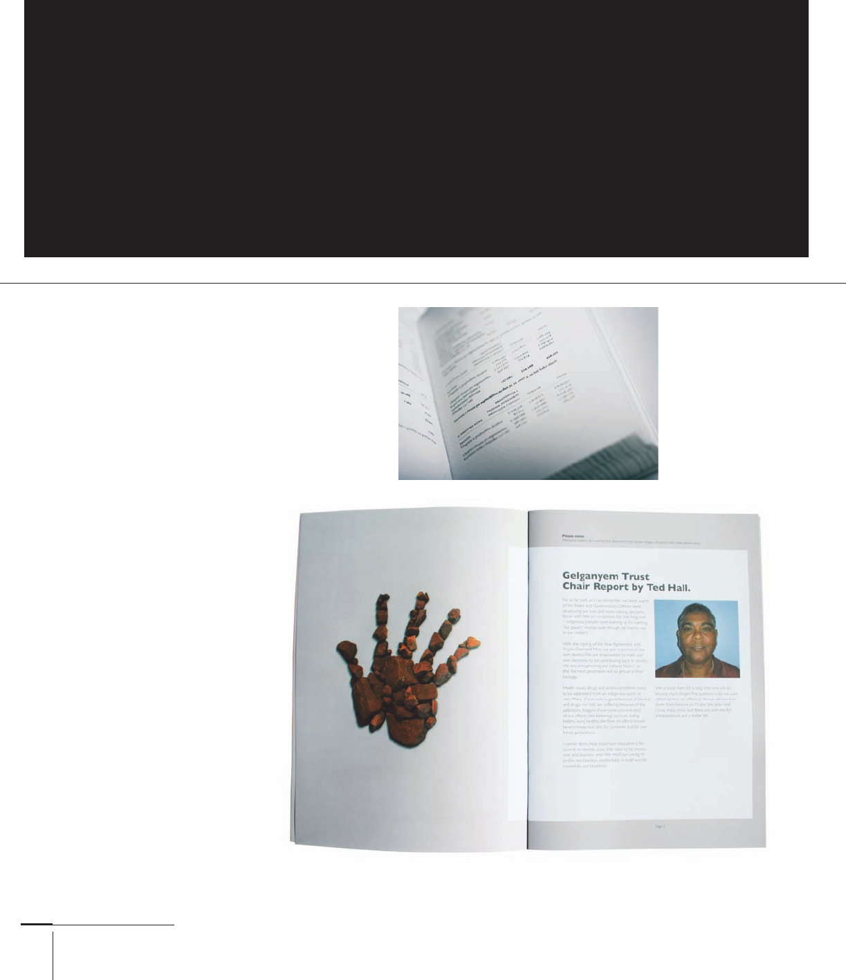
For continuous reading of the Future, Country book about Gelganyem, Kevin Finn
used a standard two-column grid to deliver the book’s text to the reader.
Text Type
For text type, use typefaces
designed for the purpose
of uninterrupted reading
such as Caslon (), Bembo
(), and Garamond ().
These three work well for
large areas of book text.
Times New Roman () —
though overused today—was
designed in the twentieth
century () to function as
a newspaper typeface, and
makes an adequate choice
for book text as well. Clear-
face (), Centaur (),
and Sabon () also have
clear readability (). Line
length, word spacing, and
leading all factor into a book
text’s readability, but choos-
ing a time-tested typeface
such as those listed in this
chapter is as good a place as
any to start.
206-233 03171.indd 212 9/23/11 5:23 PM

Job:03171 Title:Typography Referenced (Rockport)
Page: 213
206-233 03171.indd 213 9/23/11 5:23 PM
Text
Job:03171 Title:Typography Referenced (Rockport)
Page: 213
213
Typographic Principles
Even with just a glance of the Union poster by /
Michael Osborne Design, the reader knows that a
patriotic message sits around the larger headline,
not only because of the large type, but also
because of the red, white, and blue color scheme.
Display Type
Display type needs to quickly
catch readers’ attention, much
like the messages on posters,
advertisements, and promotions
made popular during the late
nineteenth century (). Using
typographic size to gain attention
continues to this day, where asser-
tiveness can help cut through the
competitive visual noise. While
text type () rarely relies on
these measures to get attention,
headlines and subheads in printed
and digital matter must pull in
readers, delineate levels of infor-
mation, tell readers where they are,
and keep their attention.
Display type must be legible (),
of course, but because the reader
can decipher the small chunks of
type rather quickly, legibility may
not be as important as with text
type. Also, the concept or message
may call for something with
more vigor and exuberance. Slab
serifs () such as Rockwell (),
Memphis (), and Clarendon
() all have enough weight and
character for use as display type
in headlines or subheads. When
enlarged, many of the raw visual
forms become present for Old
Style () and Garalde serif faces,
so use these for display type with
consideration. Finally, a variety of
sans serifs and scripts can also do
the job well.
AdamsMorioka, Inc., paired a serif-faced
headline that announces the Mohawk
Via brand with a delicate, formal script
for the quality assurance statement.
To enable distance reading and announce the place illustrated on Jennifer
Beorkrem’s poster, “The Great Lakes” is set in a large typeface, while the
smaller typographic elements mapped on the lakes identify each body of water.
206-233 03171.indd 213 9/23/11 5:23 PM
Job:03171 Title:Typography Referenced (Rockport)
Page: 214
206-233 03171.indd 214 9/23/11 5:23 PM
Text
Job:03171 Title:Typography Referenced (Rockport)
Page: 214
214
Typography, Referenced
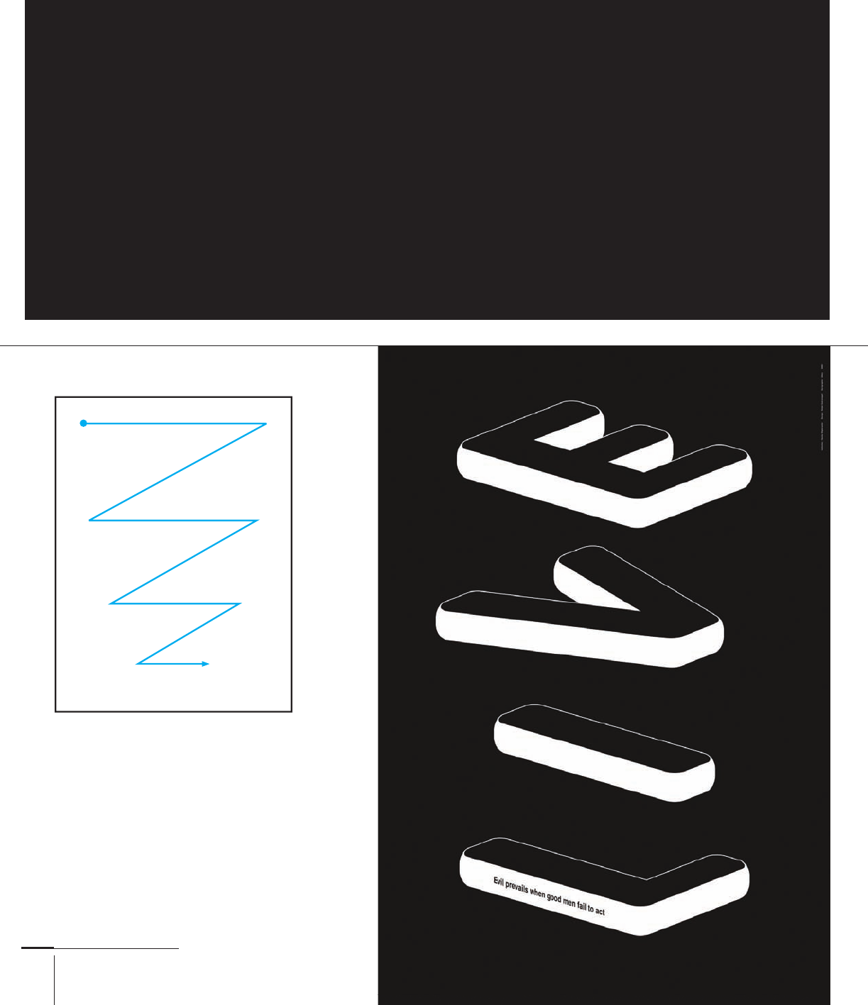
By positioning the letters
E, V, I, and L vertically on
this composition, this
poster by Ralph Schraivogel
reads “” one way
and “” the other.
Readers typically begin
at the top left (at the
circle) and scan right
and down, left and
down, until fi nally
reaching the compo-
sition’s bottom. This
is not a prescription
but rather one of the
many ways that readers
approach and read
graphic materials.
TYPOGRAPHIC PRINCIPLES
Reading Direction
and Scanning
Western cultures read the written language from left to right, which typically puts the reader’s fi rst glance
at the upper left-hand corner of formats. From there, readers scan left to right, diagonally down to the next
line, and back again from left to right. This Z-shaped scanning pattern often occurs when reading text
type () in magazines or books, as well as with digital media such as content found on the Internet.
206-233 03171.indd 214 9/23/11 5:23 PM
Job:03171 Title:Typography Referenced (Rockport)
Page: 215
206-233 03171.indd 215 9/23/11 5:23 PM
Text
Job:03171 Title:Typography Referenced (Rockport)
Page: 215
215
Typographic Principles
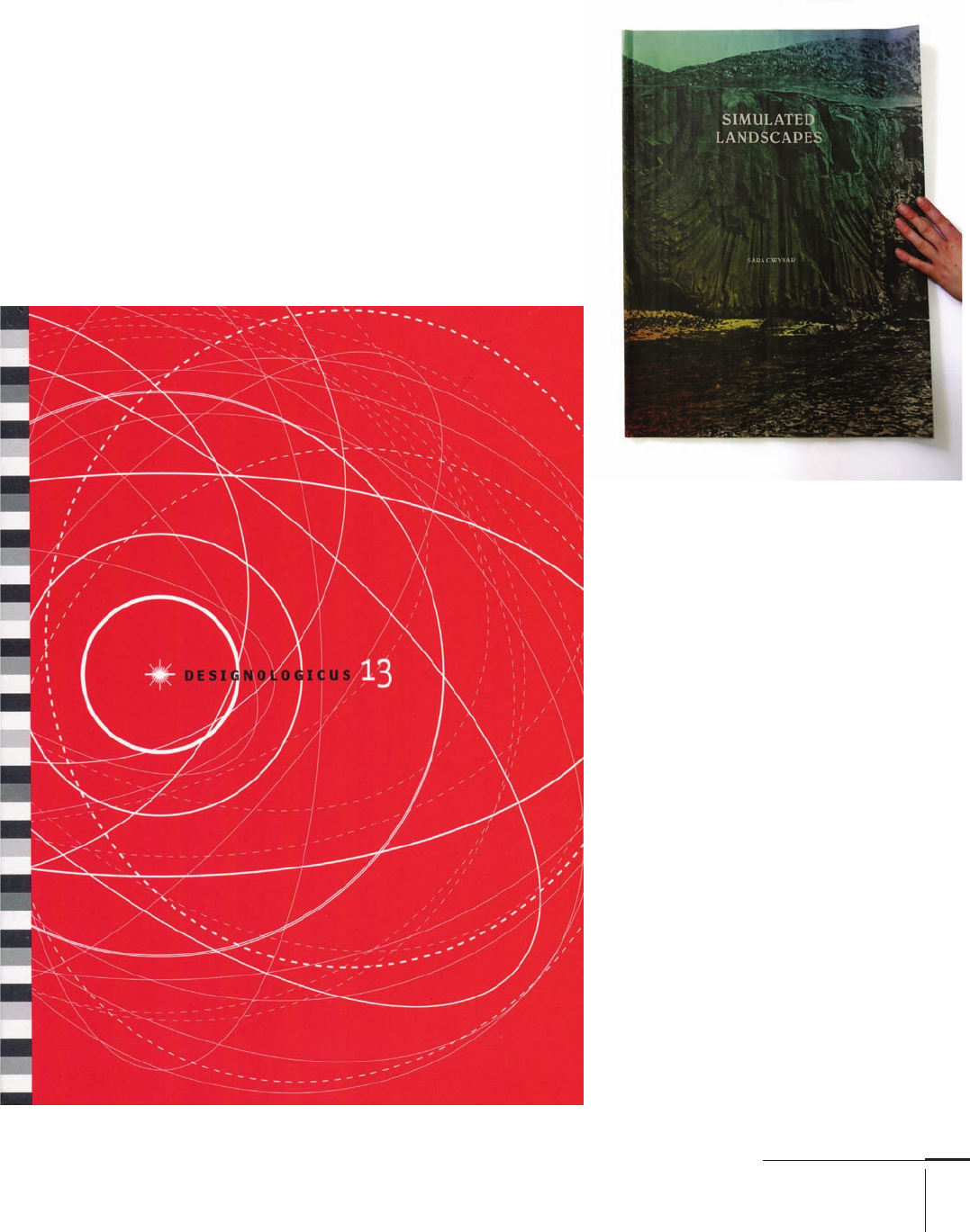
Focal Point
Dynamic compositions, especially those meant to attract a viewer’s
attention, often employ a focal point that does not allow a reader to scan
starting with the top-left corner. In these compositions, the designer
takes control, telling the reader what to read fi rst on the format. This
decisive communication method comes in handy for posters and adver-
tisements, package design, and signage. Contrasts () in size, shape,
typeface, color, and texture create these focal points.
The straight line of black
type serves as enough
contrast against the circular
elements in the Designo-
logicus composition for
readers to key in on the title.
Although economical in
execution, Sara Cwynar’s book
cover isolates the title text
amidst a textured background
to eff ectively create a focal
point. York University
Department of Design, Canada.
206-233 03171.indd 215 9/23/11 5:23 PM
Job:03171 Title:Typography Referenced (Rockport)
Page: 216
206-233 03171 C2.indd 216 10/12/11 10:09 AM
Text
Job:03171 Title:Typography Referenced (Rockport)
Page: 216
216
Typography, Referenced
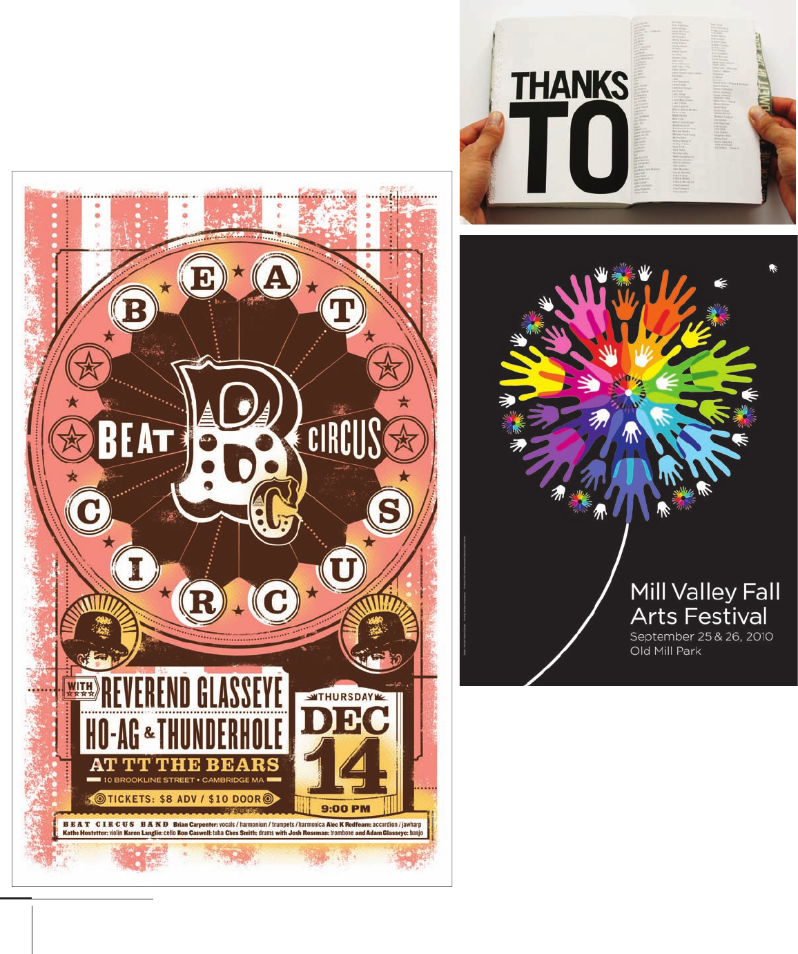
Center placement within a composi-
tion immediately grasps the reader’s
attention. Lure Design, United States.
This spread from
the book Memories
uses an extra-large
headline to announce
“Thanks.” Creatives,
United Kingdom.
Sometimes type works as a secondary
visual component, as in this poster by
/Michael Osborne Design. Its fl owery
graphic element sits in the composition’s
center, off set by the smaller type headline
in the lower-right corner. This composi-
tion would not have the same impact had
the items been transposed, with the type
large and the colorful graphic smaller.
206-233 03171.indd 216 9/23/11 5:24 PM
..................Content has been hidden....................
You can't read the all page of ebook, please click here login for view all page.