
Job:03171 Title:Typography Referenced (Rockport)
Page: 57
Job:03171 Title:Typography Referenced (Rockport)
Page: 57
052-067 03171.indd 57 9/22/11 9:17 AM
Text
Job:03171 Title:Typography Referenced (Rockport)
Page: 57
Type Classifi cation and Identifi cation
57
Text
Job:03171 Title:Typography Referenced (Rockport)
Page: 57
Vertical axis of
curved strokes.
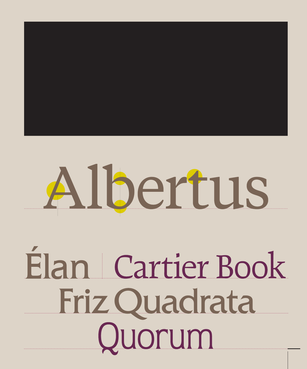
Serif Glyphic
Typefaces in this category tend to refl ect lapidary inscriptions rather than pen-drawn
text. Contrast (230) in stroke weight is usually minimal, and the axis of curved
strokes tends to be vertical. The distinguishing feature of these typefaces is the
triangular-shaped serif design, or a fl aring of the character strokes at termination.
Some type classifi cation systems break down this one category into two groups:
Glyphic and Latin. Latins are faces with strict triangular-shaped serifs.
Minimum
contrast in
stroke weight.
Triangular-
shaped serif
design.
052-067 03171.indd 57 9/22/11 9:17 AM
Job:03171 Title:Typography Referenced (Rockport)
Page: 58
Job:03171 Title:Typography Referenced (Rockport)
Page: 58
052-067 03171.indd 58 9/22/11 9:17 AM
Text
Job:03171 Title:Typography Referenced (Rockport)
Page: 58
Text
Job:03171 Title:Typography Referenced (Rockport)
Page: 58
58
Typography, Referenced
Slight stroke
contrast
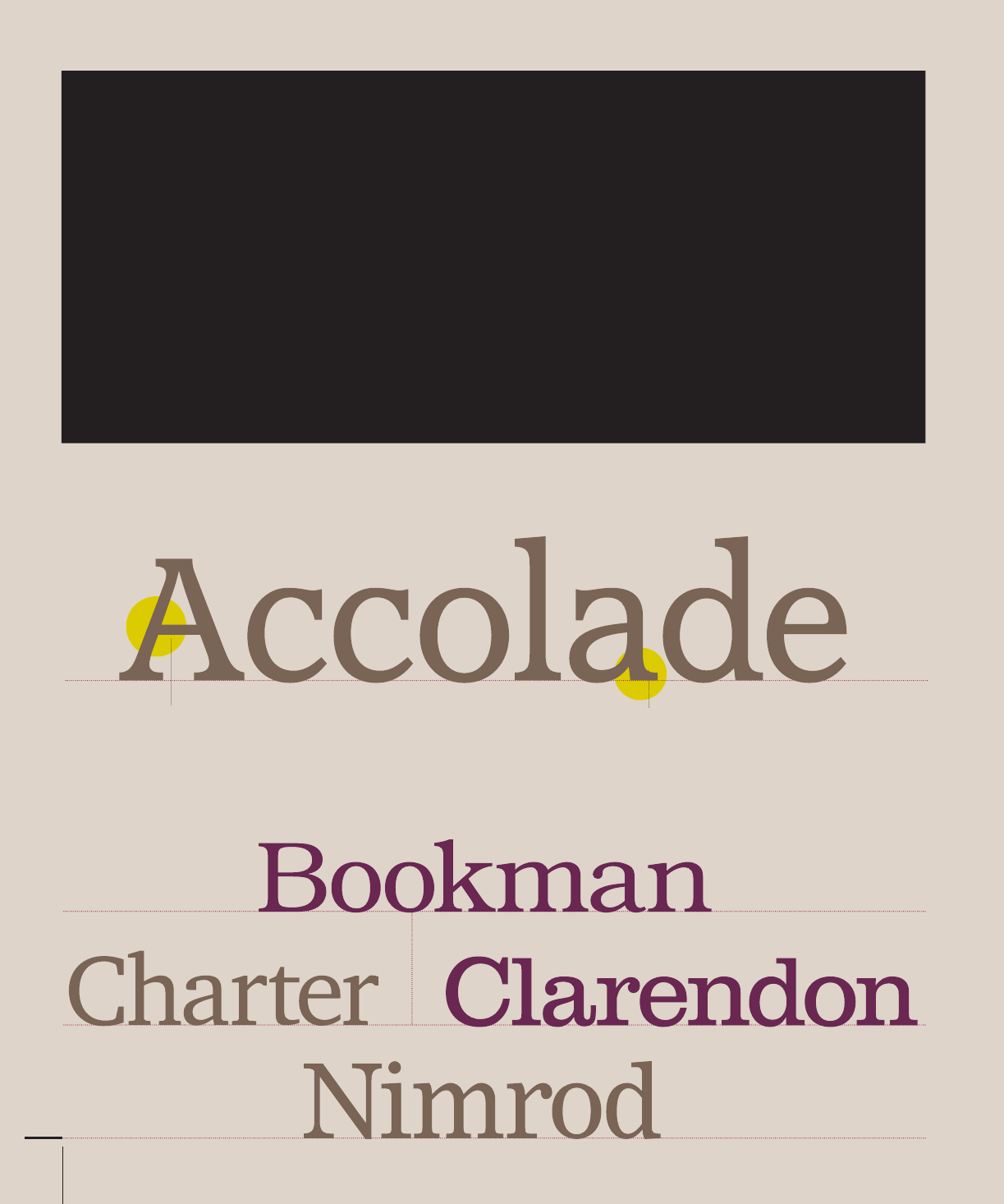
Serif Clarendon
As the name implies, these are typefaces patterned after the Clarendon type styles fi rst released
in the mid nineteenth century (13). Clarendons were designed as boldfaces to accompany text
composition. Their stroke contrast (230) is slight and serifs tend to be short to medium length.
Many of these designs were later released as display types (213). More obvious character stroke
weight and serifs longer than earlier designs mark more current interpretations of this style.
Short- to medium-
length serifs
052-067 03171.indd 58 9/22/11 9:17 AM
Job:03171 Title:Typography Referenced (Rockport)
Page: 59
Job:03171 Title:Typography Referenced (Rockport)
Page: 59
052-067 03171.indd 59 9/22/11 9:17 AM
Text
Job:03171 Title:Typography Referenced (Rockport)
Page: 59
Type Classifi cation and Identifi cation
59
Text
Job:03171 Title:Typography Referenced (Rockport)
Page: 59
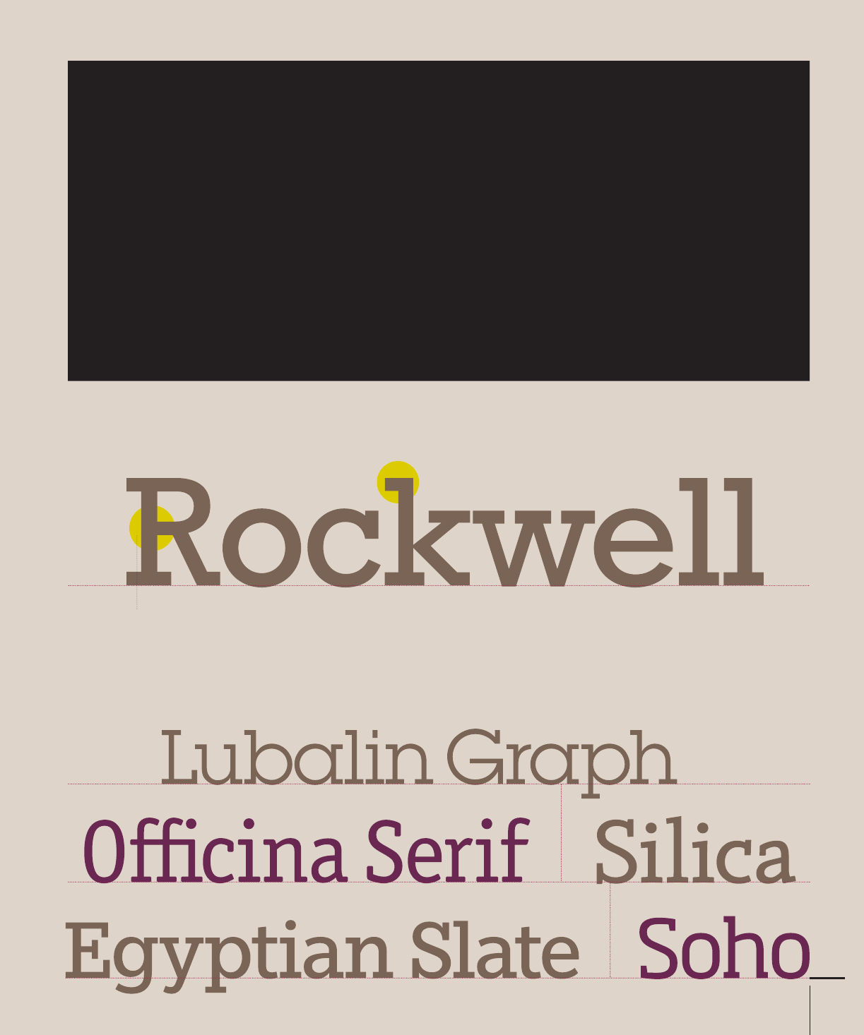
Serif Slab
Generally imperceptible
changes in stroke weight
Slab serif typefaces became popular in the nineteenth century (13) as advertising
display designs. These typefaces have very heavy serifs with little or no bracketing.
Generally, changes in stroke weight are imperceptible. Many view slab serif type styles
as sans serif designs with the simple addition of heavy (stroke weight) serifs.
Very heavy serifs
with little or no
bracketing
052-067 03171.indd 59 9/22/11 9:17 AM

Job:03171 Title:Typography Referenced (Rockport)
Page: 60
Job:03171 Title:Typography Referenced (Rockport)
Page: 60
052-067 03171.indd 60 9/22/11 9:17 AM
Text
Job:03171 Title:Typography Referenced (Rockport)
Page: 60
Text
Job:03171 Title:Typography Referenced (Rockport)
Page: 60
60
Typography, Referenced
Sans Serif Grotesque
Obvious contrast
in stroke weight
These are the fi rst commercially popular sans serif typefaces. Contrast (230) in stroke
weight is most apparent in these styles, there is a slight “squared” quality to many of
the curves, and several designs have the bowl-and-loop lowercase (332) g common to
roman types. In some cases the R has a curled leg and the G usually has a spur.
Some modern sans serif designs derive from the fi rst Grotesques, but are more refi ned
in form. Stroke contrast is less pronounced than earlier designs, and much of the
squareness in curved strokes is also lost. Typically the most obvious distinguishing
characteristic of these faces is their single-bowl g and more monotone weight stress.
Slight “squared”
quality to many
of the curves
Bowl-and-loop
lowercase g in
many designs
052-067 03171.indd 60 9/22/11 9:17 AM

Job:03171 Title:Typography Referenced (Rockport)
Page: 61
Job:03171 Title:Typography Referenced (Rockport)
Page: 61
052-067 03171.indd 61 9/22/11 9:17 AM
Text
Job:03171 Title:Typography Referenced (Rockport)
Page: 61
Type Classifi cation and Identifi cation
61
Text
Job:03171 Title:Typography Referenced (Rockport)
Page: 61
Based on the propor-
tions of roman
inscriptional letters
Sans Serif Humanist
These are based on the proportions of roman inscriptional letters. In many
cases, contrast (230) in stroke weight is also readily apparent. Many claim
that these are the most legible (330) in terms of character design and most
easily read in terms of typography of the sans serif typefaces. They also
most closely match the design characteristics and proportions of serif types.
Many of these typefaces display a strong calligraphic (64) infl uence.
Readily apparent
contrast in
stroke weight
Strong, apparent
calligraphic
infl uence
052-067 03171.indd 61 9/22/11 9:17 AM
..................Content has been hidden....................
You can't read the all page of ebook, please click here login for view all page.