
Job:03171 Title:Typography Referenced (Rockport)
Page: 182
166-205 03171 C2.indd 182 10/12/11 10:03 AM
Text
Job:03171 Title:Typography Referenced (Rockport)
Page: 182
182
Typography, Referenced
TYPEFACES AND SPECIMENS
Slab Serif
A
lso called Egyptian, square
serif, or mechanistic, these
nineteenth-century type-
faces grew out of the Industrial
Revolution and became prevalent in
advertising campaigns that called for
large, attention-getting slogans. Chron-
ologically, slab serifs follow the Didone
() era. They have been classifi ed along-
side serif typefaces, but have begun to
receive their own classifi cation system
because of the cultural and functional
milieu that brought about their creation.
Their medium contrast () and
blocky serifs make them ideal for use
at large sizes, as they were intended
during the Industrial Revolution when
posters and signs needed bigger, bolder
type to successfully yell at passersby.
Clarendon () typifi es this cate-
gory, with enough weight and character
for use in display type () such as head-
lines or subheads. Like serifs and sans
serifs, slab serifs () have their own sub-
classifi cations known as Clarendons
(or ionics) with their brackets and the
unbracketed Egyptians. Slab serifs rarely
get used for text type () because their
bold forms weigh down the page with too
much black, making for heavy passages
in books, magazines, or newspapers.
166-205 03171.indd 182 9/23/11 4:17 PM
Job:03171 Title:Typography Referenced (Rockport)
Page: 183
166-205 03171 C2.indd 183 10/12/11 10:03 AM
Text
Job:03171 Title:Typography Referenced (Rockport)
Page: 183
183
Typefaces and Specimens
SLAB SERIF CHARACTERISTICS
Typography
Typography
Typography
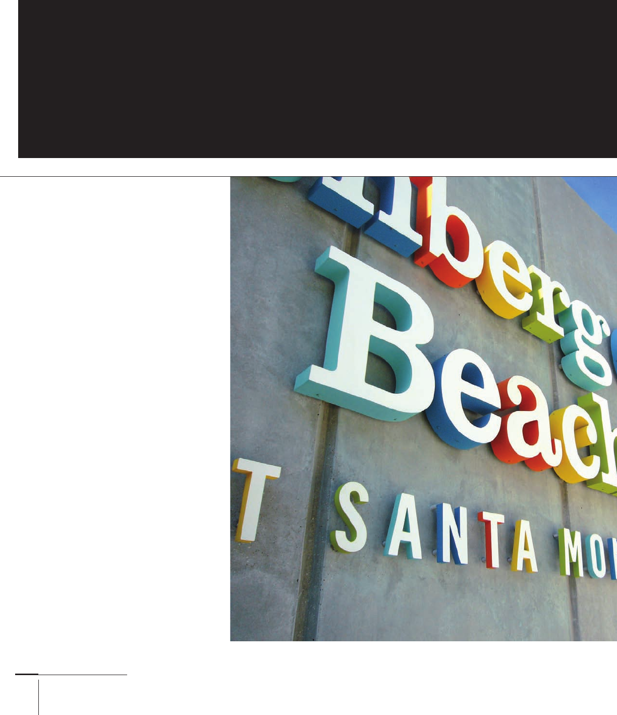
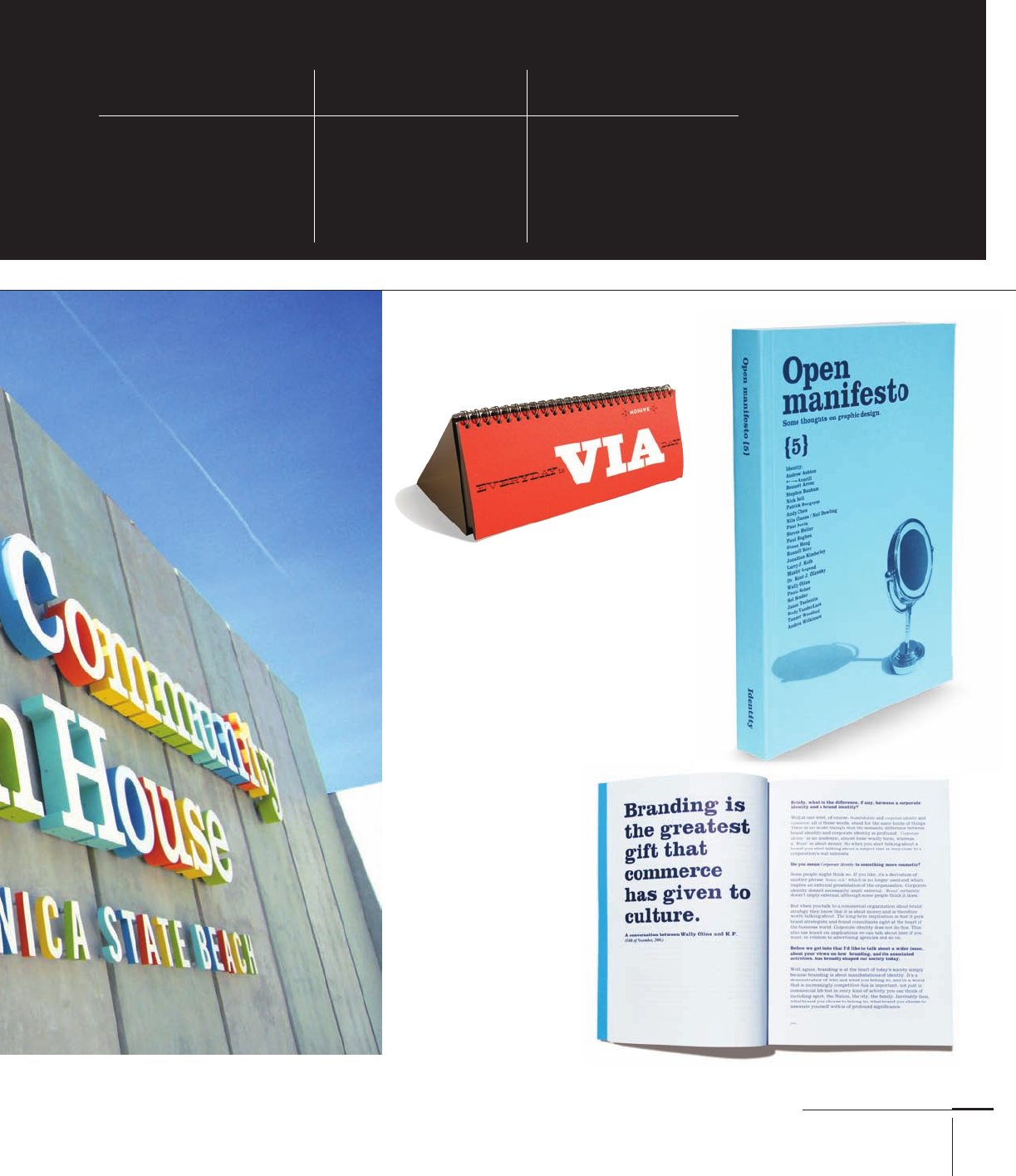
Annenberg Community
Beach House building
facade done in Clarendon
by AdamsMorioka,
Inc., United States
Mohawk Via roll catalog by
AdamsMorioka, Inc., United States
Open Manifesto
book and
interior done in
Clarendon, Kevin
Finn, Australia
166-205 03171.indd 183 9/23/11 4:17 PM
Bracketed or Clarendon serif
(set in Clarendon): Bracketed
serifs, short descenders,
pronounced drop forms and
ball terminals, low contrast
Unbracketed or Egyptian serif
(set in Rockwell): No brackets
on serifs, short descenders,
geometric properties
Geometric (set in I Lubalin
Graph Book): No brackets
on serifs, short descenders,
predominantly geometric

Job:03171 Title:Typography Referenced (Rockport)
Page: 184
ABCDEFGHIJ KLMNOPQRSTUVWXYZ
a bcdefg hijklmnopqr stuvwxyz
166-205 03171.indd 184 9/23/11 4:18 PM
Job:03171 Title:Typography Referenced (Rockport)
Page: 184
166-205 03171.indd 184 9/23/11 4:18 PM
Text
Job:03171 Title:Typography Referenced (Rockport)
Page: 184
184
Typography, Referenced
Background Traits
The uppercase () J, Q, and R look organic, along with the a, g,
and r. Like the original typewriter fonts, American Typewriter
functions best at small sizes; when enlarged to display sizes
above point, many of its peculiarities become evident.
American Typewriter
YEAR
ORIGINAL DESIGNERS
Joel Kadan and Toni Stan
CLASS
Clarendon, Rounded Serif
A designer’s job will become
even more challenging as
the quantity of information
and noise increases during
the twenty-fi rst century.
Those who possess a broad
typographic understanding
will best meet the
communicative and creative
challenge, especially during
a time when people know
the di erence between
one font and another—
and which ones read better
or worse with software’s
default 120-percent leading.
ABCDEFGHIJKLMNOPQRSTUVWXYZ 1234567890
abcdefghijklmnopqrstuvwxyz
The quick brown fox jumped over the lazy dog.
ABCDEFGHIJKLMNOPQRSTUVWXYZ 1234567890
abcdefghijklmnopqrstuvwxyz
The quick brown fox jumped over the lazy dog.
ABCDEFGHIJKLMNOPQRSTUVWXYZ 1234567890
abcdefghijklmnopqrstuvwxyz
The quick brown fox jumped over the lazy dog.
SELECTED AMERICAN TYPEWRITER ALPHABETS
Top to bottom: -point American Typewriter light, medium, and bold
EXAMPLE
-point American Typewriter
Original typewriter fonts from the s () and s ()
were monospaced; the letters all had a uniform width. Courier
is a perfect example. Joel Kadan and Tony Stan designed
American Typewriter diff erently, where the letter rather than
a universal measurement determined the width of the body.
Despite these and other formal changes, American Typewriter
still retains the rounded ball terminals that its typewriter kin—
Remington, Underwood—possess.
166-205 03171 C2.indd 184 10/12/11 10:03 AM
Job:03171 Title:Typography Referenced (Rockport)
Page: 185
ABCDEFGHIJKLMNOPQRSTUVWXYZ
abcdefghijklmnopqrstuvwxyz
166-205 03171.indd 185 9/23/11 4:18 PM
Text
Job:03171 Title:Typography Referenced (Rockport)
Page: 185
Typefaces and Specimens
185
Background Traits
Some versions and interpretations of Bookman date
back to the late s. It became a popular choice in the
early s because of its unique swash characters. After
essentially disappearing from usage, it went through
a revival in the late s. Because so many versions
existed without a complete family, Ed Benguiat ()
created a complete Bookman family for I in .
Children’s book designers have incorporated Bookman for
decades because of its large x-height, which makes it easy to
read even at small sizes. Because of this and its wide body,
adding even a point or two of additional leading when setting
text type () makes its paragraphs appear lighter, and in
eff ect, easier for readers to digest because they see less weight
optically. Bookman should be set at a wide enough measure to
avoid too many hyphens.
Bookman
YEAR
circa
ORIGINAL DESIGNERS
Wadsworth A. Parker
CLASS
Clarendon Serif
A designer’s job will become
even more challenging as
the quantity of information
and noise increases during
the twenty- rst centur y.
ose who possess a broad
typographic understanding
will best meet the
communicative and creative
challenge, especially during
a time when people know
the difference between one
font and another—and
which ones read better or
worse with software’s default
120-percent leading.
ABCDEFGHIJKLMNOPQRSTUVWXYZ 1234567890
abcdefghijklmnopqrstuvwxyz
e quick brown fox jumped over the lazy dog.
ABCDEFGHIJKLMNOPQRSTUVWXYZ 1234567890
abcdefghijklmnopqrstuvwxyz
e quick brown fox jumped over the lazy dog.
ABCDEFGHIJKLMNOPQRSTUVWXYZ 1234567890
abcdefghijklmnopqrstuvwxyz
e quick brown fox jumped over the lazy dog.
SELECTED BOOKMAN ALPHABETS
Top to bottom: -point Bookman light, medium, and bold
EXAMPLE
-point Bookman
166-205 03171.indd 185 9/23/11 4:18 PM
Job:03171 Title:Typography Referenced (Rockport)
Page: 186
ABCDEFGHIJKLMNOPQRSTUVWXYZ
abcdefghijklmnopqrstuvwxyz
166-205 03171.indd 186 9/23/11 4:18 PM
Text
Job:03171 Title:Typography Referenced (Rockport)
Page: 186
186
Typography, Referenced
Background Traits
As a “classic” typeface, Cheltenham has undergone many reviv-
als since its original design. The architect, Bertram Goodhue,
originally designed Cheltenham, and in the s, Morris
Fuller Benton () expanded it for American Type Found-
ers with various widths to make it a true type family. Tony
Stan completed the design in , giving it a larger x-height.
Goodhue infused Cheltenham with a sense of stability
and structure that likely came from his training as an
architect. Its short, stocky serifs make Cheltenham
almost appear like a semi serif at smaller sizes. Because
it is more condensed compared to its fellow Old Style
() faces, Cheltenham fi ts more characters per measure.
And its lack of distinct characters makes it a logical
choice for text type () in books or magazines.
Cheltenham
YEAR
ORIGINAL DESIGNERS
Bertram Goodhue
CLASS
Clarendon Serif
A designer’s job will become
even more challenging as
the quantity of information
and noise increases during
the twenty-fi rst century.
Those who possess a broad
typographic understanding will
best meet the communicative
and creative challenge,
especially during a time when
people know the difference
between one font and another—
and which ones read better
or worse with software’s
default 120-percent leading.
ABCDEFGHIJKLMNOPQRSTUVWXYZ 1234567890
abcdefghijklmnopqrstuvwxyz
The quick brown fox jumped over the lazy dog.
ABCDEFGHIJKLMNOPQRSTUVWXYZ 1234567890
abcdefghijklmnopqrstuvwxyz
The quick brown fox jumped over the lazy dog.
ABCDEFGHIJKLMNOPQRSTUVWXYZ 1234567890
abcdefghijklmnopqrstuvwxyz
The quick brown fox jumped over the lazy dog.
SELECTED CHELTENHAM ALPHABETS
Top to bottom: -point Cheltenham book, book italic, and bold
EXAMPLE
-point Cheltenham
166-205 03171.indd 186 9/23/11 4:18 PM
..................Content has been hidden....................
You can't read the all page of ebook, please click here login for view all page.