
Job:03171 Title:Typography Referenced (Rockport)
Page: 103
068-121 03171.indd 103 9/22/11 4:57 PM
Type Designers
Text
Job:03171 Title:Typography Referenced (Rockport)
Page: 103
Erik Spiekermann
German, –
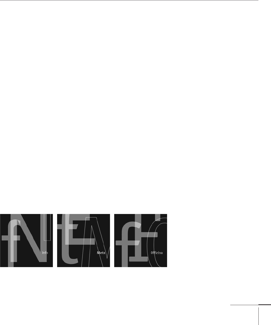
Typefaces: Berliner Grotesk (), LoType (), Offi cina Serif (),
Meta (), Info (), Govan (), Unit (, with Christian Schwartz),
Bosch (, with Schwartz), Deutsche Bahn (, with Schwartz), Meta Serif ()
Erik Spiekermann is an accom-
plished type designer, graphic
designer, and typographic con-
sultant. A native of Hanover,
Germany, he spent fi ve years
working and lecturing in
London and now lives in Berlin.
From to ,
Spiekermann studied art
history in Berlin’s Free
University and ran a printing
and metal type business from
his basement. In , he
moved to London, where he
lectured at the London College
of Communication (formerly
called the London College
of Printing) and worked as a
freelance designer.
In , he returned to
Germany and founded Meta-
Design, which grew into
Germany’s largest design fi rm
with more than employees.
Spiekermann is also a prin-
cipal of the FontShop (; ),
a company dedicated to selling
high-quality PostScript fonts
from all major manufacturers.
In addition, FontShop, through
its subsidiary FontFont, creates
and promotes new fonts from
up-and-coming designers
and publishes the quarterly,
disc-only magazine Fuse.
The FontFont library
also includes several of
Spiekermann’s own typeface
designs, including FF Meta,
identifi ed as “the Helvetica of
the ’s” and one of the most
popular typefaces in the world.
Another of his typefaces,
Offi cina, is widely used in Web
design. Info, his latest, is
used for the navigation system
of a major European airport.
Spiekermann frequently
writes about type and typog-
raphy, including his book Stop
Stealing Sheep & Find Out How
Type Works, published by Adobe
Press. He holds an honorary
professorship at the Academy of
Arts in Bremen, Germany, and
teaches workshops at design
schools around the world.
In , the Royal Society of
Arts in London made Spieker-
mann an Honorary Royal
Designer for Industry. In ,
the European Union awarded
him Ambassador for the Euro-
pean Year of Creativity and
Innovation, and in , the
Federal Republic of Germany
presented him with a lifetime
achievement award.
068-121 03171.indd 103 9/22/11 4:57 PM
Job:03171 Title:Typography Referenced (Rockport)
Page: 104
068-121 03171.indd 104 9/22/11 4:57 PM
Typography, Referenced
Text
Job:03171 Title:Typography Referenced (Rockport)
Page: 104
Sumner Stone
American, –
Sumner Stone created the Stone
type family or “clan” (as he calls
it), which is composed of four
matched types: Stone Serif, Stone
Sans, Stone Informal, and Stone
Humanist Sans.
Following his undergraduate
degree in sociology and an
introductory course in calligraphy
taught by Lloyd Reynolds at Reed
College in Portland, Oregon, Stone
worked as a lettering artist for
Hallmark Cards. He then opened
his own design studio in Sonoma,
California, and earned an M.A.
in mathematics from Sonoma
State University.
After working as director
of typography at Autologic in
Newbury Park, , and Camex in
Boston, Massachusetts, he joined
Adobe Systems () in as its
fi rst director of typography. There
he conceived and implemented
Adobe’s typographic program
including the Adobe Originals,
participated in the development of
Adobe’s hinting and font editing
software, conceived and initiated
the technology called Multiple
Masters, and was responsible for
licensing the fi rst PostScript type-
faces from Japan.
In , Stone established Stone
Type Foundry Inc., now located in
Rumsey, California. The foundry
produces and markets Stone’s
typeface designs, which include
a wide range of styles. Its fi rst
release was Stone Print designed
for the text of Print magazine. The
foundry’s repertoire now includes
both historical revivals such as
the prize-winning Bodoni, and
the extensive Magma super-fam-
ily which in was selected by
Print magazine as one of the ten
typefaces of the decade.
Basalt,
Arepo Pencil,
Munc typeface with leaves and straw ornaments,
Typefaces: Stone (1987), Ends Means Mends (1992),
Stone Print (1992), Cycles (1993), Silica (1993), Arepo
(1996), Basalt (1998), Leaves & Straw (2003), Magma
(2004), Munc (2005), Tuff (2009)
068-121 03171.indd 104 9/22/11 4:57 PM
Job:03171 Title:Typography Referenced (Rockport)
Page: 105
068-121 03171.indd 105 9/22/11 4:57 PM
Type Designers
Text
Job:03171 Title:Typography Referenced (Rockport)
Page: 105
Jan Tschichold
German, –
Typefaces: Transito (), Zeus (),
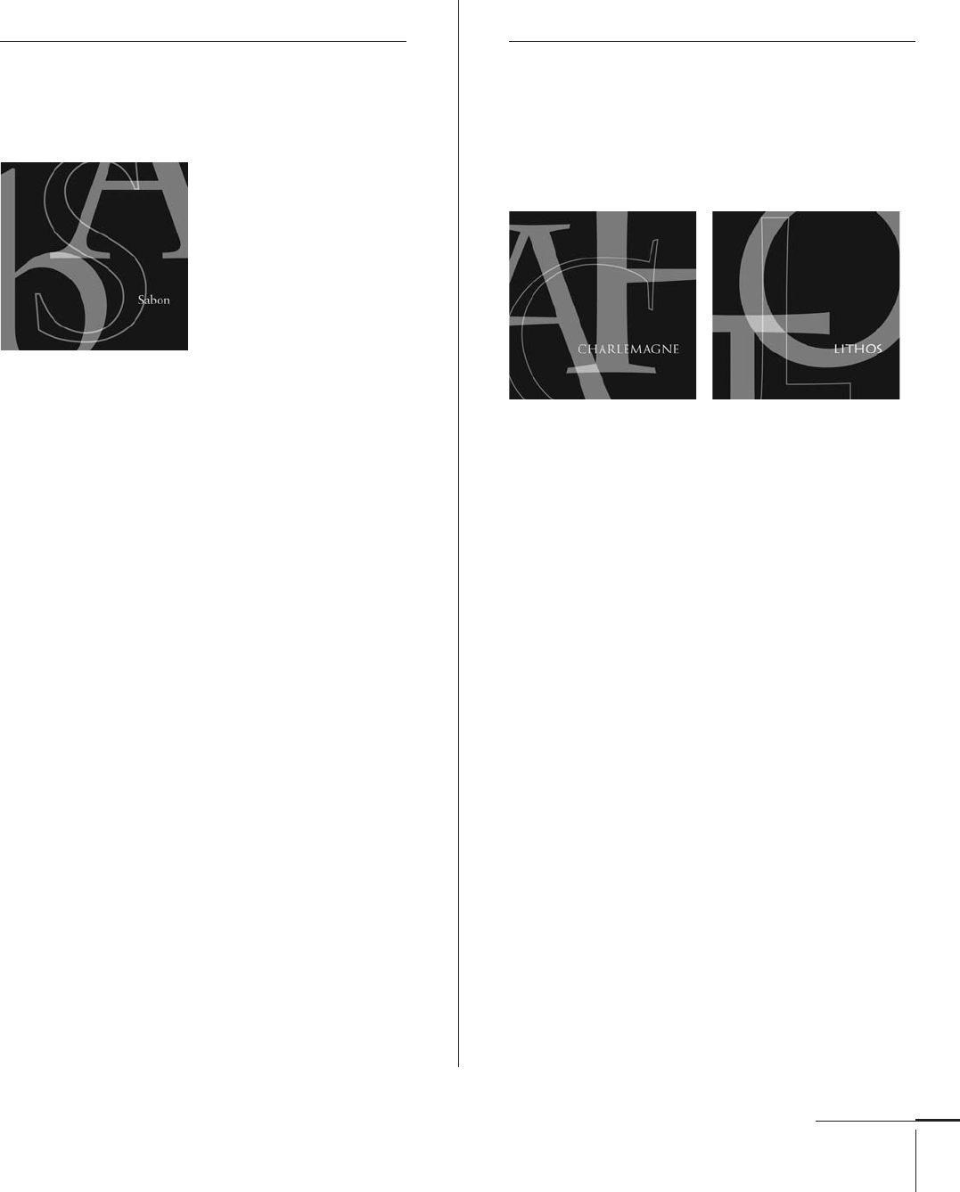
Saskia (), Sabon ()
Jan Tschichold was one of the most controversial and
infl uential graphic designers and typographers of the
twentieth century (). He was born in Leipzig, Germany,
in . As a teenager, he studied calligraphy, typography,
and engraving, and continued his formal studies at the
Academy for Graphic Arts and Book Trades in Leipzig and
at the School of Arts & Crafts in Dresden.
Following a visit to the Weimar Bauhaus exhibition
in , he immediately became an advocate of “new
typography,” which celebrated abstract modernist
principles such as asymmetrical () layouts and sans
serif typefaces. Years later, he became as well known for
denouncing these ideals and returning to traditional
principles. Tschichold began his teaching career at the
Leipzig Academy, and from to , he taught at the
German School for Master Printers in Munich.
He designed several typefaces during the s ()
and s () in Germany; however most of them were
lost during World War II. He designed his well-known
typeface, Sabon (), in the early s (). It remains
widely used today.
In , the American Institute of Graphic Arts () in
New York presented him with its highest honor, the
Medal, and in , the Royal Society of Arts in London
made him the fi rst Honorary Royal Designer for Industry.
Carol Twombly
American, –
Typefaces: Mirarae (),
Adobe Caslon, Charlemagne, Lithos, Trajan (),
Myriad (, with Robert Slimbach), Viva (),
Nueva (), Chapparal ()
Carol Twombly studied graphic design and architecture
at the Rhode Island School of Design () where she
fi rst became interested in letterforms and type design.
She subsequently received a master’s degree from
Stanford University in the digital typography graduate
department under Charles Bigelow (), and later
joined his fi rm, Bigelow & Holmes.
In , Twombly won fi rst prize from the Morisawa
Typeface Design Competition for her Latin typeface
Mirarae, which Bitstream () subsequently produced.
From to , she worked as a staff designer at
Adobe Systems () developing some of the most widely
recognized digital fonts of the twentieth century (),
including Lithos (based on inscribed Greek lettering),
Trajan (based on Roman capital letters found on the
Trajan column), and Myriad (designed with fellow Adobe
Systems designer, Robert Slimbach []).
Twombly retired from Adobe in to pursue other
design interests including textile and jewelry design.
068-121 03171.indd 105 9/22/11 4:57 PM
Job:03171 Title:Typography Referenced (Rockport)
Page: 106
068-121 03171.indd 106 9/22/11 4:57 PM
Typography, Referenced
Text
Job:03171 Title:Typography Referenced (Rockport)
Page: 106
Gerard Unger
Dutch, –
Typefaces: Demos (), Praxis (),
Hollander (), Flora (),
Swift (), Amerigo (), Argo (),
Oranda (), Gulliver (),
-fonts (), Capitolium (),
Paradox (), Coranto (),
Vesta (), Capitolium News ()
Born in Arnhem in , Gerard Unger
is a Dutch type designer, graphic designer,
and educator. He studied at the Gerrit
Rietveld Academie in Amsterdam, then
worked at Total Design, Prad, and Joh.
Enschedé. Since , he has worked inde-
pendently in Bussum, The Netherlands.
Unger also teaches graphic design and
typography at the Gerrit Rietveld Academie
in Amsterdam, for the University of
Reading’s () department of typography
and graphic communication in the
United Kingdom, and at The Netherlands’s
University of Leiden.
He has designed typefaces for the
Dutch highway sign system and the
Amsterdam Metro. His newspaper typeface,
Gulliver (), is familiar to millions of
readers as it is the typeface used in both
Today and several international
publications and newspapers, including
Germany’s Stuttgarter Zeitung.
Unger has received numerous
recognitions and awards, including the
H. N. Werkman Prize in , the Maurits
Enschedé Prize in , and the Society
for Typographic Arts Typography Awards
in .
Jürgen Weltin
German, –
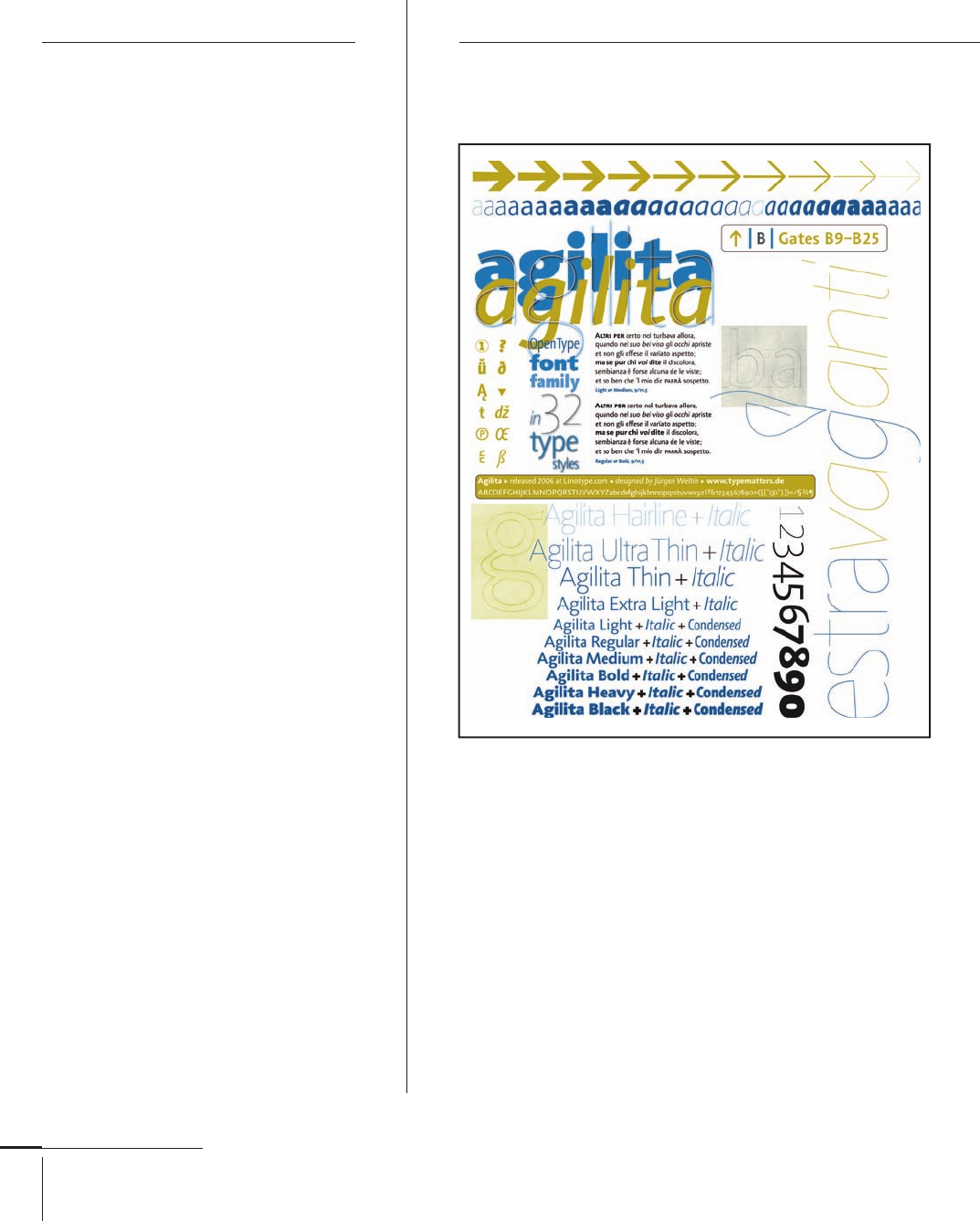
Typefaces: Finnegan (), Yellow (), Balega (),
Agilita (), Mantika ()
Jürgen Weltin was born in Constance, Germany, in .
Before beginning his formal studies in graphic design at
the Technical College in Würzburg, Germany, he worked at
a local publishing house. During this same time period, he
apprenticed at Stankowski Duschek and studied at the
Bournemouth & Poole College of Art and Design in Dorset,
United Kingdom.
Weltin joined Freda Sack and David Quay’s The Foundry
in , where he worked on type development projects,
including Foundry Gridnik and Foundry Form. He received
a D&AD Silver Award in for his typeface design for the
British Telecommunications’s Yellow Pages directory.
Agilita,
068-121 03171.indd 106 9/22/11 4:57 PM
Job:03171 Title:Typography Referenced (Rockport)
Page: 107
068-121 03171.indd 107 9/22/11 4:58 PM
107
Type Designers
Text
Job:03171 Title:Typography Referenced (Rockport)
Page: 107
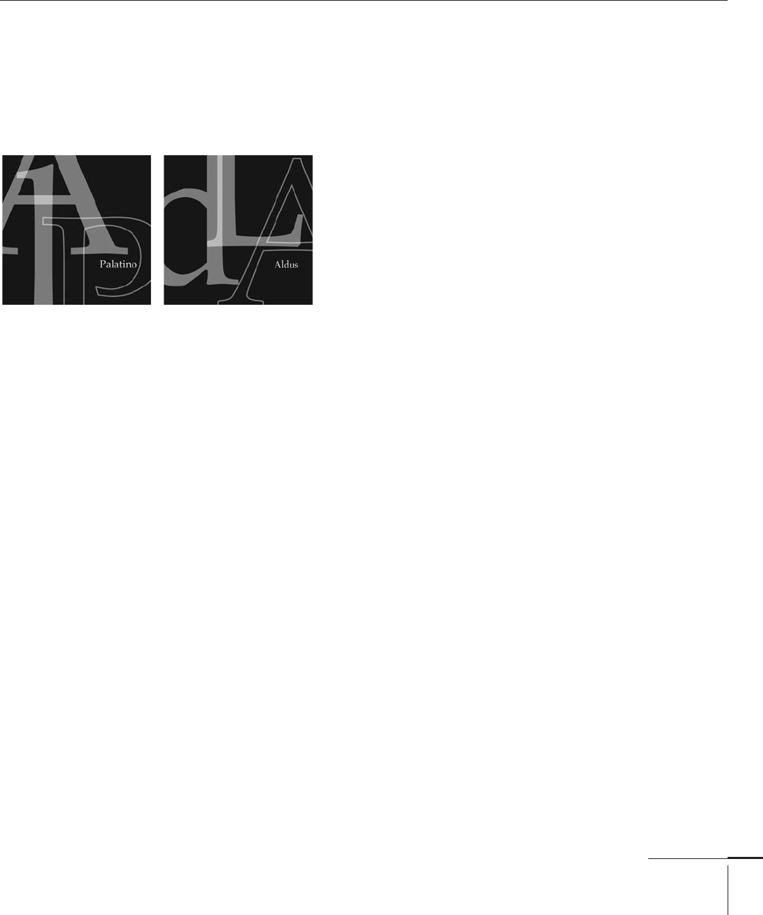
Hermann Zapf
Germany, –
Typefaces: Michelangelo, Palatino, Sistina (1950), Melior (1952), Saphir, Virtuosa (1953),
Aldus, Kompakt, Mergenthaler Antiqua (1954), Optima (1958), Hunt Roman (1962), Jeanette (1967), Firenze (1968),
Textura, Venture (1969), Hallmark Uncial (1970), Medici Script, Missouri (1971), Crown, Scriptura (1972),
Orion (1974), Comenius Antiqua, Marconi, Noris Script, Zapf, Zapf International (1976), Edison, Zapf Dingbats (1978),
Zapf Chancery (1979), Vario (1982), Aurelia, Euler (1983), Zapf Renaissance Antiqua (1987), Zapfi no (1998)
Hermann Zapf was born in Nurem-
berg, Germany, in . He is a
master calligrapher, artist, edu-
cator, and one of the most prolifi c
type designers of the twentieth
century (16). He has created more
than typefaces for metal type
foundries, photo compositors, and
digital foundries. Two of his most
renowned typefaces are Palatino
and Optima. The latter, which he
called a “serifl ess roman,” was
inspired by inscriptional letter-
ing he had seen in Florence. It still
remains extremely popular with
calligraphers and stone carvers.
A self-taught type and book
designer since , Zapf has
worked for D. Stempel AG, Mer-
genthaler Linotype Company,
H. Berthold AG (126), Hell
Digiset, Hallmark Cards, and
International Typeface Corpora-
tion (128). In , he became
a professor of typographic
computer programming at the
Rochester Institute of
Technology (349) in New York.
Zapf has received numerous
awards for his typographic work
including the Gold Medal
at the International Buchkunst-
Ausetllung in Leipzig, the
Frederic W. Goudy Award in
Typography from in , and
the Gutenberg Prize for technical
and aesthetic achievement in
type in . He was also made
an Honorary Royal Designer for
Industry in London in .
In , Zapf was awarded
the Order of Merit of the Federal
Republic of Germany.
068-121 03171 C2.indd 107 10/12/11 9:32 AM
..................Content has been hidden....................
You can't read the all page of ebook, please click here login for view all page.