

Job:03171 Title:Typography Referenced (Rockport)
Page: 142
Job:03171 Title:Typography Referenced (Rockport)
Page: 142
142-165 03171.indd 142 9/23/11 11:42 AM
Text
Job:03171 Title:Typography Referenced (Rockport)
Page: 142
Text
Job:03171 Title:Typography Referenced (Rockport)
Page: 142
142
Typography, Referenced
Typefaces
and Specimens
By Jason Tselentis
J
ohannes Gutenberg created the opportunity to mass-
produce typography when he designed moveable type in
the s, and the technology spread throughout Europe.
Printers—and later type foundries—crafted by hand
individual letters that would become the typefaces used for
producing printed material such as the Gutenberg Bible.
Many of those fi rst typefaces stemmed from the blackletter
() calligraphy so ingrained in Gutenberg’s Germanic culture
of the time. Venetian scripts, with their delicate and handcrafted
qualities, were appropriated in later day Europe during the s.
Muscular, even angular strokes rose to prominence during the
s and s, popularized by the Dutch. And slab serif ()
fonts used for advertising and promotion became a necessity in
the s, when large posters and signs shouted for attention.
But when William Caslon IV boldly obliterated the serifs from
his type design, later called sans syrruph (“sans serif,” or
“without serifs”) by English type founder Vincent Figgins in ,
it paved the way for a new dawn in typeface design. Historically,
technological developments such as the shift to Linotype ()
and Monotype () machines, and later to phototypesetting,
shaped the how and why of a typeface’s design. Today, diff er-
ences in language, writing forms, marketing, and artistic vision
sway look, feel, function, and trend. Many of today’s typefaces
are revivals (even re-revivals) or adaptations of original designs
from centuries past. And unfortunately, some designers and
foundries have rendered poor copies due to unreliable sources
or too many variations from which to model their designs.
142-165 03171.indd 142 9/23/11 11:42 AM
Job:03171 Title:Typography Referenced (Rockport)
Page: 143
Job:03171 Title:Typography Referenced (Rockport)
Page: 143
142-165 03171.indd 143 9/23/11 11:42 AM
Text
Job:03171 Title:Typography Referenced (Rockport)
Page: 143
Text
Job:03171 Title:Typography Referenced (Rockport)
Page: 143
143
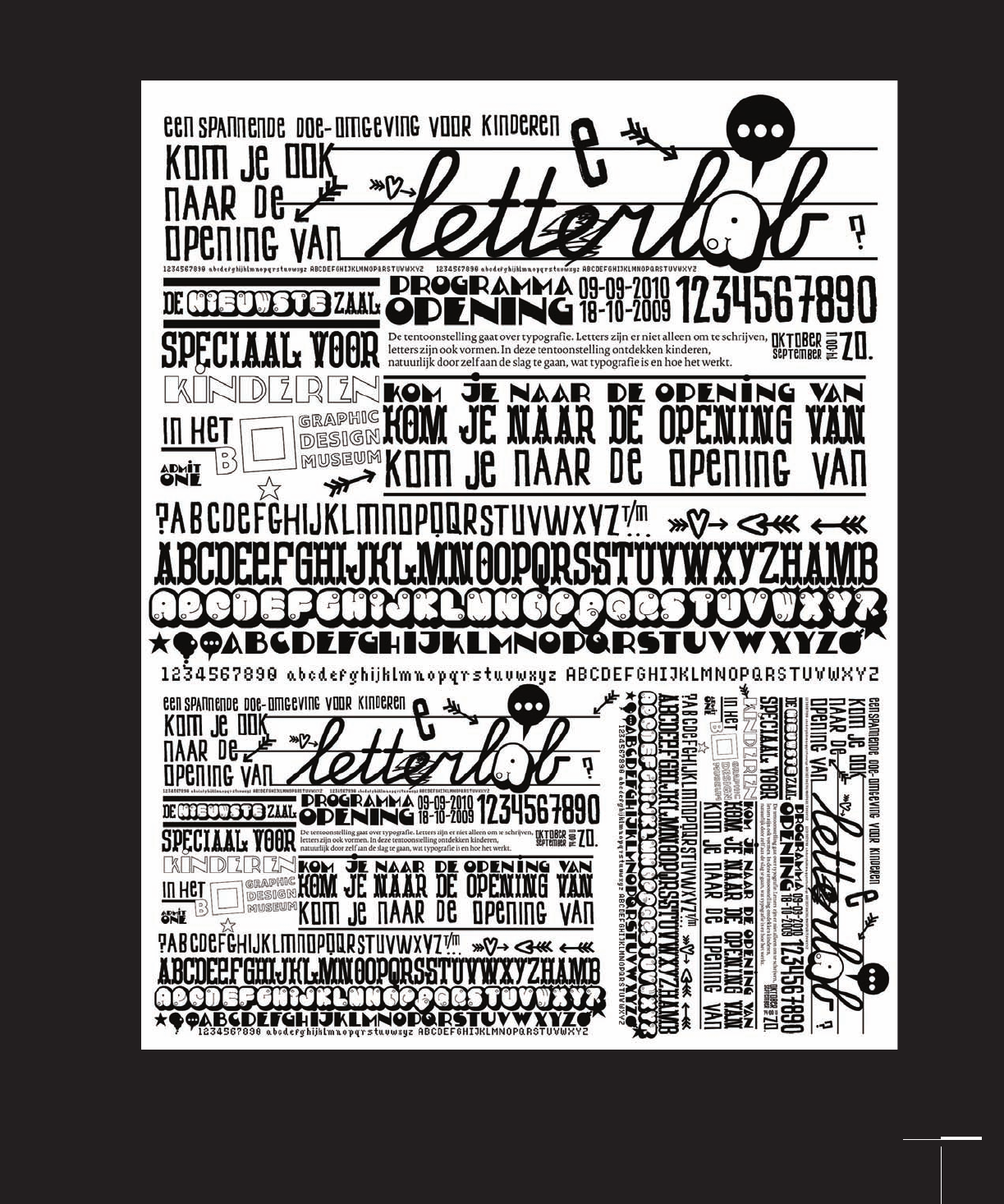
Letterlab typography specimen sheet and repertoire, Strange Attractors Design, The Netherlands
142-165 03171.indd 143 9/23/11 11:42 AM
Job:03171 Title:Typography Referenced (Rockport)
Page: 144
Job:03171 Title:Typography Referenced (Rockport)
Page: 144
142-165 03171.indd 144 9/23/11 11:42 AM
Text
Job:03171 Title:Typography Referenced (Rockport)
Page: 144
144
Typography, Referenced
Text
Job:03171 Title:Typography Referenced (Rockport)
Page: 144
TYPEFACES AND SPECIMENS
Specimen Sheets
W
hen it comes to selecting a typeface, a
designer must consider many factors, but one
tool continues to be helpful: a specifi cation
sheet, an example of every letter, symbol, and
number in a typeface shown in diff erent sizes and con-
texts. Type specimens have long enabled printers and
designers to see an entire character set in a range of sizes.
By looking at one or many typeface specimens, identi-
fying the typeface (or typefaces) appropriate to a project
should become clear.
In today’s digital world, type specimens exist mostly on
the Web in the form of simple character displays on web-
sites. One of the newer specifi cation tools is on-screen
testing, during which websites allow users to view how
the text of fonts—sometimes up to several dozen—will
display. Those who intend to use the type in print are at a
bit of a disadvantage looking at it on screen. Fortunately,
many foundries and distributors off er a downloadable
for printing, testing, and comparing the specimens
on paper—especially handy for instances of use with a
colored or textured substrate that will modify the font’s
typographic color. Designers can also send away for speci-
mens in printed catalogs.
During the past century, the number of available
typefaces has moved in parallel with technological
improvements. As technology for viewing and compar-
ing typographic specimens increased, so too did the
number of typefaces. Classifi cation systems to help
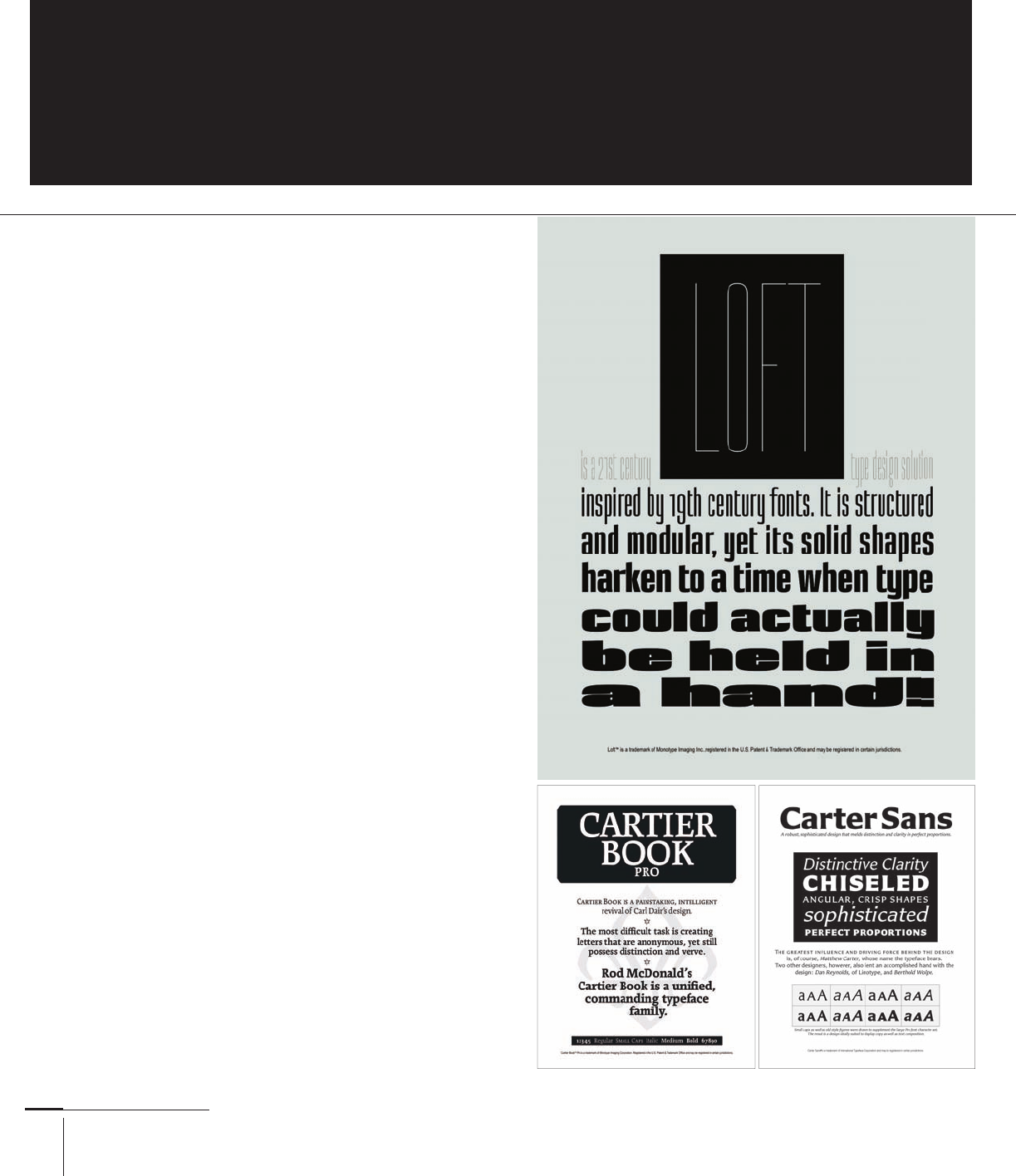
Specimen sheets, such as these three from Monotype
Imaging, have a similar layout and purpose as
those printed during the predigital era, only they’re
available as downloadable fi les from www.fonts
.com. Whether found online or held as printed sheets,
specimen sheets are vital tools for seeing how typefaces
look and feel before committing them to a project.
142-165 03171.indd 144 9/23/11 11:42 AM
Job:03171 Title:Typography Referenced (Rockport)
Page: 145
Job:03171 Title:Typography Referenced (Rockport)
Page: 145
142-165 03171.indd 145 9/23/11 11:42 AM
Text
Job:03171 Title:Typography Referenced (Rockport)
Page: 145
Text
Job:03171 Title:Typography Referenced (Rockport)
Page: 145
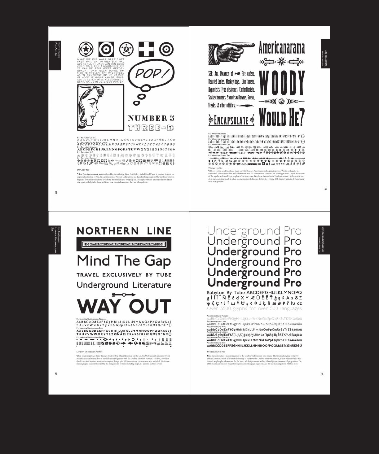
The P foundry has its catalog available for purchase, and many of its specimen sheets
show the type in use as a collection of phrases, and words in various weights.
142-165 03171.indd 145 9/23/11 11:42 AM

Job:03171 Title:Typography Referenced (Rockport)
Page: 146
Job:03171 Title:Typography Referenced (Rockport)
Page: 146
142-165 03171.indd 146 9/23/11 11:42 AM
Text
Job:03171 Title:Typography Referenced (Rockport)
Page: 146
146
Typography, Referenced
Text
Job:03171 Title:Typography Referenced (Rockport)
Page: 146
Web designers used to be limited to a mere dozen Web-safe fonts.
But thanks to new tools such as Typekit, designers can browse
through nearly any type specimen online. Typekit’s online
catalog allows the designer to see a range of styles and weights,
along with how the font will appear in a variety of browsers and
operating systems. This range of testing is akin to seeing how
a font would appear on one type of paper versus another.
designers sort and select type have come and gone, but
sorting by history, features, tools used, usage clas-
sifi cation, and the Vox system are the mainstays:
•
Historical classifi cations position typefaces or their reviv-
als within the time period during which their visual
attributes were invented.
•
Classifying by features such as shape, proportion, or use
clusters typefaces into visual categories rather than within
an historical canon.
•
The tools used to create the typeface can also become a
mode of classifi cation. This is more prevalent for predigi-
tal typefaces, when myriad tools were used such as chisels,
pens, geometric measuring devices, rulers, or brushes.
•
Last, usage classifi cation includes categories such
as text or display, coated or uncoated paper, off set or
digital printing, and—to fragment even further—
digital as well as small screen.
•
Of all the classifi cation methods, the Vox system has the
widest level of consensus. Maximillien Vox created it in
, and the Association Typographique Internationale
() adopted it on the merits of its traditional terminol-
ogy and historical criteria. The fi rst four categories relate
to early serif type forms including the Venetian Human-
ist, Garalde, Transitional (), and Didone (). The more
familiar categories such as slab serif () and sans serif
each have their own subcategories. And Glyphic (),
script, and graphic round out the list, helping to neatly
position some of the typographic outliers.
Any of the above systems work under the proper circum-
stances, and depending on the piece at hand, designers
still take liberties with the way they sort and view type-
faces. But one constant remains: dispute. Many designers,
typographers, artisans, and printers consider many of the
new typographic breed weeds among the fl owery time-
tested faces included in this chapter. Everyone seems to
have his or her own opinions about what is timeless and
what is purely functional.
Put a graphic designer and a typographer in the
same room and ask them to share with each other their
list of top fonts. Chances are good that that list
would have as many similarities as diff erences. But those
on which they agreed would likely have unique propor-
tions, characteristics, shapes, or uses. After their voting,
if they had to research the history of their chosen fonts,
as well as those they left off of the list, chances are they
would have a newfound perspective on those they
selected and neglected.
Typefaces will continue to become popular or
unpopular, but a broad, conceptual understanding of
these time-tested typefaces can go a long way toward
ensuring that designers have a springboard for the
continued use and celebration of typography.
142-165 03171.indd 146 9/23/11 11:42 AM
..................Content has been hidden....................
You can't read the all page of ebook, please click here login for view all page.